What is Terminator HUD (1984)?
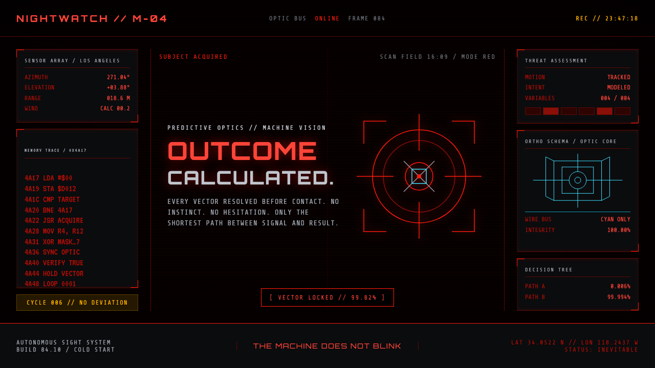
Terminator HUD turns vision into a verdict: blood-red targeting data, cold mono readouts, and an unblinking machine consciousness staring through absolute black.
Terminator HUD (1984) in brief
Terminator HUD is the machine-eye interface associated with James Cameron’s 1984 film The Terminator. It frames the world as a T-800 reads it: a red targeting layer sits over blackness, reticles settle onto subjects, scrolling machine text reports conditions, and the visible image feels less like a scene than a system deciding what a scene means. Surveillance becomes an aesthetic language rather than a hidden technical process.
Its palette and material mood are brutally restricted. Dead black provides the field; luminous red carries nearly all urgent information; gunmetal suggests the T-800’s cold mechanical body. Thin cyan wireframes appear only in connection with Cyberdyne schematics, making that accent feel technical and exceptional rather than decorative. There is no welcoming ambient light, soft visual relief, or organic color variation.
The style is recognizable because it makes the interface feel attached to the machine rather than placed in front of an audience. Crosshairs, coordinates, brackets, scanlines, threat assessments, and opcode-like text do not behave as conventional interface conveniences. They create pressure. The viewer is positioned as the observed target, while the screen projects the unnerving confidence of a system that has already processed the outcome.
Where does Terminator HUD (1984) come from?
The style belongs to the 1984 release of The Terminator, which reached theaters on October 26. Its setting in the film’s visual imagination is Los Angeles, while the supplied production context identifies Hemdale and Orion Pictures. This matters because Terminator HUD is not presented as a generic future-computer look. It is a specific cinematic point of view: the world seen through a machine built to identify, assess, and pursue.
Its source material places the aesthetic within practical science-fiction effects of the 1980s, tech-noir, and cyberpunk machine-vision aesthetics. Those terms describe three layers of the result. Practical science-fiction effects give the image a physical, constructed presence; tech-noir gives it darkness, threat, and urban fatalism; machine vision gives its graphics a cold observational purpose. The interface does not promise discovery or play. It promises classification.
The HUD’s most important conceptual move is to make information hostile. In many interfaces, data is organized to reduce uncertainty for a human user. Here, data signals that uncertainty has already been removed by the machine. A target bracket is not an invitation to choose; it is evidence of selection. A threat assessment is not advice; it is an internal statement of capability. Scrolling readouts become part of the machine’s psychological presence.
The named figures in the supplied origin context are James Cameron, Stan Winston, Gale Anne Hurd, and Adam Greenberg. Together, their presence situates the style within the film’s authored visual world rather than treating it as an anonymous collection of retro interface fragments. For contemporary designers, that distinction is essential: the red overlay, mechanical text, and black field work because they serve a machine character and a tech-noir atmosphere, not because they are interchangeable symbols of futurism.
What defines the Terminator HUD (1984) look?
Absolute Black Field
Black is not merely a background; it is the condition in which the interface exists. It removes domestic warmth, environmental detail, and visual comfort, leaving only what the machine elects to reveal. Large empty areas are therefore active space. They make each red mark feel isolated, deliberate, and potentially consequential.
Blood-Red Priority
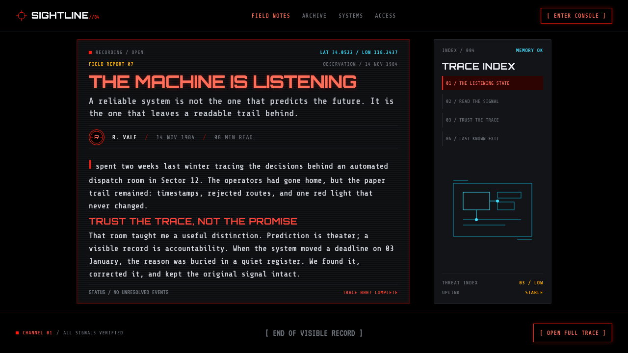
Red carries targeting, status, and machine urgency. It should read as emitted light against darkness, never as a cheerful accent. The strongest red elements belong to the most consequential information: reticles, target brackets, warnings, or decisive readouts. When every detail glows with equal intensity, the style loses its threat hierarchy.
Monospaced Machine Text
Mono readouts suggest a system processing rather than a brand speaking. Text appears as compact evidence: code-like fragments, coordinates, assessments, labels, and scrolling operational language. The typographic voice should remain impersonal and terse. Its power comes from the feeling that the machine has no need to explain itself in human terms.
Reticles and Target Brackets
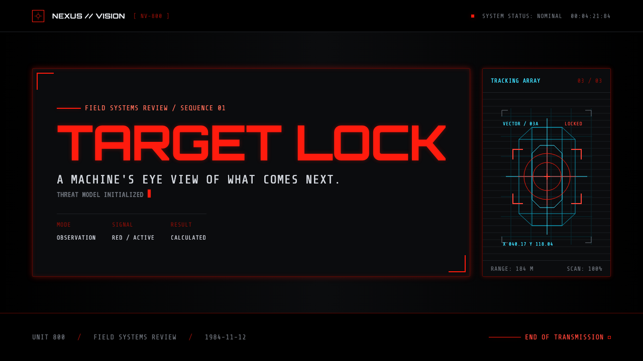
Crosshairs and brackets give the composition its predatory focus. They convert a person, object, or image region into a tracked subject. These marks work best when they are sparse and exact, sitting over a clearly chosen focal point. They should imply active measurement, not become a decorative pattern scattered over the whole screen.
Scanlines and Signal Friction
Crawling scanlines introduce the sense that the image is being captured, interpreted, and transmitted in real time. They add friction without turning the surface soft or nostalgic. The effect should remain controlled: a machine signal under stress, not a damaged screen. It is a reminder that vision here is technical mediation rather than transparent reality.
Reserved Cyan Wireframes
Cyan is reserved for Cyberdyne wireframes and schematic information, making it a secondary technical channel rather than a competing neon accent. Against red and black, it reads as colder, more abstract, and more structural. Its rarity is the point: it identifies diagrams, systems, and constructed knowledge without weakening the red targeting logic.
Who shaped Terminator HUD (1984)?
Cameron is named in the supplied material as the filmmaker associated with the 1984 machine-eye view. In this style’s educational framing, his name anchors the HUD to The Terminator’s specific cinematic perspective: an interface that turns looking into calculation and pursuit.
Stan Winston appears among the key figures provided for the theme. His inclusion places Terminator HUD within a practical science-fiction context, where the machine is understood as a cold, constructed physical presence rather than an abstract software metaphor.
Gale Anne Hurd is listed in the supplied origin material as a key figure. In the context of this article, that credit helps keep the aesthetic connected to its film-production world instead of reducing it to a loose collection of red terminal motifs.
Adam Greenberg is also named in the source context. His inclusion reinforces the style’s dependence on cinematic seeing: blackness, metallic presence, red overlays, and selected technical detail are composed as a point of view, not simply arranged as interface decoration.
How do you use Terminator HUD (1984) today?
For presentation covers, Terminator HUD works when the subject benefits from controlled menace, system analysis, security, automation, or machine intelligence. Begin with a near-empty black field, establish one primary focal object or title, then let red brackets or a reticle claim it. Keep the composition directional and severe. A cover should feel like an acquisition screen, not like an action-film poster crowded with effects.
Content slides need more restraint than covers. Use a mono typographic voice for labels, metadata, and short system-like notes, while retaining a clear reading hierarchy for the actual argument. Divide material with thin rules, corner brackets, and red coordinate-like markers rather than boxes around every paragraph. For data slides, treat charts as targets under analysis: isolate a finding, label it with concise machine language, and reserve the most luminous red for the signal that matters.
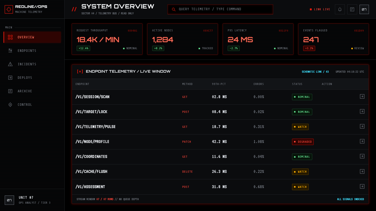
For web interfaces, the style is strongest in operational dashboards, monitoring surfaces, analytical tools, security views, and controlled pricing or product pages. Black space should make scanning easier, not conceal information. Red should identify action, priority, or active tracking; mono text can distinguish system metadata from human-readable explanations. Cyan wireframes belong to architecture, schematics, or technical relationships, where their contrast communicates a separate class of information.
For editorial and marketing work, use the aesthetic to frame a story about surveillance, automation, systems, or technological consequence. A feature page can alternate between black narrative fields and tightly controlled technical inserts. Cropped imagery, target brackets, and sparse scanlines can make a photograph feel observed rather than merely displayed. The copy must carry equal weight: terse labels and clinical captions work best when balanced by readable editorial prose.
The common mistake is mistaking Terminator HUD for generic neon cyberpunk. Filling every surface with bright colors, decorative code, glitch noise, and unrelated icons turns the machine’s focused perception into visual clutter. The original logic is narrow: black creates isolation, red declares priority, cyan identifies specific technical diagrams, and every bracket or readout should imply an actual act of tracking, assessment, or calculation.
Terminator HUD (1984) — FAQ
Is Terminator HUD simply a cyberpunk interface style?
Cyberpunk machine-vision aesthetics are one of its supplied reference movements, but the style is narrower than generic cyberpunk. It relies on a machine’s hostile point of view: black isolation, red target acquisition, mono operational language, and only occasional cyan schematics. Generic cyberpunk can be dense, colorful, urban, and expressive; Terminator HUD is selective, cold, and evaluative.
Why is the black background so important?
The black field removes everything that is not being selected or interpreted by the system. It makes the red overlay appear emitted, deliberate, and intrusive, while leaving the viewer with little visual comfort. Replacing black with a busy scene or a softly colored background changes the emotional premise from machine surveillance to ordinary futuristic decoration.
When should cyan appear in a Terminator HUD composition?
Use cyan sparingly for Cyberdyne wireframes and schematic material. Its job is to identify a technical diagram layer that differs from the red targeting system. If cyan becomes a broad decorative glow or competes equally with red, the visual hierarchy collapses and the composition loses the distinction between observation, targeting, and machine knowledge.
Can this style work for a consumer-facing product?
It can, but only where surveillance, technical control, gaming tension, automation, or high-stakes system feedback supports the product’s voice. It is poorly suited to experiences that need reassurance, warmth, care, or leisurely exploration. The strongest applications borrow its hierarchy and point-of-view discipline without forcing every user into the role of a target.
Related design styles
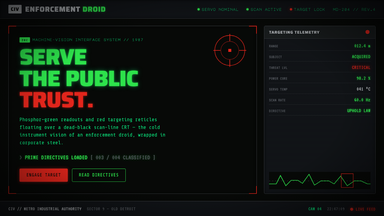 RoboCop (1987)Machine vision as interface. Phosphor-green readouts on dead-black CRT, red r…
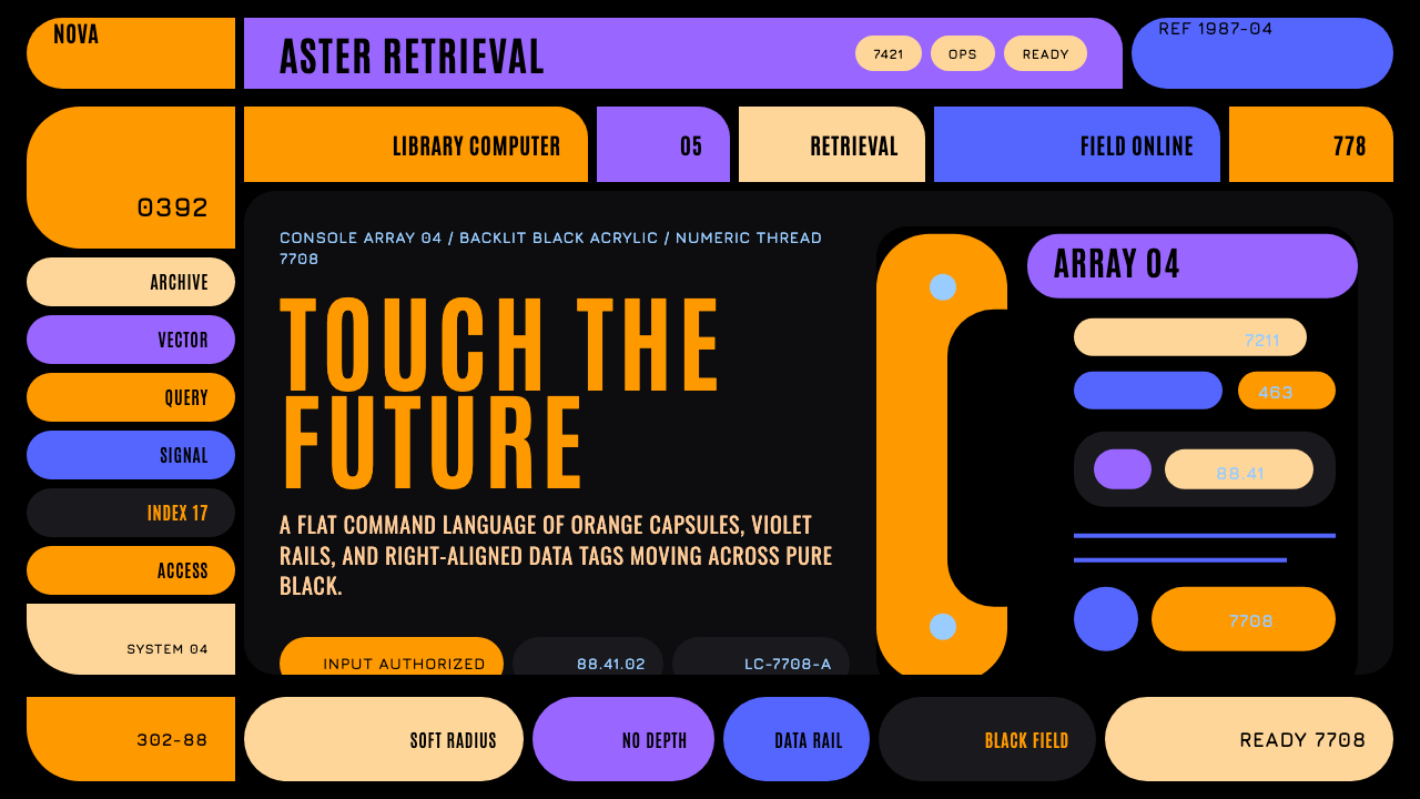 Star Trek LCARSFuture as flat command. Orange-violet elbows and Jura numbers glow on black.
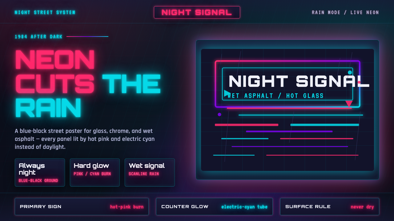 Tech-NoirAlways night. Blue-black asphalt reflects hot pink and electric cyan neon.
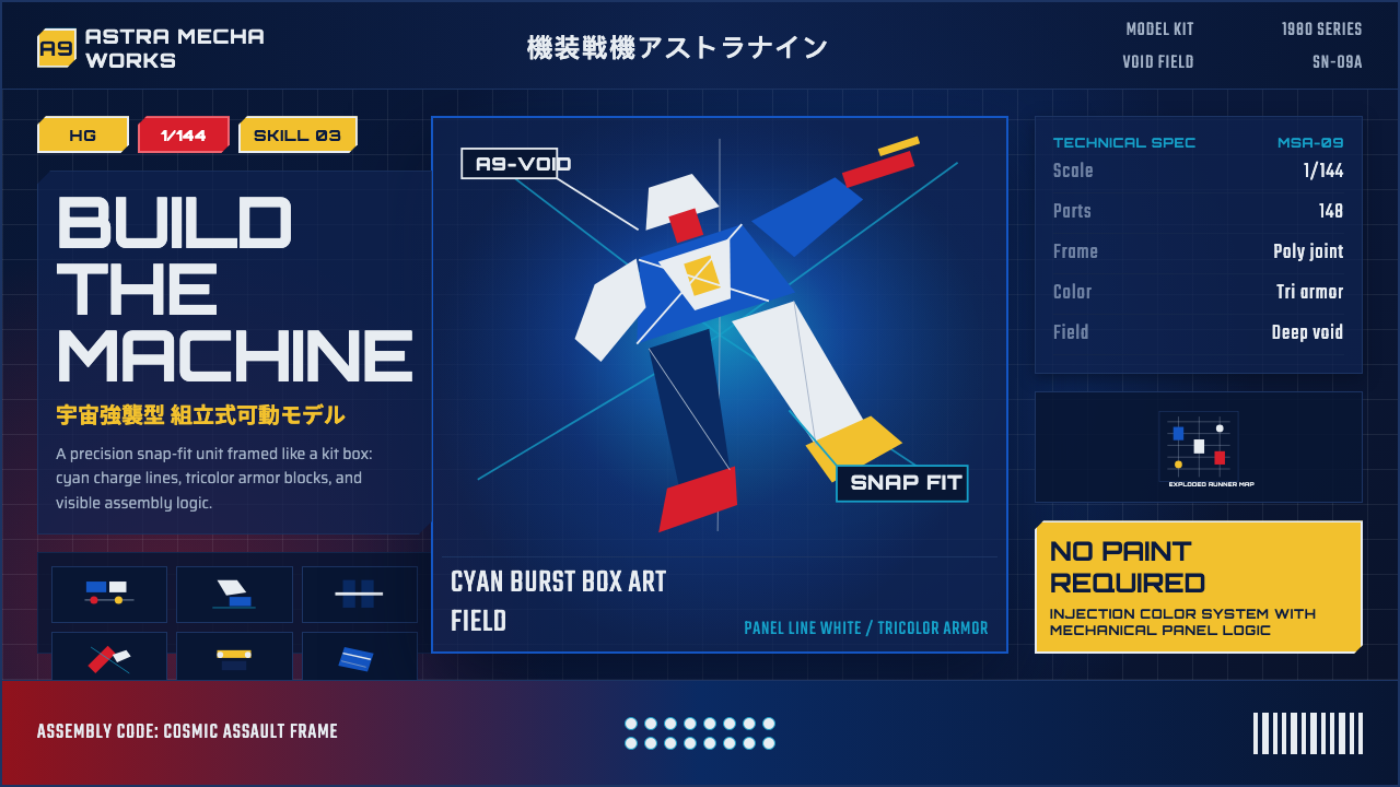 Gunpla Model BoxBuild-sheet drama. Cosmic navy, cyan burst, tricolor armor, and spec-panel gr…
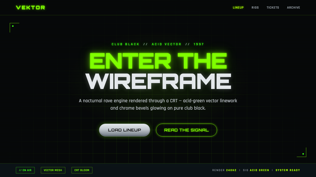 Playstation Rave Green 1997Enter the wireframe. Acid-green vector lines and chrome glow on club black, a…
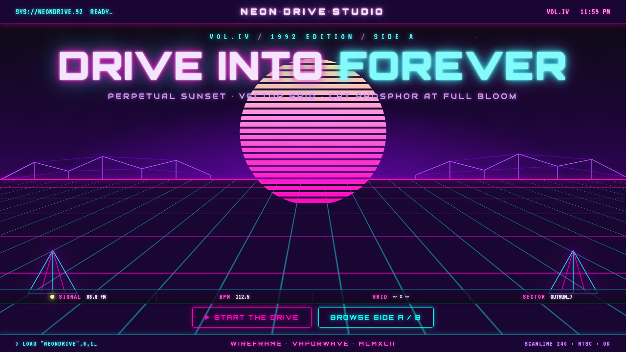 Wireframe VaporwaveDrive into forever. Magenta-cyan grid races to a vanishing point under a stri…