What is Star Trek LCARS?
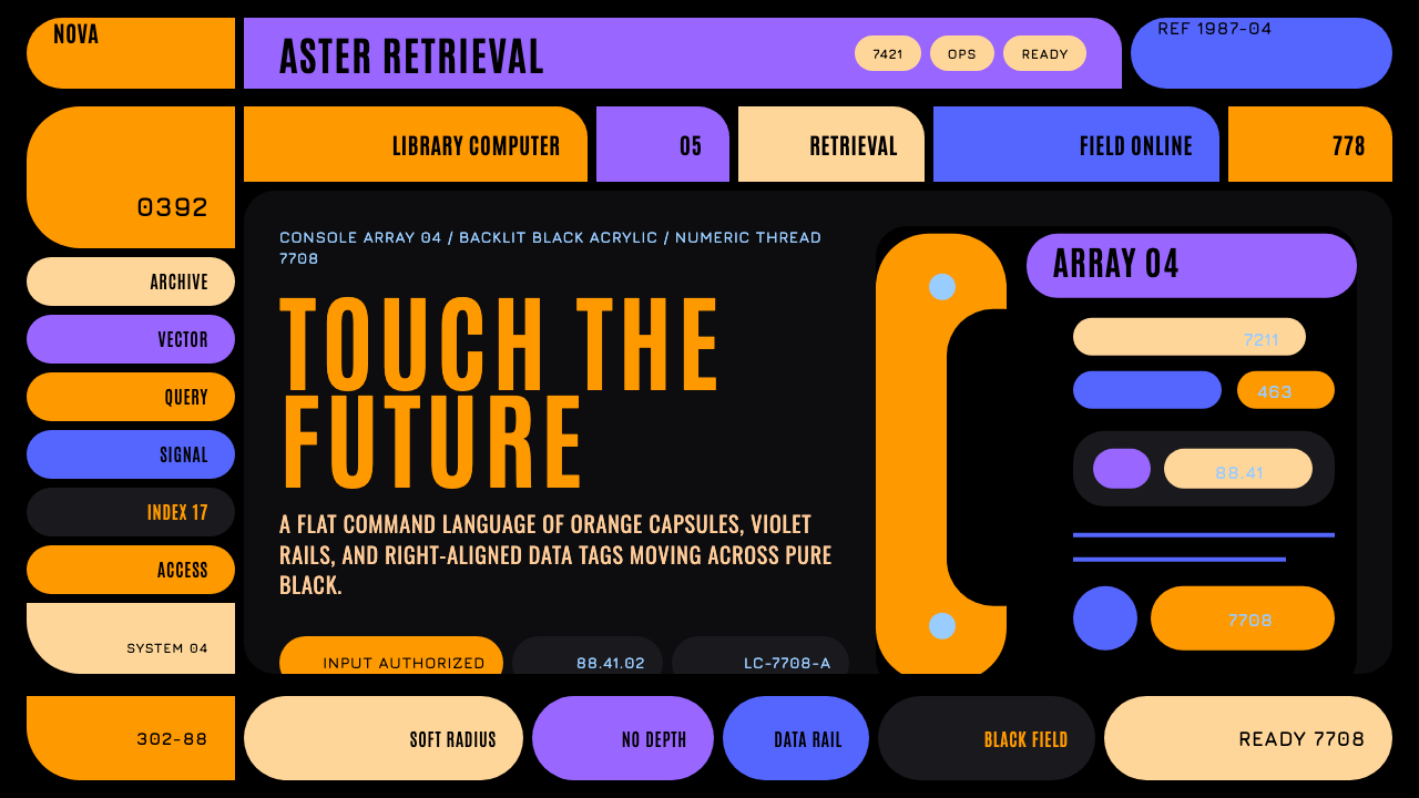
LCARS is a fictional starship computer interface that became one of the most recognizable graphic languages in television — flat color, sweeping elbows, and Okuda's disciplined geometry glowing on black.
Star Trek LCARS in brief
Star Trek LCARS is a design system drawn from the Library Computer Access and Retrieval System, the touchscreen computer interface designed by scenic art supervisor Michael Okuda for Star Trek: The Next Generation, which premiered in 1987. Though entirely fictional — no such interface ever existed as functional software — LCARS became one of the most widely recognized and widely imitated graphic design languages ever to originate in television production design.
The system reads from a pure-black backlit console: softly rounded color blocks in warm orange and tan glow beside cooler violet and blue capsule shapes, connected by thin colored rail lines and threaded through with right-aligned numeric tags that suggest live telemetry data. Nothing about the composition tries to look like a real-world touchscreen operating system of any era — it invents its own confident, alien logic.
The style is resolutely flat: no gradients, no bevels, no skeuomorphic chrome or drop shadows anywhere in an authentic composition. Its entire identity lives in geometry rather than surface treatment — pill-shaped buttons known as Okudagrams, generous black negative space that lets each color block breathe, and the style's signature move: an elbow shape that bends a horizontal header bar down into a vertical sidebar using one continuous, unbroken curve.
Where does Star Trek LCARS come from?
LCARS was created by Michael Okuda, who served as scenic art supervisor across multiple Star Trek television series and films beginning with Star Trek: The Next Generation in 1987. Okuda was tasked with designing the on-screen computer displays, control panels, and signage that would appear throughout the fictional starship Enterprise-D, and rather than approximating existing 1980s computer interface conventions, he invented an entirely new visual system meant to feel plausibly futuristic without resembling any real contemporary technology.
Okuda developed the system in close collaboration with his wife, Denise Okuda, who worked alongside him as a scenic artist and graphic designer on the same productions, and with Rick Sternbach, an illustrator and technical consultant responsible for much of the show's spacecraft and technology design. Together, this team established not just the visual style but an internally consistent logic for how information should be organized on screen — a foundational document within the production that later crew members and subsequent Star Trek productions could reference to keep the look consistent across hundreds of episodes and multiple series.
The name itself — Library Computer Access and Retrieval System — was conceived as an in-universe technical justification for the interface, giving it a plausible fictional function even though its actual design priorities were entirely about production practicality and visual readability on camera. Screen graphics needed to be legible to television audiences at a glance, distinguishable from other on-screen technology in competing science fiction productions, and inexpensive enough to produce across an enormous number of episodes and film productions spanning decades.
What makes LCARS unusual as a design-history case study is that it originated entirely within a fictional production context — a television art department, not a technology company or design studio — yet went on to influence real-world interface design discourse, inspire fan-made functional software recreations, and become a recognizable shorthand for "futuristic computer interface" across popular culture, three decades after its 1987 debut.
What defines the Star Trek LCARS look?
Flat Color Blocks
Every interface element is rendered as a solid, unmodulated block of color — no gradients, no lighting effects, no simulated depth. This flatness was partly a production necessity of 1980s television graphics technology and became, over decades, the style's core identifying feature.
Okudagram Pills
Named informally after their creator, these pill-shaped rounded rectangles function as buttons, labels, and status indicators throughout the system. Their soft, uniform rounding contrasts with the otherwise geometric precision of the layout, giving the interface a tactile, almost organic quality despite its mechanical color logic.
The Elbow
The signature compositional device: a horizontal bar bends downward into a vertical sidebar using a single continuous curved radius rather than a right angle. This elbow is the single most recognizable structural signature of the style and should anchor any major layout composition rather than being treated as an optional flourish.
Warm-Cool Color Pairing
Warm orange and tan tones sit deliberately beside cool violet and blue tones within the same composition, creating internal contrast without introducing a third competing hue family. This pairing is a structural device for distinguishing functional zones, not a decorative color scheme.
Black Negative Space
Pure, deep black dominates the majority of the composition's area, functioning as backlit void rather than empty unused space. Color blocks should read as if illuminated from within against this black field, and the black itself should never be treated as a surface to fill with texture or secondary content.
Right-Aligned Numeric Tags
Thin strips of numeric characters, right-aligned along panel edges, suggest live system telemetry or reference codes without needing to convey any actual functional data. These tags should feel dense and precise, threading between larger color blocks like a technical footnote running alongside the main composition.
Curved Rail Dividers
Thin colored lines and bars, often curved rather than straight, separate functional zones within the interface. These rails carry their own color coding, distinct from the blocks they divide, adding a layer of organizational logic that reads as systematic even without literal readable content.
Who shaped Star Trek LCARS?
The scenic art supervisor who created LCARS for Star Trek: The Next Generation beginning in 1987, and continued refining and applying the system across subsequent Star Trek television series and films for decades. His invented interface language became so influential that fans and designers still reference his name informally when describing the style's signature pill-shaped buttons.
A scenic artist and graphic designer who worked alongside Michael Okuda developing and applying the LCARS system across the same productions. Her collaborative role in establishing the interface's internal consistency across hundreds of episodes is integral to the system's coherence as a design language rather than an ad hoc collection of screen graphics.
An illustrator and technical consultant responsible for much of the spacecraft and technology design across Star Trek: The Next Generation and related productions. Working alongside the Okudas, Sternbach helped ensure the LCARS interface felt integrated with the broader technical and production design of the fictional universe rather than existing as an isolated graphic element.
How do you use Star Trek LCARS today?
Star Trek LCARS is a bold, high-contrast interface style, and applying it well means committing fully to its flat, geometric confidence rather than softening it with gradients, shadows, or muted colors that would undermine its backlit-console identity. The elbow, the black ground, and the warm-cool color pairing are all structural — treat them as load-bearing rather than optional decoration.
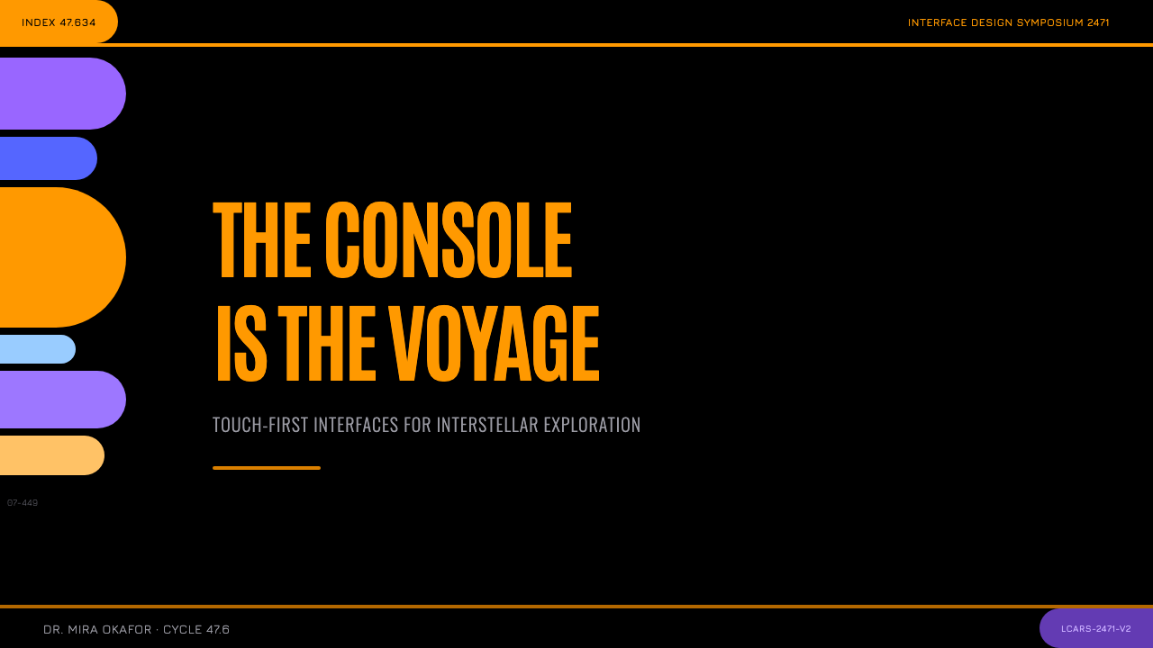
For presentation slides, a cover page benefits from the pure black ground with a single elbow-shaped graphic anchoring the title, paired with orange or violet Okudagram-style pill shapes holding key text. Content slides should organize information into color-coded functional zones connected by curved rail dividers, keeping the black negative space generous rather than filling every area with color.
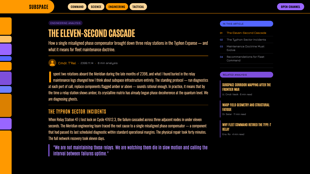
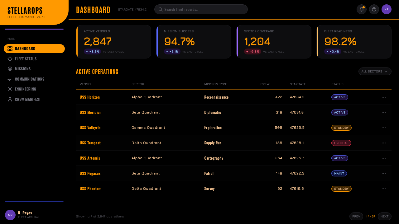
For web interfaces, the style suits products that want to signal a bold, confident, futuristic identity — gaming, entertainment, sci-fi-adjacent brands, or any dashboard where distinct functional zones benefit from strong color-coding. Navigation elements can use pill-shaped buttons directly, and section dividers can adopt the elbow curve rather than a straight horizontal rule, particularly where a sidebar meets a header.
For editorial and marketing work, the style suits features on television and film production design, retro-futurism, or science fiction history. Pull quotes and section breaks can use a small elbow or pill-shaped graphic device, and photography or illustration should favor high-contrast, backlit compositions over naturally lit scenes, which dilute the console-glow effect the style depends on.
A common mistake is adding gradients, bevels, or drop shadows to the color blocks in an attempt to modernize the style — this directly contradicts LCARS's resolutely flat identity and produces a generic sci-fi-UI look rather than the specific, historically grounded LCARS language. Another mistake is treating the numeric tags as decorative filler rather than a deliberately dense, technical-feeling texture that should stay legible even if not functionally meaningful.
Star Trek LCARS — FAQ
Was LCARS ever a functional real-world computer interface?
No — LCARS was designed entirely for television production, created by scenic art supervisor Michael Okuda to appear on screen displays within the fictional Star Trek universe. It was never intended to function as real operating software during its original production, though its influence has since inspired fan-made recreations and functional software projects that emulate its look decades after its 1987 debut.
Why is the style so strictly flat with no gradients or shadows?
Part of the reason is historical — 1980s television graphics production had real technical constraints on rendering depth and lighting effects. But flatness also became a deliberate identity choice as the style was refined across decades: the confident, geometric flatness reads as a distinctly non-naturalistic, alien computer aesthetic, deliberately avoiding any resemblance to real-world touchscreen conventions of any era.
What is the significance of the "elbow" shape specifically?
The elbow — a header bar curving down into a sidebar through one continuous radius — is the single most recognizable structural signature of the LCARS language, distinguishing it from any generic flat-color interface. It functions as both a practical layout solution, connecting horizontal and vertical panel regions smoothly, and a visual signature immediately identifiable to anyone familiar with the style, even in a single isolated fragment of a composition.
Can this style work for interfaces unrelated to science fiction?
Yes — the underlying design logic (strong color-coded functional zones, generous negative space, pill-shaped interactive elements, and confident flat geometry) is a genuinely useful information-architecture pattern independent of its fictional origin. Applied thoughtfully, it can organize dashboards, control panels, or data-dense interfaces for any product, provided the black ground and flat color discipline are preserved rather than diluted into a generic dark-mode theme.
Related design styles
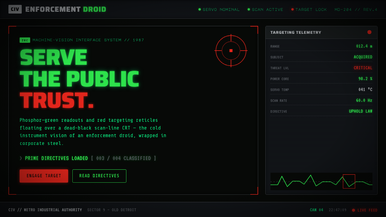 RoboCop (1987)Machine vision as interface. Phosphor-green readouts on dead-black CRT, red r…
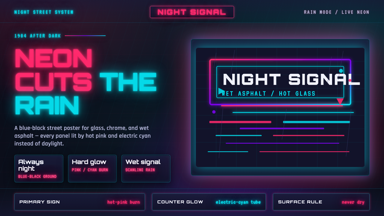 Tech-NoirAlways night. Blue-black asphalt reflects hot pink and electric cyan neon.
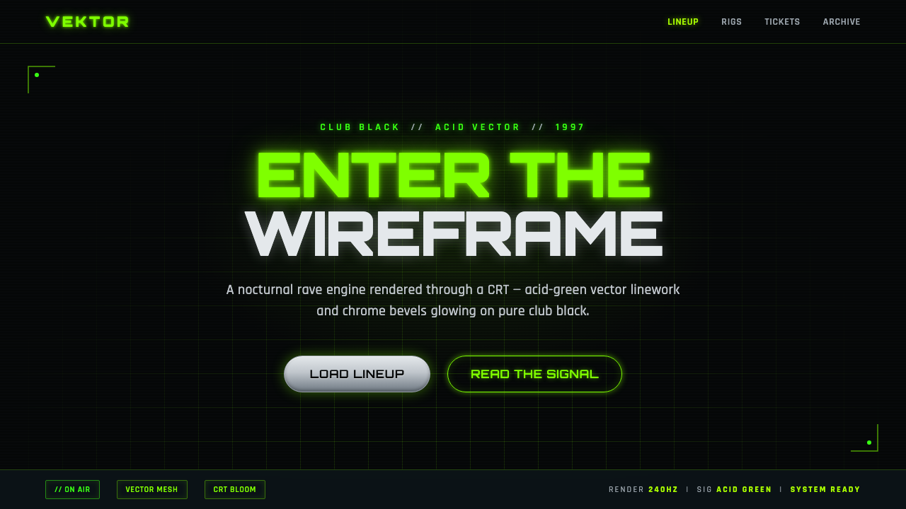 Playstation Rave Green 1997Enter the wireframe. Acid-green vector lines and chrome glow on club black, a…
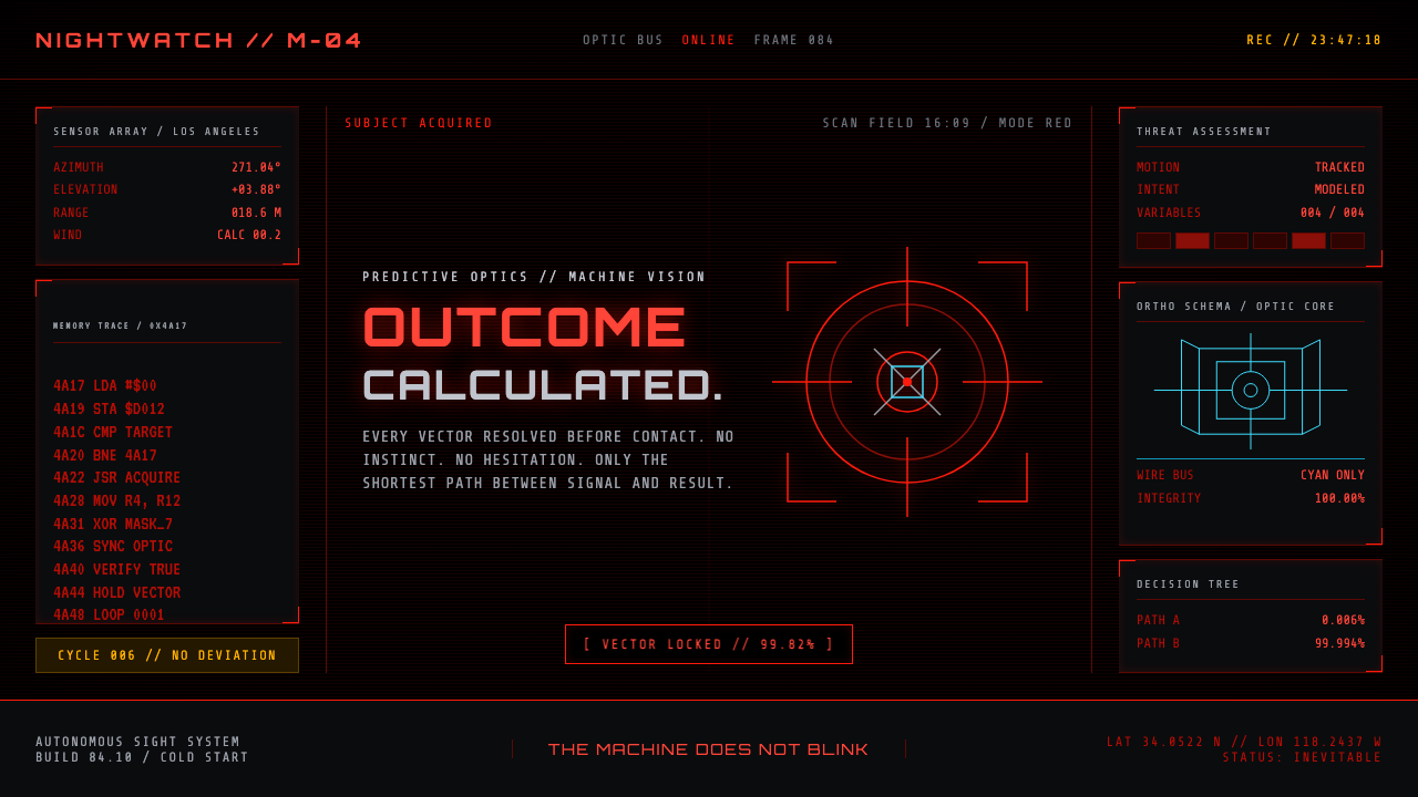 Terminator HUD (1984)The machine never blinks. Blood-red reticles and mono data burn across absolu…
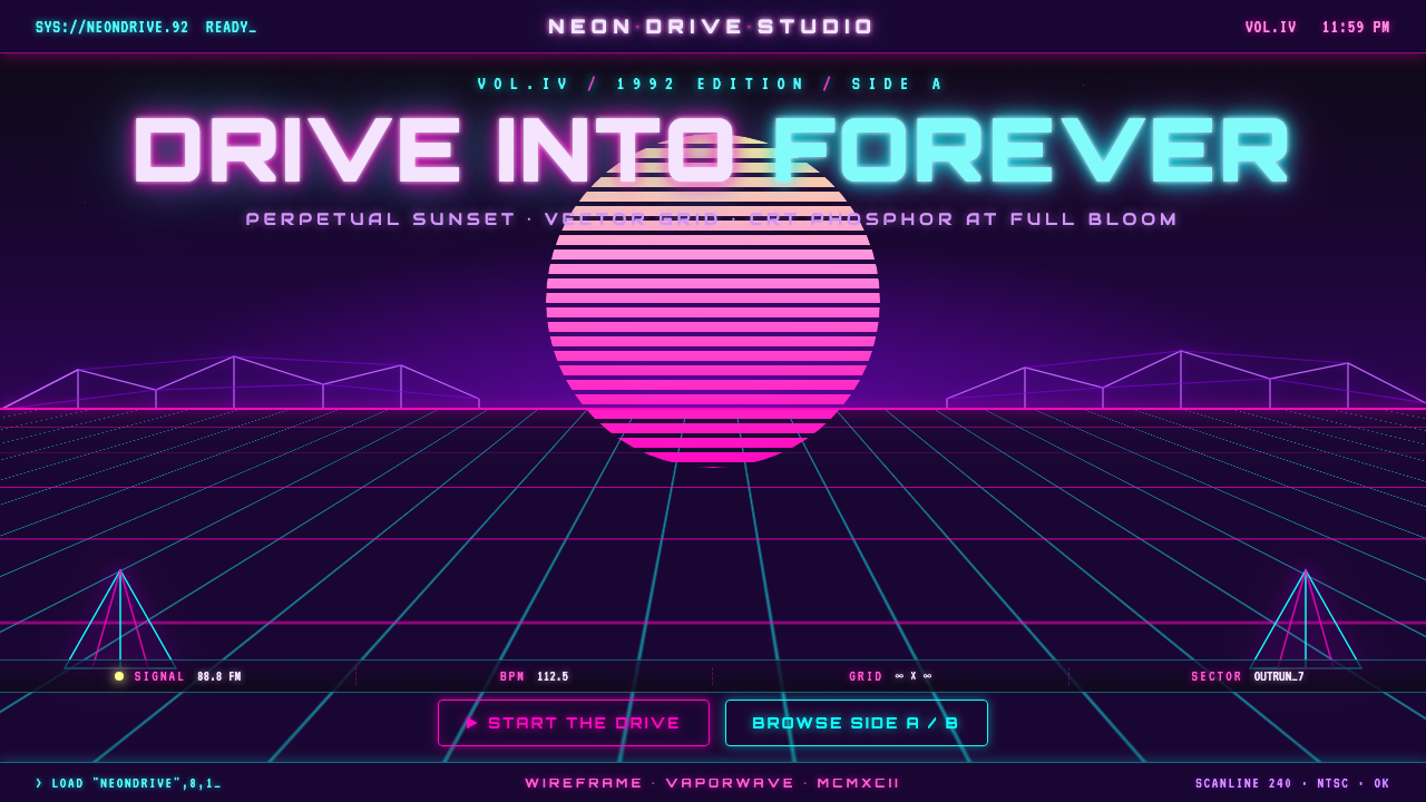 Wireframe VaporwaveDrive into forever. Magenta-cyan grid races to a vanishing point under a stri…
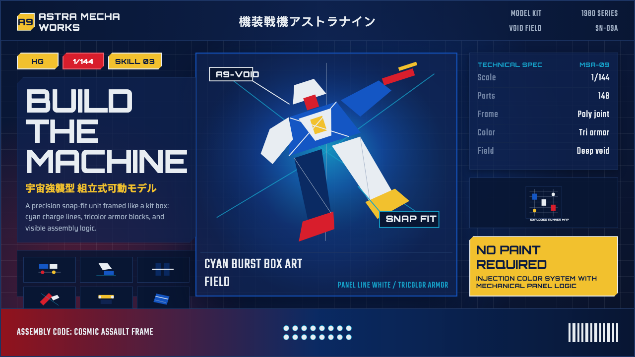 Gunpla Model BoxBuild-sheet drama. Cosmic navy, cyan burst, tricolor armor, and spec-panel gr…