What is Wireframe Vaporwave?
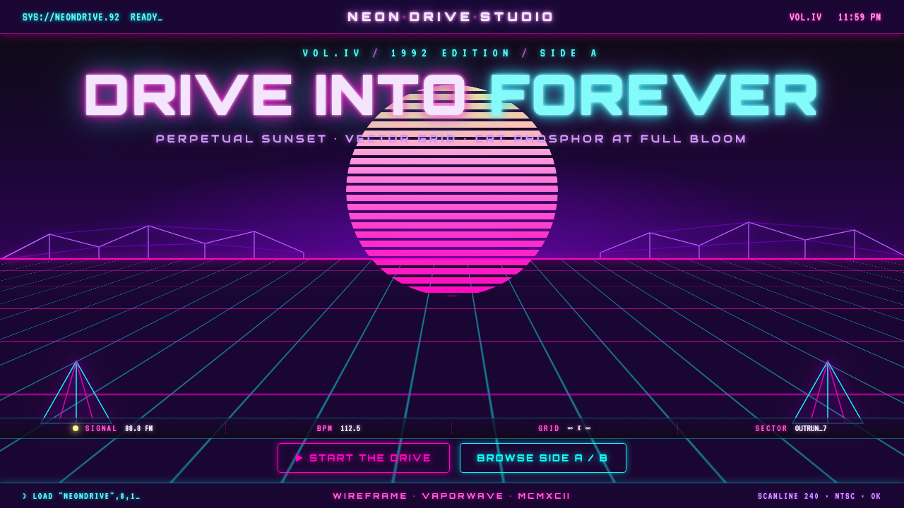
Wireframe Vaporwave turns the future into an endless night drive: neon lanes accelerate toward a flawless horizon while a striped Retrosun holds the sky in permanent sunset.
Wireframe Vaporwave in brief
Wireframe Vaporwave is the hard-edged outrun wing of synthwave: a luminous perspective grid races toward a perfect vanishing point beneath a deep indigo-violet night sky. Magenta and cyan lines define the ground plane, low-poly violet forms interrupt the distance, and a striped Retrosun sits at the horizon like a digital celestial object. The scene evokes the imagined future of early computer graphics rather than a literal historical interface.
Its central effect is velocity. The grid is not simply decoration under a title or image; its converging lines pull the eye forward and make a still composition feel as though it is moving. The dark ground is equally important. Neon only feels electric when it emerges from darkness, so the night field creates the contrast that lets the cyan and magenta appear to radiate.
This is not soft, pastel vaporwave. Wireframe Vaporwave favors crisp vector-like edges, controlled geometric depth, CRT-phosphor glow, and a perpetual-sunset horizon. Its nostalgia is built from a retro-future fantasy: the visual language of an early-3D 1992 imaginary, preserved as an open road with no destination except the vanishing point.
Where does Wireframe Vaporwave come from?
Wireframe Vaporwave belongs to a global internet visual culture shaped by synthwave, outrun, vaporwave, and retro-futurism. Its stated era is a 1992-vintage early-3D wireframe and outrun look: a period imagined through the visual shorthand of vector grids, glowing electronic color, simplified polygonal space, and computer-generated horizons. The style does not claim one physical birthplace; it circulates through a shared digital memory of what the future once looked like.
Its strongest lineage is early-CG vector-grid imagery. In this language, perspective is exposed rather than hidden. The ground is a visible coordinate system, the horizon is a deliberate geometric event, and distant objects are reduced to faceted silhouettes. That reduction is essential: it makes the scene read as a constructed digital world, not as a natural landscape rendered realistically.
Synthwave and outrun give the style its nocturnal forward drive, while vaporwave contributes the suspended, artificial atmosphere of a future remembered after the fact. Wireframe Vaporwave narrows those influences into a more disciplined visual formula: deep indigo-violet night, magenta-cyan grid lines, low-poly violet geometry, and the striped Retrosun. The result is not merely retro; it is a specific promise of perpetual motion and permanent twilight.
What defines the Wireframe Vaporwave look?
Night Ground
The foundation is a deep indigo-violet night field, never cream or pure white. Darkness is not empty background; it is the optical condition that allows neon to appear luminous. A bright field weakens the style immediately because it turns the grid into colored linework rather than light cutting through space.
Vanishing-Point Grid
Magenta and cyan grid lines stretch across a flat plane and converge precisely at the horizon. Their role is directional before it is ornamental: every receding line reinforces forward motion. The geometry should remain crisp and legible, with a clear perspective logic instead of a loose decorative mesh.
Neon Contrast
Magenta and cyan are the signature luminous pair. They should feel like phosphor glow against the night, not like pastel paint spread evenly across the composition. Their contrast separates planes, signals motion, and establishes the artificial electronic temperature that distinguishes this branch from softer vaporwave imagery.
Retrosun Horizon
The striped Retrosun is a horizon device rather than a naturalistic sun. Its bands make the celestial form read as a graphic signal, while its gradient-like sunset presence gives the scene a fixed temporal mood. It should sit behind the grid and reinforce the vanishing point, never compete with it as a separate illustration.
Low-Poly Distance
Violet low-poly geometry gives the horizon volume without breaking the vector-grid discipline. Faceted mountains or abstract structures belong in the distance, where they frame the route and imply a digital landscape. Smooth, organic, or highly realistic forms dilute the early-CG illusion.
Crisp Phosphor Finish
Glow should preserve edge clarity. The intended feel is CRT phosphor and hard vector precision: light blooms enough to feel electric, yet the grid, typography, and silhouettes remain sharply defined. Excessive haze turns the scene into ambient neon mood and loses the hard-edged outrun character.
Who shaped Wireframe Vaporwave?
Synthwave and outrun visual designers define the style's forward-driving night world. Their shared vocabulary centers on neon perspective, electronic color contrast, and a horizon that suggests continuous travel. In Wireframe Vaporwave, this lineage supplies the sense of acceleration and the insistence that the image should feel built for motion even when it is static.
The early-CG vector-grid lineage provides Wireframe Vaporwave with its exposed construction logic. Rather than masking perspective with realism, it makes coordinates, receding lines, faceted space, and horizon geometry visible. That openness is why the style can feel both nostalgic and synthetic: its world announces that it was made from digital rules.
Retro-futurist internet visual culture keeps the style alive as a shared rather than local language. It recombines synthwave, outrun, vaporwave, and early computer-graphics memory into images that are instantly readable across platforms. Its contribution is the 1992 imaginary itself: not a documentary record, but a stylized future that never had to become real.
How do you use Wireframe Vaporwave today?
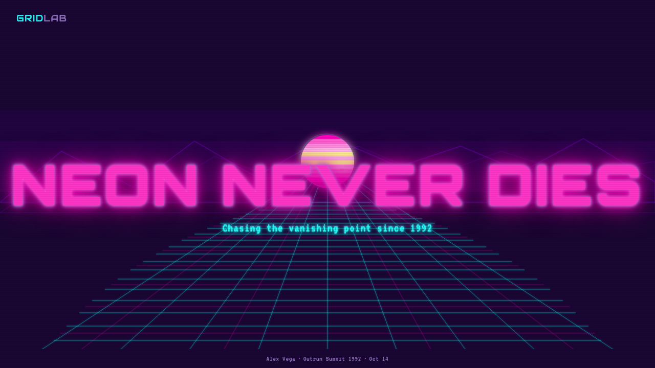
For presentation covers, Wireframe Vaporwave works when a topic needs immediate momentum: a launch, a music-adjacent concept, a digital product vision, or a future-facing event. Let the road-like grid establish the full composition, place the Retrosun at the horizon, and keep the title sharply legible against the night. The cover should feel like an entry point into a route, not like a collage of unrelated neon objects.
Content slides need more restraint than the cover. Use the grid as a horizon or structural footer while keeping the main reading field dark and calm. Headings, labels, and key metrics can use the neon pair as navigational signals, while body material remains high-contrast and disciplined. On data slides, charts should inherit the same directional logic: a chart can feel native when its axes, dividers, and emphasis marks echo the precise luminous grid rather than introducing soft corporate decoration.
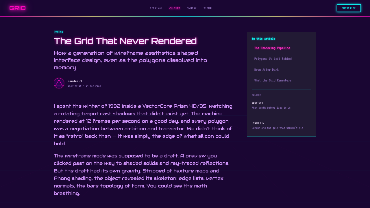
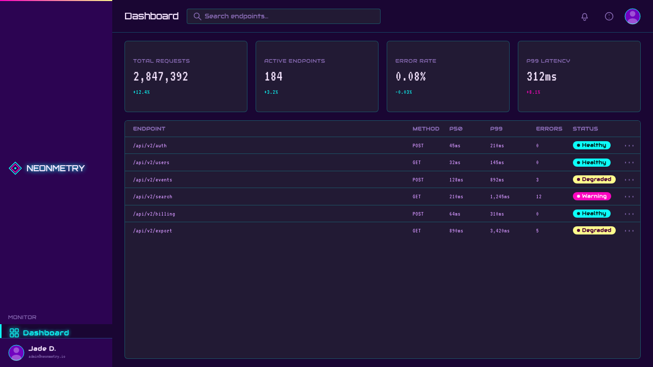
For web interfaces, the style suits dashboards, media experiences, event pages, and concept-led pricing pages where a strong sense of destination supports the product story. A dashboard can reserve the grid for the shell or empty states, use neon to identify active information, and let the indigo-violet field hold dense content. Pricing can use the horizon to frame plans as routes or levels, but the transactional information must remain direct and easy to scan.
For editorial and marketing work, Wireframe Vaporwave is strongest when it gives a campaign a coherent scene rather than merely a color treatment. Feature pages can open with a horizon sequence, section transitions can use receding lines to imply progression, and promotional imagery can let low-poly forms create a distant stage. Copy should be assertive and concise; the visual world already carries a heavy atmosphere, so verbose decoration weakens it.
The common mistake is reducing the style to generic pink-and-blue neon. Without a dark indigo-violet ground, a disciplined vanishing point, and crisp grid geometry, the result becomes soft vaporwave mood rather than Wireframe Vaporwave. Another mistake is adding too many glowing objects. The grid, Retrosun, and distant low-poly forms already establish a complete world; extra symbols, diffuse light, or competing gradients make the route feel crowded and slow.
Wireframe Vaporwave — FAQ
Is Wireframe Vaporwave the same as vaporwave?
It belongs to vaporwave visual culture but is a narrower, harder-edged branch. General vaporwave can be pastel, collage-based, soft, or nostalgic in many different ways. Wireframe Vaporwave commits to the outrun vocabulary of a dark night field, luminous perspective grid, low-poly distance, and striped Retrosun. Its mood is not drift or decay; it is perpetual forward travel.
Why must the background remain dark?
The dark indigo-violet field is the condition that makes the neon grid glow. On cream or white, magenta and cyan become ordinary graphic accents and the scene loses its electronic night atmosphere. Darkness also creates spatial depth: it lets the horizon recede, keeps distant geometry mysterious, and makes the bright lines feel like an illuminated system suspended in open space.
Can photography be used in this style?
Photography can be used, but it should not replace the constructed digital scene. Treat it as a sharply separated layer that can coexist with the grid, horizon, and neon contrast, rather than as a naturalistic window. If a photograph introduces soft daylight, organic texture, or realistic depth as the dominant visual language, it will overpower the early-CG vector-grid logic.
How much glow is appropriate?
Enough to make magenta and cyan feel electrically luminous, but never so much that the grid loses its hard geometry. The style depends on readable perspective and crisp silhouettes. When glow becomes mist, the scene turns ambient and soft; when it remains controlled, it reads like CRT phosphor surrounding precise vector structure.
What most often makes a design feel inauthentic?
Usually the loss of directional structure. A palette alone cannot create Wireframe Vaporwave. If there is no convincing vanishing point, no dark night ground, or no relationship between the Retrosun, grid, and distant geometry, the result becomes generic neon decoration. The style feels authentic when every major element supports one clear journey toward the horizon.
Related design styles
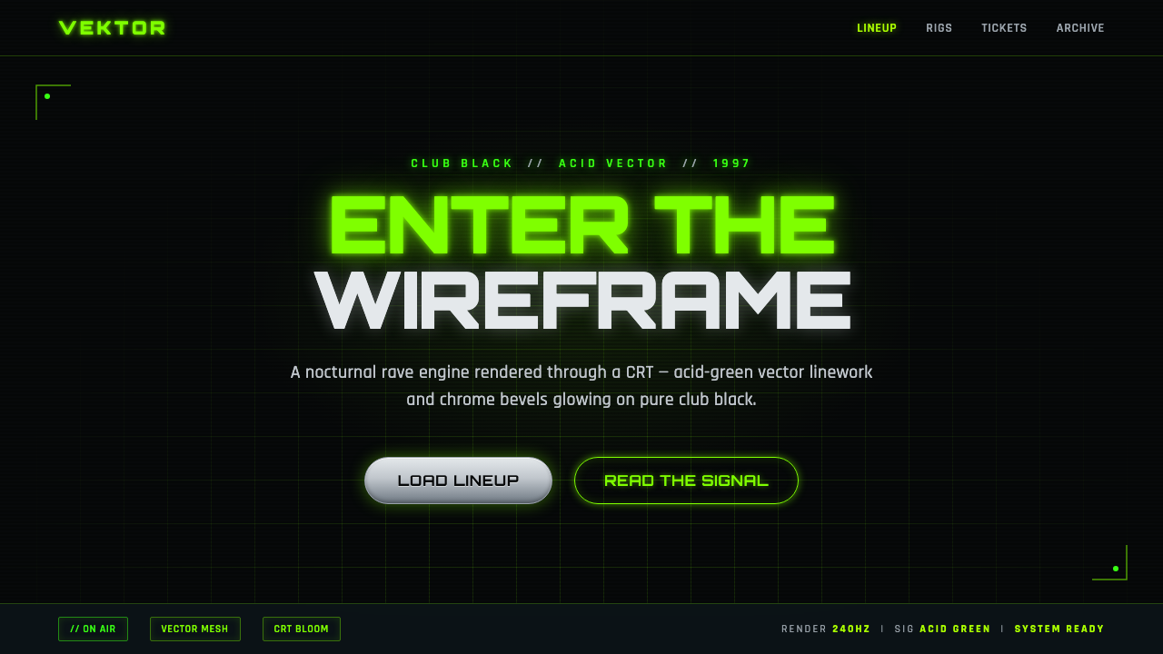 Playstation Rave Green 1997Enter the wireframe. Acid-green vector lines and chrome glow on club black, a…
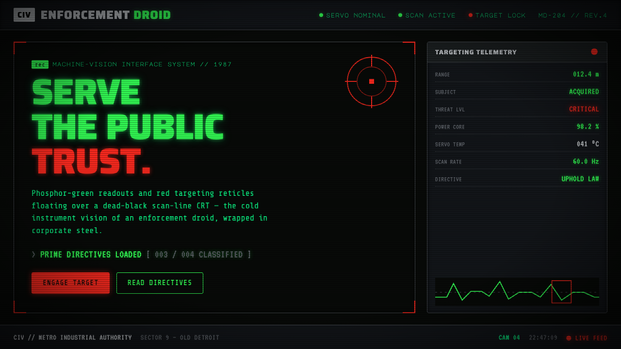 RoboCop (1987)Machine vision as interface. Phosphor-green readouts on dead-black CRT, red r…
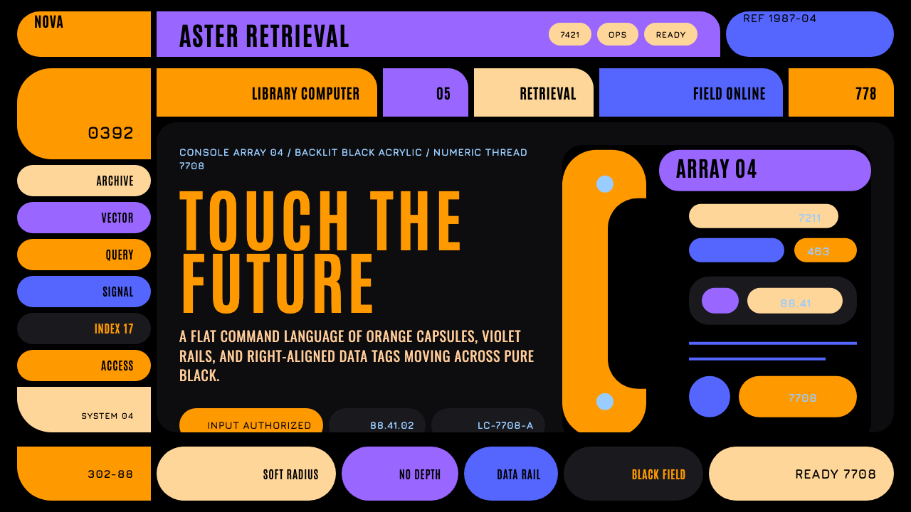 Star Trek LCARSFuture as flat command. Orange-violet elbows and Jura numbers glow on black.
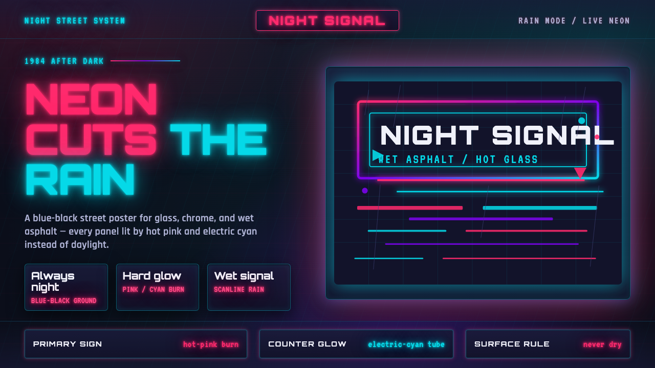 Tech-NoirAlways night. Blue-black asphalt reflects hot pink and electric cyan neon.
 Gunpla Model BoxBuild-sheet drama. Cosmic navy, cyan burst, tricolor armor, and spec-panel gr…
 Terminator HUD (1984)The machine never blinks. Blood-red reticles and mono data burn across absolu…