What is RoboCop (1987)?
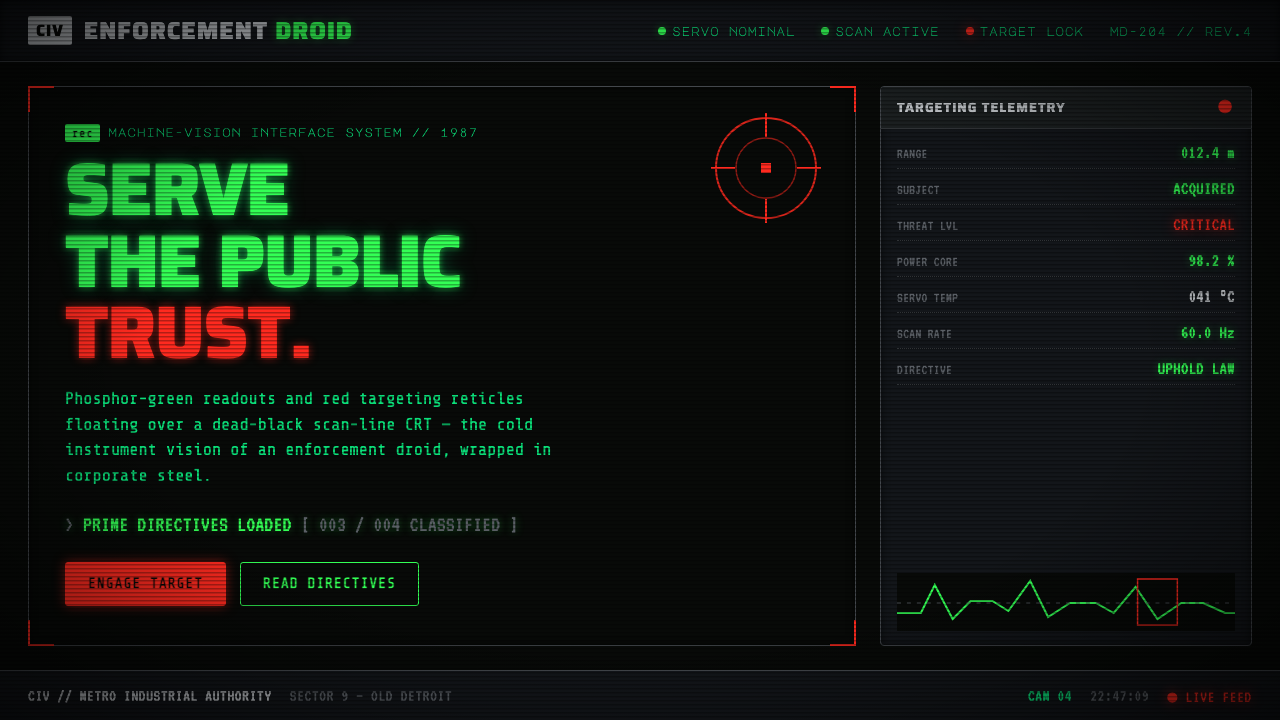
RoboCop turns the interface into a machine’s point of view — phosphor-green readouts on dead-black CRT darkness, with red reserved for the instant of danger.
RoboCop (1987) in brief
The RoboCop design language is machine vision made visible. Its world is read through green-phosphor indicators, crosshairs, scan-lined black screens, and blunt broadcast panels rather than through soft, human-centered interface cues. The result feels like a soldier’s machine interpreting reality: everything is measured, classified, tracked, and held at a clinical distance.
Color is not decorative in this system. Phosphor green carries the ordinary work of seeing: readouts, labels, telemetry-like information, and the persistent glow of a display that never quite becomes a window. Red is withheld for high alert, targeting, and sudden escalation. Around those signals sits a harder industrial envelope of corporate slate-gray, chromed-visor steel, and nearly black display fields.
The style combines cyberpunk industrial science fiction with the visual grammar of a corporate-satire HUD and the broadcast graphics of the 1980s. It should feel assembled from hardware, surveillance equipment, and television-era information panels. Surfaces are dark and dense, typography is segmented and monospace, and texture comes from scanning, glow, and mechanical repetition rather than from ornament.
Where does RoboCop (1987) come from?
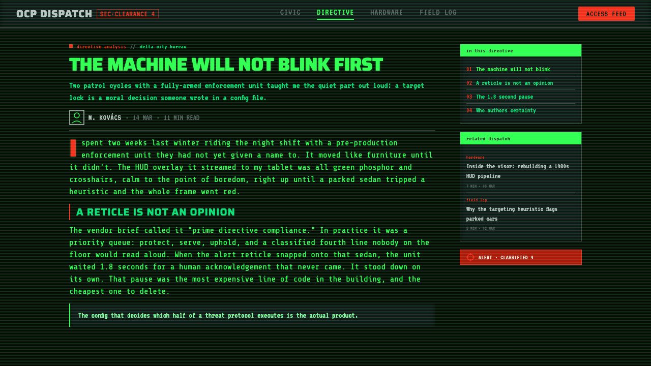
The source of this aesthetic is RoboCop, the 1987 film set in a dystopian near-future Old Detroit. Its visual premise is not simply that technology exists, but that technology mediates perception. ED-209 sees the world as a soldier’s machine, and that premise gives the interface its defining emotional distance: the display does not invite conversation; it processes a situation.
The film’s production context is described as a North American, US-made satirical mediascape. That matters because the interface is never only military or futuristic. It is also corporate, broadcast, and promotional. The cold machine view is wrapped in OCP corporate slate-gray, chromed steel, and chunky television-graphic panels, creating a tension between industrial authority and commercial spectacle.
The style belongs to several overlapping movements named in the source material: cyberpunk industrial science fiction, corporate-satire HUD aesthetics, and 1980s machine-vision graphics. These strands explain why the system feels both functional and theatrical. The readout suggests a technical instrument, the corporate shell suggests institutional power, and the broadcast treatment turns information into a public performance.
What defines the RoboCop (1987) look?
Phosphor Field
Phosphor green is the working color of the system. It belongs to readouts, labels, indicators, and the continuous visual labor of machine perception. Against a dead-black or near-black field, it appears less like painted ink than emitted light. The green should feel slightly clinical and electrically persistent, with enough restraint to preserve legibility. It is the default state of seeing: active, watchful, and never entirely warm.
Alert Red
Red is the sole dramatic accent. It should appear when the interface shifts from observation to threat: a targeting reticle, a high-alert state, or a moment that demands immediate attention. Because ordinary information remains green, red retains its authority. If it spreads across every control, badge, and decoration, the hierarchy collapses. The most convincing use is brief, concentrated, and unmistakably consequential.
CRT Scan Lines
The display surface carries the memory of a cathode-ray tube: horizontal scanning, faint banding, and a texture that makes information feel physically emitted rather than digitally placed. Scan lines should support the screen illusion without obscuring the content. They work best as a restrained atmospheric layer across dark fields, especially where the design needs to suggest surveillance, broadcast equipment, or an older machine still operating under pressure.
Segmented Monospace
Typography should recall segmented displays and industrial terminals. Monospace spacing gives every character an assigned position, making text feel measured by an instrument rather than composed by a typographer. Short labels, status lines, coordinates, and commands benefit from this treatment. Hierarchy comes through scale, brightness, spacing, and density rather than through ornamental type changes. The type is part of the machinery: regular, legible, and slightly impersonal.
Industrial Shell
The luminous display needs a material counterweight. Corporate slate-gray, chromed-visor steel, and heavy dark framing give the interface a body. These tones should feel engineered, manufactured, and exposed to use. They are not luxury metallics and should not become glossy decoration. Their role is to make the green readout feel embedded in a machine with weight, casing, and institutional purpose.
Broadcast Panels
Panels are chunky, declarative, and slightly theatrical. They can frame a readout, divide a status area, or present a message as if it were being transmitted to an audience. Their geometry should be blunt and functional, with strong rectangular fields and clear internal ordering. This is where the corporate-satire dimension becomes visible: information is not merely available; it is packaged, branded, and presented with institutional confidence.
Reticle Geometry
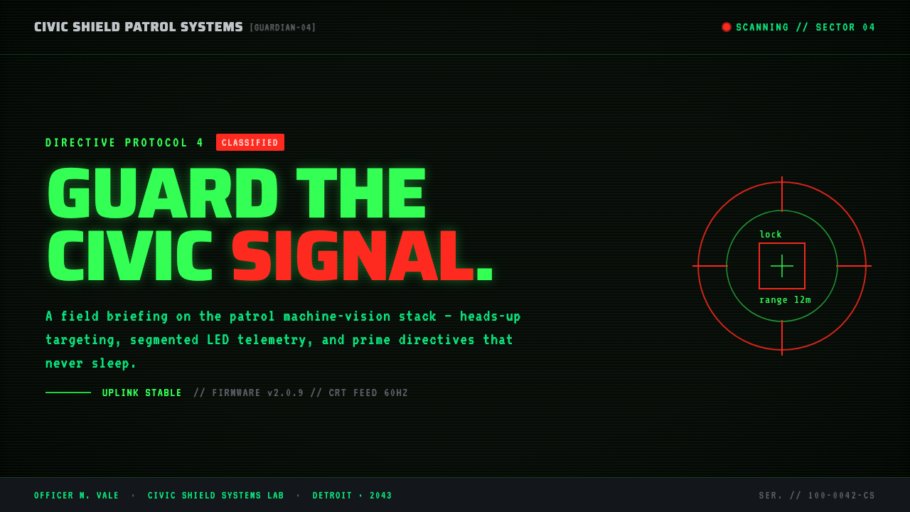
Crosshairs and targeting marks provide the system’s most recognizable geometry. They imply alignment, selection, and controlled attention. Use them as purposeful instruments rather than generic decoration: a reticle should point toward an object, mark a boundary, or signal that the machine has selected something for scrutiny. The geometry is strongest when it remains spare, angular, and visibly connected to the act of machine vision.
Who shaped RoboCop (1987)?
Paul Verhoeven is the creative figure directly associated in the source material with RoboCop’s 1987 satire. His importance to this design language lies in the collision of cold machine vision with corporate and broadcast spectacle. The system should therefore resist becoming a generic futuristic terminal. It needs the sharper contradiction of an interface that looks operational, institutional, and faintly performative at the same time.
Rob Bottin is identified in the source material as a key figure in the RoboCop origin. His inclusion keeps the visual system tied to physical industrial presence rather than weightless digital futurism. In practical design terms, that means frames, panels, metallic shells, and dark enclosures should feel built and inhabited. Even a purely digital screen benefits from the suggestion that it belongs to a machine with mass.
Craig Davies is also named as a key figure in the approved origin material. His place in the reference reinforces the importance of treating RoboCop as a complete visual environment rather than a palette alone. The green readout, red reticle, corporate gray, chrome-like steel, and broadcast panel structure must operate together. The style is convincing when its parts describe the same institutional machine.
How do you use RoboCop (1987) today?
For presentation slides, use the system as a controlled viewing instrument. A cover can place a large green readout or reticle against a near-black field, with a restrained steel-gray frame suggesting hardware around the title. Content slides should organize information into chunky broadcast panels, using segmented monospace type for labels and status language. Data slides benefit from machine-like marks, measured groupings, and green as the stable information state; red should identify only the exceptional value or alert.
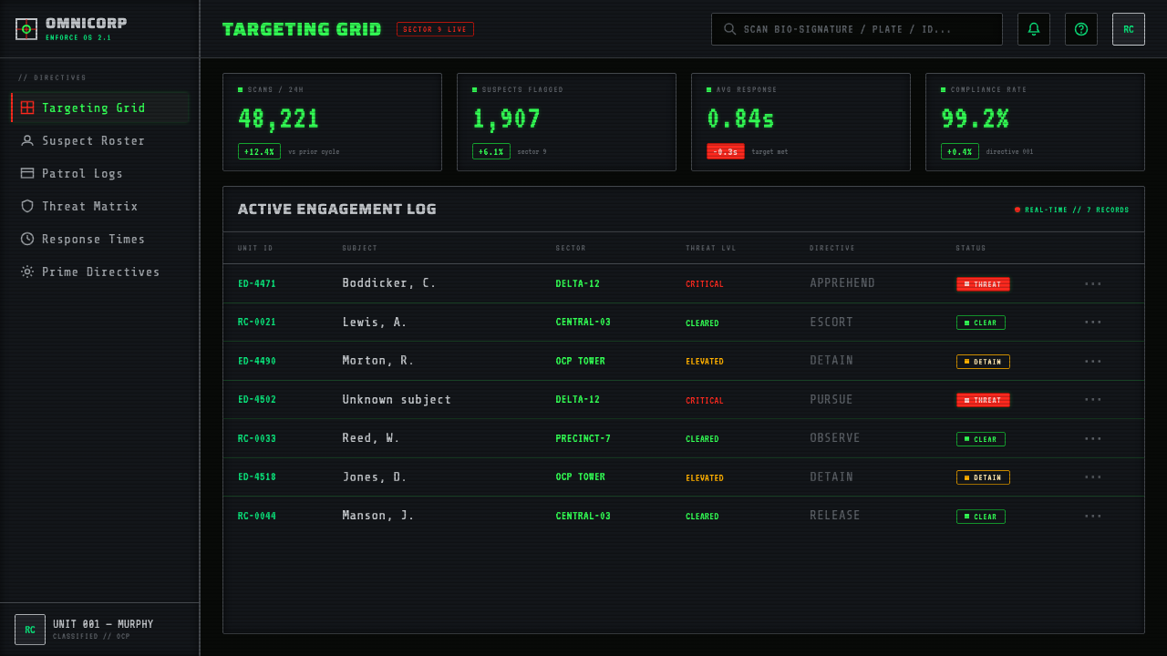
For web interfaces, the RoboCop language suits dashboards, monitoring tools, operational consoles, and pricing pages that want to project institutional authority. Keep the main field dark, use green for ordinary data and active readings, and reserve red for warnings or urgent changes. Cards should feel like embedded panels rather than floating lifestyle components. Pricing tiers can be framed as system states, with slate-gray and steel providing the structure while green confirms availability or selection.
For editorial and marketing work, the style works best when the page behaves like a broadcast from an industrial organization. Headlines can be treated as status declarations, while supporting copy sits inside dense, clearly bounded panels. Marketing pages may use reticles and scan-line fields to direct attention toward a product claim, launch message, or call to action. Editorial layouts should leave enough dark space around the information so the green glow remains legible and the page does not become visual noise.
For charts, reports, and data-heavy communication, translate the machine-vision premise into disciplined hierarchy. Use repeated labels, aligned readings, clear panel boundaries, and a stable relationship between the display field and the industrial shell. A chart should look like an instrument reading, not a colorful infographic. Green can establish the normal operating picture, while red marks deviation, targeting, or danger. The graphic language should remain legible even when the scan-line texture is removed.
The common mistake is treating the style as a costume: adding green text, random red accents, scan lines, and a futuristic typeface without giving those elements a shared logic. Another failure is using red everywhere, which destroys its alert meaning. The system also weakens when metallic surfaces become glossy decoration or when scan lines overpower the content. Every effect should answer the same question: does this make the interface feel more like a machine seeing, classifying, and communicating?
RoboCop (1987) — FAQ
Is RoboCop style just a green terminal interface?
No. Green is only the working signal. The full language also requires dead-black CRT fields, scan-line texture, segmented monospace type, targeting geometry, chunky broadcast panels, and an industrial shell of slate-gray and chrome-like steel. Without that surrounding structure, the result becomes a generic terminal. RoboCop’s distinctiveness comes from the collision of machine vision, corporate authority, and television-era spectacle.
Why should red be used so sparingly?
Red represents escalation because ordinary information is carried by green. A red reticle or alert therefore changes the perceived state of the whole interface. If red is applied to decoration, navigation, and routine emphasis, it stops communicating danger and becomes another background color. The style depends on a clear emotional separation: green means the machine is reading, while red means the machine has identified a threat or urgent target.
Can this style work on a light background?
It can be adapted, but the result loses the central logic of a phosphor display. The source aesthetic depends on green appearing as emitted light against near-black CRT darkness. A light variation may retain slate-gray panels, steel framing, segmented type, and red alert marks, but it should be understood as an adaptation rather than the canonical expression. The darker field is what makes the interface feel like a machine’s vision.
How much CRT texture should be visible?
The texture should be visible enough to establish the display surface, but quiet enough that text remains the first thing read. Scan lines are atmospheric evidence of the machine, not the subject of the interface. They work best when they reinforce dark fields, panel depth, and broadcast character without reducing contrast or clarity. If the user notices the scan lines before the message, the texture has become an effect instead of a system.
What kinds of products suit the RoboCop design language?
It suits products that benefit from operational authority, monitoring, machine intelligence, or a deliberately industrial identity: dashboards, control rooms, analytical tools, security interfaces, and data-heavy presentations. It is less suitable when the product depends on softness, warmth, domestic comfort, or organic tactility. The style projects distance and institutional power. That can be compelling when intentional, but it can also make a friendly consumer experience feel cold or surveillant.
Related design styles
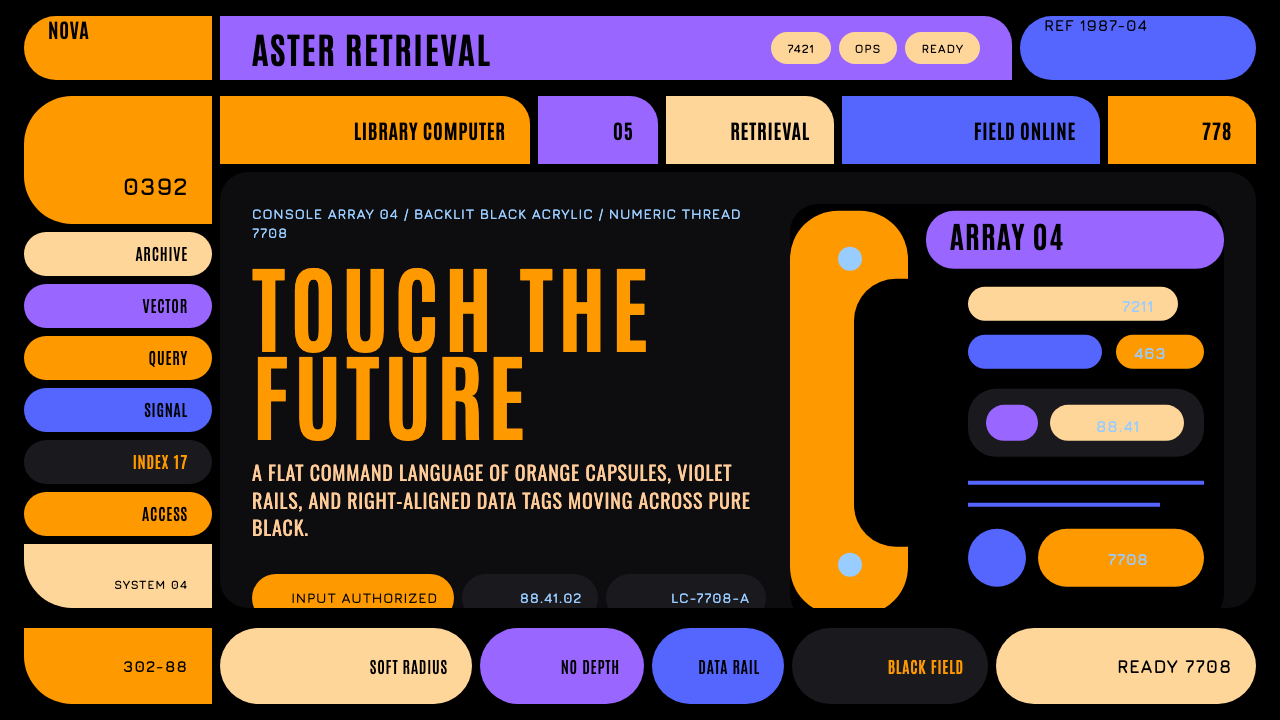 Star Trek LCARSFuture as flat command. Orange-violet elbows and Jura numbers glow on black.
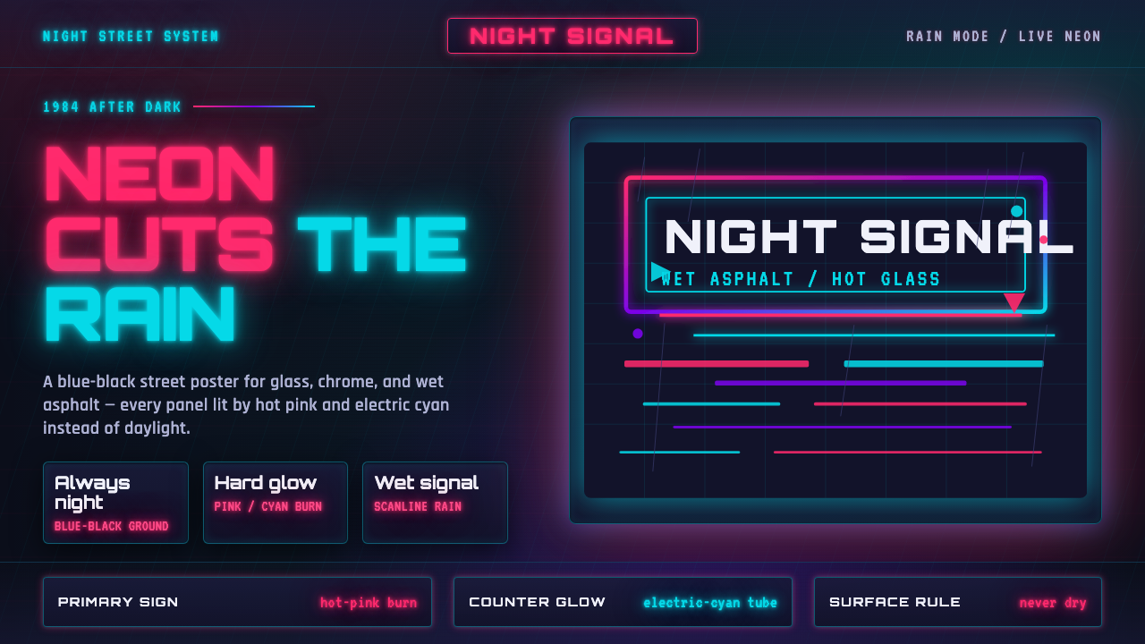 Tech-NoirAlways night. Blue-black asphalt reflects hot pink and electric cyan neon.
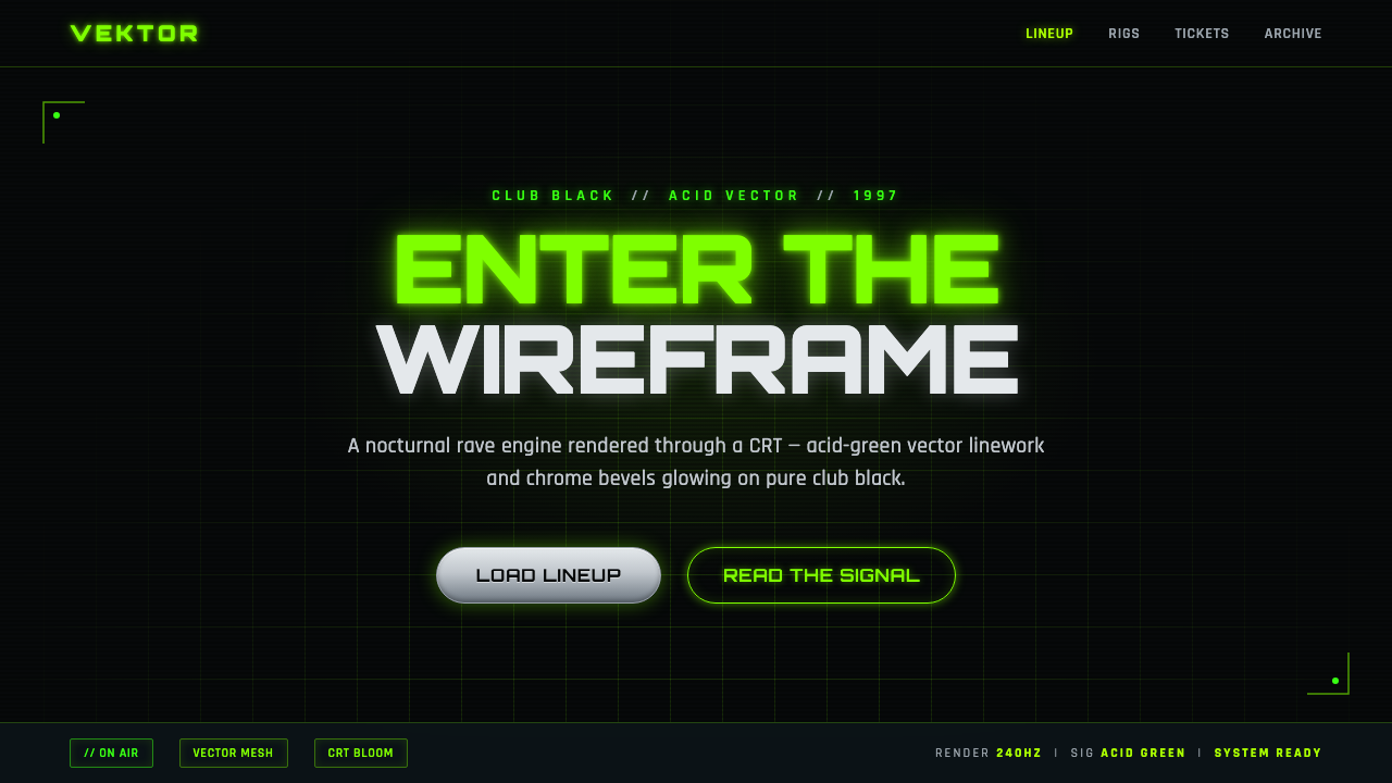 Playstation Rave Green 1997Enter the wireframe. Acid-green vector lines and chrome glow on club black, a…
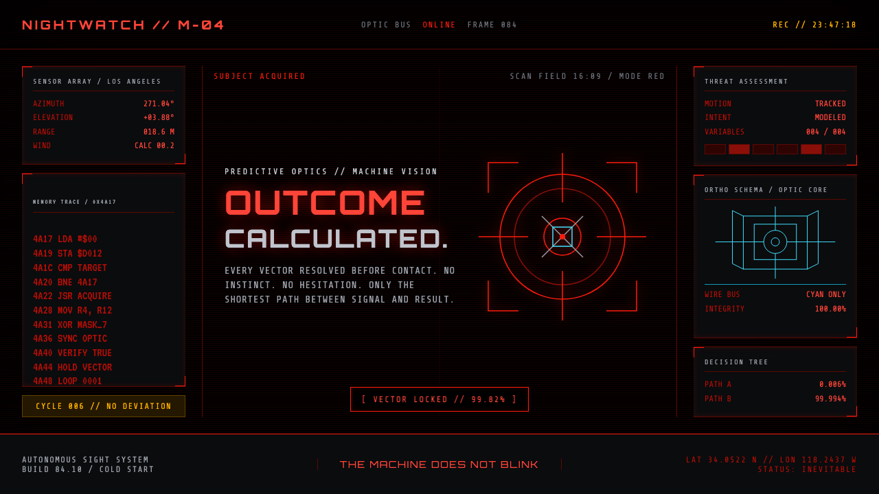 Terminator HUD (1984)The machine never blinks. Blood-red reticles and mono data burn across absolu…
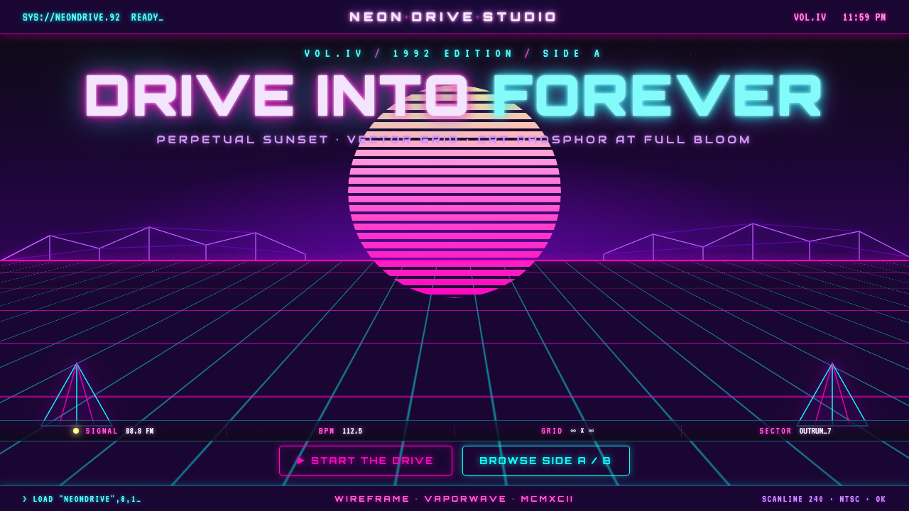 Wireframe VaporwaveDrive into forever. Magenta-cyan grid races to a vanishing point under a stri…
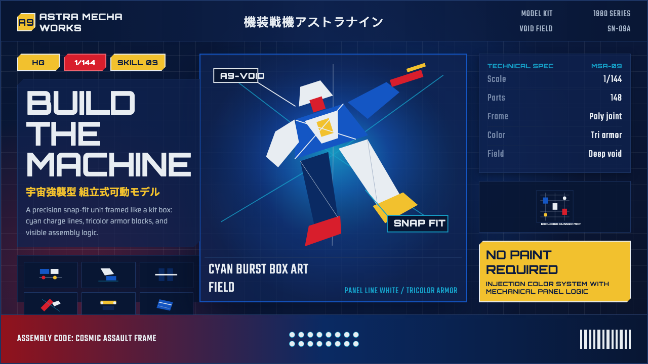 Gunpla Model BoxBuild-sheet drama. Cosmic navy, cyan burst, tricolor armor, and spec-panel gr…