What is Playstation Rave Green 1997?
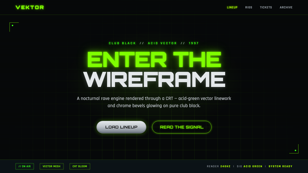
PlayStation Rave Green 1997 turns the screen into a midnight club: acid-green wireframes, chrome glints, and CRT light cutting through absolute black.
Playstation Rave Green 1997 in brief
PlayStation Rave Green 1997 is a late-nineties, UK-led PlayStation advertising aesthetic shaped by rave imagery, club-flyer graphics, body-modification subculture, and the emerging Y2K appetite for chrome and digital surfaces. Its world is set against club black. Across that darkness, acid-green vector lines, glowing meshes, and metallic forms create the impression of a machine vision that has become physical, social, and nocturnal.
The style treats the display as a place to enter rather than a neutral container for information. Wireframes suggest rooms, bodies, objects, and motion without fully resolving them into naturalistic images. Chrome appears as a hard, reflective interruption; green light is not comforting illumination but an electrical signal. The resulting atmosphere is cold, synthetic, and future-facing, like a rave glimpsed through the curved glass and phosphor glow of a CRT.
Its strength comes from contrast and compression. Nearly everything happens between deep black, hostile neon green, and steel-like highlights, while typography behaves like information issued from a club system rather than editorial copy placed on a page. The look is graphic but not clean in a conventional corporate sense. It favors glow, visual pressure, and a charged sense that the interface is operating after dark.
Where does Playstation Rave Green 1997 come from?
The style belongs to the period from 1997 into the early 2000s, within the broader Y2K and rave-advertising moment. Its immediate setting was Sony Computer Entertainment Europe, with UK-led PlayStation campaigns providing the commercial frame. That location matters because the visual language does not arrive as generic technology branding. It arrives through a club-facing cultural lens: black backgrounds, fluorescent signal color, kinetic typography, and imagery that makes digital experience feel collective and bodily.
Late-nineties rave and club-flyer design culture supplied the mood. In this visual environment, darkness is active rather than empty. It creates the conditions for laser-like lines, glowing contours, and isolated fragments of type to feel amplified. Information is allowed to look urgent, artificial, and slightly disorienting. The screen is not made to resemble daylight publishing; it is made to resemble a nightlife surface where light, sound, movement, and identity are all intensified.
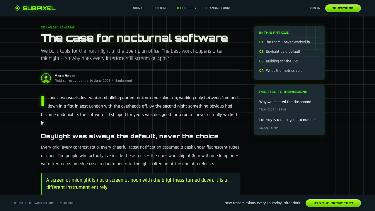
The Y2K chrome aesthetic added a second register: polished, steel-like, and distinctly synthetic. Against the black field and green vector light, chrome reads less as luxury than as a sign of machinery, body modification, and an imminent digital future. The contrast between immaterial wireframe and reflective metal is central. One looks like pure information; the other looks heavy, hard, and touchable. Together they make the image feel suspended between virtual space and physical club culture.
Within the PlayStation lineage, Double Life and the Mental Wealth campaign are named reference points for this direction. Their importance here is not as a template to copy frame by frame, but as part of an advertising lineage in which PlayStation could speak through altered perception, subcultural intensity, and a heightened idea of the self. PlayStation Rave Green 1997 condenses that lineage into a reusable visual vocabulary: CRT darkness, acid-green vectors, techno-flyer type, chrome interruption, and an always-after-hours sense of futurity.
What defines the Playstation Rave Green 1997 look?
Club Black
The background should feel absolute, absorptive, and nocturnal. Black is not a neutral canvas waiting to be decorated; it is the atmosphere that gives every green trace and chrome edge its force. Large dark fields create silence around active elements, making the composition feel lit from within rather than placed on a conventional page.
Acid-Green Vectors
Cold neon green is the system’s signal color. It appears as contour, coordinate, wireframe, or luminous trace rather than as a soft wash of atmosphere. It should feel electrically precise and slightly unnatural. The green is most effective when it marks structure, movement, or entry points, leaving black to preserve the sense of depth and danger.
Wireframe Space
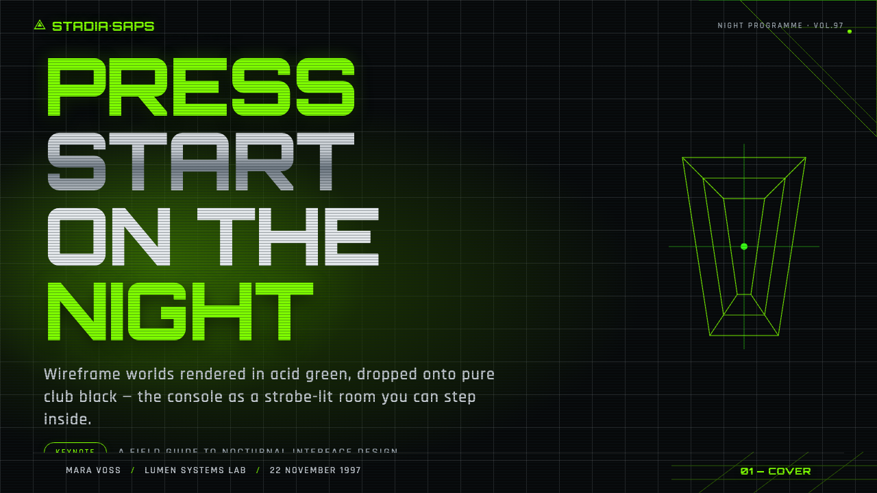
Wireframes transform surfaces into speculative space. A mesh can imply a body, a room, a machine, or a digital landscape without resolving into a literal illustration. The important quality is incompleteness: the viewer reads an object through its skeletal geometry, as though the image is still being calculated on a screen.
Chrome Interruption
Chrome introduces a hard, reflective counterweight to the immaterial green line. It works best as a compact highlight, capsule, surface fragment, or mechanical detail that catches attention and then releases it. The effect should feel polished but cold, closer to industrial hardware or body-modification imagery than to luxury ornament.
CRT Glow
The light should suggest a screen rather than sunlight. Green edges glow into darkness, metallic forms catch a tight halo, and gradients behave like electronic emission rather than natural shading. This is not soft ambience. It is the optical sensation of an image pushing outward from a CRT, intense at the edge and unstable against black.
Techno Flyer Type
Typography should read as club communication: compressed, assertive, and arranged with deliberate pressure. It can stack, align to vectors, interrupt a mesh, or sit beside a chrome fragment. The aim is not decorative retro nostalgia. It is to make language feel issued by a system of music, machines, and nighttime circulation.
Nocturnal Futurity
The style imagines the future as an after-hours condition. It is neither warm nor soft, and it avoids domestic friendliness. Every choice should reinforce voltage, speed, artificiality, and altered perception. Even when the composition is sparse, it should feel like it belongs to a live electronic environment rather than a quiet technical interface.
Who shaped Playstation Rave Green 1997?
Sony PlayStation UK marketing provides the campaign context for this visual language. Its role is important because the aesthetic is advertising-led: it converts console culture into a public, nocturnal, club-adjacent image world rather than presenting technology as neutral consumer hardware.
Rave and club-flyer design culture supplies the visual temperament: darkness as a stage, signal-like fluorescent color, intense type, and composition built for attention under artificial light. It explains why the aesthetic feels social and bodily even when its imagery is made from abstract vectors and digital surfaces.
The Double Life ad lineage is a named point of reference within the approved PlayStation context. It signals an approach to advertising in which identity and perception can be heightened, displaced, or made strange, helping the Rave Green vocabulary feel like a cultural proposition rather than a decorative treatment.
The Mental Wealth campaign is another named reference in this PlayStation lineage. Alongside the rave-era visual language, it supports a wider sense that PlayStation communication could inhabit an intensified psychological and social space, where technology is tied to experience, mood, and self-image.
How do you use Playstation Rave Green 1997 today?
For presentation covers, use club black as the field and establish one dominant event: a green wireframe entering from an edge, a chrome capsule catching a small highlight, or a short title cutting across a mesh. Keep the cover sparse enough that the light appears deliberate. Content slides should preserve the same world while becoming more disciplined: use the green vector language to organize sections, keep body copy calm against the dark ground, and let type carry the sequence rather than adding unrelated decorative motifs.
Data slides can make the style especially convincing when information is treated as an electronic landscape. Charts, paths, labels, and comparison structures can adopt the wireframe logic, with green reserved for the active signal and chrome-like accents used to isolate a selected state or headline value. The goal is not to disguise data as a rave poster. It is to make analytical material feel as though it belongs to the same illuminated system, with clear reading paths surviving the visual intensity.
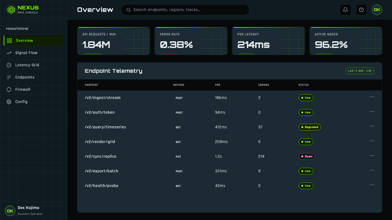
For web interfaces, the style is strongest in dashboards, launch surfaces, music-adjacent experiences, and pricing pages that benefit from a high-energy technological identity. A dashboard can use black space to separate dense groups, wireframe dividers to imply navigation, and acid green for states requiring immediate attention. A pricing page can use chrome details to distinguish an offer or action while keeping the underlying hierarchy typographic. The interface should remain legible first; the rave effect comes from the atmosphere around interaction, not from making every control glow.
For editorial and marketing work, treat each section as a broadcast from the same night-world. Editorial pages can set long reading passages against disciplined black space, then introduce wireframe diagrams, typographic interruptions, or metallic fragments at transitions. Marketing pages benefit from dramatic product reveals, sharp text blocks, and isolated green contours that carry the eye across the composition. The style works best when copy is confident and concise, because excessive explanation weakens its club-flyer directness.
The common mistake is to reduce the aesthetic to neon green on black. Without wireframe spatial logic, CRT-like emission, controlled chrome contrast, and techno-flyer typographic pressure, the result becomes generic cyber styling. A second mistake is warming the palette with friendly colors, softening every glow, or filling every empty area with effects. This style needs darkness to remain dark and green to remain a signal. Restraint makes the charged elements feel more electric.
Playstation Rave Green 1997 — FAQ
Is PlayStation Rave Green 1997 simply a cyberpunk style?
No. It can overlap with familiar cyber imagery because it uses darkness, electronic light, and future-facing surfaces, but its approved source language is more specific: late-nineties rave and club-flyer culture, UK-led PlayStation advertising, Y2K chrome, and CRT-like wireframe glow. The mood is less about a fictional dystopian city and more about nightlife, altered perception, and a screen becoming a club environment.
Why is black so important to the aesthetic?
Black supplies the club setting and makes the green line read as light rather than ordinary color. It also gives chrome room to feel reflective and gives wireframes enough visual depth to imply a space beyond the screen. Replacing the dark field with a bright or warm ground removes the nocturnal pressure that connects the aesthetic to rave-era advertising and CRT viewing.
Can the style use photography?
It can, but photography should be pulled into the same electronic world rather than presented as a naturalistic image. The approved source material emphasizes club and body-modification subculture imagery alongside vectors, meshes, chrome, and glow. That suggests imagery should feel subjected to the screen: dark, high-impact, and integrated with wireframe structure and techno-flyer typography rather than quietly framed as editorial photography.
Does chrome need to dominate every composition?
No. Chrome is an accent and counterweight, not the whole visual system. If it dominates, the design can lose the tension between immaterial vector space and hard reflective surface. Use it to punctuate a title, mark a focal object, or add a mechanical interruption. The black field and acid-green wireframe remain the primary environment.
What makes an application feel authentic rather than generically retro?
Authenticity comes from preserving the relationship between the elements. Club black must create the night-world; acid green must act as a cold signal; wireframes must imply digital space; chrome must remain a sharp interruption; and typography must carry club-flyer urgency. Borrowing isolated symbols such as a green glow or a metallic capsule is not enough. The composition needs to feel like a rave encountered through a CRT.
Related design styles
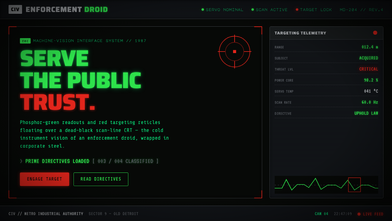 RoboCop (1987)Machine vision as interface. Phosphor-green readouts on dead-black CRT, red r…
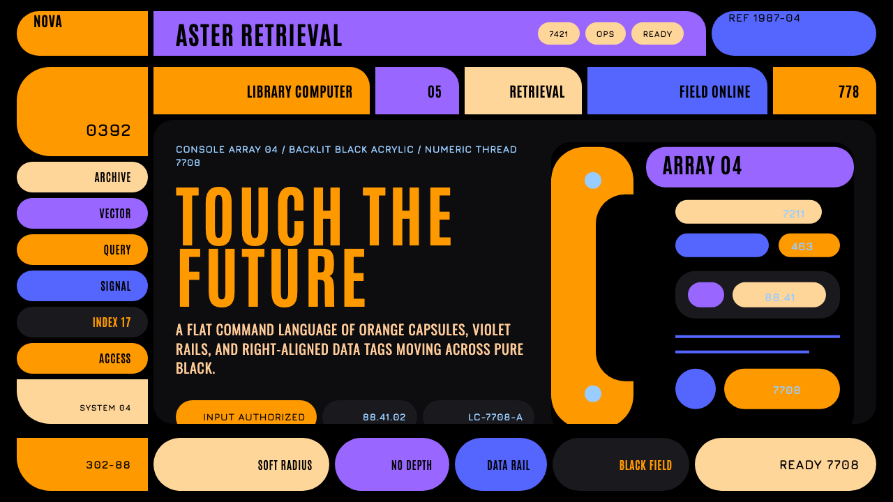 Star Trek LCARSFuture as flat command. Orange-violet elbows and Jura numbers glow on black.
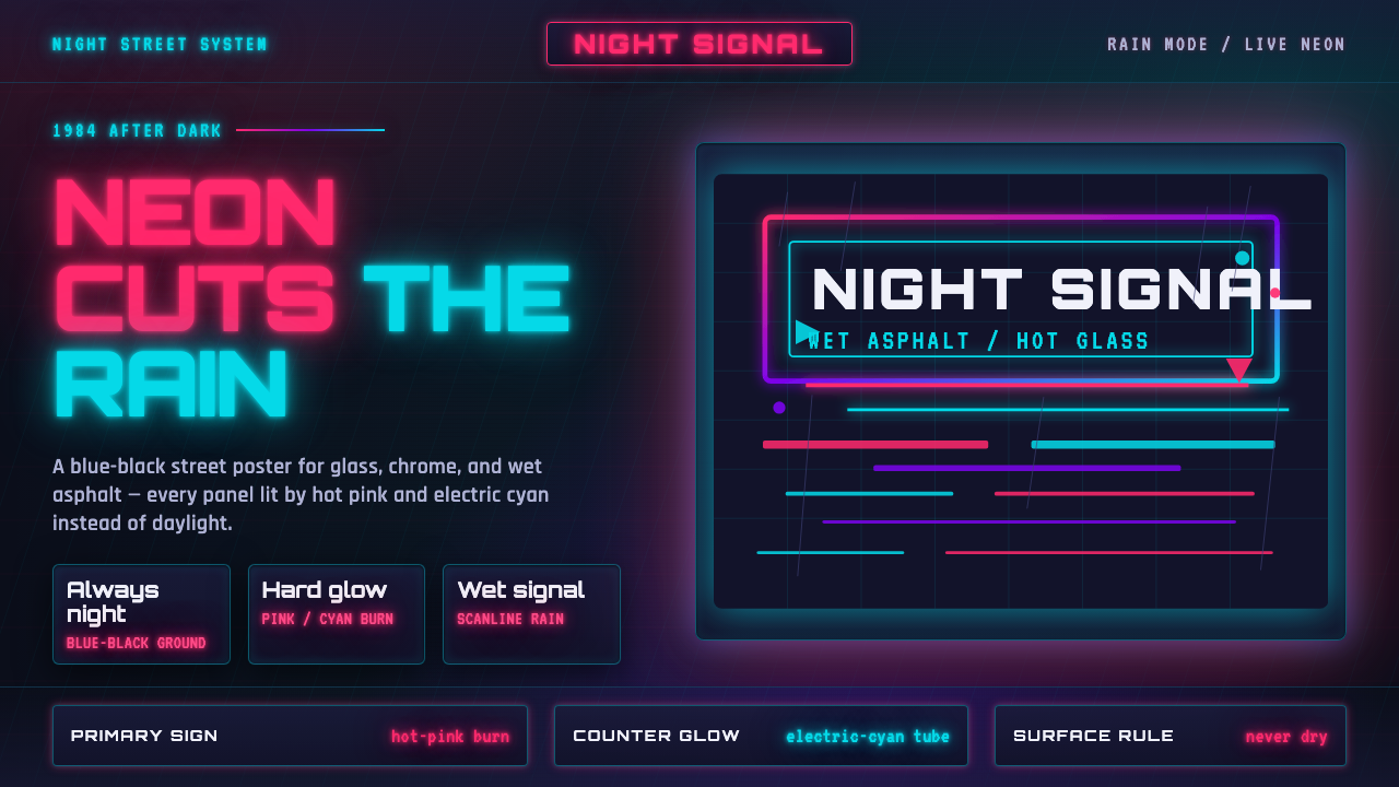 Tech-NoirAlways night. Blue-black asphalt reflects hot pink and electric cyan neon.
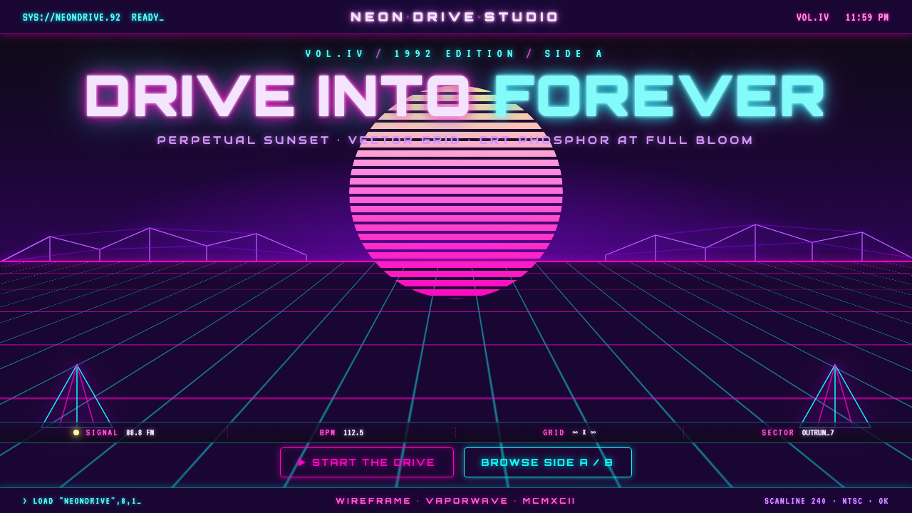 Wireframe VaporwaveDrive into forever. Magenta-cyan grid races to a vanishing point under a stri…
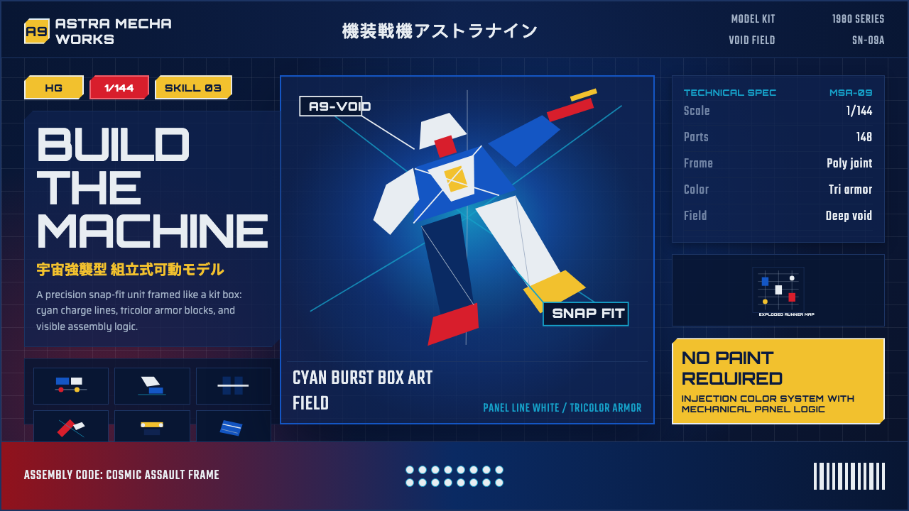 Gunpla Model BoxBuild-sheet drama. Cosmic navy, cyan burst, tricolor armor, and spec-panel gr…
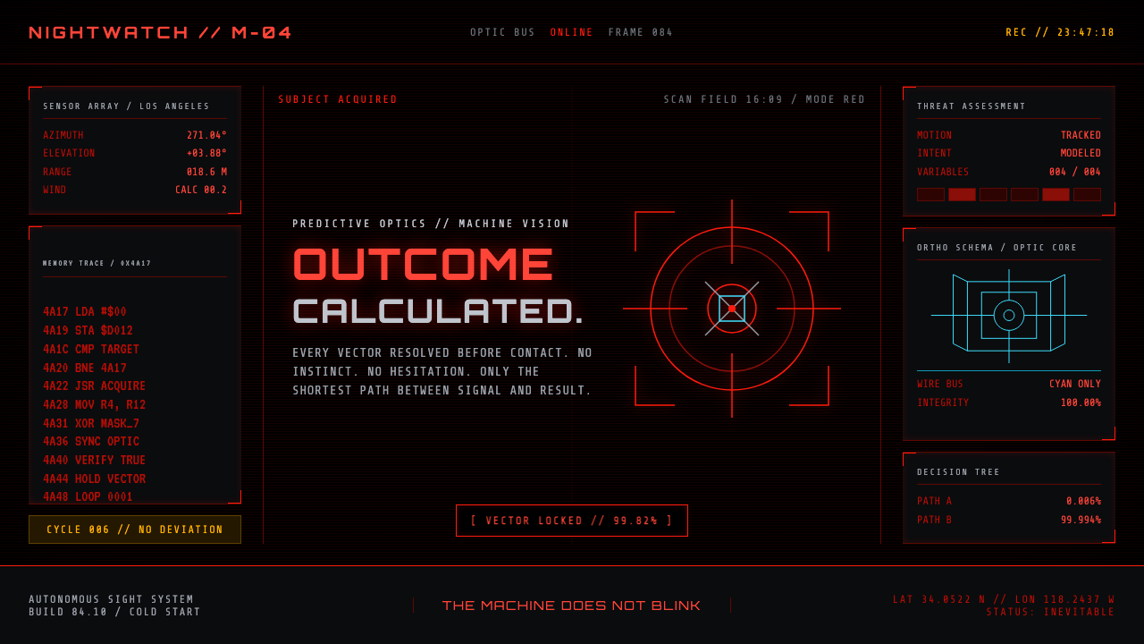 Terminator HUD (1984)The machine never blinks. Blood-red reticles and mono data burn across absolu…