About RoboCop (1987)
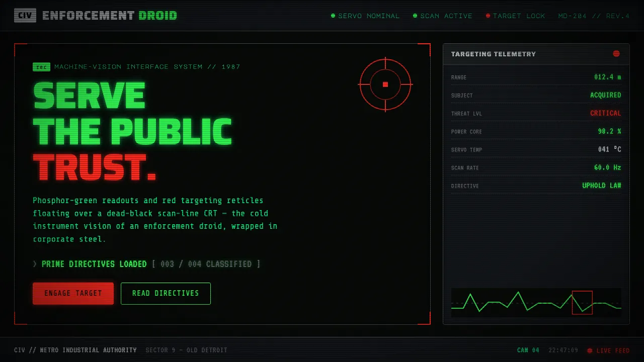
RoboCop's ED-209 sees the world as a soldier's machine: green-phosphor LED readouts and crosshairs floating over a black, scan-lined CRT, with a red targeting reticle flaring up at the moment of high alert. Paul Verhoeven's 1987 satire wrapped that cold vision in OCP corporate slate-gray, chromed-visor steel, and chunky broadcast-graphic panels.
This design system distills that POV into interface tokens — phosphor green on near-black ground, red as the sole alert accent, segment-display monospace type, and CRT scan-line texturing throughout.
- Origin
- North America (US production; satirical mediascape)
- Era
- 1987 (dystopian near-future Old Detroit)
- Key figures
- Paul Verhoeven · Rob Bottin · Craig Davies
- Movements
- Cyberpunk industrial sci-fi · Corporate-satire HUD aesthetic · 1980s machine-vision graphics
RoboCop (1987) design spec
Colors
Typography
The other 11 sections — buttons, cards, spacing, motion, techniques and more — open once you unlock. Download the DESIGN.md or send it to your AI in one click. Unlock once, yours forever.
Sign up nowStyles similar to RoboCop (1987)
Also inspired by film, games & music, with a close feel.
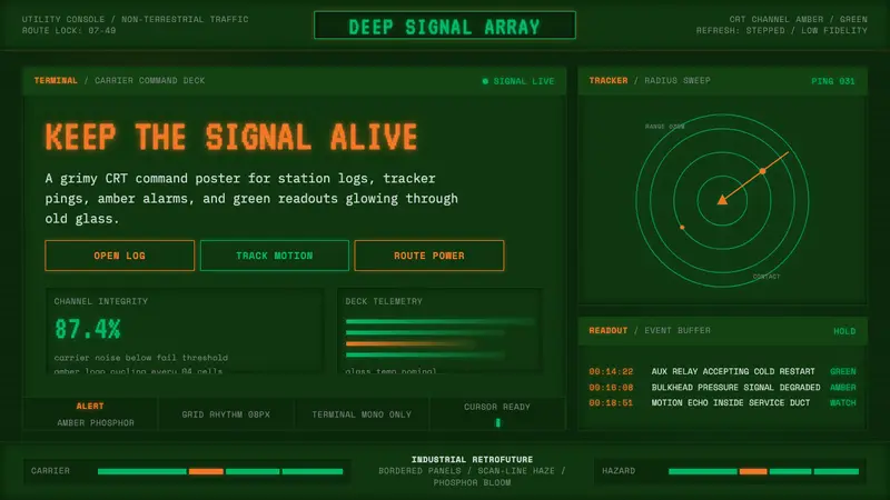 Alien: Isolation (Sevastopol)Lo-fi dread glows. Amber phosphor and terminal green pulse through bordered CRT panels.
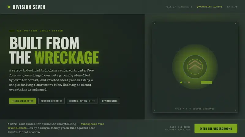 12 MonkeysBuilt from the wreckage. Sickly fluorescent green on crushed-black concrete, worn typewriter type.
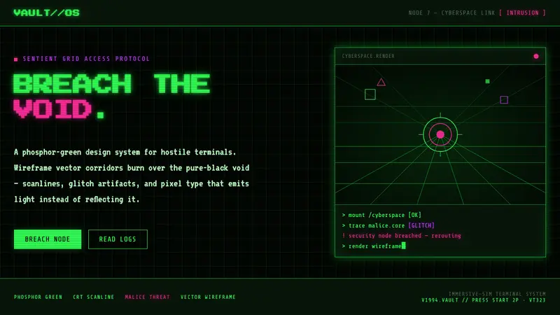 System Shock (Citadel cyberspace)Hostile retro terminal. Phosphor-green wireframes burn over black, magenta marks SHODAN's threat.
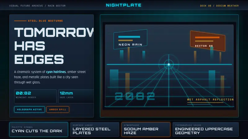 Retro-Futurism (Syd Mead)Tomorrow looks dangerous. Steel-blue night, neon cyan edges, and amber rain reflections.