What is Neon Genesis Evangelion?什么是 Neon Genesis Evangelion?
Evangelion turns the cockpit into a design system — deep-black surfaces, tech-green readouts, and saturated-red-orange alarms that make every screen feel like a sortie countdown.《福音战士》把驾驶舱变成了一套设计语言——深黑底面、科技绿读数与高饱和橙红警报,让每一个界面都像出击前的倒计时。
Neon Genesis Evangelion in briefNeon Genesis Evangelion 速览
Neon Genesis Evangelion is the 1995 mecha-anime television series created by Hideaki Anno at Gainax studio that fused giant-robot spectacle with existential dread. Its visual language — NERV's tech-green UI grids, EVA-01's saturated red-orange armor plating, Tokyo-3's deep-black sky, and the hazard-yellow chevrons stenciled across everything operational — became the gravitational center of every mecha and post-apocalyptic anime that followed, and has since escaped its medium entirely to influence game UI, dark-mode web design, and industrial-themed brand identities.《新世纪福音战士》是1995年由庵野秀明在 Gainax 工作室创作的机器人动画电视系列,将巨型机甲战斗与存在主义焦虑揉在一起。它的视觉语言——NERV 司令部的科技绿 UI 网格、初号机饱和的橙红色装甲、第三新东京市深沉的夜空,以及模印在所有操作界面上的危险黄色条纹——成为后续所有机甲与末世动画的母体,并早已突破动画本身,影响了游戏 UI、深色模式网页设计和工业主题品牌视觉。
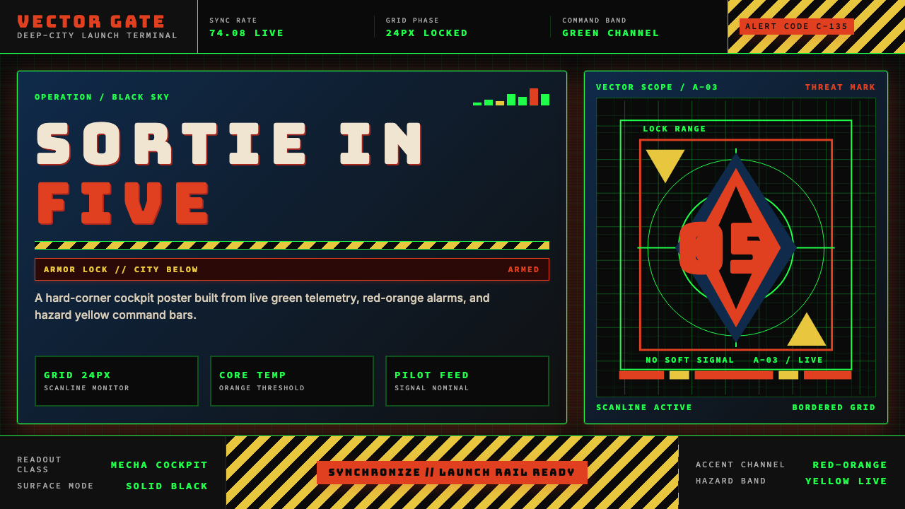
As a design vocabulary, Evangelion is cockpit aesthetics under pressure. Deep-black grounds are interrupted by sparse, high-contrast readouts in tech-green — not a decorative green but the specific, slightly cold green of phosphor monitors and radar screens. Against that ground, saturated red-orange explodes for alarms and warnings, and hot yellow marks hazard zones and structural boundaries. Type is monospaced and terse, as though rendered on cathode-ray terminals. The overall effect is of a system built for life-or-death legibility: everything visible has a reason to be visible, and nothing is decorative.作为设计词汇,福音战士代表的是高压驾驶舱美学。深黑底面上点缀着稀疏而高对比度的科技绿读数——不是装饰性的绿色,而是磷光管显示器与雷达屏幕特有的那种略带寒意的冷绿。在这个底色之上,高饱和橙红爆发为警报与告警,热黄色标记危险区域和结构边界。文字是等宽的、简洁的,仿佛由阴极射线终端渲染输出。整体效果就像一套为生死间可读性而建造的系统:凡是可见的,皆有理由可见;没有任何元素是装饰性的。
The aesthetic draws from multiple real-world sources that Anno and character designer Yoshiyuki Sadamoto absorbed in production: cold-war military control rooms, NASA mission displays, industrial safety signage, and the phosphor-screen UIs of early 1990s workstations. Evangelion synthesized these references into a coherent and emotionally charged visual system — one where the relentlessness of the interface communicates the relentlessness of the world the characters inhabit.这套美学来自庵野秀明与人物设计师贞本义行在制作过程中吸收的多个现实参照:冷战时期的军事指挥室、NASA 任务显示屏、工业安全标识,以及1990年代初工作站的磷光屏幕 UI。《福音战士》将这些参照融合为一套连贯且充满情感张力的视觉系统——界面的无情感直接传达了角色所处世界的无情。
See the Neon Genesis Evangelion design system查看 Neon Genesis Evangelion 完整设计系统
Where does Neon Genesis Evangelion come from?Neon Genesis Evangelion 从何而来?
Neon Genesis Evangelion aired on TV Tokyo from October 1995 to March 1996, produced by Gainax, the independent studio founded by anime fans that had already made its name with Gunbuster (1988) and Nadia: The Secret of Blue Water (1990). Hideaki Anno, who directed the series, entered production in a state of severe depression — a biographical fact the show absorbed and transformed into its central subject matter. What began as a commission for a conventional mecha property mutated, episode by episode, into something far stranger: a series that weaponized its own production constraints, broke its visual grammar deliberately in the final episodes, and insisted on treating its teenage pilots as psychologically realistic human beings rather than genre archetypes.《新世纪福音战士》于1995年10月至1996年3月在东京电视台播出,由 Gainax 制作——这家由动画迷创立的独立工作室此前已凭借《gunbuster》(1988年)与《蓝宝石之谜》(1990年)声名鹊起。执导本作的庵野秀明进入制作时正处于严重抑郁状态——这一传记事实被作品吸收并转化为核心主题。这部原本被委托为传统机甲作品的动画,随着集数推进而变异为截然不同的东西:一部刻意将自身制作局限武器化、在最终数集中打破视觉语法、并坚持将少年驾驶员当作心理现实的人而非类型原型来处理的作品。
The visual design emerged from a collaboration among several key figures. Anno directed and conceived the overall visual tone. Yoshiyuki Sadamoto, the character designer, gave the series its distinctive human proportions — elongated, angular figures that contrast sharply with the massive, inhuman scale of the Evangelion units. Ikuto Yamashita was responsible for the mechanical design of the EVA units and the angular, biomechanical structures of NERV's underground headquarters, drawing on aerospace engineering sketches, submarine interiors, and images of industrial infrastructure. The UI and screen graphics — the cascading kanji text, the hexagonal targeting overlays, the MAGI supercomputer readouts — were developed under Anno's supervision as a coherent fictional interface language, drawing on real computer-terminal aesthetics of the early 1990s.视觉设计来自几位核心人物的协作。庵野秀明负责导演并构想整体视觉基调。人物设计师贞本义行赋予本作独特的人物比例——修长、棱角分明的身形与福音战士机体巨大而非人化的尺度形成强烈对比。山下いくと负责 EVA 机体与 NERV 地下司令部的机械设计,参照了航空航天工程草图、潜艇内部结构与工业基础设施影像,创造出那些棱角分明的生物机械结构。而界面与屏幕图形——层叠滚动的汉字文本、六边形瞄准覆层、MAGI 超级计算机的读数显示——在庵野的监督下发展为一套连贯的虚构界面语言,根植于1990年代初期真实计算机终端的美学。
Composer Shiro Sagisu's score contributed an unexpected dimension to the visual identity: the contrast between propulsive orchestral action themes and Beethoven-era classical works used in moments of psychological collapse created an emotional dissonance that the visual system mirrors. The show's willingness to hold still on a static image — a single architectural frame, an empty corridor, a close-up on an eye — for dramatically extended periods also defined the aesthetic, proving that restraint and emptiness could be as expressive as action.作曲家鹫巢诗郎的配乐为视觉身份贡献了意想不到的维度:推进感强烈的管弦乐动作主题与在心理崩溃时刻使用的贝多芬时代古典音乐之间的对比,制造了一种情感失调感,而视觉系统正是这种失调的镜像。作品愿意在一帧静止画面上停留——一栋建筑的构图、一条空旷的走廊、一个眼神的特写——保持戏剧性的延长,同样定义了这套美学,证明克制与空旷可以与动作一样富有表现力。
The original 1995–1996 broadcast series was followed by the theatrical film The End of Evangelion in 1997, which provided an alternate conclusion that pushed the visual language toward its logical extreme — hallucinatory sequences that dissolved the tech-green cockpit aesthetic into psychological abstraction. Then came the Rebuild of Evangelion tetralogy, produced by Anno's new studio Khara, released across 2007 to 2021, which reconstructed the original story with contemporary production values while preserving the core color vocabulary intact. The persistence of the visual system across three decades — original broadcast, the 1997 film, and four Rebuild features — is testimony to how precisely it was originally conceived.原版1995至1996年的电视系列之后,1997年上映了剧场版《新世纪福音战士剧场版:Air/真心为你》,提供了一个将视觉语言推至逻辑极限的替代性结局——幻觉性的序列将科技绿驾驶舱美学溶解为心理抽象。此后,庵野秀明的新工作室 Khara 制作了《重建》四部曲,自2007年至2021年陆续公映,在保留核心色彩词汇的同时,以当代制作水准重新建构了原作故事。这套视觉系统跨越三十年——原版电视系列、1997年剧场版与四部重建剧场版——始终如一地运作,本身就是它最初被构想得多么精确的证明。
What defines the Neon Genesis Evangelion look?Neon Genesis Evangelion 的视觉特征是什么?
Color Palette色彩体系
The Evangelion palette is structured around three functional color roles deployed against deep black. Tech-green — the cool, slightly desaturated green of phosphor monitors — carries all informational readouts and ambient interface glow: it reads as data, as machine intelligence, as operational status. Saturated red-orange appears exclusively for alerts, warnings, and critical states: it is the color of danger acknowledged and escalated. Hot yellow marks physical hazard boundaries, structural warnings, and industrial chevrons. The three together operate like a traffic signal hierarchy, but one designed for cockpit panic rather than pedestrian safety. Deep black is not a neutral ground but an active void — the visual weight of absolute darkness against which the three accent colors detonate.福音战士的色彩体系围绕三种功能性色彩角色构建,以深黑为底。科技绿——磷光监视器特有的那种冷调、略微去饱和的绿——承载所有信息读数与界面环境光:它被读解为数据、机器智能、运行状态。高饱和橙红仅出现于警告、告警与危急状态:它是危险被确认并升级后的颜色。热黄色标记物理危险边界、结构警示与工业条纹。三者合力形同一套交通信号层级体系,只是专为驾驶舱紧急状态而非行人安全设计。深黑不是中性的底色,而是一个主动的虚空——绝对黑暗的视觉重量,在其上三种强调色得以引爆。
Typography字体排印
Evangelion typography is defined by monospaced, terminal-derived letterforms — the visual grammar of machine output rather than human authorship. Text appears in tight, controlled clusters: status labels, coordinate readouts, unit designations. Hierarchy is established not through expressive typeface choices but through scale contrast and color assignment: large designations in tech-green, small metadata in dimmer tones. The occasional intrusion of Japanese kanji in cascading readout columns adds a layer of cultural density and controlled illegibility — the user understands that there is more data than they can process, and that the machine is always producing it. All type behavior communicates system state, never personality.福音战士的排印由等宽的、源自终端的字形所定义——机器输出的视觉语法,而非人类书写的语法。文字以紧凑、受控的组块出现:状态标签、坐标读数、机体编号。层级不是通过表情丰富的字体选择确立,而是通过尺度对比与色彩分配确立:大型编号以科技绿呈现,小型元数据以更暗的色调显示。层叠读数列中偶尔出现的汉字片假名,为画面增添了一层文化密度与受控的不可读性——观者理解到存在超出自身处理能力的数据,而机器始终在产生它。所有文字行为传达的是系统状态,从不传达个性。
Grid and Interface Structure网格与界面结构
Evangelion interfaces are organized by tight, modular grids — panels, hexagonal cells, overlapping translucent layers — that suggest a sophisticated underlying information architecture. The grid is not decorative: each cell has a designated function, and the visible boundaries between cells communicate that the data is organized, classified, and under control even when the content is dire. Hexagonal grid overlays, targeting reticles, and circular radar sweeps introduce organic geometry — forms drawn from nature and from weapons systems — that contrasts with the rectangular panel grid and prevents the aesthetic from feeling purely orthogonal.福音战士的界面由紧密的模块化网格组织——面板、六边形单元格、叠加的半透明图层——暗示着一套复杂的底层信息架构。这套网格不是装饰性的:每个单元格都有指定功能,单元格之间可见的边界传达着数据已被组织、分类并处于受控状态——即便内容触目惊心。六边形网格叠层、瞄准十字线与圆形雷达扫描引入了有机几何形——源自自然与武器系统的形态——与矩形面板网格形成对比,防止这套美学显得纯然正交。
Depth and Layering深度与图层
Unlike flat design systems that eliminate all depth cues, Evangelion aesthetics depend on the controlled use of translucency and overlay. Interface panels are semi-transparent, allowing darker background information to bleed through; alert overlays appear on top of operational displays without completely obscuring them. This layering communicates that all information is simultaneously present and that the operator must manage multiple channels at once. The depth is functional rather than decorative — it is the visual representation of information overload held just barely under control.与消除所有深度线索的扁平化设计体系不同,福音战士美学依赖对透明度与叠层的受控使用。界面面板是半透明的,允许更暗的背景信息透出;警报叠层出现在操作显示之上,却不完全遮蔽底层内容。这种叠层关系传达着所有信息同时在场,操作者必须同时管理多个频道。这种深度感是功能性的而非装饰性的——它是信息过载在勉强受控状态下的视觉呈现。
Hazard Markings and Industrial Signage危险标识与工业标牌
Evangelion borrows heavily from industrial safety culture: the yellow-and-black chevron stripe, the stenciled warning label, the bold clearance marking. These elements appear throughout NERV's architecture and EVA unit surfaces, and they serve a double function. Operationally, they communicate that this is a real environment with real physical dangers. Aesthetically, they prevent the tech-green-and-black palette from becoming purely sleek — the hazard markings are rough, physical, analog interventions in a digital environment. They are the trace of the human hand in a machine world.福音战士大量借用工业安全文化:黄黑色条形斜纹、模板印刷的警告标签、粗体的间距标识。这些元素遍布 NERV 的建筑与 EVA 机体表面,并发挥双重功能。在操作层面,它们传达这是一个存在真实物理危险的真实环境。在美学层面,它们防止科技绿与黑色的调色板变得过于光洁——危险标识是数字环境中粗粝的、物理的、模拟的介入。它们是机器世界中人类手工的痕迹。
Psychological Darkness心理性的黑暗感
Evangelion's visual system is not just a technical interface style — it carries an emotional tone specific to the series. The combination of deep black, cold green, and harsh red-orange produces an atmosphere of constant threat and fatigue. Unlike cyberpunk neon, which tends toward energetic spectacle, Evangelion's palette is weighted and oppressive: the lights in this world are not decorative illuminations but warning signals and survival indicators. When applying this aesthetic, the underlying emotional register — anxiety, vigilance, the sense of operating under conditions of extreme stress — is part of what the palette communicates, not an accidental byproduct.福音战士的视觉系统不仅仅是一种技术界面风格——它携带着专属于这部作品的情感基调。深黑、冷绿与刺烈橙红的组合制造出一种持续威胁感与疲惫感的氛围。不同于往往走向充满能量的奇观感的赛博朋克霓虹,福音战士的调色板是沉重而压抑的:这个世界里的光不是装饰性的照明,而是警告信号与生存指标。在应用这套美学时,其底层的情感调性——焦虑、警觉、在极端压力条件下运作的感受——是色彩传达的一部分,而非偶然的副产品。
Motion and Urgency动态感与紧迫性
Even in static applications, Evangelion aesthetics imply motion and urgency through compositional decisions. Diagonal cuts, alert borders that suggest animation, text positioned at the edge of readable space, and numerical countdowns embedded in layouts all create the impression that the current state is transitional — that something is about to happen. This is the aesthetic of the moment before sortie: a state of suspended but imminent action. Effective static applications of this style lean into that quality of held breath, using composition and scale contrast to create visual tension without relying on actual animation.即便在静态应用中,福音战士美学也通过构图决策暗示动态与紧迫性。斜切分割、暗示动画状态的警报边框、置于可读空间边缘的文字、嵌入版面的数字倒计时——这一切都制造出当前状态是过渡性的印象——某件事即将发生。这是出击前一刻的美学:悬而未发的、一触即发的行动状态。有效的静态应用应充分利用这种屏息感,以构图与尺度对比制造视觉张力,而不依赖实际动画。
See the Neon Genesis Evangelion design system查看 Neon Genesis Evangelion 完整设计系统
Who shaped Neon Genesis Evangelion?谁塑造了 Neon Genesis Evangelion?
Anno directed and conceptually shaped every dimension of Evangelion's visual language. His decision to draw interface aesthetics from real-world military control rooms, early-1990s computer terminals, and industrial safety signage — rather than purely from prior anime conventions — gave the series a visual credibility that distinguished it immediately from its contemporaries. His willingness to hold still on empty architecture, negative space, and deliberately degraded imagery in the final episodes proved that the aesthetic could absorb psychological disruption and become more powerful for it. The visual system Anno built has outlasted the series itself and remains a live reference in game design, dark-mode UI, and post-apocalyptic brand identity.庵野秀明导演并从概念层面塑造了《福音战士》视觉语言的每一个维度。他决定从现实世界的军事指挥室、1990年代初期的计算机终端和工业安全标识中汲取界面美学——而非纯粹从此前的动画惯例中取材——使本作在视觉上的可信度立刻区别于同时代的作品。他愿意在最终数集中让空旷建筑、负空间与刻意降质的图像静止停留,证明了这套美学能够吸收心理层面的解构并因此变得更为强大。庵野构建的视觉系统已经超越了作品本身的生命,至今仍是游戏设计、深色模式 UI 与末世主题品牌身份的活跃参照。
As character designer, Sadamoto established the human scale against which the series' inhuman scale is measured. His elongated, angular figures — with their large eyes and psychologically legible expressions — carry the series' emotional weight in counterpoint to the cold machine aesthetic of the interface systems. Sadamoto's design work ensures that the viewer always feels the human cost embedded inside the technical spectacle. He later adapted the series into a manga that ran from 1994 to 2013, demonstrating how the visual system translates to a static, ink-on-paper medium — and confirming that the aesthetic depends on color and form relationships rather than on the animation medium specifically.作为人物设计师,贞本义行确立了用于衡量作品中非人化尺度的人类比例基准。他修长、棱角分明的人物形象——大眼睛与心理上清晰可读的表情——在界面系统冷峻机械美学的对位声部中承载了作品的情感重量。贞本的设计工作确保观者始终能感受到技术奇观内部包裹的人类代价。他后来将本作改编为漫画,自1994年连载至2013年,证明了这套视觉系统如何在静态的纸墨媒介中转译——并确认了这套美学依赖色彩与形态关系,而非特定依附于动画媒介。
Yamashita's mechanical designs for the EVA units and NERV's underground infrastructure translated the series' conceptual ambiguity — the EVAs are both weapons and living beings — into visual form. His approach drew on aerospace engineering blueprints, submarine schematics, and biological cross-sections simultaneously, creating machines that read as both constructed and grown. The angular, stressed-surface quality of his mechanical designs established the material vocabulary that the UI elements were then required to coexist with: a world of extreme physical engineering in which the interface systems are just another layer of engineered control.山下いくと为 EVA 机体与 NERV 地下基础设施设计的机械造型,将本作在概念层面的模糊性——EVA 既是武器也是生命体——转化为可视形态。他的方法同时汲取了航空航天工程蓝图、潜艇结构图与生物横截面图,创造出既像建造又像生长而成的机体。他机械设计中棱角分明、表面受力的品质确立了界面元素必须与之共存的物质词汇:一个极端物理工程学的世界,在其中,界面系统不过是另一层被工程化的控制。
Sagisu's score for Evangelion is directly relevant to understanding the visual aesthetic because it operates by the same logic of tonal collision. His juxtaposition of propulsive orchestral action music with Beethoven-era classical works — heard in moments of psychological breakdown and introspective paralysis — created an emotional dissonance that the visual system mirrors in its own terms: the cold, legible clarity of the interface against the psychological chaos of the characters inhabiting it. The score demonstrated that the Evangelion aesthetic is not simply a dark color palette but a complete sensory argument about the relationship between operational clarity and existential despair.鹿巢诗郎为《福音战士》创作的配乐与理解视觉美学直接相关,因为它遵循同一套音调碰撞逻辑。他将推进感强烈的管弦乐动作音乐与贝多芬时代的古典作品并置——后者出现在心理崩溃与内省性瘫痪的时刻——制造了一种情感失调感,而视觉系统以自己的方式镜像了这种失调:界面冷峻清晰的可读性,对照栖居其中的角色的心理混乱。这部配乐证明,福音战士美学不仅仅是一套深色调色板,而是一个关于操作清晰性与存在主义绝望之间关系的完整感官论证。
Gainax, the studio that produced the original 1995–1996 series, was itself an institution whose visual culture shaped Evangelion's aesthetic. Founded by anime fans, it brought a reverence for technical detail and a willingness to experiment with visual grammar that conventional broadcast production studios rarely attempted. When Anno founded Studio Khara to produce the Rebuild of Evangelion tetralogy (2007–2021), the studio's approach was to preserve the core visual vocabulary while upgrading the production means — demonstrating that the aesthetic was a principled system capable of surviving a generational production shift, not a period artifact of mid-1990s anime.制作原版1995至1996年系列的 Gainax 工作室,本身就是一个其视觉文化塑造了《福音战士》美学的机构。由动画迷创立的它,带来了对技术细节的敬重,以及愿意尝试常规广播制作公司极少敢触碰的视觉语法实验。当庵野秀明创立 Khara 工作室制作《重建》四部曲(2007至2021年)时,该工作室的取向是:保留核心视觉词汇,同时升级制作手段——证明了这套美学是一套有原则的系统,能够经受代际制作迭代而留存,而非1990年代中期动画的时代产物。
How do you use Neon Genesis Evangelion today?今天怎么用 Neon Genesis Evangelion?
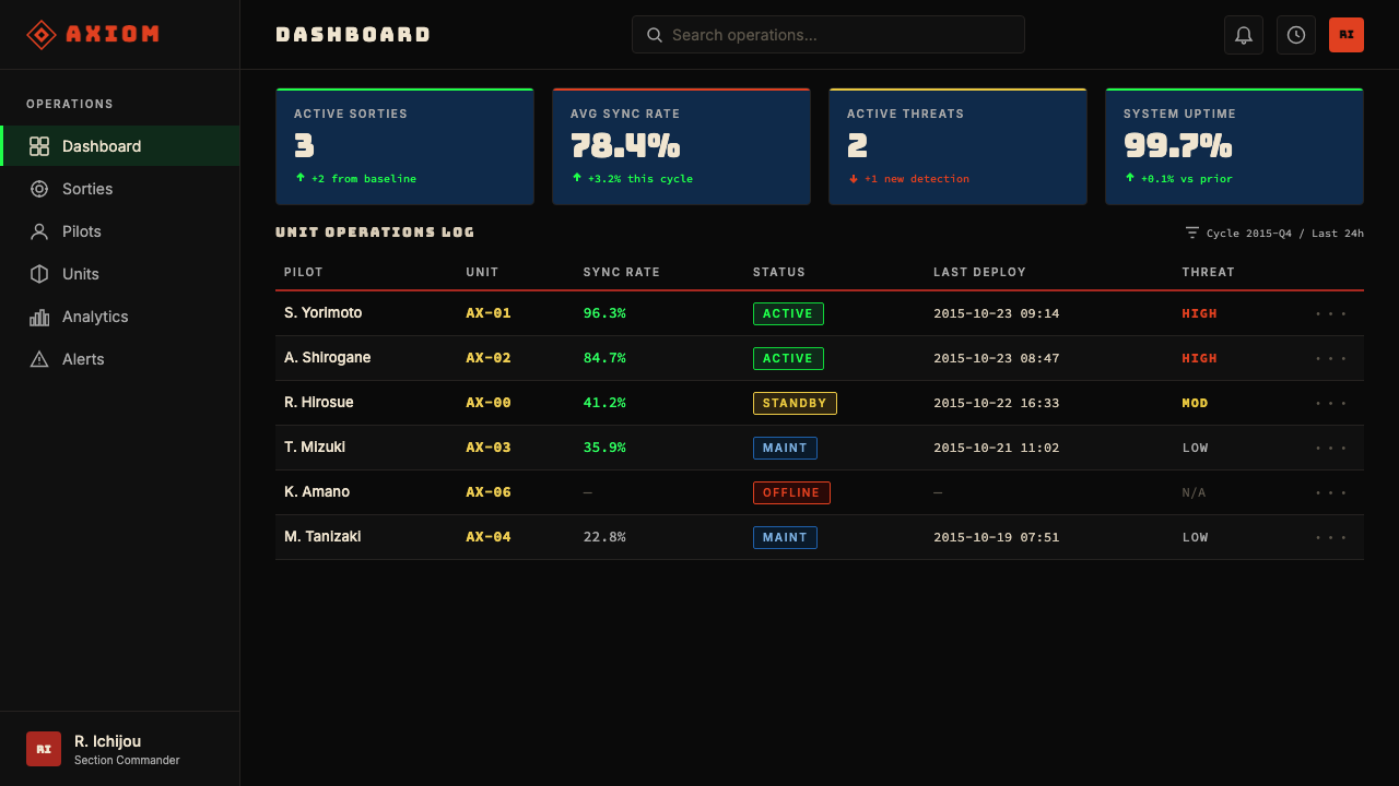
Evangelion aesthetics translate powerfully into presentation and slide design, particularly for technology products, security platforms, and any context where conveying operational authority and technical depth is more important than warmth or approachability. A cover slide benefits from the full weight of the palette: a deep-black full-bleed background with a bold tech-green headline, a single red-orange accent element — a structural line, a category tag, a geometric border — and sparse, monospaced metadata in a dimmer tone. The effect is immediately distinctive and communicates seriousness without needing any figurative imagery. Content slides should restrain the palette: keep backgrounds near-black, use tech-green for headlines and active states only, and use white or light gray for body text to maintain readability. Data visualization slides are where the aesthetic earns its keep — bar charts and line graphs rendered with tech-green bars, red-orange alert thresholds, and yellow reference lines map directly onto the cockpit readout language and make data feel urgent and operational.福音战士美学在演示与幻灯片设计中转化能力极强,尤其适用于科技产品、安全平台,以及任何传达操作权威性与技术深度比传达温度或亲切感更重要的场景。封面页适合使用调色板的全部分量:深黑色满版背景,配以粗体科技绿标题,单一的橙红色强调元素——结构性线条、类别标签或几何边框——以及以更暗色调呈现的稀疏等宽元数据。这样的效果立即具有辨识度,无需任何具象图像便能传达严肃性。内容页应当克制调色板:背景保持接近黑色,科技绿仅用于标题与激活状态,正文使用白色或浅灰以保证可读性。数据可视化页是这套美学最能展现价值的地方——以科技绿渲染柱状图与折线图、以橙红色标记警告阈值、以黄色标示参考线,直接对应驾驶舱读数语言,让数据呈现出紧迫感与操作感。
For web UI and dashboard design, the Evangelion aesthetic is particularly well-suited to monitoring dashboards, developer tools, security consoles, and dark-mode applications where the interface needs to communicate that it is always-on, always watching, and always processing. Define a strict panel grid — modular rectangular sections separated by thin structural lines rather than heavy borders — and treat each panel as a distinct data zone. Use tech-green sparingly for active metrics, current values, and primary interactive states. Reserve red-orange for error states, critical thresholds, and destructive actions; reserve yellow for warnings and caution states. Everything else should be near-black, dark gray, or very low-contrast white. Navigation and labels should be monospaced or at minimum geometric, never humanist.对于网页 UI 和仪表板设计,福音战士美学尤其适合监控仪表板、开发者工具、安全控制台,以及任何界面需要传达「始终在线、始终监视、始终处理」感的深色模式应用。定义严格的面板网格——由细结构线而非粗边框分隔的模块化矩形区域——将每个面板视为独立的数据区域。科技绿应节制使用,仅用于活跃指标、当前值与主要交互状态。橙红色保留给错误状态、危急阈值与破坏性操作;黄色保留给警告与注意状态。其余所有元素应为接近黑色的深灰或极低对比度的白。导航与标签应使用等宽字体,至少使用几何风格字体,绝不使用人文主义字体。
For pricing pages and feature comparison tables, the aesthetic works well when the product being sold has genuine technical complexity and a professional buyer. A dark-background pricing table with tech-green highlights on the recommended tier, red-orange badges for enterprise or critical features, and monospaced type throughout communicates that this is software built by people who understand the domain deeply. Avoid using the palette for consumer products where the buyer's primary decision factor is emotional confidence — the aesthetic reads as imposing rather than inviting in those contexts.对于定价页与功能对比表,当所销售的产品具有真实的技术复杂度且目标购买者是专业用户时,这套美学表现出色。深色背景的定价表,以科技绿高亮推荐档位,以橙红色徽标标示企业版或关键功能,全程使用等宽字体,传达出这是一款由深刻理解该领域的人构建的软件。避免将此调色板用于消费者产品——当购买者的主要决策因素是情感信任时,这套美学读起来更像强迫而非邀请。
For editorial, marketing, and campaign design, Evangelion aesthetics support strong information hierarchy and a distinctive visual voice, but require careful scope management. A full-bleed dark background with tech-green headlines and red-orange call-to-action elements creates high-impact hero sections and announcement banners. The hazard-chevron motif — alternating yellow and black diagonal stripes — works as a structural divider or border accent in editorial layouts, communicating urgency without using explicit language. Poster and social card applications benefit from the palette's natural tension: even a single bright accent against deep black reads as high-stakes and immediate.对于编辑、营销与活动设计,福音战士美学支持强劲的信息层级与独特的视觉声音,但需要谨慎的范围管理。满版深色背景配以科技绿标题和橙红色行动号召元素,能创造高冲击力的主视觉区块与公告横幅。危险斜纹条纹——黄黑色交替的对角线条——可作为编辑版面中的结构性分隔线或边框装饰,无需明确文字即可传达紧迫感。海报与社交卡片应用得益于这套调色板自然产生的张力:即便是深黑中的一个明亮强调色,也会被读解为高度关键与即时性。
The most common mistake when applying this aesthetic is over-illuminating the design — using too many bright accent colors at once, across too many elements, until the deep-black ground disappears and the result looks like generic cyberpunk rather than Evangelion's specifically controlled cockpit language. The palette's power comes entirely from restraint: most of the composition should be dark, with tech-green, red-orange, and yellow deployed as precise, purposeful signals in a field of darkness. A second common error is using rounded corners and soft shadows, which contradict the aesthetic's angular, mechanical grammar — all container edges should be sharp, and any shadow used should be hard and directional. A third is decorative use of the monospaced type convention: in this aesthetic, monospaced type communicates machine output and system data; using it for body text or marketing copy without that functional justification breaks the internal logic and reads as costume rather than system.应用这套美学时最常见的错误是过度照亮设计——同时在过多元素上使用过多明亮强调色,直到深黑底色消失,结果看起来像泛化的赛博朋克而非福音战士特有的受控驾驶舱语言。这套调色板的力量完全来自克制:构图的大部分应当是暗的,科技绿、橙红与黄色作为精确的、有目的的信号部署在黑暗的场域中。第二个常见错误是使用圆角与柔和阴影——这与这套美学的棱角化、机械化语法相矛盾,所有容器边缘应当是尖锐的,若使用阴影也应是硬边且有方向性的。第三个错误是装饰性地使用等宽字体惯例:在这套美学中,等宽字体传达机器输出与系统数据;若将其用于正文或营销文案而缺乏该功能性依据,会打破内在逻辑,读起来像服装而非系统。
See the Neon Genesis Evangelion design system查看 Neon Genesis Evangelion 完整设计系统
Neon Genesis Evangelion — FAQNeon Genesis Evangelion · 常见问题
How is Evangelion different from generic cyberpunk?福音战士风格与泛化赛博朋克风格有何不同?
The distinction is in emotional register and compositional discipline. Cyberpunk neon aesthetics — think Blade Runner or Akira — tend toward sensory abundance: multiple colors, high-density visual information, the spectacle of the future made overwhelming. Evangelion's palette is deliberately impoverished by comparison: three functional colors against deep black, with the black dominant. The emotional tone is not energy and possibility but vigilance and dread. Compositionally, cyberpunk embraces visual maximalism — layered signage, dense crowds, glowing advertisements — while Evangelion's interfaces are sparse and controlled, communicating that every visible element has earned its presence. If a design feels exhilarating, it is leaning cyberpunk; if it feels oppressive and precise, it is closer to Evangelion.区别在于情感基调与构图自律。赛博朋克霓虹美学——想想《银翼杀手》或《阿基拉》——往往走向感官丰盛:多种颜色、高密度视觉信息、令人不知所措的未来奇观。相比之下,福音战士的调色板是刻意贫乏的:三种功能性颜色对阵深黑,且以黑色为主导。情感基调不是能量与可能性,而是警觉与恐惧。在构图上,赛博朋克拥抱视觉最大主义——叠层标牌、密集人群、发光广告——而福音战士的界面是稀疏且受控的,传达着每个可见元素都已赢得自己存在的资格。如果一个设计令人感到振奋,它在向赛博朋克倾斜;如果感到压迫且精确,它更接近福音战士。
Can this aesthetic work on a light or white background?这套美学能用在浅色或白色背景上吗?
It can adapt, but with significant concessions. The palette's power comes from the contrast between bright functional signals and an absorptive dark ground — deep black is not a stylistic choice but a structural necessity. On a white or light ground, tech-green becomes an accent color competing with black body text rather than an ambient glow reading against darkness; the result loses the cockpit-readout legibility logic entirely. A practical adaptation for light-mode contexts is to treat the Evangelion palette as a dark-panel system within a light UI: sections, cards, or callout blocks in near-black can carry the full palette while the surrounding page remains light. The pure dark version is always stronger.可以适配,但需要相当大的妥协。这套调色板的力量来自明亮功能性信号与吸收性暗底之间的对比——深黑不是风格选择,而是结构性必要条件。在白色或浅色底面上,科技绿变成了与黑色正文竞争的强调色,而非在黑暗中浮现的环境光;由此,驾驶舱读数的可读性逻辑完全失效。在浅色模式场景中的实用适配方式是将福音战士调色板视为浅色 UI 内部的深色面板系统:接近黑色的区域、卡片或标注块可以承载完整调色板,而周围页面保持浅色。纯深色版本永远更强。
Does the monospaced type convention apply to all text, or only certain elements?等宽字体的使用惯例适用于所有文字吗,还是仅适用于特定元素?
Only to elements that have a machine-output or system-data function in the layout. Status labels, coordinates, numerical readouts, timestamps, version numbers, unit designations — these are natural candidates for monospaced treatment because they are communicating system state. Body text, descriptive copy, and marketing language are not machine output; applying monospaced type to them breaks the internal logic of the aesthetic and produces something that reads as styling rather than system. A well-executed Evangelion-aesthetic layout might mix monospaced type for data elements with a geometric or condensed sans-serif for headings and body, with the monospaced type reserved as a marker for machine-generated or operational content.仅适用于版面中具有机器输出或系统数据功能的元素。状态标签、坐标、数值读数、时间戳、版本号、机体编号——这些是等宽处理的天然候选对象,因为它们在传达系统状态。正文、描述性文案与营销语言不是机器输出;对它们应用等宽字体会打破美学的内在逻辑,产生的效果读起来像风格装扮而非系统语言。一个执行到位的福音战士美学版面,可能将等宽字体用于数据元素,将几何体或压缩无衬线字体用于标题与正文,等宽字体保留为机器生成内容或操作性内容的专属标记。
Is this aesthetic appropriate for consumer-facing products?这套美学适合面向消费者的产品吗?
It depends entirely on what emotional contract the product is making with the user. Evangelion aesthetics communicate operational authority, vigilance, and technical seriousness — they are appropriate when those qualities align with the product's promise. A cybersecurity platform, a developer tool, a financial data terminal, a game or entertainment product with a military or post-apocalyptic theme — these contexts invite the palette. Consumer products built on trust, warmth, accessibility, or sensory pleasure — food, wellness, social, children's products — will find the aesthetic hostile to their goals. The palette's inherent message is that the system is in control, not the user; in contexts where user empowerment and delight are primary values, that message is counterproductive.完全取决于产品与用户订立的是什么样的情感契约。福音战士美学传达操作权威性、警觉感与技术严肃性——当这些品质与产品承诺相符时,它是合适的。网络安全平台、开发者工具、金融数据终端、军事或末世主题的游戏或娱乐产品——这些场景邀请这套调色板入场。建立在信任、温度、易达性或感官愉悦之上的消费者产品——食品、健康、社交、儿童产品——会发现这套美学与其目标相悖。这套调色板内在传达的信息是系统在掌控,而非用户;在以用户赋权与愉悦为首要价值的场景中,这个信息是适得其反的。
How do you avoid the aesthetic feeling dated or tied to 1990s anime specifically?如何避免这套美学看起来过时或与1990年代动画具体绑定?
The 1995 origin is a strength, not a liability, if the design commits to the underlying functional logic rather than quoting surface details from the show itself. The aesthetic becomes dated when it relies on specific iconography — the distinctive NERV logo, direct EVA unit references, recognizable kanji panels — because those elements are nostalgic callbacks rather than functional design choices. The version that ages well is the one that understands what the visual system is actually doing: using dark grounds and sparse, color-coded signals to create a high-contrast, high-legibility operational interface. That logic is timeless because it derives from military and industrial design practice that preceded the anime and has continued to evolve since. Applied at the level of system logic rather than surface quotation, the aesthetic reads as contemporary dark-mode interface design with a disciplined visual personality.1995年的起源是优势而非负担——前提是设计对底层功能逻辑的承诺,而非对剧集本身表面细节的引用。当设计依赖特定图像符号时,这套美学会显得过时——NERV 特有的标志、对 EVA 机体的直接引用、辨识度极高的汉字面板——因为那些元素是怀旧式的回调而非功能性的设计选择。能够经受时间考验的版本,是那些理解这套视觉系统究竟在做什么的版本:以暗底与稀疏的色彩编码信号,创造高对比度、高可读性的操作界面。这套逻辑是超越时代的,因为它来源于先于这部动画存在的军事与工业设计实践,并在之后持续演进。在系统逻辑层面而非表面引用层面上的应用,让这套美学读起来像具有自律视觉个性的当代深色模式界面设计。
Related design styles相关设计风格
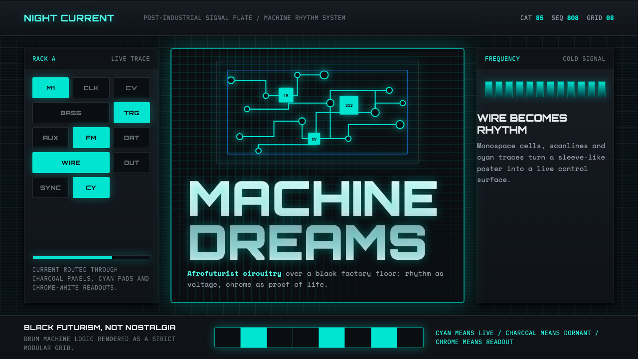 Detroit TechnoCold machines dream. Electric cyan circuits and chrome display type lock to a…冷机器在做梦。电青线路与铬感字形锁进黑色网格。
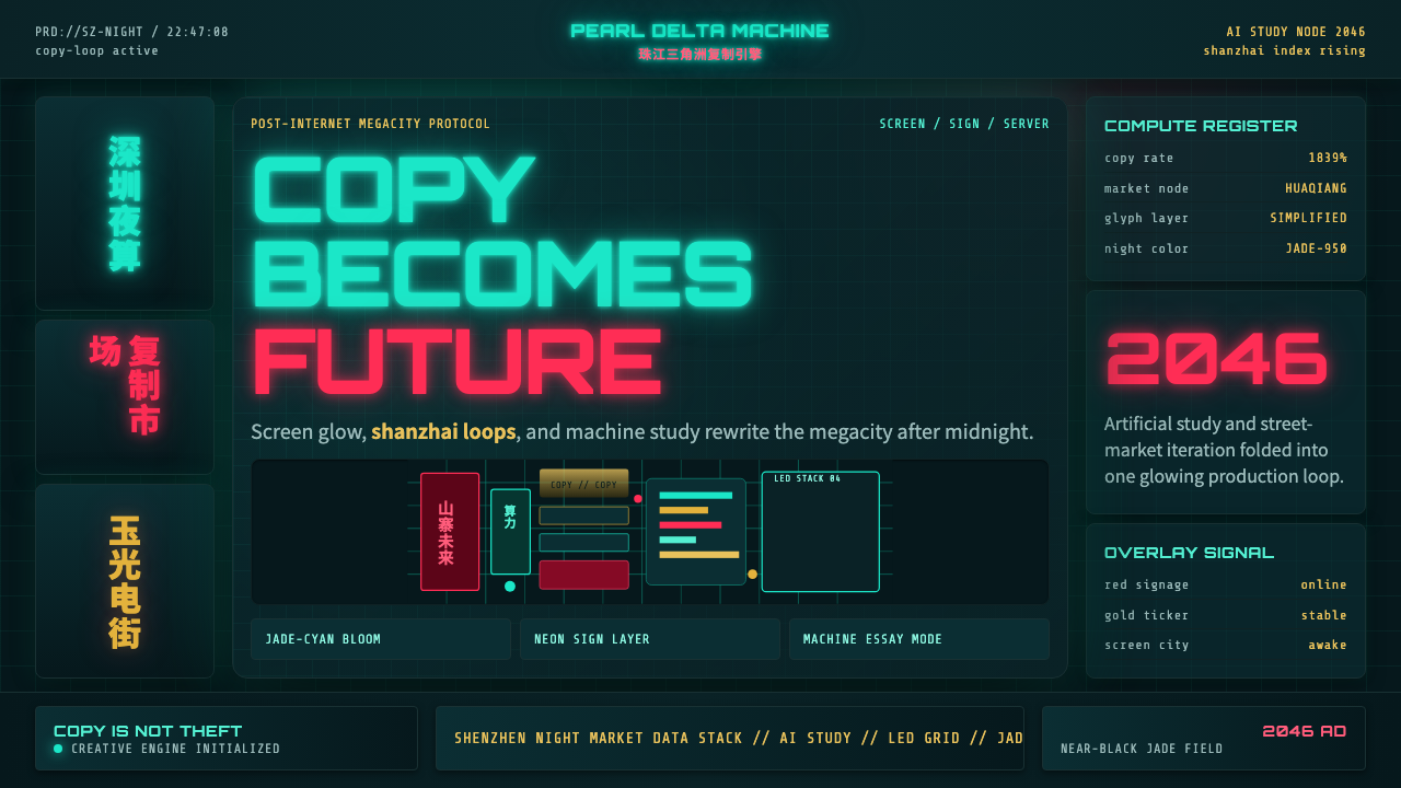 SinofuturismCopy becomes future. Jade-cyan grids, red signage, and Orbitron data stack th…复制成为未来。玉青网格、红色招牌与数据字叠起夜城。
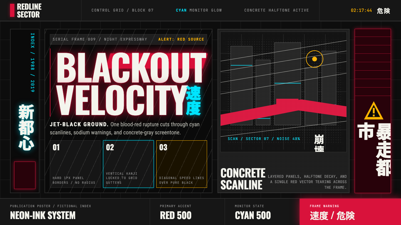 Akira (Otomo)Cyberpunk at impact. Kaneda red, cyan kanji, halftone concrete, and diagonal…冲击式赛博朋克:金田红、青色汉字、混凝土网点与斜向速度线。
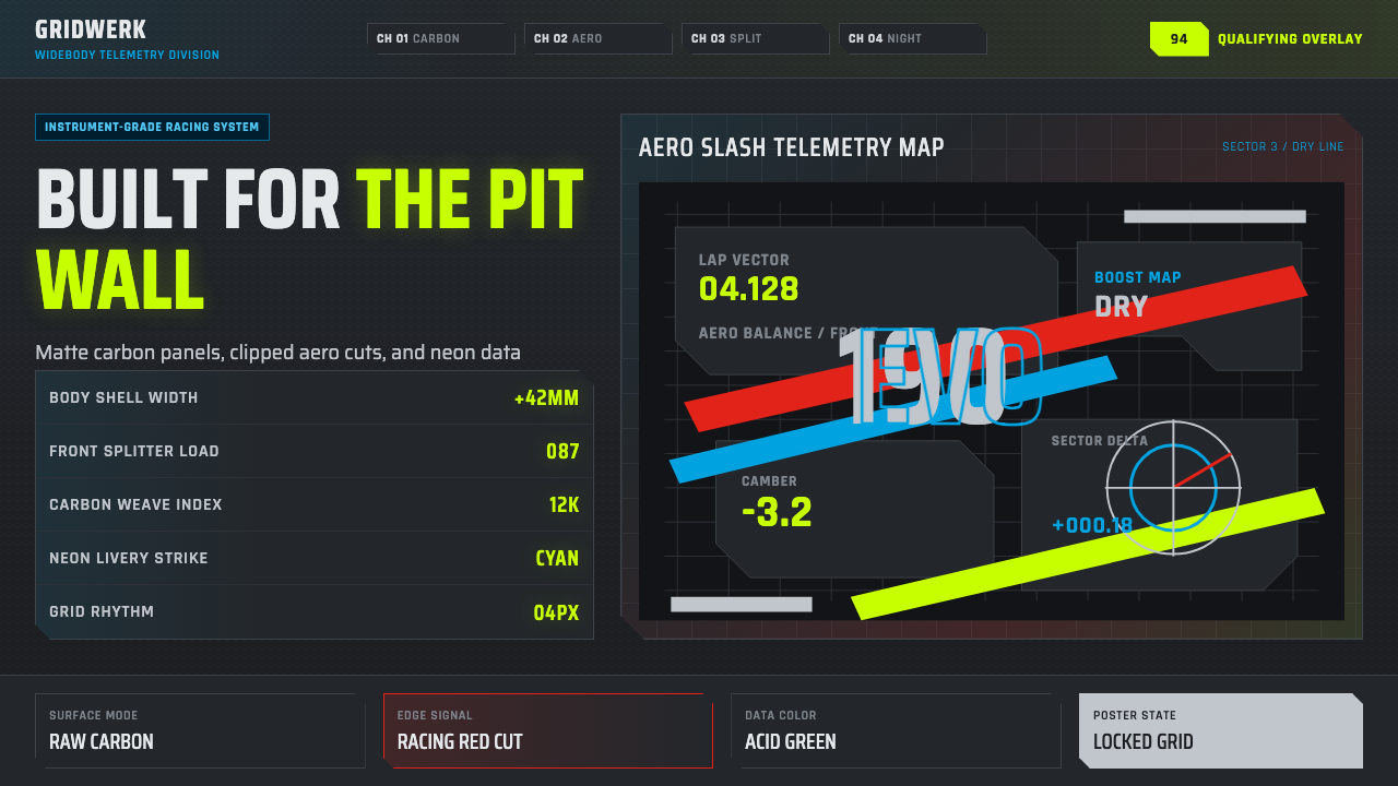 DTM Touring CarEngineered aggression. Carbon black grid, gunmetal type, cyan and acid teleme…工程化攻击感。碳黑网格、枪灰字体、青蓝与酸绿遥测斜线。
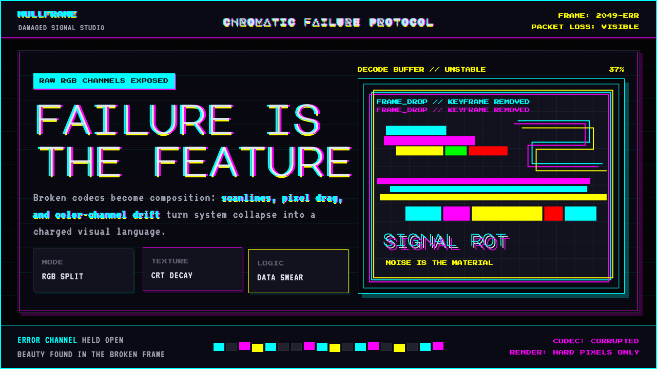 Glitch DatamoshErrors as composition. Corrupted JPEGs, RGB splits, scanlines — failure treat…把数字错误升华为视觉语言:损坏的 JPEG、RGB 色差偏移、扫描线、像素排序…
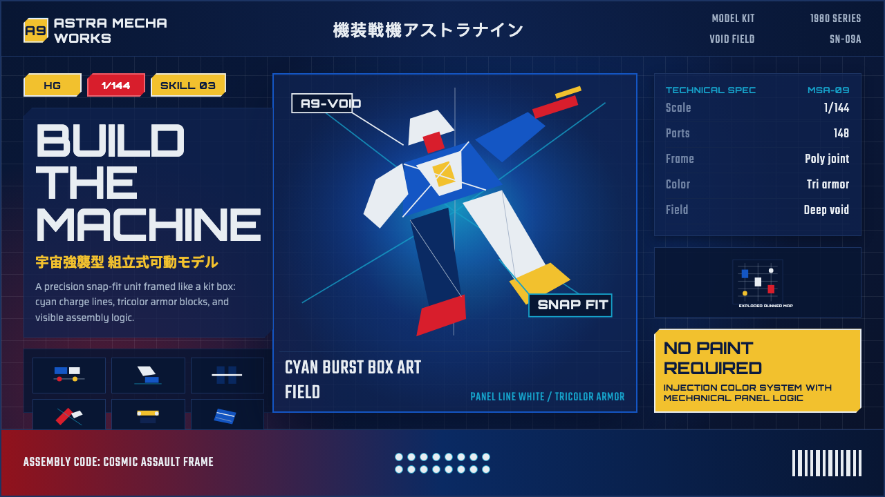 Gunpla Model BoxBuild-sheet drama. Cosmic navy, cyan burst, tricolor armor, and spec-panel gr…拼装说明般的戏剧感:宇宙蓝、青蓝爆光、三色装甲与参数网格。