What is Glitch Datamosh?什么是 Glitch Datamosh?
Glitch Datamosh treats digital failure as raw material — corrupted frames, chromatic splits, and pixel-sorting artifacts elevated into a deliberate aesthetic language.故障数据碾压将数字错误视为原材料——损坏的帧、色差分裂与像素排序痕迹,被升华为一套刻意为之的视觉语言。
Glitch Datamosh in briefGlitch Datamosh 速览
Glitch Datamosh is a digital art and design aesthetic that treats the visual artifacts of broken or corrupted media as compositional elements rather than errors to be corrected. Corrupted JPEG blocks, datamoshed video frames in which motion data from one clip bleeds into another, RGB channel splits that pull the red, green, and blue layers of an image apart in space, and pixel-sorting trails that streak and smear across a photograph — all of these are symptoms of failing systems, repurposed as intentional aesthetic tools.故障数据碾压是一种数字艺术与设计美学,它将损坏或腐化媒体产生的视觉痕迹视为构图元素,而非需要纠正的错误。损坏的 JPEG 色块、来自一段视频的运动数据渗入另一段的数据碾压帧、将图像红绿蓝三通道在空间上撕裂开来的 RGB 分离,以及在照片上拉出条纹与涂抹的像素排序轨迹——这些都是系统故障的症状,被重新诠释为刻意为之的美学工具。
The style operates on a fundamental inversion: what digital culture normally hides — the seams, the glitches, the moments when a system breaks down — becomes the subject and the substance of the work. A datamoshed image does not simulate damage; it actually is damaged, or processed in a way that replicates damage. This gives the work a quality of raw authenticity that is difficult to achieve through conventional design: the artifacts are real, and the audience, having encountered corrupted media in everyday life, recognizes them as real.这种风格建立在一个根本性的倒置之上:数字文化通常会隐藏的东西——接缝、故障、系统崩溃的瞬间——成为了作品的主题与实质。一张数据碾压的图像并非模拟损坏,它实际上就是受损的,或以复制损坏效果的方式处理过的。这赋予了作品难以通过常规设计手段获得的原始真实感:这些痕迹是真实的,而观众在日常生活中曾遭遇过损坏的媒体,他们能辨认出这种真实。
Visually, the aesthetic is dark in mood and neon in palette. Deep blacks and near-blacks dominate grounds, against which electric magentas, acid greens, blown-out cyans, and aggressive reds appear in streaks, halos, and displaced channels. The human figure — particularly the face — is a recurring subject, rendered distorted, smeared, or fragmented into colored bands. The overall impression is one of technological unease: a world where the infrastructure of image-making has become visible and unstable.在视觉上,这种美学氛围幽暗而色调霓虹。深黑与近黑色主导底面,在其上,电气品红、酸性绿、过曝的青色与侵略性的红色以条纹、光晕和错位通道的形态出现。人体——尤其是面部——是一个反复出现的主题,被呈现为扭曲、涂抹或碎裂成彩色带状的形态。整体印象是一种技术性的不安感:一个图像生产基础设施已变得可见且不稳定的世界。
See the Glitch Datamosh design system查看 Glitch Datamosh 完整设计系统
Where does Glitch Datamosh come from?Glitch Datamosh 从何而来?
The roots of glitch aesthetics reach into the earliest moments of consumer digital technology. In the 1980s and 1990s, as home computers and early video hardware became widespread, users began encountering corruption artifacts — scrambled pixels from bad RAM, streaked video from damaged tape heads, the characteristic JPEG blocking of heavily compressed images — as everyday annoyances. A small number of artists began to notice that these failures had a visual character worth exploring. Early experiments included deliberately damaging floppy disks, opening image files in audio editors to produce scrambled results, and physically bending cartridge hardware mid-operation.故障美学的根源可追溯至消费级数字技术最初普及的年代。在1980至1990年代,随着家用电脑与早期视频硬件的广泛普及,用户开始将损坏痕迹——坏内存造成的像素乱码、磁头受损导致的视频条纹、过度压缩图像特有的 JPEG 色块——视为日常烦恼。少数艺术家开始注意到这些故障具有值得探索的视觉特质。早期实验包括故意损坏软盘、在音频编辑器中打开图像文件以产生乱码效果,以及在运行时物理弯折游戏卡带硬件。
Cory Arcangel's 2002 work Super Mario Clouds — in which he removed all game sprites from a Nintendo cartridge, leaving only the scrolling cloud background — marked an early high-profile intersection of artist intervention, digital culture nostalgia, and systems thinking. Arcangel's approach was conceptual: the corruption was controlled and precise, the result spare and meditative rather than chaotic. Around the same time, a diffuse online community of net-artists and early bloggers was developing a shared vocabulary of glitch techniques and sharing them through forums and early social media, building the aesthetic from the bottom up.科里·阿坎格尔2002年的作品《超级马里奥云》——他从任天堂卡带中移除了所有游戏精灵,只留下滚动的云朵背景——标志着艺术家干预、数字文化怀旧与系统思维的一次早期高知名度交汇。阿坎格尔的方式是概念性的:损坏是受控且精确的,结果简洁而沉思,而非混沌。大约同期,一个松散的网络艺术家与早期博主群体正在网络论坛与早期社交媒体上开发和分享共同的故障技法词汇,从下而上建构着这一美学。
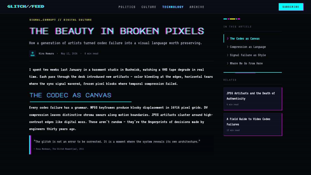
The theoretical underpinning arrived with Rosa Menkman's foundational text The Glitch Moment(um), published in 2011. Menkman, a Dutch media artist and theorist, argued that glitch art was not merely a visual style but a critical practice — a way of making the normally invisible workings of digital infrastructure visible and questioning the assumption that technological systems should be seamless and transparent. Her framework gave the existing practice an intellectual vocabulary and legitimacy, and attracted attention from academic institutions including Goldsmiths London and the MIT Media Lab, both of which became centers for critical digital media study.理论支撑随着罗莎·门克曼2011年的奠基性文本《故障时刻》的出版而到来。门克曼是荷兰媒体艺术家与理论家,她主张故障艺术不仅仅是一种视觉风格,而是一种批判性实践——一种使数字基础设施通常不可见的运作机制变得可见、并质疑技术系统应当无缝且透明这一假设的方式。她的框架为既有实践赋予了知识性词汇与合法性,并吸引了包括伦敦金史密斯学院与麻省理工媒体实验室在内的学术机构的关注,两者均成为批判性数字媒体研究的中心。
The aesthetic crystallized into a recognizable mainstream style between roughly 2010 and 2015. Music videos by major artists — Kanye West's Welcome to Heartbreak directed by Nabil, Beyoncé's Hold Up, and a wave of electronic and hip-hop productions — brought datamoshing and RGB-splitting techniques to enormous audiences. Simultaneously, the rise of Instagram and Tumblr created platforms where glitch-influenced image-making could circulate rapidly, and a generation of graphic designers began incorporating chromatic aberration, scanlines, and pixel-sorting into commercial work. By the mid-2010s, the aesthetic had become a recognizable shorthand for themes of technology, anxiety, surveillance, and post-internet identity.大约在2010至2015年间,这种美学凝固为一种可辨识的主流风格。多位重量级艺术家的音乐录影带——纳比尔执导的坎耶·韦斯特《Welcome to Heartbreak》、碧昂斯的《Hold Up》,以及一波电子音乐与嘻哈作品——将数据碾压与 RGB 分离技术带入了广泛的受众视野。与此同时,Instagram 与 Tumblr 的崛起创造了平台,使受故障影响的图像制作能够迅速传播,一代平面设计师开始将色差、扫描线与像素排序融入商业作品。到2010年代中期,这种美学已成为技术、焦虑、监控与后互联网身份等主题的可辨识简写。
What defines the Glitch Datamosh look?Glitch Datamosh 的视觉特征是什么?
Chromatic Aberration and Channel Splitting色差与通道分离
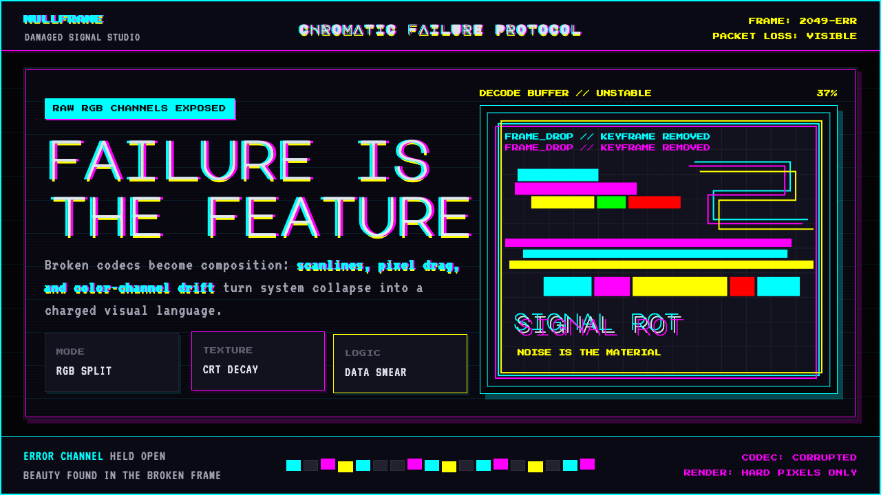
The most immediately recognizable characteristic of glitch aesthetics is the deliberate misalignment of color channels. In an authentic glitch or a faithful simulation, the red, green, and blue layers of an image separate in space — one shifts left, another right, a third remains centered — creating a ghosted, prismatic halo around edges and subjects. The effect evokes both the physical failure of analog CRT displays and the compression artifacts of digital video. Applied with restraint, it reads as a subtle vibration; pushed to extremes, it dissolves figures into bands of displaced color.故障美学最直接可辨的特征,是对色彩通道的刻意错位。在真实故障或忠实模拟中,图像的红、绿、蓝三层在空间中相互分离——一层向左移,另一层向右移,第三层保持居中——在边缘与主体周围形成幽灵般的棱镜光晕。这种效果同时唤起模拟 CRT 显示器的物理故障与数字视频压缩痕迹。以克制手法运用时,它呈现为一种微妙的振动感;推至极端时,它将形体消解为错位色彩的条带。
Datamosh and Motion Bleed数据碾压与运动渗漏
Datamoshing is a technique specific to compressed video codecs, in which the keyframe data of one clip is removed or corrupted so that the motion vectors from a preceding clip persist into new content. The result is a smearing or melting of motion information across a cut — flesh tones from one scene bleed across the geometry of another, backgrounds liquefy while foreground subjects remain sharp, or a face slowly morphs into the landscape behind it. In still-image design, this quality is evoked through deliberate smear and stretch, particularly along horizontal axes, as though a single frame were caught mid-corruption.数据碾压是一种特定于压缩视频编解码器的技术,通过移除或损坏一段视频的关键帧数据,使前一段视频的运动向量持续渗入新内容。结果是运动信息在剪切点跨越地融化或涂抹——一个场景的肤色渗入另一个场景的几何形体,背景液化而前景主体保持清晰,或一张面孔缓缓融入其身后的风景。在静态图像设计中,这种品质通过刻意的涂抹与拉伸来唤起,尤其沿水平轴方向,仿佛单帧图像被捕捉于损坏进行时。
Dark Ground with Neon Palette暗底与霓虹色板
The glitch aesthetic is almost universally dark in its ground treatment. Deep blacks and saturated near-blacks serve as the dominant field, against which neon and fluorescent accent colors — electric magentas, acid greens, blown-out cyans, hot reds — operate at full saturation. This combination evokes the phosphorescent glow of CRT monitors, the color bleeding of analog VHS tape, and the oversaturated palette of early computer graphics. The darkness is not empty or minimal; it is dense and slightly unstable, often broken by grain, scanlines, or compression noise.故障美学在底面处理上几乎普遍是深色调的。深黑与高饱和近黑色作为主导底场,在其上,霓虹与荧光强调色——电气品红、酸性绿、过曝的青色、炽热的红色——以全饱和度运作。这种组合唤起 CRT 显示器的荧光发光、模拟 VHS 磁带的颜色渗漏,以及早期电脑图形的过饱和色板。这种黑暗并非空洞或极简;它是密集且略带不稳定性的,常被颗粒、扫描线或压缩噪点所打破。
Scanlines and Compression Artifacts扫描线与压缩痕迹
Horizontal scanlines — thin, evenly spaced dark lines that cross the composition — reference the raster scan of CRT displays and early video monitors. They impose a visible mechanical grid on top of whatever image sits beneath, flattening and texturizing simultaneously. JPEG compression artifacts — the blocky eight-by-eight-pixel grid that appears when compression is pushed too hard — are similarly used to create fields of colored noise and texture. Both effects layer a second visual system over the primary image, creating a sense that the work exists inside a screen or transmission rather than on a neutral surface.水平扫描线——穿越构图的细密、均匀分布的暗线——指涉 CRT 显示器与早期视频监视器的光栅扫描机制。它们将一个可见的机械网格叠加在任何底层图像之上,同时产生平面化与质感化的效果。JPEG 压缩痕迹——压缩过度时出现的八乘八像素方格网格——同样被用来创造彩色噪点与纹理的区域。两种效果都在主图像上叠加了第二套视觉系统,制造出一种作品存在于屏幕或传输内部、而非中性表面之上的感知。
Pixel Sorting像素排序
Pixel sorting is a technique in which the pixels of an image are algorithmically reordered based on properties such as brightness, hue, or saturation, typically along a single axis. The result is a dramatic streak or trail — portions of the image that meet a threshold condition smear horizontally or vertically, creating long ribbons of blended color while adjacent areas remain intact. The aesthetic effect is somewhere between a long photographic exposure and a data visualization: the underlying image remains recognizable but appears to be flowing or disintegrating in one direction. Pixel sorting is often the most visually dramatic element in glitch composition.像素排序是一种技术,通过算法根据亮度、色调或饱和度等属性沿单一轴向对图像像素重新排列。结果是戏剧性的条纹或拖尾——满足阈值条件的图像区域在水平或垂直方向上涂抹扩散,形成混合色彩的长条带,而相邻区域保持完整。美学效果介于长曝光摄影与数据可视化之间:底层图像仍然可辨认,但看起来正在沿某一方向流动或瓦解。像素排序往往是故障构图中视觉上最戏剧性的元素。
The Distorted Figure变形的人体
The human body — and especially the face — occupies a privileged position in glitch imagery. When a face is subjected to datamoshing, channel-splitting, or pixel-sorting, the distortion carries psychological weight that an abstract field of noise does not. Eyes displaced from their sockets, a jaw smeared horizontally across a dark ground, a portrait rendered as overlapping ghost images in three misaligned colors — these configurations produce a specific kind of unease that connects glitch art to wider themes of identity, surveillance, and the instability of digital selfhood. The figure is not used for portraiture; it is used as a site of disintegration.人体——尤其是面部——在故障图像中占据优先地位。当一张脸经历数据碾压、通道分离或像素排序时,这种变形所承载的心理重量,是抽象噪点场域所无法企及的。从眼眶中错位的眼睛、水平涂抹在暗底上的下颌、以三种错位颜色呈现为重叠幽灵图像的肖像——这些构型产生一种特定的不安感,将故障艺术与身份认同、监控,以及数字自我不稳定性等更广泛主题联结起来。这里的人体不是用于肖像刻画,而是用作瓦解的场所。
Controlled Chaos and Signal/Noise Tension受控的混沌与信号/噪声张力
Despite appearances, skilled glitch composition is highly controlled. The most effective work sets areas of legibility against areas of corruption — a recognizable subject floats in a field of noise, or a clean typographic element anchors a composition otherwise given over to distortion. This signal-to-noise tension is what separates glitch design from undifferentiated visual chaos: the audience must be able to read something, even if the reading is effortful, for the corruption to function as content rather than simply as obstruction. The art lies in calibrating exactly how much of the signal to preserve.尽管表面看来如此,熟练的故障构图实际上是高度受控的。最有效的作品在清晰区域与腐化区域之间制造张力——一个可辨认的主体浮现于噪点场域之中,或一个干净的字体元素锚定着其余部分已被变形接管的构图。这种信号与噪声的张力,正是将故障设计与无差别视觉混沌区分开来的关键:观众必须能够读取某些东西,即便读取本身需要耗力,这样损坏才能作为内容而非单纯的阻碍而发挥作用。艺术在于精确校准究竟保留多少信号。
See the Glitch Datamosh design system查看 Glitch Datamosh 完整设计系统
Who shaped Glitch Datamosh?谁塑造了 Glitch Datamosh?
Dutch media artist and theorist Rosa Menkman is the most important single figure in the theorization of glitch art. Her 2011 publication The Glitch Moment(um) provided the movement with an intellectual framework, arguing that glitch is not a failure of technology but a productive rupture — a moment when the normally opaque workings of a digital system become visible and open to critique. Menkman continues to create glitch-based visual works, conduct academic research, and develop taxonomies for artifact types that have become standard reference in critical digital media studies. Her ongoing influence bridges artistic practice and theoretical scholarship in a way that few practitioners in the field match.荷兰媒体艺术家与理论家罗莎·门克曼是故障艺术理论化进程中最重要的单一人物。她2011年出版的《故障时刻》为这场运动提供了知识框架,主张故障不是技术的失败,而是一种生产性断裂——数字系统通常不透明的运作在此时刻变得可见并向批判开放。门克曼持续创作基于故障的视觉作品、开展学术研究,并发展出已成为批判性数字媒体研究标准参考的痕迹类型分类法。她持续的影响力以少有人能企及的方式,在艺术实践与理论学术之间架设桥梁。
New York-based artist Cory Arcangel pioneered the intervention approach to digital glitch, creating work that manipulates existing hardware and software systems rather than generating noise from scratch. His 2002 Super Mario Clouds — achieved by carefully hacking a Nintendo cartridge to remove all sprites except the scrolling clouds — exemplifies the conceptual precision of his practice: the intervention is minimal, the result uncanny, the point sharp. Arcangel's work established that glitch art could be collected, exhibited, and taken seriously by major institutions, and his early adoption of web-native distribution helped establish the cultural norms of net-art more broadly.纽约艺术家科里·阿坎格尔开创了数字故障的干预方法,创作通过操纵现有硬件与软件系统、而非从头生成噪声的作品。他2002年的《超级马里奥云》——通过精心破解任天堂卡带、移除除滚动云朵外的所有精灵而实现——体现了其实践的概念精确性:干预是最小化的,结果是令人难安的,观点是鲜明的。阿坎格尔的工作确立了故障艺术可被主要机构收藏、展出并认真对待的先例,他对网络原生传播的早期采用,也更广泛地帮助建立了网络艺术的文化规范。
Chicago-based artist and educator Nick Briz occupies a unique position in the glitch community as both practitioner and pedagogue. His widely circulated tutorials and educational videos on glitch techniques made the practice accessible to a generation of digital artists who encountered it through the open internet rather than institutional art education. Briz is notable for his insistence on the political and critical dimensions of glitch practice — he argues consistently that how we make glitch matters as much as what it looks like, and that the choice to work with broken systems is itself a form of commentary on the systems we live inside.芝加哥艺术家与教育者尼克·布里兹在故障社群中以兼具实践者与教育者的身份占据独特位置。他广泛传播的故障技法教程与教学视频,使一代通过开放互联网而非机构艺术教育接触这一实践的数字艺术家得以入门。布里兹以对故障实践的政治性与批判性维度的坚持而著称——他始终主张,我们如何制造故障与故障看起来如何同等重要,选择与损坏的系统共事,本身就是对我们所生活的系统的一种评论。
Phillip Stearns works at the intersection of glitch aesthetics and physical fabrication, most notably through his Glitch Textiles project, in which corrupted image data is woven directly into fabric using industrial Jacquard looms. The resulting textiles materialize the visual language of digital error in a medium that predates the computer — the same punch-card logic that underlies Jacquard weaving is a conceptual ancestor of digital binary code. Stearns's practice demonstrates that glitch is not confined to screens or transmission; the formal vocabulary of corruption can migrate into any medium that can encode and decode visual information.菲利普·斯特恩斯在故障美学与实体制造的交汇处工作,最具代表性的是他的《故障织物》项目——损坏的图像数据通过工业提花织机直接编织进布料。由此产生的织物在一种早于计算机的媒介中将数字错误的视觉语言实体化——提花织造所依赖的穿孔卡片逻辑,正是数字二进制码的概念先祖。斯特恩斯的实践表明,故障并不局限于屏幕或传输;损坏的形式词汇可以迁移至任何能够编码与解码视觉信息的媒介。
How do you use Glitch Datamosh today?今天怎么用 Glitch Datamosh?
Glitch Datamosh is a high-intensity style that communicates technological unease, subcultural edge, and self-aware digitality. Applying it effectively requires understanding not just its visual grammar but the emotional and contextual signals it sends. It is not a neutral backdrop — it makes claims about the content it frames, positioning that content as raw, transgressive, or aware of its own mediation. This makes it powerful in the right contexts and actively counterproductive in the wrong ones.故障数据碾压是一种高强度风格,传递技术性不安感、亚文化锐度与自我意识的数字性。有效运用它,不仅需要理解其视觉语法,还需要理解它所发出的情感与语境信号。它不是中性背景——它对所框架的内容做出主张,将该内容定位为原始的、越界的,或对自身媒介化有所意识的。这使它在正确的语境中极具力量,在错误的语境中则会适得其反。
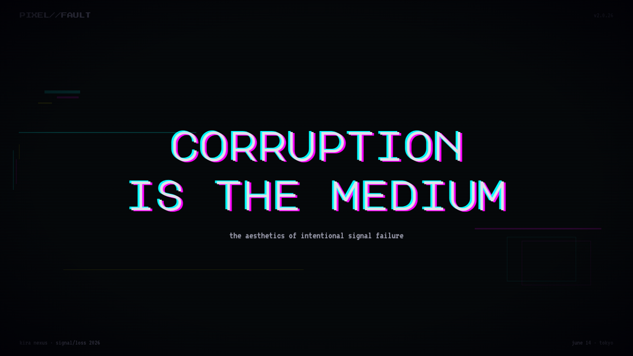
For presentation slides, the style works best on covers, section dividers, and high-stakes feature reveals rather than on data-heavy content pages. A cover using glitch aesthetics should anchor one legible typographic element — typically the title and date — against a field of controlled distortion; the corruption should frame the text, not compete with it. Section dividers can carry more visual intensity, using full-screen pixel-sorting or channel-split imagery as a palate cleanser between major topics. Data slides, however, should be restrained: charts and graphs require clean grounds and unambiguous color encoding; glitch texture introduced into a bar chart will undermine legibility without adding meaning. Reserve the distortion for editorial moments, not analytical ones.对于演示文稿,这种风格最适合封面、章节分割页与高关注度的功能揭示,而非数据密集的内容页。使用故障美学的封面应将一个可读的字体元素——通常是标题与日期——锚定在受控变形的底场中;损坏应该框住文字,而非与之竞争。章节分割页可以承载更强的视觉强度,将全屏像素排序或通道分离图像用作主要话题之间的视觉换气。然而数据页应保持克制:图表和图形需要干净的底面与无歧义的色彩编码;在柱状图中引入故障纹理会损害可读性而不增加意义。将变形保留给编辑性时刻,而非分析性时刻。
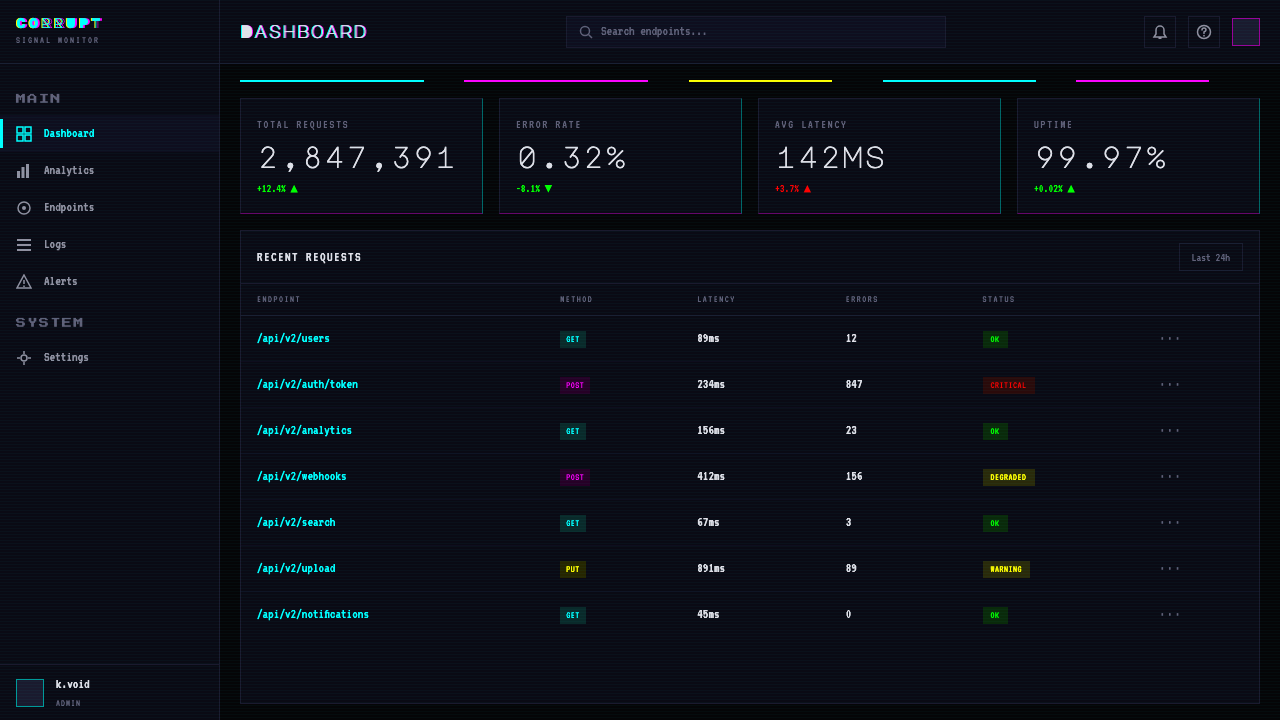
For web interfaces and dashboards, glitch aesthetics suit dark-mode products in creative technology, music, gaming, or security sectors where the aesthetic signals insider familiarity with the digital substrate. Applied to a dashboard, the style works through texture and micro-detail rather than wholesale distortion: scanline overlays at low opacity on hero panels, subtle channel-split on hover states for interactive elements, pixel-noise texture fields as background surfaces rather than in foreground content. Pricing pages in this style pair dark grounds with neon accent colors to differentiate tiers, using the saturation and vibrancy of glitch-adjacent hues as a hierarchy signal. Navigation and body text must remain fully legible — the glitch is environment, not obstruction.对于网页界面与仪表板,故障美学适合创意技术、音乐、游戏或安全领域的深色模式产品,在这些领域中,这种美学向内行观众发出对数字基底的熟悉感信号。应用于仪表板时,这种风格通过质感与微细节而非全面变形来运作:主视觉区域以低透明度扫描线叠加,交互元素的悬停状态以细微通道分离处理,像素噪点纹理作为背景表面而非前景内容。这种风格的定价页面将深色底面与霓虹强调色搭配,用故障相邻色调的饱和度与鲜艳度作为层级信号。导航与正文必须保持完全可读——故障是环境,而非障碍。
For editorial and marketing work — album artwork, poster campaigns, event promotion, fashion editorial — the style has its most natural habitat. Here the full visual grammar can deploy without accessibility constraints: a face dissolving into color channels, a logotype with deliberately misaligned layers, a full-bleed background of pixel-sorted imagery overlaid with sparse clean typography. The most effective editorial applications use the contrast between the distorted image layer and a single clean typographic layer as the primary compositional tension. Marketing materials for technology launches, cultural events, and creative platform announcements have used this aesthetic to signal that the product occupies territory at the edge of mainstream digital culture — aware of its own construction, unafraid of its own failure.对于编辑与营销作品——专辑封面、海报活动、活动宣传、时尚编辑——这种风格有其最自然的栖息地。在这里,完整的视觉语法可以无障碍访问性约束地展开:一张消解为色彩通道的面孔,刻意错位叠层的标志字体,全出血的像素排序图像背景上叠加稀疏干净的字体。最有效的编辑应用,将变形图像层与单一干净字体层之间的对比作为主要构图张力。技术发布、文化活动与创意平台公告的营销素材,已用这种美学来表明产品占据主流数字文化边缘的领域——对自身构建有所意识,对自身失败无所畏惧。
The most common mistake when applying glitch aesthetics is applying distortion indiscriminately, without preserving any signal. Effective glitch composition depends on contrast between corrupted and legible zones — if everything is equally distorted, the distortion ceases to read as deliberate and becomes visual noise. A secondary mistake is using all the aesthetic markers simultaneously at full intensity: maximum chromatic aberration, full pixel-sorting, scanlines at high opacity, and heavy JPEG blocking combined produce cacophony rather than tension. The strongest work picks one or two primary distortion modes and uses the others sparingly as supporting texture. Finally, the style's darkness and intensity make it poorly suited to contexts requiring warmth, approachability, or trust-building — healthcare, financial services, children's products, and consumer goods aimed at broad general audiences should approach with significant caution or avoid it entirely.应用故障美学时最常见的错误,是不加区分地施加变形,而不保留任何信号。有效的故障构图依赖腐化区域与清晰区域之间的对比——如果所有内容同等程度地变形,变形就不再被解读为刻意为之,而成为视觉噪声。第二个常见错误是同时以最大强度使用所有美学标记:最大程度的色差、完整的像素排序、高透明度的扫描线,与严重的 JPEG 色块叠加,产生的是喧嚣而非张力。最有力的作品选择一到两种主要变形模式,将其余作为辅助质感节制使用。最后,这种风格的幽暗与强度使其不适合需要温暖感、亲和力或建立信任的语境——医疗保健、金融服务、儿童产品,以及面向广泛普通受众的消费品,应当显著谨慎或完全回避。
A note on cultural context: glitch aesthetics carry specific subcultural associations — with electronic music, hacker culture, net-art, and post-internet identity politics — that will be recognized by audiences familiar with those communities and may read as affectation or noise to audiences who are not. The style works best when the product or context genuinely shares those associations, and least well when applied purely decoratively by brands seeking to borrow the aesthetic's edge without earning it.
See the Glitch Datamosh design system查看 Glitch Datamosh 完整设计系统
Glitch Datamosh — FAQGlitch Datamosh · 常见问题
Is glitch design the same as vaporwave?故障设计和蒸汽波是同一回事吗?
They share some ancestry — both are post-internet aesthetics that engage with digital nostalgia and consumer media culture — but they operate differently. Vaporwave draws on early computer graphics, mall aesthetics, and late-1980s through mid-1990s consumer culture; its palette is pastel and its mood is ironic melancholy. Glitch aesthetics are darker, more technically specific in their artifact references, and more politically inflected toward critique of digital infrastructure. Vaporwave finds beauty in the smooth surfaces of corporate culture; glitch art finds beauty in those surfaces breaking down. They can coexist in the same composition, but they pull in opposite emotional directions.两者有共同的渊源——都是后互联网美学,都与数字怀旧和消费媒体文化产生关联——但运作方式不同。蒸汽波借鉴早期电脑图形、购物中心美学与1980年代末至1990年代中期的消费文化;其色板是粉彩色调,情绪是带有讽刺意味的忧郁。故障美学更为幽暗,在痕迹指涉上更具技术特异性,在批判数字基础设施上更具政治色彩。蒸汽波在企业文化光滑表面中发现美;故障艺术在这些表面的崩裂中发现美。两者可以共存于同一构图中,但它们在情感方向上向相反方向拉扯。
Do I need to use real corruption, or can I simulate the effects?我需要使用真实的损坏效果,还是可以模拟这些效果?
Simulation is standard practice in commercial and design contexts, and the visual results are often indistinguishable from the real thing. Authentic datamoshing requires codec manipulation and video editing skills that are not always accessible, and the results can be unpredictable. Most design work in this aesthetic uses filters, blend modes, layer displacement maps, and dedicated software to achieve chromatic aberration, scanline overlays, and pixel-sorting effects without engaging the underlying corruption mechanisms. The critical community sometimes draws a distinction between simulation and authentic glitch on philosophical grounds, but for applied design purposes, the visual outcome matters more than the process by which it was achieved.在商业与设计语境中,模拟是标准做法,视觉结果往往与真实损坏无法区分。真实的数据碾压需要编解码器操作与视频编辑技能,这些并非总是易于获取,且结果可能难以预料。这种美学中的大多数设计作品使用滤镜、混合模式、图层置换贴图和专用软件来实现色差、扫描线叠加与像素排序效果,而无需触及底层损坏机制。批判性社群有时从哲学立场上区分模拟与真实故障,但对于应用设计目的而言,视觉结果比实现过程更为重要。
Can glitch aesthetics work in a light-background layout?故障美学能在浅色背景版面上发挥作用吗?
It can, but the effect changes substantially. The neon accent colors that read as electric and urgent against a dark ground become more cheerful and less menacing on white or cream. Scanlines become visible marks rather than atmospheric texture. Chromatic aberration can work well on white — it carries the same optical quality — but pixel-sorting and JPEG artifact textures tend to read as decorative rather than disruptive when the ground is light. A light-ground glitch composition shifts the aesthetic register from technological dread toward something closer to pop-art playfulness. Whether that shift serves the design depends entirely on the context. Some applications — youth branding, playful consumer technology, editorial design for lifestyle publications — may benefit from the lighter reading.可以,但效果会发生实质性变化。在深色背景上呈现为电气感与紧迫感的霓虹强调色,在白色或奶油色上变得更为欢快、威胁感减弱。扫描线成为可见标记而非氛围性纹理。色差在白色底面上同样能有效运作——它保有相同的光学品质——但像素排序与 JPEG 痕迹纹理在浅色底面上往往更像装饰性而非破坏性。浅色底面的故障构图,将美学格调从技术性恐惧转向更接近波普艺术玩趣感的方向。这种转变是否服务于设计,完全取决于语境。某些应用——青年品牌、趣味性消费技术、生活方式出版物的编辑设计——可能从这种较轻的解读中获益。
How do I keep glitch design accessible and legible?如何在使用故障设计的同时保持可访问性与可读性?
The central rule is to never apply distortion effects to text that must be read. Reserve glitch effects for image layers, backgrounds, and decorative elements; keep typographic content on clean, undistorted layers with sufficient contrast against their ground. For body text and interface labels, the dark grounds typical of the aesthetic require light, high-contrast type — not mid-tone or low-contrast choices. Chromatic aberration applied to headlines can be effective if the underlying letterforms remain readable after the channel offset; test by removing the effect and checking that the base type passes contrast requirements independently. Screen-reader accessibility is not affected by visual glitch effects, so semantic HTML and alt text practices apply normally.核心规则是:绝不将变形效果应用于必须被阅读的文字。将故障效果保留给图像层、背景与装饰性元素;将字体内容置于干净、未变形的图层上,与底面保持足够的对比度。对于正文与界面标签,这种美学典型的深色底面需要浅色、高对比度的字体——而非中间调或低对比度的选择。应用于标题的色差可以有效,前提是底层字形在通道偏移后仍然可读;测试方法是去除效果,检查基础字体是否独立满足对比度要求。视觉故障效果不影响屏幕阅读器的可访问性,因此语义化 HTML 与替代文本规范照常适用。
Is this style too niche for mainstream commercial work?这种风格对于主流商业作品来说是否过于小众?
It depends on what mainstream means in a given context. In music, gaming, fashion, and youth-oriented consumer technology, glitch-adjacent aesthetics have been mainstream for over a decade — audiences in these sectors recognize and respond to the visual language without needing it explained. In financial services, healthcare, or broad-market consumer goods, the style would read as niche or jarring to most audiences. The practical test is whether the target audience has meaningful exposure to the cultural contexts — electronic music, net-art, hacker culture, streaming platform design — in which the aesthetic is already normalized. Where that exposure exists, the style reads as confident and culturally aware. Where it does not, it reads as arbitrary or aggressive.这取决于特定语境中“主流”的含义。在音乐、游戏、时尚与面向年轻受众的消费技术领域,故障相邻美学已经主流化超过十年——这些领域的受众能够辨认并回应这种视觉语言,无需解释。在金融服务、医疗保健或大众市场消费品领域,这种风格对大多数受众而言会显得小众或突兀。实际的判断标准是:目标受众是否对这种美学已被规范化的文化语境——电子音乐、网络艺术、黑客文化、流媒体平台设计——有实质性的接触。在这种接触存在的地方,这种风格传递自信与文化感知力;在不存在的地方,它显得任意或具有攻击性。
Related design styles相关设计风格
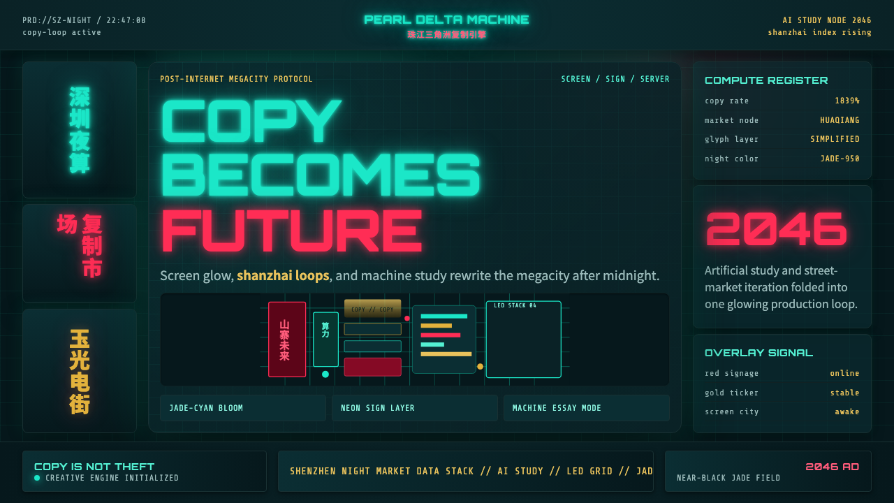 SinofuturismCopy becomes future. Jade-cyan grids, red signage, and Orbitron data stack th…复制成为未来。玉青网格、红色招牌与数据字叠起夜城。
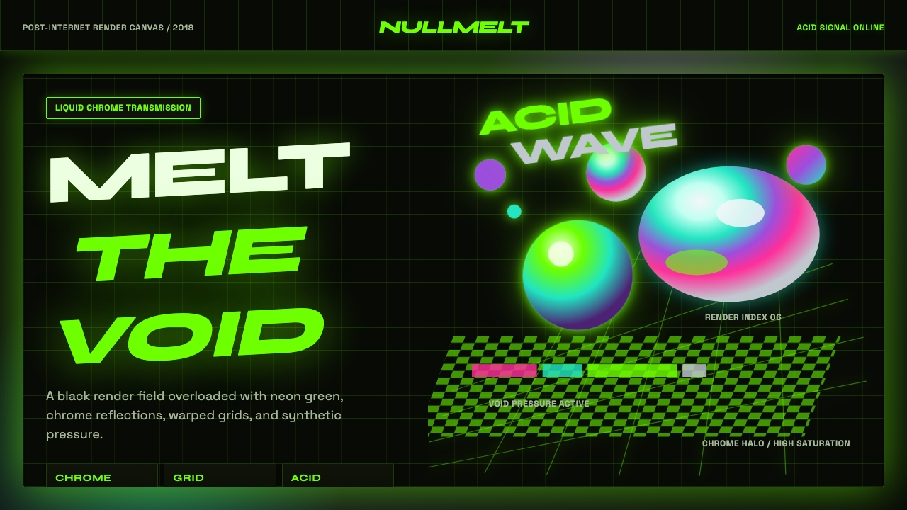 Acidwave 3D RenderPsychedelia hits the render engine. Neon green, chrome orbs, and warped grids…迷幻被塞进渲染引擎:霓虹绿、液态铬球与扭曲网格灼烧黑底。
 Detroit TechnoCold machines dream. Electric cyan circuits and chrome display type lock to a…冷机器在做梦。电青线路与铬感字形锁进黑色网格。
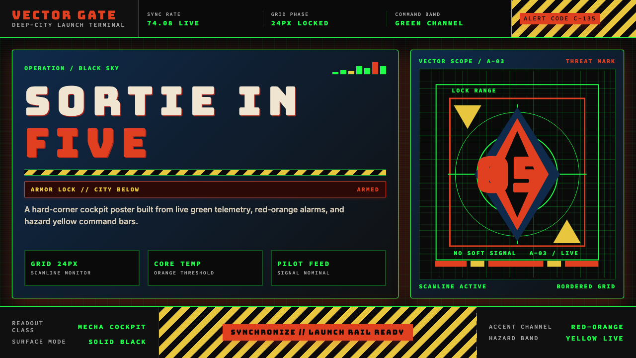 Neon Genesis EvangelionCockpit dread at launch. Tech-green grids, red-orange alarms, and hazard yell…出击前的驾驶舱压迫感。科技绿网格、橙红警报与危险黄条。
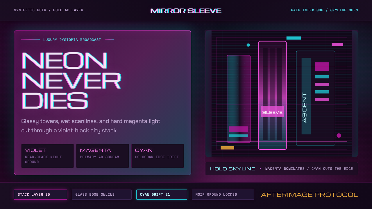 Altered CarbonNeon screams off noir. Magenta glass, cyan scanlines, and stacked vertical si…霓虹刺破黑夜:品红玻璃、青色扫描线与垂直招牌。
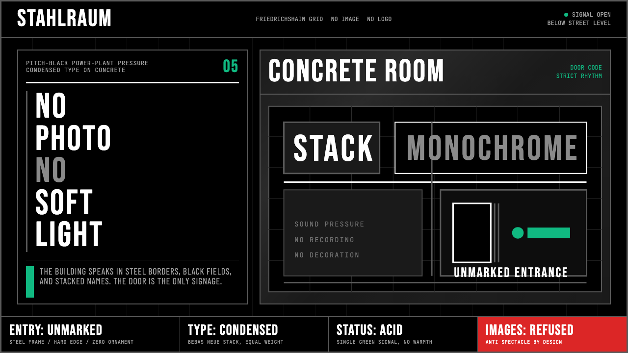 Berlin Techno (Berghain era)Refuses spectacle. Black grid, steel rules, condensed type, one acid-green si…拒绝景观:黑色网格、钢灰粗线、窄体大字,只留一盏酸绿信号。