What is Berlin Techno (Berghain era)?什么是 Berlin Techno (Berghain era)?
Berghain turned a decommissioned power plant into the world's most austere nightclub, and its visual language — pitch black, condensed type, zero logos, one acid signal — became the definitive aesthetic of Berlin techno.Berghain 将一座废弃发电厂变成全球最苦行的夜店,它的视觉语言——漆黑底色、窄体大字、零 logo、一盏酸信号——成为柏林电子乐美学的最终定义。
Berlin Techno (Berghain era) in briefBerlin Techno (Berghain era) 速览
Berlin Techno (Berghain era) is a design language born inside a decommissioned East Berlin power station and refined through two decades of club culture, flyer design, and the deliberate rejection of commercial spectacle. Its visual grammar is built on absolute black grounds, ultra-condensed sans-serif type, heavy horizontal rule lines, and an almost total absence of color — with the rare exception of a single acid-green or emergency-red signal that cuts through the void like a status indicator on industrial machinery.柏林电子乐(Berghain 时代)是一套诞生于东柏林废弃发电站、经过二十年俱乐部文化、传单设计与对商业景观的刻意拒绝而淬炼成形的设计语言。它的视觉语法建立在绝对的黑色底面、超窄体无衬线字体、粗重水平分割线,以及几近彻底的无色之上——唯一的例外是偶尔切入虚空的一点酸绿或警示红,如同工业机械上的状态指示灯。
The style encodes a philosophical position as much as an aesthetic one. Where most commercial design seeks to attract and seduce, Berlin Techno refuses. There are no gradients, no rounded corners, no decorative illustration, no photographic warmth. Surfaces are matte and unyielding — brushed-steel gray panels, concrete-textured fields, deep monochrome grounds. The typography is severe and functional, borrowing its condensed, all-caps logic from railway departure boards and industrial signage rather than from advertising.这套风格传达的是一种哲学立场,与其说是美学选择,不如说是价值宣言。当大多数商业设计竭力吸引与诱惑时,柏林电子乐选择拒绝。没有渐变,没有圆角,没有装饰插图,没有摄影的温度。表面是哑光的、冷硬的——拉丝钢灰面板、混凝土质感的色块、深沉的单色底面。字体排印严苛而功能性,借鉴的是铁路发车牌与工业标识的紧缩全大写逻辑,而非广告美学。
What makes this system coherent is its discipline around absence. The power of a Berlin Techno layout comes not from what is present but from how much has been stripped away. A date, a time, a name — set in condensed type at extreme scale against pure black — communicates everything the event needs to say. The austerity is not poverty of imagination; it is a statement that the music is the event, and the design's job is to get out of its way.使这套系统保持内聚力的,是它对缺席的纪律。一张柏林电子乐版面的力量,不来自于在场的元素,而来自于被剥除的一切。一个日期、一个时间、一个名字——以极大字号的窄体字排印在纯黑底上——传达了一场活动需要说的全部。这种苦行不是想象力的贫乏,而是一个声明:音乐才是活动本身,设计的使命是退场。
See the Berlin Techno (Berghain era) design system查看 Berlin Techno (Berghain era) 完整设计系统
Where does Berlin Techno (Berghain era) come from?Berlin Techno (Berghain era) 从何而来?
The story begins not with graphic designers but with a building. Berghain opened in 2004 in a former heating plant (Heizkraftwerk) that had served East Berlin during the divided-city era. The venue sits on the Friedrichshain-Kreuzberg border — a liminal zone that survived reunification as an industrial no-man's-land — and its architecture set the visual terms before any designer made a single decision. Poured concrete walls, steel staircases, cavernous dark rooms with no natural light: the building demanded a design language that matched its severity.故事的起点不是平面设计师,而是一栋建筑。2004 年,Berghain 在一座曾为东柏林服务的前热力发电厂(Heizkraftwerk)中开业。场馆坐落于弗里德里希斯海因区与克罗伊茨贝格区的交界地带——一个在统一后以工业无人地带姿态幸存下来的边界地带——其建筑在任何设计师做出第一个决定之前,就已经确立了视觉基调。浇筑混凝土的墙体、钢制楼梯、没有自然光的巨大暗室:这栋建筑要求一套能与其严峻气质相匹配的设计语言。
The visual culture of the Berlin techno underground had been forming since the early 1990s, when clubs like Tresor opened in another ruin — the vaults beneath a demolished department store on Potsdamer Platz. That first wave of Berlin club aesthetics — photocopied flyers, smeared type, no-budget black-and-white printing — established the norm that cheapness and austerity were virtues, not failures. By the time Berghain opened under co-founders Norbert Thormann and Michael Teufele, that anti-spectacular ethos had hardened into something deliberate and codified. The club's no-photography policy, enforced by door staff placing stickers over phone cameras, removed the visual document from the experience entirely — which paradoxically made the flyer and poster the only designed artifact that represented the club publicly.柏林电子乐地下文化的视觉语境早在 1990 年代初就开始形成,彼时 Tresor 等俱乐部在另一片废墟中开业——波茨坦广场一栋被拆除的百货公司地下金库。那一波柏林俱乐部美学的第一浪潮——复印传单、涂抹式字体、零预算黑白印刷——确立了一个规范:廉价与苦行是美德,不是失败。到 Berghain 在联合创始人 Norbert Thormann 和 Michael Teufele 的主导下开业时,这种反景观的精神已经凝固为某种刻意而有章可循的东西。俱乐部的禁止拍照政策——由门卫在手机摄像头上贴贴纸来执行——从体验中彻底抹去了视觉记录,这反而使传单与海报成为代表俱乐部公开形象的唯一设计物。
Resident DJs Marcel Dettmann and Ben Klock, along with the club's associated record label Ostgut Ton, extended the aesthetic into music packaging. Ostgut Ton sleeves are paradigmatic: they are almost universally black or near-black, typeset in condensed or extended sans-serif at large scale, with no artwork beyond abstract photography or pure graphic geometry. The label's visual identity — which has remained remarkably consistent from its founding through the 2010s — is the closest thing to an official design manual the scene has produced.驻场 DJ Marcel Dettmann 和 Ben Klock,连同俱乐部旗下厂牌 Ostgut Ton,将这套美学延伸至音乐包装。Ostgut Ton 的唱片封面具有范式意义:几乎清一色是黑色或近黑色,以大字号的紧缩或宽体无衬线字体排印,除了抽象摄影或纯几何图形外没有任何插图。这个厂牌的视觉识别系统——从成立之初到 2010 年代保持着惊人的一致性——是这个场景迄今最接近官方设计手册的存在。
The broader Berlin techno visual grammar of the Berghain era also absorbed influences from German industrial and public-information design: Deutsche Bahn signage, Cold War-era East German printed matter, the functional typography of Bahnhof departure boards. These references were not nostalgic; they were chosen because they solved the same problem — communicating essential information at speed and distance with zero decorative budget. The result, across two decades of flyers, websites, ticket platforms, and merchandise, is one of the most consistent and recognizable visual subcultures in contemporary music.Berghain 时代的柏林电子乐整体视觉语法还吸收了德国工业与公共信息设计的影响:德国铁路(Deutsche Bahn)的标识系统、冷战时代东德印刷品、火车站发车牌的功能性排版。这些参照并非出于怀旧,而是因为它们解决了相同的问题——在零装饰预算的条件下,以速度和距离传达必要信息。经过二十年的传单、网站、售票平台与周边产品,这一视觉语言成为当代音乐中最具一致性、最易辨认的视觉亚文化之一。
What defines the Berlin Techno (Berghain era) look?Berlin Techno (Berghain era) 的视觉特征是什么?
Ground and Surface底色与表面
The canonical ground is absolute, unmodulated black — not dark gray, not charcoal, but the deepest possible field, evoking the absence of light in a windowless concrete room. Secondary surfaces read as brushed steel or raw concrete: cool mid-tone grays with a slightly textured or matte quality, as if the material is industrial rather than designed. There are no gradients, no vignettes, no backgrounds that suggest light sources. The darkness is architectural, not atmospheric.标准底色是绝对的、无调制的黑——不是深灰,不是炭黑,而是可能存在的最深色域,唤起无窗混凝土房间里光的缺席。次级表面呈现为拉丝钢或原始混凝土的质感:带有轻微纹理或哑光感的冷色调中灰,仿佛材料本身是工业品而非设计物。没有渐变,没有暗角,没有任何暗示光源存在的背景。这种黑暗是建筑性的,不是氛围性的。
Typography字体排印
Type is the primary visual event. The characteristic choice is ultra-condensed or heavily extended sans-serif, set in all capitals at scales that dominate the composition — headlines that take up the full width of a flyer or screen, with almost no tracking and no concession to decorative variation. The logic comes from transit signage and industrial labeling: maximum information density, zero ornamentation. Body text, when it appears, is set at a small scale in a neutral weight, creating an extreme contrast between informational levels.字体排印是主要的视觉事件。标志性的选择是超窄体或重度宽体无衬线字体,以全大写、统治构图的字号排印——标题铺满传单或屏幕的全宽,几乎没有字距调整,也不作任何装饰性变化。其逻辑来自交通标识与工业标牌:最大信息密度,零装饰。正文(若出现)以小号中性字重排印,在信息层级之间制造极端的对比。
Color Logic色彩逻辑
Color is almost entirely absent as decoration. The working palette is black, deep concrete gray, and white or near-white for type — a monochrome system derived from the physical materials of the venue itself. When color appears, it functions as a signal rather than as aesthetic enrichment: acid green marks status, active states, or a single featured element; emergency red marks warnings or critical hierarchical breaks. These accent colors appear at most once per composition, at high contrast against the dark ground, never as background fields.色彩作为装饰几乎完全缺席。工作色板是黑色、深混凝土灰,以及用于文字的白色或近白色——一套源自场馆物理材料的单色系统。当色彩出现时,它作为信号而非美学丰富而存在:酸绿标示状态、活跃态或单一被强调的元素;警示红标示警告或关键层级断裂。这些强调色在每个构图中最多出现一次,以高对比度叠于深色底面之上,从不用作背景色块。
Rule Lines and Grid分割线与网格
Heavy horizontal rule lines — at a weight that would read as overscaled in most design contexts — serve as the primary structural element separating informational zones. They echo German Bahnhof signage and industrial printouts: precise, mechanical, functional. The underlying grid is strict but asymmetric in its application: elements lock to the grid with discipline but do not mirror across a central axis. Negative space is used aggressively, with large areas of pure black ground that function as compositional breathing room.粗重的水平分割线——其线重在大多数设计语境中会显得过度——作为分隔信息区域的主要结构元素。它们呼应德国火车站标识与工业打印输出:精确、机械、功能性的。底层网格严格,但在应用上是非对称的:元素有纪律地锁定于网格,却不以中轴镜像。负空间被激进地运用,大面积纯黑底色作为构图中的呼吸空间。
Texture and Material质感与材料
Where texture appears, it is the texture of industrial materials — concrete grain, brushed metal, the slight tooth of uncoated paper — rather than decorative pattern. This is not skeuomorphism; the textures do not simulate specific objects but evoke a category of material reality. In digital contexts, this translates to surfaces that resist glossiness: matte rendering, slight grain overlays, and a general avoidance of anything that suggests polish or consumer finish.若出现质感,那是工业材料的质感——混凝土颗粒、拉丝金属、非涂布纸张的轻微纸纹——而非装饰性图案。这不是拟物化设计;这些质感不模拟具体的物件,而是唤起一类物质现实。在数字场景中,这体现为抗拒光泽的表面:哑光渲染、轻微颗粒叠加,以及对一切暗示抛光或消费品质感的元素的普遍回避。
Zero Radius and Hard Edge零圆角与硬边
Corners are sharp. Every rectangle, every border, every card or panel element meets at a right angle with no rounding. This is not an oversight or a technical default — it is a direct reference to the physical world of concrete architecture, metal fabrication, and industrial furniture. Rounded corners read as consumer friendliness; sharp corners read as structural honesty. In the Berlin Techno system, this distinction carries moral weight: friendliness is a manipulation, structure is a fact.角是锐利的。每一个矩形、每一条边框、每一个卡片或面板元素,都以直角相交,没有任何圆角处理。这不是疏忽或技术默认值——它是对混凝土建筑、金属加工与工业家具的物理世界的直接参照。圆角传达消费品的友好感;锐角传达结构的诚实。在柏林电子乐系统中,这一区别具有道德重量:友好是一种操控,结构是一个事实。
Anti-Spectacle Economy反景观的节制
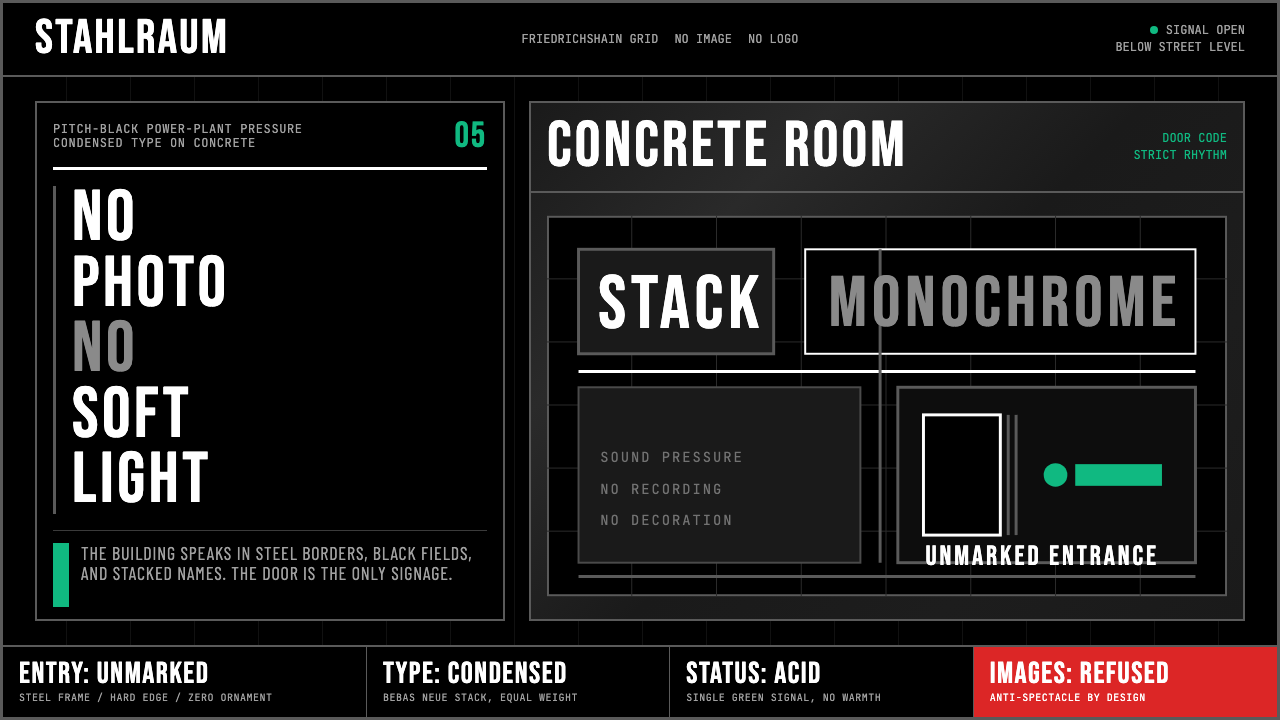
The system's most defining characteristic is what it refuses to include. No photography of performers. No lifestyle imagery. No decorative illustration. No badge, seal, or logo beyond a plain wordmark. No taglines. No social-proof elements. The informational content of a canonical Berlin Techno artifact — a flyer, a poster, a digital event listing — is purely operational: who, when, where. Everything beyond that is considered noise. This extreme economy creates a paradoxical effect: the design communicates exclusivity and seriousness precisely because it communicates so little.这套系统最决定性的特征是它拒绝包含的一切。没有表演者的摄影。没有生活方式图像。没有装饰性插图。除纯文字标识外没有任何徽章、印章或 logo。没有标语。没有社会证明元素。一件标准柏林电子乐设计物——传单、海报、数字活动列表——的信息内容是纯粹操作性的:谁、何时、何地。超出这些的一切都被视为噪音。这种极端的节制产生了一种悖论性效果:设计之所以传达出专属感与严肃性,恰恰是因为它传达得如此之少。
See the Berlin Techno (Berghain era) design system查看 Berlin Techno (Berghain era) 完整设计系统
Who shaped Berlin Techno (Berghain era)?谁塑造了 Berlin Techno (Berghain era)?
The two founders of Berghain — Thormann previously ran Snax, a queer party at Ostgut, the club that preceded Berghain in the same building — shaped the venue's radical anti-branding position from the outset. Their decision to enforce a no-photography policy, to refuse advertising, and to let the building speak for itself rather than constructing a commercial visual identity set the terms for the entire design language. The club's 'brand' is its absence of brand.Berghain 的两位创始人——Thormann 此前在 Ostgut(Berghain 在同一建筑中的前身)经营同性恋派对 Snax——从一开始就塑造了场馆激进的反品牌立场。他们做出的决定——执行禁止拍照政策、拒绝广告、让建筑本身发言而非构建商业视觉识别——确立了整套设计语言的前提。这家俱乐部的「品牌」,就是品牌的缺席。
Dettmann is one of Berghain's founding residents and a central figure at Ostgut Ton, the club's associated record label. His releases and the visual packaging of the label — consistently austere, monochrome, typographically dominant — helped codify the aesthetic beyond the physical space of the club. Dettmann's own DJ sets became inseparable from the visual identity: the music's relentless, functional intensity mirrors the design's refusal of spectacle.Dettmann 是 Berghain 的创始驻场 DJ 之一,也是俱乐部旗下厂牌 Ostgut Ton 的核心人物。他发行的作品以及厂牌的视觉包装——始终如一的苦行、单色、字体主导——帮助将这套美学固化为超越俱乐部物理空间的存在。Dettmann 的 DJ 演出与视觉识别变得难以区分:音乐无情的、功能性的强度,映照着设计对景观的拒绝。
Fellow Berghain resident Ben Klock extended the club's visual and sonic ethos through his own label, Klockworks. The Klockworks catalog is a case study in Berlin Techno design discipline: sleeves are almost invariably black with minimal type, catalog numbers function as titles, and the series has a documentary consistency across dozens of releases that reads more like an industrial archive than a music catalog. Klock's work illustrates how individual artists within the scene became designers-by-necessity, shaping the aesthetic through production decisions.同为 Berghain 驻场的 Ben Klock 通过自己的厂牌 Klockworks 延伸了俱乐部的视觉与声音精神。Klockworks 的目录是柏林电子乐设计纪律的典型案例:封面几乎清一色是黑色配以极简文字,目录编号充当标题,整个系列在数十张发行中保持着文献式的一致性,读来更像一份工业档案而非音乐目录。Klock 的工作说明了场景中的个体艺术家如何出于必要成为设计师,通过生产决策塑造美学。
Founded in 2006 as the in-house record label of Berghain and Panorama Bar, Ostgut Ton is the closest thing to a design authority the Berlin Techno scene has produced. Its visual identity — developed and maintained with extraordinary consistency over nearly two decades — is the primary public-facing artifact of the club culture. The label's sleeves, catalog design, and website collectively constitute a design system that influenced not only music packaging but also digital design in adjacent creative fields, from fashion to architecture to art direction.Ostgut Ton 于 2006 年作为 Berghain 与 Panorama Bar 的内部厂牌成立,是柏林电子乐场景迄今最接近设计权威的存在。其视觉识别系统——在近二十年间以惊人的一致性被发展与维护——是俱乐部文化最主要的公开面孔。厂牌的封面、目录设计与网站共同构成一套设计系统,影响范围不仅限于音乐包装,还延伸至时尚、建筑、艺术指导等相邻创意领域的数字设计。
Berghain's head doorman since its founding and a practicing photographer, Marquardt is a paradoxical figure in a no-photography venue. His own portraiture — high-contrast black-and-white photographs of the Berlin underground subculture, many taken in the era before Berghain — contributed to the visual vocabulary of darkness, industrial body aesthetics, and unsparing directness that the club's design language formalized. His presence at the door became itself an act of design: the human face of an institution that otherwise has none.Sven Marquardt 自开业起担任 Berghain 的首席门卫,同时也是一位活跃的摄影师——在一个禁止拍照的场馆里,这是一个自相矛盾的身份。他的人像摄影——柏林地下亚文化的高对比度黑白照片,许多拍摄于 Berghain 开业前的年代——为俱乐部设计语言所正式化的那套视觉词汇贡献了素材:黑暗、工业身体美学与不妥协的直接性。他站在门口本身就是一种设计行为:一家几乎没有人类面孔的机构的人类面孔。
How do you use Berlin Techno (Berghain era) today?今天怎么用 Berlin Techno (Berghain era)?
Berlin Techno (Berghain era) is among the most immediately recognizable styles available to a contemporary designer, which makes it both powerful and dangerous. Its strength lies in its absolute commitment to a set of values — severity, functionality, anti-spectacle — that read as authority and credibility in the right context. Misapplied, it reads as affectation or inaccessibility. The first question before adopting this system is always: does the product or content actually share those values, or is the design merely borrowing the aesthetic prestige of a culture it is not part of?柏林电子乐(Berghain 时代)是当代设计师可调用的辨识度最高的风格之一,这使它既强大又危险。它的力量在于对一套价值观的绝对承诺——严峻、功能性、反景观——这在恰当的语境中传达出权威感与可信度。一旦误用,它传达的是矫揉或拒人于千里之外。在采用这套系统之前,首先要回答的问题始终是:这个产品或内容是否真的共享这些价值观,还是设计仅仅在借用一种它并不属于的文化所积累的美学声望?
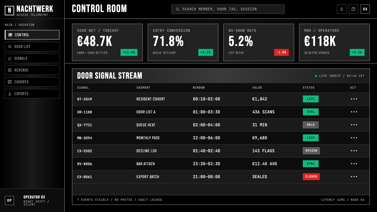
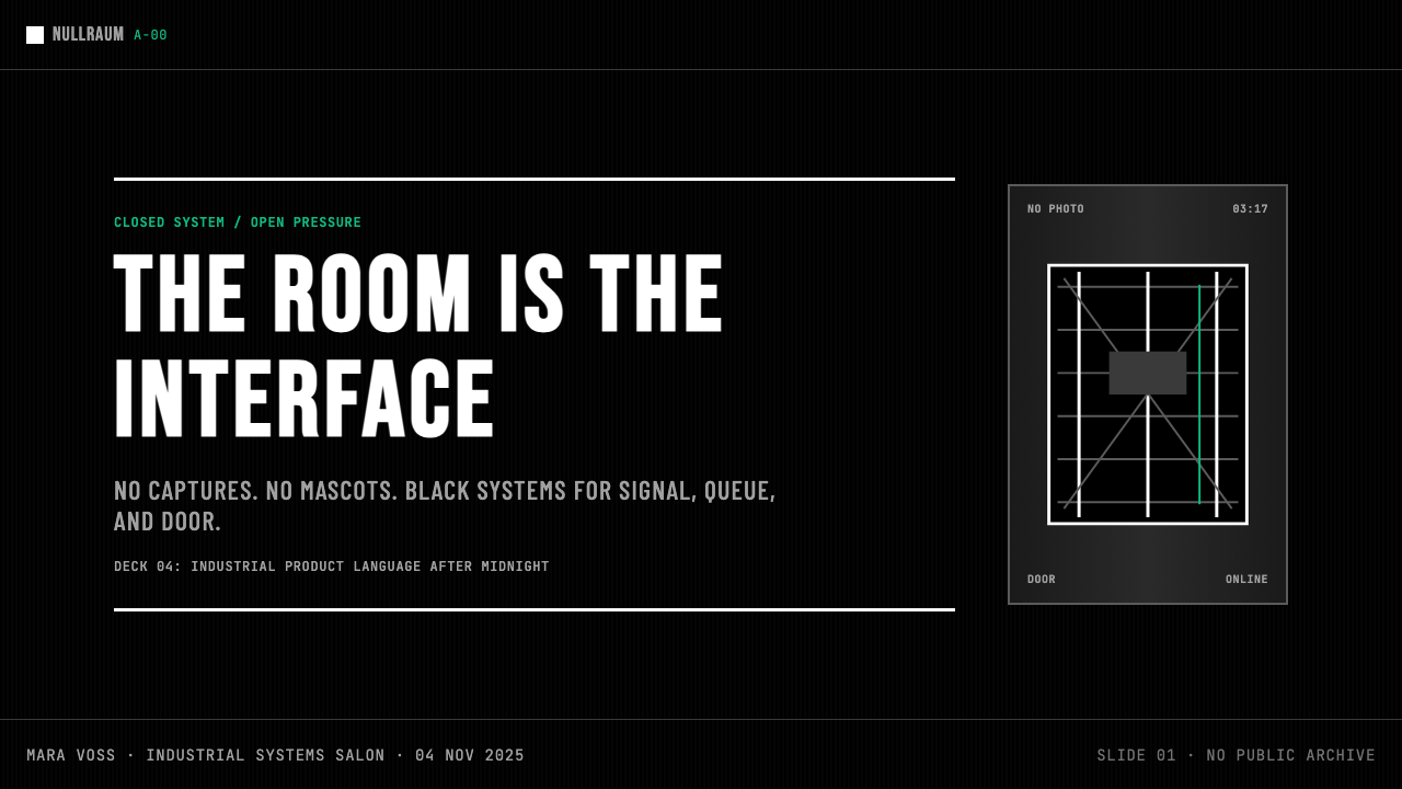
For presentation slides, the style is most effective in contexts where the content itself is dense, technical, or authoritative — strategic decks, research reports, technical briefings, or any presentation where the audience's trust is earned through rigor rather than charm. A cover slide in this system uses a full-bleed black ground, a single condensed-type title at near-maximum scale, and a minimal date or subtitle in a contrasting small weight. Content slides are typographic and grid-locked: data is presented as stark tables or high-contrast charts with no decorative fill, section breaks are marked by heavy rule lines rather than color changes, and the only relief from the monochrome is a single acid-green or red accent used consistently for the most critical data point per slide.对于演示文稿,这种风格在内容本身密集、技术性强或具有权威性的场景中最为有效——战略报告、研究汇报、技术简报,或任何通过严谨而非魅力赢得受众信任的演示。这套系统下的封面页使用满铺的黑色底色,以接近最大字号的窄体字排印单一标题,以小号对比字重排印极简的日期或副标题。内容页是字体排印式的、网格锁定的:数据以简洁的表格或高对比度图表呈现,无装饰填充;段落分隔以粗重分割线标记而非颜色变化;单色系中唯一的缓解是每页为最关键数据点一致性使用的单一酸绿或红色强调。
For web interfaces, the style suits products where the user expects expertise rather than warmth: developer tools, security platforms, data dashboards, professional audio or DJ software, and editorial platforms with a technical or analytical character. The implementation requires discipline at the component level — every card has sharp corners, every input has a visible border rather than a ghost treatment, every interactive state uses the accent color sparingly rather than defaulting to conventional hover effects. Navigation should be typographic wordmarks and labels; icon decoration beyond simple geometric indicators undermines the system. Pricing pages in this style communicate premium positioning through restraint: tiers are separated by heavy ruled lines rather than color-coded cards.对于网页界面,这种风格适合用户期待专业能力而非亲切感的产品:开发者工具、安全平台、数据仪表板、专业音频或 DJ 软件,以及具有技术或分析特质的编辑平台。实施需要在组件层面保持纪律——每个卡片有锐角,每个输入框有可见边框而非幽灵处理,每个交互状态以克制方式使用强调色而非默认常规悬停效果。导航应为字体式文字标识与标签;除简单几何指示符外的图标装饰会破坏系统。这种风格下的定价页面通过克制传达高端定位:层级以粗重分割线区分,而非色彩编码的卡片。
For editorial and marketing work, the system is best suited to contexts with a cultural cachet component — music publications, architecture journals, fashion editorial, technology companies positioning themselves as infrastructure rather than consumer products, or any brand that derives authority from understatement. A marketing page in this style uses alternating full-width blocks of black-on-near-white and white-on-black, with condensed type at poster scale for section headers and a tight, small-scale body text for detail. The single accent color — acid green is the canonical choice — is reserved for calls to action and treated as a functional signal rather than a brand color.对于编辑与营销内容,这套系统最适合具有文化声望成分的场景——音乐出版物、建筑杂志、时装编辑、将自身定位为基础设施而非消费产品的科技公司,或任何从低调中获得权威感的品牌。这种风格下的营销页面使用黑底近白字与白底黑字的交替满宽区块,以海报字号的窄体字排印段落标题,以紧密的小号正文排印细节。单一强调色——酸绿是经典选择——保留给行动号召,作为功能性信号而非品牌色处理。
The most common mistake when applying this style is over-darkening without committing to the system's discipline. A dark color scheme alone does not produce Berlin Techno; the defining characteristics are the hard rules, the condensed type at extreme scale, the zero decorative elements, and the radical economy of color. Designers frequently add depth through layered transparency, subtle gradient overlays, or soft glow effects — all of which dissolve the system's defining hardness. A second common error is using the accent color as a background field or applying it to multiple elements simultaneously. The acid-green signal reads as a signal precisely because it appears once, unexpectedly, against absolute black. Use it twice and it becomes decoration; use it three times and the entire tonal logic of the system collapses.应用这种风格时最常见的错误是过度暗化而不执行系统的纪律。仅仅是深色配色方案并不能产生柏林电子乐美学;决定性特征是硬边分割线、极大字号的窄体字、零装饰元素,以及对色彩的激进节制。设计师频繁地通过分层透明度、微妙渐变叠加或柔和发光效果来增加深度——所有这些都会消解系统决定性的硬度。第二个常见错误是将强调色用作背景色块,或同时将其应用于多个元素。酸绿信号之所以能作为信号,恰恰因为它在绝对黑色中只出现一次,出人意料。使用两次它就变成装饰;使用三次整个系统的色调逻辑就崩溃了。
See the Berlin Techno (Berghain era) design system查看 Berlin Techno (Berghain era) 完整设计系统
Berlin Techno (Berghain era) — FAQBerlin Techno (Berghain era) · 常见问题
Is Berlin Techno just dark mode design with a different name?柏林电子乐只是换了个名字的深色模式设计吗?
No. Dark mode is a preference setting that inverts a light interface for readability in low-light environments; it typically retains all the rounded corners, soft shadows, and friendly visual language of the light-mode equivalent. Berlin Techno is a design philosophy with a specific cultural origin, a defined set of structural rules — hard edges, condensed type, minimal accent color, heavy rule lines, zero decorative elements — and a particular stance toward the user: one of austerity rather than accommodation. A dark mode product can be made friendly and approachable; a Berlin Techno product deliberately is not. The darkness is not a comfort feature — it is a position.不是。深色模式是一种为在低光环境下提高可读性而翻转浅色界面的偏好设置,它通常保留了浅色模式版本中所有的圆角、柔和阴影和友好的视觉语言。柏林电子乐是一种有特定文化起源的设计哲学,有一套明确的结构规则——锐角、窄体字、极简强调色、粗重分割线、零装饰元素——以及一种对用户的特定姿态:苦行而非迁就。深色模式产品可以被设计得友好而易亲近;柏林电子乐产品刻意不这样做。这种黑暗不是舒适功能——它是一种立场。
Can this style work for a brand that wants to appear premium or luxury?这种风格能用于想要呈现高端或奢侈品牌感的品牌吗?
It depends entirely on what kind of premium the brand is claiming. Berlin Techno communicates a form of exclusivity rooted in scarcity, severity, and cultural insider status — the same exclusivity communicated by Berghain's door policy. This reads as premium in contexts where the audience already knows and respects the reference: music, architecture, high-end technical tools, certain sectors of fashion. It does not read as premium in contexts where luxury is conventionally signaled by warmth, heritage, craft detail, or opulence. A Swiss watch brand using Berlin Techno would likely read as cold and industrial; a professional audio software company using it would read as exactly right.这完全取决于品牌主张的是哪种高端感。柏林电子乐传达的是一种植根于稀缺性、严峻感与文化圈内地位的专属感——与 Berghain 门卫政策传达的专属感相同。在受众已经了解并尊重这个参照的语境中,这传达为高端:音乐、建筑、高端专业工具、时装的某些领域。在奢华感通常以温暖、传承、工艺细节或富丽堂皇来表达的语境中,它不会传达为高端。一个瑞士腕表品牌使用柏林电子乐,读来可能是冷漠而工业化的;一个专业音频软件公司使用它,读来则恰到好处。
How should the acid-green accent color be used without it looking like a generic tech palette?如何使用酸绿强调色,避免它看起来像通用科技配色?
The key is treating it as a signal, not as a brand color. In the Berlin Techno system, the acid green appears once — on the single most operationally important element in a composition, whether that is a 'play' button on an event page, a status indicator on a dashboard, or a call-to-action on a marketing page. It should never appear as a background field, a decorative stripe, or a color applied to multiple interactive elements simultaneously. The acid green gets its power from contrast and scarcity: it is surprising against absolute black, and it is surprising because it appears so rarely. Once it becomes a repeating motif, it reads as generic tech green, not as an emergency signal from an industrial control panel.关键在于将其作为信号而非品牌色处理。在柏林电子乐系统中,酸绿只出现一次——在构图中操作上最重要的单一元素上,无论是活动页面的播放按钮、仪表板上的状态指示器,还是营销页面上的行动号召。它绝不应作为背景色块、装饰性色带,或同时应用于多个交互元素的颜色出现。酸绿的力量来自对比与稀缺:它在绝对黑色中令人意外,正是因为极少出现而令人意外。一旦它成为重复出现的母题,读来就变成了通用科技绿,而不是工业控制面板上的应急信号。
Does the style require actual photography to be black-and-white?这种风格要求真实的摄影必须是黑白的吗?
Not strictly, but photography in a Berlin Techno layout must be handled with extreme care. The canonical approach treats photographic images as high-contrast monochrome objects — full black-and-white or heavily desaturated with crushed shadows and blown highlights — rather than naturalistic color images. Color photography, if used, should be desaturated to near-grayscale and cropped aggressively to eliminate any sense of environmental warmth or lifestyle context. The test is whether the image reads as a graphic object or as a window into a scene: the former is consistent with the system; the latter is not. In practice, many Berlin Techno artifacts use no photography at all, relying entirely on typography and rule lines.没有严格要求,但柏林电子乐版面中的摄影必须以极大的谨慎处理。标准做法将摄影图像作为高对比度单色对象处理——纯黑白或重度去饱和、阴影压死、高光爆出——而非自然主义彩色图像。若使用彩色摄影,应去饱和至接近灰度,并激进裁切以消除任何环境温度感或生活方式语境。检验标准是:这张图像是作为图形对象读取,还是作为进入某个场景的窗口读取——前者与系统一致,后者不一致。在实践中,许多柏林电子乐作品完全不使用摄影,完全依赖字体排印与分割线。
Is there a risk that this style reads as aggressive or unwelcoming, and how should that be managed?这种风格是否有被解读为攻击性或拒人于千里之外的风险?如何应对?
Yes, and this risk should be taken seriously rather than designed around. The style's severity is not a bug — it is the feature. Berghain's door is notoriously selective, and the design language encodes the same message: not everyone is the intended audience. In product design contexts, this means the style is appropriate when the product genuinely serves a specific, self-selecting audience that values competence and directness over accessibility and warmth. Attempting to soften the system with rounded corners, warmer accent colors, or illustrative elements does not produce a friendlier version of Berlin Techno — it produces a diluted and incoherent one. If the audience requires warmth, the honest answer is to choose a different design system entirely.是的,这种风险应该被认真对待,而不是通过设计来绕过它。这种风格的严峻不是缺陷——它就是特性。Berghain 的大门以严格的筛选而闻名,而设计语言传达的是同样的信息:并非所有人都是目标受众。在产品设计语境中,这意味着这种风格适用于产品真正服务于一个特定的、自我筛选的、重视能力与直接性胜过可及性与温暖感的受众的场景。试图用圆角、更温暖的强调色或插图元素来软化这套系统,不会产生柏林电子乐的友好版本——只会产生一个被稀释的、不连贯的版本。如果受众需要温暖感,诚实的答案是完全选择另一套设计系统。
Related design styles相关设计风格
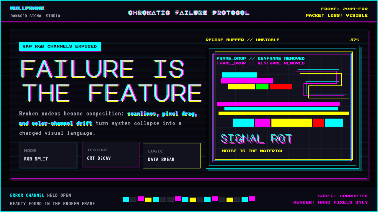 Glitch DatamoshErrors as composition. Corrupted JPEGs, RGB splits, scanlines — failure treat…把数字错误升华为视觉语言:损坏的 JPEG、RGB 色差偏移、扫描线、像素排序…
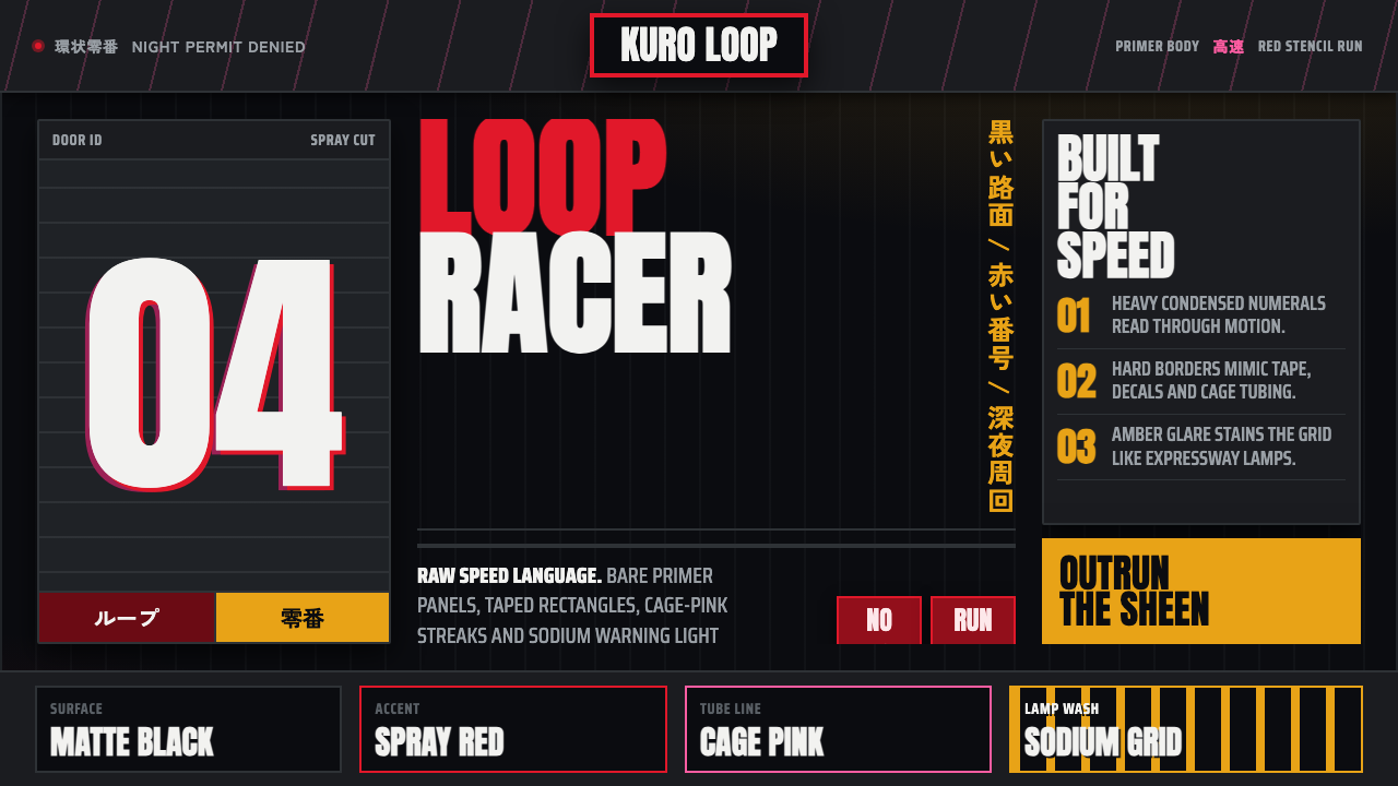 Kanjōzoku Loop RacerSpeed as contraband. Hot red numbers slice black tarmac with amber grid glare.速度像违禁品。黑色沥青上,火红数字与琥珀网格切开夜色。
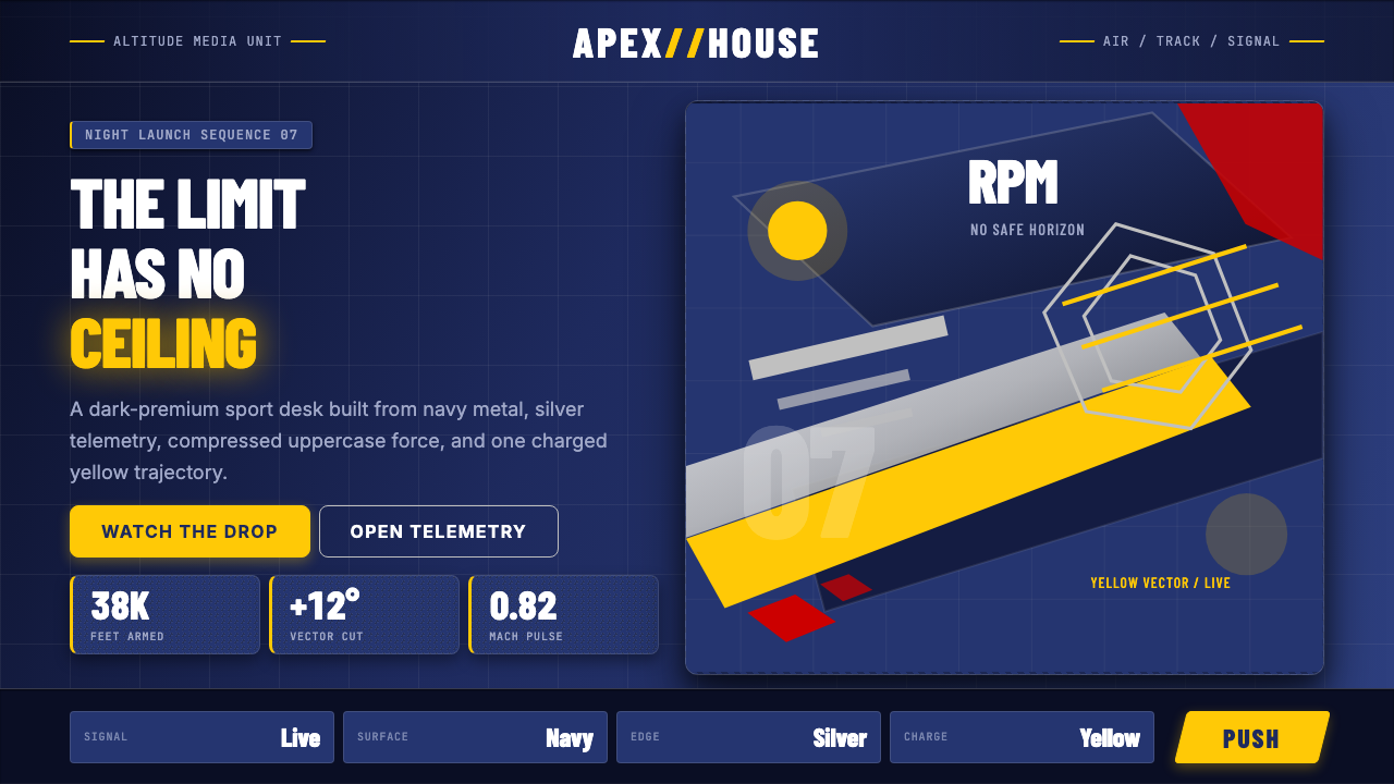 Red Bull Extreme SportsAdrenaline goes corporate. Navy chrome, condensed uppercase, yellow slashes a…肾上腺素也很企业。海军蓝金属面、压缩大写与黄色斜切加速。
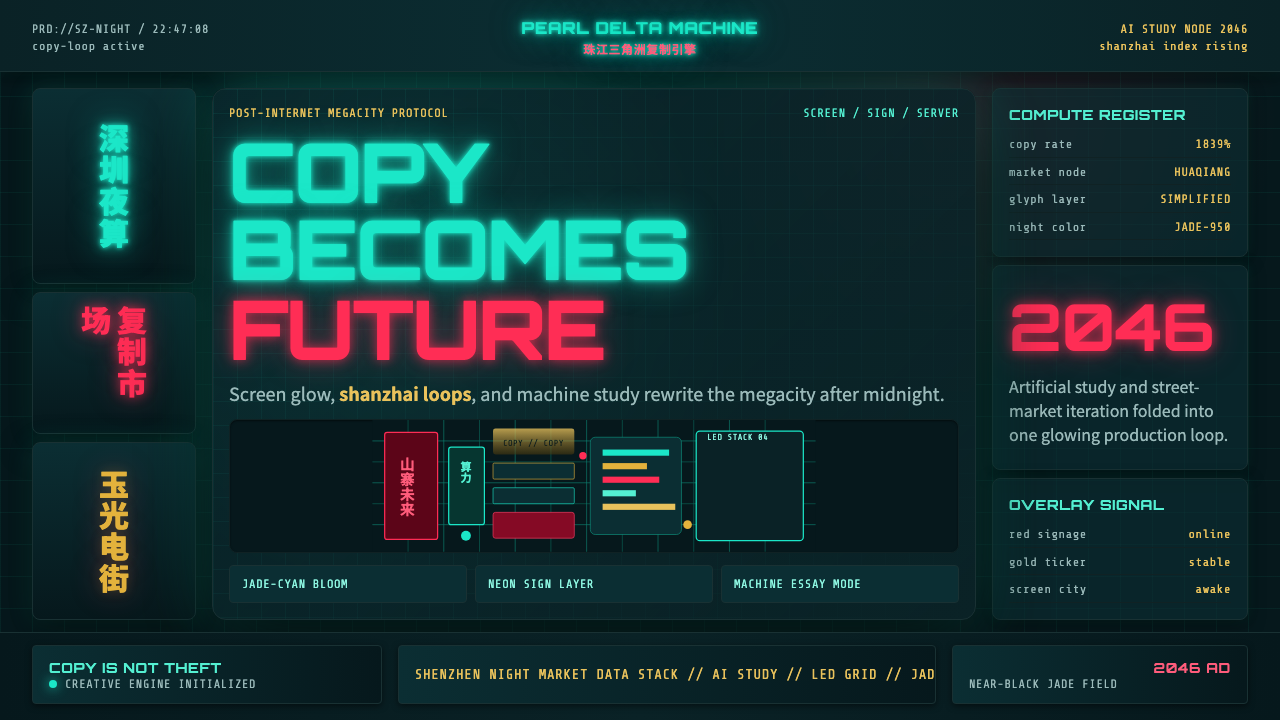 SinofuturismCopy becomes future. Jade-cyan grids, red signage, and Orbitron data stack th…复制成为未来。玉青网格、红色招牌与数据字叠起夜城。
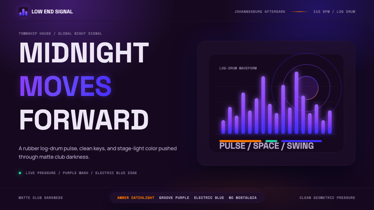 AmapianoClub darkness, fully awake. Purple-blue waveforms pulse through geometric typ…午夜黑场醒着:紫蓝声波穿过几何字体。
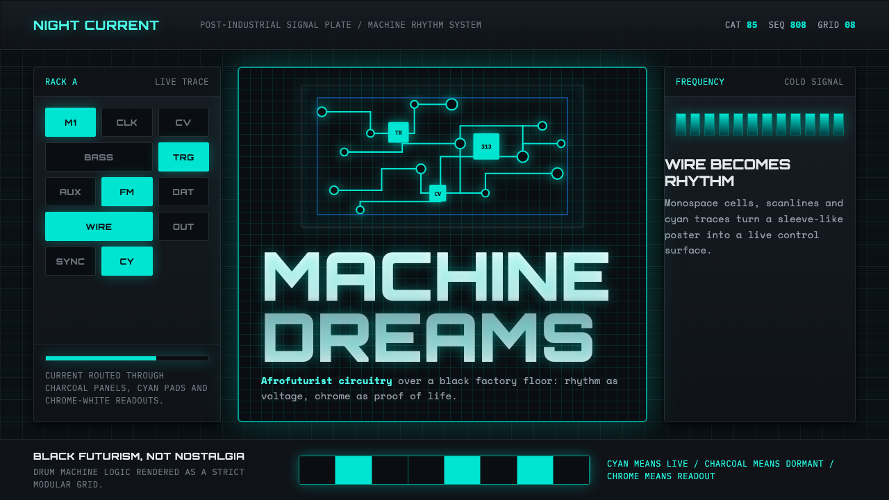 Detroit TechnoCold machines dream. Electric cyan circuits and chrome display type lock to a…冷机器在做梦。电青线路与铬感字形锁进黑色网格。