What is Red Bull Extreme Sports?什么是 Red Bull Extreme Sports?
Red Bull turned an energy drink can into a global media empire by building a visual language as extreme as the athletes it sponsors.红牛将一罐能量饮料变成了全球媒体帝国,靠的是一套与它赞助的极限运动员一样极端的视觉语言。
Red Bull Extreme Sports in briefRed Bull Extreme Sports 速览
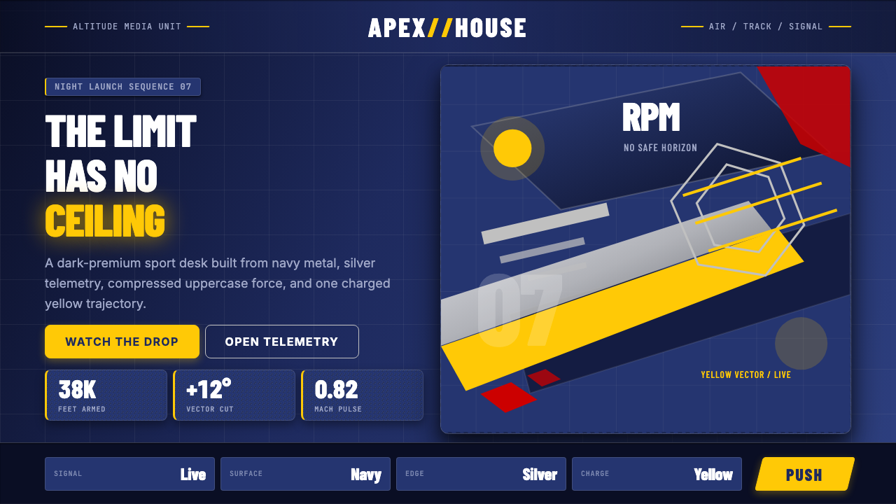
Red Bull Extreme Sports is a corporate design identity that grew far beyond its origins as a beverage brand. The visual system is built on a foundation of deep navy and metallic silver — colors that read as premium, authoritative, and slightly dangerous — punctuated by a charging-bull yellow that signals raw energy. This palette is not playful or casual; it is the color of a helmet, a sponsorship banner, a race livery. Against these corporate anchor colors, extreme-sports photography of humans doing genuinely impossible things — jumping from the stratosphere, racing open-wheel cars, cliff-diving into Croatian coves — provides the emotional charge that the brand's carefully controlled geometry cannot supply on its own.红牛极限运动是一套企业设计识别系统,其影响力早已远超一个饮料品牌的边界。这套视觉体系以深海军蓝与金属银为底色——这两种颜色传递出高端、权威、略带危险的气质——并以充电公牛般的黄色作为能量爆发点。这套色板不是玩乐的、也不是随意的;它是头盔的颜色、赞助横幅的颜色、赛车涂装的颜色。在这些企业锚色之上,是真正做着不可能之事的人类极限运动摄影——从同温层纵身一跳、驾驶单座赛车、跳入克罗地亚海湾——为品牌那套精确控制的几何语言提供单靠几何本身无法供给的情绪张力。
The typographic approach is built on condensed, uppercase letterforms — forms that feel compressed under pressure, as if the letters themselves are aerodynamic. Nothing is decorative; everything is maximally legible at speed, whether read on a racing car at two hundred kilometers per hour or glanced at on a broadcast lower-third. Layout geometry leans angular and diagonal: slashes, chevrons, skewed photographic crops, wedge-shaped divisions. The cumulative effect is a brand that communicates momentum, controlled aggression, and the consistent message that physical and human limits are obstacles to be overcome rather than respected.字体排印建立在压缩大写字形的基础上——这些字形仿佛在压力下被压扁,字母本身就是流线型的。没有任何装饰性内容;一切都以最高速度下的可读性为优先,无论是在以时速两百公里飞驰的赛车侧面被瞥见,还是在电视转播字幕条上被扫读。版式几何倾斜而成角:斜线、箭形切割、倾斜的摄影裁切、楔形分割。累积效果是一个传递动量、受控攻击性的品牌,以及一条始终如一的信息——人类与物理的极限是需要被克服的障碍,而非值得尊重的边界。
What makes the Red Bull visual identity culturally interesting is its unusual position between corporate precision and subcultural authenticity. It does not look like a traditional consumer goods brand, but neither does it look like an underground sports culture. It occupies a third register: the media company that owns the events it broadcasts, the sponsor that employs the athletes it features, the publication that covers the sports it funds. This vertical integration is visible in the design — it is simultaneously a brand mark and a production house identity, as comfortable on the side of a Formula One car as on a long-form documentary title card.红牛视觉识别在文化上的有趣之处,在于它占据了企业精准与次文化真实性之间的罕见位置。它看起来不像传统消费品品牌,但也不像地下运动文化。它占据第三种频道:拥有它所转播的赛事的媒体公司、雇用它所呈现的运动员的赞助商、报道它所资助的运动的刊物。这种垂直整合在设计中清晰可见——它同时是品牌标识和制作公司身份,出现在一级方程式赛车侧面和长篇纪录片片头时同样自如。
See the Red Bull Extreme Sports design system查看 Red Bull Extreme Sports 完整设计系统
Where does Red Bull Extreme Sports come from?Red Bull Extreme Sports 从何而来?
Red Bull was founded in 1987 when Austrian entrepreneur Dietrich Mateschitz partnered with Thai businessman Chaleo Yoovidhya to bring a reformulated version of the Thai energy drink Krating Daeng to the European market. The brand launched first in Austria and struggled in early market tests — it was, Mateschitz reportedly said, one of the least successful product launches in history. Within a decade, it had become the defining energy drink of the late twentieth century, with a visual identity that had evolved from a simple silver can with two red bulls charging toward a golden sun into something far more systematic and media-oriented.红牛创立于1987年,由奥地利企业家迪特里希·马特施茨与泰国商人许书标合作,将泰国能量饮料卡拉宝(Krating Daeng)的改良配方带入欧洲市场。该品牌首先在奥地利上市,早期市场测试并不顺利——马特施茨据报曾说,这是历史上最不成功的产品上市之一。但不到十年,它就成为二十世纪末最具代表性的能量饮料,其视觉识别也从一款简单的银色罐体(两头红牛冲向金色太阳)演化为更具系统性与媒体导向性的存在。
The visual identity matured through the 1990s and 2000s alongside the brand's sponsorship of extreme sports, which was not incidental to the brand but constituted its core marketing strategy. Red Bull did not advertise in the conventional sense — it owned events. The Red Bull Flugtag, the Red Bull Crashed Ice, the Red Bull Air Race, and eventually the Red Bull Racing Formula One team were not sponsorships of pre-existing properties but events created from scratch to generate content. Red Bull Media House, founded in 2007, formalized this strategy into a full media production company, publishing magazines, producing films, operating a television channel, and eventually a record label. The design system had to function as both a corporate brand and a media production house identity simultaneously.视觉识别在1990至2000年代随品牌对极限运动的赞助而趋于成熟——赞助并非品牌营销的附属动作,而是其核心策略。红牛并不以传统方式打广告,而是拥有赛事本身。红牛飞天节、红牛冰上极速赛、红牛空中大赛,以及最终的红牛F1车队,都不是对既有赛事的赞助,而是从零开始创造内容的活动。2007年成立的红牛媒体之家将这一策略正式化为完整的媒体制作公司,出版杂志、制作电影、运营电视频道,乃至一家唱片公司。这套设计系统必须同时作为企业品牌与媒体制作公司身份运转。
The visual anchor of the brand — the two charging bulls against the yellow solar disk — traces its origin to the Thai source drink, but the European reformulation pushed it toward a more premium, angular, and kinetic visual treatment. The navy ground that became the brand's signature color was a departure from the red-and-gold palette of the Asian original; it signified European premium positioning, coldness, speed, and the darkness of high altitude. Where the Thai original was warm and folkloric, the Austrian reinterpretation was sleek, corporate, and globally scalable.品牌的视觉核心——两头冲锋的公牛与黄色太阳圆盘——溯源于泰国原版饮料,但欧洲改良版将其推向更为高端、棱角分明、充满动感的视觉处理。深海军蓝作为品牌标志色,是对亚洲原版红金色调的背离;它传递的是欧洲高端定位、冷峻感、速度与高海拔的黑暗。泰国原版是温暖而民间的,奥地利的重新诠释则是光洁、企业化、全球可扩展的。
Felix Baumgartner's 2012 Red Bull Stratos mission — in which he jumped from a helium balloon at the edge of space, breaking the sound barrier in freefall and setting multiple world records — represents the apex of the brand's visual and conceptual ambition. The mission was produced and broadcast by Red Bull Media House as a live global event. The imagery produced — a solitary figure in a pressure suit standing at the edge of the stratosphere, the curvature of the earth below and absolute blackness above — is among the most striking documentary photography of the twenty-first century. It also established definitively that Red Bull's design identity could contain and frame events of genuine historical significance, not merely extreme sports entertainment.费利克斯·鲍姆加特纳2012年的红牛同温层任务——他从太空边缘的氦气球上跳下,在自由落体中突破音障并创造多项世界纪录——代表了品牌视觉与概念野心的顶点。这次任务由红牛媒体之家作为全球直播活动制作与播出。所产生的影像——一个身着压力服的孤独身影站在同温层边缘,脚下是地球的弧线,头顶是绝对的黑暗——是二十一世纪最震撼的纪录摄影之一。它也最终确立了红牛设计识别能够容纳并框定真正具有历史意义的事件,而不仅仅是极限运动娱乐。
What defines the Red Bull Extreme Sports look?Red Bull Extreme Sports 的视觉特征是什么?
Color Palette色彩体系
The palette is anchored by a deep navy ground that reads as both corporate authority and nocturnal speed — the color of deep water or the sky at altitude just before total darkness. Against it, metallic silver provides a cold, premium sheen, while a high-energy yellow signals the charging bull and raw kinetic force. A concentrated red appears primarily in the brand mark itself. The palette avoids warmth entirely; there are no earth tones, pastels, or analogous harmonies. Everything is either a neutral or an aggressive signal color, creating a visual vocabulary of high contrast and maximum readability under demanding conditions.色板以深海军蓝为底色,同时传递企业权威与夜间速度感——如同深水的颜色,或高空接近绝对黑暗前的天色。在此之上,金属银提供冷峻的高端光泽,高能量黄色传递冲锋公牛与原始动能,浓缩的红色则主要出现在品牌标识本身。整个色板完全回避温暖感:没有大地色调、没有粉彩、没有类比和声。每种颜色要么是中性底色,要么是攻击性信号色,形成一套在极端条件下保持高对比与最大可读性的视觉词汇。
Typography字体排印
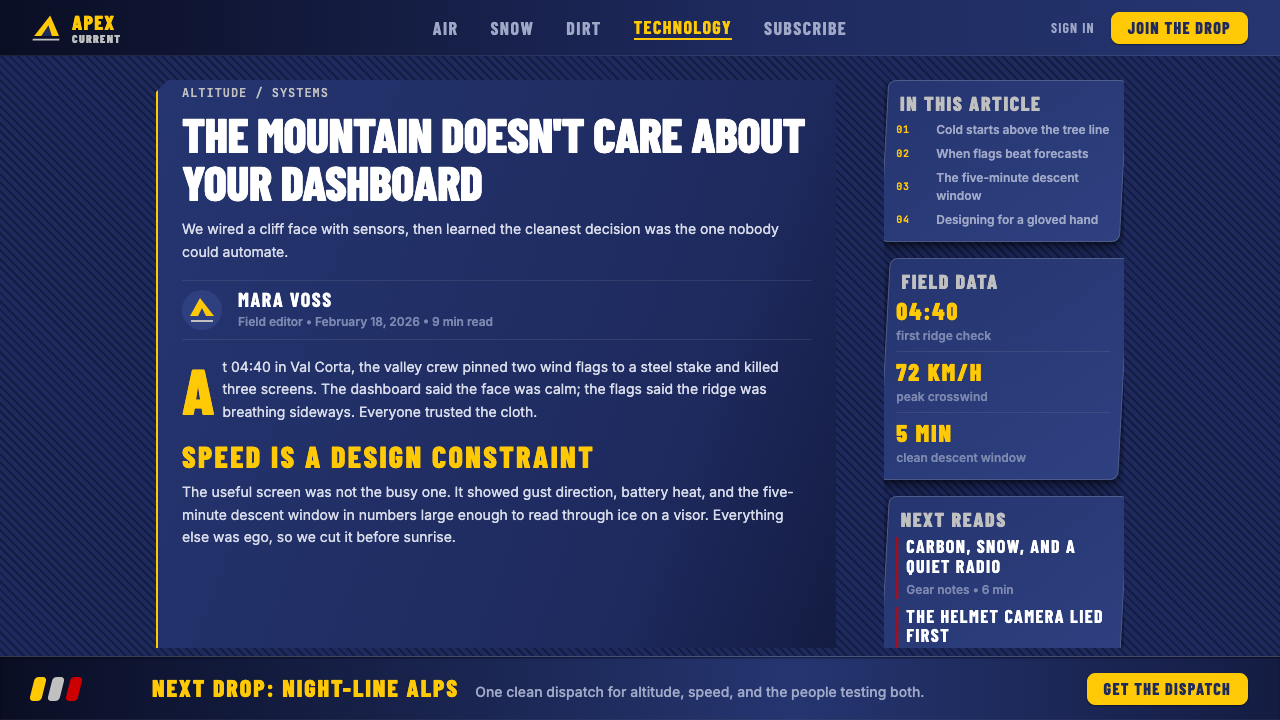
All primary communication is set in condensed, uppercase letterforms — compressed horizontally to convey speed and urgency, while maintaining maximum vertical impact in limited horizontal space. The condensed uppercase approach is well-suited to broadcast environments (scoreboards, lower-thirds, racing livery) where text must be read at a glance and at distance. Weight is heavy; there is no use of light or thin cuts for principal text. All-capitals treatment is consistent across headlines, labels, and graphic callouts, reinforcing a tone of declarative authority rather than conversational warmth.所有主要信息传达均采用压缩大写字形——在水平方向被压缩以传递速度与紧迫感,同时在有限横向空间内保持最大纵向冲击力。压缩大写的处理方式非常适合广播环境(计分板、字幕条、赛车涂装),文字必须在瞬间和远距离被读取。字重沉厚;主要文本不使用细体或超细字重。全大写处理贯穿标题、标签与图形引用,强化了宣示性权威的语气,而非对话性温度。
Diagonal and Angular Geometry斜线与成角几何
Where most corporate identities rely on horizontal and vertical axes, Red Bull's layout language is built on the diagonal. Slashes, chevrons, wedge-shaped divisions, and skewed photographic crops appear across every application — packaging, broadcast graphics, editorial layouts, and digital interfaces. This diagonal emphasis does not feel arbitrary; it reads as inherent to the physics of speed and trajectory. A skewed rectangular band across a cover page implies motion. A wedge cutting into a photograph implies penetration. The geometry is angular rather than curved, reinforcing a visual language of precision and controlled force rather than organic flow.大多数企业识别依赖水平与垂直轴线,而红牛的版式语言建立在对角线上。斜线、箭形切割、楔形分割与倾斜的摄影裁切出现在每一个应用场景中——包装、广播图形、编辑版面与数字界面。这种对角线强调并不显得随意;它读起来像是速度与轨迹物理学所固有的属性。封面页上一条倾斜的矩形带暗示运动;切入照片的楔形暗示穿透力。几何形是成角而非曲线的,强化了精准与受控力量的视觉语言,而非有机流动感。
Extreme-Sports Photography极限运动摄影
Photography is not supplementary to the Red Bull visual system — it is load-bearing. The brand's design geometry provides the frame; the photography provides the content and emotional energy. Imagery consistently features humans at the outer edges of physical possibility: athletes suspended at great heights, moving at extraordinary speeds, inhabiting environments that are hostile to human life. The photographic treatment favors dramatic perspective — wide-angle distortion, aerial views, action-frozen at peak tension — and high contrast, which reinforces the brand palette's inherent darkness. Ordinary lifestyle photography has no place in the system; everything must evidence an encounter with genuine physical extremity.摄影并非红牛视觉系统的补充要素——它是承重构件。品牌的设计几何提供框架,摄影提供内容与情绪能量。图像始终呈现站在人类体能极端边界的运动员:悬挂在巨大高度的运动员、以非凡速度运动的身体、置身于对人类生命充满敌意的环境中。摄影处理倾向于戏剧性透视——广角畸变、鸟瞰视角、在最高张力时刻定格的动作——以及高对比度,强化品牌色板固有的黑暗感。普通生活方式摄影在这套系统中没有位置;每张图像都必须证明与真实物理极限的遭遇。
Metallic and Dark Surfaces金属与深色表面
The tactile and material dimension of the brand is defined by its relationship to metallic surfaces — the aluminum can, the carbon-fiber racing car, the chrome helmet visor. In two-dimensional applications, this material sensibility translates into the use of gradient-free metallic tones, high-contrast lighting in photography, and a dark ground that suggests both premium positioning and the physical environments the brand inhabits: night racing, high-altitude skies, underwater diving. Unlike brands that use metallics to suggest luxury, Red Bull uses them to suggest equipment — functional, engineered, performance-oriented objects rather than decorative ones.品牌的触感与材质维度由其与金属表面的关系所定义——铝制罐体、碳纤维赛车、镀铬头盔面罩。在二维应用中,这种材质感性转化为无渐变金属色调的使用、摄影中的高对比度打光,以及暗示高端定位与品牌所栖居物理环境的深色底面:夜间赛车、高空天色、水下潜水。与用金属感传递奢华的品牌不同,红牛用金属感传递的是装备——功能性、工程化、性能导向的物件,而非装饰性的存在。
Brand Mark Integration品牌标识整合
The two-bulls motif — two charging bulls facing each other before a radiant yellow sun-disk — functions as both a heraldic emblem and a dynamic action image. It is reproduced at every scale, from the face of a can to the nose of a Formula One car to a stadium banner. The mark's bilateral symmetry is unusual in a design system otherwise committed to diagonal asymmetry; this contrast gives the mark a ceremonial weight that differentiates it from the kinetic surrounding graphics. When the mark is isolated, it reads as a seal of authority; when surrounded by the full brand system, the system amplifies its energy.两头公牛图案——两头冲锋公牛面对面,身后是辐射光芒的黄色太阳圆盘——同时作为纹章徽标与动态行动图像发挥功能。它在每一个尺度上被复现:从罐体正面到一级方程式赛车车头,再到体育场横幅。这枚标志的双边对称在一个其他方面都倡导对角线不对称的设计系统中是异常的;这种对比赋予标志一种仪式性重量,使其有别于周围的动感图形。当标志被单独呈现时,它读作权威印章;当被完整品牌系统包围时,系统放大了它的能量。
Minimalism of Ornament, Maximalism of Content装饰极简,内容极大
Red Bull's design vocabulary is not minimal in the contemporary sense — it is dense, kinetic, and visually loaded — but it is rigorously free of decorative ornament that serves no structural or narrative purpose. Every graphic element is either a brand signal (the palette, the mark, the condensed typography) or content (the photography, the data, the editorial text). There is no ambient texture, no decorative pattern, no gradient fill applied for visual richness. The effect is a kind of saturated functionalism: the frame is stripped and mechanical, but within it, the content is as extreme as the sport it depicts.红牛的设计词汇并非当代意义上的极简——它是稠密的、充满动感的、视觉负载很高的——但它严格地不含任何无结构或叙事目的的装饰性元素。每个图形元素要么是品牌信号(色板、标志、压缩字体),要么是内容(摄影、数据、编辑文本)。没有环境质感,没有装饰图案,没有为视觉丰富性而添加的渐变填充。效果是一种饱和的功能主义:框架是剥离的、机械性的,但在其中,内容与它所描绘的运动一样极端。
See the Red Bull Extreme Sports design system查看 Red Bull Extreme Sports 完整设计系统
Who shaped Red Bull Extreme Sports?谁塑造了 Red Bull Extreme Sports?
The Austrian co-founder of Red Bull died in 2022 after building one of the most distinctive corporate identities in consumer goods history. Mateschitz's core insight — that the brand could own the culture around a product rather than simply selling the product — drove the decision to invest in events, athletes, and media production rather than conventional advertising. The design philosophy of the brand reflects his sensibility: premium, dark, engineered, and built for performance environments rather than supermarket aisles. His insistence that Red Bull would not compete on price, and would instead position itself at the intersection of sport, lifestyle, and media, gave the design team a brief broad enough to build something genuinely original.这位奥地利红牛联合创始人于2022年辞世,身后留下消费品历史上最具辨识度的企业识别之一。马特施茨的核心洞见——品牌可以拥有围绕产品的文化,而不仅仅是销售产品本身——驱动了投资赛事、运动员与媒体制作而非传统广告的决定。品牌的设计哲学映射他的感性:高端、黑暗、工程化、为性能环境而非超市货架而生。他坚持红牛不以价格竞争,而是将自身定位于运动、生活方式与媒体的交汇点,这给了设计团队足够宽广的创作委托,使其得以构建真正原创的东西。
Red Bull Media House, established in Salzburg in 2007, operates as the production arm responsible for translating the brand's extreme-sports identity into editorial, film, broadcast, and digital content. The creative team — functioning more like a media organization than a traditional brand design department — established the visual language for Red Bull's content properties: Red Bulletin magazine, Red Bull TV, and the film and documentary division that produces feature-length works. Their contribution is the systematization of the brand across editorial and broadcast contexts, ensuring that the same visual logic that governs packaging design also governs documentary cinematography and magazine layout.红牛媒体之家于2007年在萨尔茨堡成立,作为制作机构,负责将品牌的极限运动识别转化为编辑、电影、广播与数字内容。创意团队——其功能更像一个媒体组织而非传统品牌设计部门——确立了红牛内容资产的视觉语言:《Red Bulletin》杂志、Red Bull TV,以及制作长片的电影与纪录片部门。他们的贡献是在编辑与广播语境中将品牌系统化,确保支配包装设计的同一视觉逻辑也同样支配纪录片摄影与杂志版面。
The Austrian skydiver who in 2012 ascended to approximately thirty-nine kilometers altitude in a helium balloon and jumped, becoming the first human to break the sound barrier in freefall. The Red Bull Stratos mission was as much a media and design project as a scientific one — the visual documentation, the broadcast graphic system, and the imagery of Baumgartner's pressure suit against the curvature of the earth produced a body of visual material that has become iconic. For the brand, Stratos demonstrated that its design identity could absorb events of genuine historical significance without those events overwhelming the brand system, and that the system could scale from a can label to a globally broadcast live event.这位奥地利跳伞运动员于2012年乘坐氦气球升至约三万九千米高空后纵身跳下,成为第一个在自由落体中突破音障的人类。红牛同温层任务与其说是科学项目,不如说同样是媒体与设计项目——视觉记录、广播图形系统,以及鲍姆加特纳压力服与地球弧线相对的影像,产生了一批已成标志性的视觉素材。对于品牌而言,同温层任务证明了它的设计识别能够容纳真正具有历史意义的事件,而这些事件不会淹没品牌系统;它也证明了这套系统能够从罐体标签扩展至全球直播活动。
The Red Bull Racing Formula One team won four consecutive constructors' and drivers' championships from 2010 to 2013, with Sebastian Vettel as the drivers' champion each year. This period established the Red Bull livery — a navy-and-silver base with the charging-bull yellow mark — as one of the most recognized visual identities in global sport. The Formula One car functions as a moving billboard at extraordinary scale and speed, and the durability of the Red Bull visual identity across the demands of broadcast television, trackside photography, and pit-lane marketing materials demonstrated the system's robustness. The racing program also introduced the chevron and the angled graphic language of the brand's later communication.红牛车队在2010至2013年间连续赢得四届一级方程式车队与车手双料冠军,塞巴斯蒂安·维特尔每年都是车手冠军。这一时期将红牛赛车涂装——海军蓝银底色配冲锋公牛黄色标志——确立为全球运动中最具辨识度的视觉识别之一。一级方程式赛车作为一块以非凡尺度与速度移动的广告牌,红牛视觉识别在广播电视、赛道摄影与维修区营销物料的多重需求下经受住了考验,展示了这套系统的稳健性。赛车项目也引入了箭形切割与成角图形语言,塑造了品牌后续传播的视觉风格。
Unlike conventional sponsors who attach their name to athletes, Red Bull employs its top athletes as content creators and ambassadors whose visual presence — their equipment, their environments, their action — becomes part of the brand's ongoing visual production. Athletes such as skateboarder Tony Hawk in the brand's earlier years, and later snowboarders, cliff divers, wingsuit pilots, and rally drivers, provided the photographic and documentary raw material that sustains the brand's visual identity over time. The result is a design system that is continuously refreshed by real human performance rather than manufactured scenarios, giving the brand an authenticity that purely graphic systems cannot achieve.与将自身名称附在运动员身上的传统赞助商不同,红牛将顶级运动员作为内容创作者与品牌大使来雇用,他们的视觉呈现——他们的装备、他们的环境、他们的动作——成为品牌持续视觉产出的一部分。滑板运动员托尼·霍克在品牌早期,以及后来的滑雪运动员、悬崖跳水运动员、翼装飞行员与拉力赛车手,提供了支撑品牌视觉识别随时间更新的摄影与纪录片原材料。结果是一套不断被真实人类表现刷新的设计系统,而非制造出来的场景,赋予品牌纯粹图形系统无法实现的真实性。
How do you use Red Bull Extreme Sports today?今天怎么用 Red Bull Extreme Sports?
Red Bull Extreme Sports as a design reference works best when the context genuinely calls for a vocabulary of speed, intensity, and physical extremity — not as visual decoration but as a truthful expression of what the product or service actually does. The style is transferable to sports technology platforms, performance equipment brands, motorsport event collateral, gaming and esports identities, and any product that positions itself at the edge of what users can achieve. Applying it to content that does not carry genuine intensity risks producing design that looks aggressive without being earned — the visual vocabulary becomes costume rather than identity.将红牛极限运动作为设计参考,最有效的场景是语境真正需要速度、强度与物理极限词汇的时候——不是作为视觉装饰,而是对产品或服务实际所为的真实表达。这套风格可移植至运动科技平台、性能装备品牌、赛车运动活动物料、游戏与电竞识别,以及任何将自身定位于用户成就边界的产品。将其应用于不具备真实强度的内容,有产生看似攻击性却未被赋予正当理由的设计的风险——视觉词汇变成了服装而非身份。
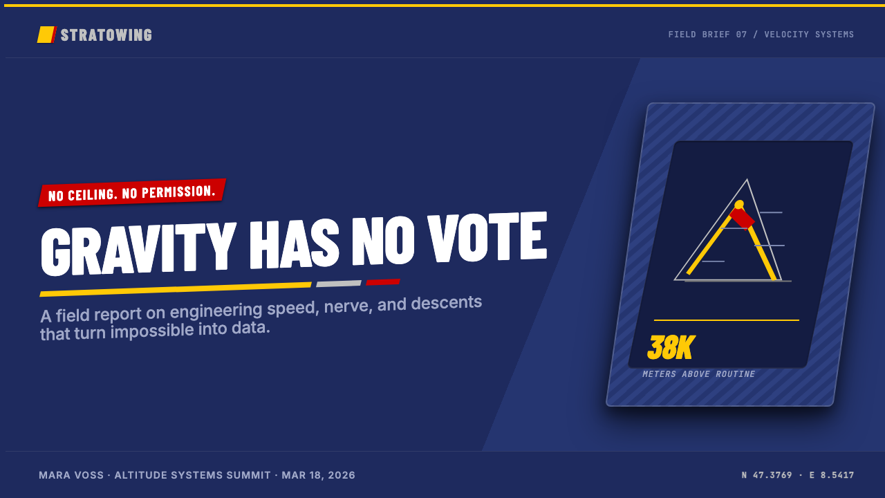
For presentation slides, the Red Bull approach produces a striking cover when the dark navy ground is committed to fully and the central image is a single high-contrast photograph that fills the frame. The title should be set in condensed uppercase at large scale, anchored to the lower third with a diagonal slash or chevron separator reinforcing the angular geometry. Content slides benefit from a strict grid with one or two bold typographic hierarchies; body text should remain light-colored against the dark ground with no decorative elements competing for attention. For data slides, charts and graphs rendered with sharp edges and filled with the brand's high-energy yellow against the navy ground become graphic objects in their own right — the data visualization and the brand language reinforce each other.对于演示文稿幻灯片,红牛式处理在以下条件下产生惊人封面:深海军蓝底色被充分贯彻,中心图像是一张充满画面的单一高对比度照片。标题应以大字号压缩大写字体排印,以对角斜线或箭形分隔符锚定在下三分之一处,强化成角几何感。内容页受益于严格的网格与一到两个粗壮的排版层级;正文应在深色底面上保持浅色,没有任何装饰性元素争夺注意力。数据页中,以硬边呈现、在海军蓝底面上以高能量黄色填充的图表本身成为图形对象——数据可视化与品牌语言相互强化。
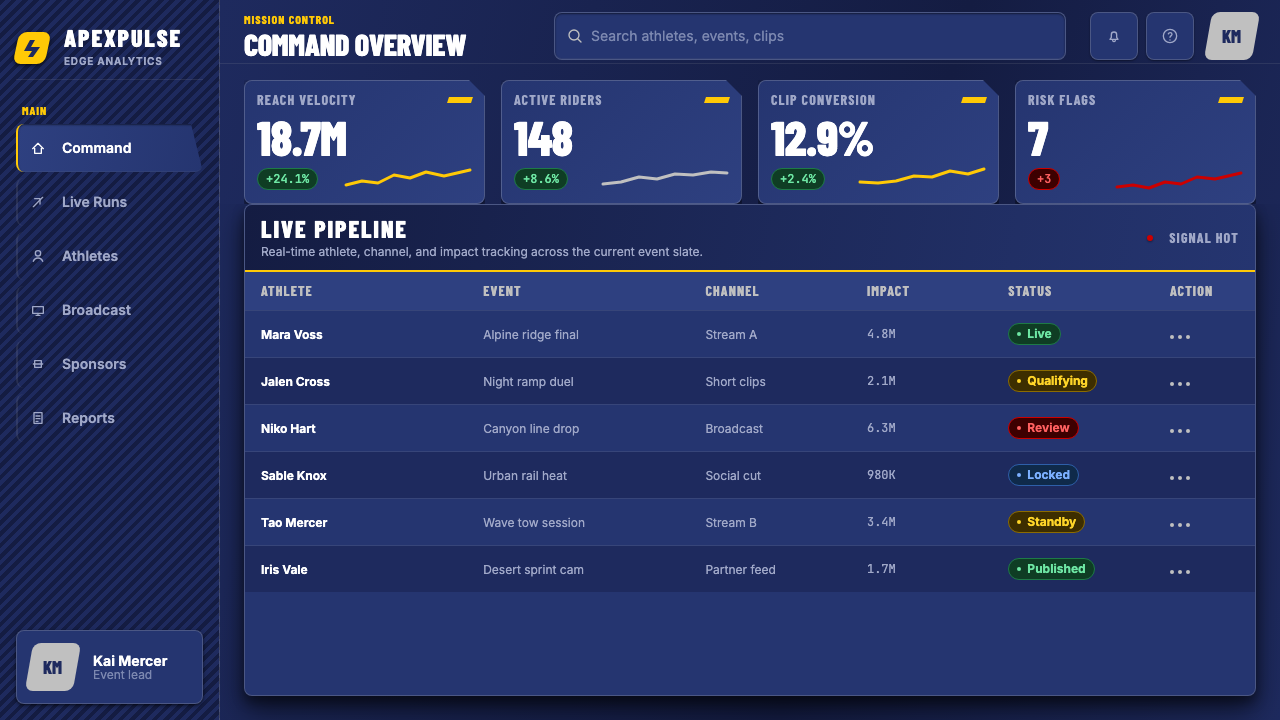
For web interfaces — particularly dashboards, performance-tracking applications, and competitive leaderboard displays — the system translates well when the dark background is treated as the primary canvas and the high-energy accent color is reserved for active states, live data indicators, and primary calls to action. Navigation should be bold and typographic, not icon-driven. Card components work with sharp-edged borders rather than soft shadows, maintaining the brand's hard-material sensibility. Pricing pages benefit from the style's clarity: tier differentiation is handled through color and typographic scale rather than decorative card styling.对于网页界面——特别是仪表板、性能追踪应用与竞争排行榜显示——当深色背景被视为主要画布,高能量强调色被保留给激活状态、实时数据指示器与主要行动号召时,这套系统的转化效果很好。导航应当大胆而字体性,而非图标驱动。卡片组件以尖锐边框而非软阴影呈现,保持品牌的硬材质感性。定价页受益于这种风格的清晰度:等级区分通过颜色与字体尺度处理,而非装饰性卡片样式。
For editorial and marketing applications — event programs, magazine layouts, social graphics, and advertising — the diagonal geometry and action photography combine most effectively when the photography is given maximum breathing room within an angular frame rather than being cropped to a thumbnail. The brand's editorial identity is built on the tension between generous scale and hard containment: a full-bleed photograph of a cliff diver, then a hard geometric overlay with the headline cut across it. Marketing materials work when they commit to the brand's severity — the style does not accommodate compromise toward softness or friendliness, and attempts to warm it up typically produce incoherence.对于编辑与营销应用——赛事节目单、杂志版面、社交图形与广告——当摄影在成角框架内获得最大呼吸空间而非被裁切为缩略图时,对角几何与动作摄影的结合最为有效。品牌的编辑识别建立在慷慨尺度与硬性容纳之间的张力上:一张悬崖跳水者的全出血照片,然后是一个硬几何叠加层,标题横切其上。当营销物料承诺品牌的严肃性时效果最佳——这种风格不能容纳向柔和或亲切性的妥协,试图温化它通常产生不连贯的结果。
A common mistake when referencing this style is treating the diagonal geometry as decoration rather than structure. Slashes and chevrons that appear randomly — not as containers for content, not as directional signals for a reading path, not as divisions between content zones — read as gratuitous visual noise rather than kinetic design. A second error is using the dark palette without genuine photographic content: when the dark navy background carries only type and graphic elements, without the high-contrast photography that provides emotional energy, the result is heavy and inert rather than dynamic. The style depends on the tension between controlled geometry and uncontrolled physical action — remove one element and the system loses its defining character.参照这种风格时最常见的错误是将对角几何视为装饰而非结构。随机出现的斜线与箭形切割——不作为内容的容器,不作为阅读路径的方向信号,不作为内容区域间的分割——读起来像是无端的视觉噪音而非动感设计。第二个错误是在没有真实摄影内容的情况下使用深色色板:当深海军蓝背景只承载文字与图形元素,没有提供情绪能量的高对比度摄影时,结果是沉重与惰性的,而非动态的。这套风格依赖于受控几何与不受控物理行动之间的张力——移除任一元素,系统就失去其定义性特质。
Finally, this style should be applied with honest assessment of audience expectations. It communicates intensity and controlled aggression naturally; it does not communicate warmth, accessibility, or calm. Products aimed at casual users, wellness contexts, or audiences who associate this visual language with intimidation should consider whether the emotional register of the style genuinely serves their objectives, or whether the design's strength will work against user trust and engagement.
See the Red Bull Extreme Sports design system查看 Red Bull Extreme Sports 完整设计系统
Red Bull Extreme Sports — FAQRed Bull Extreme Sports · 常见问题
Is Red Bull Extreme Sports a design style or just a brand identity?红牛极限运动是一种设计风格,还是只是一个品牌识别?
It is both, and the distinction matters when applying it. As a brand identity, it belongs to Red Bull GmbH and its specific commercial context. As a design style, it represents a transferable visual vocabulary: dark premium grounds, condensed uppercase typography, diagonal geometric divisions, high-contrast action photography, and metallic accent tones. This vocabulary predates Red Bull in parts — condensed type in extreme-sports graphics has roots in 1980s skateboard and BMX culture — but Red Bull systematized and corporatized it into a globally recognized design language. Referencing it as a style means drawing on this vocabulary while applying it to a different subject or context.两者兼而有之,而这一区别在应用时很重要。作为品牌识别,它属于红牛有限公司及其特定的商业语境。作为设计风格,它代表一套可移植的视觉词汇:深色高端底面、压缩大写字体、对角几何分割、高对比度动作摄影与金属强调色调。这套词汇的部分元素早于红牛而存在——极限运动图形中的压缩字体源于1980年代的滑板与BMX文化——但红牛将其系统化并企业化为一套全球公认的设计语言。以这种风格为参照,意味着借用这套词汇并将其应用于不同的主题或语境。
Can this style work for digital products that are not sports-related?这种风格能用在与运动无关的数字产品上吗?
Yes, with careful scoping. The style's core attributes — dark backgrounds, high contrast, condensed type, angular geometry — translate well to any digital context that values intensity, performance orientation, and technical precision: security monitoring dashboards, financial trading interfaces, industrial control systems, developer tools, and competitive gaming platforms. What does not transfer easily is the action photography, which works only when the content genuinely depicts physical performance. In contexts where no such photography exists, the design vocabulary must do more structural work and risk feeling like an empty aesthetic reference rather than a coherent system.可以,但需要仔细限定范围。这种风格的核心属性——深色背景、高对比度、压缩字体、成角几何——可以很好地移植到任何重视强度、性能导向与技术精准的数字语境:安全监控仪表板、金融交易界面、工业控制系统、开发者工具与竞技游戏平台。不易移植的是动作摄影,它只有在内容真正描绘物理表现时才有效。在没有此类摄影的语境中,设计词汇必须承担更多结构性工作,并有沦为空洞美学参照而非连贯系统的风险。
How does this style differ from other dark sports brand aesthetics?这种风格与其他深色运动品牌美学有何不同?
The key differences are the corporate precision and the media-house depth. Many dark sports brand aesthetics — streetwear, skateboarding, underground race culture — deliberately resist corporate polish; their roughness and inconsistency signal authenticity. Red Bull's aesthetic achieves the opposite: it is dark and kinetic but also perfectly controlled, systematized, and scalable from a can label to a globally broadcast live event. The second distinction is scale of content: most sports brands work with still photography and short-form graphics, while Red Bull's design system is built to carry long-form documentary film, magazine editorial, and live broadcast — media formats that require a design identity robust enough to function as an invisible frame rather than a competing visual element.关键区别在于企业精准度与媒体公司的内容深度。许多深色运动品牌美学——街头服饰、滑板、地下赛车文化——刻意抵制企业式的精致感;粗糙与不一致本身就是真实性的信号。红牛的美学实现了相反的效果:深沉而充满动感,但同时又完全受控、系统化,并可从罐体标签扩展至全球直播活动。第二个区别是内容规模:大多数运动品牌使用静态摄影与短形式图形,而红牛的设计系统是为承载长篇纪录片、杂志编辑与直播——这些媒体形式需要一套足够稳健的设计识别,能够作为隐形框架而非与视觉元素竞争的存在。
Should the diagonal geometry always be present, or can it be used sparingly?对角几何是否必须始终存在,还是可以节制使用?
Sparingly is usually better. The diagonal elements — slashes, chevrons, skewed crops — are most effective as structural organizers that divide the composition into distinct zones or direct the eye along a specific reading path. Used across every element on every page, they produce visual fatigue rather than kinetic energy. A practical approach: use diagonal geometry at transitions and boundaries — between a headline and a photograph, between a header zone and body content, between two content sections — and let the content within those zones rest on horizontal and vertical axes. This preserves the style's sense of motion without making every surface feel like it is in motion simultaneously.节制使用通常更好。对角元素——斜线、箭形切割、倾斜裁切——在作为结构性组织者、将构图划分为不同区域或引导视线沿特定阅读路径移动时最为有效。在每一页的每一个元素上都使用,产生的是视觉疲劳而非动能。一个实际的做法:在过渡与边界处使用对角几何——标题与照片之间、页眉区域与正文内容之间、两个内容区块之间——让这些区域内的内容在水平与垂直轴上安歇。这保留了风格的运动感,而不让每一个表面同时感觉都在运动。
What types of projects should avoid this style?哪些类型的项目应该避免这种风格?
Projects where warmth, approachability, and emotional softness are design priorities should avoid this style. Healthcare interfaces that rely on patient trust and calm, consumer applications serving elderly or accessibility-focused audiences, children's educational products, food and beverage brands that emphasize naturalness or craft, and any service where users are in an emotionally vulnerable state at point of use — these contexts require visual languages that signal safety, human warmth, and ease of use. The Red Bull style signals intensity and high performance; applied to the wrong context, it can communicate intimidation, exclusion, or cold technological distance rather than the empowerment it intends.将温暖感、亲近性与情绪柔和性作为设计优先项的项目应避免这种风格。依赖患者信任与冷静感的医疗界面、服务老年人或无障碍导向用户的消费应用、儿童教育产品、强调自然性或手工感的食品与饮料品牌,以及任何用户在使用时处于情绪脆弱状态的服务——这些语境需要传递安全感、人文温度与使用便利性的视觉语言。红牛风格传递的是强度与高性能;应用于错误的语境,它传递的可能是恐吓、排斥或冰冷的技术距离,而非它所意图传递的赋权感。
Related design styles相关设计风格
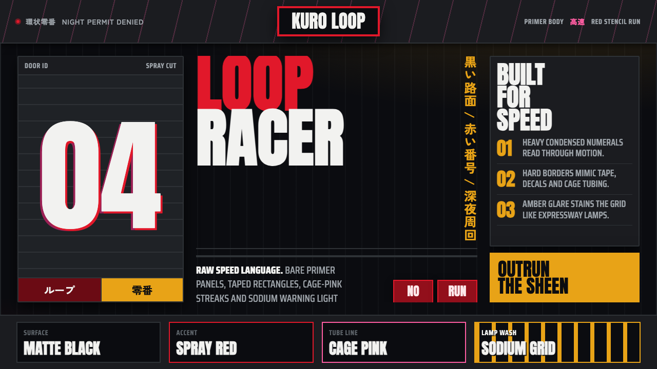 Kanjōzoku Loop RacerSpeed as contraband. Hot red numbers slice black tarmac with amber grid glare.速度像违禁品。黑色沥青上,火红数字与琥珀网格切开夜色。
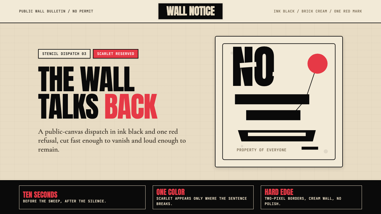 Banksy Stencil GraffitiProtest is reduced to a cut mark. Anton black on brick cream, one scarlet red…抗议被压成剪影。砖墙奶油底、Anton黑字,一点猩红打断。
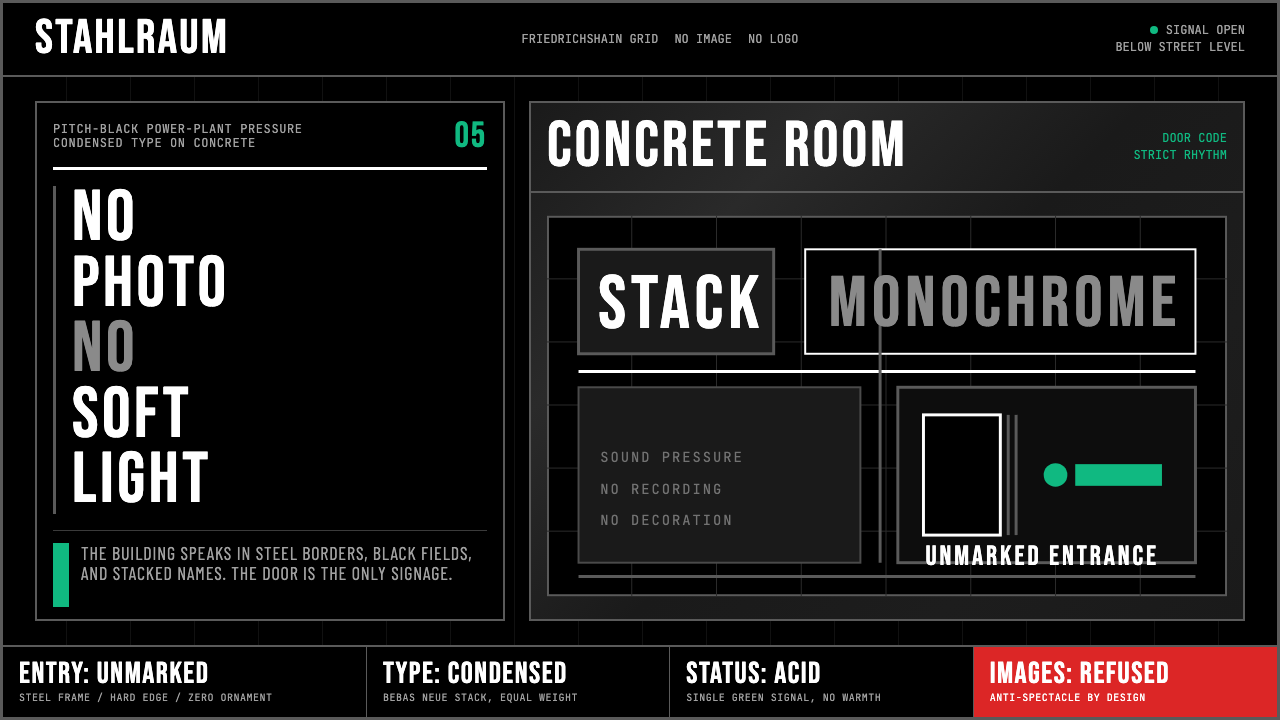 Berlin Techno (Berghain era)Refuses spectacle. Black grid, steel rules, condensed type, one acid-green si…拒绝景观:黑色网格、钢灰粗线、窄体大字,只留一盏酸绿信号。
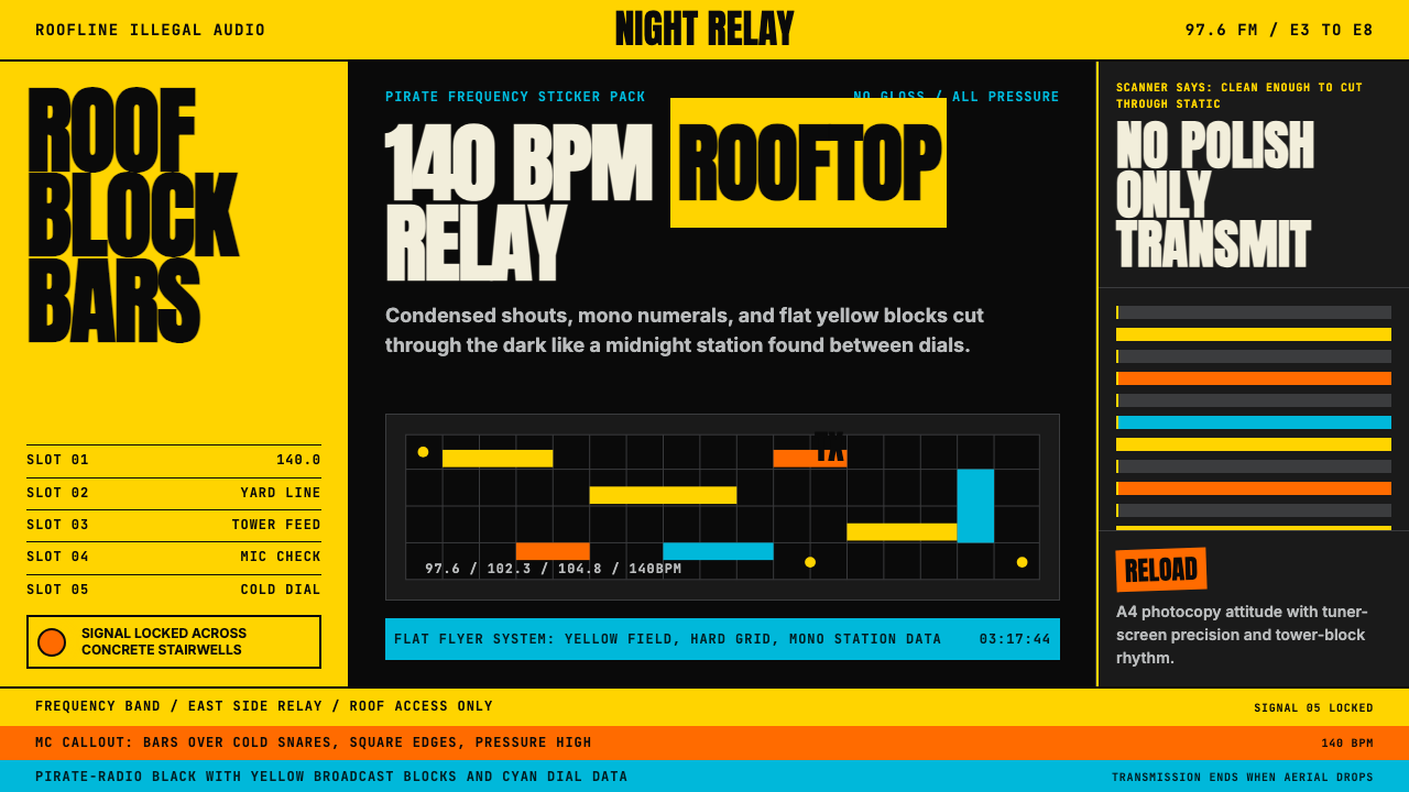 Grime London Pirate Radio (2003)Pirate signal, flat and urgent. Yellow blocks, mono FM numerals, hard flyer g…盗台信号,平面又急促。黄块、等宽频率字、硬网格成形。
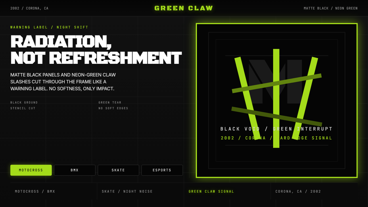 Monster Energy Claw (2002)Aggression, not refreshment. Matte black and neon-green claw slashes cut the…不是清爽,是冲击。哑黑底与霓绿爪痕撕裂画面。
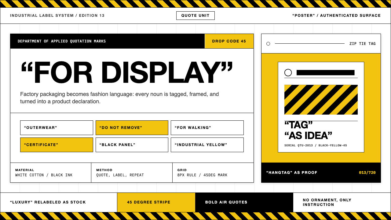 Off-White (Virgil Abloh era)Industrial irony, labeled. Yellow stripes and Helvetica quotes turn luxury in…工业反讽标签化:黄黑斜纹与粗黑无衬线引号,把奢侈变成工厂库存。