What is Off-White (Virgil Abloh era)?
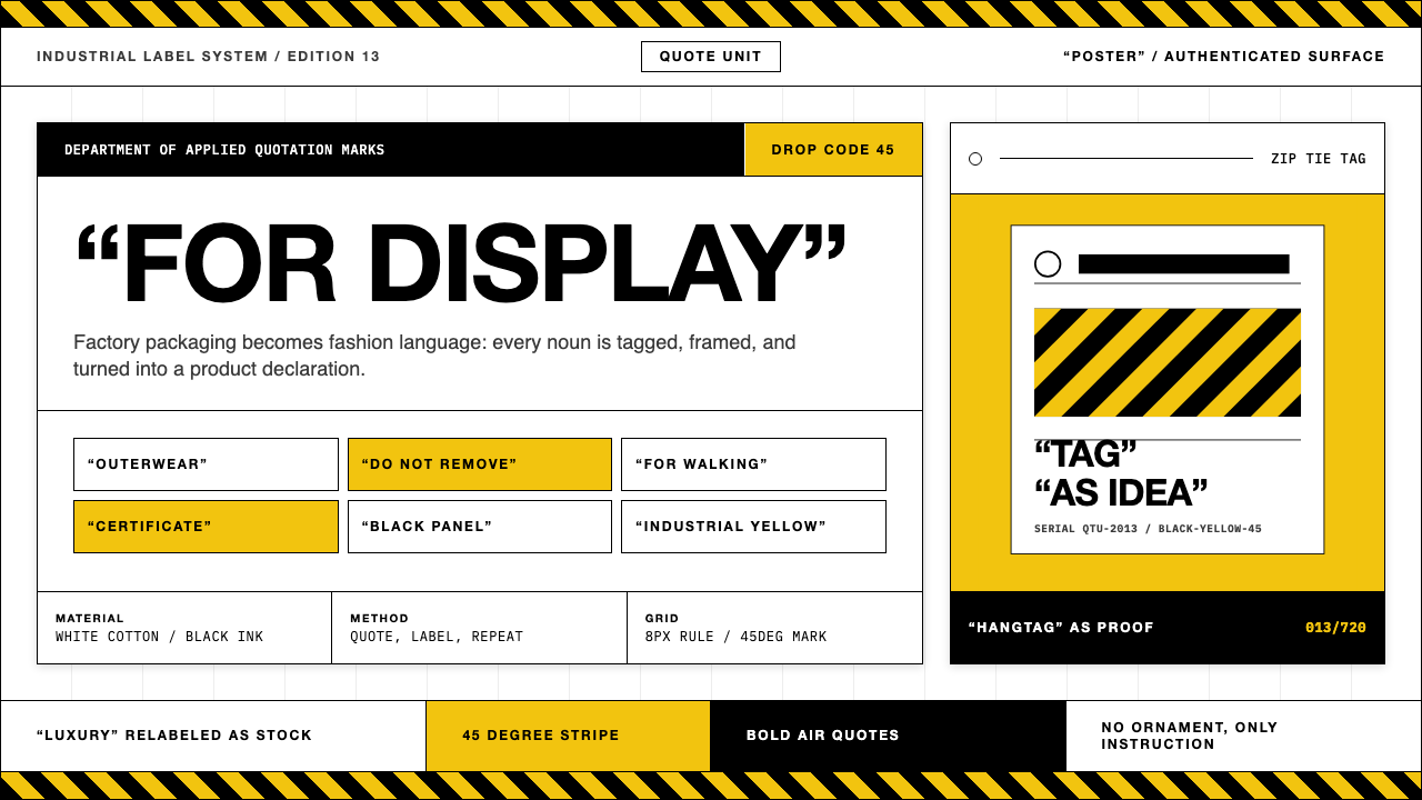
Off-White turned factory labeling into a luxury grammar — diagonal caution tape, air-quoted words, and zip-tie hangtags that made every garment look like it was simultaneously product and commentary on product.
Off-White (Virgil Abloh era) in brief
Off-White is the Milan-based fashion and design house that Virgil Abloh founded in 2013. Its visual identity synthesized contradictions that the fashion world had kept separate: streetwear and haute couture, readymade irony and expensive craft, Duchampian conceptualism and Bauhaus graphic severity. The result was a design language so immediately legible that it defined the aesthetic grammar of the mid-to-late 2010s across fashion, graphic design, product packaging, and digital interfaces.
The label's signature vocabulary is built from a handful of recurring elements: diagonal black-and-yellow stripes borrowed from industrial hazard marking, bold condensed uppercase letterforms enclosed in quotation marks that question the name of the thing being named, zip-tie hangtags that mimic factory quality-control tags, and typographic conventions drawn from product-specification sheets and shipping labels. Each element was already part of the visual landscape — on construction sites, in warehouses, on cargo palettes — before Abloh recontextualized it as luxury.
What made Off-White more than a clever exercise in irony was Abloh's consistent theoretical frame. He cited Marcel Duchamp's readymades as a founding principle: the act of selecting, framing, and labeling an object transforms it, regardless of what the object physically is. Applied to clothing and product design, this meant that the label was not just branding — it was the artwork. The quotation marks around 'SHOELACES' or 'FOR WALKING' do not mock the object; they hold it at a philosophical distance that simultaneously inflates and deflates its cultural status.

Where does Off-White (Virgil Abloh era) come from?
Virgil Abloh was born in Rockford, Illinois in 1980, the son of Ghanaian immigrants. He trained as a civil engineer at the University of Wisconsin–Madison and then earned a master's degree in architecture from the Illinois Institute of Technology — a program whose curriculum was still shaped by Mies van der Rohe's legacy. Architecture, with its insistence on structural logic, material honesty, and the relationship between form and program, remained the conceptual spine of everything Abloh later designed.
Before founding Off-White, Abloh served as creative director of Donda, Kanye West's creative agency, beginning around 2009. The collaboration pushed him into album art, stage design, merchandise, and the broader visual culture surrounding popular music — contexts where graphic language operates at a distance, read from afar on screens and at venues, and where bold, immediately legible visual systems succeed over subtle ones. His 2009 internship at Fendi in Rome, which he shared with Kanye West, gave him a direct experience of the European luxury production system from the inside.
Off-White launched in Milan in 2013 under the umbrella of the New Guards Group. Abloh named it after the idea of a space between black and white — neither one thing nor the other, occupying a conceptual gray zone that mirrored his own position between streetwear and luxury, between art school and fashion house. The brand's early collections drew heavily on the visual language of construction, industrial design, and the American Midwest's working landscape, filtered through the graphic precision Abloh had absorbed from the Bauhaus-descended curriculum at IIT.
The brand reached its cultural peak between 2017 and 2021. In 2017, Nike commissioned Abloh's 'The Ten' project — a reworking of ten iconic Nike silhouettes that applied Off-White's deconstructive vocabulary to some of the most recognized product designs in the world. The collaboration became one of the most influential sneaker and fashion events of the decade. In March 2018, LVMH appointed Abloh as artistic director of Louis Vuitton's men's wear — making him the first Black artistic director in the house's history. He continued running Off-White simultaneously. In November 2021, Abloh died of cardiac angiosarcoma, a rare heart cancer he had been diagnosed with in 2019 and had treated privately. He was 41. Art director Ib Kamara succeeded him at Off-White in 2022, continuing the project under LVMH ownership.
What defines the Off-White (Virgil Abloh era) look?
Diagonal Stripe
The forty-five-degree black-and-yellow diagonal stripe is Off-White's most recognizable motif. Derived directly from industrial hazard marking — the kind used on construction barriers, heavy machinery, and loading-dock floor markings — it carries an intrinsic sense of warning and attention-capture. Abloh used it at every scale: as a belt, as a print covering an entire garment, as a border element on hangtags and packaging. The stripe is never decorative in the conventional fashion sense; it is a citation, a piece of visual found text transplanted from industrial reality into luxury context.
Air-Quoted Typography
Placing a noun in quotation marks — 'SHOELACES', 'FOR WALKING', 'AIR', 'BROOKLYN' — is Off-White's most conceptually loaded device. The quotation marks signal that the word is being used, not mentioned: they simultaneously name the thing and question whether the name means anything. The typeface is bold, condensed, and set in capitals, clearly indebted to industrial label conventions and Helvetica's neutral authority. The combination of typographic weight and philosophical punctuation produces a tension that reads as both sincere and ironic at once — the signature Off-White ambiguity.
Zip-Tie Hangtag
The plastic zip-tie hangtag — identical to the fasteners used in logistics, electronics packaging, and industrial bundling — became one of the most copied accessories in fashion during the 2010s. On a garment retailing for hundreds or thousands of dollars, the zip tie functions as an index of Off-White's core conceptual operation: the most ordinary industrial fastener becomes an authenticating device and a collector's object. Many buyers deliberately left the tag attached after purchase, wearing it as a visible signal of provenance and cultural belonging.
Stark Achromatic Palette
The Off-White chromatic system is built around pure white, full black, and industrial yellow — with occasional use of orange-red or natural off-white as ground tones. Unlike fashion houses that rotate seasonal color stories, Abloh's palette was almost stubbornly achromatic, with the yellow diagonal stripe serving as the only consistent chromatic accent. This restraint gave collections a graphic authority and ensured that the brand's typographic and structural elements, rather than color fields, did the communicative work. The result reads like industrial signage: functional, non-decorative, immediately legible.
Product-Label Typography
Beyond the quotation-mark device, Off-White's typographic system draws extensively on the conventions of product specification sheets, customs declarations, and shipping manifests: serial numbers, size designations, material compositions, care instructions — all rendered in the same bold or condensed typefaces that industry uses for functional labeling. Abloh treated text as texture and as conceptual content simultaneously. Numbers, codes, and terse descriptors placed on garments and accessories created the visual impression of objects that were simultaneously mass-produced goods and unique cultural artifacts.
Deconstruction and Exposure
Off-White garments frequently expose their own construction: raw edges are left unfinished, interior structure is made visible, stitching appears on the outside, and seam allowances are treated as design elements rather than hidden production details. This approach is in direct dialogue with the deconstructivist fashion of Maison Margiela and Comme des Garçons, but Abloh inflected it with a streetwear directness — the exposure was less about fashion-school criticism and more about showing the object as an object, consistent with the readymade ethos running through the entire brand.
Architectural Restraint
Despite the density of conceptual reference within any given Off-White piece, the overall compositional logic tends toward restraint: white space is used generously, elements are placed with the deliberateness of a diagram rather than the layering of a fashion collage, and individual motifs are given room to register as singular objects. Abloh's architectural training — particularly his time with a curriculum shaped by Mies van der Rohe's maxim 'less is more' — produces a preference for structural clarity over visual noise, even when the individual elements are individually bold.

Who shaped Off-White (Virgil Abloh era)?
Abloh founded Off-White in 2013 and served as its creative director until his death in November 2021. Trained as a civil engineer and architect, he brought a structural, diagrammatic approach to fashion and graphic design that had no direct precedent in either field. His 2017 Nike 'The Ten' collaboration and his 2018 appointment as Louis Vuitton men's wear artistic director made him one of the most influential creative figures of the decade. He was the first Black artistic director in Louis Vuitton's history. Throughout his career, Abloh consistently framed his work through the lens of conceptual art — particularly the Duchampian readymade — and insisted that graphic design, fashion, product design, and architecture were a single continuous field.
Sierra Leone-born Ib Kamara succeeded Abloh as Off-White's art director in 2022. Previously editor-in-chief of Dazed magazine and a prominent stylist, Kamara brings an editorial and African cultural perspective to a brand whose visual language he inherited intact. His tenure represents the project's ongoing life under LVMH ownership — working within a visual system Abloh built while gradually opening new cultural and geographic references. Kamara's work in his first years at the brand demonstrates both fidelity to the established vocabulary and a measured expansion of its reference set.
Duchamp is not a figure in Off-White's organizational history but is its defining intellectual ancestor. His 1917 'Fountain' — a commercial urinal submitted to an art exhibition under a pseudonym — established the readymade as an art form: the artist's selection, framing, and contextual placement of an existing object constitutes a creative act. Abloh cited Duchamp repeatedly as the theoretical basis for his design practice. Every Off-White zip tie, every air-quoted label, every piece of industrial typography placed on an expensive garment is a readymade operation — the transformation of meaning through context rather than through fabrication.
The creative partnership between Abloh and West, which ran from their shared Fendi internship in 2009 through Abloh's years at Donda, was foundational to the visual culture that preceded Off-White. West's music and cultural position gave Abloh a platform to develop graphic systems — album covers, merchandise, tour visuals — that needed to operate at mass scale and at high intensity simultaneously. The collaboration taught Abloh that luxury and street, high-concept and populist, were not incompatible but mutually energizing — a lesson that became the operating premise of Off-White.
LVMH's investment in Off-White, completed through the New Guards Group acquisition in 2019, and the subsequent appointment of Abloh to Louis Vuitton, represented the luxury conglomerate's most decisive acknowledgment that streetwear had permanently altered the cultural geography of fashion. Arnault's decision to place Abloh at Vuitton's men's wear was a commercial and cultural signal: the codes that Off-White had spent six years establishing — industrial graphic language, conceptual labeling, the streetwear-luxury hybrid — were not a subcultural moment but a lasting structural shift in how luxury communicates.
How do you use Off-White (Virgil Abloh era) today?
Off-White's visual vocabulary is among the most widely applied — and most widely misapplied — of any contemporary design language. Correct application requires understanding the system's internal logic: every element is a citation, not a decoration. The diagonal stripe does not exist because it is visually interesting; it exists because it carries industrial meaning that is being deliberately displaced. The quotation marks do not exist to make text look designed; they exist to create semantic suspension. When either element is used purely for visual effect, the result is pastiche rather than application.
For presentation slides, Off-White works powerfully on cover and section-break pages where a single bold idea needs to dominate. A cover built in this idiom might place a large title in condensed all-caps against a white or near-white ground, with a diagonal stripe element running edge-to-edge and a single air-quoted descriptor positioned below the main title. Section slides can use the product-label convention: number the sections like serial designations, set section titles in the heavy condensed style, and let generous white space do the structural work. Data slides benefit from the diagrammatic quality — charts become labeled objects, with terse all-caps callouts treating data points the way Off-White treats product attributes.
For web interfaces, the style suits platforms and dashboards where authority, directness, and a deliberately anti-luxury-soft stance are values. A pricing page in this language uses a white or off-white ground, near-black body text at a generous measure, and diagonal-stripe or typographic band accents to differentiate tiers. UI components should be bordered and unambiguous — no soft card shadows, no gradient buttons. Interactive states use a bold chromatic shift — a yellow or black fill — rather than a subtle hover tint. Navigation wordmarks are set in the same condensed bold style as editorial labels, maintaining typographic consistency across functional and brand elements.
For editorial and marketing applications, the Off-White idiom excels when the content itself has conceptual or cultural density. A campaign headline treated as an air-quoted noun — 'SUMMER', 'COLLABORATION', 'LIMITED' — frames the reader as a participant in the irony rather than a passive recipient of information. Feature layouts use wide white margins, bold typographic rules as structural dividers, and a spare editorial rhythm that lets each text block read as a labeled object. Print and digital posters in this style work best when they commit to a single typographic idea at large scale, resisting the temptation to add secondary graphic complexity.
A common mistake when applying Off-White's vocabulary is treating the quotation marks and diagonal stripes as graphic decoration that can be mixed freely with other visual systems. In authentic application, every element is part of a coherent conceptual argument: the industrial language must remain internally consistent, the palette must stay controlled, and the typography must carry the weight of the layout without ornamental support. Adding the quotation-mark device to an otherwise conventional fashion layout produces visual confusion rather than conceptual tension. Similarly, using the diagonal stripe merely as a border or separator — without the industrial-citation logic that gives it meaning — reduces it to a pattern rather than a signal.

Off-White (Virgil Abloh era) — FAQ
Is Off-White a graphic design style or a fashion brand?
It is both, and the inseparability of the two was intentional. Abloh consistently argued that the brand's visual language — the stripes, the quotation marks, the typographic system — was not branding applied to a fashion product but was itself the creative work. The garments and accessories were the vehicles through which a graphic and conceptual system was distributed. This is why Off-White's visual vocabulary migrated so rapidly into other design fields: it was legible and transferable precisely because it was a graphic design system first, a fashion brand second.
What is the difference between using quotation marks as an Off-White reference and just using them for emphasis?
The distinction is conceptual, not typographic. Quotation marks used for emphasis — 'fresh' ingredients, 'revolutionary' technology — are scare quotes: they signal skepticism about the word being used. Off-White's quotation marks function differently. They do not mock the object ('SHOELACES' is not being questioned as a label for shoelaces); they suspend the naturalness of the naming act itself. The effect is closer to the philosophical use-mention distinction than to conventional scare quoting. In practical application, the Off-White device works when the quoted word is entirely literal — a functional noun, a material description, a dimension — so that the quotation marks create strangeness through context rather than through irony about the word's accuracy.
Can the Off-White visual language work without the brand recognition?
Yes, but only if the conceptual logic is maintained rather than just the surface elements. The diagonal stripe reads as industrial citation regardless of whether the viewer knows Off-White; the quotation-mark device creates semantic suspension in any literate viewer regardless of fashion context. What the brand recognition adds is a layer of cultural legibility — viewers familiar with Off-White will read the vocabulary as a deliberate homage or extension, while other viewers will read it as a direct application of the underlying conceptual logic. The system's strength is that both readings are valid and interesting.
How does Off-White relate to other deconstructivist fashion brands?
Off-White is often grouped with Maison Margiela and Comme des Garçons as a deconstructivist fashion practice, but the grouping obscures significant differences. Margiela's deconstruction operates through the garment's interior — exposing lining, revealing pattern pieces, turning tailoring inside out — and its graphic language is deliberately absent or anonymized. Comme des Garçons deconstructs proportion, silhouette, and cultural expectation, with a graphic register that tends toward the abstract or literary. Off-White's deconstruction is entirely graphic and conceptual, not structural in the tailoring sense. The garment construction may be conventional; what is deconstructed is the relationship between the object, its name, and its context. This makes Off-White more directly a graphic design practice than either Margiela or Kawakubo.
Does the style still work after Abloh's death, or is it dated?
The visual language Abloh developed has the same relationship to his death that Bauhaus graphic conventions have to 1933: the originating context is closed, but the vocabulary remains productive. The risk is that elements become purely referential — used because they look like Off-White, not because the underlying logic is being applied. Applied with the conceptual rigor Abloh modeled, the system remains a genuinely useful framework: the readymade operation, the industrial citation, the semantic quotation mark are durable ideas that work in any era when a designer needs to simultaneously present an object and question its cultural status. The style becomes dated only when it is used as a surface aesthetic rather than as a thinking tool.
Related design styles
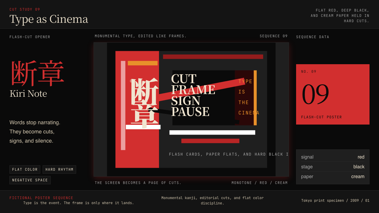 SHAFT Monogatari TypographyType becomes cinema. Red cuts, black flats, and monumental kanji steer the fr…
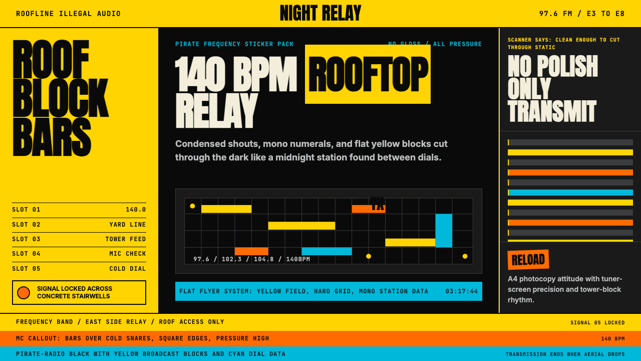 Grime London Pirate Radio (2003)Pirate signal, flat and urgent. Yellow blocks, mono FM numerals, hard flyer g…
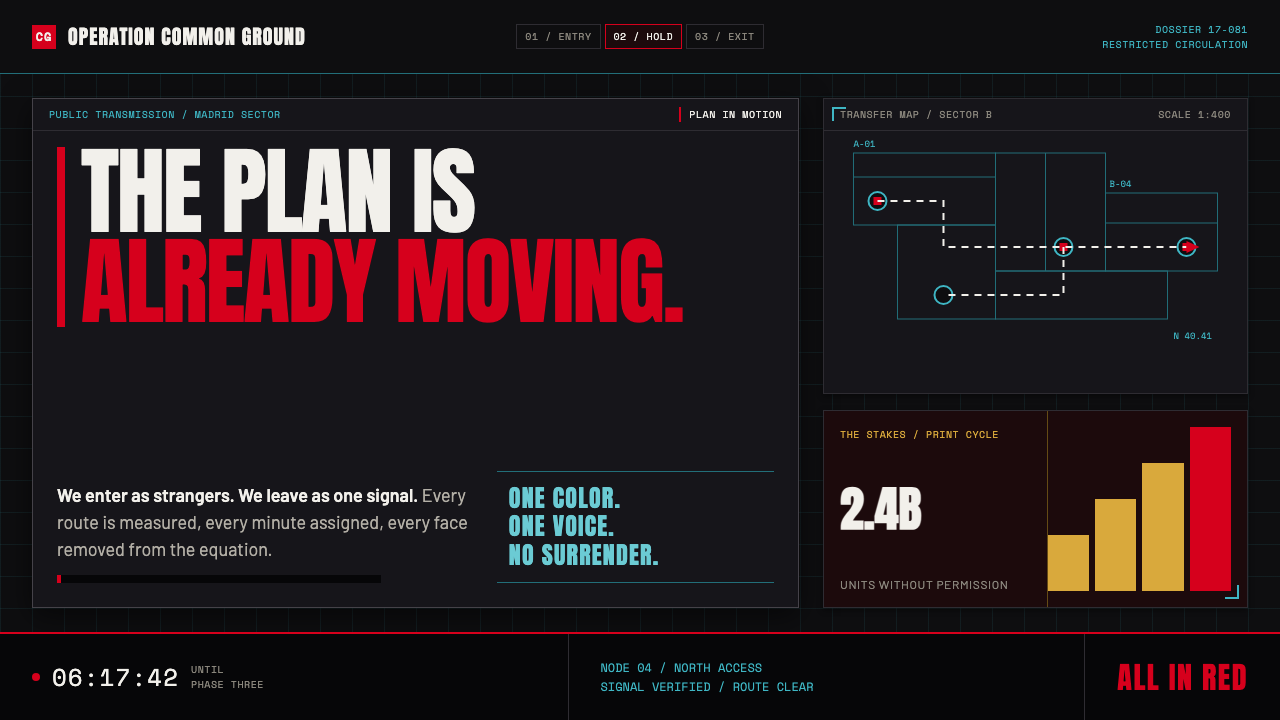 Money Heist (La Casa de Papel)Resistance becomes spectacle. Arterial red cuts through graphite grids and ta…
 Balenciaga (Demna era)Threatening restraint. Black grids, white hairlines, spaced sans at brutal sc…
 Banksy Stencil GraffitiProtest is reduced to a cut mark. Anton black on brick cream, one scarlet red…
 Kanjōzoku Loop RacerSpeed as contraband. Hot red numbers slice black tarmac with amber grid glare.