What is Balenciaga (Demna era)?什么是 Balenciaga (Demna era)?
Balenciaga under Demna Gvasalia turned couture restraint into a weapon — deep black grounds, monumental spaced type, and zero ornament deployed as provocation.Demna Gvasalia 执掌 Balenciaga 后,将高定的克制变成了武器——纯黑底色、巨型宽字距字体与零装饰构成了一套挑衅性的视觉宣言。
Balenciaga (Demna era) in briefBalenciaga (Demna era) 速览
Balenciaga in the Demna era is the defining luxury-streetwear visual language of the late 2010s and 2020s. Its grammar is deliberately severe: deep, near-absolute black grounds host monumental display type set at extreme widths and letter-spacing. Corners are sharp and unrounded. Ornament is entirely absent. The effect is simultaneously architectural and confrontational — less a fashion house identity than a brutalist manifesto dressed in couture.Demna 时代的 Balenciaga 是 2010 年代末至 2020 年代最具定义性的奢侈品-街头杂交视觉语言。其语法刻意严酷:近乎绝对的纯黑底色上,巨型显示字体以极宽字距占据版面。角落锋利,无任何倒圆。装饰完全缺席。整体效果同时具有建筑感与对抗性——与其说是一个时装屋的识别系统,不如说是一份穿着高定的野兽派宣言。
What separates the Demna visual system from generic dark minimalism is its specific relationship to scale and weight. Type dominates every composition at sizes that feel oppressive, not elegant. A single word — the house name, a season, a city — becomes the entire visual event. Negative space is not used for breathing room but for pressure: the emptiness presses in from all sides, making the central element feel trapped and powerful at the same time.将 Demna 视觉系统与普通深色极简主义区分开来的,是它与尺度和字重的特殊关系。字体以一种令人压抑而非优雅的巨大尺寸支配每一个构图。一个单词——屋号、季节、城市——成为整个视觉事件。留白不是用来制造呼吸空间的,而是用来制造压力的:虚空从四面八方挤压进来,让核心元素同时显得被困与强大。
Beneath the intimidating surface runs a rigorous ironic intelligence. Demna-era Balenciaga consistently stages the language of luxury against deliberately mundane or absurd references — fast-food branding structures, supermarket bag silhouettes, political campaign typography. The visual identity inherits this quality: it is always slightly too serious, too rigid, too industrial to be taken entirely at face value. That dissonance is the point.在令人生畏的表面之下运行着严格的反讽智识。Demna 时代的 Balenciaga 始终将奢侈品的语言置于刻意平庸或荒诞的参照系旁边——快餐品牌结构、超市购物袋轮廓、政治竞选式排版。视觉识别系统继承了这种品质:它永远比应有的样子更严肃一点、更僵硬一点、更工业一点,无法被完全当真。这种不和谐感正是重点所在。
See the Balenciaga (Demna era) design system查看 Balenciaga (Demna era) 完整设计系统
Where does Balenciaga (Demna era) come from?Balenciaga (Demna era) 从何而来?
The house of Balenciaga was founded in San Sebastián, Spain in 1917 by Cristóbal Balenciaga, who later relocated to Paris in 1937. Cristóbal was known for architectural couture — sculptural silhouettes that departed radically from the body, constructed with engineering precision. He closed the house in 1968, and for decades after his death in 1972, Balenciaga passed through several creative directors without finding a sustained identity. Nicolas Ghesquière (1997–2012) brought critical acclaim and a forward-looking technical aesthetic, but it was Demna Gvasalia's appointment in 2015 that produced the seismic shift in the house's cultural and visual register.Balenciaga 时装屋由 Cristóbal Balenciaga 于 1917 年在西班牙圣塞巴斯蒂安创立,后于 1937 年迁往巴黎。Cristóbal 以建筑式高定著称——雕塑般的廓形从身体上激进地脱离,以工程精度构造。他于 1968 年关闭了时装屋,1972 年去世后,Balenciaga 经历了多任创意总监却始终未能形成持续的身份认同。Nicolas Ghesquière(1997—2012年)带来了批评界的赞誉与前瞻性的技术美学,但真正引发时装屋文化与视觉坐标地震式转变的,是 2015 年 Demna Gvasalia 的任命。
Demna Gvasalia was born in 1981 in Sukhumi, in the then-Soviet republic of Georgia. His family fled the Georgian-Abkhaz war in 1992, eventually settling in Germany and later Belgium, where Demna studied fashion at the Royal Academy of Fine Arts in Antwerp — the same institution that produced the Antwerp Six. Before Balenciaga, he co-founded Vetements in 2014 with his brother Guram, a collective that became notorious for deconstructed streetwear, ironic branding, and deliberately anti-glamour aesthetics. Vetements established the vocabulary — outsized proportions, Soviet-bloc references, DIY urgency — that Demna then translated into the Balenciaga context at industrial luxury scale.Demna Gvasalia 于 1981 年生于苏呼米——当时属苏联格鲁吉亚共和国。1992 年格鲁吉亚-阿布哈兹战争爆发,他的家庭被迫逃离,最终定居于德国,后又迁往比利时。Demna 在安特卫普皇家美术学院修读时装——与「安特卫普六人组」出自同一机构。加入 Balenciaga 之前,他于 2014 年与兄弟 Guram 共同创立了 Vetements,这个集体以解构街头、反讽品牌和刻意反魅力美学而声名大噪。Vetements 确立了一套词汇——超尺寸比例、苏联集团参照、DIY 紧迫感——Demna 随后将其以工业奢侈品的体量移植进了 Balenciaga 的语境。
The visual identity that emerged at Balenciaga from 2015 onward drew on several converging influences. One is the tradition of French haute couture's typographic restraint — the austere logotype and minimal seasonal communication that high houses had used for decades. Another is the brutalist architecture of the post-war Eastern Bloc, which Demna has cited repeatedly as a formative visual environment: unornamented concrete, aggressive scale, the absence of comfort. A third is the vernacular of post-Soviet streetwear and sportswear, where bold, no-frills type and high-contrast colorways carried status without elegance.2015 年之后在 Balenciaga 形成的视觉识别系统,汇聚了几股影响。其一是法国高定在排印上的克制传统——各大老牌高定多年来惯用的朴素标准字与极简季节沟通物。其二是战后东欧集团的野兽派建筑,Demna 反复援引其为成长期的形象环境:无装饰的混凝土、压迫性的尺度、舒适感的缺席。其三是后苏联街头与运动服饰的大众语汇——在那套系统里,粗犷无修饰的字体与高对比度配色在不借助优雅的情况下传递地位。
The Triple-S sneaker, introduced in 2017, crystallized the Demna aesthetic commercially and visually: a maximalist silhouette that was simultaneously ugly and covetable, sold at luxury price points, branded with the same monumental type as the runway looks. The campaign imagery — shot by Demna himself or by photographers working in a deliberately flat, fashion-reportage register — reinforced the house's rejection of conventional luxury photography. Models in oversized pieces stood against blank or brutalist backgrounds, shot straight-on, lit without glamour. By 2018, the Balenciaga visual system was the most imitated aesthetic in luxury fashion and had migrated far beyond the fashion industry into technology, finance, and independent creative direction.2017 年推出的 Triple-S 老爹鞋在商业与视觉两个层面将 Demna 美学结晶化:一个极大主义的廓形,同时丑陋与令人垂涎,以奢侈品价位出售,印着与秀场单品相同的纪念碑式字体。活动图像——由 Demna 本人或以刻意平直的时装报道风格拍摄的摄影师操刀——强化了时装屋对传统奢侈品摄影的拒绝。身着超大单品的模特儿立于空白或野兽派背景前,正面直拍,无魅力打光。到 2018 年,Balenciaga 的视觉系统已成为奢侈时尚界模仿最广泛的美学,并远远渗透进时尚行业之外的科技、金融与独立创意总监领域。
What defines the Balenciaga (Demna era) look?Balenciaga (Demna era) 的视觉特征是什么?
Color色彩
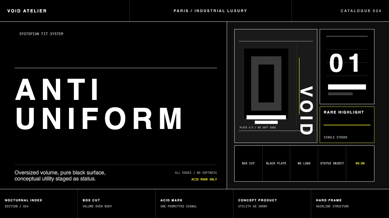
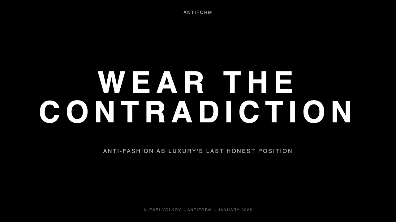
The Demna-era palette is anchored by near-absolute black — not warm charcoal, not navy, but the flattest, most compressive black possible. Against it, white or very pale type creates maximum contrast without any intermediate value. Accent color, when it appears, is used sparingly and with calculated shock: a single high-saturation tone dropped into an otherwise monochrome field. The seasonal shows occasionally expand the palette to include faded brights or washed primaries, but the default identity communication strips color to its binary extreme. This black-and-white severity is not minimalism in the softened contemporary sense — it is aggression rendered in two tones.Demna 时代的色板以近乎绝对的纯黑为锚点——不是暖调炭灰,不是深海军蓝,而是最平、最具压迫感的黑色。在其映衬下,白色或极浅色的字体制造出最大限度的对比,没有任何中间值。强调色出现时极其克制,且带有精算过的冲击感:一个高饱和度单色调被投入一片单色底面。季节性秀场偶尔将色板扩展至褪色亮色或洗旧主色,但默认的品牌识别沟通将色彩剥削至二元极端。这种黑白的严酷性不是当代软化版本的极简主义——它是用两种色调呈现的攻击性。
Typography字体排印
Type is the primary visual event in every piece of Demna-era Balenciaga communication. Display type is set at sizes that dominate the frame entirely — a wordmark or season label scaled to an extent that approaches abstraction. Letter-spacing is pushed to extreme widths, creating horizontal tension across the surface. The typeface choices lean toward grotesque or neo-grotesque forms with no personality curve: neutral, blunt, industrial. Uppercase is the default register; lowercase rarely appears in formal brand contexts. Weight contrast within a single composition is minimal — the system trusts scale alone to create hierarchy, not multiple weights competing for attention.字体排印是 Demna 时代 Balenciaga 每件沟通物中的首要视觉事件。展示字体被设置在完全支配版面的尺寸上——一个屋号或季节标签被放大到接近抽象的程度。字距被推到极宽,在画面表面制造出水平张力。字体选择倾向于无个性曲线的怪诞体或新怪诞体:中性、钝拙、工业感。大写字母是默认书写规范;小写字母在正式品牌场景中极少出现。单一构图内的字重对比极小——系统信任尺度本身创造层级,而非让多个字重相互竞争注意力。
Grid and Layout网格与版式
Compositions are governed by a strict, often centered or symmetrical grid — in deliberate contrast to the asymmetric dynamism of much contemporary luxury branding. This symmetry, combined with monumental scale, produces a gravitas closer to institutional signage or state typography than to fashion editorial. Margins are generous, functioning as compression rather than relief: the wide empty border presses the central element inward. Information hierarchy within a single layout is flat — one thing is said, at scale, and nothing else competes for attention.构图受严格的、通常居中或对称的网格支配——与大多数当代奢侈品牌不对称的动感品牌视觉形成刻意对比。这种对称性与纪念碑式的尺度叠加,产生出一种更接近机构标牌或国家字体的庄严感,而非时装编辑的气质。边距宽阔,但其功能是压迫而非舒缓:宽阔的空白边框将核心元素向内挤压。单一版面内的信息层级是扁平的——一件事情被以巨大尺寸陈述,没有任何其他元素与之竞争注意力。
Texture and Surface质感与表面
There is no surface texture in the Demna visual identity — no grain, no noise, no material warmth. Backgrounds are flat and optically dense. This digital flatness reads as deliberate: in a landscape where luxury brands routinely invoke craft through linen textures and aged paper effects, Balenciaga's refusal of any such signifier is itself a statement. The smoothness is not refinement; it is removal. The only texture acknowledged is that of print production itself — the weight of a paper stock or the solidity of a thick carrier bag — treated as the material baseline, not a designed flourish.Demna 的视觉识别系统中没有表面质感——没有颗粒感,没有噪点,没有材料温度。背景平整且在视觉上密实。这种数字化的平面性显然是刻意的:在奢侈品牌普遍通过亚麻质感和仿旧纸效果唤起工艺感的生态中,Balenciaga 对任何此类符号的拒绝本身就是一个宣言。这种平滑不是精致,而是去除。唯一被承认的质感是印刷生产本身的质感——纸张克重或厚实手提袋的触感——被视为材料基线,而非设计点缀。
Imagery and Photography图像与摄影
Campaign photography in the Demna era rejects conventional luxury staging. There is no aspiration, no soft light, no implied lifestyle. Images are often shot in flat, overcast light or under harsh artificial sources that flatten the face. Settings alternate between desolate urban environments — brutalist concrete plazas, bleak parking structures, windswept public spaces — and deliberately studio-plain white or black grounds. Models are not styled to perform desire; they stand, often expressionless, in clothes that perform their own logic. This refusal of seduction is the seduction.Demna 时代的广告摄影拒绝传统奢侈品的视觉舞台设定。没有憧憬感,没有柔和光线,没有暗示性的生活方式。图像常在平淡的阴天光线下或使压平面部的强烈人工光源下拍摄。场景在荒凉的城市环境——野兽派混凝土广场、萧瑟的停车场结构、风吹过的公共空间——与刻意平淡的白色或黑色纯色背景之间切换。模特不被造型为表演欲望;他们只是站立,通常面无表情,穿着执行自身逻辑的衣服。这种对诱惑的拒绝,本身就是诱惑。
Zero Ornament零装饰
The Demna identity system contains no graphic flourishes, no seasonal illustrations, no decorative linework, no badge or emblem beyond the wordmark, no icons, no pattern work. Where other luxury houses deploy monograms, toile patterns, or archival motifs as connective tissue, Balenciaga deploys blankness. The absence is structural: every communication is one message, delivered at maximum weight, with nothing around it. This total withdrawal from decoration is what makes the system feel both ascetic and brutal — discipline exercised not as refinement but as refusal.Demna 的识别系统中没有图形花饰,没有季节性插图,没有装饰性线条,没有除标准字以外的徽章或纹章,没有图标,没有图案。其他奢侈品牌用字母组合、提花图案或档案母题作为黏合组织,Balenciaga 用的是空白。这种缺席是结构性的:每件沟通物就是一条信息,以最大重量传递,周围什么都没有。对装饰的彻底撤退,正是让这套系统同时显得苦行与野蛮的原因——纪律被施行,不是作为精致,而是作为拒绝。
Irony and Conceptual Edge反讽与概念锋芒
Uniquely among luxury visual systems, the Demna identity carries a layer of conceptual irony that separates it from pure severity. The deliberate over-sizing of type, the adoption of political-campaign or bureaucratic-forms layouts, the staging of luxury goods against discount-retail aesthetics — all of these moves signal that the system is aware of its own posturing. It is luxury dressed in anti-luxury's clothing, and the knowing tension between those two positions is part of what the identity communicates. Applying the style without that self-awareness produces something that reads merely as bleak rather than intentional.在所有奢侈品视觉系统中独一无二的是,Demna 的识别系统承载着一层将其与纯粹严酷感区分开来的概念性反讽。字体的刻意过度放大、政治竞选或官僚表格版式的采用、将奢侈品置于折扣零售美学前的舞台设定——这些举措都表明这套系统清楚地意识到自身的姿态表演。它是穿着反奢侈品外衣的奢侈品,而这两种立场之间的知情张力,正是识别系统所传达的一部分内容。在缺乏这种自我意识的情况下应用这种风格,产生的结果只会被读作阴郁,而非刻意为之。
See the Balenciaga (Demna era) design system查看 Balenciaga (Demna era) 完整设计系统
Who shaped Balenciaga (Demna era)?谁塑造了 Balenciaga (Demna era)?
Demna is the Georgian-born creative director who joined Balenciaga in 2015 after co-founding the Vetements collective. His background — the Georgian-Abkhaz war, migration through Europe, Antwerp fashion training — informs every layer of the visual system he built at Balenciaga: the brutalist references, the post-Soviet typography, the anti-seduction photography, the ironic product-as-commentary approach. He has described his design process as autobiography, and the visual identity he produced at Balenciaga is inseparable from that personal history. In 2021 he also became the artistic director of Vetements concurrently, and in 2022 he parted ways with Vetements to concentrate on Balenciaga.Demna 是出生于格鲁吉亚的创意总监,2015 年以 Vetements 集体联合创始人的身份加入 Balenciaga。他的成长背景——格鲁吉亚-阿布哈兹战争、流亡欧洲的经历、安特卫普时装训练——渗透进他在 Balenciaga 构建的视觉系统的每一层:野兽派参照、后苏联排印、反诱惑摄影、产品即评论的反讽手法。他将自己的设计过程描述为自传,而他为 Balenciaga 打造的视觉识别系统与这段个人历史密不可分。2021 年他同时兼任 Vetements 艺术总监,2022 年与 Vetements 分道扬镳,专注于 Balenciaga。
The house's founder, Cristóbal Balenciaga (1895–1972), was born in the Basque Country and trained as a tailor before opening his Paris house in 1937. His couture was radically sculptural — the cocoon coat, the sack dress, the balloon skirt — designed to construct a relationship between garment and body that departed from Parisian norms. He was known for his reclusive perfectionism and his disdain for fashion's social spectacle. Demna has cited Cristóbal as the legitimate inheritance for his own anti-glamour stance: both designers, in their respective eras, refused to make dressing comfortable or aspirational in conventional terms. The severity of the Demna visual identity carries a formal echo of Cristóbal's constructive discipline.时装屋创始人 Cristóbal Balenciaga(1895—1972年)生于巴斯克地区,在成为裁缝后于 1937 年在巴黎开设时装屋。他的高定带有激进的雕塑性——茧形大衣、袋形裙、气球裙——被设计为构建一种偏离巴黎规范的服装与身体的关系。他以隐居式的完美主义和对时尚社交奇观的蔑视而闻名。Demna 将 Cristóbal 视为自己反魅力立场的合法遗产:两位设计师在各自的时代,都拒绝让穿着在传统意义上变得舒适或令人憧憬。Demna 视觉识别系统的严酷性,携带着 Cristóbal 构造式纪律的形式回响。
Ghesquière served as creative director of Balenciaga from 1997 to 2012, preceding Demna and establishing a very different but equally influential house aesthetic: futuristic, technically precise, with a strong emphasis on material innovation and a more conventionally fashion-forward visual identity. His tenure is responsible for Balenciaga's re-entry into critical relevance after decades of relative dormancy. Where Ghesquière's visual language was sleek and aspirational, Demna's is deliberately its opposite — the contrast between the two eras is itself part of the house's contemporary narrative. Ghesquière left to become creative director of Louis Vuitton, where he has built a third distinct identity.Ghesquière 于 1997 至 2012 年担任 Balenciaga 创意总监,在 Demna 之前建立了截然不同但同样具有影响力的时装屋美学:未来主义、技术精准,强调材料创新,具有更为传统时尚前瞻性的视觉识别。他的任期使 Balenciaga 在数十年相对沉寂之后重新进入批评界的视野。Ghesquière 的视觉语言光滑而令人憧憬,Demna 的则刻意与之相反——两个时代之间的对比本身就是时装屋当代叙事的一部分。Ghesquière 离开后出任路易威登创意总监,在那里构建了第三套独特的识别系统。
As chairman and CEO of Kering — the luxury conglomerate that owns Balenciaga — Pinault provided the institutional framework within which the Demna experiment became possible at scale. The decision to appoint an anti-establishment Georgian streetwear designer to one of Paris's oldest couture houses was a calculated strategic risk, and Pinault's backing was necessary for that risk to be sustained through the controversy-heavy early years. Kering's ownership also enabled the aggressive commercial expansion that turned the Triple-S sneaker and the visual system built around it into a genuinely global cultural phenomenon, rather than a critical fashion-industry moment.作为拥有 Balenciaga 的奢侈品集团开云的董事长兼首席执行官,Pinault 提供了使 Demna 实验得以在规模上成为可能的机构框架。将一位反建制的格鲁吉亚街头服饰设计师任命到巴黎最古老的高定时装屋之一,是一次经过计算的战略冒险,而 Pinault 的支持对于在充满争议的早期阶段维持这种冒险是不可或缺的。开云的所有权也使得积极的商业扩张成为可能,将 Triple-S 老爹鞋及其周围建立的视觉系统转化为真正全球性的文化现象,而非仅仅是时装行业内部的关键时刻。
How do you use Balenciaga (Demna era) today?今天怎么用 Balenciaga (Demna era)?
The Demna-era Balenciaga visual system is one of the most widely imitated aesthetics of the past decade, but also one of the most frequently misapplied. Applying it successfully requires understanding what makes it specific rather than merely dark or minimal: the precise relationship between type scale, negative space compression, and the near-total absence of supporting graphic elements. A layout that simply uses black and large type is not a Balenciaga-style layout — it is missing the pressure, the ironic self-awareness, and the compositional discipline that the actual system deploys.Demna 时代的 Balenciaga 视觉系统是过去十年中被模仿最广泛的美学之一,但也是被误用最频繁的之一。成功应用它需要理解是什么使它具体,而不仅仅是深色或极简:字体尺度、留白压缩与几乎完全缺席的辅助图形元素之间的精确关系。一个仅仅使用黑色和大号字体的版面,不是 Balenciaga 风格的版面——它缺少真实系统所部署的压力感、反讽自我意识和构图纪律。
For presentation slides, the style works with exceptional authority on cover and title pages where a single message must land with maximum weight. A cover in this mode carries one word or short phrase in monumental, widely-spaced display type against a near-black ground, with the presenter or event credit set in a single very small line at the bottom — nothing else. Content slides should be treated as severely as possible: one idea per slide, text set larger than feels comfortable, no decorative dividers, no icon accompaniments, no gradient or shadow on individual elements. Data visualizations take on a starkly diagrammatic quality — charts become geometric slabs in high-contrast tones, with labels set in the same monumental typeface family used throughout, scaled down but never decorated.在演示文稿中,这种风格在封面和标题页上具有极强的权威性,适合单一信息需要以最大重量落地的场合。这种模式下的封面承载一个词语或短语,以巨型宽字距显示字体置于近黑底色上,演讲者或活动信息在底部以单行极小字号标注——仅此而已,别无其他。内容页应当尽可能严格处理:每张幻灯片一个想法,字体设置得比感觉舒适的尺寸更大,无装饰性分割线,无图标伴随,单个元素上无渐变或阴影。数据可视化呈现出极度示意图式的品质——图表成为高对比色调的几何板块,标签使用贯穿始终的同一纪念碑式字体家族,缩小但绝不装饰。
For web interfaces, the aesthetic is well-suited to high-concept product pages, waitlist or launch pages, editorial platforms, and any context where projecting authority and cultural seriousness is the primary goal. The approach requires a full-bleed dark ground, type set at sizes that dominate each viewport section, and an almost complete absence of UI chrome — no visible grid lines, no soft-shadow cards, no decorative icons. Navigation is purely typographic. Interactive states are signaled by the most minimal possible change — a weight shift, an underline, a reversal of contrast — without hover animations or transition effects that would soften the surface's rigidity. Pricing or tier pages work well with this approach when the product is a single dominant option rather than a complex matrix.对于网页界面,这种美学适合高概念产品页面、候补或发布页面、编辑平台,以及任何以投射权威感和文化严肃性为首要目标的场景。这种方法需要铺满全幅的深色底面,字体以支配每个视口区域的尺寸设置,以及几乎完全缺席的界面装饰——没有可见的网格线,没有软阴影卡片,没有装饰性图标。导航纯为字体性的。交互状态通过尽可能微小的变化来传达——字重变化、下划线、对比度反转——不带悬停动画或会软化表面刚性的过渡效果。当产品是单一主导选项而非复杂矩阵时,定价或等级页面在这种方法下效果良好。
For editorial and marketing communications, the style supports strong single-message statements: event announcements, product launches, cultural partnership campaigns. A Balenciaga-derived editorial layout places the central claim at overwhelming scale, uses a very controlled secondary information layer in a contrasting small size, and leaves substantial areas deliberately empty — not as passive white space but as active compositional pressure. Print applications benefit especially from the system's directness: a poster in this mode needs only type and ground; nothing else justifies its presence. Email communications using this aesthetic must resist the temptation to add explanatory visual scaffolding — the system works through reduction, not addition.对于编辑和营销沟通,这种风格支持强劲的单一信息陈述:活动公告、产品发布、文化合作活动。Balenciaga 衍生的编辑版面将核心主张置于压倒性的尺度上,使用一个在对比小尺寸下的高度受控的次级信息层,并刻意留下大面积空白——不是作为被动的留白,而是作为主动的构图压力。印刷应用特别受益于这套系统的直接性:这种模式下的海报只需要字体与底色,其他任何元素都无法为其存在提供正当理由。使用这种美学的电子邮件沟通必须抵制添加解释性视觉支架的诱惑——这套系统通过削减而非增加来运作。
A consistent and significant mistake when applying this aesthetic is adding softness to ease perceived severity — rounding corners, adding subtle gradients to backgrounds, introducing warm-toned accent colors, or softening the type weight. Each of these moves works against the system's core mechanism. The discomfort the style produces is not a flaw to be corrected but the primary communicative act. Similarly, adding multiple typeface families, mixing in illustrative elements, or deploying the black-ground palette with a casual or playful information hierarchy produces an incoherent result — dark in appearance, but without the conceptual discipline that makes the Balenciaga visual language legible as a system rather than a mood.应用这种美学时一个持续且显著的错误,是为了缓解感知严酷性而添加柔和感——倒圆角、为背景添加微妙渐变、引入暖调强调色,或软化字重。这些举措中的每一个都对抗了系统的核心机制。这种风格所产生的不适感不是需要被纠正的缺陷,而是首要的传达行为。同样,添加多个字体家族、混入插图元素,或以随意或俏皮的信息层级部署黑色底面色板,会产生不连贯的结果——外观上是深色的,但缺乏让 Balenciaga 视觉语言作为系统而非氛围被读取所需的概念纪律。
See the Balenciaga (Demna era) design system查看 Balenciaga (Demna era) 完整设计系统
Balenciaga (Demna era) — FAQBalenciaga (Demna era) · 常见问题
Is this style really about Balenciaga's fashion, or is it a general dark-luxury direction?这种风格真的是关于 Balenciaga 时装的,还是一种通用的深色奢华方向?
It is specifically about Balenciaga under Demna and is not interchangeable with generic dark-luxury aesthetics. What makes the Demna system distinctive is its combination of brutalist scale, post-Soviet typographic references, and conceptual irony — none of which are present in, say, the dark aesthetics of Bottega Veneta or Celine. Using a black ground and large sans-serif type does not make something Balenciaga-coded; the system requires the specific register of monumental pressure combined with a deadpan conceptual layer. Generic dark-luxury is aspirational; the Demna system is confrontational. The distinction matters when selecting it as a reference for design work.这特指 Demna 执掌下的 Balenciaga,与通用的深色奢华美学不可互换。使 Demna 系统具有独特性的,是它对野兽派尺度、后苏联排印参照与概念性反讽的组合——这些元素在葆蝶家或思琳的深色美学中都不存在。使用黑色底面和大号无衬线字体并不能使某件作品具有 Balenciaga 的编码;这套系统需要纪念碑式压力与冷面概念层相结合的特定语域。通用深色奢华是令人憧憬的;Demna 系统是对抗性的。在将其作为设计工作参照时,这种区别至关重要。
Can this aesthetic work for brands outside fashion and luxury?这种美学能用于时尚和奢侈品以外的品牌吗?
Yes, but the transfer requires deliberate adaptation. The Demna visual system has already migrated into technology, independent publishing, architecture studios, and financial services — specifically in contexts where the brand wants to communicate seriousness, non-conformity, or cultural authority without conventional luxury signifiers. The adaptation that works is one that retains the core structural principles — compressed negative space, monumental type scale, zero decoration, high-contrast binary palette — while removing any direct fashion references that would make the result feel like a costume rather than a genuine identity. What does not work is applying the palette and type scale to a warm or playful brand voice, or to products that depend on consumer approachability for commercial success.可以,但这种迁移需要刻意的适配。Demna 视觉系统已经渗透进科技、独立出版、建筑事务所和金融服务领域——特别是在品牌希望在没有传统奢侈品符号的情况下传达严肃性、非从众性或文化权威性的场景中。有效的适配是保留核心结构原则——压缩的负空间、纪念碑式的字体尺度、零装饰、高对比度二元色板——同时去除任何会使结果感觉像戏服而非真实识别的直接时装参照。不起作用的是将这套色板和字体尺度应用于温暖或俏皮的品牌声音,或应用于商业成功依赖消费者亲和力的产品。
How does the Demna-era aesthetic relate to the earlier Balenciaga under Nicolas Ghesquière?Demna 时代的美学与之前 Nicolas Ghesquière 时期的 Balenciaga 有什么关联?
The two eras share only the house name and Cristóbal's founding legacy. Ghesquière's Balenciaga was sleek, futuristic, and technically aspirational — the visual identity reflected this with a cleaner, more refinedly editorial aesthetic that aligned with the high-fashion visual conventions of its moment. Demna's Balenciaga deliberately broke from every one of those conventions: where Ghesquière was aspirational, Demna is confrontational; where Ghesquière's imagery was polished, Demna's is flat and anti-glamour; where Ghesquière's typography was elegant, Demna's is industrial. Understanding the contrast is useful because it makes clear that the Demna aesthetic is an active argument against its predecessor, not simply an evolution — and that argumentative stance is part of what gives the system its energy.两个时代只共享时装屋的名字和 Cristóbal 的创始遗产。Ghesquière 的 Balenciaga 光滑、未来主义、技术上令人憧憬——视觉识别以一种更清晰、更精致的编辑美学反映这一点,与其时代的高时尚视觉惯例相符。Demna 的 Balenciaga 刻意打破了这些惯例中的每一条:Ghesquière 令人憧憬,Demna 是对抗性的;Ghesquière 的图像是抛光的,Demna 的是平直的、反魅力的;Ghesquière 的排印是优雅的,Demna 的是工业性的。理解这种对比是有用的,因为它清楚地表明 Demna 美学是对其前任的主动论辩,而非简单的演化——这种论辩姿态正是赋予这套系统能量的一部分。
What is the biggest risk of using this style incorrectly?错误使用这种风格最大的风险是什么?
The biggest risk is producing something that reads as bleak or oppressive without being legible as intentional. The Demna system works because every element of its severity is clearly chosen — the scale, the emptiness, the absence of warmth are all decisions, not defaults. When a designer applies the surface features — black ground, large type, no decoration — without the underlying conceptual precision, the result reads not as deliberate but as merely unfinished or uninviting. The style depends on the audience sensing that someone made every choice with full awareness; remove that sense and the severity becomes noise rather than signal. This is why misapplications of the style often feel oppressive where the original feels commanding.最大的风险是产生一件被读作阴郁或压迫性,而无法被理解为刻意为之的作品。Demna 系统之所以有效,是因为其严酷感的每个元素都清晰地是被选择的——尺度、空白、温度的缺席都是决定,而非默认状态。当设计师在没有底层概念精度的情况下应用表面特征——黑色底面、大号字体、无装饰——结果不会被读作刻意,而只会被读作未完成或令人不悦。这种风格依赖于观众感知到某人在完全意识下做出了每一个选择;失去这种感知,严酷感就变成噪音而非信号。这就是为什么对这种风格的误用往往感觉压迫,而原作感觉是在发号施令。
Does the ironic conceptual dimension mean this style cannot be used sincerely?反讽的概念维度是否意味着这种风格不能被真诚地使用?
Not exactly. The irony in the Demna system is structural — it operates through the gap between the signals the visual language sends (institutional authority, brutal permanence) and the contexts it is applied to (seasonal fashion, disposable consumer goods). That gap is always present when the style is used in commercial contexts, and a designer does not need to explicitly flag it or lean into it; the structure creates it automatically. What sincerity requires is precision and commitment: choosing every element deliberately, maintaining the system's internal logic without softening exceptions, and understanding why specific choices read as authoritative rather than simply dark. The style can be used earnestly to communicate genuine institutional weight, genuine severity, or genuine cultural seriousness — the ironic dimension does not require winking at the audience.不完全是。Demna 系统中的反讽是结构性的——它通过视觉语言发出的信号(机构权威、野蛮的永久性)与其被应用的场景(季节性时装、一次性消费品)之间的落差来运作。这种落差在风格被用于商业场景时始终存在,设计师不需要明确标记它或刻意强调它;结构自动创造它。真诚所需要的是精准与承诺:刻意地选择每个元素,在没有软化例外的情况下维持系统的内在逻辑,并理解为什么特定的选择被读作权威性的,而不仅仅是深色的。这种风格可以被真诚地用于传达真实的机构分量、真实的严肃性或真实的文化庄重感——反讽的维度不需要向观众眨眼。
Related design styles相关设计风格
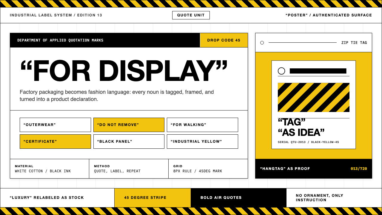 Off-White (Virgil Abloh era)Industrial irony, labeled. Yellow stripes and Helvetica quotes turn luxury in…工业反讽标签化:黄黑斜纹与粗黑无衬线引号,把奢侈变成工厂库存。
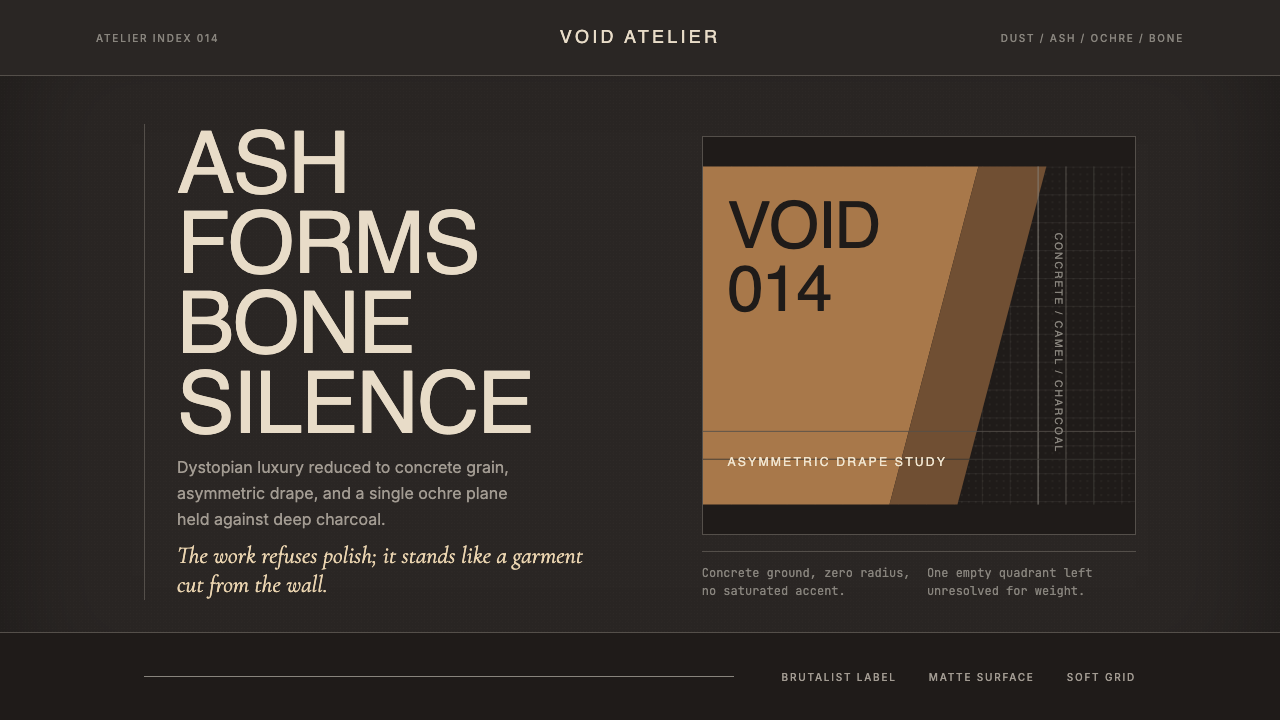 Rick Owens DarkstarRestraint has gravity. Charcoal concrete, bone type, and one ochre drape hold…克制自带重力:炭灰混凝土、骨白字、单片赭色垂坠定住画面。
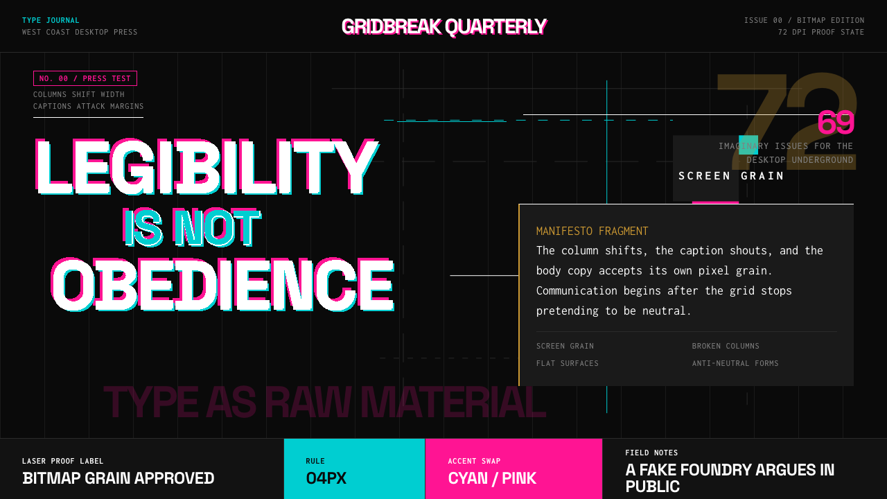 Emigre Magazine (1984–2005)Defies the tidy grid. Cyan, ochre, and hot-pink bitmap type collides on black.拒绝整齐网格:黑底上的青色、赭色与热粉像素字相撞。
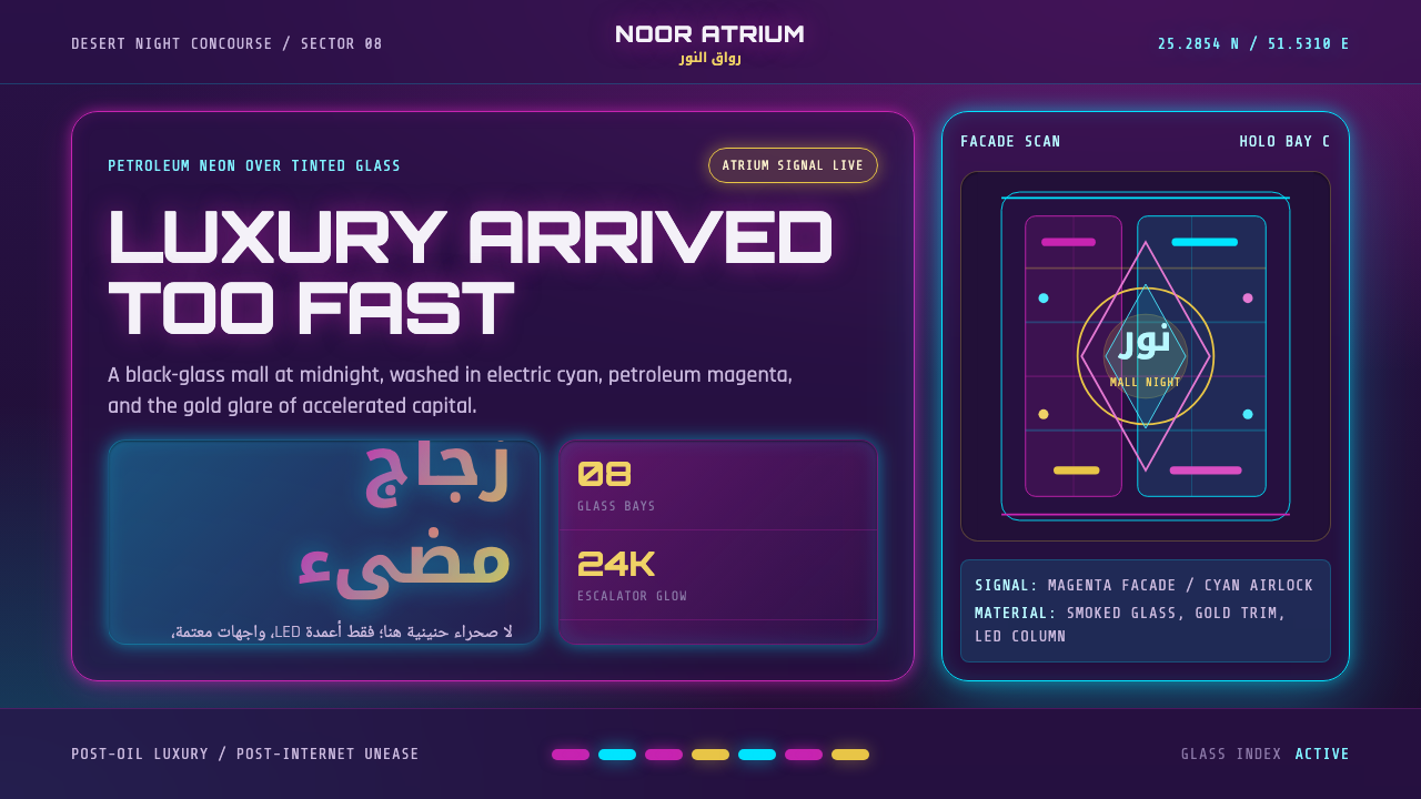 Gulf FuturismLuxury feels accelerated. Magenta-cyan neon cuts glass grids over purple-blac…奢华被加速:品红与电青霓虹切过紫黑玻璃网格。
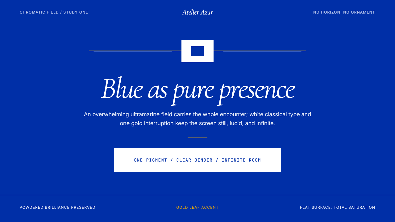 Klein Blue (IKB)Color becomes the content. Pure ultramarine field, white italic serif, one go…色彩即内容:纯群青场域、白色斜体衬线与一线金色。
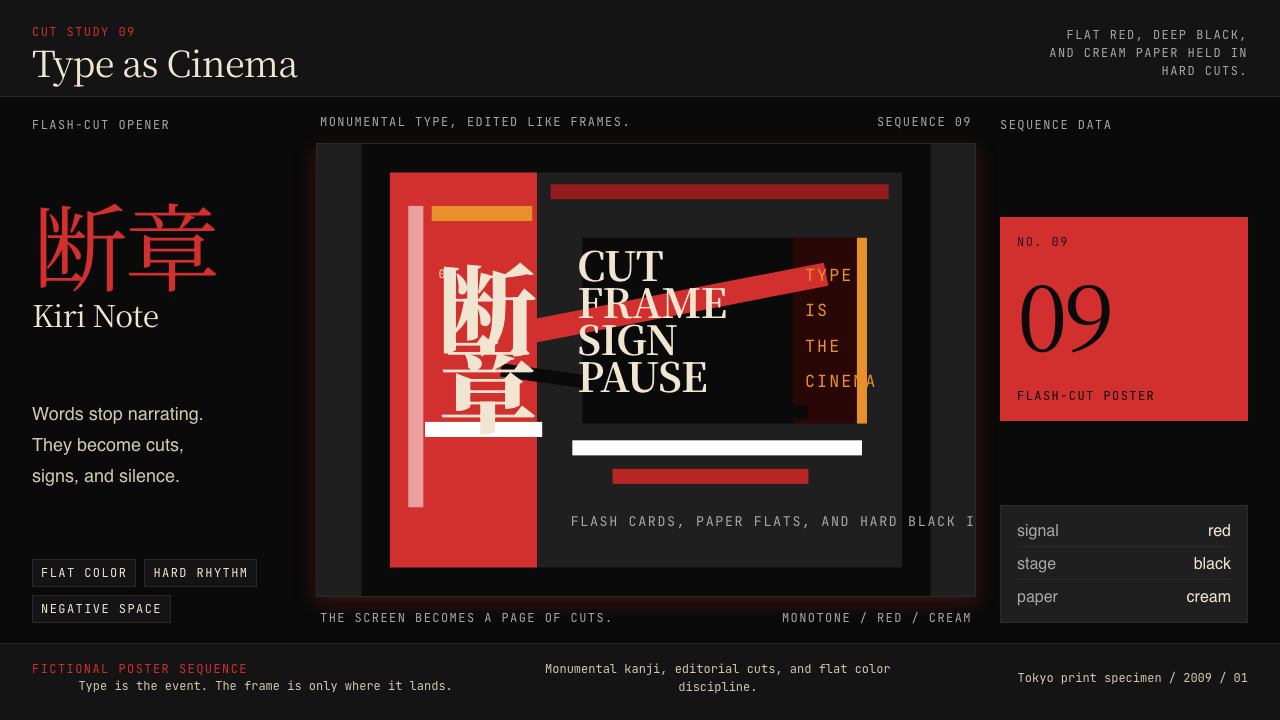 SHAFT Monogatari TypographyType becomes cinema. Red cuts, black flats, and monumental kanji steer the fr…文字变成电影。红黑平涂与巨字闪切主导画面。