What is Gulf Futurism?
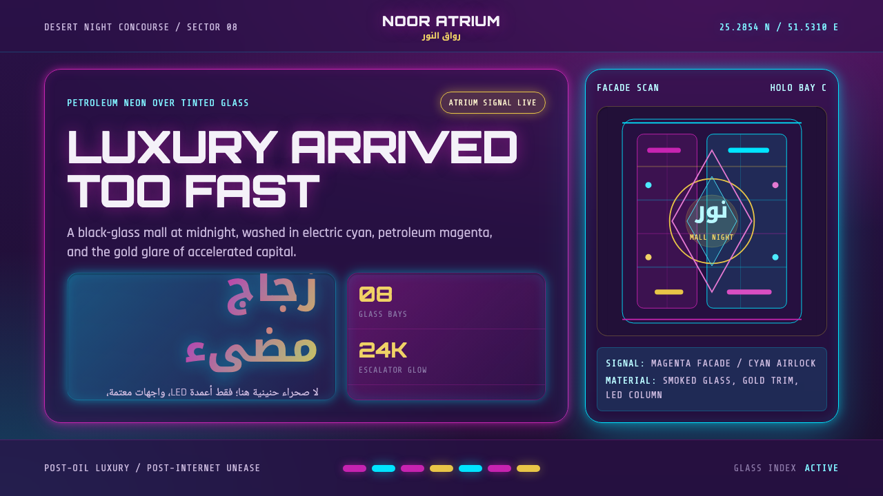
Gulf Futurism renders oil-boom luxury as neon: a black glass tower at desert night, drenched in petroleum magenta and electric cyan.
Gulf Futurism in brief
Gulf Futurism is a visual language named by artist Sophia Al-Maria and musician Fatima Al-Qadiri to describe the hypermodern Arabian Peninsula — a region where oil wealth compressed decades of urban development into a few hyper-accelerated years. Where earlier depictions of the Gulf leaned on souks, dunes, and camels, Gulf Futurism looks instead at the atrium, the tinted curtain wall, the gold-toned escalator, and the mall that stays exactly the same temperature regardless of what the desert outside is doing.
The aesthetic is built on a single non-negotiable move: saturated, artificial light against a ground so dark it reads as purple-black rather than true night. Petroleum magenta and electric cyan are its signature register, laid over glass and polished stone rather than over paper or fabric. Surfaces are hard, reflective, and cool to the touch even when the color temperature is hot — luxury rendered through material sheen, not through pattern or texture.
What makes the style more than a color scheme is its emotional charge. Gulf Futurism holds dazzlement and disorientation in the same frame: the same glass tower that signals arrival and wealth also signals a future that outran the culture meant to inhabit it. It is not a celebration of technology for its own sake, nor a nostalgia piece — it is a document of speed, describing what it feels like when a place skips stages of development that took other regions a century to work through.
Where does Gulf Futurism come from?
The term Gulf Futurism was coined around 2012 by the Qatari-American artist and writer Sophia Al-Maria, working alongside the Kuwaiti-American musician and producer Fatima Al-Qadiri. Al-Maria had spent her childhood shuttling between the Pacific Northwest and Qatar, watching Doha transform from a modest coastal town into a skyline of glass towers within a single generation — a compression of time that felt, to her, closer to science fiction than to conventional urban history. Al-Qadiri, raised in Kuwait, brought a parallel sensibility shaped by the sound and spectacle of Gulf consumer culture: shopping malls, luxury car showrooms, and the region's fascination with imported futurity.
Both artists were responding to something specific: the way the Gulf states — Qatar, Kuwait, the United Arab Emirates chief among them — had used oil and gas revenue to build infrastructure and skylines at a pace with no real historical precedent. Where Western modernism unfolded across a century of incremental industrialization, Gulf cities appeared to skip straight to a hyper-modern endpoint, importing global architecture firms, luxury retail brands, and entertainment megaprojects wholesale. Al-Maria described this condition in her writing as a kind of alien deja vu — a future that had already arrived, built by others, superimposed onto a landscape and a culture that had not authored it.
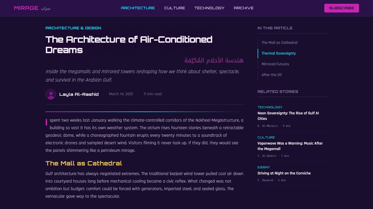
Gulf Futurism also positioned itself explicitly against an older visual tradition: the Orientalist fantasy of the Gulf as a timeless, exotic backdrop of tents and dunes, a trope that had persisted in Western media long after it stopped describing anything real. By training its focus on shopping malls, LED signage, and air-conditioned atriums instead, the movement insisted on the actual, present-tense built environment of the region — a rebuttal delivered through the same tools of image-making that had spread the older fantasy.
The aesthetic first crystallized across a loose body of work rather than a single manifesto: Al-Maria's essays and short films, Al-Qadiri's music and album artwork (frequently produced alongside her sister, the artist Monira Al-Qadiri), and a wider current of post-internet art that was, at the same historical moment, using digital tools to interrogate how global consumer culture homogenizes place. Arabic calligraphy reappears throughout this work not as historical ornament but recast as holographic, illuminated signage — the old script wearing the region's new visual skin.
What defines the Gulf Futurism look?
Color
The palette pivots on a single high-contrast pairing: a searing magenta with petroleum undertones against an electric, almost chemical cyan. Both sit on a ground so deep in purple and black that it reads as tinted glass rather than open sky. There is no pastel register and no earth tone; color here is meant to look manufactured and artificially lit, never natural or sun-warmed.
Surface and Material
Everything reads as hard and reflective: tinted glass, polished stone, brushed or gold-toned metal. There is no soft fabric, no matte paper texture, no organic grain. Luxury is communicated through sheen and reflectivity rather than through pattern or ornament — a surface should look like it could show a distorted reflection of the neon lighting it up.
Light
Light is always artificial and always the protagonist: LED columns, backlit signage, glowing atrium coves. Natural daylight rarely appears at all — the aesthetic is nocturnal by default, since it is at night that the neon and the glass can dominate a scene uncontested. Light sources are visible as objects in their own right (a glowing column, a lit sign) rather than implied through soft ambient glow.
Calligraphy and Signage
Arabic calligraphy appears throughout, but recast: not ink on paper but illuminated, holographic, or backlit signage, treated as a light-emitting object rather than as historical script. The letterforms retain their traditional flow and calligraphic weight, but the medium carrying them is entirely contemporary — a fusion that signals continuity of language inside a radically new visual economy.
Architecture and Space
The characteristic setting is the atrium: a tall, glass-enclosed interior volume, often lined with escalators, that mediates between the extreme exterior desert climate and an artificially cooled interior world. Verticality matters — towers and multi-story mall interiors dominate over low horizontal forms. Interiors feel sealed and self-sufficient, deliberately cut off from the climate and geography just outside the glass.
Mood
The emotional register sits deliberately between awe and unease. Surfaces are dazzling and inviting, but the overall feeling carries a current of disorientation — a sense of a future that arrived faster than the culture around it could metabolize. This is not dystopian in a dark or ruined sense; it is a hyper-affluent unease, luxury pushed to a speed that feels slightly vertiginous.
Absence of the Old Orientalist Vocabulary
What is deliberately missing matters as much as what is present: no tents, no dunes rendered as scenic backdrop, no camels, no traditional souk staged as spectacle. Gulf Futurism actively displaces the older exoticized imagery of the region with the region's actual contemporary built environment, treating the mall and the tower as more truthful subjects than the desert postcard.
Who shaped Gulf Futurism?
Al-Maria, a Qatari-American artist and writer, coined the term Gulf Futurism to describe the compressed, hyper-accelerated modernization she witnessed growing up between the United States and Qatar. Her essays, films, and visual art return repeatedly to malls, towers, and the psychological disorientation of a landscape rebuilt faster than its inhabitants could adjust to. Her writing frames the aesthetic not as a celebration of technology but as a document of what rapid, externally-imported modernization feels like from the inside.
Al-Qadiri, a Kuwaiti-American musician and producer, co-developed the Gulf Futurism concept alongside Al-Maria, translating its visual and cultural logic into sound and album artwork. Her music often pairs glossy, synthetic production with imagery drawn from Gulf consumer spectacle — luxury goods, shopping malls, imported entertainment — giving the aesthetic an audible counterpart to its visual signature.
Monira Al-Qadiri, Fatima's sister, is a Kuwaiti artist whose sculpture and video work frequently engages the same territory — the visual culture of Gulf petro-wealth, iridescent and metallic surfaces, and the region's relationship to oil as both resource and aesthetic object. Her collaborations and parallel practice helped give Gulf Futurism a presence in fine art and installation contexts beyond music and writing.
How do you use Gulf Futurism today?
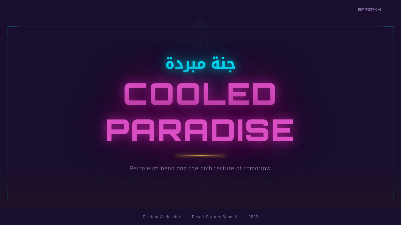
Gulf Futurism translates well into presentation cover slides and any context where a single, dramatic hero image needs to set a tone of accelerated luxury. A cover works best as a near-black or deep purple-black field with a single strong magenta-to-cyan lighting gesture — a glowing edge, a vertical column of light, a reflective surface catching color — rather than as an evenly lit, fully-colored canvas. Restraint on how much surface actually catches light is what keeps the effect feeling architectural rather than like a generic neon gradient.
For content and data slides, treat the two accent colors the way the aesthetic treats real neon signage: sparingly, and only where something genuinely needs to draw the eye. Body content should sit on the dark purple-black ground in a cool, quiet, high-contrast tone; magenta and cyan are reserved for key figures, headline numbers, or a single call-out per slide. Charts benefit from being rendered as if they were lit objects themselves — a single glowing accent line against a dark field reads as more authentically Gulf Futurist than filling every bar or segment with neon.
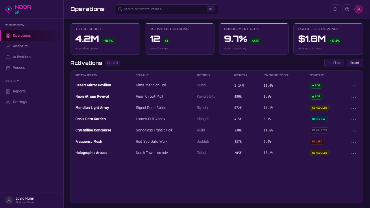
In web UI, the style suits dashboards and pricing pages that want to signal premium, high-tech positioning without looking playful. Dark-mode-first is essentially mandatory — the aesthetic does not have a credible light-mode version. Interactive states (hover, active, selected tier) are the natural home for the magenta-cyan accent pairing, while resting states stay in near-black and muted cool grays. Card and panel edges benefit from a faint glow rather than a hard drop shadow, echoing the way light behaves on glass and polished surfaces rather than on paper.
For editorial and marketing work, Gulf Futurism is strongest as a hero-and-atmosphere device: a landing page's top section, a magazine feature's opening spread, an event poster. It is less suited to dense, text-heavy layouts, since its power comes from a small number of high-impact lighting gestures against a large dark field — cramming multiple neon elements into a busy composition dilutes the effect rather than intensifying it. Pairing the aesthetic with calligraphic or script-based display type (used sparingly, as a signage-style accent rather than as body copy) reinforces the style's core tension between an old script and a hyper-new visual economy.
The most common mistake is treating Gulf Futurism as simply 'add magenta and cyan neon to anything dark' without the material logic underneath. Without the sense of glass, reflection, and artificial architectural light, the palette alone reads as generic cyberpunk or vaporwave rather than as Gulf Futurism specifically. The style depends on a hard, cool, glossy material world and an atmosphere of accelerated luxury and disorientation — strip that away and only the color pairing survives, which is not enough to carry the reference.
Gulf Futurism — FAQ
Is Gulf Futurism the same as cyberpunk or vaporwave?
They share a neon-on-dark palette but come from different places and carry different meanings. Cyberpunk imagines a dystopian near-future built around technology and corporate control, often in fictional Western or East Asian mega-cities. Vaporwave is a nostalgic, ironic remix of 1980s–90s consumer aesthetics, deliberately hollow and detached. Gulf Futurism is neither speculative nor ironic — it describes a real, specific place and a real economic and cultural condition: the compressed, oil-funded modernization of the actual Arabian Peninsula. The glass towers and neon it depicts already exist; it is documentary in spirit even when it looks futuristic.
Why is Arabic calligraphy such a central element rather than just a regional decoration?
Because it embodies the aesthetic's central idea in a single image: an ancient script rendered through the newest possible medium, illuminated signage instead of ink. The calligraphy is not there to signal 'Middle Eastern setting' the way a generic Orientalist illustration would. It is there to show continuity — the same language, the same visual tradition, now delivering its meaning through LED and holographic display rather than through pen and paper, which is exactly the compressed, layered sense of time the whole aesthetic is describing.
Does Gulf Futurism have to be nocturnal, or can it work in daylight?
The aesthetic is nocturnal by default because its entire power depends on artificial light dominating a scene uncontested, which only reads clearly against a dark ground. A daylight version is possible but requires substituting the desert sun's own harsh, high-contrast quality for the neon, and it will read as a different, more architectural register — closer to documentary photographs of Gulf skylines than to the glowing, dreamlike quality the term usually describes. If daylight is required, the safer move is to stay inside sealed interior atriums lit artificially even at midday, rather than depicting open exterior daylight directly.
Is Gulf Futurism a celebration of consumer luxury, or a critique of it?
It is deliberately both at once, and that ambivalence is the point. The aesthetic does not moralize against luxury or oil wealth, but it also refuses to present the malls and towers as uncomplicated triumphs. The dazzling surface and the undercurrent of disorientation are meant to coexist in the same image — a viewer is meant to feel the pull of the glossy spectacle and the unease of a landscape and culture reshaped faster than anyone could fully process, at the same time.
What kind of products or brands does Gulf Futurism suit, and where does it feel wrong?
It suits contexts that want to signal premium technology, nightlife, luxury retail, music and event branding, or speculative near-future storytelling with a specific cultural anchor rather than a generic sci-fi one. It works less well for anything that needs to feel warm, artisanal, or grounded in natural materials — the aesthetic is fundamentally about glass, artificial light, and engineered surfaces, not texture or handcraft. It can also feel misapplied if used purely decoratively, detached from any sense of place or material logic, since its meaning depends on the specific historical condition it was coined to describe.
Related design styles
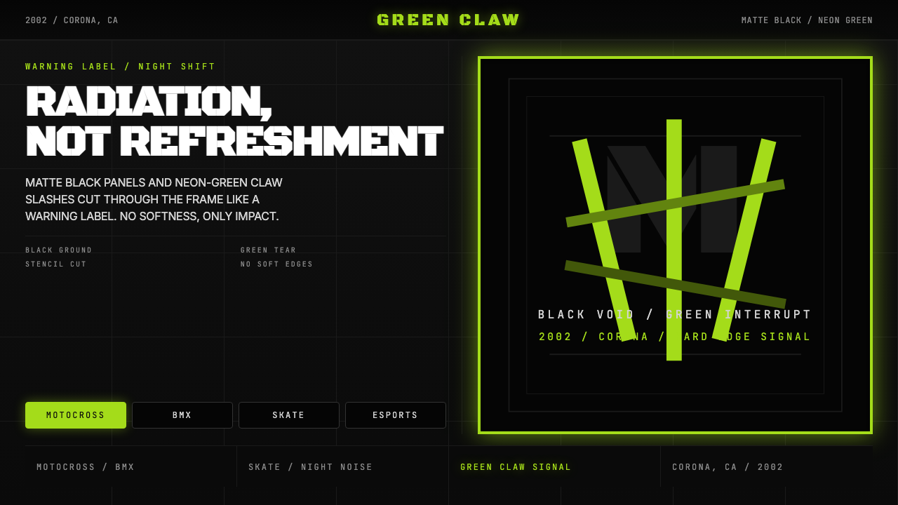 Monster Energy Claw (2002)Aggression, not refreshment. Matte black and neon-green claw slashes cut the…
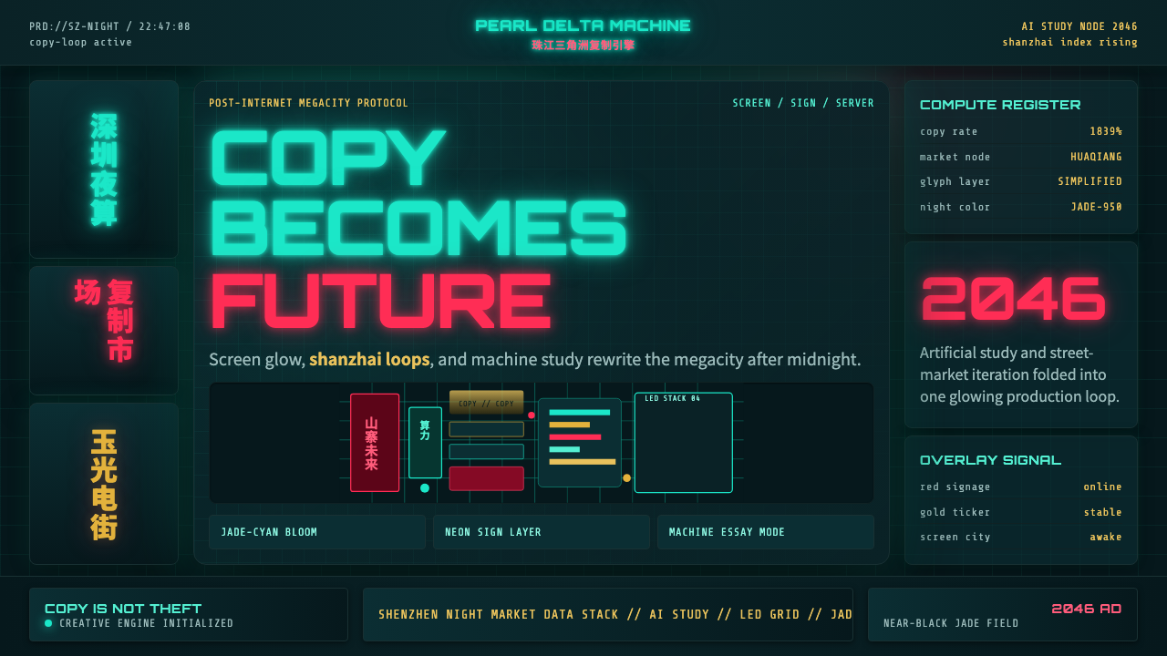 SinofuturismCopy becomes future. Jade-cyan grids, red signage, and Orbitron data stack th…
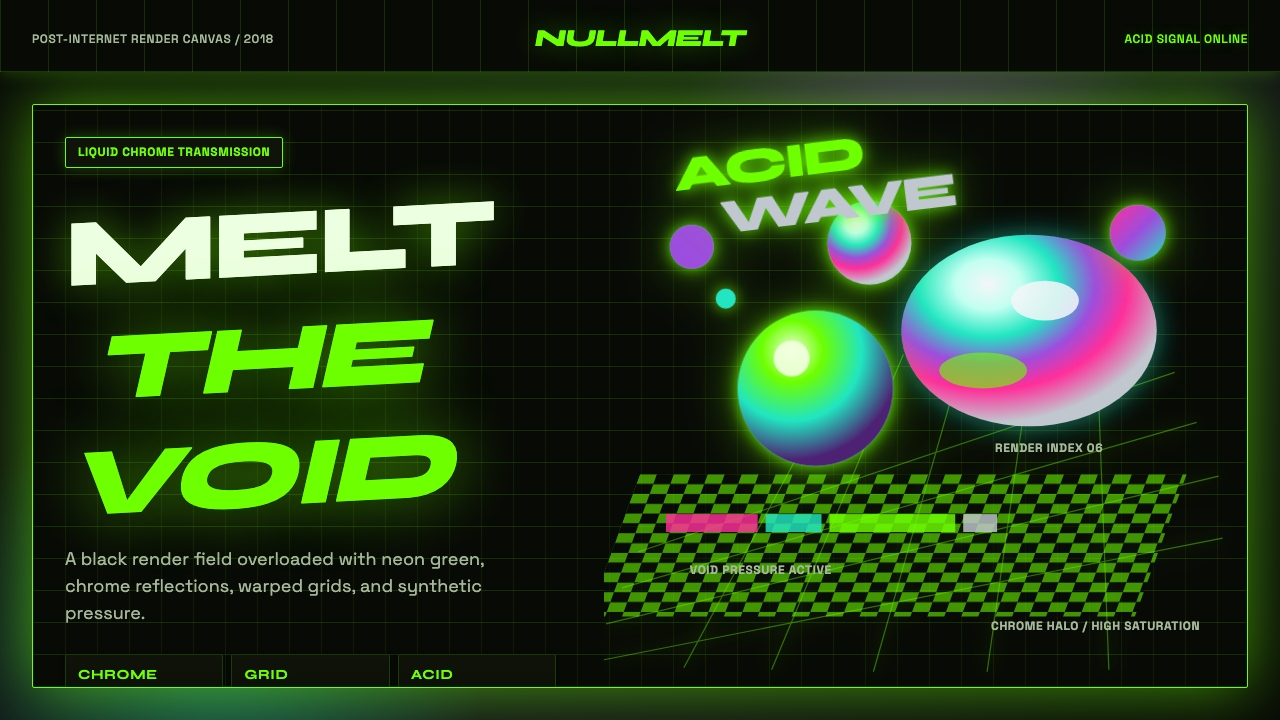 Acidwave 3D RenderPsychedelia hits the render engine. Neon green, chrome orbs, and warped grids…
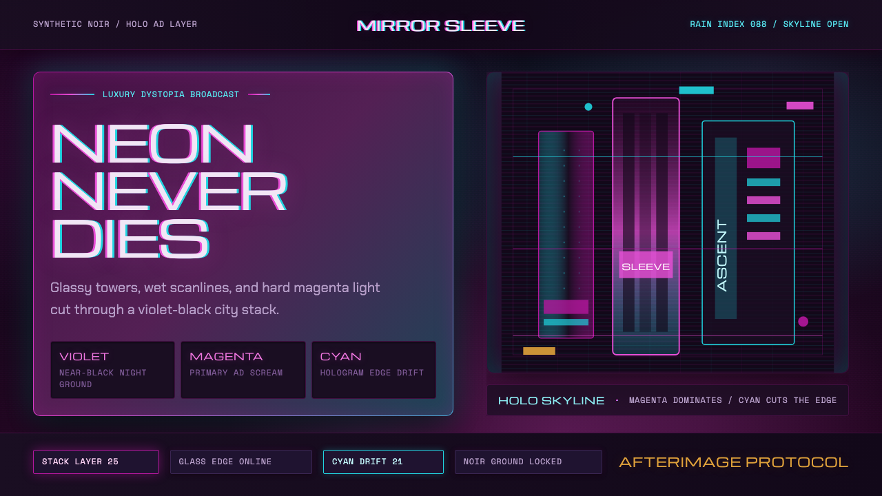 Altered CarbonNeon screams off noir. Magenta glass, cyan scanlines, and stacked vertical si…
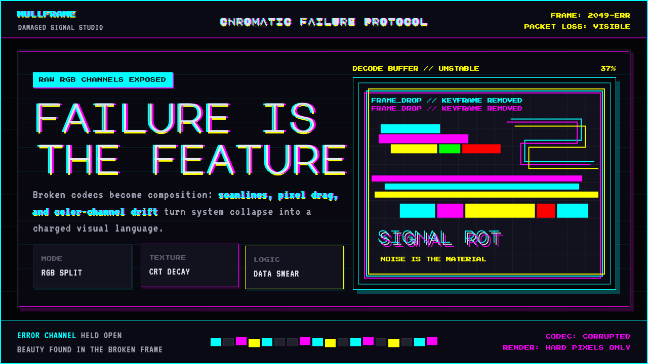 Glitch DatamoshErrors as composition. Corrupted JPEGs, RGB splits, scanlines — failure treat…
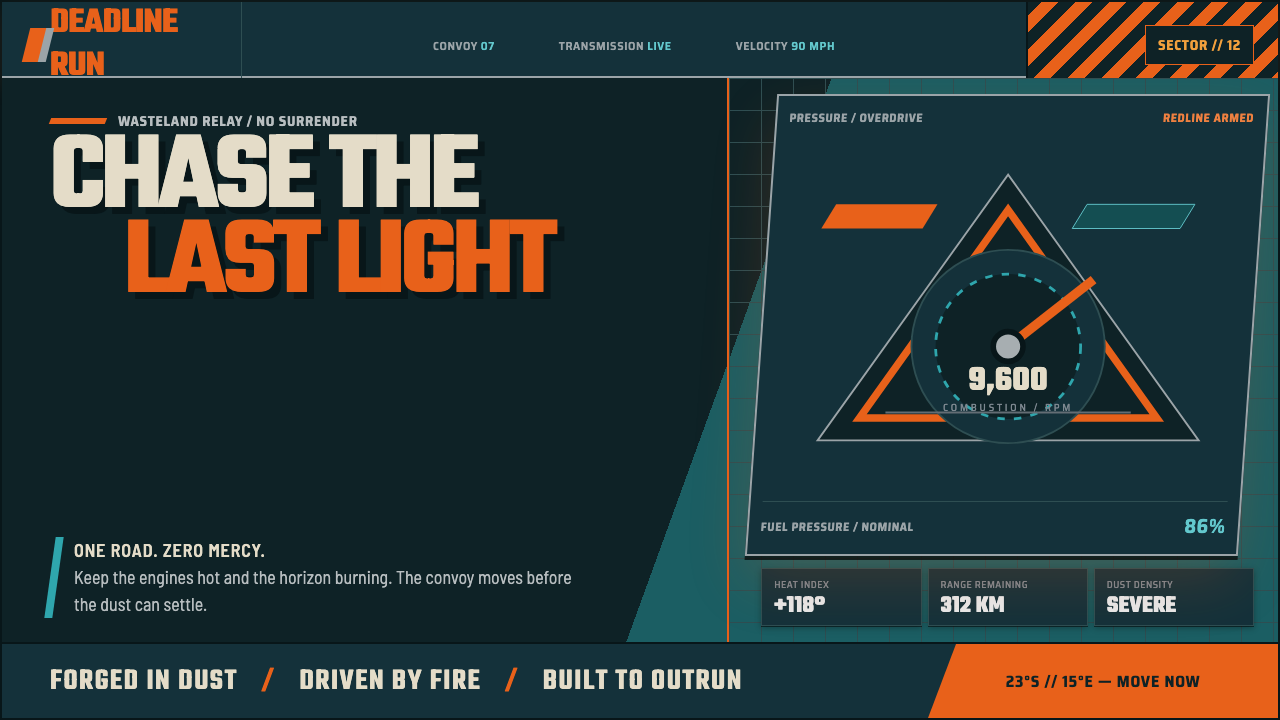 Mad Max Fury Road (2015)Built to roar. Molten saffron cuts through petrol teal, riveted grids, and ha…