What is Tahrir Square 2011?什么是 Tahrir Square 2011?
No polish, no decoration — Tahrir Square's revolutionary graphics reduced design to its most urgent form: stenciled crimson on black, bold Arabic lettering on crumbling downtown walls, civic signal stripped bare.没有修饰,没有装饰——解放广场的革命图像将设计压缩至最紧迫的形态:黑底上的猩红模板喷绘、开罗破旧街墙上粗犷的阿拉伯文字,公民信号赤裸呈现。
Tahrir Square 2011 in briefTahrir Square 2011 速览
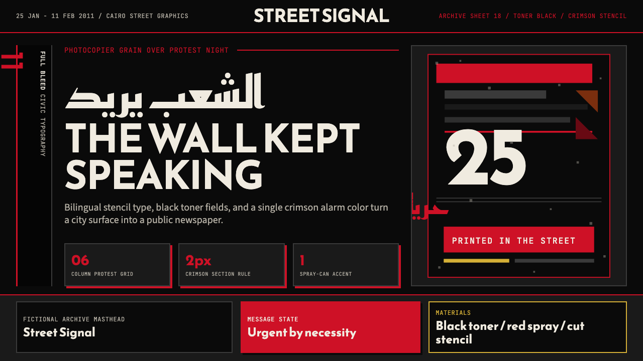
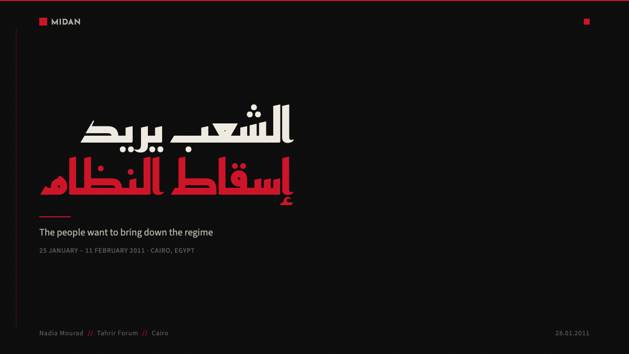
Tahrir Square 2011 is a design language drawn directly from the street graphics of Egypt's January 25th Revolution — the eighteen-day uprising that filled Cairo's central square and toppled a three-decade presidency. Its visual vocabulary consists of photocopier-grain stencils, crimson-and-black protest banners, hand-sprayed Arabic calligraphy, and urgent typographic compositions that prioritized legibility at a distance over any consideration of finish or craft.解放广场2011是一套直接源自埃及1月25日革命街头图像的设计语言——那场持续十八天、填满开罗中心广场并推翻三十年总统统治的起义。它的视觉词汇由复印机颗粒感的模板喷绘、猩红黑色的抗议横幅、手工喷涂的阿拉伯书法,以及在远距离可读性上优先于任何工艺考量的紧迫排版构图组成。
Where most historical design movements emerged from studios, academies, or corporate commissions, this one came from necessity and public space. Activists, artists, and anonymous participants produced visual communication under physical risk, using whatever materials were available — spray cans, photocopiers, house paint, torn fabric. The resulting aesthetic is one of deliberate rawness: grain is not a flaw but a record of production; imperfect edges are evidence of speed and circumstance. The style treats constraint itself as a design principle.大多数历史设计运动诞生于工作室、学院或企业委托,而这一风格诞生于必要性与公共空间。活动人士、艺术家和无名参与者在身体风险下制造视觉传播,使用任何可用的材料——喷漆、复印机、墙漆、撕碎的布料。由此产生的美学是一种刻意的粗粝:颗粒感不是缺陷,而是生产过程的记录;不完美的边缘是速度与境况的证据。这种风格将约束本身视为设计原则。
As a contemporary design system, Tahrir Square 2011 captures that urgency and translates it into a structured visual language. It is dark-ground by nature — backgrounds are deep black or near-black, against which stark white text and blood-crimson accents cut with maximum force. The effect is confrontational and immediate, communicating authority through visual weight rather than polish. It is design understood as direct civic action: every element earns its place by the force of what it says.作为当代设计系统,解放广场2011捕捉了那种紧迫感,并将其转化为有结构的视觉语言。它本质上是深色底面——背景是深黑或近黑,衬托着斩截的白色文字与血红色强调,以最大力度冲击视觉。效果是对抗性的、即时的,通过视觉重量而非精致工艺传达权威感。这是被理解为直接公民行动的设计:每个元素都以它所传达内容的力量赢得自己的位置。
See the Tahrir Square 2011 design system查看 Tahrir Square 2011 完整设计系统
Where does Tahrir Square 2011 come from?Tahrir Square 2011 从何而来?
The revolution that generated this visual style began on January 25, 2011 — Egypt's national Police Day — when tens of thousands of Egyptians flooded Tahrir Square in central Cairo to demand the end of President Hosni Mubarak's thirty-year rule. The protests were the Egyptian arm of the wider Arab Spring, a wave of popular uprisings that spread across North Africa and the Middle East beginning in late 2010. By February 11, Mubarak had resigned. The visual material that covered Cairo's walls during those eighteen days, and in the turbulent years that followed through 2013, constitutes one of the most significant bodies of street art and protest graphic design produced anywhere in the twenty-first century.产生这套视觉风格的革命始于2011年1月25日——埃及国家警察节——数万名埃及人涌入开罗市中心的解放广场,要求终结穆巴拉克总统长达三十年的统治。这场抗议是更广泛的阿拉伯之春的埃及部分——从2010年底开始席卷北非与中东的大规模民众起义浪潮。到2月11日,穆巴拉克宣布辞职。这十八天里覆盖开罗墙壁的视觉材料,以及此后延续至2013年的动荡岁月中产生的图像,构成了二十一世纪任何地方所产生的最重要的街头艺术与抗议平面设计作品集之一。
The geography of the uprising shaped its visual culture. Tahrir Square itself was the focal point of mass assembly, but the street art was concentrated on Mohamed Mahmoud Street — a narrow artery running from the square into the surrounding neighborhood — and Talaat Harb, Cairo's downtown commercial spine. Mohamed Mahmoud became, in particular, the site of intense mural-making after street battles there in November 2011, when security forces blinded dozens of protesters with birdshot. Artists memorialized the injured and dead directly on the walls at the scale of buildings, turning the entire street into a public monument. These were not gallery works — they were acts of documentation and accusation made in the open, for everyone.起义的地理形态塑造了其视觉文化。解放广场本身是大规模集会的焦点,但街头艺术集中于穆罕默德·马哈茂德街——一条从广场延伸入周边社区的狭窄动脉——以及开罗市中心的商业主干道塔拉特·哈尔布街。穆罕默德·马哈茂德街尤其在2011年11月的街头冲突之后成为密集壁画创作的场所:安全部队在那里用散弹枪打瞎了数十名抗议者。艺术家们以建筑规模将伤亡者直接铭刻在墙上,将整条街道转化为一座公共纪念碑。这些不是画廊作品——它们是在公开场合为所有人而做的记录与控诉行为。
The key artistic figures who shaped the movement's visual language included Ganzeer (Mohamed Fahmy), whose large-scale stencils and wheat-paste compositions mixed Arabic script with imagery drawn from everyday Egyptian life, and Keizer, who worked in a rawer, more confrontational mode. Their work was complemented by the digital organizing efforts of Wael Ghonim, the Google executive whose anonymous Facebook activism helped mobilize the uprising, and by the posthumous presence of Khaled Said — a young Alexandrian man whose death at police hands in 2010 became a central symbol and whose image appeared repeatedly on protest materials. The movement was never centrally organized visually; it was a distributed production made by many hands responding to the same conditions.塑造这一运动视觉语言的核心艺术人物包括贾扎尔(穆罕默德·法赫米),其大型模板与小麦糊裱贴构图将阿拉伯文字与埃及日常生活图像相混合;以及凯撒,以更粗粝、更具对抗性的方式创作。他们的工作与谷歌高管瓦埃勒·戈宁的数字组织努力相辅相成——他以匿名Facebook活动帮助动员了这场起义;同时也与哈立德·萨义德的象征性存在密不可分——这位年轻的亚历山大人于2010年死于警察之手,成为核心象征,其形象反复出现在抗议材料上。这一运动在视觉上从未被中央统一组织;它是许多双手在相同条件下响应而生的分布式生产。
The tools and constraints of the moment determined the aesthetic. Photocopiers were central — they allowed rapid, cheap duplication of text and imagery for flyers and banners. Stencils enabled fast wall-marking without requiring skilled draftsmanship at scale. Spray paint was the dominant medium for large works, giving edges their characteristic bleed and grain. Arabic typography was urgent and immediate, often rendered by hand rather than composed with type-setting tools — calligraphic forms merged with graffiti energy. Black was the dominant ground because it absorbed and did not compete with the stark, high-contrast signal of the message. Crimson and white cut against that dark field with maximum legibility and emotional force. The entire visual system was the product of specific material conditions and political urgency, not of stylistic preference.当时的工具与约束条件决定了美学形态。复印机是核心——它允许快速、廉价地复制文字与图像,用于传单和横幅。模板让快速的墙面标记无需大规模的熟练绘图技能。喷漆是大型作品的主导媒介,赋予边缘其特有的渗透感与颗粒纹理。阿拉伯文字是紧迫而即时的,往往手工书写而非用排版工具排列——书法形态与涂鸦能量相融合。黑色是主导底色,因为它吸收光线,不与信息的斩截高对比信号竞争。猩红与白色在那片暗色底面上以最大可读性和情感力量切入。整套视觉系统是特定物质条件与政治紧迫性的产物,而非风格偏好的选择。
What defines the Tahrir Square 2011 look?Tahrir Square 2011 的视觉特征是什么?
Ground and Contrast底色与对比
The fundamental condition of this style is deep black as the dominant ground. Against that near-absolute dark, white type achieves maximum legibility and crimson achieves maximum emotional intensity. The contrast ratio is not modulated for comfort — it is pushed to its extreme intentionally. Light does not leak in softly; it cuts. Midtones and muted intermediaries are absent. Every element is either signal or ground, with nothing in between.这种风格的根本条件是以深黑作为主导底色。在那片近乎绝对的暗色衬托下,白色文字达到最大可读性,猩红色达到最大情感强度。对比度不为舒适性而调节——它被刻意推至极端。光线不是柔和渗入,而是斩截切入。中间色调和低饱和度的过渡色缺席。每个元素要么是信号,要么是底色,之间没有任何东西。
Stencil Grain and Texture模板颗粒与质感
The photocopier and the spray-paint stencil leave distinctive marks: ink that bleeds at edges, toner that clusters in uneven densities, paint that feathers beyond the mask's border. These are not imperfections to be corrected — they are the honest record of how the work was made. In the Tahrir Square system, grain and texture carry authenticity. Over-smoothed or vector-clean renditions lose the material evidence that gives the style its urgency and credibility.复印机与喷漆模板留下独特的印记:在边缘渗透的墨水,聚集成不均匀密度的碳粉,溢出遮蔽边界的漆面羽化。这些不是需要纠正的缺陷——它们是工作方式的诚实记录。在解放广场2011系统中,颗粒感与质感承载着真实性。过度平滑或矢量清洁的呈现方式会失去赋予这种风格紧迫感与可信度的物质证据。
Arabic Typography and Script Energy阿拉伯文字与书写能量
Arabic letterforms are central to the style's identity, not optional decoration. The script appears at monumental scale, often rendered by hand rather than set from a typeface, carrying the energy of calligraphic tradition pushed into urgent immediacy. Strokes are bold and decisive; there is no fussiness. When Latin characters appear alongside Arabic, they are subordinated — auxiliary information in a system whose primary voice is Arabic. The visual rhythm of Arabic's right-to-left flow is built into the compositional logic.阿拉伯字母形态是这种风格身份的核心,而非可选装饰。文字以纪念碑式的尺度出现,往往手工书写而非从字体中排出,承载着书法传统被推入紧迫即时性的能量。笔画粗犷而果断,没有任何繁琐。当拉丁字符与阿拉伯文字并列出现时,它们处于从属地位——在一个主要声音是阿拉伯语的系统中的辅助信息。阿拉伯语从右至左的视觉节奏内嵌于构图逻辑之中。
Hard Grid and Banner Composition硬网格与横幅式构图
Despite the apparent rawness, the compositions follow a rigorous underlying structure. Protest banners work within a strict horizontal register — a single message, full width, maximum type size, nothing else. Wall murals divide the picture plane into bold zones, each carrying one visual argument. There is no ambiguity about hierarchy: the largest element is the subject; everything else is support. This banner logic — single zone, single message, high contrast — is the structural spine of all compositions in the system.尽管表面粗粝,构图遵循严格的底层结构。抗议横幅在严格的水平区域内运作——单一信息、全幅宽度、最大字号、别无其他。墙面壁画将画面分割成粗犷的区域,每个区域承载一个视觉论点。关于层级不存在任何模糊:最大的元素是主体,其他一切都是支撑。这种横幅逻辑——单一区域、单一信息、高对比度——是系统中所有构图的结构脊梁。
Crimson as Signal猩红色作为信号
Among the very restricted palette, crimson carries a specific and loaded meaning. It reads simultaneously as blood, as danger, and as urgent attention. It does not function as a pleasant accent or a brand differentiator — it functions as an alarm. Used at full intensity against black, crimson stops the eye immediately. In this system, the color is never softened or used decoratively; it appears only where the maximum urgency of the content demands it.在极度受限的色板中,猩红色承载着特定而沉重的含义。它同时传递血液、危险与紧急注意的信号。它不作为愉悦的强调色或品牌差异化因素使用——它作为警报使用。以全强度在黑色底面上出现时,猩红色立即阻住视线。在这个系统中,这种颜色从不被柔化或用于装饰;它仅在内容的最大紧迫性要求时出现。
Scale as Argument尺度作为论点
In the original street works, scale was an argument — a figure painted at building height was a political statement about the importance of that person or cause relative to the surrounding architecture and authority. This principle translates into the design system as a consistent emphasis on maximum type size and bold proportional relationships. Headlines are not large to aid readability alone; they are large to assert primacy. The relationship between the largest and smallest elements is always extreme, never gradual.在原始街头作品中,尺度是一个论点——以建筑高度绘制的人像是关于该人或该事业相对于周围建筑与权威重要性的政治声明。这一原则在设计系统中转化为对最大字号和粗犷比例关系的持续强调。标题不仅仅是为了可读性而大;它是大以主张优先地位。最大元素与最小元素之间的关系始终是极端的,从不渐进。
Absence of Decoration装饰的缺席
There are no decorative borders, no ornamental flourishes, no ambient texture applied for visual warmth. The absence is not the result of restraint as an aesthetic principle in the Bauhaus sense — it is the result of urgency eliminating everything that does not contribute to the message. In the original context, a decorative border would have been a waste of spray paint and time. That same logic, translated into contemporary design, produces compositions where every element is load-bearing.没有装饰边框,没有装饰性花体,没有为视觉温度而施加的环境质感。这种缺席不是包豪斯意义上克制作为美学原则的结果——它是紧迫性消除一切不服务于信息传达之物的结果。在原始语境中,一个装饰边框将是喷漆和时间的浪费。同样的逻辑转化为当代设计,产生的构图中每个元素都是承重的。
See the Tahrir Square 2011 design system查看 Tahrir Square 2011 完整设计系统
Who shaped Tahrir Square 2011?谁塑造了 Tahrir Square 2011?
Ganzeer is the most internationally recognized artist to emerge from the Egyptian revolution's visual culture. Working under a pseudonym that means 'chain' in colloquial Egyptian Arabic, he combined large-scale stencil work with wheat-paste imagery and hand-lettered Arabic to produce compositions that merged the directness of propaganda with the sophistication of contemporary street art. His mural of a military tank facing a young man on a bicycle — the Tank vs. Bread Seller — became one of the defining images of post-Mubarak Cairo, reproduced worldwide as a symbol of the revolution's confrontation with military authority. He later emigrated to the United States, where he continued working across visual art, comics, and political graphic design.贾扎尔是从埃及革命视觉文化中涌现出的国际知名度最高的艺术家。他以埃及口语中意为「锁链」的化名工作,将大型模板作品与小麦糊裱贴图像和手写阿拉伯文字相结合,创作出融合宣传画直接性与当代街头艺术成熟性的构图。他的壁画《坦克对面包小贩》——一辆军用坦克面对一个骑自行车的年轻人——成为穆巴拉克后时代开罗最具决定性的图像之一,作为革命对抗军事权威的象征在全球广泛传播。他后来移居美国,继续在视觉艺术、漫画和政治平面设计领域工作。
Keizer worked in a rawer and more confrontational register than Ganzeer, producing stencil-based works that emphasized the immediate conditions of protest — faces of the fallen, riot scenes, figures in confrontation with security forces. His work is less concerned with legibility at distance and more with the visceral impact of close encounter. Where Ganzeer brought compositional refinement to the street-art tradition, Keizer pushed toward a directness that refused any aesthetic mediation between message and viewer. Both artists were central to defining Mohamed Mahmoud Street as a space of political art.凯撒以比贾扎尔更粗粝、更具对抗性的方式工作,创作以模板为基础的作品,强调抗议的即时状况——倒下者的面孔、骚乱场景、与安全部队对峙的人物。他的工作不太关注远距离的可读性,更关注近距离相遇的内脏冲击。贾扎尔为街头艺术传统带来了构图上的精炼,而凯撒则推向一种拒绝在信息与观看者之间进行任何美学中介的直接性。两位艺术家都是将穆罕默德·马哈茂德街界定为政治艺术空间的核心人物。
Ghonim was not a visual artist but a digital organizer whose role in shaping the revolution's communication culture made him inseparable from its visual history. As a Google executive based in Dubai, he administered the anonymous Facebook page 'We Are All Khaled Said,' which helped organize the January 25 protests and frame their demands for an Egyptian public. His arrest by Egyptian authorities and subsequent release became a galvanizing media event. The visual language of the Facebook-era protest communication he helped develop — stark, image-forward, emotionally direct — was the digital analog of the wall-based street graphics, and the two informed each other throughout the uprising.戈宁不是视觉艺术家,而是数字组织者,他在塑造革命传播文化方面的角色使他与革命的视觉历史密不可分。作为驻迪拜的谷歌高管,他管理着匿名Facebook页面「我们都是哈立德·萨义德」,帮助组织了1月25日的抗议活动,并为埃及公众构建了抗议诉求。他被埃及当局逮捕并随后获释,成为振奋人心的媒体事件。他参与发展的Facebook时代抗议传播的视觉语言——斩截、图像优先、情感直接——是墙面街头图像的数字对应物,两者在整个起义过程中相互影响。
Khaled Said was a twenty-eight-year-old Alexandrian man beaten to death by Egyptian police in June 2010. Photographs of his disfigured body were circulated online by his family, generating widespread outrage and becoming the visual catalyst for the movement that would culminate in the January 25 uprising. His face — in both the before photograph of a young man and the after photograph of police brutality — appeared repeatedly on walls, in stencils, on banners, and in digital graphics throughout the revolution. He was not a participant in the design culture but its most powerful recurring image: the specific human face of the argument for change.哈立德·萨义德是一位二十八岁的亚历山大人,于2010年6月被埃及警察殴打致死。他毁容的遗体照片被家人在网上传播,引发广泛愤慨,成为最终汇聚为1月25日起义的运动的视觉催化剂。他的面孔——既有年轻人的事前照片,也有警察暴行的事后照片——在整个革命期间反复出现在墙壁、模板、横幅和数字图像上。他不是设计文化的参与者,而是其最有力的反复出现的图像:变革论点的具体人类面孔。
Much of the most significant visual production of the Egyptian revolution was unsigned and unclaimed — made by activists, students, workers, and first-time image-makers responding to specific events in real time. This distributed, anonymous authorship is not a historical gap to be filled but a structural feature of the aesthetic itself. The style's authority comes not from individual genius but from collective urgency. Curating individual named figures therefore gives an incomplete picture of where the visual language actually came from: it emerged from conditions shared across thousands of participants, each contributing to a visual commons that belonged to everyone and to no one.埃及革命中最重要的大量视觉生产是无署名、无人认领的——由活动人士、学生、工人以及初次制作图像的人实时回应特定事件而创作。这种分散的匿名作者身份不是需要填补的历史空白,而是美学本身的结构性特征。这种风格的权威不来自个人天才,而来自集体紧迫性。因此,梳理个别具名人物会给出一幅关于这套视觉语言究竟从何而来的不完整图景:它从数千名参与者共同分享的条件中涌现,每个人都为一个属于所有人也不属于任何人的视觉公共领域做出贡献。
How do you use Tahrir Square 2011 today?今天怎么用 Tahrir Square 2011?
Tahrir Square 2011 is a high-intensity style and should be selected deliberately, not as a default. It communicates confrontation, urgency, and political or civic seriousness. It works for contexts where the message is more important than the medium, where directness is valued over elegance, and where the audience is expected to engage with something that demands attention rather than invites browsing. Applied to the wrong context — a wellness brand, a children's product, a hospitality service — it reads as aggressive or alienating.解放广场2011是一种高强度风格,应当经过刻意选择,而非作为默认方案。它传达对抗、紧迫感以及政治或公民的严肃性。它适用于信息比媒介更重要、直接性比优雅性更受重视、受众被期望参与某种需要注意力而非邀请浏览的内容的语境。应用于错误的语境——健康品牌、儿童产品、酒店服务——它会被读作具有攻击性或令人疏远。
For presentation slides, the style is most effective in contexts that carry real stakes: public policy decks, social impact reports, advocacy campaigns, or any presentation where the speaker wants the visual environment to signal that the content is not decorative. A cover built in this system uses a deep black field, a single high-contrast headline at maximum size, and a crimson accent on one phrase or one graphic element. Content slides follow the banner principle: one argument per slide, expressed at the largest legible type size the layout permits, with any supporting material in a secondary weight that does not compete with the primary statement. Data visualizations take on a stark, diagrammatic quality — charts are rendered without gridlines or soft fills, using only the core palette.对于演示文稿,这种风格在承载真实利益的语境中最为有效:公共政策简报、社会影响报告、倡导活动,或任何演讲者希望视觉环境信号传达「内容非装饰性」的演示。在这个系统中构建的封面使用深黑色底面、最大尺寸的单一高对比度标题,以及在某一短语或某一图形元素上的猩红色强调。内容页遵循横幅原则:每页一个论点,以版面允许的最大可读字号表达,任何支撑材料以不与主要陈述竞争的次级字重呈现。数据可视化呈现出斩截的示意图式品质——图表不使用网格线或柔和填充,仅使用核心色板渲染。
For web interfaces, the style is suited to platforms that want to signal conviction rather than comfort: investigative journalism sites, political organizing tools, advocacy organization homepages, or direct-action campaign pages. The approach is to work with a true dark background, high-contrast white body text, and crimson reserved for calls to action, alerts, or navigation states that require immediate attention. Card components use hard borders rather than shadows; spacing is generous but not soft. The overall density should feel deliberate and loaded rather than airy. Avoid the style for e-commerce or consumer-facing interfaces where purchase decisions depend on warmth and approachability.对于网页界面,这种风格适合希望传达信念而非舒适感的平台:调查性新闻网站、政治组织工具、倡导机构主页,或直接行动活动页面。方法是使用真正的深色背景、高对比度白色正文,猩红色保留给行动号召、警示或需要即时注意的导航状态。卡片组件使用硬边框而非阴影;间距宽裕但不柔和。整体密度应感觉刻意而沉重,而非轻盈。避免将该风格用于电子商务或面向消费者的界面,在那些语境中购买决策依赖温暖感和亲近感。
For editorial and marketing work, the system's poster sensibility translates into section headers that dominate the page, pull quotes that take up more visual real estate than the surrounding text, and dividing elements that are bold cuts rather than hairlines. Marketing materials — event posters, social media graphics, campaign assets — are where the style is most naturally at home. A single full-bleed image in high-contrast treatment, one headline in bold script or heavy type, one crimson accent: this is the compositional core. The style rewards restraint in the number of elements; adding complexity undermines the banner logic that gives it its power.对于编辑与营销工作,这个系统的海报感性转化为主导页面的章节标题、占用比周围文字更多视觉空间的引用语,以及粗犷切割而非细线的分割元素。营销材料——活动海报、社交媒体图像、活动资产——是这种风格最自然归宿的地方。单幅全出血高对比度处理的图像,一个粗犷书法或重型字体的标题,一个猩红色强调:这是构图核心。这种风格因元素数量的克制而获益;增加复杂性会削弱赋予其力量的横幅逻辑。
The most common mistake when applying this style is softening it to make it more approachable — adding warm midtones, reducing contrast, substituting softer reds for crimson, adding drop shadows or glow effects that import visual comfort. Each of these choices diminishes what the style actually is. The rawness and extremity are not liabilities to be managed; they are the mechanism by which the style communicates. A second common error is treating the grain and texture as decorative elements that can be applied arbitrarily — overlaying noise filters on otherwise smooth compositions. Authentic grain in this system is the residue of a specific production process; it should appear structurally, where the stencil or print process would have left it, not as a uniform atmospheric wash.应用这种风格时最常见的错误是柔化它以使其更易接近——添加温暖的中间色调、降低对比度、用更柔和的红色替代猩红色、添加投影或发光效果来引入视觉舒适感。这些选择中的每一个都会削弱这种风格实际上是什么。粗粝感和极端性不是需要管理的负担;它们是这种风格进行传播的机制。第二个常见错误是将颗粒感与质感视为可以任意添加的装饰元素——在其他方面光滑的构图上叠加噪点滤镜。这个系统中真实的颗粒感是特定生产过程的残留物;它应当结构性地出现,出现在模板或印刷过程本应留下它的地方,而非作为均匀的大气晕染覆盖全局。
See the Tahrir Square 2011 design system查看 Tahrir Square 2011 完整设计系统
Tahrir Square 2011 — FAQTahrir Square 2011 · 常见问题
Is this style appropriate for commercial work, or is it too politically loaded?这种风格适合商业项目吗?还是说它的政治意涵过于沉重?
The style carries real political history, and that history should be acknowledged rather than laundered. Commercial applications work when the brand or project has a genuine alignment with civic urgency, social advocacy, or the kind of directness the style embodies — a non-profit campaign, a journalism platform, an activist technology product. It becomes problematic when the aesthetic is borrowed purely for visual impact while the underlying purpose is neutral or commercially self-interested, in the same way that co-opting protest imagery for unrelated marketing has long been recognized as a form of bad faith. The style is not forbidden for commercial use, but it demands that the message justify the visual register.这种风格承载着真实的政治历史,这段历史应当被承认,而非被漂白。当品牌或项目与公民紧迫性、社会倡导或这种风格所体现的直接性具有真实契合时,商业应用是有效的——非营利活动、新闻平台、活动人士技术产品。当美学被纯粹为了视觉冲击而借用,而潜在目的是中性的或出于商业自利时,它就变得有问题了,就像将抗议图像挪用于无关营销长期以来被认为是一种不诚实行为一样。这种风格不是禁止商业使用,但它要求信息能够为视觉语域辩护。
Can this style work for light-background layouts, or is the dark ground essential?这种风格能用于浅色背景版面吗?还是深色底面是本质性的?
The dark ground is not merely an aesthetic preference — it is integral to the visual logic. The original street works were largely produced on dark surfaces (walls, fabric, dark paper), and the system's contrast relationships are calibrated for that condition. A light-ground inversion is possible but fundamentally changes the character: on a white or cream background, the style loses much of its confrontational weight and begins to read as stark minimalism rather than political urgency. If a light background is required by context, the approach is to treat it as a constrained variant — retaining the boldness of type, the restricted palette, and the banner composition logic — while acknowledging that the result will be a lighter-intensity interpretation of the source material.深色底面不仅仅是一个美学偏好——它是视觉逻辑的组成部分。原始街头作品大多在深色表面上制作(墙壁、织物、深色纸张),系统的对比关系是为那种条件校准的。浅色底面反转是可能的,但从根本上改变了特质:在白色或奶油色背景上,这种风格失去了大部分对抗性重量,开始被读作斩截的极简主义而非政治紧迫感。如果语境要求浅色背景,方法是将其视为约束性变体——保留字体的粗犷感、受限的色板和横幅构图逻辑——同时承认结果将是对源材料的较低强度诠释。
How should Arabic script be handled when the audience is primarily non-Arabic-reading?当受众主要是非阿拉伯语读者时,应如何处理阿拉伯文字?
Arabic script in this system is not merely decorative — it is the primary visual voice of the source material. Removing it entirely for non-Arabic audiences strips the style of its most culturally specific element and produces something closer to generic high-contrast brutalist design. The better approach is to treat Arabic text as a visual element even when it is not the primary readable content — as texture, as scale anchor, as historical reference — while ensuring that the information-carrying work is done by legible text in the audience's primary language. This preserves the visual character of the original while serving the communication needs of the specific context. Using Arabic text purely as decoration without acknowledging its meaning or origin is a form of appropriation that should be handled with care and, where possible, with input from Arabic-speaking collaborators.这个系统中的阿拉伯文字不仅仅是装饰——它是源材料的主要视觉声音。为非阿拉伯语受众完全移除它,会剥去这种风格最具文化特异性的元素,产生更接近泛化高对比度野兽派设计的东西。更好的方法是将阿拉伯文字作为视觉元素处理,即使它不是主要的可读内容——作为质感、作为尺度锚点、作为历史参照——同时确保承载信息的工作由受众主要语言中可读的文字完成。这在服务特定语境传播需求的同时,保留了原始内容的视觉特质。将阿拉伯文字纯粹作为装饰使用而不承认其含义或来源,是一种需要谨慎处理的挪用行为,条件允许时应征求阿拉伯语合作者的意见。
What distinguishes this style from generic 'grunge' or distressed design?这种风格与一般的「颓废」或「做旧」设计有何区别?
Generic grunge design uses distress and texture as aesthetic choices — applied to create a mood of edginess, rebellion, or retro nostalgia without reference to any specific visual history. The Tahrir Square system's rawness is not applied for mood; it is the record of a specific production method (stencil, spray paint, photocopier) used under specific conditions (urgency, risk, limited materials) for a specific purpose (civic communication, political protest). The difference matters practically: in this system, texture and grain should appear where they would logically have appeared in the original production process, not distributed uniformly across the composition as a style overlay. The composition structure — banner logic, Arabic typography, dark ground — does most of the work that places this within a specific historical and cultural tradition rather than generic distressed design.一般的颓废设计将破旧感和质感作为美学选择使用——添加以创造前卫、反叛或复古怀旧的情绪,不参照任何特定的视觉历史。解放广场系统的粗粝感不是为情绪而添加的;它是在特定条件下(紧迫性、风险、有限材料)为特定目的(公民传播、政治抗议)使用特定生产方式(模板、喷漆、复印机)的记录。这种区别在实践中很重要:在这个系统中,质感和颗粒感应当出现在它们在原始生产过程中逻辑上应当出现的地方,而不是作为风格叠层均匀分布在整个构图上。构图结构——横幅逻辑、阿拉伯文字、深色底面——承担了大部分将其置于特定历史和文化传统中而非泛化做旧设计的工作。
How can this style be applied respectfully given its origins in a real political uprising?鉴于这种风格源自真实的政治起义,如何以尊重的方式应用它?
Respectful application starts with acknowledgment: understanding where the visual language comes from, who made it, and what it cost the people who produced it. This does not mean that the style can only be used in political contexts — design traditions migrate, and aesthetic influence is a form of historical recognition — but it does mean that the application should be intentional. Using the style in contexts of genuine civic purpose, social advocacy, or urgent communication honors the register of the original. Using it purely as visual novelty for a brand with no relationship to the values it embodies treats real human experience as scenery. When in doubt, ask whether the urgency of the visual form is matched by the urgency of the content — if the content does not justify the register, the register is borrowed in bad faith.尊重性应用始于承认:理解这套视觉语言从何而来、是谁创造了它,以及创造它的人为此付出了什么代价。这并不意味着这种风格只能在政治语境中使用——设计传统会迁移,美学影响是一种历史认可的形式——但它确实意味着应用应当是有意图的。在真正的公民目的、社会倡导或紧迫传播的语境中使用这种风格,尊重了原作的语域。将其纯粹作为视觉新颖性用于与其所体现价值观毫无关联的品牌,是将真实的人类经验当作布景。有疑虑时,追问视觉形式的紧迫感是否与内容的紧迫感相匹配——如果内容不能为这种语域辩护,那么借用这种语域就是出于不诚实。
Related design styles相关设计风格
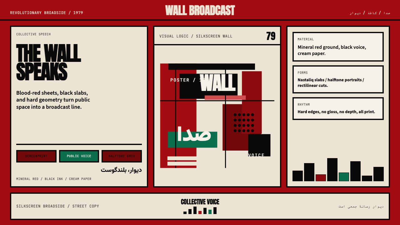 Iranian Revolution Poster (1979)Collective voice in ink. Blood red, black slabs, and hard screenprint geometr…集体之声凝成油墨海报。血红、黑色字块与硬边丝网几何。
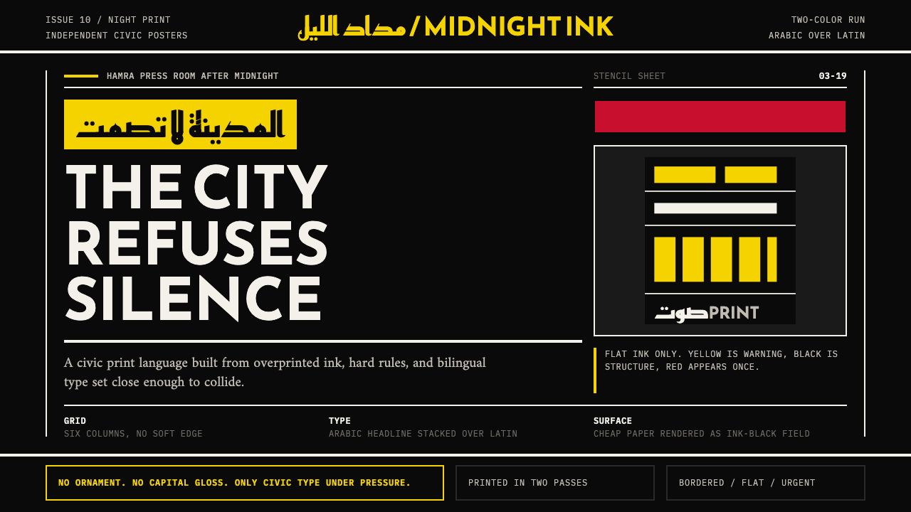 Beirut Indie Graphic DesignCivic type as protest. Sulfur yellow Arabic blocks collide with ink-black pos…公民字体即抗议:硫磺黄阿文块撞上墨黑海报网格。
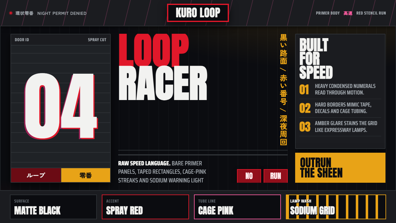 Kanjōzoku Loop RacerSpeed as contraband. Hot red numbers slice black tarmac with amber grid glare.速度像违禁品。黑色沥青上,火红数字与琥珀网格切开夜色。
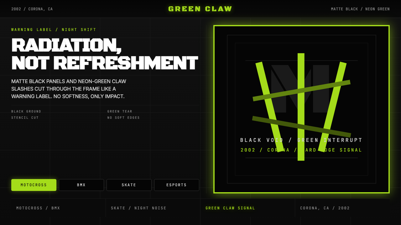 Monster Energy Claw (2002)Aggression, not refreshment. Matte black and neon-green claw slashes cut the…不是清爽,是冲击。哑黑底与霓绿爪痕撕裂画面。
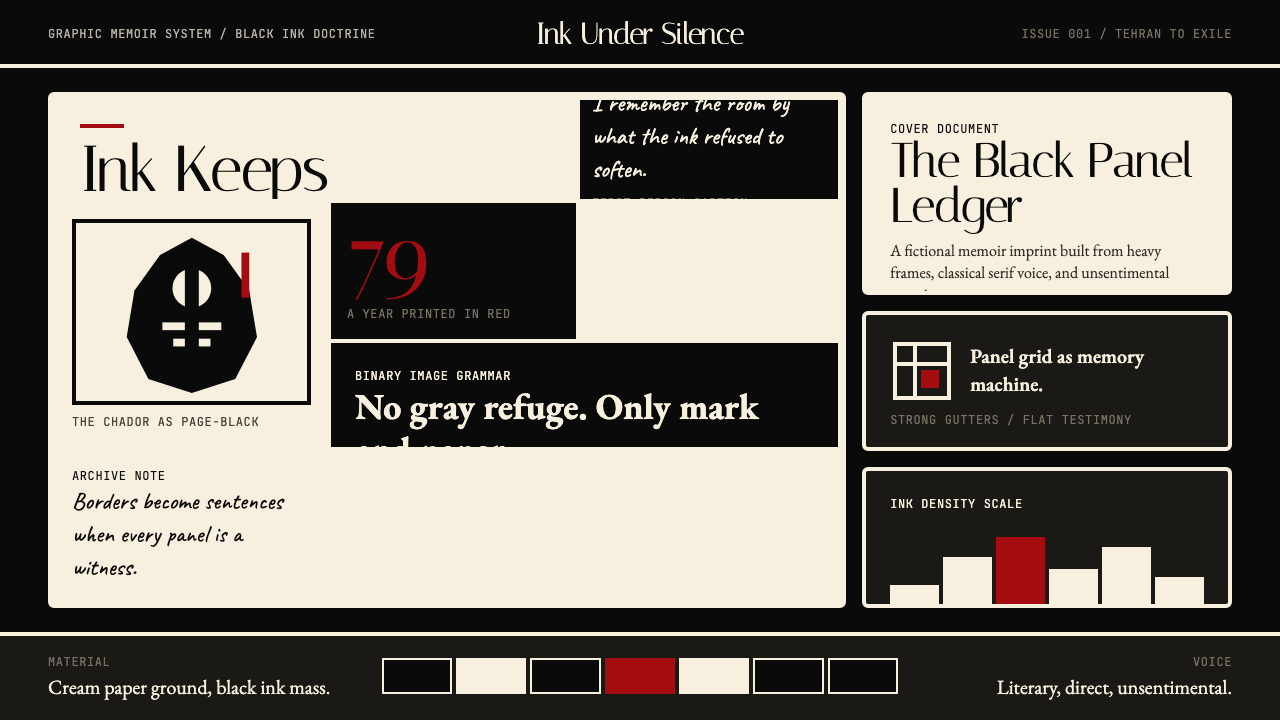 Persepolis (Marjane Satrapi, 2000)Stark memory, pure ink. Cream panels, heavy black borders, one revolution-red…记忆冷峻如墨。奶油纸格、粗黑边框,一笔革命红。
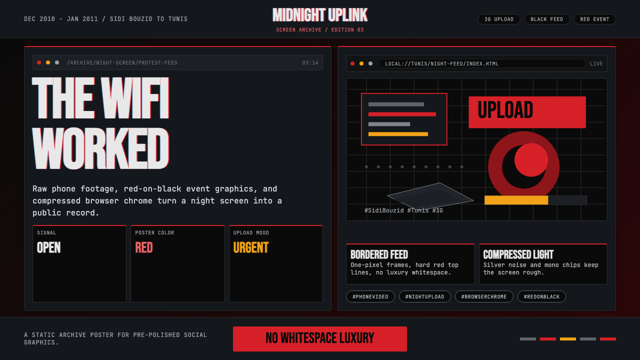 Tunisian Jasmine Revolution (2010)Raw urgency wins. Red browser grids and mono hashtags compress 3am protest in…原始紧迫感取胜:红色浏览器网格与等宽话题压缩凌晨抗议。