What is Tunisian Jasmine Revolution (2010)?
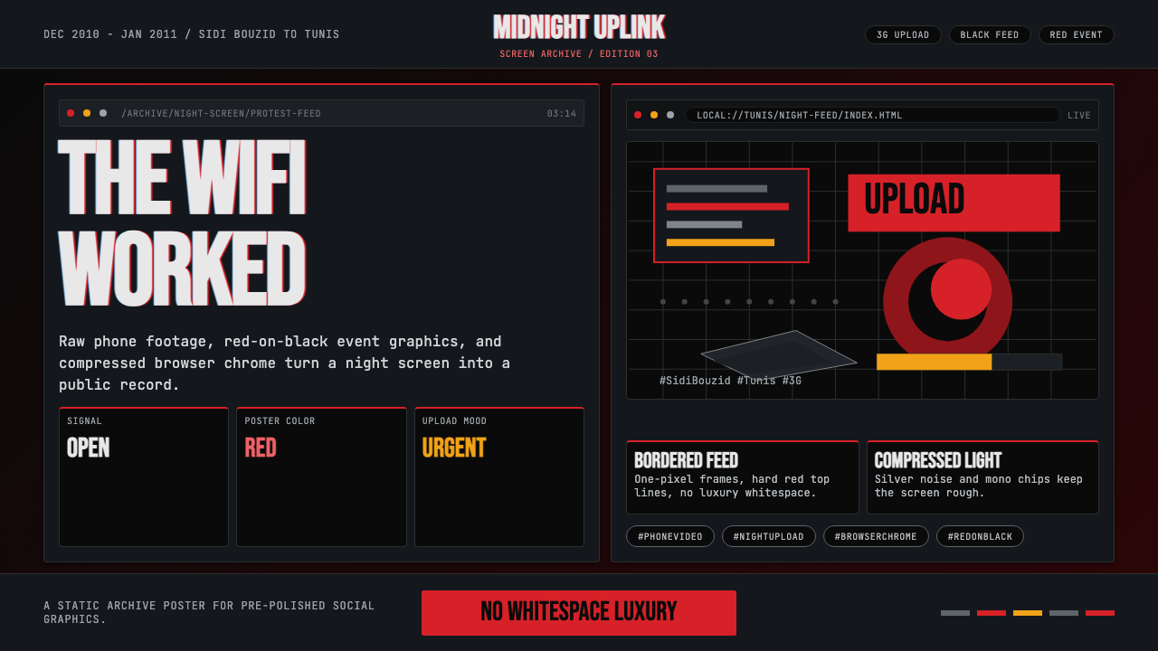
Before Instagram filtered revolution into nostalgia, Tunisia's December 2010 uprising forged a raw digital aesthetic — fluorescent red on black, monospace hashtags, and the cold glow of a café laptop at three in the morning.
Tunisian Jasmine Revolution (2010) in brief
The Tunisian Jasmine Revolution design style captures the visual language of the world's first social-media-era popular uprising — the one that toppled Ben Ali's government in January 2011 and ignited the broader Arab Spring. It is not a retrospective aesthetic applied in hindsight but an authentic document of how people communicated urgency at the exact moment when mobile phones and social platforms became the primary instruments of political organizing.
Visually, the style is dense, utilitarian, and unapologetically low-fidelity. Images arrive compressed by 3G transmission, printed as fluorescent event posters on black grounds, or rendered as Anonymous-mask vectors beside the Tunisian crescent. Monospace typefaces carry hashtag chips and blog post headers. Browser-chrome tab bars and notification counters double as compositional devices. The palette is minimal and confrontational: deep black grounds offset by a single charged color — most often a hot red or acid green — that functions as a signal flare rather than decoration.
Unlike many protest aesthetics that soften into cultural branding over time, this style retains its edge because it is grounded in a specific technological moment — the era before smartphone cameras resolved cleanly, before Twitter moved to algorithmic timelines, before the vocabulary of digital activism was absorbed into mainstream marketing. Using it today is a deliberate act of historical citation: an acknowledgment that urgency and constraint can be more expressive than polish.
Where does Tunisian Jasmine Revolution (2010) come from?
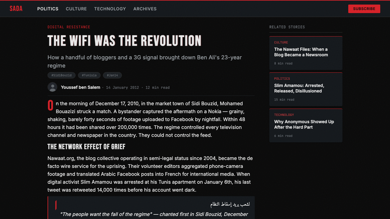
On December 17, 2010, Mohamed Bouazizi, a twenty-six-year-old unlicensed vegetable seller in Sidi Bouzid, set himself on fire in front of the regional government building after a municipal inspector confiscated his cart and publicly humiliated him. He died of his burns on January 4, 2011. His act was not the first of its kind in Tunisia, but it was the first to be captured by a bystander's phone camera and uploaded immediately to Facebook, where it reached Nawaat — Tunisia's most prominent dissident blog — within hours.
Nawaat had been operating since 2004 under co-founders including Sami Ben Gharbia, who was then living in political exile in the Netherlands. The blog specialized in aggregating censored news and leaking government documents; by 2010 it had developed a recognizable visual grammar: dark backgrounds, high-contrast typography, and the deliberate compression artifacts of images that had passed through multiple re-uploads. When the Bouazizi video and subsequent protest footage began circulating, Nawaat provided the visual context and curatorial framing that transformed scattered phone-camera clips into a coherent political narrative.
Lina Ben Mhenni, a Tunis University linguistics professor who blogged as 'A Tunisian Girl', was among the first on-the-ground reporters to travel to Sidi Bouzid and document the protests directly. Her photographs — shot on a compact camera and processed minimally — set a visual standard for the coverage: unposed, granular, often blurred by movement, but georeferenced and timestamped with a precision that made them legally significant as documentation. This journalistic rawness became an aesthetic value rather than a technical limitation.
Slim Amamou, a hacker and activist later appointed as Secretary of State for Youth and Sports after Ben Ali's departure, represented the technical subculture that gave the uprising much of its visual identity. The Anonymous collective's Guy Fawkes mask — which had circulated in Tunisian hacker communities since the 2008 Operation Tunisia — appeared in protest imagery alongside the Tunisian crescent, creating an unlikely hybrid symbol. Browser windows, terminal screens, and the visual language of early social media feeds became the compositional scaffolding of the revolution's self-representation. By January 14, 2011, when Ben Ali fled to Saudi Arabia, an identifiable protest visual vocabulary had coalesced — one that would go on to influence the Egyptian, Libyan, and Syrian uprisings that followed within weeks and months.
What defines the Tunisian Jasmine Revolution (2010) look?
Color
The palette is built on confrontation rather than harmony. A near-total black ground — the color of unlit screens and power outages — is punctuated by a single high-energy accent: most often a red that reads as emergency alert rather than brand, or an acid green that carries the associations of terminal text and hacker culture. Intermediate tones are compressed out; the mid-range is absent by design, just as 3G-transmitted images crushed gradients into hard edges. White appears almost exclusively as a typography color — functional contrast, never warmth.
Typography
Monospace typefaces are the typographic foundation — the typewriter-descended letterforms of code editors and terminal windows, chosen not for stylistic whimsy but because they were what activists had on screen when urgency struck. Hashtags formatted as chip-like tokens, usernames in fixed-width columns, and blog post URLs broken across lines all carry this character. Where proportional type appears, it tends toward the utilitarian system fonts of Windows XP and early Firefox — the fonts that loaded without a CDN in a café with unreliable Wi-Fi.
Texture and Compression
Compression artifacts — the blocky disintegration that occurs at high JPEG compression ratios, the horizontal noise bands of a low-bitrate video still — are not flaws to be corrected but marks of authentic transmission. Images that have passed through multiple re-uploads accumulate these artifacts, and the visual system treats them as a form of provenance: evidence that the image traveled, that it was real, that its urgency was real. Grain, blur, and pixelation are handled as content-carrying texture rather than noise to eliminate.
Browser Chrome as Composition
Tab bars, address fields, notification badges, and the structural chrome of web browsers and mobile interfaces are incorporated as compositional elements rather than containers to be hidden. A protest graphic might show a Facebook event window with its characteristic blue-grey header intact; a political poster might be laid out as a browser tab. This approach treats the platform as part of the message — the medium is not merely a vehicle but a visible actor in the communication.
Density and Layering
Information is stacked rather than spread. Multiple type hierarchies compete in tight vertical columns; images are cropped to their essential content and placed without generous margins; captions, timestamps, and source credits appear as fine-print overlays rather than separate design zones. The overall impression is of a screen on which too much is happening at once — not as a failure of layout but as an accurate representation of information overload as a political condition. Breathing room is a luxury that crisis does not afford.
Hybrid Iconography
The style's iconographic vocabulary blends nationalist symbols — the Tunisian crescent and star, the jasmine flower — with the international symbols of internet subculture: the Guy Fawkes mask, hashtag notation, the at-sign, the chain-link icon for shared URLs. This juxtaposition is not decorative eclecticism but a literal record of how the uprising was organized: local grievance expressed through globally legible platforms, national identity asserted using tools built in Silicon Valley.
Urgency Indicators
Time and location are foregrounded as design elements. Timestamps appear not in captions but in the body of compositions — as large typographic elements that communicate when as prominently as what. Geotagged coordinates, city names, and event countdown timers carry visual weight equivalent to headline type. This is the aesthetic logic of the live-coverage ticker and the event notification: the moment of occurrence is the content, not a footnote to content.
Who shaped Tunisian Jasmine Revolution (2010)?
Bouazizi was the Sidi Bouzid street vendor whose act of self-immolation on December 17, 2010 triggered the cascade of protests that became the Jasmine Revolution. He was not a political activist but an economically marginalized worker whose humiliation by a local official crystallized widespread frustration with the Ben Ali government's corruption and unemployment. The image of his cart — and later the video of his act — became the first iconic visual documents of the uprising, establishing the phone-camera image as the definitive medium of the revolution.
Ben Mhenni was a linguistics professor and blogger whose online journal 'A Tunisian Girl' became one of the primary documentary records of the uprising. Working against government censorship and personal risk, she traveled to Sidi Bouzid and other protest sites to photograph and report directly. Her visual approach — unfiltered, timestamped, geolocated — established a documentary aesthetic that distinguished authentic protest documentation from state-controlled media imagery. She was nominated for the Nobel Peace Prize in 2011.
Amamou was a hacker-activist and co-founder of the Pirate Party of Tunisia who was arrested by Ben Ali's security forces in January 2011 and released after the revolution. His presence in hacker and open-internet communities connected the Tunisian uprising to the international Anonymous network, helping to establish the hybrid iconography — Guy Fawkes mask alongside Tunisian national symbols — that became visually central to the movement. After Ben Ali's fall, he briefly served as Secretary of State for Youth and Sports before resigning in protest at the transitional government's continuation of internet censorship.
Ben Gharbia was the co-founder of Nawaat, the Tunis-based dissident blog that became the primary digital platform for publishing censored material and organizing protest communication. Operating from exile in the Netherlands, he developed Nawaat's visual and editorial approach — aggregating phone-camera footage, leaking government documents, and building the visual grammar of the resistance — before returning to Tunisia after Ben Ali's departure. Nawaat's dark-background, high-contrast aesthetic became the template for much of the revolution's online visual presence.
The Anonymous hacktivist collective launched 'Operation Tunisia' in January 2011, targeting Tunisian government websites with distributed denial-of-service attacks and distributing censorship-circumvention tools. Their involvement introduced the Guy Fawkes mask — already a global symbol of Anonymous — into Tunisian protest imagery, where it combined with local national symbols to create one of the most visually distinctive hybrids of the uprising. Anonymous's visual identity, built on the mask and the tagline 'We are Legion', was adapted, combined, and recirculated by Tunisian activists in ways that neither the collective nor the activists fully controlled.
How do you use Tunisian Jasmine Revolution (2010) today?
The Tunisian Jasmine Revolution style is most effective when applied to contexts where urgency, authenticity, and the rejection of corporate polish are genuine communicative goals — not merely aesthetic choices. It has natural applications in social impact work, newsroom products, civic technology, and any presentation that needs to convey that something real and pressing is at stake. When the content itself carries weight, this style amplifies that weight; when the content is lightweight or corporate, the style reads as costume rather than communication.
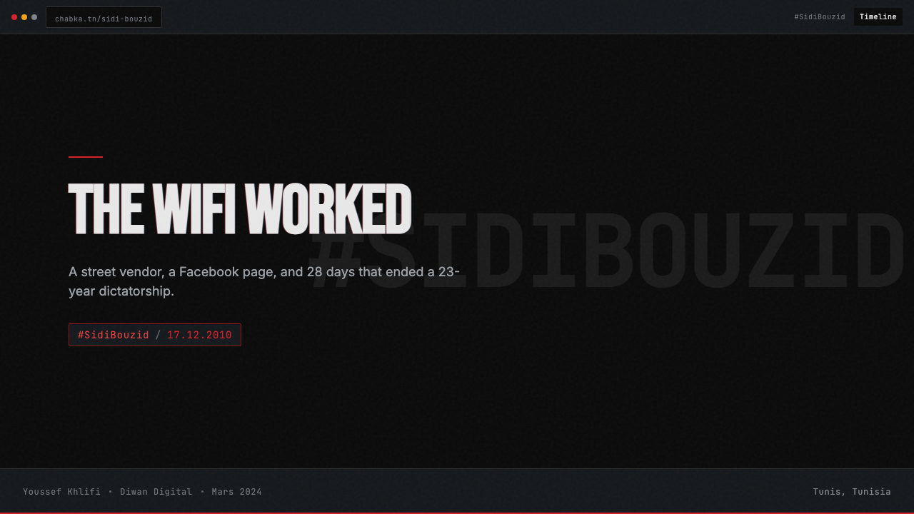
For presentation slides, the style works best as a deliberate counterstatement to polished deck conventions. A cover slide built on a saturated color-on-black composition with a condensed headline set in monospace makes a powerful opening for a talk on inequality, digital rights, misinformation, or any topic where the stakes are genuinely high. Content slides should lean into the density — two-column layouts with tight leading, timestamps and source citations presented as prominent typographic elements, and data visualizations that treat compression artifacts and signal noise as deliberate texture rather than imprecision to be corrected. Avoid softening the palette toward pastels or adding decorative transitions; the power is in the commitment to rawness.
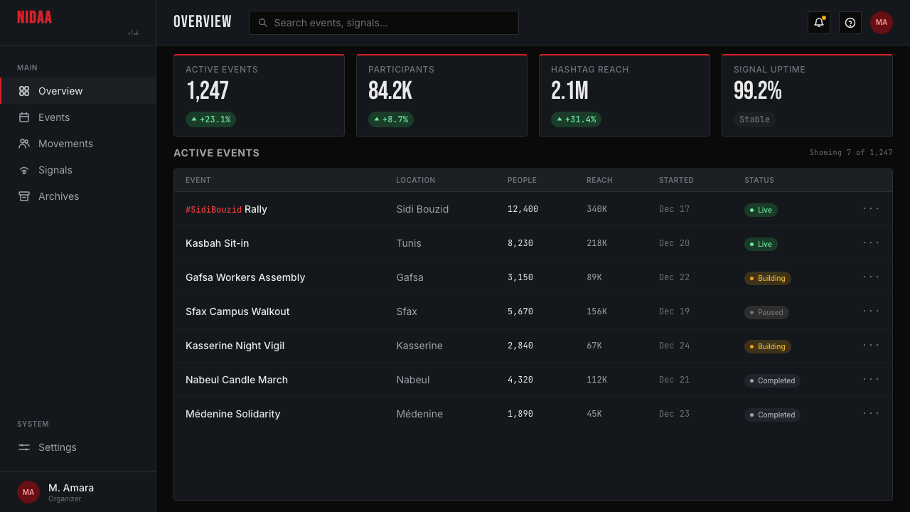
For web interfaces, this style is well-suited to platforms that deal in urgency: breaking news dashboards, civic alert systems, monitoring tools, and advocacy landing pages. The approach: a near-black background, a single accent color used exclusively for interactive states and critical alerts, monospace type for data fields and status indicators, and dense information layouts with minimal white space. Card components should eschew rounded corners and soft shadows in favor of hard edges — or borders in the accent color that read as signal rather than container. Navigation should be typographic and minimal; iconography beyond the essential is a distraction from content.
For editorial and marketing work, the style supports strong political or documentary framing. A report cover laid out as a browser window or terminal screen immediately signals a digital-native perspective. Pull quotes formatted as if they were tweets — with handle, timestamp, and a notification counter — reference the style's iconographic vocabulary without resorting to literal screenshots. Marketing pages for tools serving journalists, researchers, or civic technologists can use the style to communicate alignment with their audience's values: prioritizing information over aesthetics, function over form.
The most common mistake when applying this style is treating it as a purely visual exercise — selecting the dark palette and monospace fonts while maintaining the spatial generosity and polish of contemporary design systems. Authentic application requires committing to the density and the rawness: tighter leading than feels comfortable, less padding than convention suggests, and a resistance to the urge to soften edges with blur or reduce urgency with animation easing. A second common mistake is importing the political imagery — protest photos, news screenshots — without the ethical weight they carry. This is a style built on real events and real people; using it decoratively, without acknowledging that context, produces work that reads as opportunistic appropriation rather than honest citation.
Tunisian Jasmine Revolution (2010) — FAQ
Is this style appropriate to use for commercial design projects, or does it carry ethical restrictions?
The style is aesthetically available for any project, but it carries a context that commercial use should acknowledge. Applying the visual language of a real political uprising to a product that has nothing to do with political urgency risks reading as appropriation rather than inspiration — especially if the project is for an organization whose values are in tension with the democratic aspirations the uprising represented. The most honest applications are those that share some genuine alignment with the original context: platforms dealing in information, accountability, or civic action. For purely commercial projects, the key is to adopt the formal properties — density, compression artifacts, confrontational palette — without importing the specific iconography (protest imagery, political symbols, news-media tropes) that would constitute a direct claim on the historical event.
How does this style differ from other protest or punk aesthetics?
Where punk and much protest graphic design is hand-produced — cut-and-paste collage, photocopied flyers, hand-lettered slogans — the Jasmine Revolution aesthetic is fundamentally digital and screen-native. The compression artifacts, browser chrome, and monospace type are not analog textures digitally simulated; they are the direct output of the actual tools used. This gives the style a different relationship to authenticity: it is documentary rather than expressive. Similarly, while punk aesthetics deliberately transgress typographic conventions, this style's typographic choices emerged from practical constraint — mobile text fields, blog post formats, social media character limits — rather than from a design ideology of transgression.
Can this dark, dense style work for a product aimed at a general consumer audience?
It is possible but requires careful editing. The full intensity of the style — near-total black grounds, saturated accent, maximum information density — is well-suited to audiences who are comfortable with information-dense environments: journalists, researchers, developers, and civic technologists. For a broader consumer audience, the style can be moderated: introduce one additional neutral mid-tone to relieve the black, reduce information density by increasing spacing in the main content areas while keeping it tight in secondary and status elements, and reserve the confrontational accent color for genuine alerts rather than applying it decoratively. The goal is to retain the visual authority of the style while reducing its cognitive demand. Going too far in this moderation, however, produces a dark-mode design system with occasional accent color — which loses the distinctive character of the original entirely.
What makes an application of this style feel authentic versus superficial?
Authentic application comes from adopting the underlying logic rather than the surface features. The logic is: constraint is expressive, the medium is visible, urgency is communicated through density not decoration, and documentation takes precedence over aestheticization. Superficial application borrows the dark palette and monospace fonts but then applies them with generous spacing, smooth animations, and a careful polish that signals the opposite of the original style's values. The tell is always in the margins and transitions: if the design is comfortable and inviting, it is not Jasmine Revolution aesthetic, whatever its color choices. Authentic work should produce a slight feeling of pressure — the sensation that there is more here than you can comfortably absorb at once — which is exactly the condition under which the original imagery was created and consumed.
How does the Jasmine Revolution style relate to contemporary lo-fi or brutalist web design?
They share surface features — dark grounds, raw typography, high information density — but have different origins and therefore different registers. Contemporary lo-fi and web brutalism are typically ironic or nostalgic in character: they cite the aesthetic of early web design from a position of deliberate aesthetic choice, often with playful intent. The Jasmine Revolution style is not ironic; it did not choose its constraints, it was produced by them. This means it carries a different emotional register — urgency rather than wistfulness, documentation rather than pastiche. In practice, the most effective way to distinguish the two is through iconographic content: brutalism often incorporates deliberately absurdist or disconnected imagery, while the Jasmine Revolution aesthetic always connects its visual intensity to the communication of specific, real, high-stakes information.
Related design styles
 Attack on Titan (2013)Dread becomes duty. Stone-gray bands, engraved caps and one steel-blue crest…
 Beirut Indie Graphic DesignCivic type as protest. Sulfur yellow Arabic blocks collide with ink-black pos…
 Manga Panel LayoutCinema in ink. Black panels, screentone dots, speed lines, and one red strike.
 Chilean BRP Ramona Parra 1971Resistance stays alive. Blood red panels, black outlines, and stencil type re…
 N'Ko ScriptIdentity writes itself. Forest green and gold baselines anchor joined N'Ko le…
 Nicaraguan Sandinista FSLN 1979Urgency in two inks. Blood red, jet black, halftone dots, and cut-stencil typ…