What is Al Jazeera Arabic News?什么是 Al Jazeera Arabic News?
A burnished-gold seal on matte charcoal — Al Jazeera's visual language turned Arab broadcast journalism into a global grammar of authority and restraint.哑光炭黑上一枚烫金印章——半岛电视台的视觉语言,将阿拉伯语广播新闻锻造成了一套全球通行的权威与克制语法。
Al Jazeera Arabic News in briefAl Jazeera Arabic News 速览
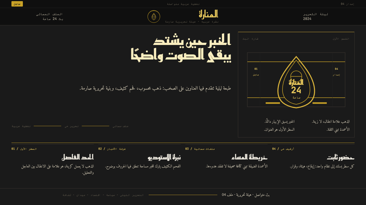
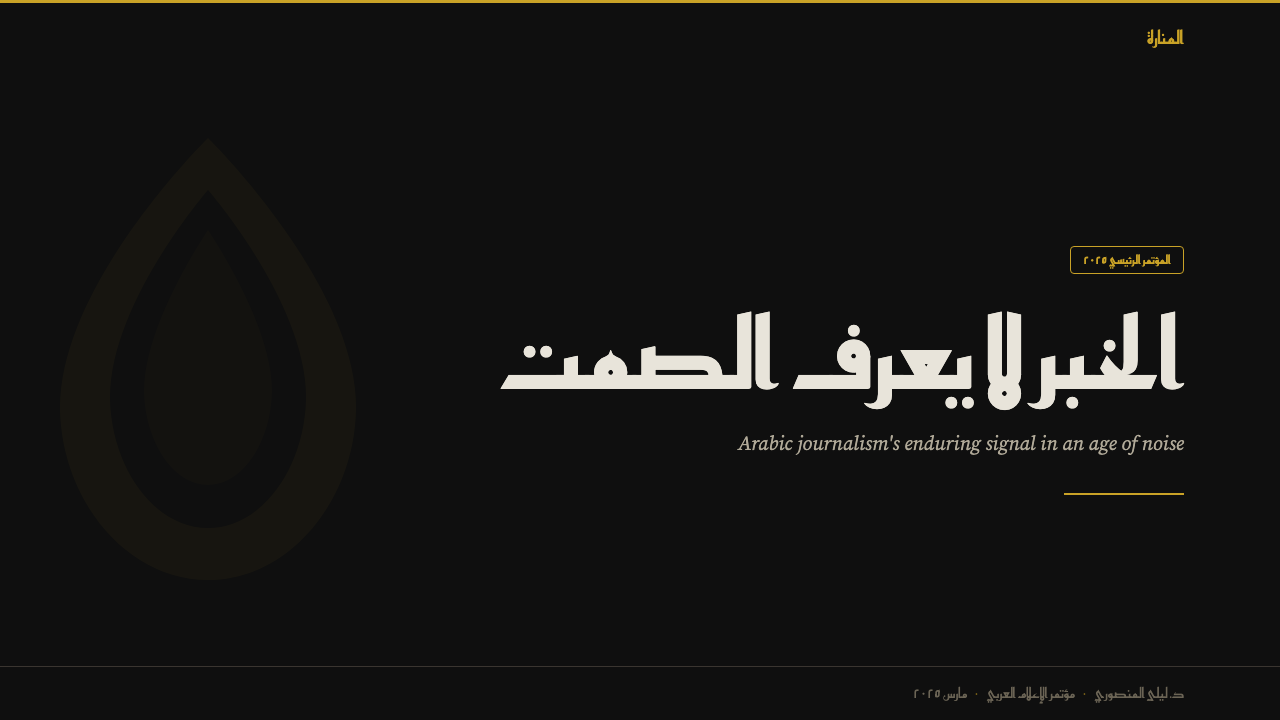
Al Jazeera Arabic News is a broadcast and digital visual identity built on the principles of editorial authority, typographic density, and chromatic restraint. Its defining image is a dark, near-matte ground — charcoal rather than pure black — set against which a single burnished-gold accent carries all symbolic weight. The palette refuses the saturated reds and whites common to Western news brands and instead builds tension through the contrast between the depth of the ground tone and the warmth of gold.半岛阿拉伯语新闻的广播与数字视觉体系,建立在编辑权威、排版密度与色彩克制三重原则之上。其标志性画面是一个深沉的近哑光底面——是炭灰而非纯黑——在这一底色之上,一个烫金强调色承载了全部象征分量。这套色板拒绝了西方新闻品牌常用的高饱和红与白,转而用底色的深邃与金色的暖意之间的张力来建立视觉重量。
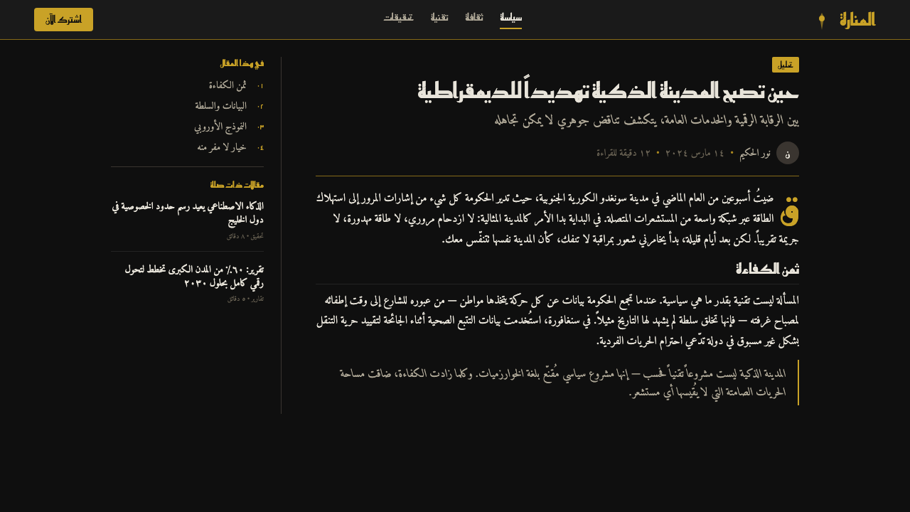
The typography is the system's structural backbone. Arabic calligraphic traditions are honored not through decorative letterforms but through dense, broadsheet-scale setting: tight line spacing, authoritative weight, and columns that feel like the printed page of a serious newspaper. Every headline is an event. Body text is treated as continuous, uninterrupted information flow — no pull-quotes for decoration, no callout boxes breaking the cadence.文字排印是整个系统的结构骨架。阿拉伯书法传统在此得到尊重,但不是通过装饰性字形,而是通过宽幅报纸式的密集排布:紧凑的行距、具有权威感的字重、以及令人联想到严肃纸媒印刷版面的文字栏。每一个标题都是一个事件。正文被处理为连续、不间断的信息流——没有用于装饰的引用段落,没有打断节奏的信息框。
What distinguishes the Al Jazeera aesthetic from other dark-ground broadcast identities is its economy of signal. The iconic teardrop logo mark and the gold section rule do not compete with the content — they orient the viewer and then step aside. This discipline reflects a newsroom philosophy: the story is the authority, and the design exists only to deliver it with maximum legibility and minimum distraction.半岛电视台美学与其他深色底面广播品牌的区别在于其信号经济性。标志性的泪滴形台标与金色分隔线,从不与内容竞争——它们为观看者定向,然后退到幕后。这种自律折射出一种新闻编辑室哲学:新闻本身是权威,设计的存在只是为了以最大可读性与最少干扰传递新闻。
See the Al Jazeera Arabic News design system查看 Al Jazeera Arabic News 完整设计系统
Where does Al Jazeera Arabic News come from?Al Jazeera Arabic News 从何而来?
Al Jazeera launched in November 1996 from Doha, Qatar, funded by Sheikh Hamad bin Khalifa Al Thani, who had recently become Emir of Qatar following a bloodless palace coup. The channel's founding coincided with a moment of acute tension in Arab media: state broadcasters across the region operated as direct organs of government censorship, and the appetite for independent pan-Arab journalism was enormous. Al Jazeera stepped into that vacuum with a mandate for editorial independence that was, at the time, genuinely unprecedented in the Arab world.半岛电视台于1996年11月从卡塔尔多哈开播,由刚刚通过不流血宫廷政变成为卡塔尔埃米尔的谢赫·哈马德·本·哈利法·阿勒萨尼出资创办。频道的创立恰逢阿拉伯媒体格局极度紧张之际:整个地区的官方广播机构几乎无一例外地作为政府审查的直接喉舌运作,市场对独立泛阿拉伯新闻的渴求十分强烈。半岛电视台以彼时在阿拉伯世界真正史无前例的编辑独立宗旨,填补了这一空白。
The early visual identity was shaped by the imperatives of the satellite broadcast context of the late 1990s. Broadcast graphics of that era were constrained by the technical limits of standard-definition transmission: fine detail bled, subtle color distinctions collapsed, and legibility at small sizes was paramount. Al Jazeera's solution — a high-contrast ground, a boldly weighted typeface for Arabic text, and a restrained gold accent — was as much an engineering response as an aesthetic one. The charcoal-and-gold scheme proved exceptionally stable across different transmission qualities and screen technologies.早期视觉形象由1990年代末卫星广播语境的客观需求所塑造。那个时代的广播图形受制于标清传输的技术局限:细节容易糊化,微妙的色彩差别容易崩塌,小尺寸下的可读性至关重要。半岛电视台的解决方案——高对比度底面、阿拉伯文的粗壮字重、克制的金色强调——既是美学选择,也是工程应对。炭灰与金色的配色方案在不同传输质量与屏幕技术下被证明具有卓越的稳定性。
The figure of Wadah Khanfar, who served as director-general from 2003 to 2011, was central to the channel's editorial maturation during the years when its visual identity became globally recognized. Under his tenure, Al Jazeera's coverage of the Iraq War, the Palestinian conflict, and the early phase of the Arab Spring established the channel's authority as a primary source — not merely a regional broadcaster. The visual system had to carry that authority, and the refinement of the identity during this period emphasized gravity over novelty: darker grounds, tighter typographic control, and a more disciplined restriction of the gold accent to structurally necessary roles.2003年至2011年间担任总监的瓦达·汗法尔,是频道视觉形象获得全球认知这一时期编辑成熟进程的核心人物。在他任职期间,半岛电视台对伊拉克战争、巴以冲突以及阿拉伯之春早期阶段的报道,确立了频道作为一手信源而非仅仅是地区广播商的权威。视觉体系必须承载这种权威,这一时期的形象精炼着重强调庄重而非新颖:更深的底色、更严格的排版控制,以及对金色强调色更有纪律的限制——只出现在结构上必要的位置。
The 2020–2024 visual refinement cycle modernized the system for high-definition and streaming contexts while preserving its essential DNA. The teardrop logo mark — derived from a stylized Arabic letter, a form simultaneously calligraphic and abstract — was refined for vector sharpness at all scales. The gold was recalibrated to read consistently across the expanded range of display technologies from OLED studio monitors to mobile screens viewed in daylight. The broader Gulf-funded media renaissance of this period, in which Qatar positioned itself as a hub of regional soft power, gave Al Jazeera's visual identity renewed strategic significance beyond mere broadcast branding.2020至2024年间的视觉再精炼周期,在保留核心基因的同时,将整套系统现代化以适应高清与流媒体语境。泪滴形台标——源自一个风格化的阿拉伯字母,同时兼具书法性与抽象性——被重新精炼以确保在所有尺寸下的矢量清晰度。金色经过重新校准,以在从OLED演播室监视器到日光下的手机屏幕这一扩展的显示技术范围内保持一致的呈现。这一时期更广泛的海湾资金媒体复兴——卡塔尔将自身定位为地区软实力枢纽——赋予了半岛电视台视觉形象超越单纯广播品牌的战略意义。
What defines the Al Jazeera Arabic News look?Al Jazeera Arabic News 的视觉特征是什么?
Ground Tone底色调性
The dominant background is a deep charcoal — not the absolute black of cinema or luxury goods branding, but a tone that retains warmth and surface without becoming brown or grey. This choice is deliberate: pure black tends to flatten elements against it, while the charcoal ground creates a subtle spatial depth that allows foreground elements — type, rules, the logo — to appear to sit above the surface rather than on it. In motion graphics, this depth is reinforced by the slight luminosity of the gold as it moves across the ground.主导性背景是一种深炭灰——不是影院或奢侈品牌常用的绝对纯黑,而是一种保留了温度与表面质感而不至于发棕或发灰的色调。这一选择出于深思熟虑:纯黑倾向于使前景元素变得扁平,而炭灰底面则创造出微妙的空间深度,使前景元素——文字、分隔线、台标——看上去浮于表面之上,而非贴附其上。在动态图形中,金色在底面上移动时的微弱光泽感进一步强化了这种深度。
Gold as Structural Signal金色作为结构信号
Gold is the system's single accent color, and it is used with strict economy. It marks the teardrop logo, horizontal section rules, and the occasional headline emphasis — nothing more. This restraint is what gives the gold its authority: when it appears, the viewer's eye goes there immediately, because it is the only warm element in an otherwise cool, dark field. Decorative use of gold — as a background wash, as a gradient, as a frame ornament — is entirely absent. The metal earns its presence through structural necessity alone.金色是这套系统唯一的强调色,使用极为经济克制。它标示泪滴形台标、水平分隔线,以及偶尔的标题强调——仅此而已。正是这种克制赋予了金色以权威:每当它出现,观看者的视线立即被吸引,因为在一片冷静、深沉的视野中,它是唯一的暖色元素。金色的装饰性用法——作为背景渲染、作为渐变、作为边框装饰——完全不存在。这种金属色靠结构上的必要性单独赢得自己的位置。
Arabic Typographic Density阿拉伯文排版密度
The typography draws on the tradition of the Arabic broadsheet: dense, tightly set, with headlines that command the full width of the column. Arabic script's connected letterforms and the right-to-left reading direction create a natural visual texture that is richer than Latin equivalents at comparable settings. Al Jazeera's typographic system leans into this density rather than loosening it for legibility. The result is a visual weight that signals seriousness — this is the typography of an institution, not a publication optimized for casual reading.这套排版体系汲取阿拉伯语大报的传统:密集、紧凑,标题充满整列宽度,以统治性的姿态出现。阿拉伯文草书体的连写字形与从右至左的阅读方向,在相近的排版参数下自然形成比拉丁文更为丰富的视觉肌理。半岛电视台的排版系统顺应这种密度,而非为可读性将其松弛。最终呈现出的视觉重量传递出庄重感——这是一家机构的字体排印,而非为轻松阅读而优化的出版物。
Calligraphic Logo Mark书法性台标
The teardrop logo is the system's most compressed formal statement. It reads simultaneously as an abstract geometric form and as a stylized Arabic letterform, bridging the calligraphic tradition and a modernist vocabulary of simple, scalable shapes. At small sizes it holds its legibility because it has been refined to its simplest possible execution; at large sizes it reveals the calligraphic gesture at its origin. This dual legibility across scales is a mark of identity design of the first order.泪滴形台标是整套系统最高度压缩的形式表达。它同时被读解为一个抽象几何形与一个风格化阿拉伯字母,在书法传统与由简洁可缩放形态构成的现代主义词汇之间架起桥梁。小尺寸下,它因被精炼至最简执行而保持可读性;大尺寸下,它则揭示出其起源处的书法手势。这种跨尺寸的双重可读性,是一流标志设计的标志。
Motion as Revelation运动作为揭示
In broadcast, the identity's most distinctive character emerges in motion: the gold mark glides or resolves onto the charcoal field, rules slide into position, and type fades up with deliberate weight. The motion language is not kinetic for its own sake — every transition serves to introduce or conclude information. Speed is measured. There are no bounce effects, no particle systems, no lens flares. The broadcast aesthetic carries the same principle as the static design: authority is quiet, and what moves should move because it must.在广播中,这套形象最具特色的品质在运动中显现:金色标志滑入或解析于炭灰底面,分隔线滑入到位,文字以刻意的分量渐入。运动语言不为动而动——每一个过渡都服务于引入或结束信息。速度是克制的。没有弹跳效果,没有粒子系统,没有镜头光晕。广播美学与静态设计秉承同一原则:权威是安静的,运动的事物之所以运动,是因为它必须运动。
Information Hierarchy Without Decoration不依赖装饰的信息层级
The screen layout establishes hierarchy through type scale, rule weight, and spatial position alone. A banner headline sits at a different scale from a ticker; the gold horizontal rule marks the boundary between the broadcast logo zone and the content field; chyron text sits in a designated lower-third area with no gradient overlay or drop shadow to lift it. Each element knows its place, and that place is defined by structure rather than by visual elaboration. The discipline is closest in spirit to the editorial design of a serious broadsheet newspaper: everything earns its position.画面版式仅通过字体大小、线条粗细与空间位置来建立层级。横幅标题与滚动字幕处于不同的尺度;金色水平线划定广播台标区域与内容区域的边界;字幕文字置于固定的下三分之一区域,无渐变叠加、无投影提升。每个元素都知道自己的位置,而那个位置由结构而非视觉细化所定义。这种自律在精神上最接近严肃大报的版面设计:一切都靠自身的分量赢得位置。
Cross-Media Stability跨媒介稳定性
One of the system's most underappreciated qualities is its stability across radically different output contexts. The charcoal-and-gold language reads with equal authority on a studio broadcast monitor, a mobile news feed, a billboard-scale out-of-home display, and a printed magazine supplement. This stability is a direct consequence of the system's economy: because the visual identity depends on contrast between two tones rather than on fine gradients, photography, or complex illustration, it degrades gracefully at lower resolutions and reproduces reliably in partial-color environments.这套系统最被低估的品质之一,是它在截然不同的输出语境中的稳定性。炭灰与金色的视觉语言,在演播室广播监视器、手机新闻订阅、户外广告牌尺寸的大幅展示,以及印刷杂志增刊上都呈现出同等的权威感。这种稳定性是系统经济性的直接结果:由于视觉形象依靠两种色调之间的对比,而非精细渐变、摄影或复杂插图,它在较低分辨率下能优雅降级,在局部色彩环境下也能可靠再现。
See the Al Jazeera Arabic News design system查看 Al Jazeera Arabic News 完整设计系统
Who shaped Al Jazeera Arabic News?谁塑造了 Al Jazeera Arabic News?
As the founding patron of Al Jazeera, Sheikh Hamad provided the political will and financial backing that made an independent pan-Arab news channel possible at a moment when no such thing existed. His decision to fund the channel without demanding editorial control was the single most consequential structural choice in Al Jazeera's history — it created the conditions under which a genuine editorial identity, and by extension a genuine visual identity, could develop. The channel's authority is inseparable from the credibility that independence conferred.作为半岛电视台的创始赞助人,谢赫·哈马德提供了政治意愿与资金支持,使一个独立的泛阿拉伯语新闻频道在一无所有的基础上成为可能。他在资助频道的同时不干涉编辑权的决定,是半岛电视台历史上影响最深远的结构性选择——它创造了真正的编辑形象、以及由此衍生的真正视觉形象得以发展的条件。频道的权威与独立性所赋予的公信力不可分割。
Khanfar served as director-general from 2003 to 2011, the decade during which Al Jazeera's global identity was most intensely forged. His tenure encompassed the Iraq War coverage that brought the channel to the attention of Western media critics and policymakers, and the early Arab Spring broadcasts that demonstrated its position as the region's primary source for breaking news. The visual gravity of the identity as it is recognized today — the insistence on restraint, the authority of the dark ground — was consolidated during his leadership.汗法尔于2003年至2011年间担任总监,正是在这十年间,半岛电视台的全球形象得到最激烈的锻造。他的任期涵盖了将频道带入西方媒体评论者与政策制定者视野的伊拉克战争报道,以及展示其作为该地区突发新闻首要来源地位的阿拉伯之春早期广播。如今被人们所认知的视觉形象的庄重分量——对克制的坚持、深色底面的权威感——在他的领导时期得以巩固。
Al-Dosari's contributions to the channel's editorial and production infrastructure helped translate the foundational editorial principles into consistent on-air execution. In broadcast identity, the distance between a design specification and a reliably consistent on-air product depends entirely on production discipline and institutional culture — the kind of sustained attention to detail that keeps a visual system coherent across thousands of hours of live programming. His role represents the operational dimension without which any visual identity remains theoretical.阿勒多萨里对频道编辑与制作基础设施的贡献,帮助将基础编辑原则转化为一贯稳定的播出呈现。在广播形象领域,设计规范与可靠一致的播出成品之间的距离,完全取决于制作纪律与机构文化——正是这种对细节的持续关注,使一套视觉系统在数千小时的直播节目中保持连贯性。他的角色代表了运营维度——没有这一维度,任何视觉形象都只能停留于理论层面。
Al Jazeera did not emerge in isolation — it was the defining institution of a broader movement of pan-Arab broadcast journalism that sought to serve Arabic-speaking audiences across national boundaries with shared news, shared analysis, and a shared visual grammar. The 24-hour news cycle format, imported from CNN and BBC World Service models, was adapted to Arabic-language contexts with editorial priorities — geopolitics, the Palestinian question, intra-Arab affairs — that Western channels had long underserved. The visual identity is inseparable from this editorial mission: it looks the way it does because it is designed to carry news that its audience takes seriously.半岛电视台并非孤立出现——它是更广泛的泛阿拉伯广播新闻运动中的定义性机构。这一运动致力于以共同的新闻、共同的分析和共同的视觉语法,跨越国家边界服务阿拉伯语受众。24小时新闻周期的形式从CNN与BBC世界新闻服务模式借鉴而来,并被调适进阿拉伯语语境,以西方频道长期服务不足的编辑优先议题为重心——地缘政治、巴勒斯坦问题、阿拉伯内部事务。视觉形象与这一编辑使命不可分割:它之所以呈现现在的样貌,是因为它被设计来承载其受众认真对待的新闻。
How do you use Al Jazeera Arabic News today?今天怎么用 Al Jazeera Arabic News?
The Al Jazeera Arabic News aesthetic is among the most purposeful dark-ground visual systems available to contemporary designers. Applying it correctly means understanding its underlying logic: authority comes from restraint, not from accumulation. Every element added to a composition that is not structurally necessary dilutes the gravity of every other element. The system works because it refuses to compete with itself.半岛阿拉伯语新闻的美学是当代设计师可用的最具目的性的深色底面视觉系统之一。正确应用它,意味着理解其底层逻辑:权威来自克制,而非积累。在构图中加入每一个结构上非必要的元素,都会稀释其他所有元素的分量。这套系统之所以有效,是因为它拒绝与自身竞争。
For presentation slides, the style is most powerful on cover and chapter-break pages. A cover built in this aesthetic should feature the charcoal ground at full field, a single large headline set in a weighty Arabic-inspired or broadly architectural typeface, and a single gold horizontal rule as the only decorative element. Supporting content slides benefit from the same discipline: type hierarchy defined entirely by scale and weight, no background patterns, no gradient fills, data visualizations treated as geometric objects against the dark ground. The gold should appear in a chart bar, a highlighted row, or an annotated data point — never as a background wash.在演示文稿中,这种风格在封面页与章节分隔页上最具力量。以这种美学构建的封面应以炭灰底色铺满整个画面,一个以具有分量感的、带阿拉伯风格或宽幅建筑感字体排印的大型标题,以及唯一作为装饰元素出现的一条金色水平线。内容支持页同样受益于这种自律:完全由尺寸与字重定义的字体层级,无背景图案,无渐变填充,数据可视化被处理为深色底面上的几何对象。金色应出现于图表柱条、高亮行或标注数据点——绝不作为背景渲染。
For web interfaces, this visual language translates most naturally to editorial dashboards, news aggregators, and any platform where the content itself is the primary visual element and the interface must recede. The approach: a near-charcoal surface for the main content container, near-white or very light warm-toned text for body copy, a single gold accent for interactive states and primary action buttons, and typographic hierarchy established through scale alone. Navigation bars should feel institutional — wordmarks, category labels, no rounded corners or playful icon sets. Card components use the gold rule as a top border to signal category or priority, never as decoration.对于网页界面,这种视觉语言最自然地转化为编辑仪表板、新闻聚合平台,以及任何内容本身是主要视觉元素、界面必须退到幕后的平台。方法如下:主内容容器使用近炭灰色表面,正文文字使用接近白色或非常浅的暖调色调,单一金色强调色用于交互状态与主要操作按钮,字体层级仅靠尺寸建立。导航栏应有机构质感——品牌文字标识、类目标签,无圆角、无活泼图标组。卡片组件以金色细线作为顶部边框以标示类目或优先级,绝不用于装饰。
For editorial and marketing applications, the system supports strong poster-level communication. A full-width hero section with charcoal ground and a large headline set in a bold, architecturally weighted typeface will communicate authority across virtually any subject matter. Section breaks on long-form article pages should use the gold horizontal rule — not a decorative flourish but a structural caesura, the way a broadsheet newspaper uses a printed rule to separate sections. Marketing materials for platforms, conferences, or institutional publications benefit from the deliberate pacing of this aesthetic: one message per visual field, delivered with maximum weight.对于编辑与营销应用,这套系统支持强有力的海报级传播。一个以炭灰底色铺满、以粗重建筑感字体排印大标题的全宽主视觉区域,能在几乎任何主题下传递权威感。长篇文章页面的分节处应使用金色水平分隔线——不是装饰性花饰,而是结构性的语气停顿,正如大报用印刷线条分隔版块一样。面向平台、会议或机构出版物的营销材料,受益于这种美学刻意的节奏感:每个视觉区域只传达一条信息,并以最大分量传达。
A common error when working in this aesthetic is treating the gold accent as generously available — using it to highlight three or four different types of elements simultaneously. When gold appears everywhere, it marks nothing. The discipline of the Al Jazeera system is that gold appears in at most two roles in any given composition: the logo mark and one structural signal. A second frequent mistake is softening the dark ground with gradients or texture overlays in the belief that it will add visual richness. It removes gravity instead. The authority of the charcoal field depends entirely on its being read as a single, resolved, unwavering tone.在这种美学下工作时,一个常见错误是将金色强调色视为慷慨可用的资源——同时用它高亮三四种不同类型的元素。当金色无处不在,它便不再标示任何东西。半岛电视台系统的自律在于:金色在任何构图中至多扮演两个角色——台标与一个结构性信号。第二个常见错误是用渐变或纹理叠加来柔化深色底面,认为这会增加视觉丰富性。然而这恰恰移除了重量感。炭灰底面的权威完全依赖于它被读解为单一的、完整的、坚定不移的色调。
See the Al Jazeera Arabic News design system查看 Al Jazeera Arabic News 完整设计系统
Al Jazeera Arabic News — FAQAl Jazeera Arabic News · 常见问题
Can this aesthetic work for light-background digital products?这种美学能用于浅色背景的数字产品吗?
A direct inversion — placing charcoal type and gold accents on a near-white ground — is structurally possible and retains much of the typographic authority. However, the specific sense of gravitas created by the dark ground is lost, because the charcoal-on-white reading carries associations with general editorial design rather than the specific weight of broadcast journalism. If a light-background application is necessary, the most effective approach is to preserve the economy of the gold accent (still appearing in at most two roles), maintain the typographic density, and use the gold horizontal rule to carry the identifying signature. The result will be authoritative but warmer than the canonical dark-ground version.直接反转——将炭灰字体与金色强调置于接近白色的底面——在结构上是可行的,并能保留大部分排版权威感。然而,深色底面所创造的特定庄重感会消失,因为白底炭字的阅读感让人联想到一般编辑设计,而非广播新闻的特定分量。若必须使用浅色背景,最有效的做法是保留金色强调色的经济性(仍至多扮演两个角色),维持排版密度,并用金色水平分隔线承载识别性特征。结果将是权威的,但比经典的深色底面版本更温暖。
How does this style differ from other dark-ground news aesthetics, such as those used by BBC or CNN?这种风格与BBC或CNN等其他深色底面新闻美学有何不同?
Western broadcast news identities built on dark grounds typically use saturated primaries — BBC red, CNN red — as their dominant accent, creating an urgency and immediacy that reads across cultures. Al Jazeera's gold accent is warmer, more restrained, and culturally specific: gold carries weight in the Gulf context as a marker of authority and value. Western news aesthetics also tend toward higher contrast, faster motion transitions, and more aggressive use of animated lower-thirds. Al Jazeera's system is measurably more deliberate: slower reveals, wider margins around type, and a single accent rather than two or three. The result is an aesthetic that prioritizes gravity over urgency — a different editorial posture entirely.建立在深色底面之上的西方广播新闻形象通常使用高饱和原色——BBC红、CNN红——作为主导强调色,制造一种能跨文化读解的紧迫感与即时性。半岛电视台的金色强调色更温暖、更克制,且具有文化特殊性:在海湾语境中,金色作为权威与价值的标志具有分量。西方新闻美学也倾向于更高的对比度、更快的运动过渡以及更激进的动态字幕使用。半岛电视台的系统明显更刻意克制:更慢的揭示、文字周围更宽的留白,以及单一而非两三个强调色。结果是一种将庄重置于紧迫之上的美学——一种完全不同的编辑姿态。
Is this a style that works only for journalism and news, or can it transfer to other domains?这种风格只适用于新闻与报道领域,还是可以迁移至其他领域?
The core values of the aesthetic — authority, restraint, typographic density, and the economy of a single warm accent against a dark field — transfer well to any domain where the content is serious and the institution behind it wants to communicate credibility rather than approachability. Financial services, legal technology platforms, government-facing digital tools, academic publishing, and high-stakes conference identity design all have requirements that align with these values. The aesthetic would struggle in domains that need to communicate warmth, playfulness, or sensory pleasure: consumer food and beverage, children's education, wellness and health applications, or any context where the user relationship depends on emotional invitation rather than institutional trust.这种美学的核心价值——权威、克制、排版密度,以及单一暖色强调在深色底面上的经济性——能很好地迁移至任何内容严肃、背后机构希望传递公信力而非亲和力的领域。金融服务、法律科技平台、面向政府的数字工具、学术出版,以及高规格会议视觉形象设计,都有与这些价值对齐的需求。这种美学在需要传递温暖感、趣味性或感官愉悦的领域会表现欠佳:消费类食品饮料、儿童教育、健康与养生应用,或任何用户关系依赖情感邀请而非机构信任的场景。
How should photography and imagery be handled within this visual system?摄影与图像在这套视觉系统中应如何处理?
Photography in the Al Jazeera aesthetic is treated as a factual element rather than an atmospheric one: images are cropped tightly to their subject, run at full bleed or against the charcoal field without decorative framing, and are not filtered or color-graded to harmonize with the palette. The design system does not try to absorb photography into itself. Instead, the image and the typographic system coexist with clear visual separation — the gold rule or the charcoal surround marks the boundary. Composite illustration, decorative stock photography, or heavily processed images with stylized color grading are incompatible with the system's editorial integrity.在半岛电视台的美学体系中,摄影被视为事实性元素而非氛围性元素:图像被紧凑裁切至主体,在炭灰底面上满版出血或无装饰框架地呈现,不经过滤色或调色处理以与色板协调。设计系统并不试图将摄影吸收进自身。相反,图像与排版系统以清晰的视觉分隔共存——金色细线或炭灰边框划定边界。合成插图、装饰性图库摄影,或经过风格化调色处理的重度后期图像,与这套系统的编辑诚信不相容。
What is the most important single discipline to internalize when applying this style?应用这种风格时,最重要的单一自律准则是什么?
Economy of signal: every element in the composition should be doing only one job, and no job should be done by more than one element. When two elements compete for the same role — two gold accents marking two different types of priority, two type sizes claiming the same hierarchical level — the system loses coherence and the authority dissolves. The Al Jazeera aesthetic depends on the viewer trusting that every visual decision is deliberate and that its meaning is unambiguous. That trust is earned by never being redundant. The gold means what it means because it means only that. When you add a second meaning, you destroy both.信号的经济性:构图中每个元素只做一件事,且没有任何一件事由超过一个元素来承担。当两个元素竞争同一角色时——两个金色强调标示两种不同类型的优先级,两个字体大小声称同一层级地位——系统失去连贯性,权威感随之消散。半岛电视台美学依赖观看者信任每一个视觉决定都是刻意为之、其含义清晰无歧义。这种信任靠从不冗余来赢得。金色之所以意味着它所意味的,是因为它只意味着那一件事。当你为它添加第二层含义,两层含义便同时被摧毁。
Related design styles相关设计风格
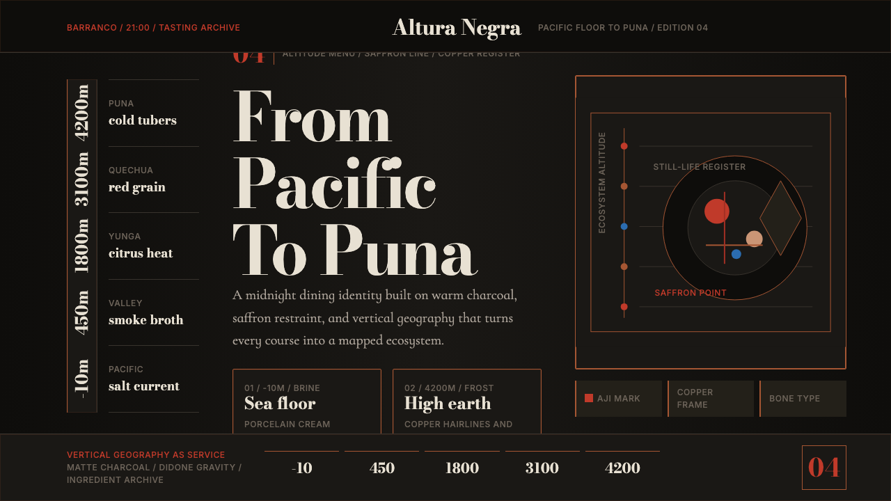 Lima Nuevo Andino CuisineAltitude turns luxurious. Charcoal fields, copper hairlines, and saffron-red…奢华来自海拔:炭黑底、铜发丝线与藏红花红纵向节奏。
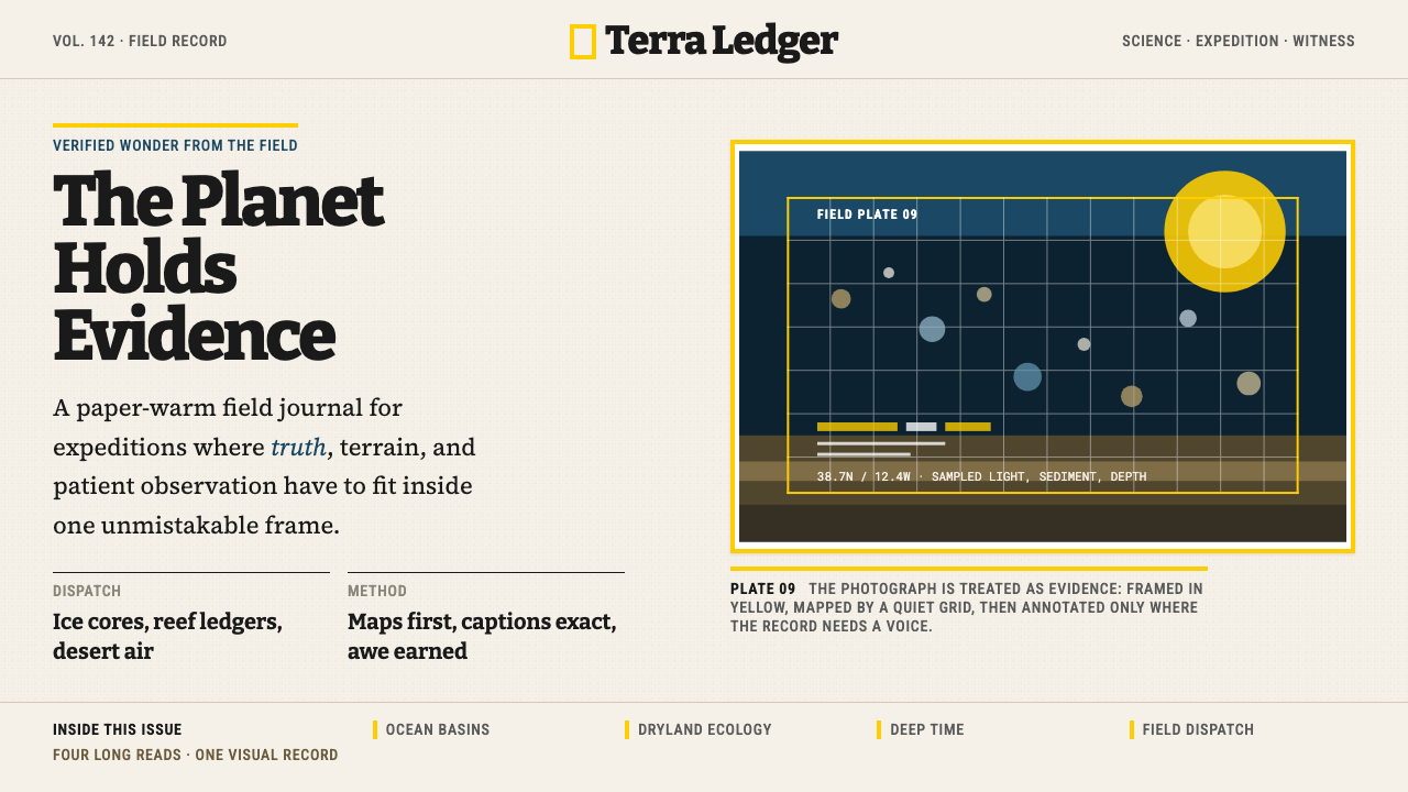 National GeographicAuthority frames wonder. Yellow border, Bitter slab type, and warm paper make…权威框住奇观:黄框、Bitter板衬线与暖纸底,让证据有史诗感。
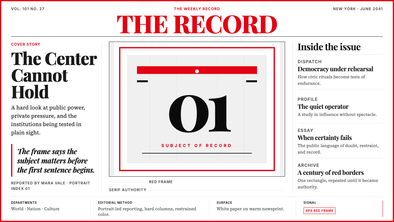 TIME MagazineAuthority in a red rectangle. Didone masthead, black-white columns, and a 4px…红框即权威。Didone刊头、黑白栏栅与4px边框定调。
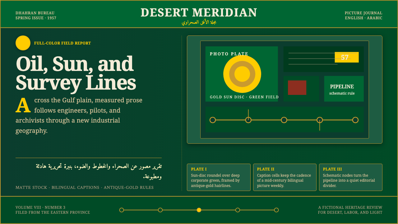 Aramco World MagazineMatte Gulf modernism. Desert green, gold sun-discs, classic serif, and naskh…哑光海湾现代主义:沙漠绿、金色太阳盘、古典衬线与纳斯赫旁注。
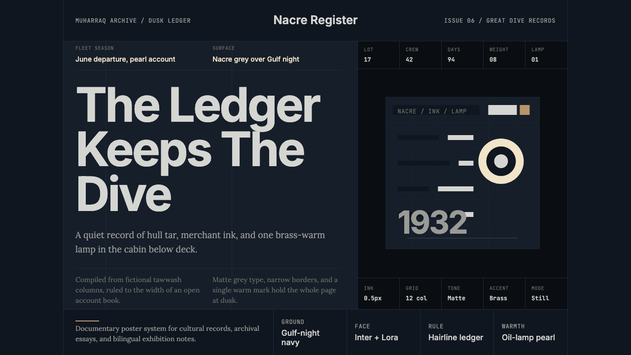 Bahraini Pearl Diving GreyQuiet authority at dusk. Nacre grey type and hairline grids hold one brass-wa…黄昏中的安静权威。珠母灰字体与发丝网格托住一盏铜暖灯。
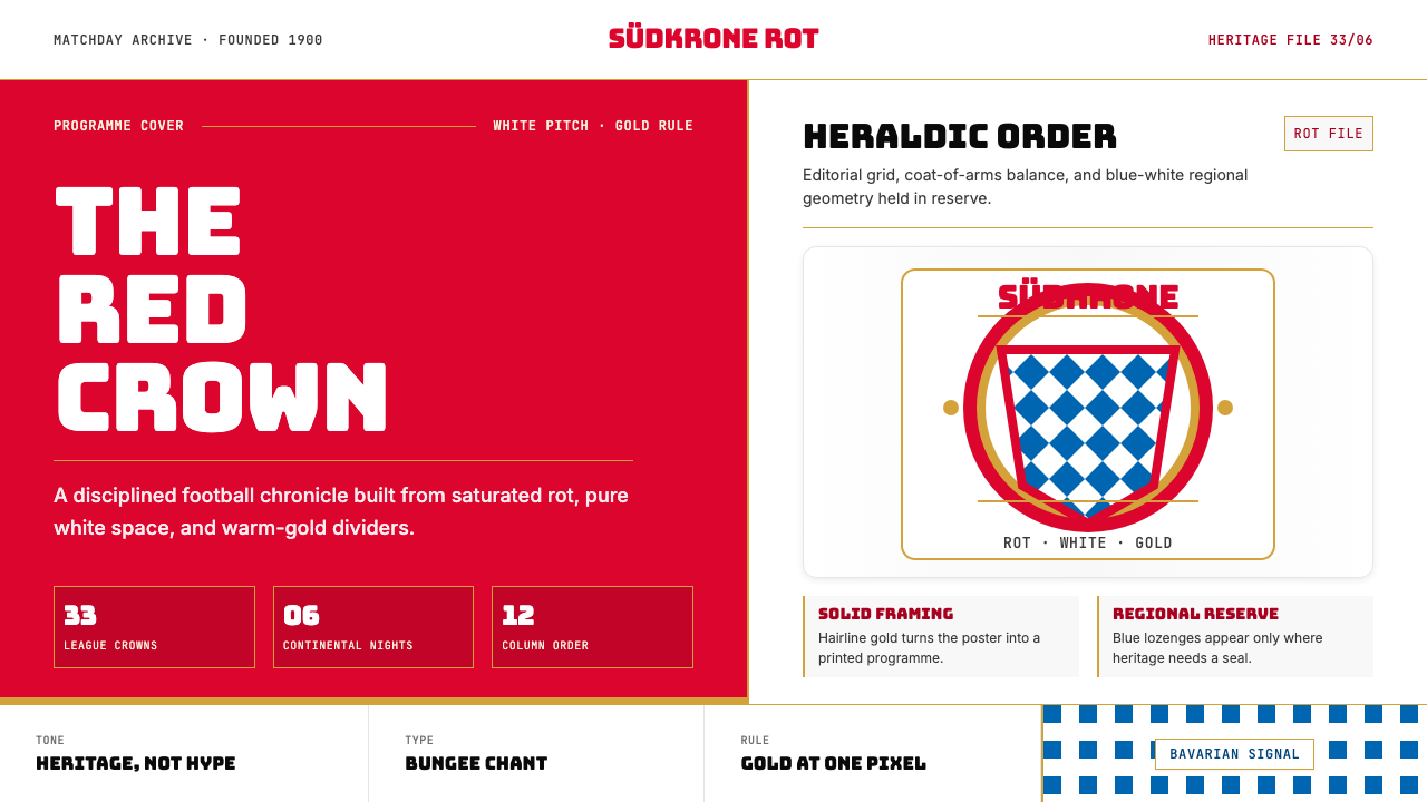 Bayern Munich (Rot)Heritage, not hype. Saturated rot fields, gold rules, and blue lozenges enfor…传统胜过喧哗:饱和红、金细线与蓝白菱格建立秩序。