Design style guide设计风格指南
What is Lima Nuevo Andino Cuisine?什么是 Lima Nuevo Andino Cuisine?
Lima's nuevo andino restaurants built a visual language as exacting as their tasting menus — matte-dark surfaces, saffron-red accent lines, and vertical diagrams that map every dish to its precise altitude in the Andes.利马的「新安第斯」餐厅构建了一套与其品鉴菜单同样严苛的视觉语言——哑光暗面、藏红花红色点缀线条,以及将每道菜精确标注于安第斯山脉海拔位置的垂直图表。
Lima Nuevo Andino Cuisine in briefLima Nuevo Andino Cuisine 速览
Lima Nuevo Andino Cuisine is a visual design system born from the gastronomic renaissance that transformed Lima into one of the world's foremost dining cities between roughly 2008 and the mid-2020s. It draws directly from the atmosphere and graphic identity cultivated by landmark restaurants — Central, Maido, Astrid y Gastón — whose dining rooms, menus, and plating philosophies established an entirely new visual register for South American haute cuisine.「利马新安第斯料理」是一套视觉设计体系,诞生于大约2008年至2020年代中期将利马转变为全球顶级餐饮城市的美食复兴运动。它直接汲取自地标性餐厅——Central、Maido、Astrid y Gastón——所精心培育的氛围与视觉身份:这些餐厅的用餐空间、菜单设计与摆盘哲学,共同为南美高级料理建立了一套全新的视觉语言。
The aesthetic is editorial and ingredient-obsessed. Where earlier Peruvian restaurant design leaned on folk motifs, woven textiles, or Inca iconography, nuevo andino stripped those references away and replaced them with something more surprising: the rigorous, altitude-indexed diagrammatic language of scientific field study. Menus become geographic documents. Walls read like data visualizations. Every visual decision reinforces the kitchen's core argument that the Andean landscape — from the Pacific ocean floor to the alpine puna — is the most biodiverse food pantry on earth.这种美学是编辑式的、以食材为核心的。早期秘鲁餐厅设计倾向于借用民俗图案、编织纺织品或印加图腾,而新安第斯风格将这些参照一扫而空,代之以更出人意料的东西:科学田野调查中那种严格的、以海拔为索引的示意图语言。菜单成为地理文献,墙面像数据可视化,每一个视觉决定都在强化厨房的核心主张——从太平洋海底到高山草原,安第斯地景是地球上生物多样性最丰富的食材库。
The result is a design vocabulary that feels simultaneously luxurious and intellectual. Warm-black and charcoal surfaces create a sense of depth and nocturnal intimacy; copper hairline borders introduce a metallic warmth that reads as precious without being ostentatious; saffron-red accent lines provide the single note of color that punctuates an otherwise restrained palette. Vertical rhythm — running floor-to-ceiling in both physical space and on the printed page — enacts the altitude gradient that is the cuisine's defining concept.结果是一套感觉同时奢华又充满知性的视觉词汇。温暖的黑色与炭色表面营造出深度感与夜间亲密氛围;铜色发丝边框引入金属温度,读来珍贵却不张扬;藏红花红色点缀线条提供了在克制色彩中唯一刺破沉静的音符。垂直节奏——在实体空间与印刷页面上均贯穿始终——将这道料理的核心概念海拔梯度,以视觉形式付诸实现。
See the Lima Nuevo Andino Cuisine design system →查看 Lima Nuevo Andino Cuisine 完整设计系统 →
Where does Lima Nuevo Andino Cuisine come from?Lima Nuevo Andino Cuisine 从何而来?
The roots of this visual system lie in the Peruvian gastronomic renaissance triggered by Apega — the Peruvian Society of Gastronomy — and accelerated by the early international success of Gastón Acurio's Astrid y Gastón in Lima's Miraflores district. Acurio, who trained at Le Cordon Bleu and El Bulli, returned to Lima in the 1990s with a conviction that Peruvian ingredients were among the most varied and extraordinary on earth and had been systematically undervalued. His restaurants and cookbooks began making that argument publicly, and by the mid-2000s, Lima was attracting culinary journalists and food tourists from across the world.这套视觉体系的根源在于秘鲁美食复兴运动。这场运动由秘鲁美食协会(Apega)推动,并因加斯顿·阿库里奥在利马米拉弗洛雷斯区的「Astrid y Gastón」赢得早期国际声誉而加速。阿库里奥曾在蓝带厨艺学院和El Bulli受训,1990年代返回利马时确信:秘鲁食材是地球上最丰富多样、最非凡卓绝的,却长期被系统性地低估。他的餐厅与食谱书开始公开为这一主张发声,到2000年代中期,利马已吸引来自世界各地的美食记者与餐饮旅游者。
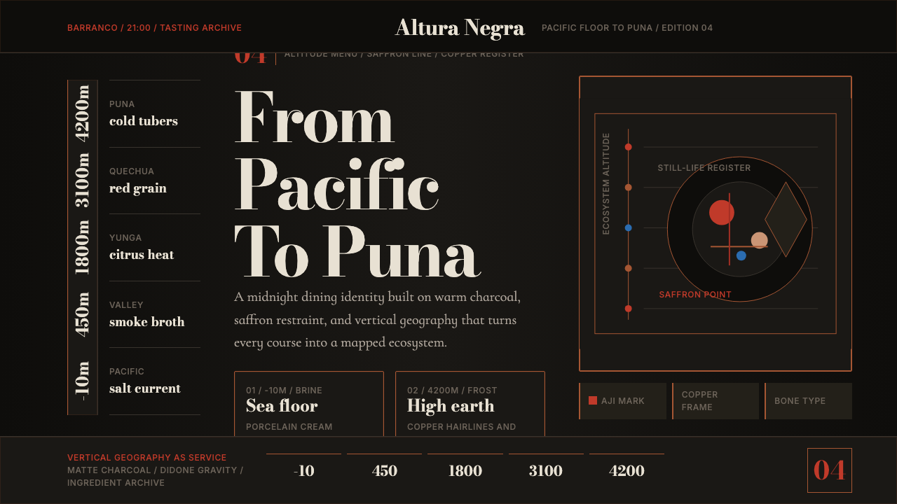
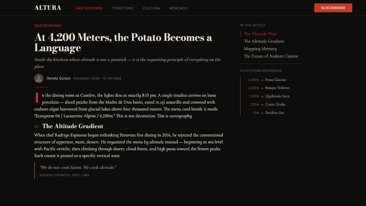
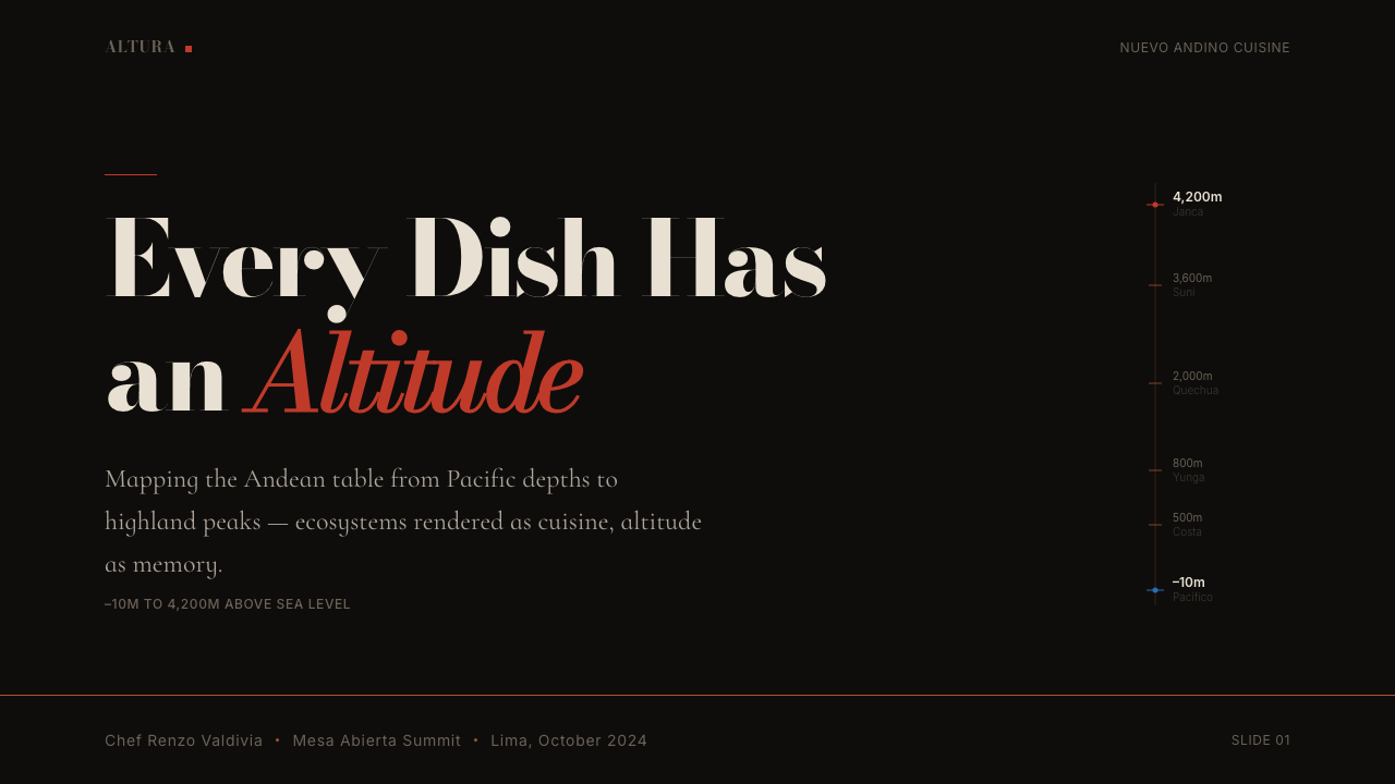
The visual turn came with the next generation, particularly Virgilio Martínez and his restaurant Central, which opened in Miraflores in 2009 and relocated to Barranco in 2021. Martínez, trained in London and New York before returning to Peru, introduced the altitude-gradient menu format that became the system's defining visual conceit: each tasting-menu course was labeled not just by ingredient but by the precise elevation at which it was foraged or farmed — 'Extreme Altitude' at over four thousand meters, 'Amazon Jungle' near sea level, 'Pacific Ocean' at negative depths. The menu was simultaneously a meal plan and a topographic map.视觉转变随下一代厨师到来,尤其是维吉利奥·马丁内斯与其餐厅Central——2009年在米拉弗洛雷斯开业,2021年迁往巴兰科。马丁内斯曾在伦敦和纽约受训后返回秘鲁,他引入了海拔梯度菜单格式,这成为整个体系最核心的视觉概念:品鉴菜单的每一道菜不仅标注食材,还标注其采集或种植的精确海拔——「极高海拔」超过四千米,「亚马逊丛林」接近海平面,「太平洋」位于零米以下。菜单同时是一份用餐计划与一幅地形地图。
Mitsuharu 'Micha' Tsumura's Maido brought a second visual influence: nikkei aesthetics, the fusion sensibility developed by Japanese-Peruvian communities whose Meiji-era immigrants arrived in Peru in 1899. Nikkei cooking places Japanese precision and minimalist presentation against Peruvian ingredient diversity. The visual language Maido cultivated — Japanese-influenced negative space, meticulous plating geometry, monochromatic tableware — reinforced the editorial restraint that the broader nuevo andino system shared.「Micha」三村光晴的Maido带来了第二种视觉影响:日裔秘鲁(nikkei)美学——由明治时代于1899年抵达秘鲁的日本移民后代所发展出的融合感性。Nikkei料理将日式精确与极简摆盘置于秘鲁食材多样性的背景下。Maido所培育的视觉语言——受日本影响的留白运用、一丝不苟的摆盘几何、单色餐具——强化了整个新安第斯体系共有的编辑式克制。
By 2015, Lima's dining rooms had converged on a recognizable visual register: darkened interiors that directed all attention to the plate, printed materials that used altitude diagrams as structural devices, and a color palette anchored in warm blacks and copper metallics with deliberate saffron-red or amber accents. The 2020s solidified this as a transferable design system — one that could travel from restaurant branding into digital menus, culinary event identities, food-focused editorial layouts, and premium hospitality interfaces well beyond Peru itself.到2015年,利马的高级餐厅已经汇聚于一套可辨认的视觉语域:将全部注意力引向餐盘的暗色室内,以海拔图表作为结构性装置的印刷材料,以及锚定于温暖黑色与铜色金属质感、辅以藏红花红或琥珀色点缀的色彩体系。2020年代将其固化为一套可移植的设计语言——能够从餐厅品牌延伸至数字菜单、美食活动视觉识别、食品编辑版面与高端餐旅界面,远超秘鲁本土边界。
What defines the Lima Nuevo Andino Cuisine look?Lima Nuevo Andino Cuisine 的视觉特征是什么?
Surface and Ground表面与底色
The foundational layer is a warm, near-black — not a cold digital black but a charcoal that carries traces of warmth, evoking the texture of fired ceramic or matte concrete. Against this ground, everything else reads with heightened clarity. The darkness is not minimalist in the Scandinavian sense; it is atmospheric, suggesting the intimate dining rooms of Barranco at nine in the evening, lit more by candlelight than overhead illumination. Content appears to float on this surface rather than rest upon it.基础底层是温暖的近黑色——不是冰冷的数字黑,而是一种带有温度痕迹的炭色,令人联想到烧制陶瓷或哑光混凝土的质感。在这片底色之上,其余一切都以更高的清晰度浮现。这种深沉并非斯堪的纳维亚式的极简主义;它是大气性的,暗示着巴兰科区晚上九点的私密用餐空间,烛光多于顶灯。内容看起来像是漂浮于这片表面之上,而非静置其上。
Accent Color and Restraint点缀色与克制
Saffron red — rich, earthy, and deeply associated with Andean dye traditions — appears in a single sustained role: the accent line that marks hierarchy, divides sections, or signals interactive elements. It is never used as background fill or applied broadly. Its power comes from scarcity. Copper appears alongside in a similarly disciplined way, used for hairline borders and rule lines where gold would feel excessive and silver would feel cold. The interplay of the two warm metallics against the dark ground is the system's most distinctive visual signature.藏红花红——浓郁、土质,与安第斯染色传统深度关联——始终只承担一个角色:标示层级、划分区段或信号交互元素的点缀线条。它从不被用作背景填充,也不大面积铺陈。它的力量来自稀缺性。铜色以同样严谨的方式出现,用于发丝边框与分隔线——在金色显得过于隆重、银色显得过于冰冷的地方。这两种暖色金属在暗色底面上的相互作用,是整个体系最具辨识度的视觉签名。
Vertical Rhythm and Altitude Mapping垂直节奏与海拔映射
The system's most intellectually distinctive feature is its use of vertical orientation to enact geographic hierarchy. Just as the altitude-gradient menu charts the landscape from ocean floor to alpine summit, design layouts in this system tend to organize information along a vertical axis, with higher-altitude or more-refined content positioned at the top and earthier, more raw material at the bottom. This is not a rigid rule but a compositional instinct that permeates every layout — information descends like elevation, and the eye is trained to read the vertical dimension as meaningful.这套体系在知性层面最具特色的,是以垂直方向来实现地理层级。正如海拔梯度菜单将地景从海底绘制到高山山顶,该体系的版面设计倾向于沿垂直轴组织信息,更高海拔或更精细的内容置于顶部,更朴实、更原始的食材则在底部。这不是一条刚性规则,而是一种浸透在每个版面中的构图本能——信息像海拔一样向下分布,视线被训练成将垂直维度读作有意义的信号。
Typography as Document字体排印的文献感
Typography in this system draws on the gravitas of high-contrast serif letterforms — the kind associated with luxury editorial publishing and scientific taxonomy — paired with light, open sans-serif type for secondary information. The contrast is not between typefaces in the decorative sense but between registers: the headline announces authority and finality; the annotation invites close reading. This combination reflects the cuisine's dual identity — it is simultaneously a fine-dining experience and a rigorous academic inquiry into Andean biodiversity.这套体系中的字体排印借助高对比度衬线字形的庄重感——那种与奢华编辑出版和科学分类学相关联的字形——配合轻盈、开放的无衬线字体承担次要信息。这种对比不是装饰意义上的字体之争,而是语域之别:标题宣告权威与终结;注释邀请细读。这种组合映照了这道料理的双重身份——它既是精致餐饮体验,也是对安第斯生物多样性的严格学术探究。
Material Warmth and Anti-Gloss材料温度与消光倾向
Unlike the glossy lacquer finishes of earlier luxury hospitality design, nuevo andino surfaces are matte or satin at most. The dining-room walls are raw concrete or limewash; the ceramics are unglazed or lightly so; printed materials use uncoated stock. This deliberate rejection of gloss communicates authenticity over opulence — it says the value is in the substance, not the surface treatment. In digital contexts, this translates to flat or very lightly textured surface treatments, no high-gloss gradients, and careful attention to matte states over hover-glow effects.与早期奢华餐旅设计中的光面漆处理不同,新安第斯的表面至多是哑光或缎面的。用餐室的墙面是原始混凝土或石灰水洗,陶瓷餐具无釉或仅轻微施釉,印刷材料使用非涂布纸张。这种对光泽的刻意拒绝传达的是真实性而非奢华感——它在说:价值在于实质,而非表面处理。在数字语境中,这转译为平面或极轻微质感的表面处理,没有高光渐变,对哑光状态的关注胜过悬停光晕效果。
Diagrammatic Precision图示化精确
Data and information are visualized with the disciplined clarity of scientific illustration rather than the expressiveness of infographic design. Altitude diagrams, ecological zone maps, and ingredient provenance charts are drawn in spare linework — thin rules, minimal labels, precise positioning. Nothing is decorative; every mark carries informational weight. This diagrammatic sensibility extends beyond actual charts: even layout grids and typographic hierarchies are conceived as systems of notation, with each element assigned a position in a logical schema rather than arranged for purely aesthetic effect.数据与信息的可视化带有科学插图的严谨清晰,而非信息图表设计的表现性。海拔图、生态区域图与食材溯源图以简洁的线条绘制——细规则线、最少标注、精确定位。没有任何东西是装饰性的,每一个标记都承载信息重量。这种图示化感性延伸至实际图表之外:版面网格与排印层级也被构想为符号系统,每个元素依照逻辑图式被分配位置,而非单纯为美感效果而排列。
Geographic and Ecological Identity地理与生态身份
The system is inseparable from its geographic specificity. References to named Andean ecosystems — the altiplano, the cloud forest, the coastal lomas — function as organizational and emotional anchors throughout a composition. This is not generic 'nature inspiration' but a very particular epistemology: the landscape is the menu, the menu is the landscape. This specificity gives the design vocabulary an authenticity that cannot be borrowed without reference to its source — when used in contexts unrelated to Andean food culture, it reads as appropriation rather than homage.这套体系与其地理特殊性密不可分。对安第斯具名生态系统的指涉——高原、云雾林、滨海洛马斯沙漠——在构图中充当组织性与情感性的锚点。这不是泛泛的「自然灵感」,而是一种非常具体的认识论:地景即菜单,菜单即地景。这种特殊性赋予设计词汇一种无法被挪用的真实性——当在与安第斯饮食文化无关的语境中使用时,它呈现出挪用而非致敬的观感。
See the Lima Nuevo Andino Cuisine design system →查看 Lima Nuevo Andino Cuisine 完整设计系统 →
Who shaped Lima Nuevo Andino Cuisine?谁塑造了 Lima Nuevo Andino Cuisine?
Martínez is the chef most directly responsible for codifying the altitude-gradient format that defines the system's visual identity. At Central — ranked among the world's top restaurants throughout the 2010s and 2020s — he developed the practice of labeling each tasting course by elevation, turning the menu into a topographic document. His collaborative projects with biologists and field researchers reinforced the scientific-document aesthetic, treating the dining room as a site of ecological inquiry. His wife and co-chef Pía León shared and deepened this vision, particularly through her solo restaurant Kjolle, where ingredient-sourcing storytelling reached an even more intimate register.马丁内斯是最直接负责将海拔梯度格式编码化的厨师,而这一格式正是整套视觉体系的核心。在Central——2010至2020年代始终跻身全球顶级餐厅之列——他发展出按海拔标注每道品鉴课程的做法,将菜单转化为地形文献。他与生物学家及田野研究者的合作项目强化了科学文献式美学,将用餐室视为生态探究的场所。他的妻子兼联合主厨皮亚·莱昂分享并深化了这一愿景,尤其通过她的独立餐厅Kjolle,让食材溯源叙事达到更私密的语调。
Acurio is the movement's most influential evangelist. He did not create the nuevo andino visual language in its mature form, but he established the cultural and institutional conditions that made it possible. By demonstrating that Peruvian cuisine could occupy the same international prestige as French or Japanese cooking, he shifted the frame of reference for Lima's chefs, freeing them to build a visual identity grounded in Andean geography rather than European precedent. His media presence — television series, bestselling cookbooks, restaurant chains across Latin America — spread Peruvian food culture globally and created an audience educated enough to receive the more conceptually rigorous aesthetics of the next generation.阿库里奥是这场运动最具影响力的布道者。他并未以成熟形态创造出新安第斯视觉语言,但他建立了使其成为可能的文化与制度条件。通过证明秘鲁料理可以占据与法式或日式烹饪相同的国际声望,他改变了利马厨师的参照框架,让他们得以建立一套根植于安第斯地理而非欧洲前例的视觉身份。他的媒体影响力——电视系列、畅销食谱书、遍布拉丁美洲的餐厅连锁——将秘鲁饮食文化传播至全球,并培育了一批有足够文化素养接受下一代更具概念深度美学的受众。
Tsumura, known as Micha, is the defining figure of nikkei cuisine — the Japanese-Peruvian fusion tradition whose visual sensibility contributed the system's commitment to negative space, geometric plating, and monochromatic restraint. Maido, his Lima restaurant, consistently ranked alongside Central on the world's top restaurant lists, giving nikkei aesthetics global visibility. His background in Tokyo and his deep familiarity with both Japanese precision cooking and Peruvian biodiversity produced a synthesis that is neither Japanese nor Peruvian but distinctly of Lima — a city shaped by over a century of Japanese-Peruvian exchange.三村光晴,人称Micha,是nikkei料理的核心人物——这一日裔秘鲁融合传统的视觉感性为整套体系贡献了留白运用、几何摆盘与单色克制的承诺。他的利马餐厅Maido在全球顶级餐厅榜单上始终与Central并肩,赋予nikkei美学全球能见度。他在东京的背景以及对日式精确烹饪与秘鲁生物多样性的深度熟悉,产生了一种既非日本式也非秘鲁式、却分明属于利马的综合——一座被逾百年日裔秘鲁交流所塑造的城市。
León co-led Central alongside Martínez and in 2018 opened Kjolle, her solo restaurant within the same Barranco building complex. If Central's visual language is topographic and scientific, Kjolle's is more intimate and sensory — an extension of the same vocabulary at a smaller, more personal scale. León's sourcing work, which took her into remote highland and jungle communities to document ingredients unknown even to most Peruvian chefs, deepened the system's claim to geographic authenticity. Her recognition as the World's Best Female Chef in 2021 brought additional international attention to the Lima school's visual and culinary identity.莱昂与马丁内斯共同领导Central,并于2018年在同一巴兰科建筑群内开设了她的独立餐厅Kjolle。如果说Central的视觉语言是地形性与科学性的,Kjolle的则更私密、更感官——同一词汇在更小、更个人化尺度上的延伸。她的食材溯源工作将她带入偏远高地与丛林社区,记录下即使对大多数秘鲁厨师也陌生的食材,深化了这套体系对地理真实性的主张。2021年她荣获全球最佳女厨师称号,为利马流派的视觉与烹饪身份带来了更多国际关注。
Muñoz, the chef behind Amaz in Lima's Miraflores district, extended the altitude-zoning visual language specifically toward Amazonian ingredients and ecosystems. Where Central charts vertical altitude, Amaz charts the horizontal reach of the Amazon basin — its visual identity uses river-network diagrams and jungle-canopy motifs in place of the altiplano. Muñoz's contribution expanded the system's geographic vocabulary beyond the Andes and demonstrated that the underlying logic — place as menu, diagram as identity — could absorb multiple ecosystems without becoming generic.穆尼奥斯是利马米拉弗洛雷斯区餐厅Amaz背后的厨师,他将海拔分区的视觉语言专门延伸至亚马逊食材与生态系统。Central绘制垂直海拔,而Amaz绘制的是亚马逊流域的水平延伸——其视觉识别以河网图与丛林树冠图案取代了高原图形。穆尼奥斯的贡献将这套体系的地理词汇扩展至安第斯山脉之外,并证明了其底层逻辑——地方即菜单、图示即身份——能够容纳多种生态系统而不流于泛化。
How do you use Lima Nuevo Andino Cuisine today?今天怎么用 Lima Nuevo Andino Cuisine?
The Lima Nuevo Andino system is well-suited to any design context where authority, geographic specificity, and intellectual depth are desired values — premium hospitality branding, culinary editorial, food-focused web interfaces, and event identities for gastronomic or cultural institutions. It is particularly powerful when the content itself has a geographic or provenance story to tell, because the system's core vocabulary — altitude mapping, ecological zonation, diagrammatic precision — gives that story a visual structure it can inhabit.利马新安第斯体系非常适合任何以权威感、地理特殊性与知性深度为诉求价值的设计语境——高端餐旅品牌、美食编辑内容、以食品为核心的网络界面,以及美食或文化机构的活动视觉识别。当内容本身有地理或溯源故事需要讲述时,这套体系尤为有力,因为其核心词汇——海拔测绘、生态分区、图示化精确——为那个故事提供了一个可以居住的视觉结构。
For presentation slides, the system works best on a dark ground with a warm-black or deep charcoal field. Cover slides benefit from an altitude diagram used as the primary composition device: a vertical gradient line running the full height of the slide, with ecosystem labels positioned at corresponding altitudes. Content slides should use a narrow left-margin column for hierarchy labels or altitude-zone tags, with the main body in a high-contrast lighter weight. Data slides take on a scientific-illustration quality — charts should be sparse, labeled with the same restraint as a field-research document, and colored only with the saffron-red or copper accent for the single most important data series.对于演示文稿,这套体系在温暖黑色或深炭色底面上表现最佳。封面页以海拔图表作为主要构图装置效果出色:一条贯穿幻灯片全高的垂直梯度线,生态系统标签按对应海拔位置排布。内容页应在左侧留出窄边柱,用于层级标签或海拔区域标签,正文主体以高对比度较浅字重呈现。数据页带有科学插图的品质——图表应当稀疏,以与田野研究文献同等克制的方式标注,只对最重要的单一数据系列使用藏红花红或铜色点缀。
For web interfaces — particularly restaurant websites, food-platform dashboards, or premium e-commerce in the food and hospitality sector — the system rewards commitment. A half-hearted application that borrows only the dark background without the vertical rhythm or the diagrammatic typography will feel generic rather than grounded. The system needs its geographic organizing logic to work: section headings that establish a vertical zone, accent lines that mark transitions, and a typographic scale that reads as authoritative documentation rather than decorative layout.对于网络界面——尤其是餐厅网站、美食平台仪表板,或食品与餐旅领域的高端电商——这套体系奖励全情投入。仅借用暗色背景而不带入垂直节奏或图示化排印的半心半意应用,感觉会流于泛化而非扎根。这套体系需要其地理组织逻辑方能成立:建立垂直分区的区段标题、标记过渡的点缀线条,以及读来像权威文献而非装饰版面的排印体系。
For editorial and marketing work, the style supports long-form storytelling with visual authority. A feature article about a chef, a culinary region, or an ingredient can use altitude diagrams as section dividers, with each chapter labeled by its ecological context. Marketing pages for food events or gastronomic experiences work well with the system's poster-like restraint: full-width feature blocks in warm charcoal, with saffron-red headlines and copper rule lines, conveying the kind of gravitas that signals serious culinary purpose rather than casual dining.对于编辑与营销内容,这种风格以视觉权威支撑长篇叙事。一篇关于厨师、美食地区或食材的深度报道可以用海拔图表作为区段分隔符,每个章节以其生态语境为标注。美食活动或美食体验的营销页面与这套体系的海报式克制高度契合:温暖炭色的全宽特性区块,配以藏红花红色标题与铜色规则线,传达一种庄重感——信号着严肃的烹饪目的,而非休闲餐饮。
The most common mistake when applying this system is using it as a generic dark-luxury aesthetic — pulling the warm blacks and copper tones without the underlying geographic and diagrammatic logic. The result is expensive-looking but empty. The system's power comes from specificity: if the content is not about place, provenance, or ecological context, the visual vocabulary has nothing to anchor to, and it defaults to being merely atmospheric. A second common error is treating saffron-red as an available accent color for any purpose. In authentic applications, it signals a single level of hierarchy or a single interactive state — the moment it appears on more than one or two elements simultaneously, its scarcity value collapses.应用这套体系时最常见的错误,是将其当作泛化的暗色奢华美学使用——提取了温暖黑色与铜色调,却没有带入底层的地理与图示化逻辑。结果看起来昂贵但空洞。这套体系的力量来自特殊性:如果内容与地方、溯源或生态语境无关,这套视觉词汇便无处锚定,最终只是流于氛围。第二个常见错误是将藏红花红视为可随意使用的点缀色。在真实应用中,它只信号化一个层级或一种交互状态——一旦同时出现在超过一两个元素上,其稀缺价值便轰然崩塌。
See the Lima Nuevo Andino Cuisine design system →查看 Lima Nuevo Andino Cuisine 完整设计系统 →
Lima Nuevo Andino Cuisine — FAQLima Nuevo Andino Cuisine · 常见问题
How does Lima Nuevo Andino differ from other dark-luxury hospitality aesthetics?利马新安第斯与其他暗色奢华餐旅美学有何不同?
Most dark-luxury aesthetics — steakhouse noir, European fine dining, Japanese omakase — use darkness to signal exclusivity without a specific geographic or intellectual claim. The Lima Nuevo Andino system is distinguished by its diagrammatic logic: the darkness is not mood alone, it is the field against which scientific illustration becomes legible. The altitude gradient, the ecological zone labels, the copper hairlines are not decorative — they are a visual argument about the landscape as the source of value. Remove the geographic specificity and you have a handsome dark layout; retain it and you have a system with genuine content.大多数暗色奢华美学——牛排馆式黑色调、欧洲精致餐饮、日式无菜单料理——都以黑暗来信号化排他性,而不做特定的地理或知性主张。利马新安第斯体系以其图示化逻辑区别于此:黑暗不只是氛围,它是科学插图得以清晰显影的底场。海拔梯度、生态区域标签、铜色发丝线不是装饰——它们是一个关于地景作为价值来源的视觉论点。去掉地理特殊性,你得到的是一个好看的暗色版面;保留它,你得到的是一套有真实内容的体系。
Can this aesthetic work for non-food brands?这种美学能用于非食品品牌吗?
With significant adaptation, yes — but the designer should be clear-eyed about what is being transferred and what is being left behind. The formal qualities — warm-black grounds, copper metallics, saffron-red accents, vertical rhythm, diagrammatic precision — can transfer to any brand communicating geographic provenance, scientific authority, or craft depth. Natural ingredients, field-research platforms, cartography tools, cultural heritage institutions, and premium outdoor equipment have all successfully borrowed elements of this register. What cannot transfer without strain is the altitude-mapping conceit itself — using it without connection to actual ecosystems reads as stylistic appropriation.经过相当幅度的改造可以——但设计师应对哪些可以迁移、哪些必须留下保持清醒认识。形式属性——温暖黑色底面、铜色金属质感、藏红花红色点缀、垂直节奏、图示化精确——可以迁移到任何传达地理溯源、科学权威或工艺深度的品牌上。天然食材、田野研究平台、制图工具、文化遗产机构与高端户外装备都曾成功借用这套语域的元素。无法不生硬迁移的是海拔测绘这个核心概念本身——在没有与真实生态系统关联的情况下使用它,读来就是风格挪用。
Is nikkei a separate style or part of the same system?Nikkei是独立风格还是同一体系的一部分?
Nikkei aesthetics are a significant source layer for the Lima Nuevo Andino system but are not identical to it. Nikkei design — rooted in the Japanese-Peruvian community's century-long synthesis — brings the negative space, geometric plating, and monochromatic tableware that characterize restaurants like Maido. Nuevo andino in the broader sense adds the altitude-mapping logic, the Andean color palette anchored in saffron and copper, and the diagrammatic documentation approach. A nikkei-specific design language is cooler and more overtly Japanese in influence; nuevo andino proper is warmer, more geographically declarative, and more concerned with ecological specificity.Nikkei美学是利马新安第斯体系的重要来源层,但二者并不等同。Nikkei设计——根植于日裔秘鲁社区百年综合实践——带来了Maido等餐厅所具有的留白、几何摆盘与单色餐具。广义上的新安第斯再叠加海拔测绘逻辑、以藏红花与铜色为锚点的安第斯色彩体系,以及图示化文献化的表达方式。Nikkei特有的设计语言更冷峻、日式影响更外显;真正的新安第斯则更温暖、更具地理宣示性,也更关注生态特殊性。
How do you handle light-background or print contexts where the dark ground is not practical?在暗色底面不实际的浅色背景或印刷语境中如何处理?
The system inverts with reasonable grace. On a light ground — uncoated cream or warm white — the copper and saffron-red accents retain their character and the diagrammatic precision reads even more clearly. The vertical altitude lines become bolder graphic objects against light fields. What is lost is the nocturnal intimacy that gives the dark-ground version its dining-room atmosphere; the light inversion reads as more clinical and documentary, closer to the field-research journal end of the spectrum than the Barranco dining room. For print collateral — menus, event programs, editorial features — this is often the appropriate register: authoritative and legible rather than atmospheric.这套体系反转后依然优雅。在浅色底面——非涂布奶油色或温暖白色——上,铜色与藏红花红色点缀保留其本色,图示化精确反而读来更清晰。垂直海拔线在浅色底场上成为更显眼的图形对象。失去的是暗色底面版本那种夜间亲密感,那种给人用餐室氛围的特质;浅色反转版读来更临床化、更文献化,更靠近田野研究日志的一端,而非巴兰科餐厅。对于印刷配套材料——菜单、活动手册、编辑特稿——这往往是合适的语调:权威而清晰,而非大气氛围性的。
Why did this particular visual language emerge from Lima rather than from another gastronomic capital?为什么这套特定的视觉语言从利马而非其他美食之都涌现?
Lima's gastronomy is unusual in that its claim to distinction rests almost entirely on geographic uniqueness — the sheer biodiversity of Peru's overlapping climatic zones — rather than on technique, history, or cultural prestige in the European sense. French cuisine claims authority through centuries of codification; Japanese cuisine through precision and ritual. Lima had to make a different argument: the landscape itself is the authority. A visual system built around diagrammatic geography — altitude maps, ecosystem labels, provenance documentation — is the most direct way to make that argument in design. Other food capitals had less need to assert geographic uniqueness because they could rely on inherited prestige; Lima invented a visual language because it needed one.利马的美食之所以不同寻常,在于其卓越性的主张几乎完全建立于地理独特性之上——秘鲁交叠气候带所孕育的惊人生物多样性——而非欧洲意义上的技法、历史或文化声望。法式料理以数百年编码化宣示权威;日式料理以精确与仪式。利马必须提出不同的论点:地景本身即是权威。围绕图示化地理构建的视觉体系——海拔地图、生态系统标签、溯源文献——是在设计中提出这一论点最直接的方式。其他美食之都对宣示地理独特性的需求较少,因为它们可以依赖继承的声望;利马发明了一套视觉语言,因为它需要一套。
Related design styles相关设计风格
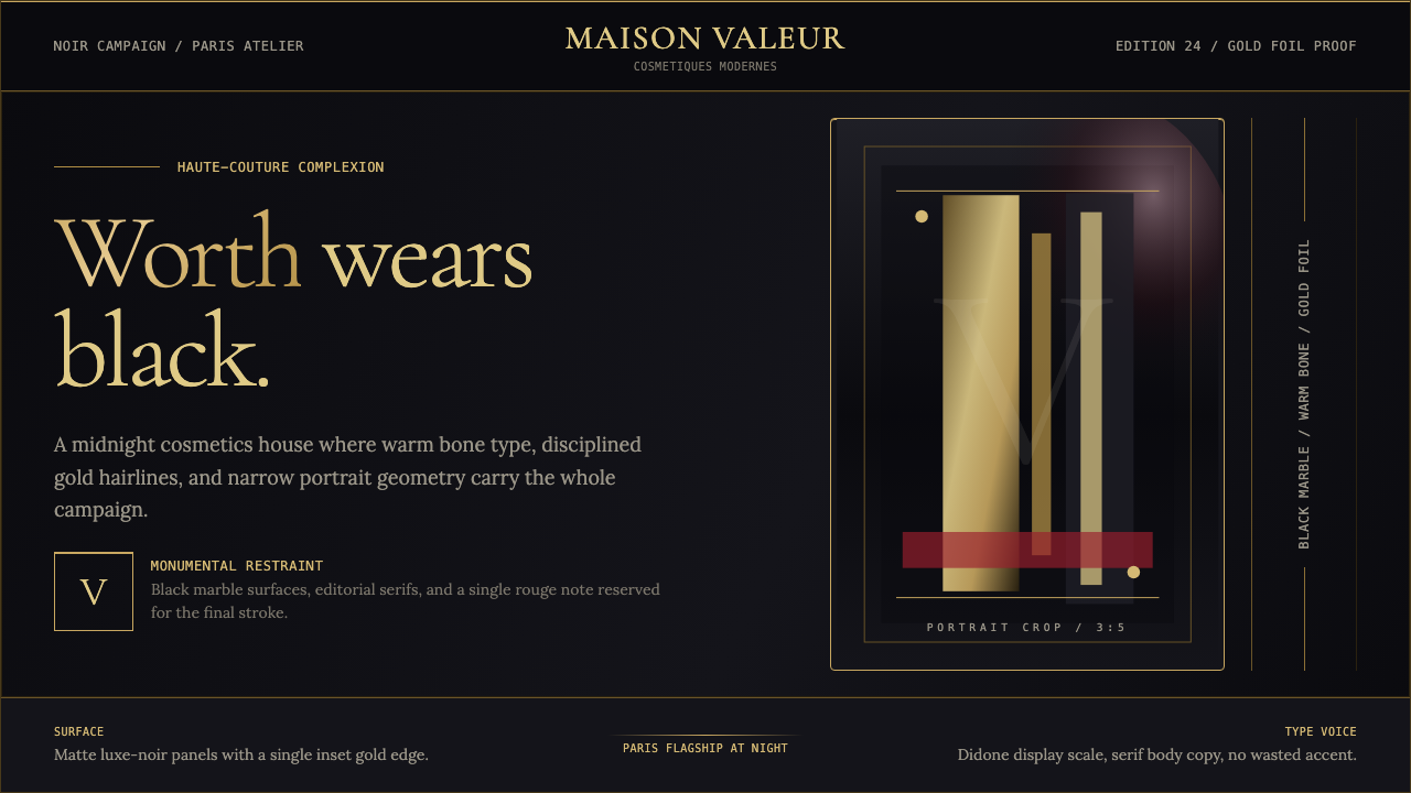 L'Oréal Paris CosmeticsMonumental restraint. Black marble fields, gold Didone type, and narrow portr…纪念碑式克制:黑色大理石场域、金色Didone字与窄幅肖像几何。
 Al Jazeera Arabic NewsAuthority, stripped bare. Gold seal, dense Arabic type, matte charcoal.权威感被提纯。金色印章、密集阿文、炭黑底面构成画面。
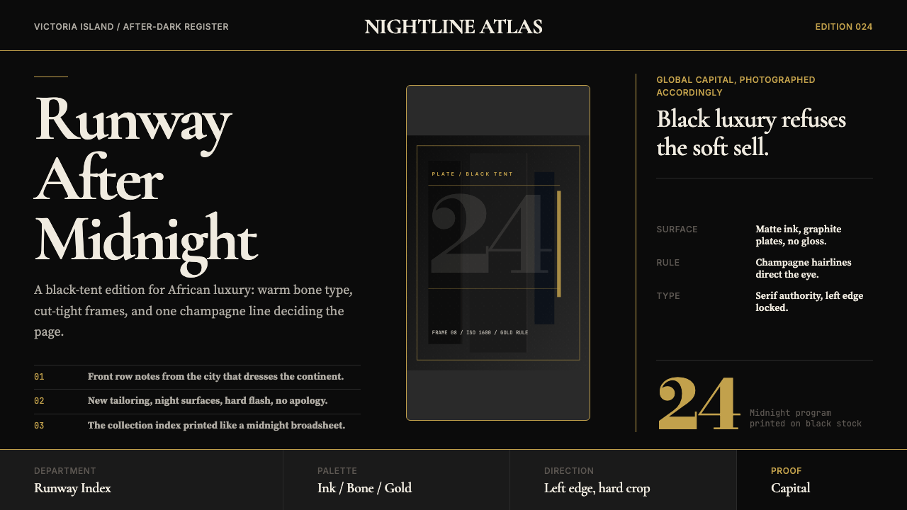 Lagos Fashion WeekBlack luxury speaks plainly. Matte ink, bone serif, and one gold hairline set…黑色奢华直截了当:哑光墨底、骨白衬线与一道金色发丝线定调。
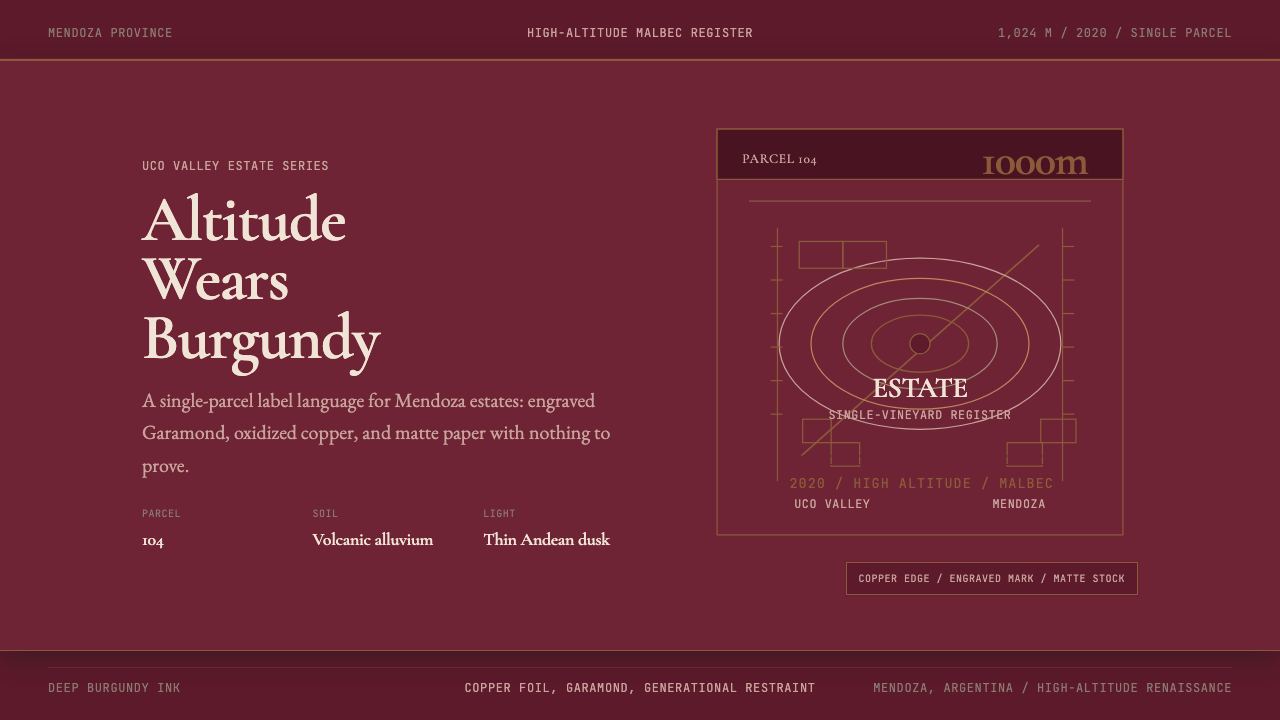 Argentine Malbec WineAltitude turned austere. Burgundy panels, engraved Garamond, oxidized copper.高海拔变得克制。酒红面板、雕刻衬线与氧化铜。
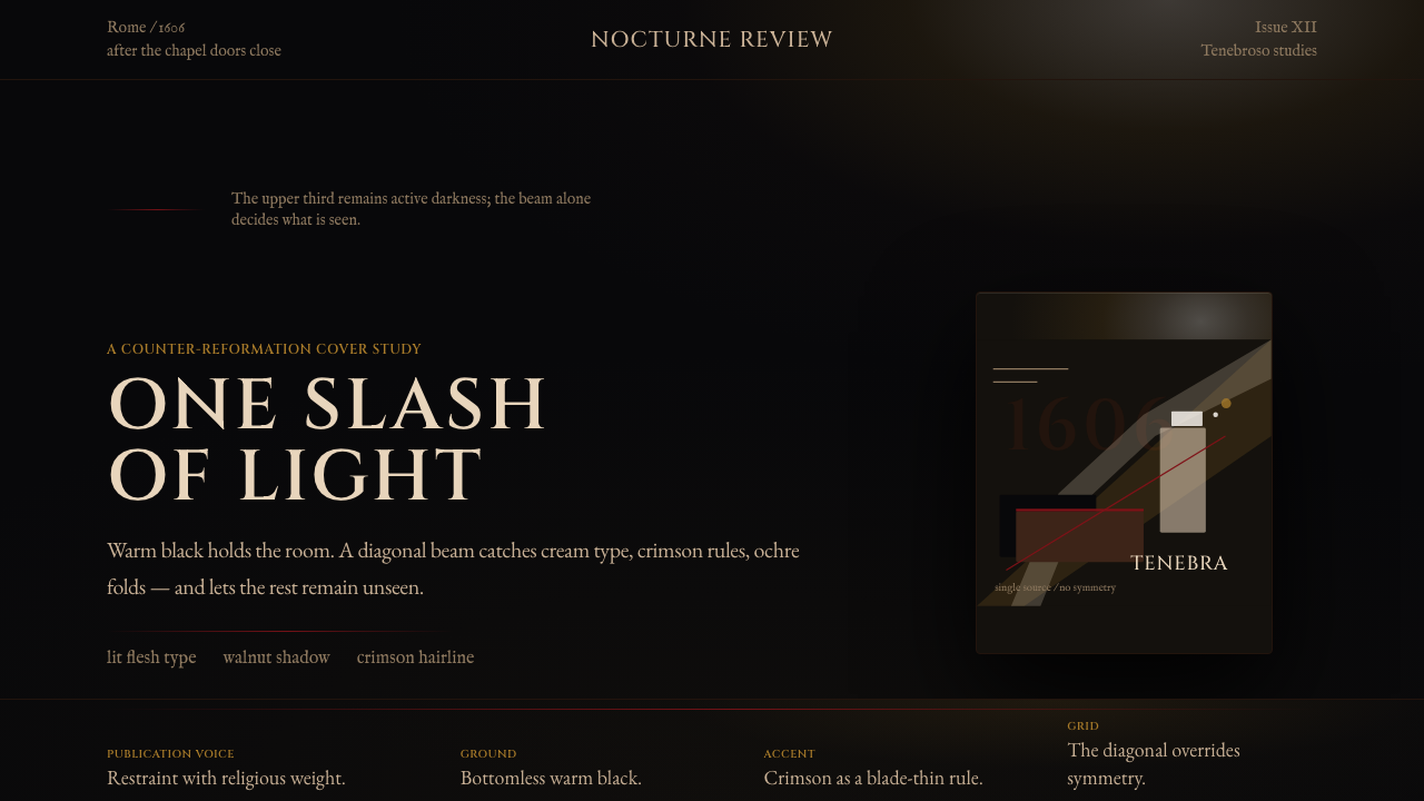 Caravaggio TenebrismDarkness acts first. Warm-black voids, Cinzel capitals, and one ochre raking…黑暗先发声:暖黑空场、Cinzel 大写与赭石斜光。
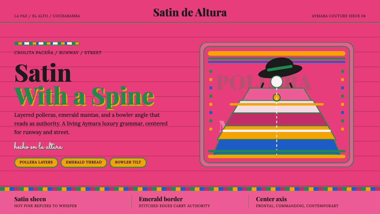 Bolivian Cholita FashionUnapologetic satin power. Hot pink fields, emerald stitches, centered pollera…拒绝低语的缎面力量。亮粉底、翡翠绣线与居中波列拉轴线。