What is L'Oréal Paris Cosmetics?什么是 L'Oréal Paris Cosmetics?
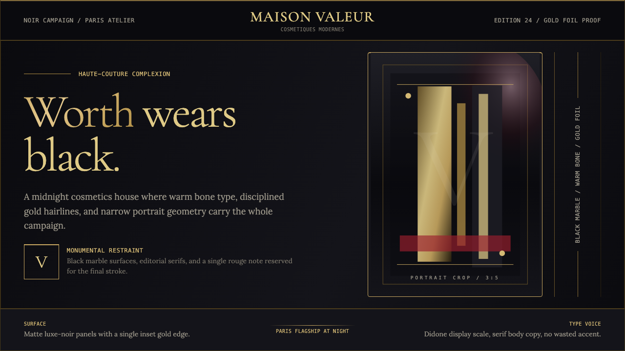
L'Oréal Paris translates a century of Parisian haute-couture authority into a design language built on the deepest black, the warmest gold, and a portrait orientation that turns every surface into a monument.欧莱雅巴黎将百年巴黎高级定制的权威,转化为以最深的黑、最暖的金与竖幅肖像构图为核心的设计语言,令每一处表面都成为一座纪念碑。
L'Oréal Paris Cosmetics in briefL'Oréal Paris Cosmetics 速览
L'Oréal Paris is the visual language of monumental Parisian luxury translated into interface, packaging, and campaign. The system draws on the blackest-black marble of a Champs-Élysées flagship store, gold-foil monograms pressed into matte surfaces, and the Didone serif headline tradition inherited from a century of haute-couture editorial photography. The result is a design vocabulary that simultaneously communicates prestige, authority, and feminine self-determination.欧莱雅巴黎是将巴黎纪念碑式奢华转化为界面、包装与广告活动的视觉语言。这套系统汲取香榭丽舍旗舰店最深邃的黑色大理石墙面、压印于哑光表面的金箔字母组合,以及承袭百年高级定制时装编辑摄影传统的迪多衬线标题。最终呈现出一套同时传达声望、权威与女性自我主张的设计词汇。
At its core, the aesthetic is built on radical restraint within a narrow range of highly charged signals. Deep, near-absolute black serves as the primary field — not as darkness or absence, but as the material analogue of expensive lacquered surfaces and photographic shadow. Against this black, a warm burnished gold reads as the accent of royalty and earned luxury, while high-key portrait photography — often a single face filling the entire frame — provides the human connection that prevents the system from feeling cold.这套美学的核心,是在极少数高度浓缩的信号之间实现彻底的克制。近乎绝对的深黑色作为主要底场——不是黑暗或缺席,而是昂贵漆面与摄影暗部的材料类比。在黑色衬托下,温暖的烧金色作为皇室与有据可查的奢华的点缀;而高调的肖像摄影——通常是一张充满整个画面的面孔——提供了防止系统显得冷漠的人文联结。
The design tradition absorbs and reflects L'Oréal Paris's 1909-to-now arc: the scientific precision of founder Eugène Schueller's chemist origins, the feminist declaration embedded in the 'Because I'm worth it' campaign of 1973, and the modern celebrity-portrait tradition in which international ambassadors carry the brand's values across cultures. Every compositional choice — the narrow portrait format, the gold Didone headline, the minimal color range — encodes this history into a system that feels simultaneously timeless and sharply contemporary.这套设计传统吸收并折射着欧莱雅巴黎从1909年至今的弧线:创始人舒莱尔(Eugène Schueller)化学家起源所蕴含的科学精准,1973年「因为我值得」广告语中嵌入的女性主义宣言,以及当代明星肖像传统——国际品牌大使将品牌价值带向不同文化。每一个构图决定——竖幅肖像格式、金色迪多标题、最小化色彩范围——都将这段历史编码进一套既显永恒又锐意当代的视觉系统。
See the L'Oréal Paris Cosmetics design system查看 L'Oréal Paris Cosmetics 完整设计系统
Where does L'Oréal Paris Cosmetics come from?L'Oréal Paris Cosmetics 从何而来?
The story begins in 1909 in a Paris still governed by Belle Époque aesthetics, when a young chemistry graduate named Eugène Schueller synthesized a new type of hair dye in his apartment and founded what would become L'Oréal. Schueller's instinct from the start was to marry scientific innovation with communicative confidence — he gave his formula a confident trade name (Auréale, later contracted to L'Oréal) and began selling it to Parisian hairdressers with a simplicity and directness that anticipated the brand's future advertising register. The company's early visual materials were modest — typeset trade cards and professional journals — but they already projected authority through sparse, legible typography rather than the ornate flourishes common in period advertising.故事始于1909年的巴黎,彼时城市仍沉浸在美好年代美学的氛围中。年轻的化学毕业生舒莱尔在自己的公寓里合成了一种新型染发剂,并创立了后来成为欧莱雅的公司。舒莱尔自始至终的本能,是将科学创新与传达上的自信相结合——他为配方取了一个自信的商标名(Auréale,后缩写为L'Oréal),并以简洁直接的方式向巴黎发型师销售,这种气质预示了品牌未来的广告基调。早期视觉材料虽简朴——排印名片与专业期刊——却已通过简练、清晰的字体而非同期广告常见的繁复花饰来投射权威。
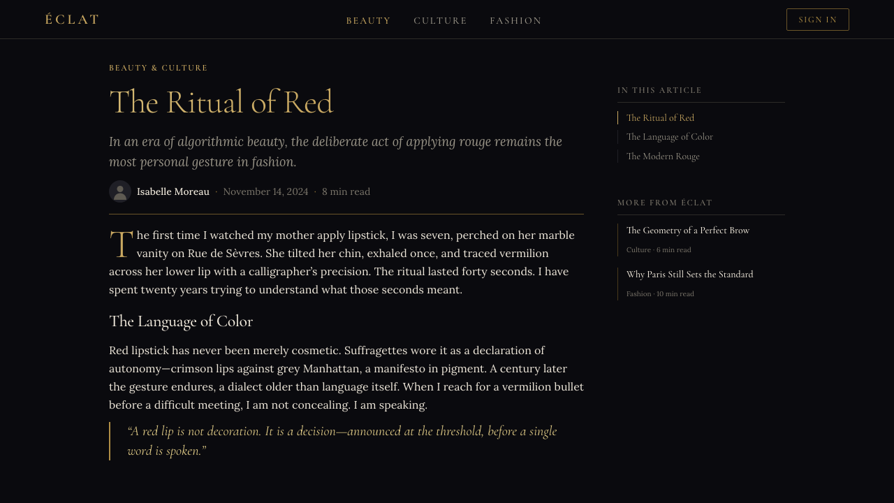
The brand's visual identity underwent its most consequential transformation in alignment with the rise of French fashion photography and the expansion of glossy magazines in the mid-twentieth century. As Vogue Paris, Elle, and Marie Claire created a new visual grammar of female aspiration in the 1950s and 1960s, L'Oréal Paris positioned itself squarely within that world — its packaging, advertising, and communications adopting the same high-contrast, editorial-photograph-and-headline formula that defined luxury magazine pages. The Didone serif tradition, with its extreme contrast between thick and thin strokes, was central to this moment: it was the typeface category of Parisian prestige, the letterform of couture house mastheads and glossy fashion spreads.品牌视觉识别最深远的转型,发生在二十世纪中叶法国时装摄影崛起与光面杂志扩张的时期。当《Vogue Paris》、《Elle》与《Marie Claire》在五六十年代构建起女性向往的新视觉语法时,欧莱雅巴黎将自身牢牢锚定于那个世界——其包装、广告与传播材料,全面采用了定义奢侈杂志页面的高对比度编辑摄影加标题公式。迪多衬线字体传统——以粗细笔画之间极度对比为特征——在这一时刻居于核心:它是巴黎声望的字体类别,是高定时装屋刊头与光面时装版面的字形语言。
The critical cultural turning point came in 1973, when American copywriter Ilon Specht wrote the line 'Because I'm worth it' for a L'Oréal Paris hair color advertisement. Specht, then twenty-three years old and a junior creative at McCann Erickson, wrote the line deliberately in the first person — a radical departure from the second-person address that dominated advertising at the time — as an assertion of women's autonomy and self-defined value. The phrase became one of the most recognized advertising lines of the twentieth century and reoriented the brand's entire identity around the concept of female self-worth rather than external approval. The visual language had to carry this weight: it became more bold, more portrait-driven, and more structured around the face as the site of confidence rather than merely the surface for product demonstration.关键的文化转折点出现在1973年,当时美国文案撰写人伊隆·斯佩克特(Ilon Specht)为欧莱雅巴黎一则染发广告写下「因为我值得」。时年二十三岁、供职于麦肯光明的初级创意人斯佩克特,刻意用第一人称写下这句话——这是对当时广告中主导地位的第二人称称谓的激进背离——作为对女性自主与自我界定价值的宣言。这句话成为二十世纪最广为人知的广告语之一,并将品牌整体身份从「外部认可」重新定向为「女性自我价值」。视觉语言必须承载这一份量:它变得更加大胆,更以肖像为驱动,更围绕面孔作为自信的场域而非仅仅作为产品展示的表面来构建。
The contemporary luxe-noir identity — the system most recognizable today — consolidated through the late 2010s and early 2020s under creative direction that leaned more aggressively into dark, monumental formats. International celebrity ambassadors including actors, athletes, and musicians from dozens of countries were photographed in consistent high-contrast portrait formats against near-black grounds, their images paired with the brand's gold typography and the 'Because you're worth it' tagline adapted across cultures. This ambassador tradition, under the executive leadership of Nicolas Hieronimus (who became CEO in 2021), extended the brand's earlier editorial logic into a globally coherent campaign system while preserving the Parisian flagship's core signals: black, gold, and the singular commanding face.当今最广为人知的「奢华暗调」识别系统,在2010年代末至2020年代初的创意方向下趋于成熟——创意方向更激进地倾向于深邃、纪念碑式的格式。来自数十个国家的国际明星大使——演员、运动员与音乐人——在近乎黑色的底面上以统一的高对比度肖像格式接受拍摄,其影像与品牌金色字体及适应各文化的「因为你值得」标语并置。这一大使传统,在2021年出任首席执行官的尼古拉斯·耶罗尼米(Nicolas Hieronimus)的执掌下,将品牌早期的编辑逻辑延伸为全球一致的广告活动系统,同时保留了巴黎旗舰店的核心信号:黑色、金色,以及那张独一无二的、令人信服的面孔。
What defines the L'Oréal Paris Cosmetics look?L'Oréal Paris Cosmetics 的视觉特征是什么?
Black as Primary Field黑色作为主底场
Unlike systems that use black as an accent or a border, L'Oréal Paris deploys near-absolute black as the dominant ground across packaging, campaign imagery, and digital surfaces. This black is not neutral — it reads as the material equivalent of lacquered luxury goods, deep-pile velvet, or the polished marble of a flagship boutique interior. It functions as an assertion of weight and permanence, ensuring that every element placed upon it — gold type, a luminous face, a product silhouette — inherits a sense of precious value by proximity.与以黑色作为点缀或边框的系统不同,欧莱雅巴黎将近乎绝对的黑色作为包装、广告形象与数字界面的主导底场。这种黑色并不中性——它传达出与漆面奢侈品、厚绒丝绒或旗舰精品店抛光大理石内饰相当的材料质感。它作为重量与永恒性的宣示而发挥作用,确保置于其上的每一个元素——金色字体、明亮的面孔、产品剪影——都因毗邻而继承了珍贵的价值感。
Warm Gold as the Singular Accent暖金色作为唯一点缀
Gold in this system is not a decorative flourish applied liberally to signal luxury — it is a disciplined accent held in reserve for the highest-hierarchy elements: the brand name, the campaign headline, the product monogram. The gold used is warm and burnished rather than bright or metallic-cool, evoking antique gilding and the enduring weight of historical prestige rather than contemporary metallic trends. Its sparing use against the deep black ground creates an immediate reading hierarchy: the eye goes to gold first, then to the face, then to secondary information.在这套系统中,金色不是被随意施加以示奢华的装饰性点缀——它是被克制地保留给最高层级元素的精确口音:品牌名称、广告标题、产品字母组合。所用的金色温暖而烧灼,而非明亮或冷调的金属感,唤起的是古旧镀金与历史声望绵延的分量,而非当代金属质感潮流。它在深黑底面上的节制运用,创造了即时的阅读层级:眼睛首先看向金色,继而是面孔,再次是次要信息。
Didone Serif Typography迪多衬线字体排印
The typeface tradition at the heart of L'Oréal Paris communications belongs to the Didone or Modern Serif category — letterforms characterized by an extreme contrast between hairline thin strokes and broad thick strokes, with horizontal serifs and a strong vertical axis. This typographic tradition originated in late-eighteenth-century Paris and became the standard face of French prestige publishing and high fashion editorial for over two centuries. In the L'Oréal Paris system, Didone headlines carry the brand's editorial authority; they communicate that what follows is not casual information but a pronouncement.欧莱雅巴黎传播核心的字体传统属于迪多或现代衬线类别——这类字形以发丝细笔画与宽粗笔画之间的极度对比、水平衬脚与强烈竖轴为特征。这一字体传统起源于十八世纪晚期的巴黎,在此后超过两个世纪里成为法国声望出版与高级时装编辑的标准字面。在欧莱雅巴黎系统中,迪多标题承载着品牌的编辑权威;它们传达出:接下来的不是随意的信息,而是一则宣告。
Portrait Orientation and the Singular Face竖幅取向与唯一面孔
The compositional signature of L'Oréal Paris campaigns is the close-cropped portrait in a tall, narrow frame — a format that echoes both the proportions of high-fashion magazine spreads and the shape of a physical perfume bottle or product column. The face in these compositions is never incidental; it fills the frame almost entirely, making direct eye contact, and is lit to emphasize the luminosity and precision of skin rather than to create atmospheric mood. This centrality of the face is the visual embodiment of 'Because I'm worth it' — the human subject is not a vehicle for demonstrating product but the protagonist of the image.欧莱雅巴黎广告活动的构图特征,是竖幅窄框内的近景肖像——这一格式既呼应了高级时装杂志版面的比例,又呼应了实体香水瓶或产品柱体的形状。这些构图中的面孔从不是偶然出现的;它几乎填满整个画框,与观者目光直接相接,以强调肌肤光泽与精准而非营造氛围情绪的方式打光。面孔的这种中心性,是「因为我值得」的视觉化身——人物主体不是演示产品的载体,而是画面的主角。
Restrained Monochromatic Range克制的近单色范围
Where most cosmetics brands rely on a wide spectrum of product colors to animate their visual identity, L'Oréal Paris maintains a remarkably narrow range in its identity system: near-black, warm gold, and the natural tones of skin and hair photography. Occasional use of deep burgundy or cool ivory appears in product-specific campaigns, but always subordinated to the dominant black-gold axis. This restraint means the identity never competes with the product's own color — the lipstick, the eyeshadow, the nail color remains visually primary while the identity system frames it with consistent authority.大多数美妆品牌依赖宽泛的产品色谱来激活视觉识别,而欧莱雅巴黎在其识别系统中维持着异常狭窄的色彩范围:近黑色、暖金色,以及肖像摄影中皮肤与发色的自然色调。在特定产品广告中偶尔会出现深酒红或冷象牙色,但始终从属于主导性的黑金轴线。这种克制意味着识别系统永远不会与产品本身的颜色竞争——口红、眼影、指甲油依然在视觉上居于首位,而识别系统则以一致的权威为其构建框架。
Gold-Foil Material Logic金箔材料逻辑
The surface quality of L'Oréal Paris packaging — whether a foundation bottle, a mascara tube, or a fragrance cap — frequently uses physical gold-foil stamping or metallic lacquering as a material reference point. In digital and print contexts, this material origin informs the way gold tones are rendered: not as flat color blocks but as tones that suggest reflective depth and surface weight. The metaphor of the gold-foil stamp — pressed into material, catching light at an angle, implying durability and investment — runs through the entire visual system as a material honesty principle that connects the physical product to its two-dimensional representations.欧莱雅巴黎包装的表面质感——无论是粉底液瓶、睫毛膏管还是香水瓶盖——频繁使用实体金箔压印或金属漆作为材料参照点。在数字与印刷语境中,这一材料起源影响着金色调的呈现方式:不是平面色块,而是暗示反射深度与表面重量的色调。金箔压印的隐喻——压入材料、从某一角度捕捉光线、暗示耐久性与投入感——贯穿整套视觉系统,作为一种材料诚实原则,将实体产品与其二维再现联结在一起。
Editorial Minimalism in Layout版面上的编辑极简主义
L'Oréal Paris layouts — in campaigns, packaging, and digital interfaces — share a compositional discipline derived from high-fashion editorial: generous clear space around every element, type set in a single dominant size against secondary information at a clearly smaller scale, and an absence of decorative borders or embellishments. The hierarchy is established through scale contrast and color contrast alone. This editorial minimalism means the system scales gracefully from a full-page magazine advertisement to a thumbnail social media post without losing its essential character — the black-and-gold axis and the face read at any size.欧莱雅巴黎的版面——在广告活动、包装与数字界面中——共享一种源自高级时装编辑的构图纪律:每个元素周围充裕的留白,主要字号的文字与明显更小的次要信息形成单一主导对比,以及装饰边框或点缀的缺席。层级仅通过尺度对比与色彩对比来建立。这种编辑极简主义意味着系统能够从整版杂志广告优雅地缩放至社交媒体缩略图,而不失其核心特质——黑金轴线与面孔在任何尺寸下都清晰可辨。
See the L'Oréal Paris Cosmetics design system查看 L'Oréal Paris Cosmetics 完整设计系统
Who shaped L'Oréal Paris Cosmetics?谁塑造了 L'Oréal Paris Cosmetics?
The founder of L'Oréal in 1909, Schueller was a chemist who understood that scientific innovation required communicative confidence to reach the market. His instinct to give his hair-dye formula a memorable, aspirational trade name — and to present it with directness rather than period ornament — established the brand's early register of intelligent authority. The scientific precision he embedded in the company's DNA persists in the visual system as a preference for clarity, structure, and the impression of rigorously formulated quality over decorative excess.1909年欧莱雅的创始人,舒莱尔是一位化学家,他理解科学创新需要传达上的自信才能触达市场。他的本能——为染发配方取一个令人难忘、充满向往感的商标名,并以直接而非同期装饰性的方式呈现——确立了品牌早期「智识权威」的基调。他嵌入公司DNA的科学精准,在视觉系统中以对清晰度、结构与严格配方品质印象的偏好持续存在,而非装饰性过剩。
A young copywriter at McCann Erickson, Specht wrote 'Because I'm worth it' in 1973 as a deliberate first-person declaration of feminine self-determination at a time when advertising universally addressed women in the second person ('Because you're worth it' came later). The phrase permanently reoriented the brand's identity from product performance to self-worth, and this shift is legible in the visual language: the face became the primary subject rather than the product, the portrait became monumental rather than aspirational, and the system's entire weight moved toward empowerment rather than aspiration-by-comparison.麦肯光明的年轻文案撰写人斯佩克特于1973年写下「因为我值得」——在广告界普遍以第二人称称谓女性的时代,这是一句刻意采用第一人称的女性自决宣言(「因为你值得」是后来的演化版本)。这句话永久地将品牌身份从产品性能重新定向为自我价值,这一转变在视觉语言中清晰可辨:面孔取代产品成为主要主体,肖像从向往性变为纪念碑式,系统的整体重心从与他人比较的向往感转向自我赋权。
The daughter of Eugène Schueller, Liliane Bettencourt inherited control of L'Oréal and through her stewardship of the company guided its expansion from a French brand into a global conglomerate while preserving the Parisian identity as its prestige anchor. Her influence ensured that the brand's French cultural capital — the association with Parisian beauty, haute couture, and editorial sophistication — remained central to the visual language even as the company diversified across mass-market and luxury segments. The black-and-gold identity system's insistence on a specifically Parisian register owes much to the continuity she maintained.舒莱尔之女莉莲·贝当古继承了欧莱雅的控制权,并在其监管下引导公司从一个法国品牌扩张为全球集团,同时将巴黎身份作为声望锚点加以守护。她的影响确保了品牌的法国文化资本——与巴黎美学、高级定制与编辑精致的关联——即便公司在大众与奢侈品市场多元化扩张时,也始终处于视觉语言的核心。黑金识别系统对特定巴黎基调的坚守,在很大程度上归功于她所维系的连续性。
Hieronimus became CEO of L'Oréal in 2021 and has presided over the consolidation of the luxe-noir visual identity into a globally coherent system. Under his leadership, the brand's ambassador program — encompassing actors, athletes, musicians, and public figures from across the world — has been organized around a consistent visual grammar: high-contrast portrait photography, the black-ground-and-gold-type formula, and the 'Because you're worth it' tagline adapted across languages and cultures. His era represents the phase in which the Parisian editorial aesthetic became genuinely global while retaining its signature monumental restraint.耶罗尼米于2021年出任欧莱雅首席执行官,主持了「奢华暗调」视觉识别系统向全球一致体系的整合。在其领导下,品牌大使计划——涵盖来自全球的演员、运动员、音乐人与公众人物——围绕一套统一的视觉语法组织:高对比度肖像摄影、黑底金字公式,以及跨语言与文化改编的「因为你值得」标语。他的时代代表了巴黎编辑美学在保留其标志性纪念碑式克制的同时,真正实现全球化的阶段。
From the mid-twentieth century onward, L'Oréal Paris built its global recognition not through abstract brand symbols but through a curated roster of human faces — movie stars, supermodels, and later athletes and musicians — photographed in a consistent high-prestige editorial register. The visual discipline required to make this system work is considerable: each ambassador's image must read immediately as 'L'Oréal Paris' rather than as individual celebrity photography, which demands that the black-field composition, the gold typographic hierarchy, and the portrait orientation remain non-negotiable constants regardless of who is photographed.从二十世纪中叶起,欧莱雅巴黎构建其全球认知度的方式,不是通过抽象的品牌符号,而是通过一份精心甄选的人类面孔名册——电影明星、超级模特,以及后来的运动员与音乐人——以统一的高声望编辑基调拍摄。使这套系统运转所需的视觉纪律相当可观:每位大使的形象必须立即被解读为「欧莱雅巴黎」而非个人明星摄影,这要求无论拍摄对象为谁,黑底场构图、金色字体层级与竖幅肖像取向都必须作为不可商量的常数保持不变。
How do you use L'Oréal Paris Cosmetics today?今天怎么用 L'Oréal Paris Cosmetics?
The L'Oréal Paris luxe-noir system is among the most architecturally specific of contemporary brand aesthetics — it achieves its effect through the precise interaction of black, warm gold, and portrait photography, and it requires a disciplined fidelity to all three elements simultaneously. Applying it correctly means resisting the instinct to lighten, diversify the palette, or substitute the Didone editorial headline with a more contemporary geometric sans-serif. The system earns its power precisely through its severity.欧莱雅巴黎「奢华暗调」系统是当代品牌美学中建筑结构最为特定的体系之一——它的效果通过黑色、暖金色与肖像摄影三者的精确互动来实现,需要同时对这三个元素保持严格的忠诚度。正确应用它,意味着抵制减淡底色、多元化色板、或以更具当代感的几何无衬线字体替换迪多编辑标题的本能冲动。这套系统的力量恰恰来自其严苛性。
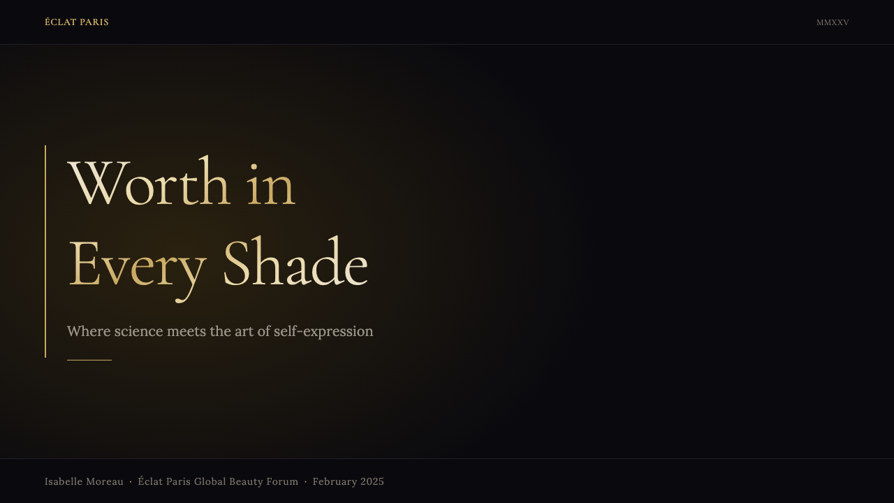
For presentation slides, the style demands a black or very deep charcoal background as the non-negotiable starting condition. Cover slides work best with a single dominant close-cropped portrait image that fills most of the frame, the title set in a tall, high-contrast serif with a warm gold tone, and the remaining text reduced to a single secondary line at a markedly smaller size. Content slides should maintain the dark ground, using warm gold for slide headers or key data labels and reserving light or near-white tones only for body text. Data visualization in this system should treat chart elements as luminous against darkness — glowing lines, bright bars — rather than imposing hard geometric shapes on a pale background.对于演示文稿,这种风格要求以黑色或极深的炭灰色背景作为不可商量的起始条件。封面页最适合以一张充满大部分画框的单一主导近景肖像图像为核心,标题以暖金色调的高对比度高衬线字体排印,其余文字缩减为明显更小的单一次要行。内容页应维持深色底面,以暖金色用于幻灯片页眉或关键数据标签,仅将亮色或近白色色调保留给正文。在这套系统中,数据可视化应将图表元素处理为在暗部中发光——发亮的折线、明亮的柱条——而非在浅色背景上叠加硬朗的几何形状。
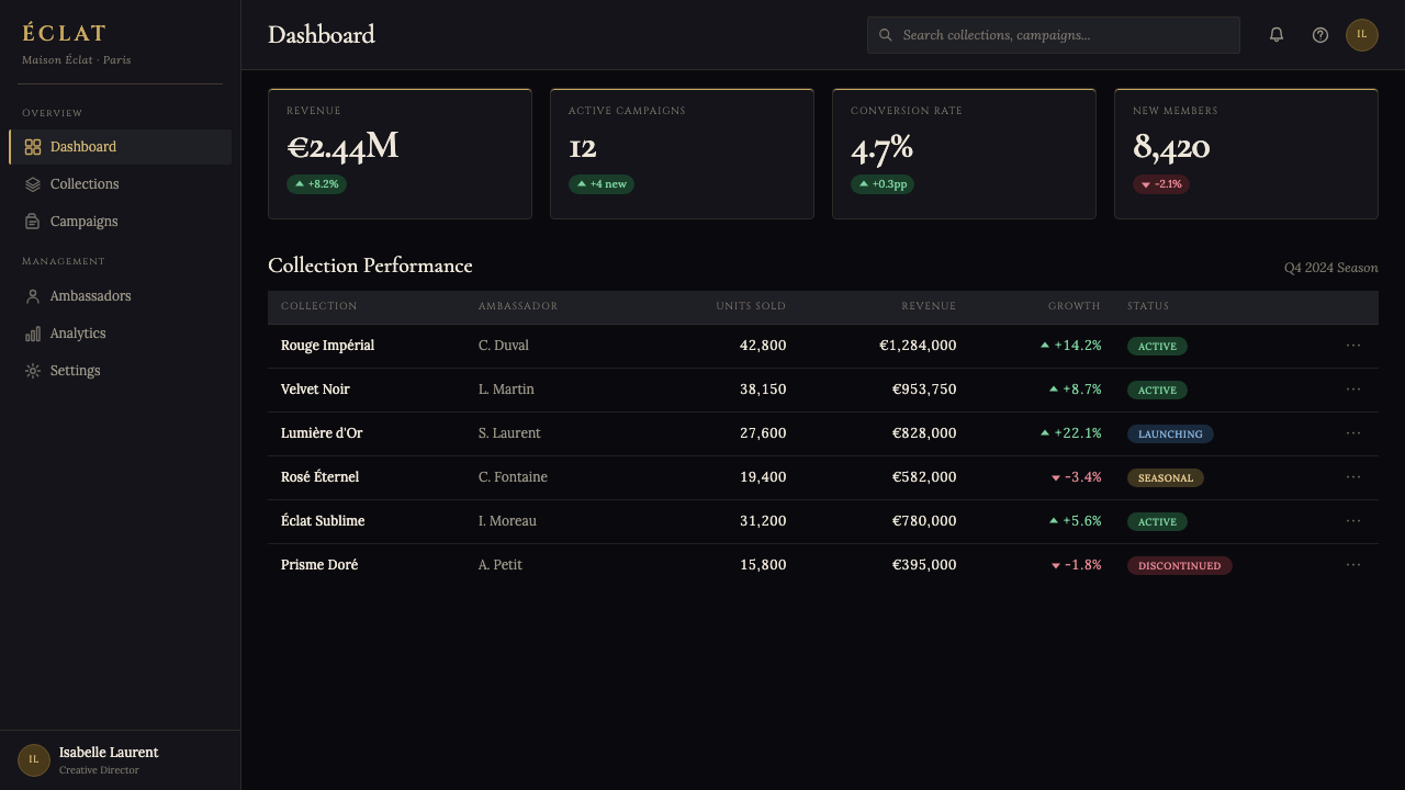
For web user interfaces, the style suits premium product pages, editorial e-commerce, and landing pages for prestige brand campaigns where conversion is secondary to brand impression. The approach calls for a full-width dark hero section with a high-resolution portrait photograph and a gold typographic headline, a strict single-column or narrow two-column content grid below, and product photography presented against a matching dark or softly lit neutral ground. Dashboard applications can adopt the palette for a high-authority read: dark backgrounds, gold as the active-state and alert-state accent, light text on dark fields for all primary information. Navigation should be typographic and minimal — the weight of the identity is carried by the hero section, not by interface chrome.对于网页用户界面,这种风格适合高端产品页、编辑式电商,以及声望品牌广告活动的落地页——这些场景中品牌印象优先于转化率。方法要求:全宽深色主视觉区包含高分辨率肖像摄影与金色字体标题,其下采用严格的单列或窄双列内容网格,产品摄影在匹配的深色或柔和打光中性底面上呈现。仪表板应用可采用这套色板打造高权威感界面:深色背景,金色作为活跃状态与警示状态点缀,深色底面上亮色文字承载所有主要信息。导航应字体化且最简——识别的重量由主视觉区承载,而非界面框架。
For editorial and marketing materials — catalogues, campaign prints, social cards, and press kits — the system's portrait-and-headline logic translates directly. Full-bleed portrait photography occupies the primary real estate; the brand name and campaign headline appear in warm gold Didone at a scale that commands the remaining space; all secondary copy retreats to a significantly smaller size in a light neutral tone. The vertical format should be preferred wherever the medium allows — it echoes both the magazine spread and the product packaging. Marketing emails and social content work best in the tall portrait format that the mobile screen naturally accommodates, with the face and the gold headline as the only above-the-fold information.对于编辑与营销材料——目录、广告印刷品、社交卡片与新闻资料包——系统的肖像加标题逻辑直接适用。全出血肖像摄影占据主要版面;品牌名称与广告活动标题以暖金色迪多字体,以命令其余空间的尺度出现;所有次要文案以浅中性色调退至明显更小的尺寸。凡媒介允许,竖幅格式应作为首选——它呼应了杂志版面与产品包装的比例。营销邮件与社交内容最适合移动屏幕自然适配的高竖幅格式,面孔与金色标题是版面折叠线以上唯一的信息。
A common mistake when applying this aesthetic is treating it as general 'luxury dark mode' — adding a black background and some gold text to any design without committing to the portrait orientation, the Didone headline character, and the radical reduction of palette. The result is a dark-and-gold design that reads as generic nightclub or spirits-brand branding rather than Parisian cosmetics authority. An equally common error is softening the contrast — using charcoal rather than true black, or warm amber rather than gold — in an attempt to make the system feel more approachable. Both mistakes undermine the fundamental principle: the power of this visual language comes from its commitment to the extreme. True near-black and warm gold together, in the right proportions and with portrait photography at the center, is what produces the specific effect. Compromise at either end collapses the system into something merely dark and decorated.应用这套美学时最常见的错误,是将其当作通用的「奢华暗色模式」——在任何设计中添加黑色背景与金色文字,却不承诺竖幅取向、迪多标题特质与色板的彻底精简。结果是一种深色加金色的设计,读起来像通用的夜店或烈酒品牌,而非巴黎美妆权威。同样常见的错误是柔化对比——用炭灰色代替真正的黑色,或用暖琥珀色代替金色——试图使系统感觉更平易近人。这两种错误都破坏了根本原则:这种视觉语言的力量来自其对极致的承诺。真正的近黑色与暖金色以正确的比例相配,以肖像摄影为核心,才是产生这种特定效果的条件。在任一端妥协,都会使系统坍缩为某种仅仅是深色且装饰性的东西。
See the L'Oréal Paris Cosmetics design system查看 L'Oréal Paris Cosmetics 完整设计系统
L'Oréal Paris Cosmetics — FAQL'Oréal Paris Cosmetics · 常见问题
How is L'Oréal Paris different from other luxury cosmetics visual identities?欧莱雅巴黎的视觉识别与其他奢侈美妆品牌有何不同?
Most luxury cosmetics brands anchor their identity in a heritage color — Chanel in cream and black, Dior in grey and silver, Guerlain in midnight blue and gold. L'Oréal Paris distinguishes itself by pushing the black further toward absolute darkness, making the near-black field itself the primary luxury signal rather than a supporting neutral. The second distinction is the centrality of the human face: where heritage luxury brands often rely on abstract symbols, monograms, or architectural photography, L'Oréal Paris makes the face non-negotiable — this keeps the system warm and aspirationally accessible in a way that pure luxury abstraction cannot achieve.大多数奢侈美妆品牌将视觉识别锚定在一种传承色上——香奈儿是奶油色与黑色,迪奥是灰色与银色,娇兰是午夜蓝与金色。欧莱雅巴黎的独特之处在于将黑色推向近乎绝对的深邃,使近黑色底场本身成为首要奢华信号,而非承托性中性色。第二个区别在于人类面孔的中心性:传统奢侈品牌通常依赖抽象符号、字母组合或建筑摄影,而欧莱雅巴黎使面孔成为不可或缺的存在——这以纯粹奢华抽象所无法实现的方式,使系统保持温暖且向往性地亲近可及。
Can this aesthetic work for products that are not cosmetics or beauty?这种美学能否应用于美妆和美容以外的产品?
The core signals of the system — deep black, warm gold, portrait orientation, high-contrast serif headline — are transferable to any context where prestige, authority, and human-centered luxury are the desired values. Fragrance, jewelry, premium hospitality, high-end fashion, and financial services products that emphasize personal achievement have all successfully adopted versions of this visual language. It struggles wherever the product's emotional register requires lightness, approachability, or playfulness — children's products, casual lifestyle brands, food and beverage outside the premium spirits category, and wellness brands that emphasize organic softness would all be poorly served by the severity of the black-and-gold formula.系统的核心信号——深黑色、暖金色、竖幅取向、高对比度衬线标题——可迁移至任何以声望、权威与以人为本的奢华为期望价值的语境。香水、珠宝、高端酒店、顶级时装,以及强调个人成就的金融服务产品,都曾成功采用这种视觉语言的变体版本。它在产品情感基调要求轻盈、亲近感或玩趣感的场景中表现欠佳——儿童产品、休闲生活方式品牌、高端烈酒品类以外的餐饮,以及强调有机柔软性的健康品牌,都无法被黑金公式的严苛性所服务。
How should skin-tone diversity be handled within this visual system?在这套视觉系统中,应如何处理肤色的多元性?
The deep black ground is, by design, a neutral that holds all skin tones with equal clarity and luminosity — a fair complexion, a medium olive tone, and a deep melanin-rich skin all read as luminous and high-prestige when lit correctly against near-absolute black. This is one of the system's structural strengths: the black field does not favor any particular skin tone the way a warm cream or cool grey background might. The challenge is in the lighting and photography direction: every skin tone requires its own lighting setup to achieve the high-contrast, luminous quality that the system demands. Applying a single lighting formula across all ambassadors undermines the system's promise of universal self-worth.深黑色底面在设计上是一种中性底场,能以同等的清晰度与光泽感承托所有肤色——浅色肌肤、中等橄榄色调与深色富含黑色素的肌肤,在正确打光下衬于近乎绝对的黑色背景时,都呈现出明亮而高贵的质感。这是该系统的一个结构性优势:黑色底场不像暖奶油色或冷灰色背景那样偏向任何特定肤色。挑战在于打光与摄影方向:每种肤色都需要其专属的布光方案,才能实现系统所要求的高对比度、光泽质感。对所有大使使用单一布光公式,会损害系统关于普世自我价值的承诺。
Is it possible to create a light-background version of this identity without losing the system's character?是否可以在不失去系统特质的情况下创建浅色背景版本的识别?
A light inversion is possible but requires significant rebalancing. On a near-white or ivory background, the black-and-gold formula reverses: deep near-black type replaces the gold headline as the primary reading element, while warm gold is reduced to a single accent — a rule, a monogram, a product name. The portrait photography must be lit differently to maintain drama on a light ground: high-contrast against soft grey or ivory rather than the luminous-against-black effect of the primary system. This light version reads as the daytime or editorial context of the identity rather than its campaign-facing monumental register, and is best used for packaging inserts, product sheets, and editorial contexts where the full dark-ground treatment would be too heavy.浅色反转版本是可能的,但需要重大的重新平衡。在近白色或象牙色背景上,黑金公式发生反转:近黑色文字取代金色标题成为主要阅读元素,而暖金色缩减为单一点缀——一条线、一个字母组合、一个产品名称。肖像摄影必须以不同方式打光,以在浅色底面上维持戏剧性:与柔和灰色或象牙色形成高对比度,而非主系统中光泽衬于黑色的效果。这一浅色版本传达的是识别的日间或编辑语境,而非其面向广告活动的纪念碑式基调,最适合用于包装内页、产品说明页与编辑语境——在这些场景中,完整的深色底面处理会显得过于厚重。
What is the most important single principle for someone applying this style for the first time?首次应用这种风格的人,最重要的单一原则是什么?
Commit to the black. The single most common failure mode when attempting this aesthetic is hedging on the background — using a deep grey instead of near-absolute black, a charcoal instead of true dark, a dark navy instead of the neutral darkness that the system requires. Any color in the background field competes with the warm gold and dilutes the identity's fundamental contrast logic. The black must be as close to absolute as the medium allows; everything else in the system derives its value from that commitment. Once the black is right, the warm gold accent and the portrait photography will find their correct register almost automatically.承诺于黑色。尝试这种美学时最常见的单一失败模式,是在背景上犹豫不决——用深灰色代替近乎绝对的黑色,用炭灰色代替真正的深色,用深海军蓝代替系统所要求的中性深色。背景底场中的任何色彩都会与暖金色竞争,并稀释识别系统的根本对比逻辑。黑色必须尽可能接近媒介所能实现的绝对值;系统中的其他一切都从这一承诺中获得其价值。一旦黑色调对了,暖金色点缀与肖像摄影将几乎自动地找到其正确的基调。
Related design styles相关设计风格
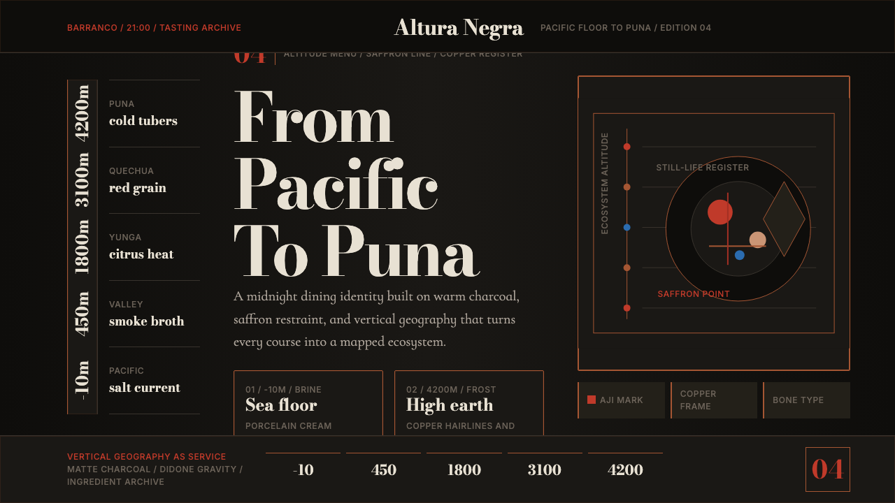 Lima Nuevo Andino CuisineAltitude turns luxurious. Charcoal fields, copper hairlines, and saffron-red…奢华来自海拔:炭黑底、铜发丝线与藏红花红纵向节奏。
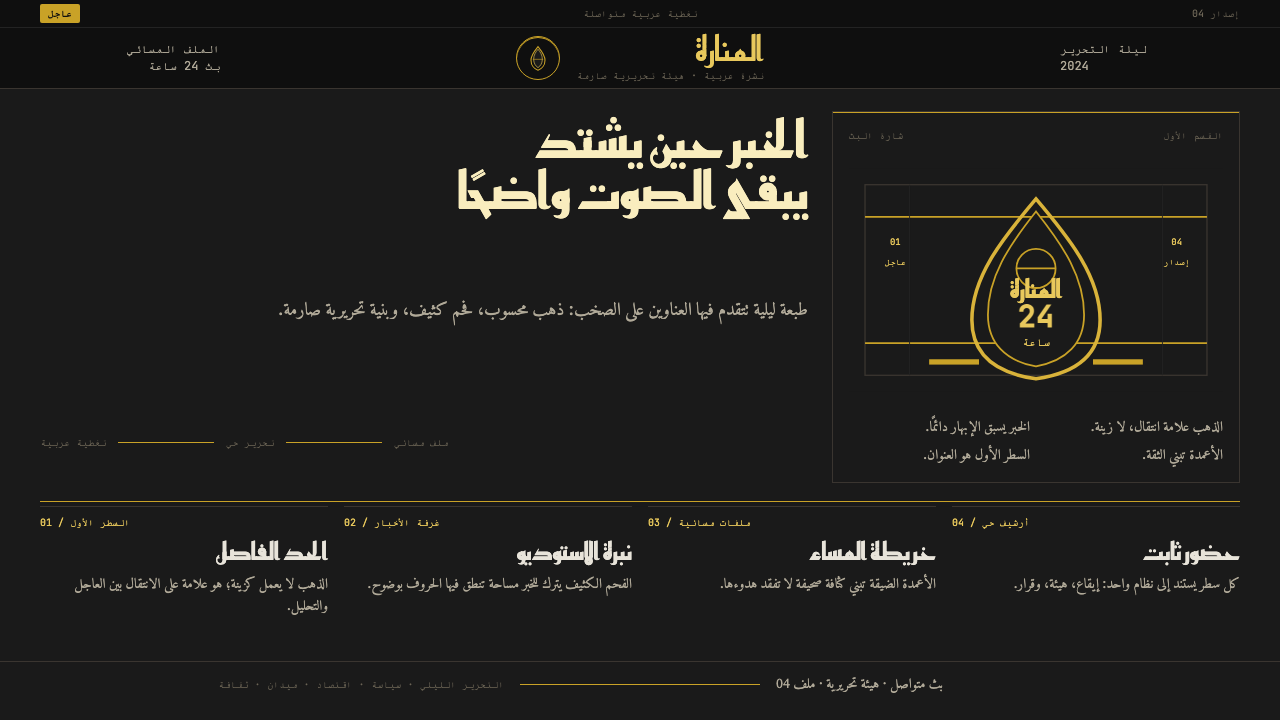 Al Jazeera Arabic NewsAuthority, stripped bare. Gold seal, dense Arabic type, matte charcoal.权威感被提纯。金色印章、密集阿文、炭黑底面构成画面。
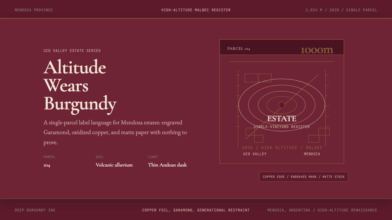 Argentine Malbec WineAltitude turned austere. Burgundy panels, engraved Garamond, oxidized copper.高海拔变得克制。酒红面板、雕刻衬线与氧化铜。
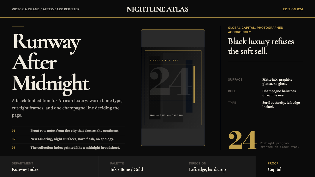 Lagos Fashion WeekBlack luxury speaks plainly. Matte ink, bone serif, and one gold hairline set…黑色奢华直截了当:哑光墨底、骨白衬线与一道金色发丝线定调。
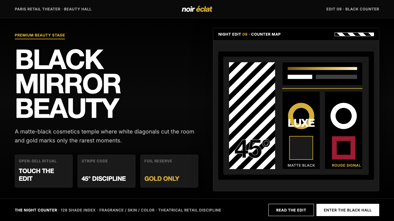 SephoraBlack is the stage. White 45° stripes and restrained gold foil make cosmetics…黑色即舞台。45°白色斜纹与克制金箔,让美妆像剧场。
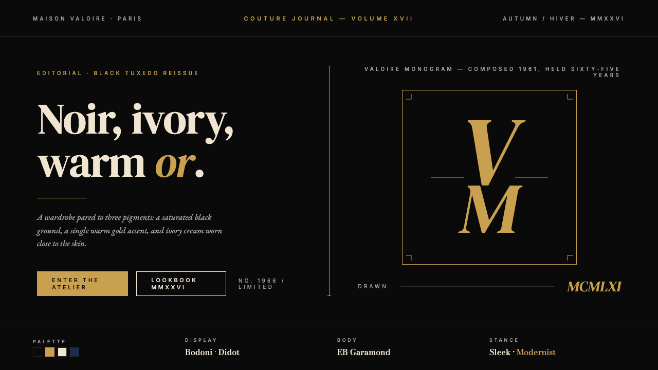 Yves Saint Laurent (YSL)Couture chiaroscuro. Saturated black ground, warm gold accent, Didot serif at…高级时装的明暗对照法:饱和深黑底色、暖金点缀、Didot 衬线大字号——克制即…