What is Sephora?什么是 Sephora?
Sephora turned a beauty store into a theatre: matte-black walls, a diagonal stripe motif, and a single restrained flash of gold make purchasing lipstick feel like entering a Parisian grand spectacle.丝芙兰将美妆零售变成了一场戏剧:哑光黑色墙壁、对角条纹图案,以及一抹克制的金色,让购买口红这件事有了踏入巴黎盛典的仪式感。
Sephora in briefSephora 速览
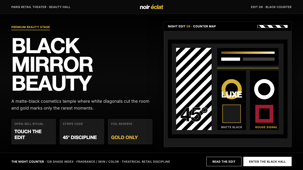
Sephora Black Luxe is the visual identity system of Sephora, the LVMH-owned French beauty retail empire. Its defining elements are near-black backgrounds, crisp white typography, the iconic forty-five-degree diagonal stripe pattern, and gold foil accents used with deliberate restraint. Together these elements produce a theatrical, high-contrast aesthetic that signals Parisian luxury while remaining legible and bold at every scale — from flagship store interiors to a lip gloss carton.丝芙兰黑奢风格是隶属于LVMH集团的法国美妆零售帝国丝芙兰的视觉识别体系。其核心元素包括:近乎纯黑的背景、锐利的白色字体、标志性的四十五度对角条纹图案,以及克制使用的金箔点缀。这些元素共同构成一种戏剧化、高对比度的美学,在每一个尺度上——从旗舰店内饰到口红包装盒——都传递出巴黎奢华气息,同时保持清晰而有力的视觉表达。
The system is built on a single dramatic conviction: black is not absence, it is stage. Where most luxury brands reach for pale neutrals or blush tones, Sephora commits to depth. The near-black ground makes every product placed against it glow, every white word snap into focus, and every gold detail read as genuinely precious rather than merely decorative. The result is an environment — digital or physical — where the customer is the protagonist and the brand is the theatrical house around them.这套体系建立在一个核心信念之上:黑色不是缺席,而是舞台。当大多数奢侈品牌选择浅色中性调或粉调时,丝芙兰义无反顾地投身深邃。近黑的底色让摆在其上的每件产品都散发光芒,让每行白色文字都干脆利落,让每处金色细节都显得真正珍贵而非单纯装饰。无论是实体空间还是数字界面,呈现出的都是以顾客为主角、品牌为剧院的体验结构。
This is not a maximalist aesthetic despite its drama. The stripe motif, the sole recurring ornamental element, is deployed sparingly and at a precise angle that gives it kinetic energy without becoming chaotic. Gold appears only at moments of premium emphasis — award callouts, VIP tiers, limited edition labels — and is never used simply to fill space. The discipline is as important as the boldness.尽管充满戏剧张力,这并不是一套极繁主义的美学。条纹图案作为唯一反复出现的装饰元素,被克制地运用,并保持精确的角度,赋予它动感而不显混乱。金色只在高端强调的关键时刻出现——奖项标注、VIP等级、限量版标签——从不用于填充空间。这种纪律感与大胆同等重要。
Where does Sephora come from?Sephora 从何而来?
Sephora was founded in 1969 by Dominique Mandonnaud in Limoges, France, under the name Shop 8. Mandonnaud's founding insight was retail-experiential rather than visual: he let customers touch, test, and browse products freely at a time when beauty counters were staffed by brand representatives who controlled access to merchandise. The open-sell model was radical. When Mandonnaud rebranded the concept as Sephora — a name fusing the Greek word for beauty with a reference to Zipporah, the wife of Moses — he had assembled a chain of stores built around the premise that beauty discovery should feel empowering rather than intimidating.丝芙兰由多米尼克·曼多诺于1969年在法国利摩日创立,最初名为Shop 8。曼多诺的创业洞见属于零售体验层面而非视觉层面:在美妆柜台由品牌代表把控商品接触权的年代,他让顾客自由触摸、试用和浏览产品。这种开放式零售模式在当时极为激进。当曼多诺将品牌更名为Sephora——这个名字融合了希腊语中「美丽」一词与摩西之妻齐波拉的名字——他已建立起一个连锁店网络,其核心理念是:发现美,应当是一种赋能体验,而非令人望而生畏的仪式。
LVMH, Bernard Arnault's luxury conglomerate, acquired Sephora in 1997. The acquisition was transformative. Arnault understood that luxury was a performance as much as a product, and under LVMH stewardship, the Sephora interior became a designed experience. The black-and-white diagonal stripe — which had appeared in some form in earlier iterations — was codified and elevated. The matte black environment was deepened. Gold, already present in the wordmark, was systematized as a premium signal. By the time Sephora opened its New York flagship on Fifth Avenue in the early 2000s, the visual identity was recognizable from the sidewalk: a black box striped like a stage set, lit from within.伯纳德·阿尔诺旗下的奢侈品集团LVMH于1997年收购了丝芙兰。这次收购带来了根本性转变。阿尔诺深知奢华是一场表演,与产品同等重要。在LVMH的管理下,丝芙兰的零售空间成为一种被设计的体验。黑白对角条纹——在早期迭代中已以某种形式出现——被系统化并提升至品牌语言的核心地位。哑光黑色环境被进一步强化。金色作为高端信号被纳入体系,不再只是词标的点缀。当丝芙兰2000年代初在纽约第五大道开设旗舰店时,其视觉识别已在街道上便一眼可辨:一个条纹如舞台布景、由内发光的黑色盒子。
The visual language owes acknowledged debts to French graphic and fashion traditions. The diagonal stripe resonates with the candy-stripe patterns of classic Parisian packaging — think Ladurée, think the chevrons of the French military — but rotated and hardened into a bold, branded motif rather than a heritage ornament. The italic wordmark echoes the confident slant of fashion magazine mastheads. Jean-Paul Goude, the photographer and art director celebrated for his work with brands including Cacharel and his iconic imagery for the 1989 bicentennial parade in Paris, influenced the theatrical, high-contrast visual culture that the brand drew from. Design agency Carbone Smolan contributed to the systematization of the identity for the American market in the early expansion years.这套视觉语言有据可查地受惠于法国平面与时尚传统。对角条纹与经典巴黎包装的糖果纹样相呼应——想想拉杜丽,想想法国军服的人字纹——但经过旋转与强化,成为一种大胆的品牌图案,而非怀旧装饰。斜体词标呼应了时尚杂志刊头那种自信的倾斜。让-保罗·高德——这位以为凯歇尔等品牌工作而著称、并为1989年巴黎建城两百周年庆典游行创作标志性影像的摄影师与艺术总监——影响了品牌所汲取的那种戏剧化、高对比度的视觉文化。设计机构Carbone Smolan在美国市场早期扩张阶段参与了视觉识别体系的系统化整理。
The period from approximately 2003 to the mid-2010s saw Sephora refine its digital expression. The stripe translated into web headers and app icons; the near-black became a standard background for digital product photography; the gold foil became a hover state and a loyalty-tier badge. By 2024 the identity had accumulated enough equity that its components — the stripe angle, the wordmark italic, the precise relationship between white type and black ground — were themselves brand assets, recognizable without the logo. What had begun as a retail environment had become a complete, portable visual language.大约从2003年至2010年代中期,丝芙兰不断打磨其数字化表达。条纹图案被移植进网页标题栏与应用图标;近黑色成为数字产品摄影的标准背景;金箔演变为悬停状态与会员等级徽章。到2024年,这套视觉体系已积累出足够深厚的品牌资产,其组成元素——条纹角度、词标斜度、白色字体与黑色底面之间的精确关系——本身已成为品牌资产,无需logo也能被辨认。一套最初只是零售空间的视觉语言,已演变为一套完整、可移植的视觉体系。
What defines the Sephora look?Sephora 的视觉特征是什么?
Near-Black Ground近黑底色
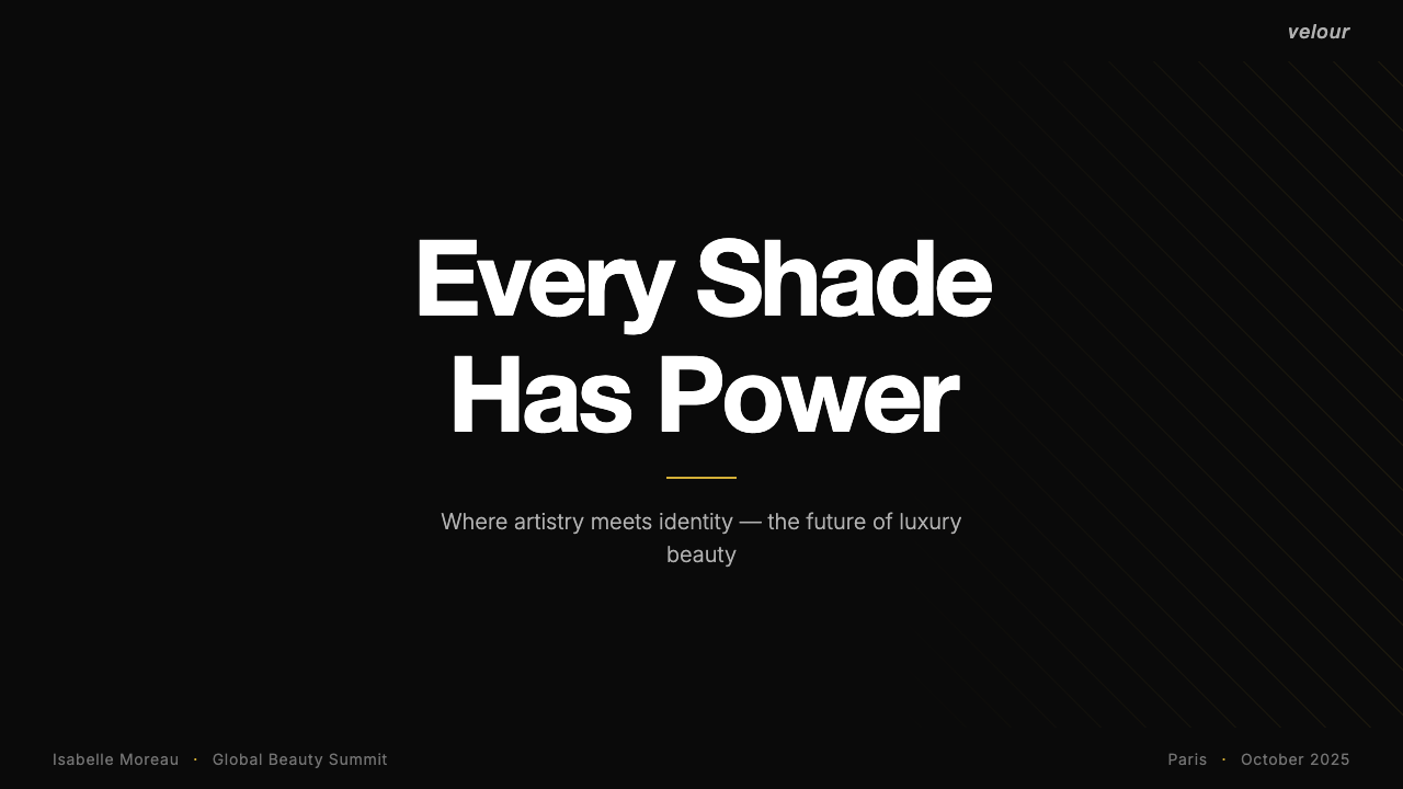
The foundation of the system is a background that stops just short of absolute black — deep enough to absorb ambient light and create visual weight, but with enough warmth to avoid the cold harshness of pure black. This near-black acts as a theatrical stage: it makes white typography crackle with contrast, causes product photography to appear lit from within, and transforms gold accents into genuinely luminous details. Nothing in the composition competes with the content placed on this ground; the background is self-effacing so that what sits atop it is elevated.这套体系的基础是一种停留在纯黑之前的背景色——深邃到足以吸收环境光、产生视觉重量,又保有足够的温度,不致落入纯黑那种冰冷的严酷。这一近黑底色充当戏剧舞台:它使白色字体在对比中迸发光芒,使产品摄影看起来从内部发光,使金色细节成为真正具有光感的点缀。构图中没有任何元素与放置在这一底色上的内容竞争;背景甘于隐身,以成就其上的一切。
Forty-Five-Degree Stripe四十五度条纹
The diagonal stripe is the system's sole recurring ornamental motif, and its angle is not arbitrary. A true forty-five-degree diagonal is the most kinetically energetic angle in a rectangular composition — steeper diagonals feel aggressive, shallower ones feel merely slanted. Applied as alternating dark and light bands of equal width, the stripe creates a visual rhythm that reads simultaneously as modern pattern and classic French packaging heritage. Its power comes from restraint: the stripe appears at structural boundaries, on carrier bags, packaging edges, and section dividers, never flooding an entire composition.对角条纹是这套体系中唯一反复出现的装饰图案,其角度并非随意为之。在矩形构图中,正四十五度对角线拥有最具动感的能量——更陡的对角线显得咄咄逼人,更平的则只是倾斜。以等宽的深浅交替条带呈现,条纹制造出一种视觉节奏,同时让人联想到现代图案与经典法式包装传统。其力量来自克制:条纹出现在结构性边界处——手提袋、包装边缘、段落分隔线——从不铺满整个画面。
Restrained Gold克制金色
Gold in this system functions as punctuation, not wallpaper. It appears exclusively at moments that require a signal of premium status: a loyalty tier badge, a bestseller crown, an award annotation, a limited-edition label. The restraint is deliberate and essential — because gold is used so sparingly, its every appearance registers as meaningful. A system where gold appeared on every heading would be gaudy; a system where it appears only once per composition reads as genuinely luxurious. The gold tone itself is warm and slightly muted rather than the bright yellow-gold of gilding, aligning it with the seriousness of the overall palette.金色在这套体系中的功能是标点符号,而非壁纸。它只出现在需要传递高端信号的时刻:会员等级徽章、畅销王冠、奖项标注、限量版标签。这种克制是刻意为之,也是至关重要的——正因为金色如此吝啬地使用,它每一次出现都显得意味深长。金色遍布每个标题的体系是俗气的;金色在每个构图中只出现一次的体系,才真正传递出奢华感。金色本身呈温暖略显低调的色调,而非鎏金那种明亮的黄金色,与整体色板的庄重感保持一致。
High-Contrast Typography高对比度排印
Type in this system is treated as an architectural element: white on near-black creates a contrast ratio that demands attention and projects confidence. The wordmark's italic slant carries the energy of fashion editorial mastheads — it is neither the upright stability of a bank nor the casual lean of a lifestyle brand, but the decisive, forward-moving confidence of a Parisian house. Body copy is set in clean, legible forms with generous line spacing, ensuring that even long beauty descriptions remain inviting rather than dense. Headlines are given room to breathe and are rarely crowded by supporting elements.字体排印在这套体系中被当作建筑元素对待:白色与近黑底色之间的高对比度要求注意力、传递自信。词标的斜体倾斜带有时尚编辑刊头的能量——它既非银行那种直立的稳重,也非生活方式品牌那种随性的倾斜,而是巴黎时装屋那种果决、向前的自信。正文以简洁易读的字形排列,行间距宽裕,确保哪怕较长的美妆描述文字也显得引人入胜而非密不透风。标题有充分的呼吸空间,鲜少被辅助元素挤压。
Theatrical Product Staging戏剧化产品陈设
Products photographed within this system are not neutrally documented — they are staged. Against the deep background, lipsticks and palettes and serums are lit to emphasize surface quality: the sheen of a compact, the matte finish of a powder, the translucency of a serum bottle. Photography is high-contrast rather than flat, with directional lighting that creates sculptural depth without soft diffusion. This approach treats every product as a jewel in a display case rather than an item in a catalogue, reinforcing the theatrical premise of the entire system.在这套体系中拍摄的产品不是中性记录,而是被精心布景的。在深色背景衬托下,口红、眼影盘与精华液被特别打光以强调表面质感:粉饼的光泽、散粉的哑光质地、精华瓶的半透明感。摄影是高对比度而非平光的,方向性布光创造出雕塑般的立体感,而无柔和的漫射。这种方式将每件产品都视为展示柜中的珠宝,而非目录里的商品,强化了整套体系的戏剧化前提。
Systematic Hierarchy系统性层级
Despite its bold appearance, Sephora Black Luxe is a highly ordered system. Information is organized into clear tiers: the brand mark at the apex, product names in prominent display type, descriptors and claims in secondary type, and fine print at the base. Each tier has its own weight and spatial relationship to the others, and these relationships are consistent across packaging, digital, print, and environmental applications. A customer encountering the system for the first time at a pop-up learns the same hierarchy that a loyal app user reads every day — the system teaches itself.尽管外观大胆,丝芙兰黑奢风格是一套高度有序的体系。信息被组织为清晰的层级:顶端是品牌标识,显眼的展示字体呈现产品名称,次级字体承载描述与卖点,细则文字置于底部。每一层级都有其自身的字重以及与其他层级的空间关系,这些关系在包装、数字、印刷与环境应用中保持一致。第一次在快闪店遭遇这套体系的顾客,学到的层级结构与每天使用应用程序的忠实用户读到的完全相同——这套体系会自我讲解。
Warm-Black Materiality暖黑材质感
The physical manifestation of the system — in store interiors, shopping bags, and premium packaging — relies on matte rather than glossy black surfaces. Matte black absorbs light and reads as serious and considered; it also makes the white stripe and gold foil elements pop by contrast without competing for reflective attention. Gloss appears selectively on product packaging where it signals a different tier or texture, not as a default surface choice. This material discipline extends into digital contexts, where background tones are chosen to evoke the same depth and warmth as physical matte black rather than the cooler, flatter quality of a true screen black.这套体系的物理呈现——店内环境、购物袋与高端包装——依赖哑光而非光泽的黑色表面。哑光黑吸收光线,传递出严肃而深思熟虑的气质;它也让白色条纹与金箔元素通过对比显得更为突出,而不与其竞争反光注意力。光泽有选择性地出现在产品包装上,在那里它传递不同的等级或质地信号,而非默认的表面选择。这种材质纪律延伸至数字场景:背景色调的选择旨在唤起与实体哑光黑相同的深度与温度,而非屏幕纯黑那种较冷、较平的质感。
Who shaped Sephora?谁塑造了 Sephora?
Mandonnaud founded Sephora and established its open-sell model, which broke the convention of brand-controlled beauty counters and allowed customers to freely browse and test products. This experiential premise — the idea that beauty retail should feel like discovery, not gatekeeping — became the philosophical foundation that the entire visual identity was later built to serve. Without the open-sell model, there would have been no need for a theatrical, immersive environment to support it.曼多诺创立了丝芙兰,并确立了开放式零售模式,打破了品牌主导美妆柜台的惯例,让顾客自由浏览和试用产品。这一体验前提——美妆零售应当是一种发现之旅,而非一道门槛——成为整套视觉识别体系后来被构建以服务的哲学基础。没有开放式销售模式,就不会有戏剧化、沉浸式的环境来支撑它。
As chairman of LVMH, Arnault oversaw the 1997 acquisition of Sephora and the subsequent transformation of the brand into a global luxury beauty platform. His conviction that retail environments must be as designed and considered as the products sold within them drove the deepening of Sephora's visual identity. Under LVMH ownership, the brand received the investment and discipline necessary to codify its black, stripe, and gold vocabulary into a rigorous, scalable system rather than a collection of loosely related store aesthetics.作为LVMH集团董事长,阿尔诺主导了1997年对丝芙兰的收购,以及随后将品牌打造为全球奢华美妆平台的转型过程。他关于零售环境必须与其中销售的产品同等精心设计的信念,推动了丝芙兰视觉识别的深化。在LVMH的所有权下,品牌获得了必要的投入与纪律,将其黑色、条纹与金色的视觉词汇整理成一套严谨、可扩展的体系,而非一系列松散相关的门店美学。
Goude, the French photographer and art director renowned for his theatrical, high-contrast imagery and his direction of the Paris bicentennial parade in 1989, is part of the broader visual culture tradition that Sephora's aesthetic draws from. His work demonstrates the principle that luxury beauty communication is most powerful when it stages its subjects rather than simply documenting them — a sensibility visible in how Sephora shoots products, its advertising campaigns, and its in-store environmental design.高德是法国摄影师与艺术总监,以戏剧化、高对比度的影像风格闻名,并曾执导1989年巴黎建城两百周年庆典游行。他是丝芙兰美学所汲取的更广泛视觉文化传统的一部分。他的作品示范了奢华美妆传播在布景而非单纯记录主体时最为有力的原则——这种感性在丝芙兰拍摄产品的方式、广告活动以及店内环境设计中清晰可见。
This New York-based design agency contributed to the systematization of Sephora's visual identity for the American market during the brand's significant international expansion in the late 1990s and early 2000s. Their work helped translate a French retail aesthetic into a coherent brand system legible across diverse contexts — packaging, retail environments, print, and early digital — ensuring that the identity scaled without losing its essential character as Sephora grew from a regional European chain into a global platform.这家纽约设计机构在品牌1990年代末至2000年代初重要国际扩张期间,参与了丝芙兰视觉识别体系针对美国市场的系统化整理工作。他们的工作帮助将一套法式零售美学转化为连贯的品牌体系,使其在不同场景——包装、零售环境、印刷与早期数字端——都清晰可读,确保随着丝芙兰从欧洲区域连锁发展为全球平台,视觉识别在扩展过程中不失其本质特征。
How do you use Sephora today?今天怎么用 Sephora?
Sephora Black Luxe translates well to any designed artifact where authority and theatrical presence are desired values. Applying it correctly requires understanding that the system's drama is structural rather than decorative — the darkness of the ground, the precision of the stripe angle, the restraint of the gold — and that departing from any of these structural decisions tends to produce results that look dramatic without reading as premium. The first question to ask before applying this system is whether the product genuinely warrants a theatrical register; dark luxury aesthetics serve brands in beauty, fragrance, high-end retail, premium digital products, and aspirational lifestyle, but they can feel overwrought in contexts that call for approachability, warmth, or technical clarity.丝芙兰黑奢风格适用于任何以权威感与戏剧性存在感为期望价值的设计物。正确应用它需要理解:这套体系的戏剧感是结构性的,而非装饰性的——底色的深度、条纹角度的精确、金色的克制——偏离任何一个结构性决策,往往会产生看似戏剧化却无法传递高端感的结果。在应用这套体系之前,首先要问的是:这款产品是否真的值得采用戏剧化的表达?深色奢华美学服务于美妆、香水、高端零售、高端数字产品与志向型生活方式品牌,但在需要亲和力、温度感或技术清晰度的场景中,可能显得过于刻意。
For presentation slides, the system works powerfully on both cover and content pages. A cover built in this style centers the presentation title in large, confident white display type against a near-black ground, with the stripe motif appearing as a structural border element — along the bottom edge, or diagonally across one corner — rather than flooding the background. Content slides should commit to the high-contrast palette: dark backgrounds with white body text, gold reserved for a single callout or key data point per slide. Data visualizations — charts, graphs, comparison tables — gain presence when treated as if products in a display case: high contrast, generous whitespace around each element, and color limited to one accent per chart. The stripe can mark section transitions or act as a progress indicator in a deck without overpowering the content.在演示文稿中,这套体系在封面与内容页上都能产生强有力的效果。以这种风格制作的封面,将演示标题以大号、自信的白色展示字体置于近黑背景上,条纹图案作为结构性边框元素出现——沿底边,或斜穿一角——而非铺满背景。内容页应当坚守高对比度色板:深色背景配白色正文字,金色保留给每张幻灯片的单一强调语或关键数据点。数据可视化——图表、对比表格——当被当作展示柜中的产品对待时会获得更强的存在感:高对比度,每个元素周围有充裕的留白,每张图表颜色限于一种强调色。条纹可以在演示文稿中标记章节切换或充当进度指示器,而不会压倒内容。
For web and app interfaces, the system suits dashboards, pricing pages, loyalty tiers, and premium product detail pages where conveying quality at first glance is essential. The structural approach: commit to a deep background as the default canvas, use white and near-white exclusively for type and interactive elements, and reserve the gold accent for the single most premium action or status indicator on any given screen — typically a top-tier membership badge, a featured product crown, or a call-to-action button on a conversion-critical page. Navigation and secondary UI elements should remain typographic and restrained; the stripe motif works well as a separator or as a branded loading indicator, but should not appear as a background texture for content areas. On mobile, the near-black ground reduces eye strain in low-light environments while maintaining the visual authority of the system.对于网页与应用界面,这套体系适合仪表板、定价页面、会员等级与高端产品详情页——在这些场景中,一眼传递品质感至关重要。结构性做法:以深色背景作为默认画布,白色与近白色专用于文字与交互元素,将金色强调保留给任意给定屏幕上唯一最高端的行动或状态指示——通常是顶级会员徽章、精选产品王冠,或关键转化页面的行动号召按钮。导航与次级界面元素应保持字体性与克制;条纹图案适合用作分隔线或品牌化加载指示器,但不应出现为内容区域的背景纹理。在移动端,近黑底色在弱光环境下减轻眼部疲劳,同时维持视觉体系的权威感。
For editorial layouts, marketing materials, and printed collateral, the system delivers high-impact results when the stripe is used architecturally. A magazine spread in this style might use the stripe as a full-width band separating a dark feature image from a cream or white body-copy section below — giving the layout a stage curtain quality. Marketing flyers and event posters benefit from the poster-like boldness: a single hero product shot in dramatic lighting on a near-black ground, product name in large white type with a gold accent line beneath, and minimal supporting copy. The stripe should appear at most once per composition, at a boundary rather than as a background fill. Campaign materials using the system tend to succeed when they adopt the theatrical staging principle: every visual element is placed deliberately, nothing decorates without purpose.对于编辑版面、营销物料与印刷品,当条纹被建筑化使用时,这套体系会带来高影响力的效果。以这种风格设计的杂志跨页,可以将条纹作为全宽色带,分隔上方的深色特写图像与下方的奶油或白色正文区——赋予版面幕布般的剧场质感。营销传单与活动海报适合这种风格的海报式大胆感:在近黑背景上一张戏剧性打光的主角产品图,产品名称以大号白色字体呈现,下方加一条金色强调线,支撑性文案极简。条纹在每个构图中最多出现一次,位于边界处而非作为背景填充。使用这套体系的活动物料,往往在采用戏剧化布景原则时最为成功:每个视觉元素都是刻意摆放的,没有任何无目的的装饰。
A common mistake when applying Sephora Black Luxe is treating the gold as a general highlight color rather than as a reserved premium signal. Designs that apply gold to every subheading, every icon, and every border begin to read as costume jewelry rather than fine gold — the signal degrades through overuse. A related error is diluting the contrast by choosing a very dark gray instead of committing to the near-black; a dark-but-not-dark-enough background makes the system look underpowered and uncertain rather than theatrical. The stripe is frequently misused as a background texture by scaling it down to a fine repeated pattern across a large area — this eliminates its graphic impact entirely. And the system does not tolerate the addition of warm, lifestyle photography or illustrated elements without significant adjustment; organic imagery introduced at full color on a dark ground typically fights rather than integrates with the visual language.应用丝芙兰黑奢风格时最常见的错误,是将金色当作通用的强调色,而非保留的高端信号。将金色应用于每个小标题、每个图标与每个边框的设计,开始传递出时尚首饰而非真金的感觉——信号在滥用中贬值。另一个常见错误是选用非常深的灰色代替近黑,稀释了对比度;不够深的背景让这套体系看起来力不从心、犹豫不决,而非戏剧化。条纹也常被误用为背景纹理——将其缩小为在大面积区域内细密重复的图案——这完全消除了它的图形冲击力。这套体系在不经重大调整的情况下,不能容纳温馨的生活方式摄影或插画元素;以全彩在深色背景上引入的有机图像,通常与这套视觉语言产生冲突,而非融为一体。
Sephora — FAQSephora · 常见问题
Does Sephora Black Luxe work for non-beauty brands?丝芙兰黑奢风格适合非美妆品牌吗?
Yes, with deliberate adaptation. The system's core principles — theatrical staging, high-contrast hierarchy, restrained premium accents — are not beauty-specific; they are luxury communication principles that apply wherever a brand wants to signal premium positioning. Fragrance, jewelry, high-end spirits, luxury digital products, and premium fashion retail have all employed variations of this vocabulary effectively. The key is whether the brand's value proposition genuinely warrants theatricality; applying a dark luxury aesthetic to a brand built on approachability or affordability produces cognitive dissonance rather than aspiration. The stripe motif is the element most associated with Sephora specifically and should be reimagined rather than copied directly if the system is being adapted for a different brand.可以,但需要刻意适配。这套体系的核心原则——戏剧化布景、高对比度层级、克制的高端强调——并非美妆专属;它们是奢华传播原则,适用于任何希望传递高端定位的品牌。香水、珠宝、高端烈酒、奢华数字产品与高端时尚零售,都曾有效运用了这套词汇的变体。关键在于品牌的价值主张是否真正值得戏剧化表达;将深色奢华美学应用于一个以亲和力或实惠感为核心的品牌,产生的是认知冲突而非向往感。条纹图案是与丝芙兰具体关联最强的元素,如果将这套体系改编用于其他品牌,应当重新演绎而非直接复制。
How should gold be deployed to avoid looking cheap?如何运用金色以避免廉价感?
Gold reads as luxurious only when it is rare within a composition. The rule of thumb: use gold for one thing per context, and make that thing worth the signal. In a pricing page, gold marks the top tier only. In a product card, gold appears on the bestseller badge only. In a presentation, gold highlights the single most important number on a data slide. Beyond frequency, the tone of gold matters enormously — a warm, slightly desaturated gold with depth reads as precious; a bright, fully saturated yellow-gold reads as gilded plastic. When rendering gold digitally, lean toward warmth and restraint; bright and vivid will undermine the premium intent regardless of how sparingly it is used.金色只有在构图中稀少出现时才会传递奢华感。经验法则:在每个场景中将金色用于一件事,且让那件事值得这个信号。在定价页面上,金色只标记最高等级。在产品卡片中,金色只出现在畅销徽章上。在演示文稿中,金色只强调数据幻灯片上最重要的那个数字。除频率外,金色的色调至关重要——一种温暖、略微去饱和的金色传递珍贵感;一种明亮、完全饱和的黄金色传递镀金塑料感。在数字端渲染金色时,偏向温暖与克制;无论使用频率多低,明亮而鲜艳的金色都会破坏高端意图。
Can this system be used with a light background instead of dark?这套体系能在浅色背景上使用吗?
A light-background inversion is possible but fundamentally changes the character of the system. On a white or cream ground, the diagonal stripe reads as a heritage pattern rather than a theatrical motif, and gold accents lose much of their luminous quality because they no longer contrast against darkness. The result tends toward classic French luxury — refined, historic, approachable — rather than theatrical contemporary luxury. This inversion is appropriate for print materials, editorial contexts, or product lines positioned as lighter and more accessible within a broader brand family. It is not a substitution for the dark system when theatrical premium presence is the goal; it is a different register for a different purpose.浅色背景的反转版本是可行的,但会从根本上改变这套体系的性格。在白色或奶油底面上,对角条纹呈现为传承图案而非戏剧性图案,金色强调也会失去大部分光感,因为它不再与黑暗形成对比。结果往往偏向经典法式奢华——精致、历史感强、易于亲近——而非戏剧化的当代奢华。这种反转适用于印刷品、编辑场景,或在更广泛的品牌家族中定位为更轻盈、更易亲近的产品线。当戏剧化高端存在感是目标时,它不是深色体系的替代方案;它是服务于不同目的的不同表达调性。
How does this system handle product diversity — what if products span many colors?这套体系如何处理产品多样性——如果产品跨越多种颜色怎么办?
This is one of the system's genuine strengths. Because the near-black background is neutral against virtually any product color — coral lipstick, violet eyeshadow, copper highlighter — it functions as a universal display surface. Product colors are allowed to be fully themselves without competing with the background's own chromatic identity. The system's structure — typography, stripe, gold accents — remains constant while product photography introduces the full chromatic variety of the range. This is a fundamentally different approach from light-background beauty systems, where product colors must be curated against a background color that has its own personality.这是这套体系真正的强项之一。由于近黑背景对几乎任何产品颜色都是中性的——珊瑚色口红、紫罗兰眼影、铜色高光——它充当了一个通用的展示底面。产品颜色可以充分呈现自身,而不必与背景本身的色彩个性竞争。体系结构——字体排印、条纹、金色强调——保持不变,而产品摄影引入了产品线的全色彩多样性。这与浅色背景美妆体系的做法根本不同——在浅色背景体系中,产品颜色必须针对一个有自身个性的背景颜色进行筛选策划。
What makes the stripe feel like a premium motif rather than a sports or candy-store pattern?是什么让条纹显得高端,而非运动或糖果店图案?
Three factors: angle, proportion, and restraint. A forty-five-degree diagonal communicates direction and dynamism without the casual associations of horizontal stripes or the aggressive energy of near-vertical ones. Equal-width bands of deep dark and bright white create maximum graphic contrast without feeling playful — the proportions are decisive rather than whimsical. And the motif's power depends entirely on appearing rarely: as a structural border, a packaging edge, a carrier bag panel, not as a background texture repeated across every surface. When the stripe floods a composition, it reads as decoration. When it appears once, at a boundary, it reads as a signature — the mark of a house rather than a pattern from a pattern library.三个因素:角度、比例与克制。四十五度对角传递方向感与动感,而不带水平条纹的随意联想或近垂直条纹的攻击性能量。深黑与明白的等宽条带创造出最大的图形对比,而不显轻松——这种比例是果决的,而非随意的。图案的力量完全取决于它的稀少出现:作为结构性边框、包装边缘、手提袋面板,而非在每个表面重复铺满的背景纹理。当条纹漫溢一个构图时,它呈现为装饰。当它只在边界处出现一次时,它呈现为签名——一个时装屋的印记,而非图案库中的一个图案。
Related design styles相关设计风格
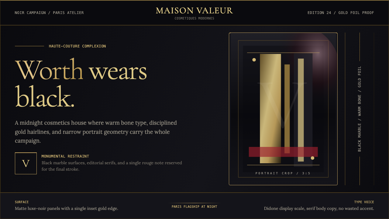 L'Oréal Paris CosmeticsMonumental restraint. Black marble fields, gold Didone type, and narrow portr…纪念碑式克制:黑色大理石场域、金色Didone字与窄幅肖像几何。
 Yves Saint Laurent (YSL)Couture chiaroscuro. Saturated black ground, warm gold accent, Didot serif at…高级时装的明暗对照法:饱和深黑底色、暖金点缀、Didot 衬线大字号——克制即…
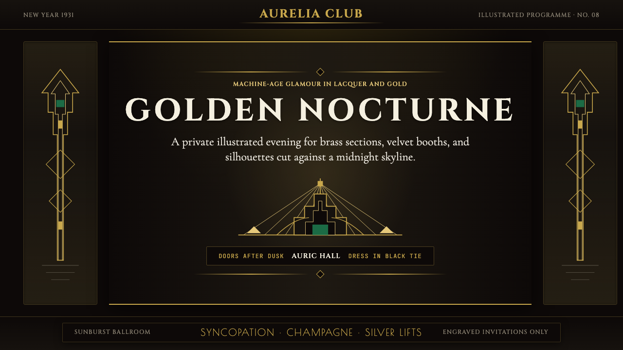 Art Deco Jazz AgeJazz Age glamour. Sunburst rays, stepped ziggurats, gold on black — Chrysler…爵士时代的流光奢华:太阳光芒、阶梯几何、金色撞黑底——克莱斯勒大厦门厅的 CS…
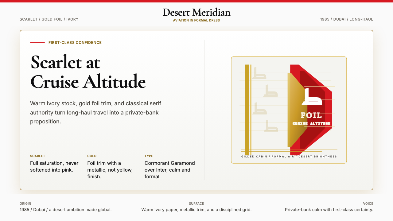 Emirates Airline (Red-Gold)Scarlet confidence, never casual. Ivory stock, gold foil, and serif restraint.猩红自信,毫不轻浮。象牙底、金箔与衬线克制。
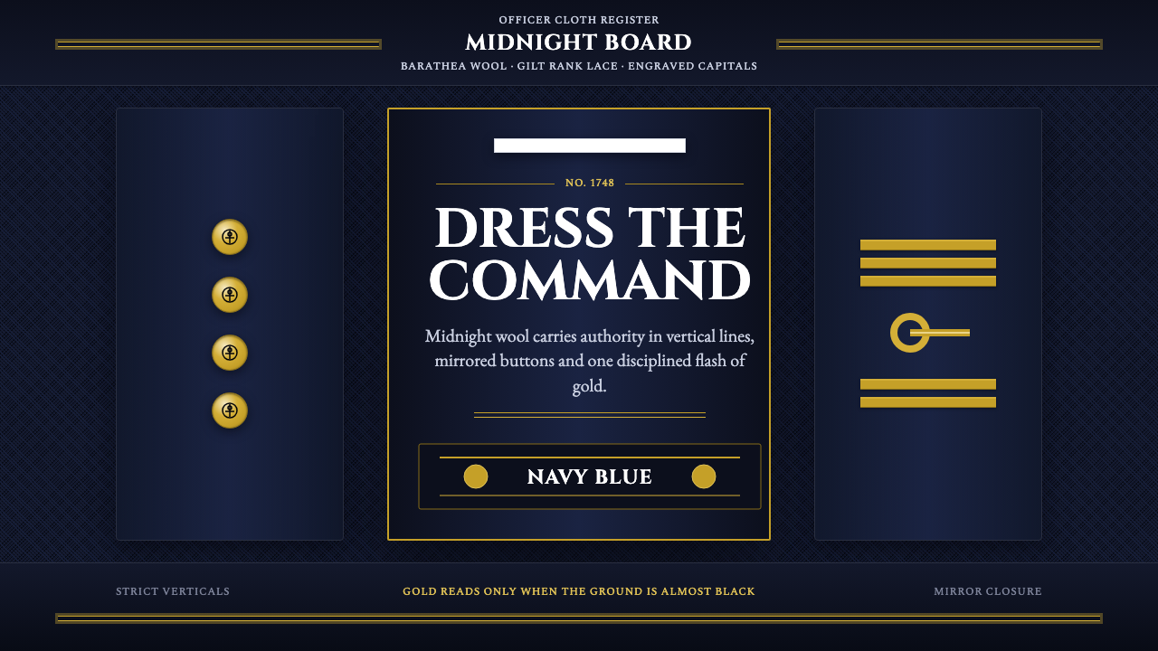 Naval Dress UniformAuthority in midnight wool. Cinzel capitals, gold lace and button symmetry ho…午夜羊毛写下权威:Cinzel 大写、金线与对称纽扣定住军阶。
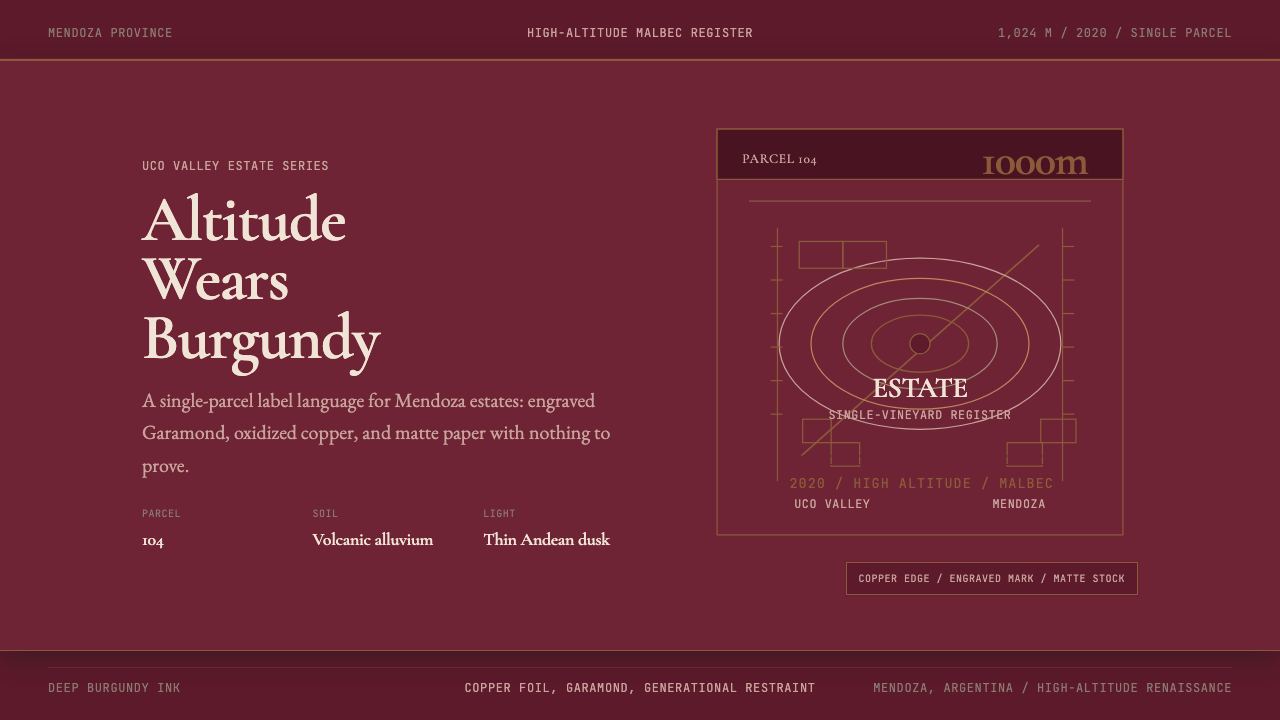 Argentine Malbec WineAltitude turned austere. Burgundy panels, engraved Garamond, oxidized copper.高海拔变得克制。酒红面板、雕刻衬线与氧化铜。