What is Naval Dress Uniform?
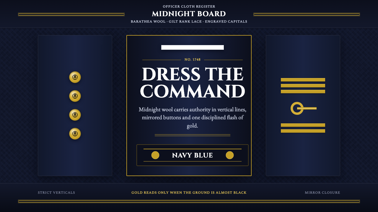
Naval Officer Dress Uniform turns the early-twentieth-century Royal Navy officer's formal wardrobe — midnight wool, gold rank lace, engraved capitals — into a design system built on tailored symmetry and quiet, hard-won authority.
Naval Dress Uniform in brief
Naval Officer Dress Uniform is a design system drawn from the formal wardrobe of a Western naval officer in the first half of the twentieth century: a barathea wool uniform so dark a navy blue that it reads as near-black from a distance, finished with gold rank lace at the cuff, gilt buttons bearing an anchor motif, and a white-covered cap. This is, quite literally, the source of the color name 'navy blue' — the shade was standardized by naval tailoring long before it became a generic color term, and the system treats that origin as central rather than incidental.
The visual logic of the system is built on contained contrast rather than variety. Nearly the entire garment sits in one deep, desaturated tone, and the only elements permitted to break that field are metallic gold — rank lace, buttons, insignia — and crisp white, reserved for the cap cover and occasionally a collar or glove. Nothing else competes for attention. Where a maximalist system spreads meaning across many colors, this one concentrates all of its meaning into where, exactly, gold is allowed to appear.
Structurally, the system depends on strict bilateral symmetry: buttons run in matched rows down the front of the coat, rank lace circles both cuffs identically, and insignia is mirrored left to right wherever it appears in pairs. This symmetry is not decorative balance in the graphic-design sense; it descends from military tailoring conventions where rank had to be readable identically from either side, at a formal review, in a single glance.
Where does Naval Dress Uniform come from?
The dark blue naval officer's uniform traces back to the Royal Navy in the mid-eighteenth century. Prior to a formal dress code, naval officers wore whatever civilian or improvised clothing suited a life at sea, which made rank difficult to distinguish at a glance aboard a crowded ship or across a harbor. The Admiralty's adoption of a standardized dark blue coat, trimmed with white facings and gold lace to indicate rank, created the template that every subsequent Western navy — including the young United States Navy — would adapt and elaborate over the following two centuries.
The specific dark, almost-black navy blue was chosen partly for practicality: dark wool concealed the inevitable grime, salt staining, and smoke residue of shipboard life far better than lighter colors, while still reading as more formal and severe than plain black. Over time, the shade became so strongly associated with naval officers that it detached from its original military context entirely and became a standalone color name in ordinary language — 'navy blue' is one of very few colors named directly after a military institution rather than a pigment, dye, or natural reference.
Rank insignia itself evolved into a precise visual grammar during the nineteenth and early twentieth centuries. Gold lace rings encircling the cuff, their number and width corresponding to specific ranks, allowed an officer's position in the chain of command to be read instantly and unambiguously by anyone trained to recognize the code — a visual system as rigorous, in its own domain, as any modern signage standard. Cap insignia, collar devices, and button design followed parallel codified rules, all reinforcing the same principle: authority should be legible without a word being spoken.
By the early twentieth century, this uniform tradition had matured into the fully codified dress uniform that this design system draws from — dark barathea wool, gilt anchor-motif buttons, gold cuff lace, and a white-covered peaked cap, worn for formal occasions, ceremonial reviews, and portraiture. The engraved-capital lettering associated with ship's crests, cap tallies (the ribbon bearing a ship or fleet's name), and formal naval documents developed alongside the uniform itself, sharing its severe, symmetrical, gold-on-dark visual logic.
What defines the Naval Dress Uniform look?
Midnight Navy Field
The base of the system is a single dark, desaturated navy blue so deep it reads as near-black in low light and only reveals its blue undertone under direct illumination. This is treated as a field, not a backdrop — nearly every surface in the system sits within this tone, and variation is expressed through material sheen rather than hue shift.
Gold as Rank Signal
Gold appears exclusively where meaning must be communicated: rank lace, button surfaces, insignia. It is never used as general decoration or filler. Because gold is reserved this strictly, its every appearance functions as information rather than ornament — a visual economy where scarcity itself carries the message.
Bilateral Symmetry
Every paired element — buttons, cuff lace, collar devices, epaulettes — mirrors exactly across the garment's centerline. This symmetry descends from a functional requirement (identical legibility from either side during formal review) but reads visually as poise and discipline, the opposite of the asymmetric tension found in more expressive design systems.
Engraved Capital Lettering
Text associated with this system — ship's crests, cap tallies, formal titles — is set entirely in capitals with a crisp, engraved quality, as if cut into metal or pressed into ribbon rather than printed casually. Lowercase forms and casual scripts have no place here; the letterform itself is meant to carry formality.
White as Sparing Contrast
White is used with the same discipline as gold — a cap cover, a collar edge, occasionally a glove — never as a large field or background. Its rarity against the dark wool field makes it read as ceremonial crispness rather than a neutral or restful tone.
Material Sheen over Pattern
Visual richness comes from the contrast between matte wool and reflective metal, not from printed pattern or illustration. Gold lace and buttons catch light in a way flat wool never does, creating depth through material property rather than surface decoration.
Restraint as Authority
The system communicates authority through what it withholds rather than what it displays: one dominant tone, two accent materials, strict symmetry, and formal lettering. There is no equivalent of a maximalist badge wall or dense pattern; every element is deliberate, and the overall impression is of quiet, earned seriousness rather than loud display.

Who shaped Naval Dress Uniform?
The mid-eighteenth-century Admiralty regulations that first standardized a dark blue officer's coat with white facings and gold rank lace established the visual template every subsequent Western navy would build upon. This regulatory tradition is the direct source of the color name 'navy blue' and the codified rank-lace system this design draws from.
The United States Navy adapted the Royal Navy's dark-blue, gold-lace framework into its own codified dress uniform regulations, carrying forward the same symmetrical button placement, rank-lace grammar, and gilt anchor-motif buttons that define this system. Its formal dress uniform remains one of the most recognizable modern descendants of the original Royal Navy template.
The specialized tradesmen who hand-produced gold rank lace, embroidered insignia, and precisely fitted dark wool uniforms turned military regulation into physical craft. Their work established the exacting standards of symmetry, metallic finish, and tailored fit that give the uniform its disciplined, formal character rather than a merely functional one.
How do you use Naval Dress Uniform today?
Naval Officer Dress Uniform suits any project that wants to project earned, quiet authority — the opposite of loud, decorative, or trend-driven design. It rewards restraint: the fewer elements allowed to break the dark field, the more authoritative each remaining element becomes.
On presentation slides, this system produces strong cover pages built on a single deep navy field with one metallic-gold title treatment set entirely in capitals, and nothing else competing for attention. Content slides should favor a strict, symmetrical grid — matched margins, mirrored placement of supporting elements — with gold reserved exclusively for section markers or the single most important figure on a page. Data slides can use gold sparingly to mark a hero metric the way lace marks rank, leaving every other number in plain, undecorated white or light gray.
For web interfaces, the system fits products built on trust, credentialing, or professional gravitas — financial platforms, legal and compliance tools, executive dashboards, membership or certification products. Dashboard chrome should stay almost entirely within the dark navy tone, with gold used only for verified status, premium tier indicators, or key actions — never as a general accent color. Pricing pages benefit from strict symmetrical layout of tiers and a single gold accent marking the recommended plan, echoing how lace marks the officer of highest rank in a lineup.
In editorial and marketing contexts, the style supports content around heritage, formalwear, institutional trust, or ceremony — luncheons, galas, institutional anniversaries, premium membership communications. A layout can set headlines in engraved-style capitals against the dark field, using gold rules or dividers with the same discipline as rank lace: present only where a genuine distinction needs to be marked.
The most common mistake is treating gold as a general decorative accent and scattering it liberally across a layout, which flattens the entire hierarchy the system depends on. In the source material, gold means something specific every time it appears; a design that uses it decoratively on borders, icons, and backgrounds all at once loses the very discipline that makes the style read as authoritative rather than merely dark and shiny.
Naval Dress Uniform — FAQ
Why is the color called 'navy blue' specifically?
The name comes directly from the Royal Navy's mid-eighteenth-century standardization of a dark blue officer's coat, chosen partly because dark wool concealed shipboard grime better than lighter shades while still reading as more formal than plain black. The shade became so closely associated with naval officers that it detached from its military origin and became a standalone color name — one of very few colors named after an institution rather than a pigment or natural reference.
Why is gold used so sparingly instead of as a broad accent?
In the original uniform, gold lace and buttons carried precise, coded meaning — the number and width of lace rings indicated exact rank, so gold could never be applied loosely without confusing that code. The design system preserves this scarcity: because gold is reserved strictly for meaningful markers, its every appearance functions as information rather than decoration.
Does the symmetry in this style need to be perfectly literal?
It should be close to literal wherever paired elements appear, since the source discipline comes from a functional requirement — rank had to be identically legible from either side of the wearer. A layout that only approximates symmetry, with slightly mismatched margins or off-center pairs, undercuts the poise the style depends on; precise mirroring is part of what reads as disciplined rather than casual.
Is this style limited to literal military or nautical branding?
No — the underlying values of restrained tone, strict symmetry, and gold reserved for genuine markers of distinction transfer well to any context built on trust, credentialing, or professional gravitas, such as financial services, legal and compliance products, or premium membership programs. What matters is whether the brand wants to project earned authority rather than approachability or playfulness.
How does the engraved-capital lettering style differ from a normal display font?
The lettering associated with this system is meant to evoke text cut into metal, embroidered onto ribbon, or pressed into formal documents rather than printed casually, so it favors an entirely uppercase treatment with a crisp, engraved quality over any lowercase or script forms. Choosing all-capitals with a formal, cut quality — rather than a softer or more casual display type — is what keeps the reference tied to ceremony and institution rather than everyday branding.
Related design styles
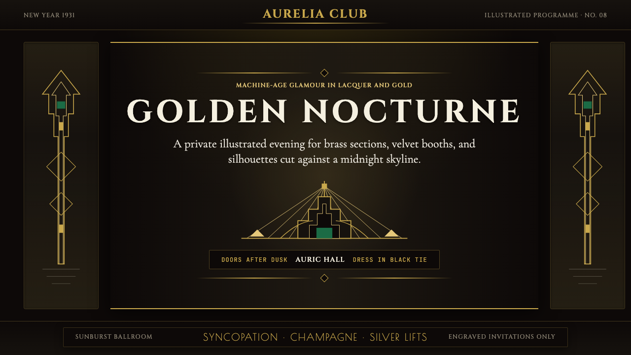 Art Deco Jazz AgeJazz Age glamour. Sunburst rays, stepped ziggurats, gold on black — Chrysler…
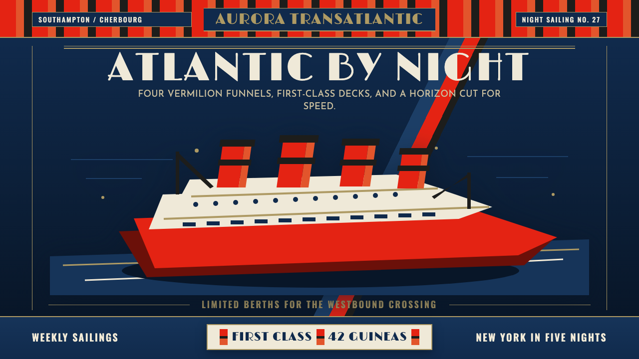 Cunard Liner PosterOceanic grandeur. Vermilion funnels, teak-gold caps, and a marine-blue poster…
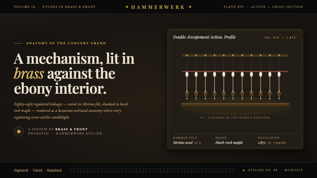 Grand Piano ActionMechanism as luxury. Brass screws and felt hammers lit out of ebony gloom, se…
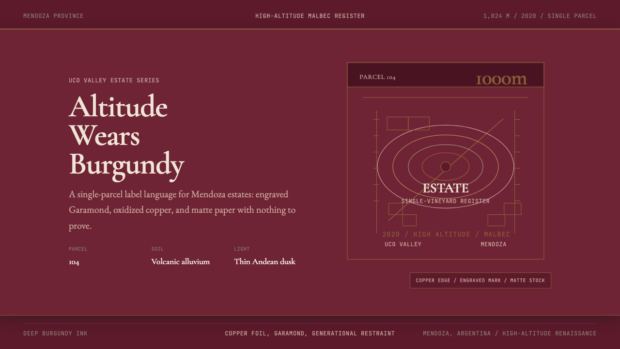 Argentine Malbec WineAltitude turned austere. Burgundy panels, engraved Garamond, oxidized copper.
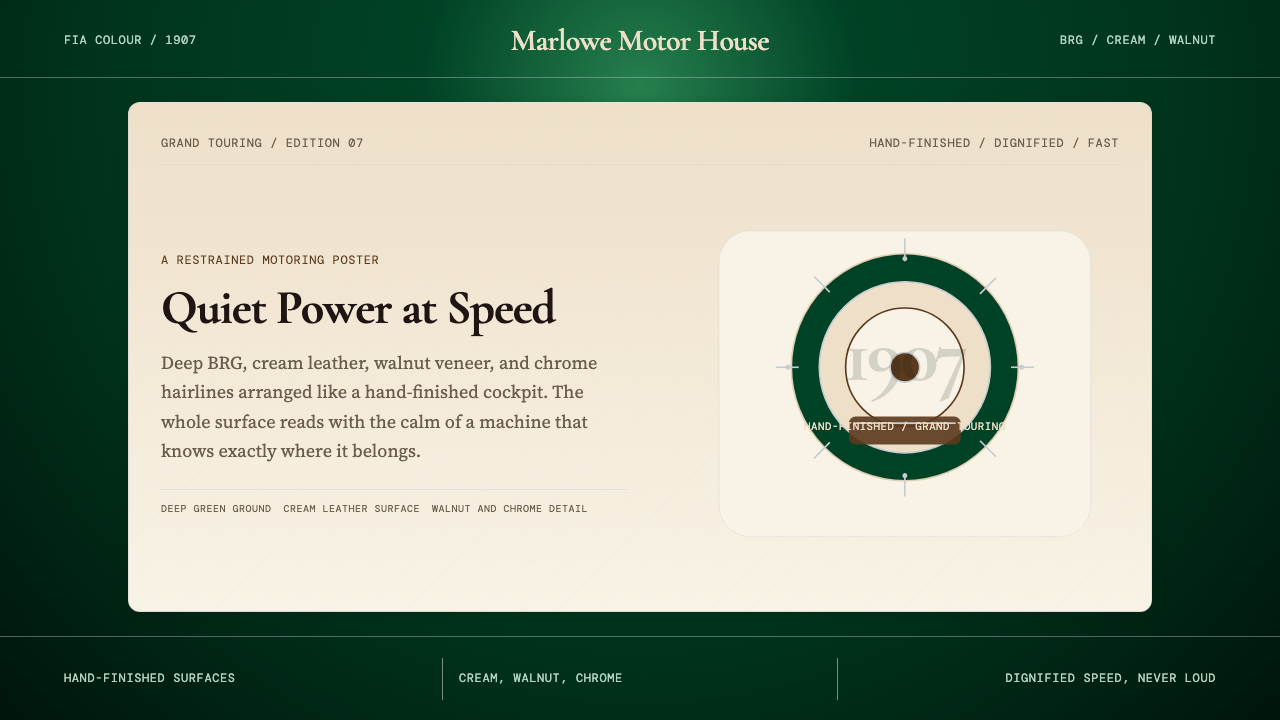 British Racing Green (Motorsport, 1907)Quiet authority at speed. Deep BRG, cream leather, walnut, and chrome hairlin…
 HermèsTwo centuries of restraint in orange. Brown serif on cream, gallery-quiet, ne…