What is Hermès?什么是 Hermès?
A wartime paper shortage gave the world its most recognizable luxury color — and Hermès turned that accident into nearly eighty years of radically quiet visual authority.一次战时纸荒赋予了世界最易辨认的奢侈品色彩——爱马仕将这场意外,锻造成近八十年极致克制的视觉权威。
Hermès in briefHermès 速览
Hermès is a Parisian maison founded in 1837 whose visual identity — the unmistakable orange ground, deep-brown classical typography on cream and white, and near-absolute rejection of decoration — has become one of the most studied and widely referenced luxury design languages in the world. The system rests on a single, almost paradoxical conviction: that the object being presented is so extraordinary that the design surrounding it must do almost nothing.爱马仕是一家创立于1837年的巴黎老铺,其视觉标识——那抹无可混淆的橙色底面、奶油与纯白底上的深棕古典字体,以及对装饰几近彻底的摒弃——已成为全球被研究最多、引用最广的奢侈品设计语言之一。整套系统建立在一个近乎矛盾的信念之上:被呈现的器物是如此非凡,围绕它的设计必须做到几乎什么都不做。
Every surface in the Hermès visual language defers to the product. Generous whitespace functions not as emptiness but as silence — the equivalent of a gallery room cleared so that a single work can be considered without distraction. Typography is classical and unhurried; spacing between letters and between lines is wide enough that reading itself slows to a pace appropriate to the object's status. Ornamental elements are essentially absent: no patterns, no flourishes, no visual noise.爱马仕视觉语言中的每一个界面都让位于产品本身。充裕的留白并非空洞,而是寂静——如同一间美术馆将展厅清空,只为让一件作品在不受干扰的情况下被凝视。字体排印古典而从容,字母间距与行距之宽,足以让阅读本身放慢至与器物身份相称的节奏。装饰性元素几乎付之阙如:无纹样,无花饰,无任何视觉噪声。
The result is a system that communicates extreme value without stating it. Where lesser luxury brands reach for visible opulence — heavy gilding, complex heraldic devices, elaborate surface texture — Hermès reaches for restraint. The message is that nothing needs to be added because nothing is missing. This is not minimalism in the contemporary tech-industry sense; it is confidence expressed as visual silence.最终呈现的系统,在不言明的情况下传达出极高的价值。当低一层级的奢侈品牌争相诉诸可见的华美——繁复镀金、复杂纹章、精工表面质感——爱马仕选择的是克制。它传递的信息是:无需添加任何东西,因为什么都不缺。这不是当代科技行业意义上的极简主义;这是以视觉寂静表达的自信。
Where does Hermès come from?Hermès 从何而来?
Thierry Hermès founded his harness workshop in the Grands Boulevards quarter of Paris in 1837, supplying bridles, saddles, and equestrian equipment to European noblemen and cavalry officers. The enterprise was built on the principle that craft excellence is its own advertisement: no piece left the atelier that was not stitched, buffed, and fitted to a standard that made every previous version obsolete. This founding ethic — that the object justifies itself — is the deepest root of the visual restraint that defines Hermès design today.1837年,蒂埃里·爱马仕在巴黎大道区创立了他的马具工坊,向欧洲贵族与骑兵军官供应缰绳、马鞍及各类马具。这家企业建立在一个信条之上:卓越的工艺本身就是最好的广告——没有任何一件作品能在未达到令此前所有版本相形见绌的缝制、抛光与装配标准时离开工坊。这一创始伦理——器物自证其价值——是今日爱马仕设计视觉克制的最深根源。
The orange that now anchors the maison's identity was not chosen; it was inherited. Before the Second World War, Hermès used cream-colored boxes with gold lettering — a palette conventional for Parisian luxury of the period. When wartime material restrictions in 1945 exhausted the supply of cream-colored cardboard, the only stock available to the manufacturer was a vivid orange-tinted board. The house adopted it out of necessity. In the decades that followed, rather than reverting to the original cream once supplies normalized, Hermès recognized that the color had become inseparable from its identity and retained it deliberately. The accident became the signature.如今锚定这家老铺身份的橙色并非经过选择,而是被继承而来。二战之前,爱马仕使用带金色字母的奶油色礼盒——这是彼时巴黎奢侈品行业的惯常色调。1945年,战时物资管制耗尽了奶油色硬纸板的供应,制造商手头唯一可用的库存是一批色泽鲜艳的橙色调纸板。老铺迫于现实采用了它。此后数十年间,当供应恢复正常后,爱马仕并未回归原来的奶油色,而是意识到这种颜色已与品牌身份浑然一体,遂有意将其保留。意外成为了标志。
The equestrian heritage shaped the visual vocabulary in more ways than color. Hermès's early product line — stirrups, bits, saddle stitching, bridle hardware — established an aesthetic of functional precision: every curve and proportion determined by what a horse and rider require, not by decorative preference. When the house expanded into leather goods, silk, and eventually ready-to-wear in the twentieth century, this underlying grammar of purposeful form accompanied the expansion. The famous carré silk scarves, introduced in 1937, carried equestrian and coaching imagery with the same formal composure that characterized the original saddlery.马术传统塑造视觉语汇的方式远不止色彩一途。爱马仕早期的产品线——马镫、马嚼子、马鞍缝线、缰绳五金件——确立了一种以功能精准为美学的风格:每一条曲线与每一个比例都由马与骑手的实际需求决定,而非装饰偏好。当这家老铺在二十世纪扩展至皮具、真丝乃至成衣时,这种以目的性形式为底层语法的传统也随之延伸。1937年推出的著名卡雷真丝方巾,以与原始马具同样端庄的形式构成,承载着马术与驾车的图像世界。
The Hermès-Dumas family, which has guided the house through successive generations, consistently positioned the maison against the consolidation trend that swept luxury in the late twentieth century. While competitors merged into conglomerates optimized for brand extension and licensing revenue, Hermès maintained private family ownership, artisanal production in French ateliers, and deliberate scarcity. This organizational posture reinforced the visual language: a house that does not need to announce itself loudly does not design as if it does. Creative directors including Pierre-Alexis Dumas have spoken explicitly about the visual system as an expression of the house's relationship to time — unhurried, continuous, indifferent to fashion cycles.历代执掌老铺的爱马仕-杜马斯家族,始终将这家老铺定位于二十世纪末席卷奢侈品行业的整合浪潮之外。竞争对手纷纷并入以品牌延伸与授权收益为优化目标的集团,爱马仕则坚守私人家族所有制、法国工坊的手工生产与刻意为之的稀缺性。这种组织姿态强化了视觉语言:一家不需要大声宣示自身的老铺,不会将设计做得像需要如此。包括皮埃尔-亚历克西·杜马斯在内的创意总监曾明确谈及,这套视觉系统是老铺时间观的外化——从容、绵延、对时尚周期漠然。
What defines the Hermès look?Hermès 的视觉特征是什么?
The Signature Orange标志橙
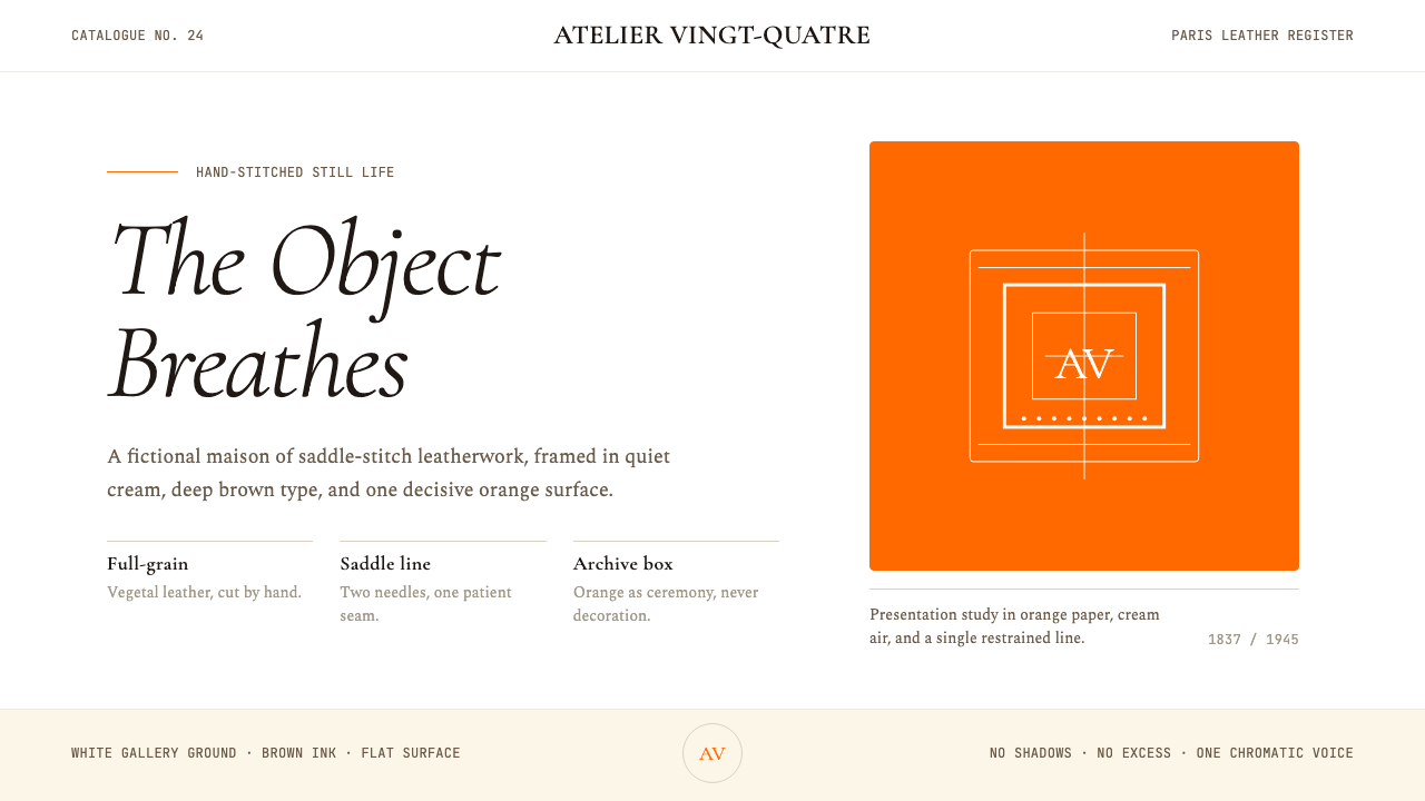
The Hermès orange occupies a precise perceptual territory between amber and tangerine — warm enough to read as sumptuous, vivid enough to be unmistakable at a distance, and restrained enough not to compete with what it frames. On the iconic box and ribbon, it functions as a field: the object becomes the figure, and the orange is simply the ground that declares the context. In digital and print applications, the color is deployed with great discipline — it tends to appear as a dominant background, a typographic accent, or a thin structural line, never as a secondary decorative element competing with the primary content.爱马仕橙占据着琥珀与橘红之间一个精确的感知领域——足够温暖以呈现丰盛感,足够鲜明以在远处一眼可辨,又足够克制而不与它所衬托的事物竞争。在标志性礼盒与丝带上,它作为底面而存在:器物成为图形,橙色只是宣示语境的地。在数字与印刷应用中,这种颜色被极为自律地使用——它倾向于作为主导背景、字体强调色或细线结构线出现,绝不作为与主体内容竞争的次要装饰元素。
Deep Brown and Cream Typography深棕与乳白字体排印
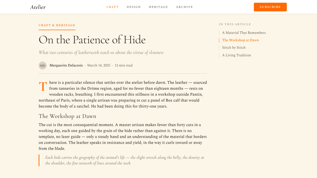
Hermès typography is set in classical serif letterforms whose warmth and historical weight feel continuous with the leather craft tradition. The ink color is a deep, saturated brown — not black, which would read as too sharp and modern — deployed against cream or off-white grounds. This warm-on-warm pairing creates a visual temperature that reads simultaneously as aged and impeccable: the sensation of handling a document from a distinguished archive rather than reading contemporary commercial copy. Letter-spacing is wide, line height generous, and text rarely appears at small sizes, reinforcing the sense that every word is considered.爱马仕的字体排印采用古典衬线字形,其温润感与历史分量与皮革工艺传统形成连续感。墨色是深沉、饱和的棕——而非黑色,黑色会显得过于锐利与现代——铺陈于奶油或近白的底色之上。这种暖色对暖色的搭配营造出一种视觉温度,令人同时感受到历经岁月与无可挑剔:仿佛正在翻阅一份名门档案馆的文件,而非阅读当代商业文案。字母间距宽阔,行高充裕,文字极少以小号出现,强化了每个字词皆经过斟酌的感受。
Radical Whitespace激进的留白
No characteristic of the Hermès visual language is harder to faithfully reproduce than its use of empty space. The margins on Hermès print materials are not simply ample — they are a statement. The whitespace around a product photograph or a paragraph of text is so generous that it communicates that the subject does not need context, supporting imagery, or proximity to other elements to justify its presence. In digital interfaces, this principle manifests as pages that feel nearly empty to a contemporary eye trained on information density, but which direct attention with absolute precision to the single element the viewer is meant to consider.爱马仕视觉语言中最难被忠实复现的特征,莫过于它对空白的使用。爱马仕印刷品上的页边距不只是充裕——它们是一种宣言。产品照片或一段文字四周的留白如此慷慨,以至于传达出一种信息:主体不需要语境、辅助图像或与其他元素的毗邻来证明自身的存在。在数字界面中,这一原则体现为对习惯于信息密度的当代眼睛而言近乎空旷的页面,却以绝对的精准将注意力导向唯一那个期待被凝视的元素。
Gallery-Quality Product Presentation美术馆级产品呈现
Hermès product photography is conceived as still-life painting rather than commercial documentation. Objects are photographed against neutral grounds, often at slight angles that reveal their three-dimensionality, and lit to show surface texture — the grain of leather, the sheen of silk — without dramatic shadows or atmospheric effects. The photographs are then surrounded by space so generous that the product reads as an art object placed in a contemplative environment rather than a commodity positioned for sale. Caption and price information, when present, appears at a distance from the image, never intrusive.爱马仕的产品摄影被设计成静物油画,而非商业图录。物件在中性底面前拍摄,往往以略微倾斜的角度呈现其立体感,打光以展现表面质感——皮革的纹路、真丝的光泽——而不借助戏剧性投影或氛围效果。照片随后被充裕至近乎过度的空间所环绕,使产品读作置于冥想环境中的艺术对象,而非被摆放出售的商品。说明文字与价格信息(若出现)与图像保持距离,绝不造成侵入感。
Near-Zero Ornamentation近乎归零的装饰
The surface decoration in Hermès communications — outside of the product objects themselves, which are often extraordinarily embellished — approaches zero. Borders, if they appear at all, are the thinnest possible lines. Backgrounds are flat, never textured or patterned. Dividers between content sections are typographic spacing rather than graphic elements. The carré scarf motifs, the equestrian and coaching imagery, the intricate hand-drawn compositions that appear on the products do not migrate into the communication design; instead, the communications hold a quiet frame around the noise and richness of the objects themselves.爱马仕传播物料上的表面装饰——产品对象本身除外,那些往往有着极为繁复的装饰——趋近于零。边框(若出现)是可能存在的最细线条。背景一律平整,从不使用纹理或图案。内容区块之间的分隔是排版上的间距,而非图形元素。出现在产品上的卡雷方巾图案、马术与驾车图像、错综复杂的手绘构图,并不迁移进传播设计;传播物料反而在器物本身的喧嚣与丰富性四周,持守着一个静默的框。
Material and Craft Continuity材料与工艺的连续性
The visual language maintains a strong referential relationship to the physical materials of the craft tradition. The cream and brown tones evoke vellum, undyed leather, and aged ivory. The typography's warmth and weight suggest hand-lettered documents and embossed die stamps. Even the orange, historically a dye used in leather treatment, carries a material resonance. This is not simulation — there is no attempt to make a screen surface look like leather — but rather a set of visual choices that remain consistent with and respectful of the material culture from which the brand emerged.这套视觉语言与工艺传统的实体材料保持着强烈的参照关系。奶油与棕褐色调令人联想到羊皮纸、未经染色的皮革与岁月沉淀的象牙色。字体排印的温润感与分量暗示着手写文件与压印钢模。就连这抹橙色,作为历史上皮革处理工艺中曾使用的一种染料,也承载着材料的共鸣。这不是模拟——并无任何试图让屏幕表面看起来像皮革的意图——而是一套与品牌所源出的物质文化保持一致且抱有敬意的视觉选择。
Temporal Unhurriedness时间上的从容
Hermès design communicates a relationship to time that is fundamentally different from most contemporary visual communication. There is no urgency, no call to immediacy, no flashing element or animated transition that implies the viewer must act now. The pacing of information — how much appears on a given surface, how widely spaced the elements — suggests that the viewer has all the time needed. This temporal quality is not accidental; it is a coherent expression of a house that explicitly positions its objects as investments to be used for decades and passed to the next generation.爱马仕的设计传达出一种与绝大多数当代视觉传播根本不同的时间关系。没有紧迫感,没有催促即时行动的呼吁,没有任何闪烁或动态过渡暗示观看者必须立刻采取行动。信息的节奏——在某个界面上呈现多少内容、元素之间的间距有多宽——暗示观看者拥有所需的全部时间。这种时间质感并非偶然;它是一家明确将自身器物定位为可使用数十年、传递下一代的投资品的老铺的连贯表达。
Who shaped Hermès?谁塑造了 Hermès?
The founder's legacy is not primarily visual but ethical: the conviction that no piece should leave the atelier unless it is the finest achievable version. Thierry Hermès established the harness workshop in Paris in 1837 with a clientele that included the crowned heads of Europe, building the maison on the premise that craft of sufficient quality requires no advertisement beyond itself. This founding posture — confidence expressed as restraint — became the animating principle of the visual language that his descendants would develop over the following century and a half.这位创始人的遗产在本质上并非视觉性的,而是伦理性的:没有任何一件作品能在未达到可企及的最高标准时离开工坊。1837年,蒂埃里·爱马仕在巴黎创立马具工坊,客户涵盖欧洲各国王室,建立这家老铺的前提是:达到足够高度的工艺无需除自身之外的任何广告。这一创始姿态——以克制表达自信——成为后世子孙在此后一个半世纪中发展的视觉语言的核心精神。
Thierry's grandson Émile, who guided the house from 1902, was the figure most responsible for transforming a specialized saddlery into a broader luxury atelier. He expanded the product range into leather accessories and began the maison's engagement with fine craftsmanship outside the equestrian world. Émile was also an avid collector of objects related to horsemanship and travel — his collection formed the visual archive that would later inform the imagery of the carré scarves and the characteristic Hermès subject matter of equestrian life, carriage travel, and the natural world.蒂埃里之孙埃米尔自1902年起执掌老铺,是将一家专业马具工坊转型为更广泛奢侈品工坊的关键人物。他将产品线扩展至皮革配件,开启了老铺在马术世界之外与精工技艺的相遇。埃米尔也是马术与旅行相关器物的热忱收藏者——他的藏品构成了视觉档案,后来成为卡雷方巾图像创作的灵感来源,以及爱马仕特有主题世界——马术生活、马车旅行与自然世界——的基础。
The current artistic director and a sixth-generation member of the founding family, Pierre-Alexis Dumas has articulated the house's visual philosophy with unusual clarity in public statements. He has described the Hermès visual system as an expression of the house's relationship to time — continuous, unhurried, and explicitly positioned against the accelerated brand communication of the contemporary industry. Under his direction, the maison has maintained its commitment to restraint in an era when digital channels created pressure toward more aggressive, high-frequency visual communication.现任艺术总监、创始家族第六代成员皮埃尔-亚历克西·杜马斯在公开表达中以罕见的清晰度阐述了老铺的视觉哲学。他将爱马仕的视觉系统描述为老铺时间观的外化——绵延、从容,并明确定位于对抗当代行业加速运转的品牌传播。在他的主持下,老铺在数字渠道催生出更具攻击性、高频率视觉传播压力的时代,仍坚守着对克制的承诺。
As head window designer for Hermès at the Faubourg Saint-Honoré flagship for nearly four decades, Leïla Menchari created some of the most celebrated retail display environments in the history of luxury commerce. Her window installations — elaborate, fantastical, and deeply narrative — occupied a deliberate counterpoint to the restraint of the house's print and packaging design. The juxtaposition is instructive: the objects themselves, in their packaging, are presented with maximum quiet; in the theater of a Menchari window, they could be placed within environments of extraordinary imaginative richness. The same object, two different frames.作为爱马仕圣奥诺雷路旗舰店橱窗设计主管近四十年,蕾拉·门夏利创作了奢侈品零售史上最负盛名的陈列环境之一。她的橱窗装置——精心繁复、奇幻瑰丽、叙事性极强——与老铺印刷及包装设计的克制形成刻意的对位。这种并置颇具启示性:器物本身在其包装中以最大限度的寂静被呈现;在门夏利的剧场式橱窗中,它们却可以被置于极具想象力丰富性的环境之内。同一件器物,两个不同的框。
The sustained visual coherence of Hermès over nearly two centuries is inseparable from continuous family stewardship. While most luxury houses of comparable age have passed through the hands of conglomerates, investors, and multiple design directors whose tenures averaged a few years each, Hermès has been guided by successive generations of the founding family. This continuity produced a visual language that evolved incrementally rather than through periodic reinvention — each generation's contribution was an inflection rather than a rupture, maintaining recognizability across the full span of the house's history.爱马仕近两个世纪视觉语言的连贯性,与家族的持续掌舵密不可分。当同等历史积淀的大多数奢侈品老铺已历经集团、投资方与平均任期仅数年的多位设计总监之手,爱马仕始终由创始家族历代成员引领。这种连续性造就了一种以渐进方式而非周期性重塑演进的视觉语言——每一代的贡献是调整而非断裂,在老铺完整历史跨度中保持着可辨认性。
How do you use Hermès today?今天怎么用 Hermès?
The Hermès visual system is one of the most difficult luxury styles to apply correctly in derivative work, because its power lies entirely in what is absent rather than what is present. Designers approaching this aesthetic for the first time tend to add the orange and the cream typography and then stop — resulting in work that has the palette but none of the restraint. Authentic application requires making the subtraction decisions first: what comes out of the layout before the Hermès color arrives.爱马仕视觉系统是衍生创作中最难被正确应用的奢侈品风格之一,因为它的力量完全来自于缺席的事物,而非在场的事物。初次接触这种美学的设计师往往加上橙色与奶油色字体后便停步——结果是拥有了色板却没有任何克制。真正的应用要求首先做出减法决定:在爱马仕色彩到来之前,版面上需要移除什么。
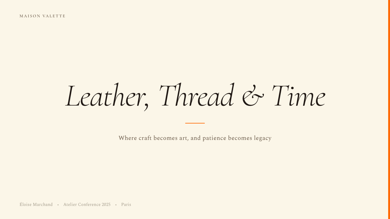
For presentation slides, this system works best when it is treated as an editorial problem rather than a graphic one. A cover slide in this aesthetic should carry almost nothing: a single product photograph or abstract image, the presentation title in a classical serif at unhurried weight, and a field of orange or cream that occupies most of the slide's surface area. Content slides should be sparing in the extreme — one idea per slide, generous vertical spacing, and type hierarchy defined purely by weight and size rather than color differentiation. If data must appear, it should be charted in the simplest possible form, with labels set in small, wide-spaced type and the data series using the warm brown and orange as the only color variables.对于演示文稿,这套系统在被当作编辑问题而非图形问题处理时效果最佳。这种美学下的封面页应当几乎什么都不承载:一张产品照片或抽象图像,以古典衬线字体呈现的演示标题,以及占据幻灯片大部分表面积的橙色或奶油色底面。内容页应当极为克制——每页一个概念,充裕的纵向间距,字体层级纯粹以字重与尺寸而非色彩差异来界定。若必须呈现数据,图表应以最简单的形式绘制,标签以小号、宽间距字体设置,数据系列仅以暖棕与橙色作为唯一的色彩变量。
For web interfaces — particularly landing pages, pricing pages, and editorial-style product pages — the style rewards layouts that commit to asymmetric compositions with a strongly dominant whitespace. Navigation should be typographic, with no icon decoration. Buttons and interactive elements should be understated: a thin border or a typographic label on an undecorated background rather than filled, rounded, or shadow-bearing components. The orange, when used in UI, should appear in one role only — primary action or brand accent — never as a categorical color system across multiple interface functions. Dashboard contexts can use the warm neutrals as background tones and reserve the orange for single high-value status indicators.对于网页界面——尤其是落地页、定价页与编辑风格的产品页——这种风格在提交于以留白为强主导的非对称构图时最为出彩。导航应当是字体性的,无图标装饰。按钮与交互元素应当低调:在无装饰背景上以细边框或字体标签呈现,而非使用填充色、圆角或带阴影的组件。橙色用于用户界面时,应只在一种角色中出现——主要行动色或品牌强调色——绝不作为跨越多个界面功能的分类色彩系统。仪表板语境中,可以将暖中性色用作背景色调,将橙色保留给单一高价值的状态指示。
For editorial and marketing materials — print campaigns, brand books, social content, and event communications — the system supports a poster-like boldness that is different from its quieter product presentation mode. Full-bleed orange grounds with reversed-out cream or white type are authentic to the tradition. Marketing pages can alternate between orange-ground and cream-ground sections, using the shift in ground color as the primary structural device, with product photography floating in either field. The critical discipline in this mode is maintaining the ratio of content to space: even in bold marketing applications, the material should feel as if it could comfortably contain twice as much information as it does.对于编辑与营销物料——印刷活动、品牌手册、社交内容与活动传播——这套系统支持一种不同于其更安静的产品呈现模式的海报式大胆感。满版橙色底面配以反白的奶油色或白色字体,是符合传统的正确做法。营销页面可以在橙色底面与奶油色底面区块之间交替,以底面色彩的转换作为主要结构性装置,产品摄影浮于任一底面之上。这种模式中的关键自律是保持内容与空间的比例:即便在大胆的营销应用中,物料也应让人感觉它本可舒适地承载两倍于现有的信息量。
A common and revealing mistake when working in this aesthetic is using the orange as an accent color sprinkled throughout an otherwise conventional layout. The orange in the Hermès system is not a highlight or a decorative touch — it is a field, a ground, a declaration of context. Using it in small quantities alongside conventional web grays or off-brand neutrals produces work that looks like an approximation rather than a commitment. The equally common opposite mistake is overcrowding: filling a layout with multiple product images, copy blocks, and supporting graphics and then applying the Hermès palette on top. The palette does not fix a crowded layout. The restraint must come first.在这种美学风格中,一个常见而颇具说明性的错误是将橙色当作强调色点缀于一个其余部分仍属常规的版面之中。爱马仕系统中的橙色不是高亮或装饰性点缀——它是底面、是地、是语境的宣示。将它以小面积使用并与常规网页灰或非品牌中性色并置,产出的作品看起来像近似,而非承诺。同样常见的反向错误是过度填塞:将多张产品图像、文案区块与辅助图形堆满一个版面,然后在上面叠加爱马仕色板。色板无法修复一个拥挤的版面。克制必须先行。
Hermès — FAQHermès · 常见问题
Can the Hermès aesthetic work for brands outside of luxury fashion?爱马仕美学适用于奢侈时尚以外的品牌吗?
It can, but with significant caveats. The visual system is a credible choice for any product or service category where deliberate scarcity, craft credentials, and premium price positioning are genuine — not aspirational — characteristics of the offer. Fine watchmaking, high-end real estate, rare wine and spirits, bespoke professional services, and the highest tier of hospitality have successfully drawn on similar visual principles. The system struggles wherever the product's actual accessibility contradicts the aspirational exclusivity the visual language projects: a mass-market product dressed in Hermès-inflected restraint reads as pretension rather than confidence.可以,但有重要的前提条件。这套视觉系统对于任何以刻意稀缺性、工艺公信力与溢价定位为真实特征——而非仅仅是愿景——的产品或服务品类,都是可信的选择。精密制表、高端房地产、稀有葡萄酒与烈酒、定制专业服务以及顶级酒店业,均曾成功借鉴类似的视觉原则。当产品的实际可及性与视觉语言所投射的理想化排他性相悖时,这套系统便会失效:一件大众市场产品披上爱马仕风格的克制外衣,读来是自命不凡,而非自信。
How should the orange be used when a dark or night-mode interface is required?当需要深色或夜间模式界面时,橙色应如何使用?
Dark-mode application of this aesthetic is inherently more difficult, because the orange was conceived as a ground color, not a foreground accent, and against dark backgrounds it tends to behave more like a warning signal than a luxury field. The most coherent approach is to invert the hierarchy: use a very deep, near-black brown — evoking aged leather or dark mahogany — as the ground, and introduce the orange as a single structural accent applied to the most important typographic element or interactive state only. Cream type on a dark brown ground retains much of the warmth and material character of the original system without requiring the orange to carry weight it was not designed to bear.这种美学在深色模式下的应用本质上更为困难,因为橙色被设计为底面色,而非前景强调色,在深色背景上它往往更像警示信号,而非奢侈品的底面。最连贯的处理方式是翻转层级:以极深的、接近黑色的棕色——令人联想到岁月沉淀的皮革或深色桃花心木——作为底面,仅将橙色作为单一的结构性强调色应用于最重要的字体元素或交互状态。深棕底面上的奶油色字体,在无需橙色承担其并非为此设计的重量的情况下,仍能保留原始系统的大部分温润感与材料质感。
What is the difference between the Hermès style and generic 'minimalist luxury' design?爱马仕风格与泛化的「极简奢侈」设计有何区别?
The distinction is specificity of origin. Generic minimalist luxury — the style that many aspirational brands adopt — achieves restraint by subtraction alone: removing decoration, reducing the palette to black and white or beige and white, and using generous whitespace. The result is correct but anonymous. Hermès restraint is grounded in a specific material and historical narrative: the warm orange with its accidental origin, the brown and cream tones that reference leather and aged document, the classical typography that connects to a craft tradition predating industrialization. Every quiet choice in the system points back to something real. The test: if you replaced the orange with a pale blue or sage green and the result looked equally at home, you are working in generic minimalism, not in a Hermès-derived system.区别在于起源的具体性。泛化的极简奢侈——许多有追求的品牌所采用的风格——仅通过减法实现克制:去除装饰,将色板简化至黑白或米与白,并使用充裕的留白。结果是正确但匿名的。爱马仕的克制植根于一个特定的材料与历史叙事:那抹带有意外起源的温暖橙色,参照皮革与岁月文件的棕与奶油色调,连接着工业化之前工艺传统的古典字体排印。系统中每一个安静的选择,都指向某个真实的存在。检验方法:如果将橙色替换为淡蓝或鼠尾草绿而结果看起来同样自然,那么你在使用的是泛化极简主义,而非爱马仕衍生系统。
How does this style handle photography and imagery?这种风格如何处理摄影与图像?
Photography in the Hermès visual system is the single area where richness is permitted — but the richness is confined to the object itself, never to the environment surrounding it. Product photographs are taken against neutral grounds and presented with extreme spatial generosity: the image floats, the surrounding space is as important as the image content. The approach excludes lifestyle photography in the conventional sense — there are no aspirational scenes, no models in ambient environments, no suggestions of a lifestyle being purchased. When human figures appear, they tend to be partial, peripheral, or highly stylized. The system trusts the object to carry all the emotional weight; the image's job is simply to present, not to narrate.摄影是爱马仕视觉系统中唯一允许丰富性的领域——但这种丰富性被限定于器物本身,而非环绕它的环境。产品照片在中性底面前拍摄,以极为慷慨的空间呈现:图像浮在其中,周围的空间与图像内容本身同等重要。这种处理方式排除了常规意义上的生活方式摄影——没有充满憧憬的场景,没有环境中的模特,没有暗示正在被购买的生活方式。当人物出现时,往往是局部的、边缘性的或高度风格化的。这套系统信任器物自身承载全部情感重量;图像的职责只是呈现,而非叙事。
Is the Hermès style appropriate for digital product design, or is it primarily a print and packaging aesthetic?爱马仕风格适合数字产品设计,还是它主要是一种印刷与包装美学?
The style was developed in print and packaging contexts and its principles transfer to digital with significant adaptation required. The main friction points are: interaction design conventions that assume visual feedback through color change, fill, and animation; the need for information density that digital interfaces often require; and the difficulty of maintaining the warmth of the palette across the wide variation of screen calibrations and ambient light conditions. Successful digital applications of the style tend to be brand-facing rather than product-facing — the maison's own editorial web presence, campaign microsites, and high-end digital lookbooks — rather than functional applications like e-commerce checkout flows or account dashboards, where usability conventions override aesthetic purity.这种风格在印刷与包装语境中发展而成,其原则在迁移至数字界面时需要相当程度的适配。主要的摩擦点在于:默认通过颜色变化、填充与动态反馈的交互设计惯例;数字界面通常需要的信息密度;以及在屏幕校准与环境光条件的宽泛变化中保持色板温润感的困难。风格在数字领域较为成功的应用往往是品牌呈现型,而非产品功能型——老铺自身的编辑性网络存在、活动微站与高端数字型录——而非电商结账流程或账户仪表板等功能性应用,在那些场景中可用性惯例凌驾于美学纯粹之上。
Related design styles相关设计风格
 The New Yorker ClassicQuiet authority. Cream paper, EB Garamond columns, ink cartoons, and one red…沉静权威:奶油纸、EB Garamond 栏栅、墨线漫画与一抹红。
 Carrara MarbleLuxury in restraint. Cool stone-white fields, feathery gray veins, and Cinzel…克制即奢华:冷石白、羽状灰纹与 Cinzel 罗马大写。
 ChanelLuxury needs no color. Black on white, pearl-cream warmth, geometric capitals…百年宣言:真正的奢华无需色彩。纯黑配纯白,唯一的偏移是珍珠乳白——克制即气场。
 Penguin Classics OrangePaperback authority. Orange tri-bands, serif title panel, and flat ink enforc…平装书的权威感:橙色三段、衬线标题与平面油墨建立克制秩序。
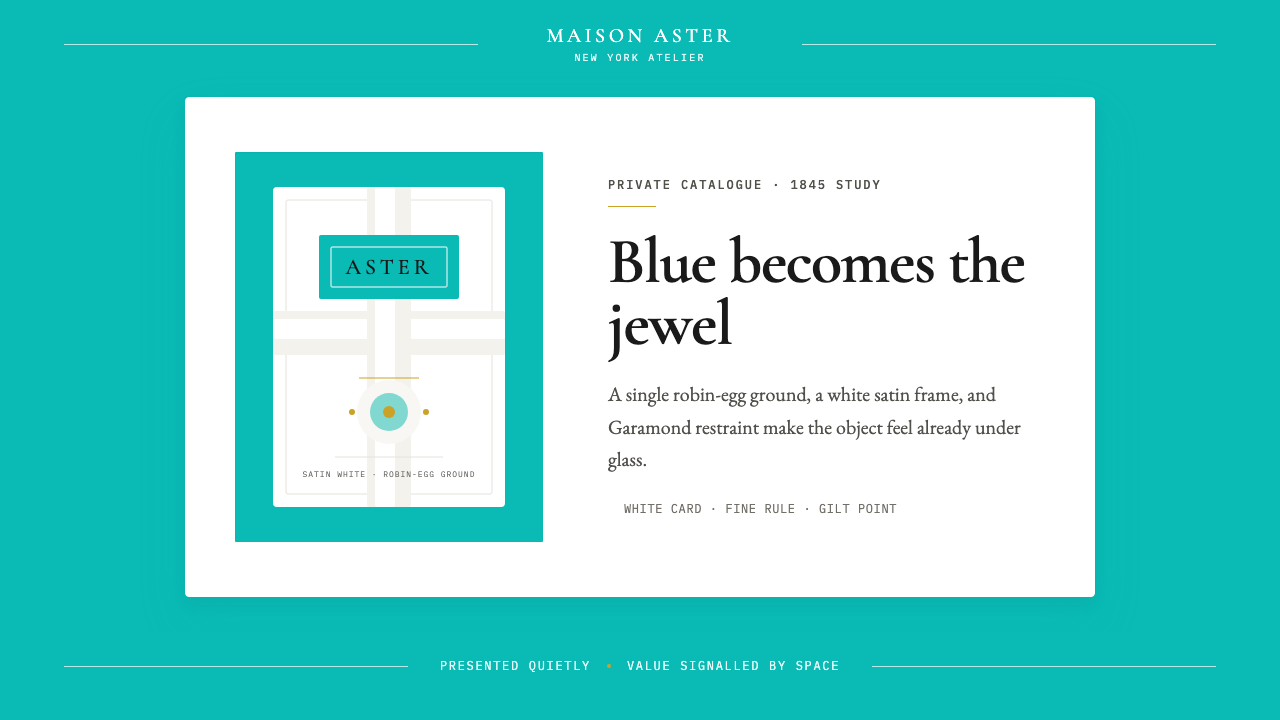 Tiffany Robin-Egg BlueBlue is the luxury signal. Robin-egg ground, white satin rules, Garamond rest…蓝色即奢华信号:知更鸟蛋蓝铺底,白缎细线与Garamond克制成章。
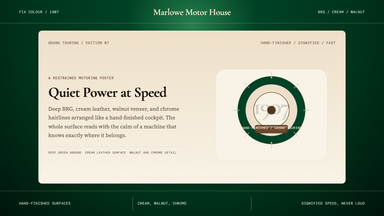 British Racing Green (Motorsport, 1907)Quiet authority at speed. Deep BRG, cream leather, walnut, and chrome hairlin…安静却有速度感。深赛车绿配奶油皮革、胡桃木和铬银细线。