What is Penguin Classics Orange?什么是 Penguin Classics Orange?
Penguin's three-band paperback cover — bold orange, clean white, and a solitary colophon — proved that a rigorous system needs no ornament to project lasting authority.企鹅出版社的三段式平装封面——浓烈的橙色、洁白的标题区与孤立的企鹅图标——证明了一套严格的系统无需任何装饰便能散发经久不衰的权威气质。
Penguin Classics Orange in briefPenguin Classics Orange 速览
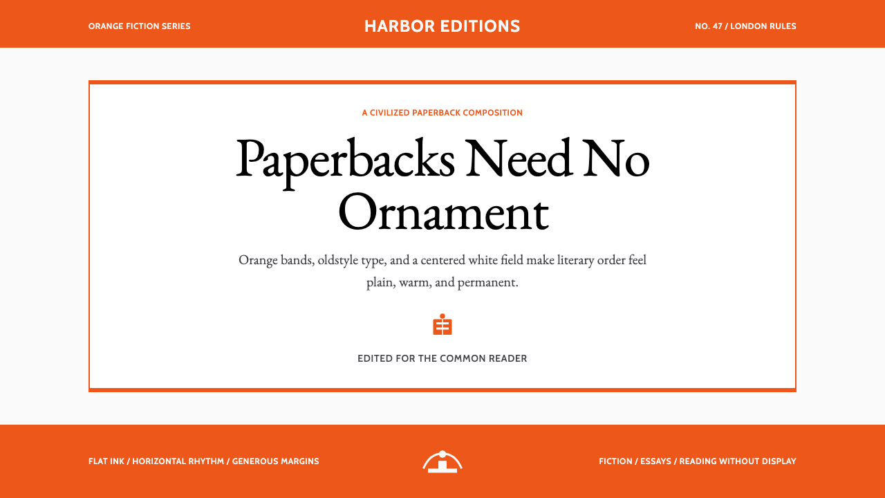
Penguin Classics Orange is the visual language distilled from one of the most disciplined book-design systems ever produced: the three-band paperback cover that Penguin Books introduced in 1935 and perfected through the postwar years. Its vocabulary is deliberately constrained — a warm, saturated orange occupying the top and bottom bands, an unadorned white panel in the centre holding the author's name and title in classical serif type, and a small illustrative colophon anchoring the lower band. Nothing else is permitted. The restraint is not poverty of imagination; it is the confident product of editorial conviction.企鹅经典橙(Penguin Classics Orange)是从有史以来最具纪律性的书籍设计系统中提炼出来的视觉语言:1935年企鹅出版社推出、并在战后数年间臻于完善的三段式平装封面。其词汇刻意精简——温暖而饱和的橙色占据上下两条色带,中间一块素白面板以古典衬线字体承载作者姓名与书名,下方色带中一枚小小的企鹅图标作为锚点。除此以外,一切皆被禁止。这种克制并非想象力的匮乏,而是编辑信念的自信产物。
The system belongs to the tradition of Modernist Functionalism, sharing lineage with the New Typography that Jan Tschichold theorized in the 1920s and then — somewhat paradoxically — partially retreated from in the 1940s. Where pure New Typography called for asymmetric grids and sans-serif type above all else, the Penguin system blended classical humanist values with modern structural economy: symmetric title panels, oldstyle serif lettering, and the horizontal rhythm of three clearly delineated bands. The result is neither cold modernism nor nostalgic traditionalism but something that reads simultaneously as civilized and contemporary.这套系统属于现代功能主义传统,与扬·奇肖尔德在1920年代理论化、又在1940年代部分撤回的新排版学有着共同谱系。纯粹的新排版学将非对称网格和无衬线字体置于一切之上,而企鹅系统则将古典人文主义价值观与现代结构经济学融合:对称的标题面板、旧式衬线字母,以及三条清晰划定的色带所构成的水平节奏。结果既非冷峻的现代主义,也非怀旧的传统主义,而是某种同时散发文明感与当代感的东西。
As a design system for digital work, Penguin Classics Orange carries that same double authority. It is bookish without being archaic, structured without being mechanical. The warm orange anchors every primary action and structural band; humanist type headings channel Gill Sans's approachable warmth; oldstyle serif body text keeps the reading experience grounded in the literary tradition. The system works because its constraints are so specific that any application of it immediately signals both seriousness and cultural confidence.作为数字作品的设计系统,企鹅经典橙承载着同样的双重权威。它带有书卷气却不显陈旧,具有结构感却不流于机械。温暖的橙色锚定所有主要交互与结构色带;人文主义字体标题致敬吉尔·桑斯的亲切温度;旧式衬线正文将阅读体验牢牢植根于文学传统。这套系统之所以有效,正是因为它的约束如此具体,以至于任何对它的运用都能立刻传递出严肃性与文化自信。
See the Penguin Classics Orange design system查看 Penguin Classics Orange 完整设计系统
Where does Penguin Classics Orange come from?Penguin Classics Orange 从何而来?
The story begins in 1935, when Allen Lane — a young publisher who had recently returned from a train journey frustrated that he could find nothing decent to read at the station bookstall — decided to produce high-quality literary paperbacks at the price of a packet of cigarettes. Penguin Books was founded with a simple premise: serious literature should be cheap enough to reach everyone. Lane asked his young assistant Edward Young to design a cover system. Young, who was twenty-one, proposed the horizontal three-band format with the now-iconic orange as the identifying color for general fiction. He also drew the first penguin colophon himself, reportedly inspired by a trip to London Zoo. The design was functional and economical — it could be printed in one or two colors, required no commissioned illustration, and produced a uniform shelf presence that made the Penguin brand instantly recognizable in any bookshop.故事始于1935年。年轻出版人艾伦·莱恩刚从一次火车旅途中归来,沮丧地发现车站书摊上找不到任何值得一读的东西,于是决定以一包香烟的价格出版高品质文学平装书。企鹅出版社就此诞生,其前提简单而坚定:严肃文学应当廉价到人人可及。莱恩委托年轻助手爱德华·扬设计一套封面系统。扬当时二十一岁,提出了水平三段式格式,以如今标志性的橙色作为大众小说系列的识别色。他还亲手绘制了第一只企鹅图标,据说灵感来自一次伦敦动物园之行。这套设计功能性强且经济实用——一两种颜色即可印刷,无需委托插图,在任何书店都能形成统一的货架存在感,令企鹅品牌一眼可辨。
The early Penguin covers were successful but inconsistent. Different titles varied in typographic execution, and the system lacked the disciplined uniformity that Lane increasingly wanted. In 1947, he invited Jan Tschichold — the Swiss typographer who had written the foundational New Typography manifesto in 1928 and then been arrested by the Nazis and forced to flee Germany — to come to London and systematize the entire Penguin production. Tschichold spent two years at Penguin (1947–1949) and transformed what had been a loose house style into one of the most precisely specified typographic systems in publishing history. He wrote rules for every detail: the precise placement of type within the title panel, the relative proportions of the three bands, the handling of series names and author names in relation to titles, the correct weight and spacing of the colophon. He insisted on classical typographic virtues — careful optical spacing, proper hierarchy, oldstyle numerals — that had nothing to do with modernist ideology and everything to do with the reader's comfort and trust.早期的企鹅封面虽然成功,却参差不齐。不同书目的排印执行存在差异,整个系统缺乏莱恩日益渴望的严格统一性。1947年,他邀请扬·奇肖尔德来到伦敦,系统化整理企鹅的全部出版物。奇肖尔德是一位瑞士排版师,曾于1928年撰写新排版学的奠基性宣言,后因纳粹逮捕被迫逃离德国。他在企鹅工作了两年(1947—1949年),将一套松散的房屋风格转化为出版史上规范最精确的排印系统之一。他为每一个细节制定规则:标题面板内的字体精确位置、三条色带的相对比例、系列名与作者名相对于书名的处理方式、图标的正确字重与间距。他坚持古典排印美德——谨慎的视觉间距、适当的层级关系、旧式数字——这些与现代主义意识形态毫无关系,却与读者的舒适感和信任感息息相关。
Tschichold's departure in 1949 did not end the system's coherence. His successor Hans Schmoller, a German émigré typographer who had trained in the classical tradition, maintained and extended Tschichold's standards for the next twenty-five years. Under Schmoller, the Penguin colophon was redrawn and refined, the grid was further codified, and the brand achieved the kind of long-term typographic consistency that is extremely rare in commercial publishing. By the time Schmoller retired in the mid-1970s, the Penguin three-band cover had been in continuous and largely unaltered production for four decades — an almost unparalleled record of disciplined design consistency in mass-market publishing.奇肖尔德于1949年离开后,系统的严整性并未随之消散。他的继任者汉斯·施莫勒——一位受过古典传统训练的德国流亡排版师——在此后二十五年间维护并发展了奇肖尔德的标准。在施莫勒的主持下,企鹅图标被重新绘制和精炼,网格进一步编码化,品牌实现了商业出版中极为罕见的长期排印一致性。施莫勒于1970年代中期退休时,企鹅三段式封面已连续且几乎未经改动地生产了四十年——这是大众出版物中几乎无可比拟的设计一致性纪录。
The visual language that Edward Young improvised, Tschichold systematized, and Schmoller extended has since become one of the most referenced design systems in the history of graphic design. It is taught in design schools as a case study in how constraints generate identity rather than limit it. Its influence can be seen in countless brand systems, editorial identities, and digital design languages that have adopted the principle of a strong color-band structure, classical typographic hierarchy, and the refusal of decorative illustration in favor of typographic authority. For designers working with digital media today, the Penguin system offers one of the clearest demonstrations available of how a system built on three elements — color, type, and proportion — can establish unmistakable authority without a single pixel of ornament.爱德华·扬即兴创制、奇肖尔德系统化、施莫勒延续发展的这套视觉语言,此后成为平面设计史上被引用最多的设计系统之一。它被设计学院作为「约束如何生成身份而非限制身份」的案例加以讲授。其影响可见于无数品牌系统、编辑视觉识别与数字设计语言,这些系统都采纳了强色带结构、古典排印层级,以及用排印权威取代装饰性插图的原则。对于今天从事数字媒体的设计师而言,企鹅系统提供了一个最清晰的示范:一套仅建立在色彩、字体与比例三个要素上的系统,无需一个像素的装饰,便能确立无可置疑的权威感。
What defines the Penguin Classics Orange look?Penguin Classics Orange 的视觉特征是什么?
The Tri-Band Structure三段式结构
The defining architecture is a horizontal tripartite division: a wide colored band at top, a white or cream title panel in the middle, and a narrower colored band at the bottom. This structure is not merely decorative — it encodes a reading hierarchy. The top band asserts the publisher's identity; the title panel carries the essential information; the bottom band anchors the colophon and series designation. Every application of this system, whether on a printed cover or a digital screen, inherits this clear vertical distribution of authority.最具决定性的架构是水平三分结构:顶部宽幅色带、中间白色或奶油色标题面板、底部较窄色带。这种结构并非纯粹装饰性的——它编码了阅读层级。顶部色带宣示出版方身份;标题面板承载核心信息;底部色带锚定图标与系列标注。这套系统的任何应用——无论是印刷封面还是数字屏幕——都继承了这种清晰的纵向权威分配。
Penguin Orange企鹅橙
The orange is warm, assertive, and occupies the full saturation range of a ripe, almost-red citrus hue. It is not a pastel, not a muted earth tone, and not a bright fluorescent — it sits at the precise point where warmth and authority meet without aggression. On a white or cream ground, it creates maximum contrast without the severity of black, and its organic warmth makes it feel editorial rather than corporate. In digital applications, this orange reads with the same forcefulness whether on screens in bright ambient light or in dark environments.这种橙色温暖、强势,处于接近红色的成熟柑橘色调的完全饱和区间。它不是粉彩,不是静谧的大地色,也不是明艳的荧光色——它恰好处于温暖感与权威感相遇而不失控的精确节点上。在白色或奶油色底面上,它形成最大对比度,却没有黑色的严厉感,而其有机的温暖质感使它呈现出编辑气质而非企业气质。在数字应用中,无论是明亮环境光下的屏幕还是暗环境,这种橙色都同样有力。
Classical Serif Typography古典衬线排印
The title panel is governed by oldstyle serif letterforms — type that draws on Renaissance humanist manuscript traditions rather than geometric or transitional models. The key quality is warmth: stroke contrast is moderate rather than extreme, serifs are bracketed and organic rather than thin and mechanical, and the overall impression is of a hand that once held a pen rather than a compass. This typographic warmth is what separates the Penguin system from the colder modernist alternatives of its era and gives it enduring legibility across generations of readers.标题面板由旧式衬线字体主导——这种字体植根于文艺复兴时期人文主义手稿传统,而非几何或过渡模型。其关键品质是温度感:笔划对比适中而非极端,衬脚有括弧状连接且富有机感而非细薄机械,整体印象是曾握过笔而非圆规的手。这种排印温度将企鹅系统与同时代更为冷峻的现代主义方案区别开来,并赋予它跨越数代读者的持久易读性。
Humanist Sans-Serif Headings人文主义无衬线标题
Where the system uses sans-serif type — for publisher imprint names, series identifiers, and display headings — it draws on the humanist rather than the geometric tradition. Humanist sans-serif letterforms retain a calligraphic skeleton, meaning that individual characters have slightly varied stroke widths and a natural axis that echoes handwriting. This gives headings warmth and approachability that geometric sans-serifs lack, and it ensures that the contrast between heading and body type is a difference in texture and weight rather than a clash of opposing philosophies.当系统使用无衬线字体时——用于出版方名称、系列标识与展示标题——它取法人文主义而非几何传统。人文主义无衬线字体保留了书写骨架,意味着各字符的笔划宽度略有变化,自然轴线呼应手写感。这赋予标题以几何无衬线字体所缺乏的温度与亲切感,并确保标题与正文之间的对比是质感与字重的差异,而非两种对立哲学的冲突。
Horizontal Rhythm and White Space水平节奏与留白
The system's composition is governed by horizontal bands rather than diagonal dynamics or circular focal points. Every element — text, colophon, rule — aligns to a consistent horizontal axis, reinforcing the sense of stable order that is central to the design's authority. White space within the title panel is generous and deliberate: the text does not crowd the panel edges, and the spacing between author name, title, and any subtitle is optically calibrated rather than mathematically mechanical. This gives even densely-worded titles an air of unhurried dignity.系统的构图由水平色带而非对角线动态或圆形焦点主导。每一个元素——文字、图标、分隔线——都与一致的水平轴线对齐,强化了这套设计权威感的核心:稳定的秩序感。标题面板内的留白慷慨而刻意:文字不逼近面板边缘,作者名、书名与任何副标题之间的间距是经过视觉校准而非数学机械计算的。这使得即便文字密集的书名也散发出从容的庄重气质。
The Colophon as Seal图标作为印章
The penguin colophon functions as a seal of quality rather than a logo in the contemporary marketing sense. Placed in the lower band, it is never oversized, never animated in digital contexts, and never treated as a decorative illustration. Its scale relationship to the band it inhabits is fixed and proportional — just large enough to be immediately legible, not so large that it dominates. This restraint is essential: the colophon's authority derives precisely from its understatement. It is a mark, not an advertisement.企鹅图标作为品质印章而非当代营销意义上的标志使用。置于下方色带中,它从不过大,在数字语境中从不动态化,也从不被当作装饰插图处理。它与所在色带的尺度关系是固定且成比例的——恰好足以立刻清晰可辨,又不至于大到喧宾夺主。这种克制至关重要:图标的权威感恰恰来源于它的内敛。它是一枚标记,而非一则广告。
Color Coding by Category按类别色彩编码
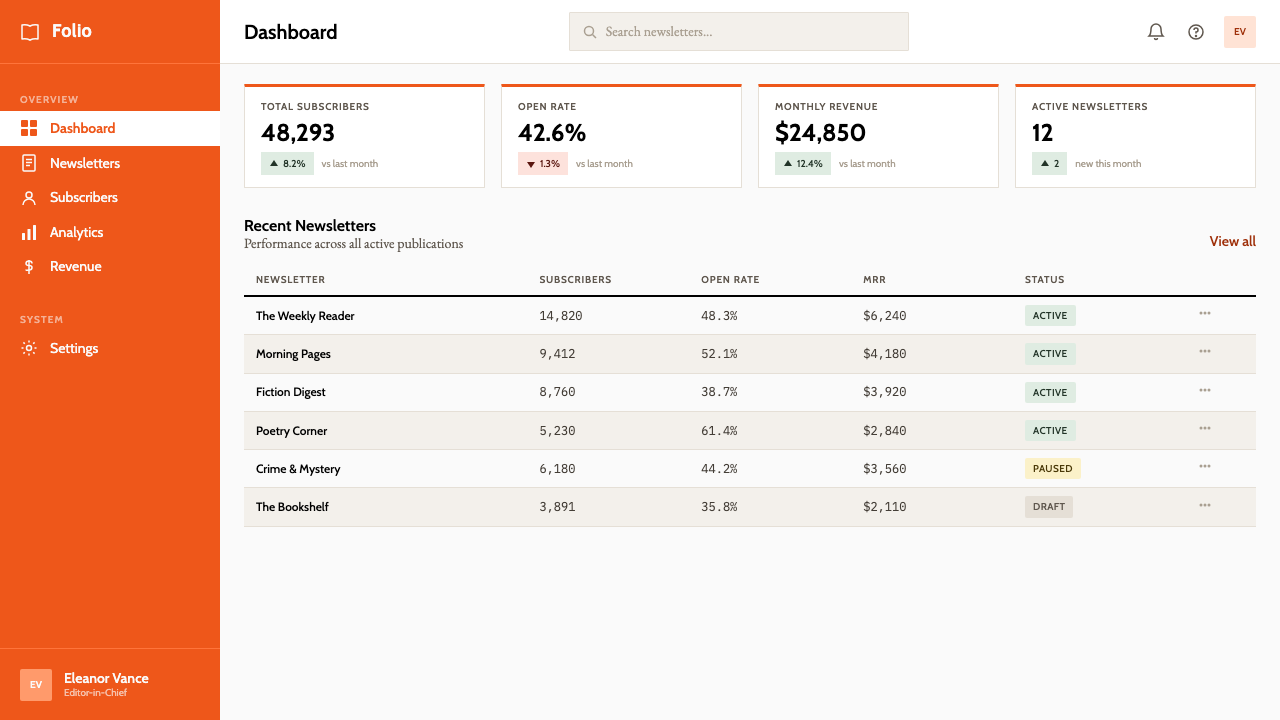
The original Penguin system used color systematically to differentiate series: orange for general fiction, green for crime, blue for biography, cerise for travel. The principle behind this is structural rather than decorative — color does categorical work that text alone would do more slowly. In digital applications derived from this system, the same logic applies: the warm orange anchors the primary or dominant category, while secondary tones drawn from the system's palette signal related but distinct content types. Color earns its presence by carrying meaning, not by providing visual interest.最初的企鹅系统以色彩系统性地区分书系:橙色代表大众小说,绿色代表犯罪,蓝色代表传记,深玫红代表旅游。这一原则是结构性而非装饰性的——色彩承担了单靠文字需要更长时间才能完成的分类工作。在从这套系统衍生的数字应用中,同样的逻辑适用:温暖的橙色锚定主要或主导类别,而从系统色板中提取的次级色调则标示相关但有别的内容类型。色彩的在场是因为它承载意义,而非提供视觉趣味。
See the Penguin Classics Orange design system查看 Penguin Classics Orange 完整设计系统
Who shaped Penguin Classics Orange?谁塑造了 Penguin Classics Orange?
Lane founded Penguin Books in 1935 with the conviction that affordable, well-produced paperbacks could democratize reading. His insistence on quality — both in the literature selected and in the visual presentation of the books — was the founding impulse behind the design system. Lane understood that a consistent, immediately recognizable cover system was not merely branding but an argument: that the books inside deserved as much visual respect as any hardcover published by a prestige house. His commercial instinct and his cultural ambition together created the conditions in which great design could flourish.莱恩于1935年创立企鹅出版社,深信价格实惠、制作精良的平装书能够使阅读大众化。他对品质的坚持——无论是所选文学作品还是书籍的视觉呈现——是这套设计系统的创始动力。莱恩明白,一套连贯、一眼可辨的封面系统不仅仅是品牌建设,更是一个论点:里面的书与任何声誉卓著的精装本一样,值得同等的视觉尊重。他的商业本能与文化抱负共同创造了伟大设计得以繁荣的条件。
Young was twenty-one when he designed the foundational three-band structure and created the first penguin colophon in 1935. The design's longevity is a testament to how well Young understood the problem he was solving: a cover system that could be produced cheaply, maintain visual consistency across thousands of titles, and signal quality without illustration. His choice of orange — warm, authoritative, legible at distance — proved so precisely calibrated to its purpose that it remained essentially unchanged for decades. Young later had a distinguished career in naval intelligence and never returned to professional design, making his contribution to Penguin one of the most consequential single acts of design in the twentieth century.1935年,扬以二十一岁之龄设计了奠基性的三段式结构并创作了第一只企鹅图标。这套设计的长久生命力证明了扬对所需解决问题的深刻理解:一套可以廉价生产、在数千个书目上保持视觉一致性、无需插图便能传递品质感的封面系统。他对橙色的选择——温暖、权威、远距可辨——事后证明与目的的契合如此精确,以至于几十年来几乎未经改动。扬后来在海军情报领域有出色的职业生涯,再未回归专业设计,使他对企鹅的贡献成为二十世纪最具深远影响的单一设计行为之一。
Tschichold arrived at Penguin in 1947 already one of the most influential typographers of the century. His 1928 manifesto Die neue Typographie had argued forcefully for asymmetric layouts, sans-serif type, and rigorous standardization. By the time he reached London, however, he had substantially revised his views, concluding that classical typographic principles — symmetry, oldstyle serifs, humanist spacing — were better suited to sustained literary reading than his earlier dogmas. His two years at Penguin produced a detailed house-style guide and transformed the production quality of every book the company published. The paradox of Tschichold's Penguin work — that the author of the New Typography spent his most productive professional years perfecting a system rooted in classical values — is itself one of the most instructive stories in the history of design.奇肖尔德1947年抵达企鹅时,已是这个世纪最有影响力的排版师之一。他1928年的宣言《新排版学》有力地论证了非对称版面、无衬线字体与严格标准化。然而抵达伦敦之时,他已对自己的观点做了大幅修正,得出结论:古典排印原则——对称、旧式衬线、人文主义间距——比他早年的教条更适合持续的文学阅读。他在企鹅的两年时间产出了一部详尽的房屋风格指南,并改变了该公司每一本出版物的制作品质。奇肖尔德企鹅工作的悖论——新排版学的作者将其最富创造力的职业岁月花在完善一套植根于古典价值观的系统上——本身就是设计史上最具启示性的故事之一。
Schmoller joined Penguin in 1949 as Tschichold's successor and remained for twenty-five years, becoming in many ways the unsung guardian of the system's integrity. A German émigré trained in the classical tradition, Schmoller refined the colophon, extended the typographic standards to cover the full range of Penguin imprints, and resisted the commercial pressures that in the 1960s and 1970s pushed many publishers toward illustrative covers and more aggressive visual styles. His decades of quiet stewardship meant that when Penguin eventually moved away from the pure three-band system in the 1970s, it was departing from a standard that had been held with unusual rigor for an unusually long time.施莫勒于1949年作为奇肖尔德的继任者加入企鹅,在此后二十五年间担任这套系统完整性的守护者,在某种程度上是被历史低估的功臣。这位受过古典传统训练的德国移民精炼了图标设计,将排印标准扩展至涵盖企鹅旗下全系列出版品,并抵御了1960至70年代推动众多出版商转向插图封面和更具攻击性视觉风格的商业压力。他数十年的默默守护意味着,当企鹅最终在1970年代走向纯粹三段式系统之外时,它所背离的是一项以异乎寻常的严格程度维持了异乎寻常漫长时光的标准。
Less prominent in design histories but essential to the Penguin production machine, Abrams was among the in-house production editors who applied Tschichold's and Schmoller's specifications at scale. The quality of a design system is only as good as the rigour with which its rules are applied at the working level, and Penguin's remarkable consistency over decades depended on production staff who understood not merely the rules but the intent behind them. Her role represents the often-invisible labor through which a design vision becomes a design standard.在设计史书写中名声较不显著,却对企鹅生产机器至关重要,埃布拉姆斯是将奇肖尔德与施莫勒的规范大规模落实执行的内部制作编辑之一。一套设计系统的品质取决于其规则在工作层面被执行的严格程度,而企鹅数十年间令人瞩目的一致性,正是依赖于那些不仅理解规则本身、更理解规则背后意图的制作人员。她的角色代表了那种往往隐而不见的劳动——正是通过这种劳动,一个设计愿景才成为一项设计标准。
How do you use Penguin Classics Orange today?今天怎么用 Penguin Classics Orange?
Penguin Classics Orange is among the most legible design systems available to contemporary practitioners because its logic is so transparent: one dominant warm color, classical type hierarchy, horizontal band structure, minimal decoration. Applying it correctly requires understanding that every element in the system earns its presence by performing a specific function. The orange signals category and publisher identity; the white panel carries the essential text; the colophon seals the whole. Importing this logic into digital work means asking, for each element, what structural work it is doing.企鹅经典橙是当代从业者可用的最易读懂的设计系统之一,因为它的逻辑极为透明:一种主导性的暖色、古典排印层级、水平色带结构、极少装饰。正确应用它,需要理解系统中的每个元素都是因为承担特定功能而获得存在资格。橙色标示类别与出版方身份;白色面板承载核心文本;图标为整体盖章。将这种逻辑引入数字工作,意味着对每个元素追问:它在做什么结构性工作?
For presentation slides, the system translates exceptionally well. A cover slide benefits most from the full tri-band treatment: orange band at top anchoring the publisher or organization identity, white central panel with the title in classical serif, and a narrower orange bar at the bottom carrying the date or edition information. Content slides should be treated as white-panel layouts — generous margins, a clean horizontal rule as section divider where needed, and type hierarchy established through size and weight rather than color. Data slides and charts benefit from orange as the accent on primary data series, with all secondary data in neutral tones. The discipline of limiting color to structural roles keeps even complex data slides readable.在演示文稿中,这套系统转化效果格外出色。封面页从完整三段式处理中获益最多:顶部橙色色带锚定出版方或组织身份,中央白色面板以古典衬线字体呈现标题,底部较窄橙色条承载日期或版次信息。内容页应作为白色面板布局处理——慷慨的页边距,需要时以简洁水平线作为段落分隔,通过尺寸与字重而非色彩建立文字层级。数据页和图表受益于将橙色作为主要数据系列的强调色,所有次要数据以中性色调呈现。将色彩严格限定于结构性角色的纪律,使即便复杂的数据页也保持可读性。
For web interfaces — particularly dashboards, pricing pages, and editorial platforms — the system offers a strong structural framework. Define the primary navigation bar in the deep warm orange, keeping all navigation text in white or cream for maximum contrast. Card components and content panels should use white backgrounds with typographic hierarchy rather than background color variation to differentiate sections. Reserve the orange for calls to action, active states, and primary tier highlights only. Hard-edged dividers replace soft shadows; the layout breathes through generous but consistent whitespace rather than through visual decoration. This approach works particularly well for products positioning themselves as authoritative, thoughtful, or literary.对于网页界面——特别是仪表板、定价页面与编辑平台——这套系统提供了强有力的结构框架。将主导航栏设定为深暖橙色,所有导航文字保持白色或奶油色以获取最大对比度。卡片组件和内容面板应使用白色背景,通过排印层级而非背景色彩变化来区分不同版块。将橙色保留给行动号召按钮、激活状态与主要等级高亮,仅此而已。硬边分隔线取代柔和阴影;布局通过慷慨而一致的留白而非视觉装饰来获得呼吸感。这种方法对于将自身定位为权威的、深思熟虑的或具有文学气质的产品尤为有效。
For editorial and marketing applications — article layouts, email newsletters, promotional materials — the system's bookish authority translates into strong brand trustworthiness. A full-width orange header band with white reversed type makes an immediate brand statement; below it, a clean white field for editorial content with body type in an oldstyle serif creates the reading experience the system promises. Marketing pages can adopt the alternating panel structure: orange-on-white feature blocks and white-on-orange reversal blocks, with the colophon or brand mark used consistently but never enlarged beyond its structural role. Pull quotes and callouts work well set in a slightly larger weight of the same serif family used for body text, avoiding the typographic noise of introducing an additional typeface.对于编辑与营销应用——文章版面、电子邮件通讯、推广材料——这套系统的书卷式权威转化为强劲的品牌可信度。全宽橙色页眉色带配以白色反白文字,立刻形成品牌陈述;其下,以旧式衬线字体呈现正文内容的洁白版面实现了系统所承诺的阅读体验。营销页面可以采用交替面板结构:橙底白字特性区块与白底橙字反转区块相互交替,图标或品牌标记始终如一地使用,但绝不放大至超越其结构性角色。引言与标注语适合以与正文相同衬线字族中略重的字重呈现,避免引入额外字体而造成排印噪声。
The most common mistake when applying Penguin Classics Orange is treating the orange as merely a brand color rather than as a structural color. In the original system, orange was not decorative — it defined spatial zones and carried categorical meaning. Designers who use orange as a highlight color scattered across a layout are breaking the fundamental logic of the system. A second common error is substituting a geometric sans-serif for the humanist type that gives the system its warmth: geometric sans-serifs read as tech-corporate and undermine the editorial authority that is the whole point of the exercise. A third error is allowing the tri-band structure to ossify into a template that is applied mechanically without understanding the proportional relationships between bands. Those proportions are not arbitrary — they were calibrated over decades — and distorting them produces work that looks like a Penguin parody rather than a Penguin derivation.应用企鹅经典橙时最常见的错误,是将橙色当作单纯的品牌色而非结构色对待。在原始系统中,橙色并非装饰性的——它定义空间区域并承载分类意义。将橙色散落于版面各处作为高亮色使用的设计师,正在打破系统的根本逻辑。第二个常见错误是用几何无衬线字体替代赋予系统温度感的人文主义字体:几何无衬线字体呈现出科技企业感,破坏了整个练习所有意义之所在的编辑权威。第三个错误是让三段式结构僵化为机械套用的模板,而不理解色带之间的比例关系。那些比例并非任意的——它们是经过数十年校准得出的——扭曲它们会产生一种看起来像企鹅讽刺画而非企鹅衍生作品的东西。
See the Penguin Classics Orange design system查看 Penguin Classics Orange 完整设计系统
Penguin Classics Orange — FAQPenguin Classics Orange · 常见问题
Is Penguin Classics Orange a minimalist style?企鹅经典橙是极简主义风格吗?
Not exactly. Minimalism, in the contemporary sense, tends toward near-total neutrality — off-white grounds, light gray type, and the deliberate suppression of any strong visual statement. Penguin Classics Orange is the opposite of neutral: the orange is emphatic, the serif type is characterful, and the tri-band structure makes a strong compositional declaration. It would be more accurate to call it disciplined or systematic rather than minimal. The design uses few elements, but each of those elements is chosen for its expressive force rather than for its ability to disappear. The result is restrained but not self-effacing.并不完全是。当代意义上的极简主义倾向于接近完全中性——近白的底面、浅灰色文字,以及对任何强烈视觉陈述的刻意压制。企鹅经典橙与中性恰恰相反:橙色是强调性的,衬线字体富有个性,三段式结构做出了强有力的构图宣言。将它称为「有纪律的」或「系统性的」比称为「极简的」更为准确。这套设计使用的元素寥寥,但每个元素都是因其表现力而被选择,而非因其消隐能力。结果是克制的,但不是自我抹消的。
How does Penguin Classics Orange differ from Swiss International Style?企鹅经典橙与瑞士国际主义风格有何不同?
Swiss International Style, which emerged in the 1950s and 1960s, is characterized by mathematical grid systems, flush-left ragged-right text setting, sans-serif type almost exclusively, and a cool, objective visual tone. Penguin Classics Orange shares the Swiss commitment to system and rigor, but diverges in almost every aesthetic value: it uses oldstyle serif type rather than geometric sans-serifs, values warmth over objectivity, and organizes space through horizontal bands rather than modular grids. Swiss Style aims at universal legibility and cultural neutrality; Penguin Orange aims at authority and cultural specificity. The two systems are compatible in their structural discipline but incompatible in their expressive intentions.瑞士国际主义风格兴起于1950至60年代,以数学网格系统、齐左参差右对齐的文字排设、几乎清一色的无衬线字体,以及冷静、客观的视觉基调为特征。企鹅经典橙与瑞士风格共享对系统化和严格性的承诺,但在几乎所有美学价值上分道扬镳:它使用旧式衬线字体而非几何无衬线字体,重视温度感而非客观性,以水平色带而非模块网格组织空间。瑞士风格追求普遍的易读性与文化中立性;企鹅橙追求权威感与文化特殊性。两套系统在结构纪律上相容,在表现意图上却南辕北辙。
Can this system work for dark-mode interfaces?这套系统能用于深色模式界面吗?
A dark inversion of Penguin Classics Orange is possible but requires deliberate adaptation rather than simple color reversal. The original system depends on the white title panel as the primary legibility zone — its brightness draws the eye and establishes hierarchy. In a dark inversion, this panel becomes dark, and orange must work harder against a dark ground. The warm orange retains reasonable visibility on dark backgrounds, but the system's characteristic warmth and bookishness are significantly reduced: dark grounds tend to push the system toward a more dramatic, editorial-noir register. This can work well for evening or premium contexts but should be treated as a distinct variant, not as the canonical system with a color swap.企鹅经典橙的深色反转版本是可行的,但需要刻意的适配而非简单的颜色对调。原始系统依赖白色标题面板作为主要易读区域——其明亮度吸引视线并建立层级。在深色反转中,这个面板变暗,橙色必须在深色底面上更为努力地发挥作用。温暖的橙色在深色背景上保留了合理的能见度,但系统标志性的温暖感和书卷气会显著减弱:深色底面往往将系统推向更具戏剧性的「编辑暗黑」风格。这在夜间或高端场景中可以奏效,但应将其视为一个独立变体,而非仅作颜色替换的正典系统。
When should I avoid Penguin Classics Orange?什么时候应该避免使用企鹅经典橙?
Penguin Classics Orange projects seriousness, literary authority, and structural order. Products that need to communicate the opposite — playfulness, sensory richness, youthful energy, emotional warmth, or cultural specificity outside the Anglo-European literary tradition — will find the style working against them rather than for them. It is also a poor choice for highly technical or data-intensive products that require dense information display, because the system's generous white space and restrained color discipline leave insufficient room for the variety of visual signals that complex data environments demand. Finally, the system performs badly when applied without understanding its proportional logic: half-hearted or misappropriated versions read as parody, which can damage rather than elevate a brand.企鹅经典橙传达的是严肃性、文学权威与结构秩序。需要传达相反品质的产品——趣味性、感官丰富性、青春活力、情感温度,或英欧文学传统以外的文化特殊性——将会发现这种风格在与自己作对而非助力自己。对于需要密集信息展示的高度技术性或数据密集型产品,它也是糟糕的选择,因为这套系统慷慨的留白与克制的色彩纪律为复杂数据环境所需的多样视觉信号留下的空间不足。最后,当这套系统在未充分理解其比例逻辑的情况下被应用时,表现会很差:半心半意或被误用的版本会被读解为讽刺模仿,这会损害而非提升品牌形象。
Why does the original system use horizontal bands rather than a more flexible grid?为什么原始系统使用水平色带而非更灵活的网格?
The horizontal tri-band structure was partly a production constraint and partly a design insight. In 1935, paperback cover printing was simple and cheap: a two-color system with ruled horizontal bands was well within the technical and financial reach of mass-market production. But the structure also solves a design problem elegantly — it assigns a fixed zone to each piece of information (publisher identity, title, series mark) and makes the hierarchy immediately legible at bookstall distance. The constraint of the band, paradoxically, gave the system its power: because every element had exactly one place to live, there was no design decision to make and no visual noise to create. Modern applications that relax the band structure into a more flexible grid often find themselves making many small decisions that the original system made for them automatically, and the results lack the decisive clarity that made the original so authoritative.水平三段式结构一半是生产约束,一半是设计洞见。1935年,平装书封面印刷简单而廉价:一套带有水平直线划分的双色系统完全在大众市场生产的技术与资金承受范围之内。但这种结构也以优雅的方式解决了一个设计问题——它为每条信息(出版方身份、书名、系列标记)指定了固定区域,并使层级在书摊距离上立刻清晰可辨。从矛盾的意义上说,色带的约束赋予了系统力量:由于每个元素都只有一个地方可以存在,就不存在需要做的设计决定,也不会产生视觉噪声。将色带结构放松为更灵活网格的现代应用,往往发现自己在做许多原始系统自动替他们做好的小决定,结果缺乏使原作如此权威的那种果断清晰。
Related design styles相关设计风格
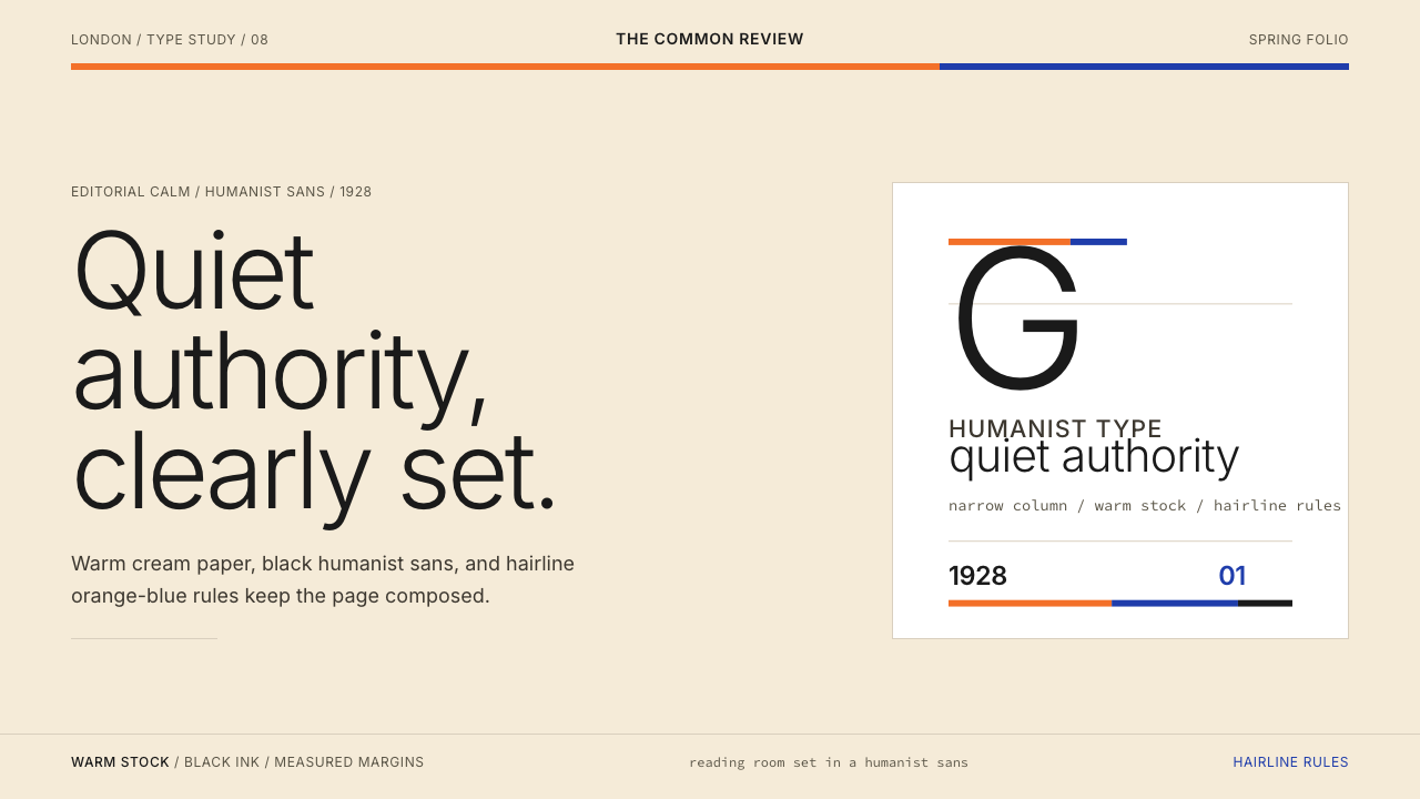 Gill Sans (BBC, 1928)Quiet authority, clearly set. Warm cream, black humanist sans, and hairline o…安静而权威。奶油底、黑色人文无衬线与橙蓝细线。
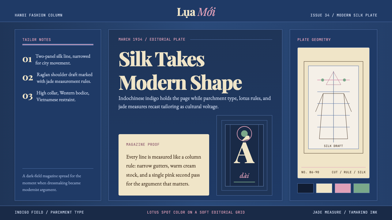 Vietnamese Áo Dài 1934 (Cát Tường)Indigo editorial poise. Parchment serif columns and lotus-pink rules frame th…靛蓝编辑气质。羊皮纸衬线栏与莲粉细线,框住1934服饰转折。
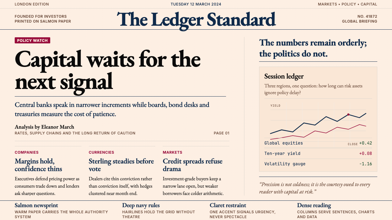 Financial Times (Pink Paper)Authority on salmon paper. Deep navy rules and claret accents discipline dens…三文鱼粉纸上的权威:深海军蓝细线与酒红点缀,约束密集衬线栏。
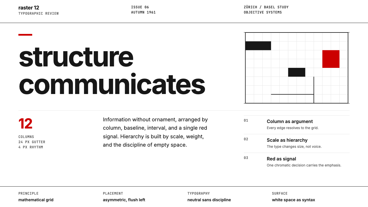 Swiss International StyleObjectivity made visible. Inter scale, white space, and one red block expose…客观性可见:Inter 尺度、留白与单一红块显露网格。
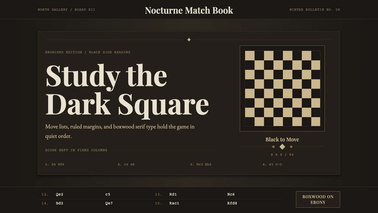 Chess TournamentQuiet intellect. Cream Playfair type, walnut rules, and notation glow on ebon…安静的智性:乌木底上乳白衬线、胡桃细线与记谱发光。
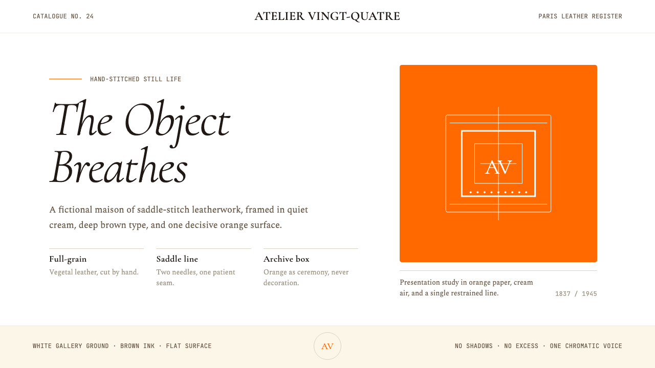 HermèsTwo centuries of restraint in orange. Brown serif on cream, gallery-quiet, ne…近两个世纪的巴黎皮革工艺:标志性的爱马仕橙、深棕衬线落于乳白纸底——产品如美术…