What is Chess Tournament?
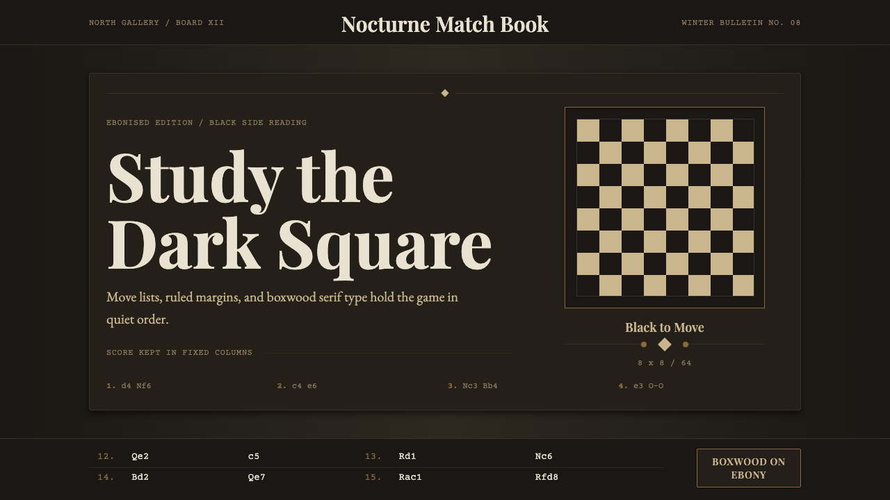
Chess Tournament is monochrome editorial design in its most concentrated form — warm cream type and ruled notation lines glowing against an ebonised dark ground, disciplined by the symmetry of the board and the logic of algebraic notation.
Chess Tournament in brief
Chess Tournament is a dark-ground editorial design system rooted in the printed culture of early twentieth-century international chess tournaments — the ruled move-lists, bulletin covers, and annotation pages that accompanied events in London, Hastings, St. Petersburg, and Nottingham. Its visual logic is governed by a single reversal: the board is read from the black side, so warm boxwood-cream and period serif letterforms glow forward against an ebonised dark field rather than receding into it.
The system is monochromatic in principle. Its palette is not black and white in a neutral sense but rather the specific material contrast of the Staunton chess set itself — the warm ivory or boxwood tone of the light pieces against the cool, lacquered darkness of the ebony pieces. Every typographic and compositional decision honors that polarity. Ruled lines mark territories the way rank and file divide the board. Move notation columns create vertical rhythm as regular as the alternating squares.
What makes Chess Tournament a design system rather than mere period nostalgia is its structural discipline. The Staunton standard (established 1849, standardized internationally in the tournament era) imposed uniform piece proportions, legible silhouettes, and functional elegance on what had previously been a chaos of regional styles. The design system imports that same standardizing ambition: everything earns its place by function, and the visual logic is as internally consistent as the rules of the game itself.
Where does Chess Tournament come from?
The Staunton chess set, designed by Nathaniel Cook and endorsed by the leading English player Howard Staunton in 1849, was the first chess piece design explicitly created for tournament play rather than decorative display. Cook's pieces — turned from boxwood (light) and ebony (dark) — prioritized legibility: each silhouette was distinct enough to be identified quickly from any seat at the board. Jacques of London manufactured them; Staunton lent his name for a promotional fee. By 1852, the Staunton set had been adopted as standard across the British chess world, and the international tournament circuit that expanded through the late nineteenth and early twentieth centuries carried that standard globally.
The tournament bulletin as a printed object emerged alongside competitive chess culture. The great international tournaments — Vienna 1873, London 1883, Hastings 1895, St. Petersburg 1914 — generated printed records: ruled tables of results, column-by-column game notation, portrait engravings of the leading players, editorial annotations in close-set serif type. These documents were not designed in any self-conscious aesthetic sense; they were functional records produced by the printing conventions of their era. But their visual consistency — dark grounds on covers, serif type, horizontal rules, the rigid column structure of algebraic notation — gives them retrospective coherence as a distinct editorial register.
The golden age of chess tournament culture ran roughly from the 1880s to the 1940s, bracketed by the dominance of champions who embodied different intellectual styles: Wilhelm Steinitz (the first official world champion, who theorized positional chess), Emanuel Lasker (who held the title for twenty-seven years and understood chess as a psychological duel), José Raúl Capablanca (whose game was known for crystalline simplicity), and Alexander Alekhine (whose attacking combinations carried a dark, obsessive energy). The bulletin aesthetic of this era — monochrome, serif-heavy, ruled and columnar — reflected the intellectual seriousness with which chess was regarded.
The Staunton silhouette itself became a graphic object of interest. The king's cross-topped crown, the queen's coronet, the bishop's mitre-cut, the knight as a stylized horse's head — these forms appeared on book covers, poster designs, and institutional graphics throughout the twentieth century, functioning as immediate signifiers of intellect, competition, and elegance. The Chess Tournament design system draws on this entire semiotic history: the pieces as visual vocabulary, the board as compositional grid, the notation page as the model of structured information display.
What defines the Chess Tournament look?
Ground and Light
The defining reversal of Chess Tournament is its dark ground. Where most editorial systems work light-on-dark as an exception, here it is the default — the reading experience is modeled on looking at the board from the black side, where the light pieces advance against darkness. The dark field is not flat black but a warm, deeply saturated ebony tone, and the foreground elements — type, rules, notation figures — carry the warmed cream of boxwood rather than a pure cold white. The result is a luminous quality: text appears to glow rather than to sit on the surface.
Typography and Notation
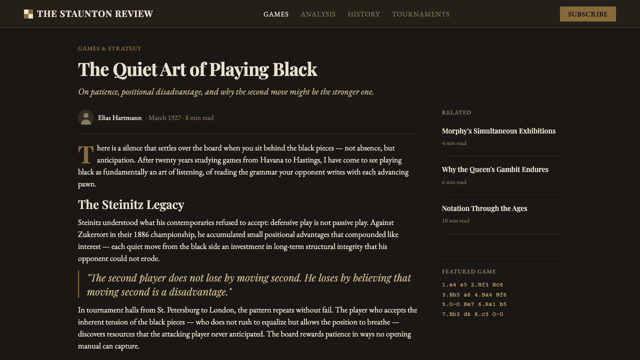
Period serif letterforms are the typographic foundation — specifically the classical, high-contrast styles associated with late Victorian and Edwardian print culture. These typefaces carry a quality of careful authority: each letter is shaped with deliberate weight contrast between thick stems and thin hairlines. Algebraic and descriptive notation columns — the move-lists that record a game — provide a secondary typographic register: monospaced, tightly tracked, numerically ruled. The interplay between expressive serif editorial text and the mechanical regularity of notation columns creates the system's characteristic visual tension.
The Rule and the Grid
Horizontal and vertical rules carry enormous structural weight in this system. They serve the same function as the lines of the board: dividing territory, creating equal-weighted zones, signaling where one domain ends and another begins. The grid is regular but not rigid in a contemporary sense — it echoes the alternating square pattern of the board, where each cell is identical in size but alternate in tone. Column structure is paramount; information is organized into vertical channels the way notation columns organize moves by ply.
Silhouette and Symbol
The Staunton piece silhouettes — king, queen, rook, bishop, knight, pawn — function as a ready graphic vocabulary. Their proportions were standardized precisely so that each could be identified at a glance by silhouette alone, without relying on color or surface detail. Used in layouts, they carry layered meaning: intellectual prestige, structured competition, the abstract elegance of rule-based systems. They work best when treated as flat, solid shapes rather than rendered objects — their visual power lies in contour, not in the simulation of carved ivory or ebony.
Intellectual Restraint
Chess Tournament does not dramatize. It presents. The editorial register of tournament bulletins was neutral and analytical — results recorded without emotional inflection, annotations given in the spare language of chess analysis. In visual terms, this translates to an absence of decorative emphasis: no ornamental borders, no illustrative embellishment, no motivational typography. What emphasis exists is structural — a bold horizontal rule, a change in column width, a shift from italic to roman. The system's emotional register is quiet confidence: the game is enough; the record speaks for itself.
Material Contrast
The system's palette derives from the two woods of the traditional Staunton set: the warm, slightly golden cream of boxwood for the light pieces, and the deep, warm-toned darkness of ebony for the dark pieces. Neither tone is neutral. Boxwood cream reads as luminous and aged — a quality of old vellum, or warm candlelight on ivory. Ebony dark reads as absorptive and weighted — not flat black but a depth with presence. The contrast between them is high but not harsh, because both tones are warm. This warmth is what distinguishes the system from the colder, more clinical monochrome of modernist black-and-white design.
Symmetry and Its Interruption
Chess is played on a perfectly symmetric board, yet a game of chess is never symmetric — the opening move destroys symmetry immediately, and the asymmetric tension between positions is what creates the game's drama. The design system reflects this paradox. Its underlying structure is symmetric: columns of equal width, rules at regular intervals, centered headers. But within that structure, the notation and annotation content is inherently asymmetric — white moves and black moves, winning positions and losing ones, decisive sacrifices and patient maneuvering. The system holds tension between ordered container and dynamic content.
Who shaped Chess Tournament?
The English player and chess journalist Howard Staunton (1810–1874) was the dominant force in Western chess in the 1840s and a central figure in establishing the international tournament circuit. His endorsement of Nathaniel Cook's 1849 piece design gave the Staunton set its name and commercial momentum. Staunton also edited the Illustrated London News chess column for decades, helping to establish the genre of chess journalism that would produce the tournament bulletins the design system draws from. His name is now permanently embedded in the international standard for the game's material culture.
The firm of Jacques of London, founded in the late eighteenth century as a manufacturer of games and sporting equipment, produced the original Staunton sets from 1849. Their craftsmanship in turning and weighting the boxwood and ebony pieces established the material and tactile standard for tournament chess. Jacques sets — with their characteristic weighted felted bases — were used at virtually every major international tournament in the second half of the nineteenth century. The firm still exists and still manufactures Staunton sets; their catalog represents an unbroken material lineage from the origin point of the design system.
The Cuban world champion José Raúl Capablanca (1888–1942) became one of the most recognizable figures of the tournament-bulletin era, appearing frequently in the illustrated pages and annotation columns of international chess publications. His playing style — economical, clear, apparently effortless — was frequently described in the same aesthetic terms as the design system: clarity, economy, and the appearance of inevitability. Capablanca's annotated game collections, with their spare commentary and clean notation typography, are among the purest examples of the tournament-bulletin print aesthetic.
Alexander Alekhine (1892–1946), the Russian-born world champion who defeated Capablanca in 1927, represented a darker and more complex side of the tournament-bulletin era. His deeply annotated game collections — particularly My Best Games of Chess — brought a new density and obsessive quality to chess literature. Alekhine's annotations were notable for their psychological depth and the physical intensity of their prose, pushing tournament chess writing toward something closer to literary analysis. His career, spanning the Russian Empire, inter-war Paris, and Occupied France, also traced the turbulent political geography that gave the bulletin era its historical weight.
Emanuel Lasker (1868–1941) held the world chess championship for twenty-seven years, from 1894 to 1921 — the longest reign in the title's history. A mathematician and philosopher as well as a player, Lasker understood chess as a cognitive and psychological discipline rather than purely a combinatorial puzzle. His presence in the tournament-bulletin record is correspondingly weighty: his games appear in nearly every major tournament publication of the period. Lasker's philosophical writings on chess, including Manual of Chess, helped establish the intellectual seriousness that the tournament-bulletin aesthetic was built to reflect.
How do you use Chess Tournament today?
Chess Tournament is a high-specificity style that works exceptionally well in contexts where intellectual credibility, concentrated attention, and the suggestion of deep expertise are desired values. Its dark ground and serif typography signal seriousness without aggression; its columnar structure suggests systematic organization rather than bureaucratic hierarchy. The style is a strong fit for platforms, publications, and presentations that want to communicate that they have thought carefully about something difficult.
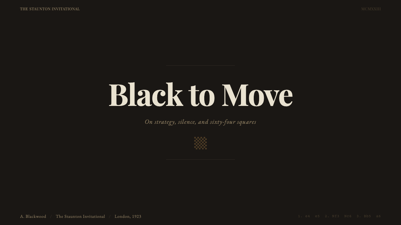
For presentation slides, Chess Tournament is best deployed as a deliberate contrast to the default light-background slide format. A cover built on a dark ebony ground with warm cream type and a single piece silhouette in the upper corner makes an immediate statement of distinction. Content slides work well as notation columns: key points set in a compact serif at moderate size, with metadata or supporting context in a smaller weight to the right or left. Data slides benefit from the board-grid analogy — tabular comparisons, move-sequence diagrams, position evaluations — where the columnar structure of the grid maps naturally onto comparison tables.
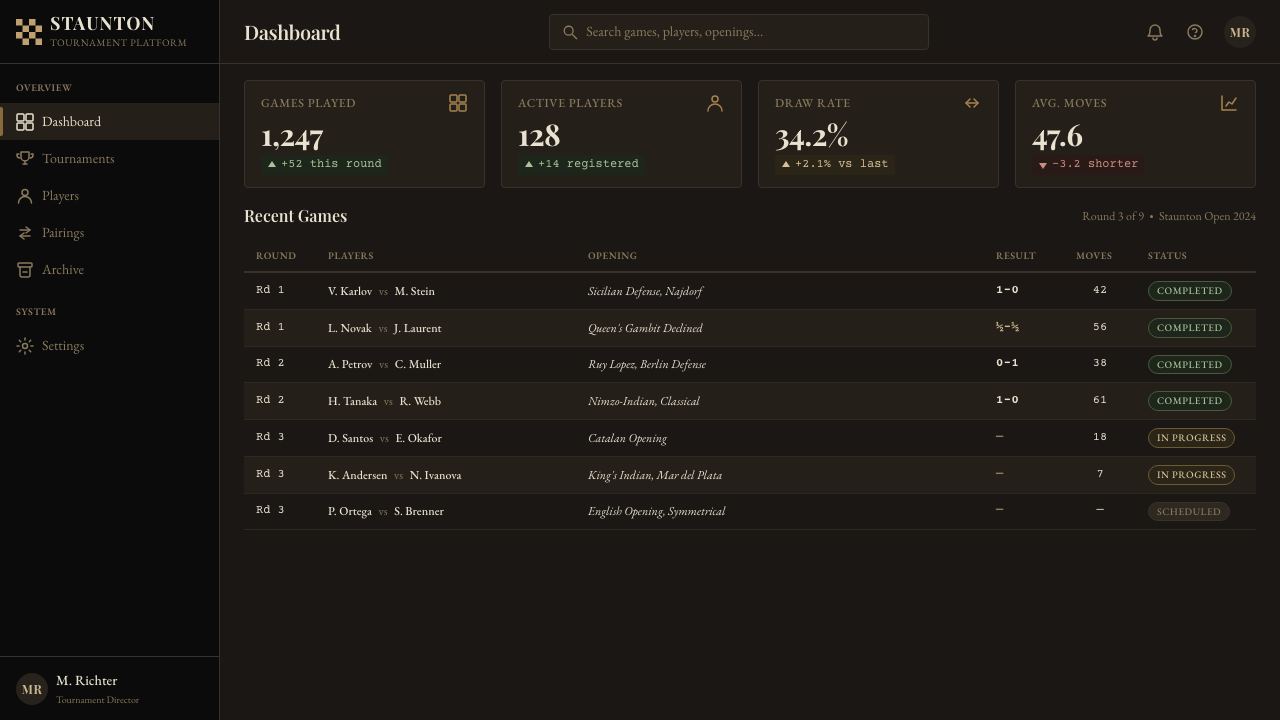
For web interfaces, the style is most at home in contexts where the content is itself complex and the reader is expected to bring attention: analytical dashboards, research platforms, literary publications, and any product whose users consider themselves specialists. The dark ground handles long-form reading well; the high contrast of warm cream on deep ebony is easier on the eyes over extended sessions than pure white-on-black. Navigation should be typographic and minimal — no iconographic decoration beyond structural indicators — and interactive states should be marked by changes in typographic weight rather than color floods.
For editorial and marketing work, the style supports long-form richness without sacrificing readability. A Chess Tournament-derived article page uses a generous column for body text set in a classical serif, with annotation-style marginalia at a smaller size for citations, cross-references, or editorial commentary. Marketing contexts should use the piece silhouettes sparingly — one on a cover, perhaps a pawn or knight — to invoke the visual vocabulary without tipping into parody. The poster tradition of chess culture (tournament announcements, championship match promotions) offers a parallel reference for bold, large-format applications.
The most common mistake when applying this style is losing the material warmth that distinguishes it from generic dark-mode design. Many practitioners invert a layout to a dark background and call it Chess Tournament, but without the specific warmth of the boxwood-cream foreground against a genuinely deep (not flat or blue-toned) dark ground, the result is simply dark-mode — not this system. A second frequent error is overloading the layout with piece silhouettes or chess imagery; the board and pieces function as structural allusions, not decorative tile patterns. Restraint with the chess vocabulary reinforces the system's intellectual register; excess tips it into theme-restaurant territory.
Chess Tournament — FAQ
How is Chess Tournament different from general dark-mode design?
General dark-mode design typically uses cool or neutral dark backgrounds — near-black with blue undertones — and cool white or light gray for text. Chess Tournament is distinguished by the warmth and material specificity of its tonal pairing: the dark ground is a deep, warm ebony — no blue cast, no cool neutrality — and the foreground is the warm cream of boxwood rather than a bright or cold white. The contrast is high but not harsh, because both tones are warm. This warmth gives the system a luminous, almost glowing quality that clinical dark mode never achieves. The serif typography and columnar structure further distinguish it from the sans-serif, card-based conventions of contemporary dark-mode UI design.
Can Chess Tournament work on a light background?
It can, but it works against the system's fundamental logic. The defining characteristic of Chess Tournament is that it reads from the dark side — the warm foreground elements advance against the dark field. On a light background, the same palette becomes a fairly conventional cream-and-brown Victorian editorial style, not unpleasant but without the distinctive luminous quality of the inverted system. If a light-ground variant is needed, the stronger move is to treat it as a deliberate quote of nineteenth-century print culture — using the cream and dark brown tones on a parchment-like light ground — rather than attempting to preserve the Chess Tournament logic in an incompatible substrate.
Is the chess imagery essential, or can the style work without it?
The style works without chess imagery, and in many applications this is the stronger choice. The structural logic of Chess Tournament — warm cream on deep ebony, classical serif type, horizontal rules, columnar information architecture — is complete in itself and does not depend on piece silhouettes to communicate. The chess vocabulary should be used when it adds specific meaning (signaling intellect, competition, strategic depth) and omitted when it would function merely as decoration. A data-heavy analytical platform built on this system's structural principles gains nothing from sprinkling chess symbols across the interface; a book cover or event poster might gain everything from a single well-placed piece.
How should color accents be handled in this predominantly monochrome system?
Chess Tournament is a monochrome system, and the temptation to introduce color accents should be resisted in most cases. The tonal range from deep ebony to warm cream is richer than it might appear — different densities of type, different weights of rule, the warm glow of piece silhouettes — and the introduction of a chromatic color tends to disrupt this carefully calibrated range rather than enhance it. When a color accent is functionally necessary (marking an active state, differentiating a critical alert, highlighting a selected move), the palette of the board itself offers a precedent: the near-green baize of the playing surface appears in some historical contexts as a subtle environmental accent, while red has occasionally been used in tournament typography for highlighting key moves or decisive moments. Neither should appear at high saturation or large area.
What makes this style feel intellectual rather than merely old-fashioned?
The difference lies in what the historical references are doing. A style feels old-fashioned when it borrows period surface qualities without understanding the structural logic underneath. Chess Tournament feels intellectual because every element references a functional system with genuine internal logic: the Staunton piece design (standardized for legibility), algebraic notation (a purely logical symbol system for recording game states), the columnar bulletin layout (optimizing for information density and retrieval). When applied with understanding of that logic — using the columnar structure for genuine information architecture, using the dark ground because it genuinely reads as advancing foreground elements rather than as an aesthetic choice made in isolation — the historical surface qualities serve as signals pointing toward that underlying rigor. The style fails when the surface is reproduced without the logic; it succeeds when the logic is alive and the surface follows from it.
Related design styles
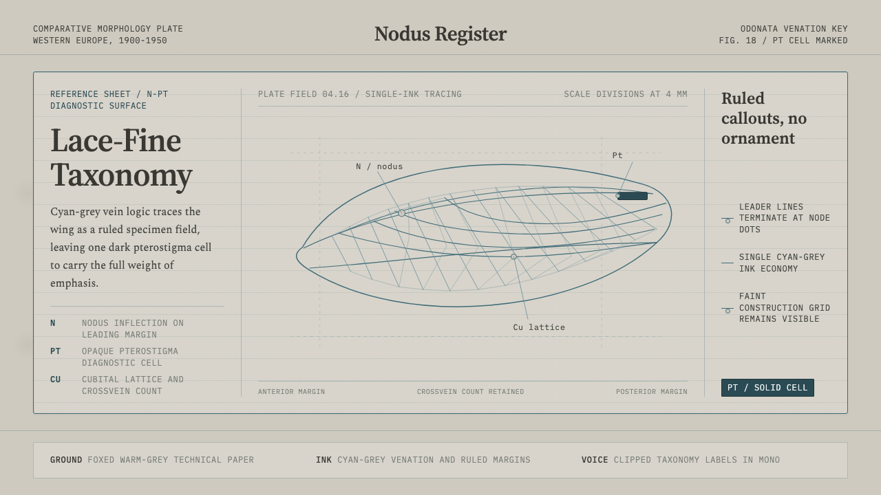 Dragonfly Wing VenationPrecision, nearly weightless. Cyan-grey veins rule a foxed paper taxonomy pla…
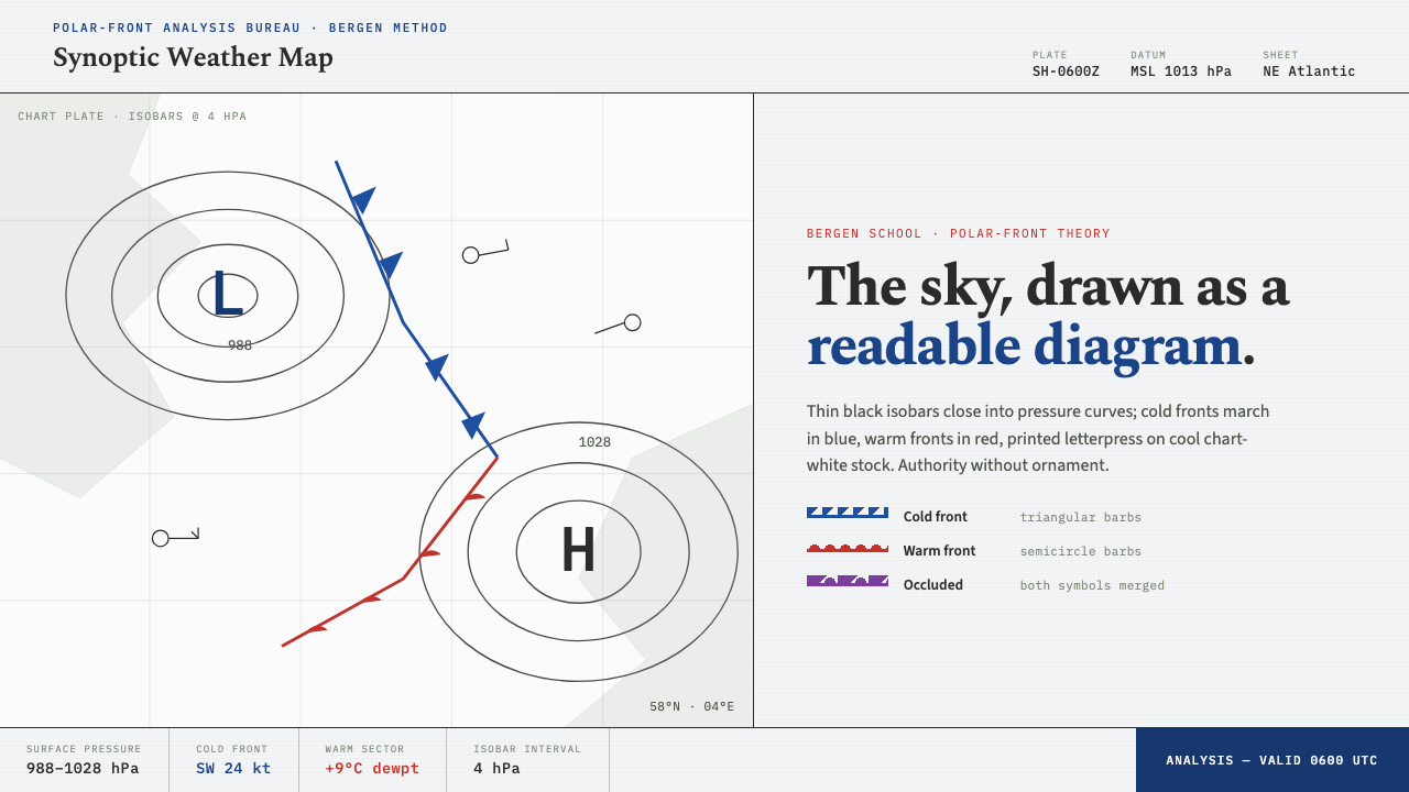 Synoptic Weather MapThe sky as a readable diagram. Black isobars, blue cold fronts, red warm fron…
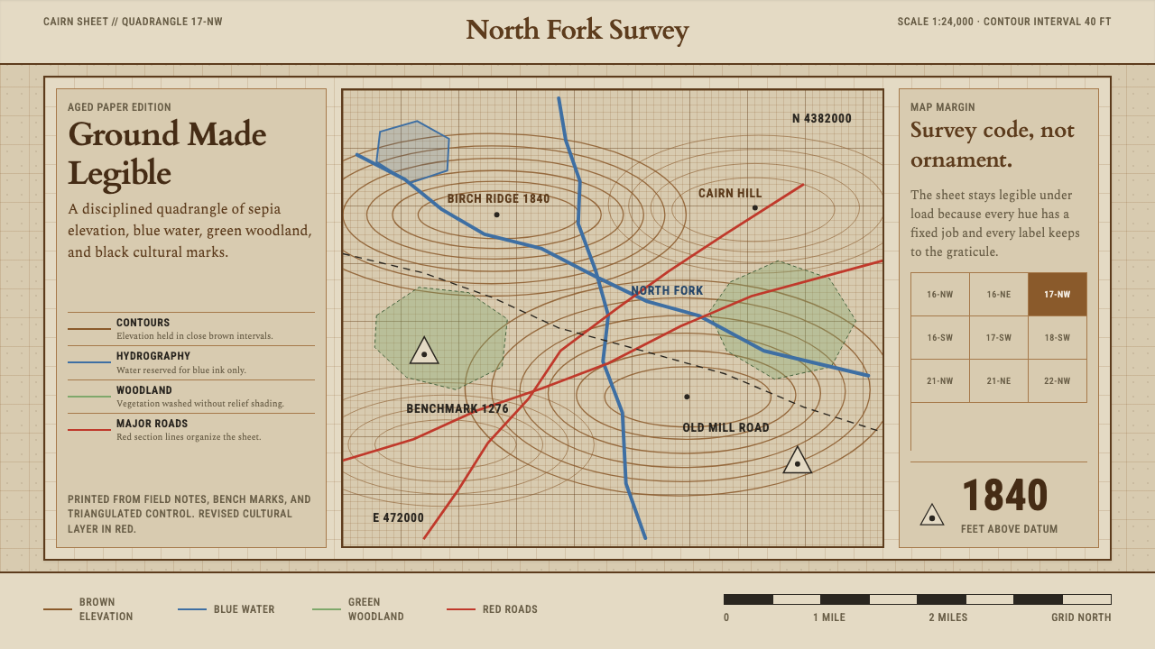 Topographic Survey MapMeasurement becomes beauty. Sepia contours and blue hydrography sit on aged m…
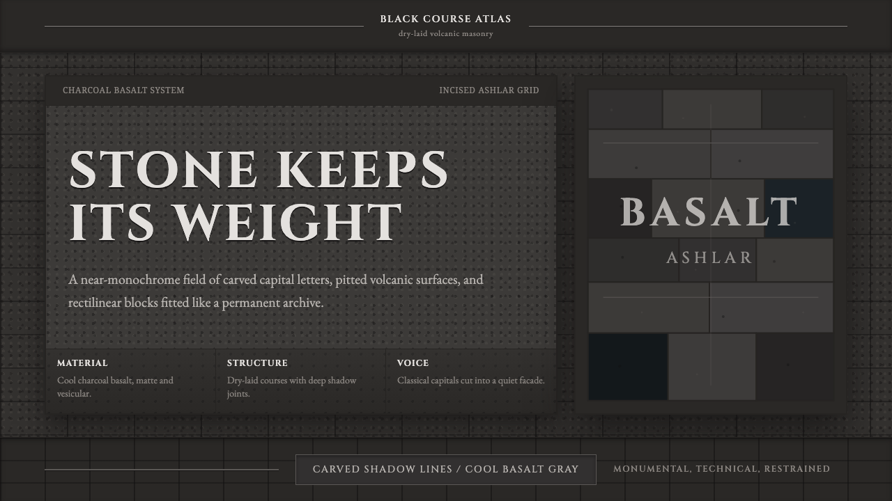 Hauran Basalt StoneMonolith refuses shine. Charcoal Cinzel capitals lock into dry-laid basalt gr…
 Inca Ashlar StoneworkStone becomes the page. Granite-gray planes lock into hairline ashlar seams.
 On Growth and FormMathematics in mourning cloth. Navy ground, gilt rules, Garamond type, hairli…