What is Bentley Snowflake?
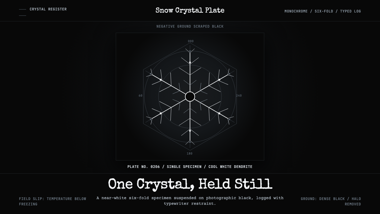
Bentley Snowflake is a design system distilled from a single obsessive act: a Vermont farmer who spent forty years pressing ice crystals onto glass slides, scraping the photographic negative to pure black, and numbering each plate by hand. The result is not minimalism — it is specimen science given aesthetic form: clinical, centered, crystalline, and utterly without color.
Bentley Snowflake in brief
Bentley Snowflake is a dark-ground design system modeled on the photomicrographic plates of Wilson A. Bentley, a self-taught farmer-scientist from Jericho, Vermont, who photographed snow crystals between 1885 and 1931. His method — catching individual flakes on black velvet, exposing them under a microscope, then scraping the photographic negative so the background became dense, matte black — produced images of startling clarity: cool near-white dendrites suspended in absolute darkness.
The aesthetic consequence is a system of extreme contrast and radical restraint. No color is admitted; the entire palette runs from photographic black through a graduated ladder of grays to the cold near-white of an ice dendrite. Hexagonal symmetry governs all ornamental decisions — six-fold geometry is not decoration but biological fact reproduced faithfully. Typewriter monospace carries every caption and label, evoking the annotation conventions of scientific fieldwork rather than the conventions of commercial typography.
Where most dark-background design systems work by imposing drama, Bentley Snowflake works by imposing discipline. Everything is centered, everything is numbered, everything is presented as if for inspection. The emotional register is not warmth or energy but rarity — the sense that what you are looking at is singular, documented, and irreproducible.
Where does Bentley Snowflake come from?
Wilson Alwyn Bentley was born in 1865 on a farm in Jericho, Vermont, a town that receives some of the heaviest snowfall in New England. As a teenager he received a microscope from his mother and became fascinated by the geometry of ice crystals, attempting to draw what he saw before the crystal melted. In 1885, at age nineteen, he attached a bellows camera to his microscope and made the first-ever successful photomicrograph of a snow crystal — a technical feat that required working outdoors in near-freezing temperatures, moving with great speed before the flake sublimated, and achieving precise focus with no autofocus and no instant feedback.
Bentley's method of scraping the photographic negative — using a fine tool to remove the silver emulsion from the background, leaving it clear to print as dense black — was his own invention. The result was a background of unusual optical density, far deeper than a simple underexposure could produce, which made the delicate white crystalline structures read with exceptional precision. He called these 'snow pictures' and spent decades giving them away to scientists, artists, and curious visitors. In 1931, the year he died, the American Meteorological Society published 'Snow Crystals,' a collection of 2,400 of his photographs, establishing a visual vocabulary for ice geometry that has never been superseded.
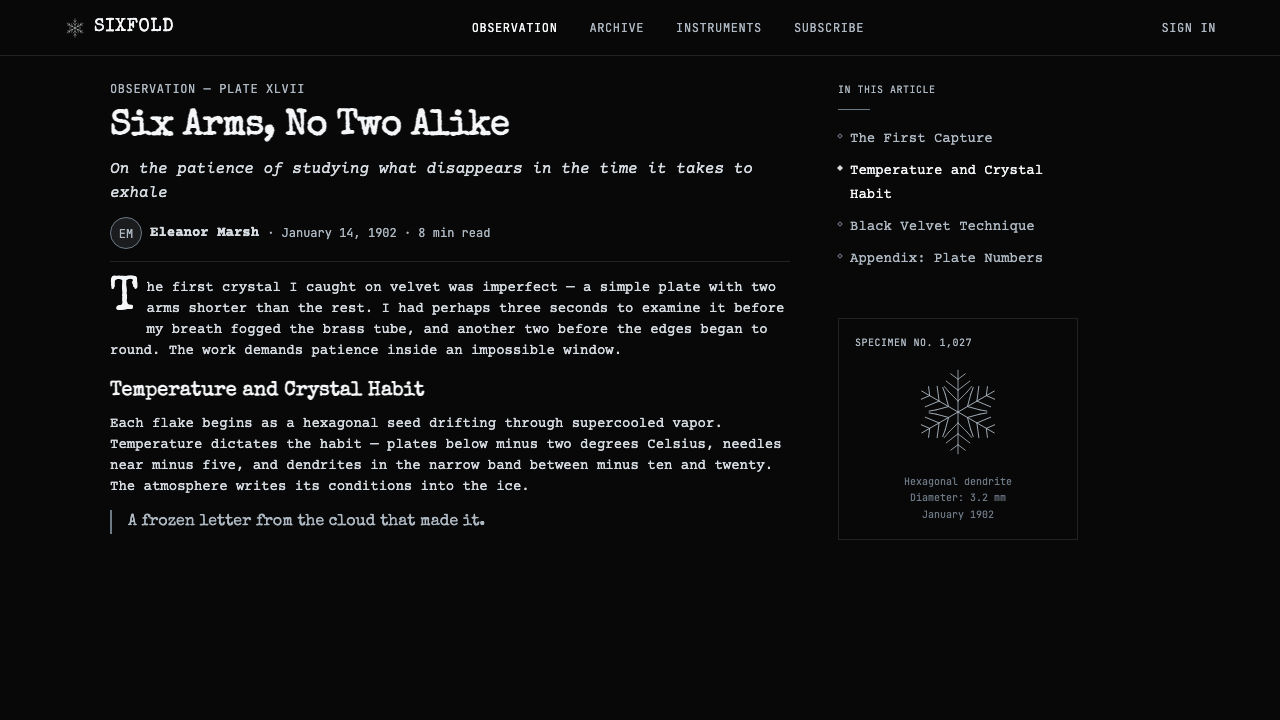
The era Bentley worked in — the decades surrounding 1902, when his photomicrographic technique reached maturity — was a period when scientific illustration was itself undergoing a transformation. Photography was replacing hand-drawn engraving as the medium of scientific record, but the conventions of scientific illustration persisted: centered compositions, sequential numbering, annotation in a neutral typeface, absence of background narrative. Bentley absorbed and embodied these conventions instinctively. His plates look like instrument readings because, in a real sense, they are.
The design system named for him abstracts this methodology: the black ground is kept, the centered specimen placement is kept, the hexagonal geometry is kept, the typewriter annotation is kept. What is added is systematization — the translation of an individual scientist's working method into a transferable visual grammar that can be applied to interfaces, presentations, and typographic systems without losing the core quality of rarefied, documented singularity.
What defines the Bentley Snowflake look?
Color — or the Absence of It
The system is strictly achromatic. The full tonal range runs from dense photographic black — the result of manually scraped negative emulsion — through a controlled ladder of cool grays to a near-white that reads as cold rather than warm. This is not the warm off-white of archival paper or linen but the specific temperature of ice: light that seems to emit rather than reflect. Introducing any chromatic hue, however desaturated, immediately breaks the clinical register that the system depends on.
Hexagonal Symmetry
All ornamental geometry in the system is grounded in six-fold symmetry — the crystallographic structure that governs the growth of ice. This is not aesthetic choice in the conventional sense; it is fidelity to the source material. Snowflakes grow along six axes because of the molecular geometry of water at freezing temperatures, and Bentley's photographs document this structural law with perfect fidelity. When the design system borrows hexagonal geometry, it is borrowing something earned by nature rather than invented by a designer.
Centered Specimen Presentation
Every primary element is centered within its frame — the crystal on the plate, the number below it, the caption beneath that. This centering is not the classical centering of formal typography but the functional centering of scientific specimen layout: the object being examined must be positioned for inspection, free of any competing visual gravity. The centering communicates that what is shown is unique, that it has been isolated for viewing, and that the ground around it is not emptiness but context — the black of the photographic background.
Typewriter Annotation
All text in the system is set in a monospace typeface that evokes the typewriter notation Bentley used to caption and number his plates. Monospace in this context does not signal code or terminal output — it signals the annotation conventions of scientific fieldwork: the typewriter was the instrument of neutral, reproducible record-keeping, the typographic equivalent of a specimen label. The typeface's evenness of stroke and fixed-width character spacing imply objectivity rather than expression, documentation rather than decoration.
Negative Space as Scientific Ground
The black ground in Bentley's plates is not absence — it is presence. It is a deliberately prepared photographic surface, scraped clean to receive the white impression of the crystal without contamination from the emulsion's grain. In the design system, this translates to a background that must be treated as a material in its own right: not a canvas to be filled but a prepared ground against which specimens appear. Generous negative space is not luxury — it is the condition of visibility.
Serial Numbering and Indexical Logic
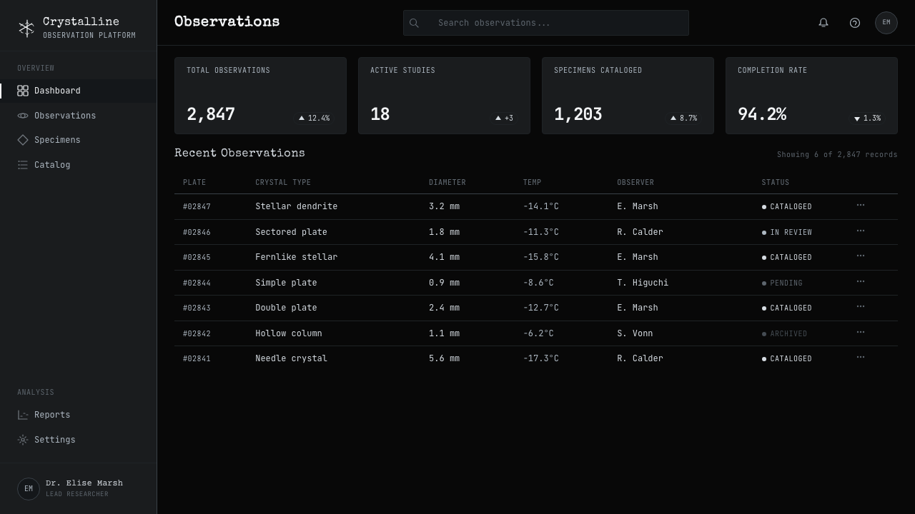
Bentley numbered each of his plates by hand, often in ink, creating a serial archive rather than a curated collection. This indexical logic — the sense that each item belongs to a numbered sequence, that there are others before and after it — is carried into the design system through the consistent use of numbering, sequencing, and archival notation. Elements feel catalogued. The visual vocabulary implies that what is shown is one specimen among many, each equally documented, each equally unique.
Tonal Gradation as Structure
Without color to create hierarchy, the system relies entirely on luminosity. The progression from dense black through mid-gray to near-white carries all the work of organizing visual priority. Dark areas recede and create ground; lighter areas advance and define specimen. Mid-grays serve as structural elements — borders, rules, secondary annotation — positioned between the pure poles. The system's tonal discipline is demanding: introduce too many gray values and the clinical clarity dissolves; collapse too many into the same level and the hierarchy disappears.
Who shaped Bentley Snowflake?
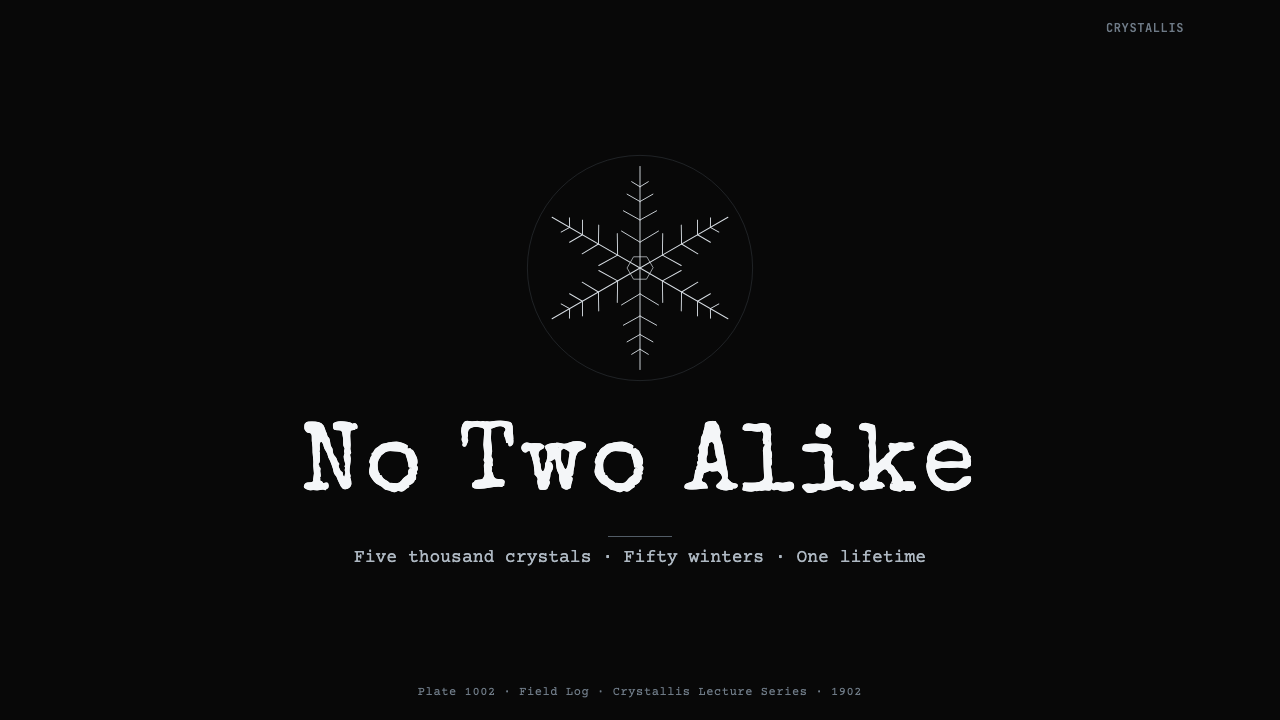
Bentley was a self-taught farmer-scientist who, between 1885 and his death in 1931, photographed more than five thousand individual snow crystals, each documented with a plate number and frequently annotated with its date and conditions of capture. He worked without institutional support or scientific training, developing his photomicrographic technique through trial and error in an unheated woodshed attached to his farmhouse. His life's work, published posthumously as 'Snow Crystals' (1931), remains the most comprehensive photographic survey of ice crystal morphology ever assembled, and his plates are still reproduced in scientific and design contexts more than ninety years after his death.
Published by McGraw-Hill in the year of Bentley's death, 'Snow Crystals' contains 2,453 photomicrographs selected from his archive of more than five thousand plates. The book's design — monochrome plates arranged in sequence, each numbered, each surrounded by the same dense black ground — established the visual grammar that the design system derives from. It was simultaneously a scientific document and an accidental design system: every page observes the same compositional rules, uses the same typographic annotation conventions, and treats each image as a specimen in an ongoing series.
Bentley worked within a broader tradition of late-nineteenth-century scientific photomicrography — the practice of attaching cameras to microscopes to document specimens that the human eye could not examine with sufficient precision or speed. This tradition, which also encompassed the photomicrography of diatoms, pollen, bacteria, and mineral sections, established the visual conventions that Bentley inherited and extended: black grounds, centered specimens, sequential numbering, caption-below annotation, and the suppression of any element that might suggest the photographer's personality or artistic intention. The design system inherits these conventions wholesale.
Bentley spent his entire life in Jericho, Vermont, and the Jericho Historical Society preserves and manages access to his original plates, papers, and equipment. The institution's stewardship of the archive means that Bentley's visual methodology is documented not just through reproduction but through primary material — the glass plates themselves, the handwritten ledgers, the correspondence with scientists and artists who requested prints. The archive remains a living reference point for researchers and designers working with the aesthetic he established.
How do you use Bentley Snowflake today?
Applying Bentley Snowflake correctly requires understanding that it is a system of exhibition, not expression. Every element should feel as though it has been isolated for examination — placed on a prepared ground, labeled, and numbered. This is a radically different stance from most design systems, which aim to create atmosphere or emotional resonance. The goal here is not warmth or invitation but the specific kind of authority that comes from scientific documentation: this is real, this is unique, this has been recorded.
For presentation slides, the system works best for material that benefits from the sense of rarity and careful documentation. A cover slide should center a single dominant element — a product, a data visualization, an image — against a dense black ground, with the title set in typewriter monospace below it and a plate number or date in a smaller weight above. Content slides should resist the temptation to fill space: generous negative space is not wasted space but the condition of the system's authority. Data visualizations translate naturally — charts and graphs become specimens on a black ground, with axes and labels rendered in monospace and values appearing as cool near-white forms against the dark field.
For web interfaces, the system is best suited to contexts that are genuinely archival, curatorial, or scientific in nature — a portfolio, a data explorer, a documentation site, a design library. The approach demands a dark background throughout, with content elements centered or carefully positioned against the ground rather than arranged in the flowing left-to-right grid logic that most web layouts assume. Navigation should be sparse and typographic — text labels only, in monospace, without icon decoration. Any interactive element — a button, a link state, a hover effect — should feel like a laboratory instrument responding to input, not a commercial interface beckoning the user.
For editorial and marketing applications, Bentley Snowflake is a strong but narrow tool. It works exceptionally well for luxury products whose value proposition centers on rarity and craftsmanship, for scientific or technical brands that want to communicate precision and rigor, and for cultural institutions dealing in archives or collections. It works poorly for anything requiring warmth, accessibility, or popular appeal — the clinical register actively works against friendliness. Marketing materials using this system should lean into its particularity: a single specimen, documented. Resist the impulse to add more.
The most common mistake when applying this system is treating the dark background as a design choice rather than a structural commitment. Practitioners often apply the black ground to hero sections or cover slides and then abandon it for lighter backgrounds in body content, creating a tonal inconsistency that undermines the system's logic entirely. In Bentley Snowflake, the dark ground is not a mood — it is the prepared surface that makes the white crystalline forms legible. Once you commit to the ground, you must maintain it. A second frequent error is adding any chromatic color — even a single accent — which immediately collapses the achromatic system's carefully constructed tonal hierarchy and signals that the designer did not understand why the system works.
Bentley Snowflake — FAQ
Is Bentley Snowflake only suitable for dark-background designs?
Yes, and this is a structural requirement rather than a stylistic preference. The system's entire visual logic depends on the behavior of near-white crystalline forms against a dense black ground — the same optical relationship Bentley created by scraping his photographic negatives. Inverting to a light background changes not just the color but the fundamental spatial relationship: a dark dendrite on white reads as drawing or silhouette, not as specimen illuminated from within. Designers who want a monochrome system with light backgrounds should look elsewhere; this system is committed to the dark ground as its organizing principle.
How does Bentley Snowflake differ from other dark monochrome design systems?
Most dark monochrome systems achieve their effect through drama — high contrast, aggressive use of white space as weight, bold typography as punctuation. Bentley Snowflake achieves its effect through documentation. The difference is in the posture: drama makes claims, documentation reports. The system's specific choices — centered placement, typewriter monospace, hexagonal ornament, serial numbering — all reinforce the sense of scientific record rather than artistic statement. A layout in this system should feel like a plate from a natural history atlas, not like a luxury brand campaign or a tech startup landing page.
Can the hexagonal motif be used freely, or are there rules about when it appears?
The hexagonal motif should be used with the same restraint that Bentley applied to his subjects: it appears when the structure demands it, not as decoration. In the system, hexagons are appropriate as primary compositional anchors — the container for a hero image, the shape of a key icon or badge — or as ornamental elements in borders and dividers where they reinforce the crystallographic reference. They become noise when used too densely or too freely, losing the quality of precision that makes them meaningful. Think of each hexagonal element as a documented specimen: place it with the care you would give to positioning a crystal on a glass plate.
What typefaces work within the Bentley Snowflake system?
The system requires monospace letterforms throughout — not as an accent or code-block treatment but as the primary typographic voice. The reasoning is functional: monospace evokes the typewriter annotation that Bentley used on his plates, and its even stroke weight and fixed character spacing reinforce the system's sense of neutral, objective record-keeping. Within monospace, a slightly condensed or neutral weight works better than ultra-bold or decorative variants. Proportional sans-serif type, serif type, and display faces all undermine the system by reintroducing design intent where the system's logic requires the absence of it.
Does the system work for branding and identity projects?
It works for a narrow but well-defined category of brands: those whose identity is built on documented singularity, scientific authority, or archival precision. Examples might include a scientific instrument manufacturer, a natural history museum, a luxury watchmaker whose communication centers on the mechanism rather than the lifestyle, or a data analytics product whose differentiator is precision rather than accessibility. It does not work for brands whose identity depends on warmth, optimism, color, or popular appeal. The achromatic constraint alone eliminates most consumer categories. Used correctly for the right brand, however, Bentley Snowflake produces an identity that is immediately distinctive and almost immune to trend — because it is grounded in natural law rather than aesthetic fashion.
Related design styles
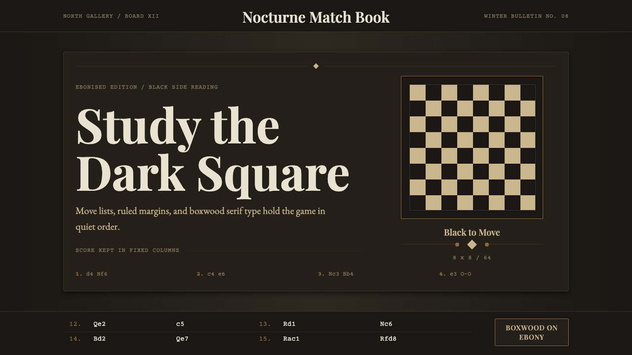 Chess TournamentQuiet intellect. Cream Playfair type, walnut rules, and notation glow on ebon…
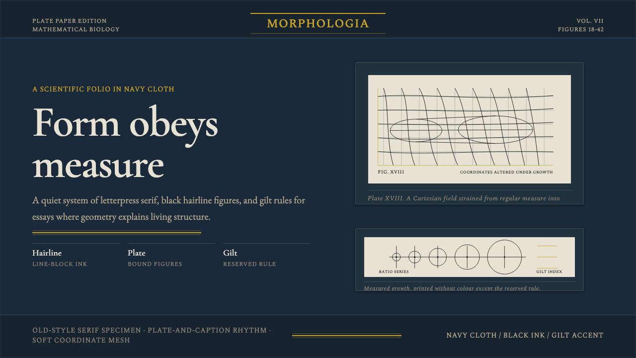 On Growth and FormMathematics in mourning cloth. Navy ground, gilt rules, Garamond type, hairli…
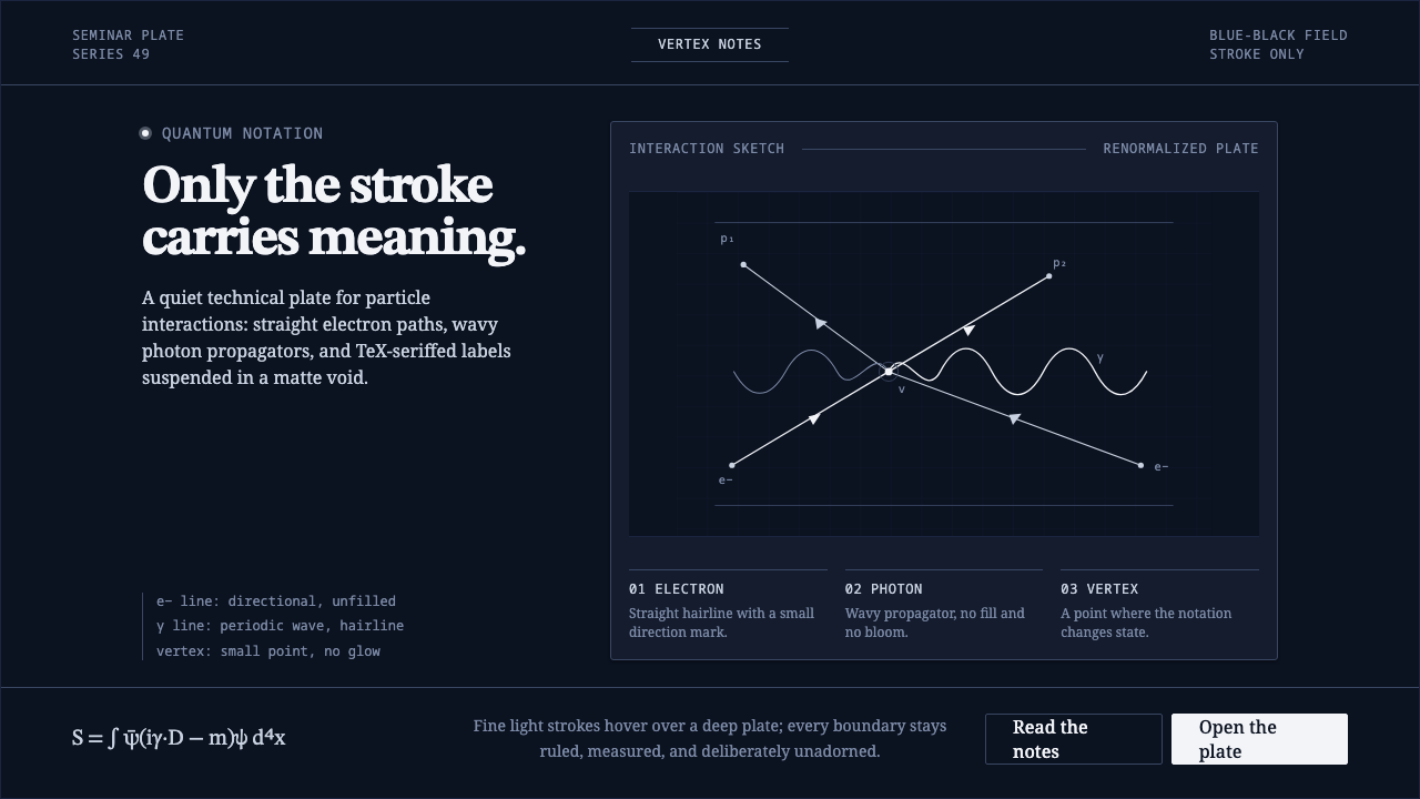 Feynman Diagram QEDMeaning reduced to strokes. Pale QED lines and TeX serif type float on blue-b…
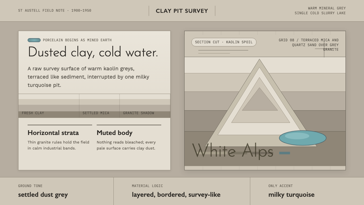 Kaolin Porcelain Clay PitIndustrial calm in dust grey. Horizontal clay strata break for one milky turq…
 Shark Jaw & DentitionForensic and strictly greyscale. Bone-white serrated dentition floats on a co…
 Armenian Vishapakar Dragon StoneAncient, cold, unmoved. Basalt gray slabs, incised grooves, sparse olive lich…