Design style guide设计风格指南
What is Bahraini Pearl Diving Grey?什么是 Bahraini Pearl Diving Grey?
Before oil reshaped the Gulf, Bahrain's wealth rose from the sea floor in the form of natural pearls — and the visual culture that surrounded that trade left behind a haunting aesthetic of nacre grey, deep-night navy, and the singular warmth of an oil lamp burning below deck.在石油重塑海湾之前,巴林的财富从海底升起,以天然珍珠的形态现身——围绕这一贸易而生的视觉文化,留下了一种令人难忘的美学:珍珠母灰、深夜蓝,以及甲板下油灯燃烧时那一缕独特的暖光。
Bahraini Pearl Diving Grey in briefBahraini Pearl Diving Grey 速览
Bahraini Pearl Diving Grey is a design language drawn directly from the material culture of the Arabian Gulf's pearling era — a period spanning roughly the 1830s through the collapse of the natural pearl market in 1932. Its visual identity is built around the tones and surfaces that defined life aboard a pearl diving vessel: the matte silvered grey of a nacre shell held against Gulf-night sky, the almost-black of deep seawater seen from above, and the single amber warmth of an oil lamp that served as the sole light source across long nights anchored offshore.巴林珠母灰是一套直接从阿拉伯湾采珠时代物质文化中提炼的设计语言——那个时代大约从1830年代延续至1932年天然珍珠市场崩溃。它的视觉身份建立在采珠船上生活所定义的色调与质地之上:贝壳珍珠母灰面映着海湾夜空的哑光银灰,从水面俯视时深海的近乎纯黑,以及停泊近海的漫长夜晚里作为唯一光源的油灯发出的那一抹琥珀暖光。
The aesthetic is documentary in spirit rather than decorative. It does not idealize or romanticize the hardship of the dive season — it observes it. The ledger pages of the tawwash merchants, the ink-black text of the chettab debt contracts, the ruled grids of the accounts recording the season's harvest: these are the design objects at the heart of the system. Restraint is not a stylistic choice but an economic and environmental reality carried forward into visual form.这套美学在精神上是纪实性的,而非装饰性的。它不美化、不浪漫化潜水季节的艰辛——它只是观察。珠宝商人(tawwash)的账簿页面、chettab债务合约上的墨黑文字、记录当季收成的栏线网格:这些是整套系统核心的设计对象。克制不是风格选择,而是一种经济与环境现实被转化为视觉形态的结果。
What distinguishes this system from other dark, moody palettes is its specific cultural grounding. The grey is not the grey of fog or concrete or corporate neutrality — it is the grey of nacre, the iridescent inner surface of the pearl oyster shell, caught in the moment before dawn when the diving fleet prepares to lower anchor. The warmth that punctuates the darkness is not generic amber but the particular quality of an oil lamp flame in high humidity, slightly softened at its edge, never fully sharp.区别这套系统与其他深色忧郁色板的,是它特定的文化根基。这里的灰不是雾气、混凝土或企业中性的灰——它是珍珠母的灰,珍珠贝壳内表面的那种晕彩,在潜水船队准备下锚的黎明前一刻被捕捉到的色泽。刺破黑暗的暖色也不是泛泛的琥珀色,而是高湿度下油灯火焰那种特定的光质——边缘略微柔化,从不完全锐利。
See the Bahraini Pearl Diving Grey design system →查看 Bahraini Pearl Diving Grey 完整设计系统 →
Where does Bahraini Pearl Diving Grey come from?Bahraini Pearl Diving Grey 从何而来?
Bahrain's pearling industry was one of the oldest and most economically consequential in the world. The island's coastal waters sat above some of the richest oyster beds in the Arabian Gulf, and the trade they supported predated Islam, predated the Portuguese arrival in the Gulf in the sixteenth century, and predated British influence in the nineteenth. At the industry's peak in the early twentieth century, more than four hundred vessels sailed from Muharraq each summer, crewed by upward of thirty thousand men — roughly half the island's population. The visual culture produced by this industry was not fine art but operational documentation: manifests, contracts, debt registers, navigational charts, the tar-caulked geometry of hull construction.巴林的采珠业是世界上最古老、经济影响最深远的产业之一。该岛沿海水域之下坐落着阿拉伯湾最丰饶的牡蛎床,围绕它建立的贸易早于伊斯兰教,早于十六世纪葡萄牙人进入海湾,也早于十九世纪英国的影响。二十世纪初全盛期,每年夏季从穆哈拉格出发的船只超过四百艘,船员多达三万余人——约占全岛人口的一半。这一产业所产生的视觉文化并非纯艺术,而是操作性文献:舱单、合约、债务登记册、航海图,以及焦油填缝的船壳几何结构。
The tawwash — the licensed pearl merchant who sailed with the fleet and graded pearls at sea — kept ledgers whose visual language was austere by necessity. Ink was conserved. Every entry was written in compressed script against hairline ruled grids. The quality of the page surface — matte, slightly textured, the colour of unbleached cloth — became the ground against which all commerce was conducted. These ledger pages are among the few surviving visual records of the pre-oil Gulf economy, and their aesthetic is the direct ancestor of Bahraini Pearl Diving Grey.珠宝商(tawwash)——随船出航、在海上对珍珠分级的持牌商人——出于必要而保持账簿视觉语言的极度俭省。墨水被节约使用。每一条目都以压缩字迹写在发丝般细的栏线网格上。页面质地——哑光、略有纹理、未漂白亚麻布的颜色——成为所有商业往来展开的底面。这些账簿页面是海湾前石油时代经济为数不多的幸存视觉记录,其美学是巴林珠母灰的直接祖先。
The collapse of the industry came quickly and from an unexpected direction. Beginning in the late 1920s, Japanese cultured pearls — grown deliberately by inserting an irritant into a live oyster and farming the result — flooded the international market at a fraction of the price of natural Gulf pearls. By 1932, the Gulf pearl trade had effectively ended. The Great Depression accelerated the collapse. Bahrain's subsequent oil discovery in 1932 redirected the island's economy entirely, but the cultural memory of the pearling era remained alive in the architecture of Muharraq, in oral tradition, and in the documentary photography of the period.产业的崩溃来得迅速,且从一个意想不到的方向袭来。1920年代末开始,日本养殖珍珠——通过向活牡蛎体内植入刺激物人工培育——以天然海湾珍珠的极小部分价格涌入国际市场。到1932年,海湾珍珠贸易已实际终结。大萧条加速了这一崩溃。巴林随后在1932年发现石油,经济彻底转向,但采珠时代的文化记忆仍然留存于穆哈拉格的建筑、口述传统,以及那个时代的纪实摄影之中。
The modern revival of interest in the pearling aesthetic is associated with the Bahrain Pearling Path, a UNESCO World Heritage designation granted in 2012. The Pearling Path encompasses seventeen merchant houses, four mosques, the seafront, and the remaining oyster beds — a preserved circuit through which the full social and economic logic of the pearling era can be traced. Alongside this heritage effort, designers and institutions led by figures including Sheikha Mai bint Mohammed Al Khalifa and textile designer Khaled Al Hashimi have worked to articulate a contemporary Khaleeji visual language rooted in authentic Gulf material culture rather than generalized Arabian ornament.对采珠美学的现代复兴兴趣,与2012年获得联合国教科文组织世界遗产认定的巴林采珠路径密切相关。采珠路径涵盖十七座商人宅邸、四座清真寺、海滨地带以及现存的牡蛎床——一条可以追溯采珠时代完整社会与经济逻辑的保存回路。与这一遗产工作并行,以谢赫迈·宾特·穆罕默德·阿勒哈利法和纺织设计师哈立德·阿尔哈希米为代表的设计师与机构,致力于阐明一种扎根于真实海湾物质文化而非泛化阿拉伯装饰的当代海湾视觉语言。
What defines the Bahraini Pearl Diving Grey look?Bahraini Pearl Diving Grey 的视觉特征是什么?
Surface Tone底面色调
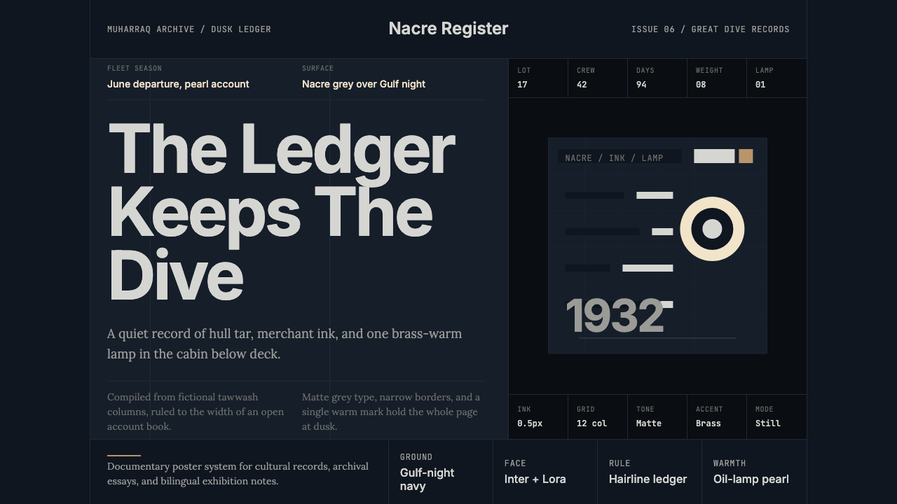
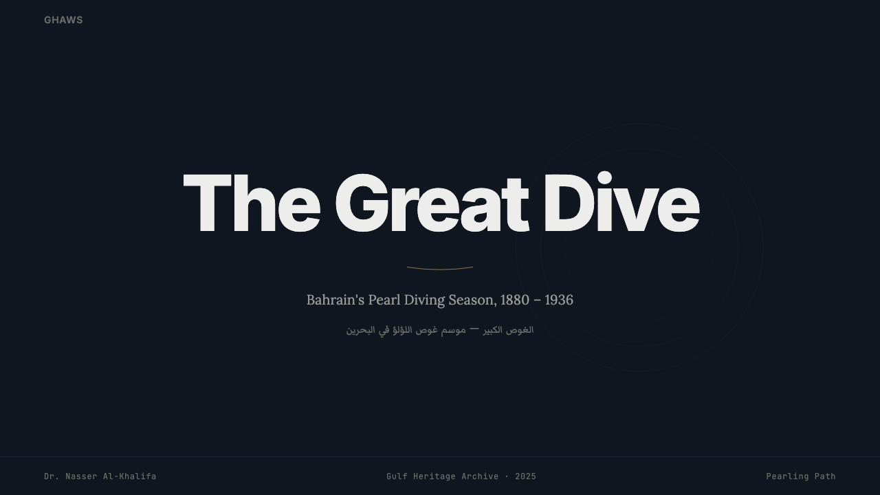
The dominant ground is a deep Gulf-night navy — not the blue of daytime sea, but the near-black of open water after sunset, still holding a trace of blue within its depth. Against this, the secondary surface is the matte silvered grey of nacre: the inner lining of the pearl oyster shell, luminous but never glossy, occupying the range between pale ash and the lightest reflection of moonlight on water. Together, these two tones define the night-aboard-a-vessel quality that makes the system immediately distinctive.主导底面是深海湾夜蓝——不是白昼海洋的蓝,而是日落后开阔水面近乎纯黑的色泽,深处仍保有一丝蓝的痕迹。与之对照的,是珍珠母的哑光银灰:珍珠贝壳的内衬,有光泽却绝不发亮,占据浅灰与月光水面最浅反光之间的音域。这两个色调共同定义了船上夜晚的气质,使这套系统一眼可辨。
Accent Warmth暖色点睛
A single brass-warm accent cuts through the coolness of the primary palette. This is not decorative gold — it carries the specific quality of an oil lamp burning in a maritime context: slightly orange at its core, cooling toward amber at its edge, never yellow enough to read as cheerful. It is used with extreme restraint, appearing as a highlight on a key data point, a navigational indicator, or the edge of an interactive element. Its rarity is its strength; repeated, it loses the sense of a lamp in darkness and becomes mere decoration.一抹黄铜暖色刺破主色板的清冷。这不是装饰性的金——它承载着海上油灯燃烧时的特定质感:核心略带橙色,向边缘冷却为琥珀,从不够黄到让人感到欢快。它被极度克制地使用:作为关键数据点的高亮、导航指示符,或交互元素的边缘。它的稀少即是它的力量;一旦重复,黑暗中油灯的感觉便消失,沦为单纯的装饰。
Grid Discipline网格纪律
The structural logic of the tawwash ledger — hairline ruled grids, carefully preserved white space, every entry occupying its allotted column — translates directly into the system's compositional approach. Lines are fine and precise, never bold or decorative. The grid is visible only as constraint, not as graphic texture. Columns align strictly, and the space between entries carries as much weight as the entries themselves. This is accounting logic applied to layout, and it produces a quiet authority that bolder systems cannot replicate.珠宝商账簿的结构逻辑——发丝般细的栏线网格、精心保留的空白、每条目占据其分配的栏位——直接转化为这套系统的构图方式。线条纤细精准,从不粗重或具有装饰性。网格只以约束的形式呈现,而非图形质地。列严格对齐,条目之间的空白与条目本身同等重要。这是会计逻辑应用于版面,产生出更大胆的系统无法复制的安静权威。
Typographic Register字体音调
Type in this system occupies a narrow tonal range: ink black against the nacre grey surface, or nacre grey against the deep-night navy ground. Scale, not color, establishes hierarchy — a lead figure or heading is set large, body text small, with the proportion between them drawn from the economy of the ledger page rather than from contemporary typographic convention. Decorative variation in letterform is absent; the emphasis is always on the quality of the text block as a whole, its weight and density against the field around it.这套系统中的字体占据狭窄的色调区间:墨黑置于珍珠母灰底面,或珍珠母灰置于深夜蓝底面。尺度而非色彩建立层级——主标题设置为大,正文设置为小,两者之间的比例来自账簿页的经济逻辑,而非当代排版惯例。字形的装饰性变化缺席;强调永远落在文字块作为整体的质量上——它的重量与密度对抗周围的场域。
Material Restraint材质克制
The system avoids simulated texture, decorative pattern, and any reference to ornamental Khaleeji motifs — geometric tile, arabesque, muqarnas shadow — that might be expected in a Gulf-heritage context. The restraint is deliberate and documentarily accurate: the pearl trade's working visual culture was not decorative. Ornament belonged to the mosque, the merchant house, the formal occasion. The ledger, the hull, the diving contract were stripped of it entirely. Applying this system correctly means resisting the impulse to add cultural decoration to signal authenticity.这套系统避免模拟质地、装饰图案,以及任何可能在海湾遗产语境中被期待的装饰性海湾母题——几何瓷砖、阿拉伯式花纹、穆卡纳斯投影。这种克制是刻意的,也是纪实上准确的:珍珠贸易的工作视觉文化本就不具装饰性。装饰属于清真寺、商人宅邸、正式场合。账簿、船壳、潜水合约则彻底剥除了它。正确应用这套系统,意味着抵制通过添加文化装饰来标示真实性的冲动。
Light Logic光的逻辑
The single-lamp model governs how illumination is handled in the system. There is one light source, and it is warm, directional, and limited in its reach. Elements close to the metaphorical lamp are rendered with the full brass-warm accent; elements at distance fall toward the cool grey of the ambient surface. Gradients used to express this falloff, if used at all, are subtle and move only between adjacent tones — they do not span the full value range and they do not use the accent color as a gradient endpoint. The effect is of objects seen by lamplight, not under studio illumination.单灯模型支配着这套系统处理光线的方式。只有一个光源,它是暖的、有方向的、照射范围有限的。靠近这个隐喻灯源的元素以完整的黄铜暖色呈现;距离较远的元素则退向周围底面的冷灰。若使用渐变来表达这种衰减,也是微妙的,只在相邻色调之间移动——不跨越完整的明度区间,也不以暖色作为渐变端点。效果是油灯下所见的物体,而非摄影棚灯光照射下的物体。
Silence as Content沉默即内容
Negative space in this system carries narrative weight. The wide margins and generous spacing between elements do not read as emptiness — they read as the open sea, as the silence of deep water, as the hours of waiting between dives. This is not arbitrary white space; it is the compositional equivalent of the diver's breath held in suspension. Overcrowding a layout removes the system's defining quality immediately. The restraint must be structural, not incidental, or the entire sensibility collapses into a generic dark interface.这套系统中的负空间承载叙事重量。元素之间宽阔的页边距与慷慨的间距,读起来不是空旷——而是开阔的海洋,深水的沉默,两次下潜之间等待的漫长时光。这不是随意的留白;它是潜水员屏住的那口气在版面上的对等物。一旦版面过于拥挤,这套系统的定义性品质便立刻消失。克制必须是结构性的,而非偶然的,否则整体气质便会坍缩为一个普通的深色界面。
See the Bahraini Pearl Diving Grey design system →查看 Bahraini Pearl Diving Grey 完整设计系统 →
Who shaped Bahraini Pearl Diving Grey?谁塑造了 Bahraini Pearl Diving Grey?
Among the most documented of the Gulf pearl merchants, Al Mosawi represents the tawwash class whose professional practice directly produced the documentary aesthetic at the heart of this design system. The tawwash sailed with the diving fleet, graded pearls at sea using trained eye and touch alone, and maintained the meticulous ledger records that are now among the few surviving primary visual documents of the pearling era. His class of merchants operated at the intersection of maritime life and commercial precision — an intersection that defines the system's character.作为记录最为详尽的海湾珍珠商人之一,Al Mosawi代表了珠宝商(tawwash)阶层,他们的职业实践直接催生了这套设计系统核心的纪实美学。珠宝商随潜水船队出航,仅凭训练有素的眼力与触感在海上对珍珠分级,并保存了如今成为采珠时代少数存世原始视觉文献的精细账簿记录。他所属的商人阶层活跃于海上生活与商业精准的交汇处——那个交汇处正是这套系统性格的定义所在。
The nawkhada — the captain of a pearl diving vessel — occupied the commanding position in the social and economic structure of the dive season. Captain Matar represents this figure: responsible for the vessel's navigation, the welfare of the crew, the management of debt relationships with the nakhuda financiers, and the daily decisions of where to anchor and how long to dive. The nawkhada's authority was both practical and symbolic — the one point of warmth and decision in the system's visual metaphor of a lamp amid deep water.纳赫达(nawkhada)——采珠船的船长——在潜水季节的社会与经济结构中占据主导地位。马塔尔船长代表了这一角色:负责船只的航行、船员的福祉、与资本方(nakhuda)债务关系的管理,以及每日在哪里下锚、潜水多久的决定。纳赫达的权威既是实际的也是象征性的——在这套系统以深水中油灯为意象的视觉隐喻里,他是那唯一的暖光与决策点。
As President of the Bahrain Authority for Culture and Antiquities, Sheikha Mai was the central figure behind the successful UNESCO World Heritage nomination of the Bahrain Pearling Path in 2012. Her institutional leadership brought together the preservation of physical sites, the documentation of oral histories, and the broader project of establishing a contemporary Khaleeji cultural identity grounded in documented material history rather than generalized heritage aesthetics. The UNESCO designation created the conditions under which the pearling era's visual culture could be studied, archived, and applied by contemporary designers.作为巴林文化与古迹局局长,谢赫迈是2012年巴林采珠路径成功获得联合国教科文组织世界遗产认定背后的核心人物。她的机构领导工作汇集了对物质场所的保护、对口述历史的记录,以及建立一种扎根于有据可查的物质历史而非泛化遗产美学的当代海湾文化身份的更广泛计划。联合国教科文组织的认定创造了条件,使采珠时代的视觉文化得以被当代设计师研究、归档并加以应用。
Al Hashimi is a Bahraini textile and material designer whose work has focused on recovering and recontextualizing the material aesthetic of the Gulf pearl trade — particularly its relationship to undyed and minimally processed natural materials, the geometry of the dhow hull and sail, and the documentary restraint of the trade's written records. His practice represents the design-facing dimension of the Khaleeji heritage revival: taking authenticated material culture as a starting point and developing from it a contemporary design vocabulary that belongs to the Gulf rather than importing generic international minimalism.阿尔哈希米是一位巴林纺织与材料设计师,其工作聚焦于恢复并再语境化海湾珍珠贸易的物质美学——尤其是它与未漂染或最低限度加工天然材料的关系、独桅帆船(dhow)船壳与风帆的几何结构,以及这一贸易书面记录的纪实性克制。他的实践代表了海湾遗产复兴面向设计的维度:以经过验证的物质文化为起点,从中发展出一套属于海湾自身的当代设计词汇,而非引进泛化的国际极简主义。
The photographers — many working for British Petroleum companies, commercial agencies, or the Bahraini government — who documented the final decades of the pearl diving industry produced the primary visual archive on which contemporary understanding of the era's aesthetic is based. Their photographs share consistent qualities: high contrast between the dark sea surface and the pale hull timbers, the reduced color range of natural materials, and the quiet compositional dignity of men at physical labor. These images, now held in archives in Bahrain, London, and Washington, constitute the most direct visual precedent for the Bahraini Pearl Diving Grey palette.二十世纪二三十年代为英国石油公司、商业机构或巴林政府工作的纪实摄影师,记录了采珠业最后几十年的影像,构成了当代理解这一时代美学的原始视觉档案。他们的照片有着一致的特质:深色海面与浅色船木之间的高对比度、天然材料缩减的色彩区间,以及从事体力劳动的人们安静而有尊严的构图。这些如今保存于巴林、伦敦和华盛顿档案馆的影像,是巴林珠母灰色板最直接的视觉先例。
How do you use Bahraini Pearl Diving Grey today?今天怎么用 Bahraini Pearl Diving Grey?
Bahraini Pearl Diving Grey is most effective in digital contexts where depth, restraint, and quiet authority are the intended experience — as opposed to energy, accessibility, or brightness. The system rewards patience: applied carefully across a product, it builds a coherent atmospheric world that feels researched and culturally specific rather than generically dark. Applied carelessly, it risks producing an interface that is simply dim, with insufficient contrast and no clear hierarchy.巴林珠母灰在数字语境中最为有效,前提是深度、克制与安静的权威是预期体验——而非活力、可及性或明亮感。这套系统回馈耐心:在产品中仔细应用,它能构建出一个连贯的氛围世界,感觉经过深入研究且具有文化特殊性,而非泛化的深色风格。粗心应用,则面临产出一个简单昏暗的界面的风险——对比度不足,层级不清。
For presentation slides, the system works best on cover and transition slides where the full atmospheric weight can be felt. A cover built on deep Gulf-night navy with nacre grey type and a single brass-warm accent on the title or a key figure has an immediate, almost cinematic presence. Content slides should shift to a lighter nacre grey ground with ink-black type to maintain legibility across varied projection environments — the pure deep navy ground is too dark for body text at small sizes in most projection settings. Data visualizations should use the nacre grey and navy as the chart background and grid lines, with the brass-warm accent reserved for the single most important data series or call-out figure.对于演示文稿,这套系统在封面与过渡幻灯片上效果最佳,能让完整的氛围分量被充分感知。以深海湾夜蓝为底、珍珠母灰字体、标题或关键数字使用单一黄铜暖色点缀的封面,具有即刻的、近乎电影般的存在感。内容幻灯片应转向较浅的珍珠母灰底面配墨黑字体,以在不同投影环境中保持可读性——纯粹的深夜蓝底面在大多数投影场景下,小字号正文的可读性过低。数据可视化应以珍珠母灰和夜蓝作为图表背景与网格线,黄铜暖色保留给单一最重要的数据系列或标注数字。
For web and dashboard interfaces, the system is well-suited to analytical tools, portfolio sites, and premium product pages where the user is expected to spend time reading and exploring rather than converting quickly. The key discipline: use the deep navy as the page background only for hero sections and full-width feature blocks; shift to the lighter nacre grey for content areas, cards, and sidebars. This prevents visual fatigue. The hairline grid approach translates directly to table and data grid components — thin dividers, generous cell padding, no bordered cards, no soft shadows.对于网页与仪表板界面,这套系统适合分析工具、作品集网站以及高端产品页面——用户预期在其中花时间阅读与探索,而非快速转化。关键纪律:深夜蓝仅用于英雄区块与全宽特性板块的页面背景;内容区域、卡片与侧边栏转向较浅的珍珠母灰。这可以防止视觉疲劳。发丝网格的方法直接转化为表格与数据网格组件——细分隔线、充裕的单元格内边距、无边框卡片、无软阴影。
For editorial and marketing contexts, the system handles long-form content well when the layout commits to a generous measure and open spacing. Chapter headers set large in nacre grey against navy create the ledger-page reading rhythm; body text in ink black on a nacre grey ground reads cleanly without the strain that pure white grounds can produce under extended reading. The brass-warm accent should appear no more than once per spread or page view — as a pull-quote marker, a section indicator, or an emphasis on a single critical figure.对于编辑与营销语境,当版面致力于慷慨的行宽与开放的间距时,这套系统能很好地处理长篇内容。章节标题在夜蓝底面上以珍珠母灰大字排版,营造账簿页的阅读节奏;正文以墨黑印在珍珠母灰底面,阅读清晰,没有纯白底面在长时间阅读下可能产生的视觉压迫。黄铜暖色在每个跨页或页面视图中出现不超过一次——作为引文标记、章节指示符,或对单一关键数字的强调。
The most common error when applying this system is reaching for pattern or decoration to signal 'Gulf heritage' — geometric tile, arabesque line, muqarnas-derived forms. These elements break the documentary logic of the system immediately. The historical visual culture this palette references was explicitly non-decorative. A second error is over-use of the brass-warm accent, which drains the system's sense of a single lamp in darkness and makes the palette read as generically warm-dark. The accent's power is entirely dependent on its scarcity.应用这套系统时最常见的错误,是通过图案或装饰来标示「海湾遗产」——几何瓷砖、阿拉伯式花纹、穆卡纳斯衍生形式。这些元素会立即打破系统的纪实逻辑。这套色板所参照的历史视觉文化是明确非装饰性的。第二个错误是过度使用黄铜暖色——这会消耗系统对黑暗中单一油灯的感知,使色板读起来只是泛泛的暖深色。暖色的力量完全依赖于它的稀少。
See the Bahraini Pearl Diving Grey design system →查看 Bahraini Pearl Diving Grey 完整设计系统 →
Bahraini Pearl Diving Grey — FAQBahraini Pearl Diving Grey · 常见问题
Is this system appropriate for light-background interfaces, or is the dark palette essential?这套系统适合浅色背景界面吗?还是深色色板是不可或缺的?
The dark palette is the system's primary mode, and inverting it loses most of what makes it distinctive. The deep Gulf-night navy and nacre grey combination on a light ground reads simply as a generic cool-grey palette — the atmospheric weight that comes from darkness, the sense of lamplight in shadow, disappears entirely. A partial adaptation is possible: use the nacre grey as a page ground, ink black for type, and the brass-warm accent for call-outs. This reads as a quieter, more documentary aesthetic than full inversion but retains the system's restraint. Reserve the full dark mode for hero sections, modal overlays, and contexts where the immersive quality is appropriate.深色色板是这套系统的主模式,反转它会失去大部分使其独特的特质。在浅色底面上,深海湾夜蓝与珍珠母灰的组合读起来只是一套普通的冷灰色板——来自黑暗的氛围重量、阴影中油灯的感知,完全消失。局部改编是可能的:以珍珠母灰作为页面底面,墨黑用于字体,黄铜暖色用于标注。这读起来比完全反转更安静、更具纪实感,同时保留了系统的克制。将完整深色模式保留给英雄区块、模态遮罩层,以及沉浸感适当的语境。
How is this system different from other dark Gulf or Middle Eastern design aesthetics?这套系统与其他深色海湾或中东设计美学有何不同?
Most contemporary Gulf-heritage design draws on architectural ornament — Islamic geometric tiling, arabesque, calligraphic flourish, muqarnas-derived shadow patterns. These elements are visually rich and culturally legible, but they reference the mosque, the palace, and formal civic culture. Bahraini Pearl Diving Grey references instead the working economy of the sea: ledgers, hulls, diving contracts, and the functional objects of maritime labor. It is documentary rather than ceremonial. The result is a system that does not look like standard 'Middle Eastern design' — it looks like evidence, like a record, like something that happened.大多数当代海湾遗产设计从建筑装饰中汲取灵感——伊斯兰几何瓷砖、阿拉伯式花纹、书法花饰、穆卡纳斯衍生的阴影图案。这些元素视觉丰富、文化可辨,但它们参照的是清真寺、宫殿与正式公民文化。巴林珠母灰参照的则是海洋工作经济:账簿、船壳、潜水合约,以及海上劳动的功能性器物。它是纪实性的,而非仪式性的。结果是一套看起来不像标准「中东设计」的系统——它看起来像证据,像记录,像某件真实发生过的事情。
Can the system accommodate color photography or illustration, or does imagery break the palette?这套系统能容纳彩色摄影或插图吗?还是图像会破坏色板?
Full-color photography is difficult to integrate cleanly because most contemporary images introduce saturation levels that sit outside the system's tonal range. The most successful approach is to treat any imagery as the Gulf documentary photographers treated their subjects: high-contrast, with desaturated midtones that allow the nacre grey and navy palette to remain dominant. Duotone processing — rendering images in the system's two primary tones — integrates photography completely. For illustration, the same logic applies: geometric, reduced to the system's tonal range, and stripped of any decorative line or pattern that would conflict with the documentary restraint.全彩摄影很难干净地融入,因为大多数当代图像引入的饱和度水平超出了这套系统的色调区间。最成功的方法是像海湾纪实摄影师对待拍摄对象那样处理图像:高对比度,中间调去饱和,使珍珠母灰与夜蓝色板保持主导。双色调处理——以系统的两个主色调渲染图像——可以将摄影完全融合。对于插图,同样的逻辑适用:几何化,简化至系统的色调区间,去除任何可能与纪实克制相冲突的装饰性线条或图案。
What makes the brass-warm accent work, and what makes it fail?是什么让黄铜暖色点缀有效,又是什么让它失效?
The accent works because of context: against the cool, dark ground, a single warm element carries enormous visual weight. The metaphor of an oil lamp in darkness is not just evocative — it is functionally accurate. A lamp works because the surrounding darkness makes its light significant. Multiply the lamps and the darkness disappears, taking the significance with it. Practically, this means the brass-warm accent should never appear on more than one element per visual unit, should never be used for body text or supporting information, and should never be used as a background color. It is a spotlight, not a flood. When it fails, it is almost always because it has been used too many times or at too large a scale.暖色点缀之所以有效,是因为语境:在冷色、深色的底面上,单一的暖色元素承载着巨大的视觉分量。黑暗中油灯的比喻不只是充满意蕴的——它在功能上也是准确的。油灯之所以有效,是因为周围的黑暗赋予了它的光以意义。灯多了,黑暗便消失,意义随之消失。在实践中,这意味着黄铜暖色在每个视觉单元中出现不超过一个元素,不用于正文或辅助信息,也不用作背景色。它是聚光灯,不是泛光灯。当它失效时,几乎总是因为被使用了太多次,或以过大的比例使用。
Is Bahraini Pearl Diving Grey suited to consumer-facing products, or is it better for professional and institutional contexts?巴林珠母灰适合面向消费者的产品吗?还是更适合专业与机构语境?
The system's restraint and documentary quality make it a stronger fit for professional, institutional, and high-consideration consumer contexts than for mass-market or impulse-purchase products. It performs well for premium financial services, archival platforms, heritage institutions, high-end portfolio sites, and analytical tools where the user relationship is characterized by trust and deliberation. In contexts that call for warmth, playfulness, or broad accessibility — mass-market retail, social media, entertainment, children's products — the system's deliberate coolness and quietness work against the product's goals. It is not a versatile baseline palette; it is a specific cultural and atmospheric register that must match the product's intended relationship with its users.这套系统的克制与纪实品质,使其更适合专业、机构与高度考量的消费者语境,而非大众市场或冲动消费产品。它在高端金融服务、档案平台、遗产机构、高端作品集网站以及分析工具中表现出色——在这些场景中,用户关系以信任与深思熟虑为特征。在需要温暖感、趣味性或广泛可及性的语境中——大众零售、社交媒体、娱乐、儿童产品——这套系统刻意的冷静与安静会对抗产品目标。它不是一套通用基础色板;它是一种特定的文化与氛围音调,必须与产品对用户所意图的关系相匹配。
Related design styles相关设计风格
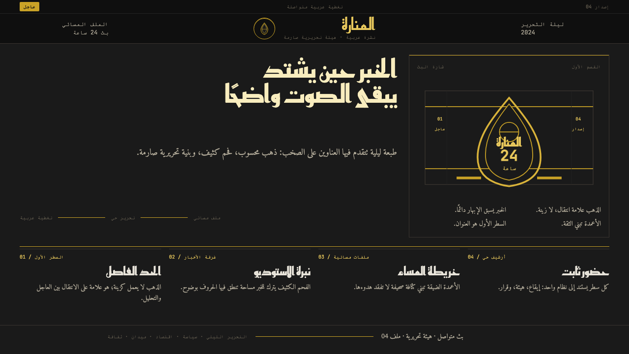 Al Jazeera Arabic NewsAuthority, stripped bare. Gold seal, dense Arabic type, matte charcoal.权威感被提纯。金色印章、密集阿文、炭黑底面构成画面。
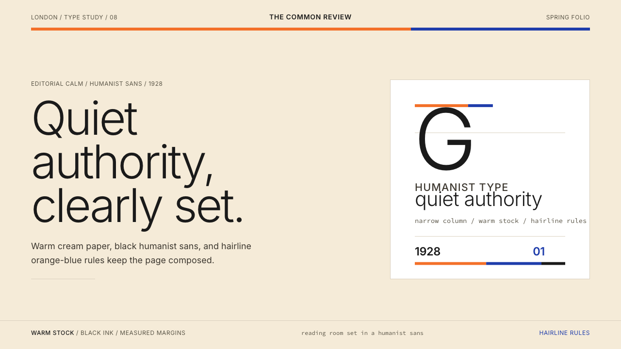 Gill Sans (BBC, 1928)Quiet authority, clearly set. Warm cream, black humanist sans, and hairline o…安静而权威。奶油底、黑色人文无衬线与橙蓝细线。
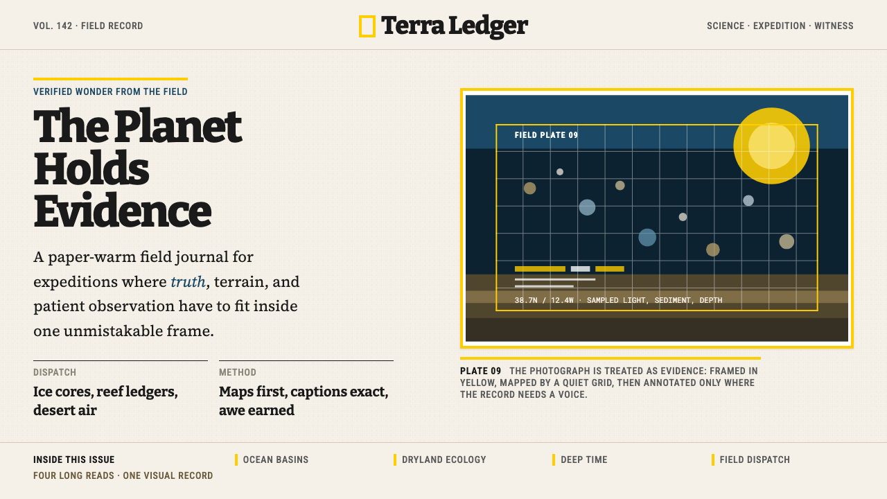 National GeographicAuthority frames wonder. Yellow border, Bitter slab type, and warm paper make…权威框住奇观:黄框、Bitter板衬线与暖纸底,让证据有史诗感。
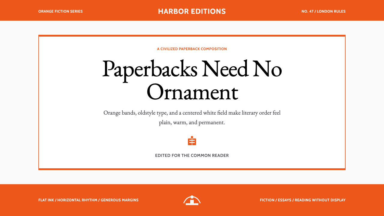 Penguin Classics OrangePaperback authority. Orange tri-bands, serif title panel, and flat ink enforc…平装书的权威感:橙色三段、衬线标题与平面油墨建立克制秩序。
 The New Yorker ClassicQuiet authority. Cream paper, EB Garamond columns, ink cartoons, and one red…沉静权威:奶油纸、EB Garamond 栏栅、墨线漫画与一抹红。
 TIME MagazineAuthority in a red rectangle. Didone masthead, black-white columns, and a 4px…红框即权威。Didone刊头、黑白栏栅与4px边框定调。