What is National Geographic?什么是 National Geographic?
The yellow border is not decoration — it is the oldest, most trusted frame in publishing history, and everything inside it must earn its place.那道黄色边框不是装饰——它是出版史上最古老、最值得信赖的框架,框内的一切都必须凭实力立足。
National Geographic in briefNational Geographic 速览
National Geographic is one of the most recognizable visual systems ever built around a single graphic element. The famous yellow border — a rectangular frame introduced in 1910 on the magazine's cover — has become so closely identified with authority, scientific rigor, and the beauty of the natural world that it functions less like a logo and more like a credential. When the border appears, it signals that what is inside has been verified, that it matters, and that it has been presented with care.国家地理是有史以来围绕单一图形元素构建的最具辨识度的视觉系统之一。那道著名的黄色边框——1910年首次出现在杂志封面上的矩形框架——与权威、科学严谨性以及自然世界的美丽如此紧密相连,以至于它的功能不像一个标志,更像一枚资质证书。当这道边框出现时,它传递的信号是:框内的内容已经过核实,它重要,并且经过了悉心呈现。
The design language that grew around that border is built on a deliberate tension: maximum photographic drama contained within maximum editorial restraint. Full-bleed imagery of extraordinary quality shares space with dense, authoritative body text set in slab-serif faces that feel both serious and warm. Color in the interface itself is minimal — the yellow is structural, used as a frame or a narrow accent rather than a field, and the grounds are warm off-white rather than clinical white. Chrome is stripped away so that the photograph — always the primary argument — is never competed with.围绕这道边框生长出来的设计语言,建立在一种刻意的张力之上:极致的摄影戏剧性,被极致的编辑克制所包容。非凡品质的满版影像,与以板状衬线字体排印的密实、权威正文共处一页——那种字体既严肃又温润。界面本身的色彩被压至最少:黄色是结构性的,用作边框或细窄的强调,而非大面积填色;底面是温暖的米白,而非临床感的纯白。所有多余的界面元素都被去除,使照片——永远是主要论点——不受任何竞争。
What distinguishes National Geographic's visual identity from other authoritative editorial brands is that restraint here does not mean coldness. The warm paper tones, the generous leading in body text, and the pairing of a rugged slab-serif headline voice with a highly readable text face all produce a register that feels both expert and inviting — the sensation of being guided through difficult or remote subject matter by someone who genuinely loves it.将国家地理视觉识别与其他权威编辑品牌区别开来的,是这里的克制并不意味着冷漠。温暖的纸感底调、正文中慷慨的行距,以及粗犷的板状衬线标题与高可读性正文字体的搭配,共同营造出一种既专业又平易近人的气质——就像一位真正热爱某一主题的向导,带领你穿越艰深或遥远的题材。
See the National Geographic design system查看 National Geographic 完整设计系统
Where does National Geographic come from?National Geographic 从何而来?
The National Geographic Society was founded in Washington, D.C., in January 1888 by a group of thirty-three explorers, scientists, and academics who wanted a formal institution for the promotion of geographical knowledge. The magazine launched the same year, initially as a dry academic journal with no illustrations. For the first two decades, it looked and read like a scholarly proceedings document — dense with text, sparing with images, and concerned primarily with scientific credibility rather than public appeal.美国国家地理学会于1888年1月在华盛顿特区由三十三位探险家、科学家和学者共同创立,旨在建立一个正式机构以推广地理知识。杂志同年创刊,最初是一本没有插图的枯燥学术期刊。在最初的二十年里,它的外观和内容都像一份学术会议文件——文字密集、图像稀少,首要关切是科学可信度,而非大众吸引力。
The pivotal transformation came under Gilbert Hovey Grosvenor, who became editor in 1899 and would shape the magazine's voice and visual direction for the next half century. Grosvenor believed that geographic knowledge was not the exclusive property of scientists — it belonged to the curious public — and that photographs were the most powerful instrument for conveying it. He faced institutional resistance: the Society's board initially objected to the extravagant use of imagery as insufficiently serious. Grosvenor persisted, and by the early 1900s National Geographic was publishing large, high-quality photographs of places and peoples that most readers would never visit in person. The readership grew rapidly, and with it the conviction that photography and scientific authority were not in conflict but mutually reinforcing.决定性的转变发生在吉尔伯特·霍维·格罗斯夫纳的主导下。他于1899年出任主编,并在此后半个世纪里塑造了杂志的声音和视觉方向。格罗斯夫纳相信,地理知识不是科学家的专属财产——它属于充满好奇心的公众——而摄影是传递它最有力的工具。他面临机构内部的阻力:学会董事会最初反对大量使用影像,认为这不够严肃。格罗斯夫纳坚持己见,到1900年代初,国家地理已在刊登大量高质量的地方与人物摄影,那些地方和人物是大多数读者永远不会亲自造访的。读者群迅速增长,随之而来的是一种信念:摄影与科学权威并不冲突,而是相互强化的。
The yellow border appeared on the cover in 1910, framing a photograph for the first time and establishing the template that would define the magazine for the rest of the century. The choice of a warm, saturated yellow was not accidental — it has high visibility on newsstands, reads at distance, and conveys warmth and energy without sacrificing the seriousness of the editorial content it contains. Over subsequent decades, the border became such a defining symbol that it was recognized by readers who had never seen the masthead text. The magazine's visual system evolved around protecting and reinforcing what the border signaled: trustworthiness, adventure, and the authority of direct observation.黄色边框于1910年出现在封面上,第一次将一张照片框住,并确立了此后整个世纪定义这本杂志的模板。选择温暖、饱和的黄色并非偶然——它在报摊上具有极高的可见度,可以远距离识别,传递温暖与能量,同时不损害其所包含的编辑内容的严肃性。在随后数十年间,这道边框成为如此决定性的符号,以至于从未见过刊头文字的读者也能认出它。杂志的视觉系统在保护和强化这道边框所传递的信号上不断演进:可信赖性、冒险精神,以及直接观察的权威。
The modern photographic era of National Geographic is inseparable from the careers of photographers like Steve McCurry, whose 1984 portrait of Sharbat Gula — the Afghan girl with the green eyes — became one of the most widely recognized magazine covers in publishing history, and David Guttenfelder, whose work from North Korea in the 2010s demonstrated that the brand's authority extended into some of the most restricted visual territories on the planet. These photographers and their peers did not simply document; they composed with an editorial rigor that made every frame feel both immediate and permanent. The design system's job was to receive that work and present it without diminishing it — a challenge the yellow border, the slab-serif typography, and the warm editorial grounds have met consistently across more than a century.国家地理的现代摄影时代,与史蒂夫·麦柯里等摄影师的职业生涯密不可分——麦柯里1984年拍摄的绿眼阿富汗女孩肖像,成为出版史上识别度最高的杂志封面之一;大卫·古滕费尔德在2010年代来自朝鲜的作品,则证明这个品牌的权威延伸至地球上视觉准入最受限制的地带。这些摄影师及其同行不只是记录,他们以编辑的严格性进行构图,使每一帧都既有即时感又有永久感。设计系统的任务是接收这些作品并呈现它们而不使其黯然失色——黄色边框、板状衬线排版以及温暖的编辑底调,在逾一个世纪的时间里始终如一地完成了这一挑战。
What defines the National Geographic look?National Geographic 的视觉特征是什么?
The Yellow Border黄色边框
The defining element of the entire visual system is the rectangular yellow frame used at the cover's perimeter and as a recurring structural accent throughout the brand. The yellow is warm and highly saturated — closer to a golden amber than a primary process yellow — and it is used exclusively as a line, a border, or a narrow band rather than a surface fill. Its structural role is to contain and to credential: whatever it surrounds is implicitly marked as verified and significant. When used as an accent inside layouts, it draws the eye to the element of highest editorial priority without competing with the photography.整套视觉系统的决定性元素,是用于封面四周及品牌内部反复出现的结构性强调的矩形黄色边框。这种黄色温暖而高度饱和——更接近金琥珀,而非印刷工艺上的标准原色黄——并且它被专门用作线条、边框或细窄色带,而非面积填色。它的结构性职能是包容与认证:凡是被它围住的内容,都隐含着已被核实、具有重要性的标记。当它作为强调色出现在版面内部时,它把视线引向编辑优先级最高的元素,同时不与摄影竞争。
Photography as Primary Argument摄影作为主要论点
Unlike design systems that treat photography as decoration or supporting evidence, National Geographic is built on the premise that the photograph is the primary argument and everything else — type, borders, white space, captions — exists to serve it. Imagery is used full-bleed when the composition warrants it, filling the entire available surface without margins. When cropped, photographs are cropped with editorial precision: framing tightens around the subject of maximum significance. The design never competes with the image by layering text or graphic elements over the most important areas of the frame.与将摄影作为装饰或辅助证据的设计系统不同,国家地理建立在一个前提之上:照片是主要论点,其他一切——文字、边框、留白、图注——都是为了服务于它而存在。当构图需要时,影像以满版方式使用,填满整个可用版面而无留白。裁切时,照片以编辑精确性进行裁切:画面收紧于最具重要性的主体周围。设计从不通过在画面最重要区域叠加文字或图形元素来与图像竞争。
Slab-Serif Authority板状衬线的权威感
The typographic register is anchored in slab-serif display faces for headlines and prominent labels — a category of letterform with thick, bracketed serifs that project authority, legibility at size, and a faint historical resonance with newspaper and scientific publication traditions. Body text is set in a highly readable serif with generous leading, creating density without fatigue. The overall typographic voice sits between the formal seriousness of academic publishing and the directness of longform journalism: knowledgeable but not forbidding, precise but not clinical.排版基调以板状衬线展示字体锚定于标题和突出标签——这一类字形具有粗厚的括弧式衬线,传递权威感、大号尺寸下的易读性,以及与报纸和科学出版传统相呼应的历史韵味。正文以高可读性的衬线字体排印,行距慷慨,在密实中不令人疲倦。整体排版气质介于学术出版的正式严肃与长篇新闻写作的直接之间:博学而不令人生畏,精确而不冷漠临床。
Warm Paper Ground温暖纸感底调
Where the background is not photographic, it is warm: an off-white that reads as aged paper or natural parchment rather than digital white. This ground temperature is one of the most important and most frequently overlooked aspects of the system. It gives the typography and the yellow accent a tactile, material quality that pure white would destroy. It also provides continuity with the magazine's print heritage — the sense that you are reading something that could exist as a physical object of weight and permanence, not a screen artifact. Applied to UI or presentation contexts, this ground immediately distinguishes the look from sterile digital minimalism.凡是背景非摄影区域,皆为温暖色:一种米白,读来像是陈年纸张或天然羊皮纸,而非数字白色。这种底调色温是整套系统中最重要、也最频繁被忽视的特征之一。它赋予排版和黄色强调色一种触感性、材质感,而纯白底色会破坏这一点。它同时与杂志的印刷传统保持连续性——那种感觉是,你在阅读某种可以作为有重量、有永久性实物存在的东西,而非一个屏幕上的人工产物。应用于界面或演示场景时,这种底调立刻将其与无菌感的数字极简主义区分开来。
Controlled Color Economy受控的色彩经济
Outside the yellow of the border and the warmth of the ground, color in the National Geographic system comes primarily from photography rather than from the graphic layer. Interface and typographic elements are restricted to the yellow, near-black for text, and warm neutrals for backgrounds and dividers. This discipline prevents the graphic system from competing with the photographs, which carry their own complex and unpredictable color worlds. The restraint also has a concentrating effect: when yellow appears as a rule or a label accent against a warm-white field, it carries disproportionate visual weight relative to its surface area, making it an efficient signal.除边框的黄色和底调的温暖感之外,国家地理系统中的色彩主要来自摄影,而非图形层。界面和排版元素被限定在黄色、近黑色文字,以及用于背景和分隔线的温暖中性色之间。这种自律防止图形系统与携带自身复杂且不可预测色彩世界的照片竞争。这种克制还具有聚焦效果:当黄色作为细线或标签强调色出现在米白底面上时,它的视觉重量相对于其面积而言是不成比例的巨大,使其成为一种高效的信号。
Dense, Credentialed Captions密实、有信源的图注
Captions in the National Geographic system are not afterthoughts — they are editorial units in their own right. They run long by the standards of most publications, providing geographic context, scientific framing, and occasionally biographical or historical background that the image alone cannot supply. Typographically, captions sit in a size and weight that is clearly subordinate to body text but not dismissibly small; they are meant to be read, not scanned. This approach to captioning signals that the visual system respects the reader's curiosity and treats the photograph as the beginning of a story rather than its entirety.国家地理系统中的图注不是事后补充——它们本身就是编辑单元。按大多数出版物的标准,它们篇幅较长,提供地理背景、科学框架,偶尔还有图像本身无法独立呈现的传记或历史背景。在排版上,图注的字号和字重明显次于正文,但不会小到被忽视;它们是供人阅读的,而非供人扫描的。这种对图注的处理方式表明,视觉系统尊重读者的好奇心,并将照片视为一个故事的开始,而非全部。
Grid Discipline with Breathing Room有呼吸空间的网格纪律
National Geographic layouts are organized on a consistent editorial grid, but the grid is used generously rather than with maximum density. Text columns are set at comfortable measures with adequate margins, and the space around photographs is treated as active — necessary room for the eye to rest before engaging with the next element. This contrasts with the maximally compressed layouts common in tabloid or commercial publishing. The sense of spaciousness is part of what communicates quality and seriousness: content that has been selected and curated does not need to compete for attention by crowding.国家地理的版面按一致的编辑网格组织,但网格的使用是慷慨的,而非最大化密度的。文字栏以舒适的行宽设置并保留充足的页边距,照片周围的空间被视为主动的——是眼睛在接触下一个元素之前需要休息的必要空间。这与小报或商业出版物中常见的最大压缩版面形成对比。这种空间感本身就是在传递品质与严肃性:经过挑选和策划的内容,不需要通过拥挤来争夺注意力。

See the National Geographic design system查看 National Geographic 完整设计系统
Who shaped National Geographic?谁塑造了 National Geographic?
Grosvenor served as editor of National Geographic Magazine from 1899 to 1954 — a tenure of fifty-five years that makes him the longest-serving editor in the magazine's history and one of the most influential editors in the history of American journalism. He transformed the publication from an academic journal with a few hundred subscribers into a mass-market institution read by millions. His central editorial conviction — that photographs could make distant places and scientific ideas legible and compelling to non-specialist readers — established the template for what the magazine would become visually and editorially. He advocated for larger, better-reproduced photographs at a time when this was considered wasteful and insufficiently serious, and he was proven correct by the subscription figures. The visual identity that still defines the brand is largely his construction.格罗斯夫纳自1899年至1954年担任《国家地理》杂志主编,任期长达五十五年,是杂志史上任职时间最长的主编,也是美国新闻史上最具影响力的编辑之一。他将这份刊物从拥有数百名订户的学术期刊,转变为数百万人阅读的大众媒体机构。他的核心编辑信念——摄影能够使遥远地方和科学观念对非专业读者变得清晰可感——为杂志在视觉和编辑上的走向奠定了模板。在大量使用更大、印刷更精良的照片被认为是浪费且不够严肃的年代,他为此力排众议,并被订阅数字证明了自己的判断。至今仍定义该品牌的视觉识别,在很大程度上是他的建构。
McCurry is the photographer most closely identified with National Geographic's visual legacy in the late twentieth century. His 1984 portrait of Sharbat Gula, a young Afghan refugee whose green eyes gazed directly into the camera against a dark ground, appeared on the June 1985 cover and became arguably the most recognized magazine cover image ever published. The photograph exemplifies the magazine's visual philosophy: a single human subject, framed with intensity, lit with precision, and composed so that the yellow border around it feels like the only appropriate container for what it holds. McCurry's work across Asia, the Middle East, and conflict zones demonstrated the capacity of the National Geographic visual system to frame human experience with both documentary rigor and visual poetry.麦柯里是与二十世纪末国家地理视觉遗产关联最为紧密的摄影师。他1984年拍摄的肖像——一位年轻的阿富汗难民女孩,绿色的眼睛在深色背景前直视镜头——刊登于1985年6月的封面,成为可以说是有史以来识别度最高的杂志封面图像。这张照片体现了杂志的视觉哲学:单一人物主体,以强度取景,以精准用光,构图使得周围的黄色边框感觉像是唯一恰当的容器。麦柯里在亚洲、中东和冲突地带的工作,展示了国家地理视觉系统以纪录片严谨性和视觉诗意同时框住人类经验的能力。
Guttenfelder represents the National Geographic photographic tradition in the digital era, and his career demonstrates how the magazine's visual authority has extended into new kinds of access and new distributional contexts. His sustained documentary work in North Korea — one of the most visually restricted countries in the world — produced images that carried the brand's credential of direct observation into territory where very few outside photographers had worked. Guttenfelder also became one of the earliest photojournalists to use mobile and social platforms as primary distribution channels, bringing the National Geographic visual ethic — environmental scale, human presence, color discipline — into the feed alongside very different visual registers.古滕费尔德代表着数字时代的国家地理摄影传统,他的职业生涯展示了杂志的视觉权威如何延伸至新型准入和新的传播语境。他在朝鲜——世界上视觉准入最受限制的国家之一——长期坚持的纪录工作,产生了将该品牌直接观察资质带入极少数外界摄影师有过工作经历的地带的影像。古滕费尔德也成为最早将移动端和社交平台作为主要传播渠道的摄影记者之一,将国家地理的视觉伦理——环境尺度、人类在场、色彩自律——带入与截然不同视觉风格并存的信息流之中。
Marden worked for National Geographic from 1934 to 1976 and was among the first photographers at the magazine to use 35mm color film extensively — a technical shift that fundamentally changed what the publication could do visually. Before small-format color film, the magazine's photographs were largely formal and static, constrained by the logistics of large-format equipment. Marden's advocacy for and mastery of the new format enabled the immersive, dynamic, intimate photography that came to define the magazine's midcentury golden age. He was also a gifted writer and underwater photographer, and his discovery of the wreck of HMS Bounty in 1957 exemplifies the combination of scientific curiosity and adventurous access that the National Geographic brand has always sought to represent.马登自1934年至1976年供职于国家地理,是杂志最早广泛使用35毫米彩色胶片的摄影师之一——这一技术转变从根本上改变了刊物在视觉上能够做到的事情。在小画幅彩色胶片出现之前,杂志的照片在很大程度上是正式而静态的,受制于大画幅设备的操作限制。马登对新格式的倡导和掌握,使那种沉浸式、动态、亲密的摄影成为可能,并最终定义了杂志二十世纪中叶的黄金时代。他同时也是一位出色的作家和水下摄影师,1957年发现邦蒂号残骸,体现了国家地理品牌始终寻求代表的科学好奇心与探险准入的结合。
How do you use National Geographic today?今天怎么用 National Geographic?
The National Geographic visual system translates well into contemporary design contexts precisely because its logic is content-first rather than style-first. Applying it correctly means beginning with a question about the material: what is the most powerful image or piece of evidence available, and how do we build the surrounding layout to serve it rather than compete with it? In contexts where you have strong photographic or documentary assets, this system will dramatically amplify them. In contexts where imagery is generic or absent, the system will feel hollow — the yellow border without a powerful photograph inside it is a credential without a claim.国家地理视觉系统能够良好地迁移至当代设计语境,恰恰是因为它的逻辑是内容优先而非风格优先。正确应用它意味着从一个关于素材的问题开始:手头最有力的图像或证据是什么,以及如何围绕它构建版面来服务它而非与它竞争?在拥有强大摄影或纪录资产的场景中,这套系统将显著放大它们。在图像平庸或缺失的场景中,系统会显得空洞——没有强大照片支撑的黄色边框,是一张没有主张的资质证书。
For presentation slides, the National Geographic approach works most powerfully on cover and section divider pages. A cover slide benefits from a full-bleed photograph that fills the entire surface, with the title in a slab-serif face positioned over a portion of the image where contrast is naturally high, and a yellow rule or border element providing structural separation between the title and any subtitle. Content slides should be treated with similar restraint: one or two strong data visualizations or quotations per slide, generous white or off-white margins, and captions or source attributions that are typographically visible rather than hidden in a footnote scale. Data slides take on a journalistic quality — present one clear finding per slide with enough context in the caption that the slide makes sense without the presenter speaking.对于演示文稿,国家地理方法在封面页和章节分隔页上最具力量。封面幻灯片适合以满版照片填满整个版面,标题以板状衬线字体置于图像中自然对比度较高的区域,黄色细线或边框元素在标题与副标题之间提供结构性分隔。内容幻灯片应以同样的克制对待:每页一至两个强有力的数据可视化或引文,慷慨的白色或米白页边距,以及在排版上清晰可见而非缩小至脚注尺寸的图注或来源标注。数据页具有新闻报道的品质——每页呈现一个清晰发现,图注中包含足够的背景,使幻灯片在演讲者不开口的情况下也能自明。
For web dashboards and product interfaces, the system is particularly effective on pages where credibility and information density must coexist. A dashboard in this register uses a warm off-white ground rather than pure white or dark grey, reserves yellow exclusively for the highest-priority status indicators or calls to action, and sets all metrics and labels in a slab-serif or authoritative serif that gives numbers a sense of weight and reliability. Navigation should be editorial in feel — text-first, with minimal iconography, organized around content categories rather than feature labels. Pricing pages benefit from the system's natural ability to signal tiers through typographic hierarchy and controlled use of the yellow accent without needing gradient backgrounds or decorative badges.对于网页仪表板和产品界面,这套系统在可信度与信息密度必须共存的页面上尤为有效。采用这种风格的仪表板使用温暖的米白底而非纯白或深灰,将黄色专门保留给最高优先级的状态指示器或行动号召,并以板状衬线或权威感衬线字体排印所有指标和标签,赋予数字以重量感和可靠感。导航应具有编辑感——文字优先,图标最少,围绕内容类别而非功能标签组织。定价页面受益于这套系统通过排版层级和受控的黄色强调自然传达等级的能力,无需渐变背景或装饰徽章。
For editorial layouts, marketing materials, and printed reports, the National Geographic system offers a powerful template for long-form content that needs to hold attention across many pages. Body text should be set at a comfortable reading size with generous line height, in a serif face that has been optimized for extended reading rather than display impact. Pull quotes and callout statistics should be set large and in the slab-serif headline face, using scale and weight rather than color to signal their importance. Section breaks are most effectively marked by a thick horizontal rule in yellow or a full-bleed photographic opener rather than decorative ornament. The warm off-white paper ground, if applied consistently to printed materials, gives the document a tactile authority that pure white cannot match.对于编辑版面、营销材料和印刷报告,国家地理系统为需要在多页中保持注意力的长篇内容提供了一个有力模板。正文应以舒适的阅读字号排印,行高慷慨,使用针对持续阅读而非展示冲击力优化的衬线字体。引文和标注统计数据应以大号板状衬线标题字体排印,使用尺度和字重而非色彩来传递其重要性。章节分隔最有效的做法是以一道黄色粗横线或满版摄影标题页标记,而非装饰性花纹。温暖米白纸感底调若在印刷材料中一致应用,将赋予文件一种纯白底色无法匹敌的触感权威性。
The most common mistake when applying this system is using the yellow as a fill color rather than a line or border element. A yellow background panel, a yellow button with full fill, or a yellow card background all immediately violate the logic of the system and produce something that looks promotional rather than authoritative. A related error is using photography decoratively — as texture or background fill — rather than as the primary subject of its frame. A blurred or overlaid photograph serves no editorial purpose in this system; if a photograph cannot be used at sufficient size and clarity to stand on its own, a typographic or abstract treatment will serve the system's values better than a decorative photographic treatment.应用这套系统时最常见的错误,是将黄色用作填充色而非线条或边框元素。黄色背景面板、全填充黄色按钮或黄色卡片背景,都会立刻违背系统的逻辑,产生一种看起来像促销材料而非权威内容的效果。与此相关的错误是装饰性地使用摄影——作为纹理或背景填充——而非作为画框内的主要主体。在这套系统中,一张模糊或叠加效果处理的照片没有任何编辑目的;如果一张照片无法以足够大的尺寸和清晰度独立呈现,纯文字或抽象的处理方式,将比装饰性的摄影处理更好地服务于系统的价值观。
See the National Geographic design system查看 National Geographic 完整设计系统
National Geographic — FAQNational Geographic · 常见问题
Can the National Geographic style work without strong photography?没有强有力的摄影作品,国家地理风格能奏效吗?
It can work, but it requires a deliberate substitution. The system is designed around photography as the primary argument, so when photography is absent or weak, something else must carry that load. The most successful substitutions are large-scale data visualization treated with the same compositional seriousness as a photograph — a well-crafted map, a precisely rendered diagram, or an infographic built to the same quality bar as the editorial imagery. Generic stock photography, illustration used decoratively, or no imagery at all will leave the yellow border feeling like an empty credential. If you have no strong visual asset, lean into the typographic authority of the system: large slab-serif type, generous spacing, and disciplined hierarchy can produce a credible result even without photography.可以奏效,但需要刻意的替代。这套系统围绕摄影作为主要论点而设计,因此当摄影缺席或薄弱时,必须有其他东西承担这一功能。最成功的替代是以与照片同等的构图严肃性对待大尺度数据可视化——一幅精心制作的地图、一张精确渲染的图表,或一个以与编辑影像同等品质标准制作的信息图形。泛化的图库摄影、装饰性使用的插图,或完全没有图像,都会让黄色边框感觉像一张空洞的资质证书。如果没有强有力的视觉资产,依靠系统的排版权威:大号板状衬线字体、慷慨的间距和严格的层级,即便没有摄影,也能产生可信的结果。
How does National Geographic style differ from other authoritative editorial brands like The Economist or Time?国家地理风格与《经济学人》或《时代》等其他权威编辑品牌有何不同?
All three are editorial authority systems, but they achieve authority through different means. The Economist is typographic authority — its power comes from density, from the refusal of photographs on the cover for most of its history, and from the confidence of words alone. Time is cover-photograph authority combined with bold red masthead — the cover functions as a verdict, and the visual system supports that declarative quality. National Geographic is photographic-scientific authority — the yellow border frames the evidence, and the system's visual warmth signals that the subject matter has been inhabited rather than merely observed from a distance. In application, The Economist style suits contexts where data and argument are paramount; Time style suits contexts of cultural currency and moment; National Geographic style suits contexts of deep subject expertise and sensory richness.三者都是编辑权威系统,但通过不同方式实现权威。《经济学人》是排版权威——其力量来自密度,来自其历史上大部分时间拒绝在封面使用照片,以及来自文字本身的自信。《时代》是封面摄影权威与醒目红色刊头的结合——封面作为一个判断而运作,视觉系统支撑这种宣示性品质。国家地理是摄影-科学权威——黄色边框框住证据,系统的视觉温度传递出一种信号:相关题材已被深入栖居,而非仅从远处观察。在应用上,《经济学人》风格适合数据与论证至上的场景;《时代》风格适合文化时效性与当下感的场景;国家地理风格适合深度主题专业知识和感官丰富性的场景。
Is it appropriate to use the National Geographic style for dark-mode interfaces?将国家地理风格用于深色模式界面是否合适?
A dark inversion is possible but requires significant care. The system's warmth — one of its most important qualities — is much harder to maintain on a dark ground. A cold dark grey background immediately loses the paper-temperature quality that distinguishes this style from generic digital minimalism. If a dark version is needed, the background should be a very dark warm brown or near-black with a warm undertone rather than a neutral or cool grey. The yellow accent remains functional in a dark environment, but its behavior changes: on a light ground it reads as a structural mark, on a dark ground it tends to dominate and can easily become the focal point of the layout rather than a frame. Use yellow even more sparingly in dark contexts, and allow photography to provide most of the warmth and color that the ground cannot supply.深色反转版本是可能的,但需要格外谨慎。系统的温度感——其最重要的品质之一——在深色底面上要难以维持得多。冷灰色深色背景会立刻失去将这种风格与泛化数字极简主义区别开来的纸张温度感。如果需要深色版本,背景应该是非常深的暖棕色或带温暖底调的近黑色,而非中性或冷灰色。黄色强调在深色环境中仍然有效,但其行为会发生变化:在浅色底面上,它被解读为结构性标记;在深色底面上,它倾向于主导整体,很容易成为版面的焦点而非边框。在深色场景中使用黄色要更加克制,让摄影提供底调无法供给的大部分温度和色彩。
How should data visualizations be styled within this system?在这套系统内,数据可视化应如何造型?
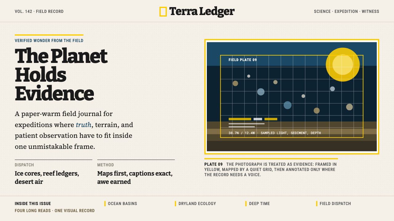
Data visualization in the National Geographic system should be treated with the same seriousness as photography: a chart or map is a form of evidence, and it should be composed and labeled to stand on its own without the body text explaining it. Maps are the most natural visualization type for this system — they have an inherent editorial authority and a visual scale that pairs naturally with full-bleed photography. Charts should use the warm ground as their canvas, restrict color to the yellow accent for highlights and near-black for the primary data series, and reserve additional color only for a second clearly distinct category. All data labels and axis text should be set in the same typographic register as the editorial text — readable, authoritative, with no decorative chart furniture. A common error is using bright multicolor palettes on charts within this system; the restraint of the editorial color discipline must extend to the data layer.国家地理系统中的数据可视化应与摄影受到同等的严肃对待:图表或地图是一种证据形式,应当被构图和标注得可以独立成立,无需正文解释。地图是最适合这套系统的可视化类型——它们具有内在的编辑权威性和视觉尺度,与满版摄影自然配对。图表应以温暖底调作为画布,将颜色限制在黄色强调用于高亮、近黑色用于主要数据系列,仅为第二个明确区分的类别保留额外颜色。所有数据标签和坐标轴文字应与编辑文字保持同一排版风格——易读、权威,无装饰性图表装置。一个常见错误是在这套系统内的图表上使用明亮的多色色板;编辑色彩自律的克制必须延伸至数据层。
What types of brands or products are a poor fit for this style?哪些类型的品牌或产品不适合这种风格?
National Geographic style struggles in contexts that require lightness, playfulness, or sensory comfort rather than authority and wonder. Consumer brands in categories like food delivery, social networking, casual gaming, or children's products will feel mismatched — the system's gravitas and density will read as heavy or even intimidating rather than inviting. Fashion and beauty brands that depend on sleekness, neutrality, or sensual softness will find the slab-serif warmth and journalistic structure too editorial in tone. Fintech and software-as-a-service products aimed at a broad consumer audience often prefer interfaces that feel lighter and more immediate; the National Geographic register can feel too serious or too print-influenced for contexts where users expect digital-native visual idioms. The style is best reserved for brands or products where deep subject matter expertise, trustworthy evidence, and a sense of earned wonder are central to the value proposition.国家地理风格在需要轻盈感、趣味性或感官舒适而非权威感和惊叹感的场景中举步维艰。食品配送、社交网络、休闲游戏或儿童产品等类别的消费品牌会感到格格不入——这套系统的庄重感和密度会被解读为沉重甚至令人望而生畏,而非平易近人。依赖时髦感、中性感或感官柔软性的时尚和美妆品牌,会发现板状衬线的温度和新闻报道式的结构在语气上过于编辑感。面向广泛消费者的金融科技和软件即服务产品,通常偏好感觉更轻盈、更即时的界面;国家地理的风格在用户期待数字原生视觉习语的场景中,可能会显得过于严肃或过于受印刷品影响。这种风格最适合保留给那些深度主题专业知识、可信赖的证据,以及一种凭实力赢得的惊叹感是核心价值主张的品牌或产品。
Related design styles相关设计风格
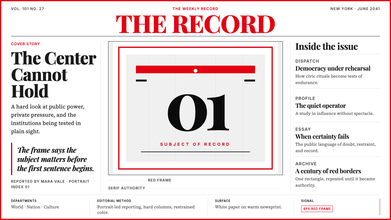 TIME MagazineAuthority in a red rectangle. Didone masthead, black-white columns, and a 4px…红框即权威。Didone刊头、黑白栏栅与4px边框定调。
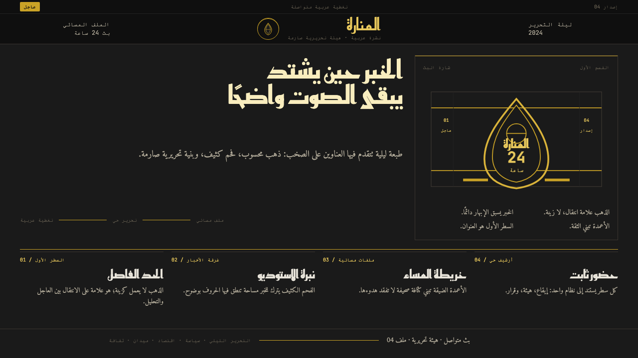 Al Jazeera Arabic NewsAuthority, stripped bare. Gold seal, dense Arabic type, matte charcoal.权威感被提纯。金色印章、密集阿文、炭黑底面构成画面。
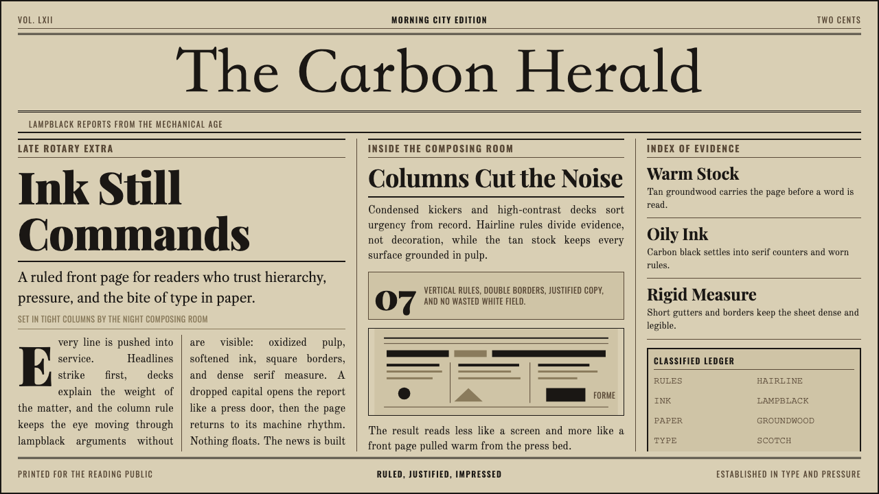 Broadsheet LetterpressAuthority in ink. Lampblack serif decks lock into tan paper with strict ruled…油墨里的权威:灯黑衬线与褐黄纸面,被严密栏线锁住。
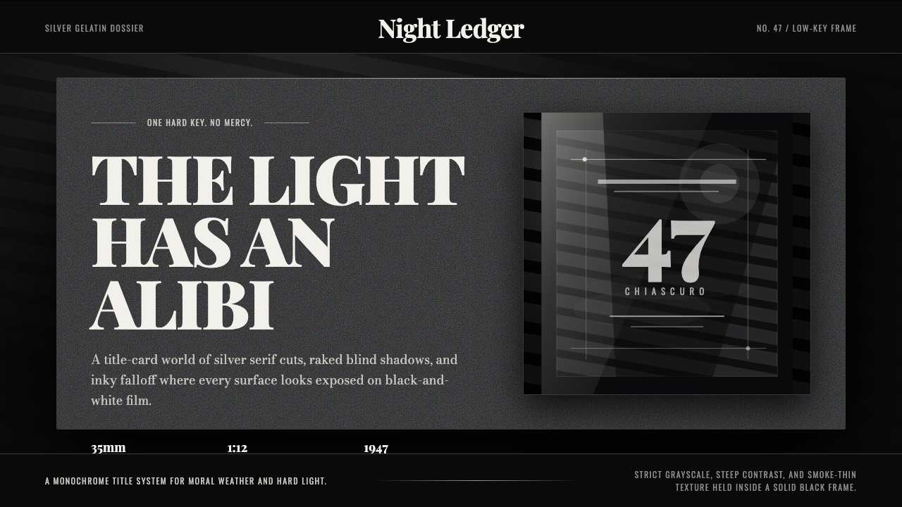 Film Noir ChiaroscuroLight is the crime. Silver serif cards, blind stripes, and grain carve drama…光就是罪证。银色衬线、百叶窗斜影与胶片颗粒从黑场刻出戏剧。
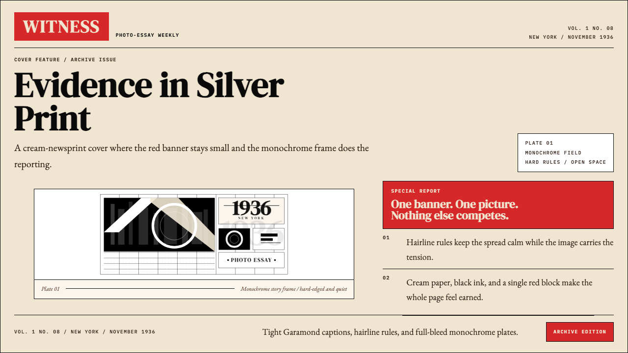 LIFE Magazine (Red-Banner)Photojournalism stripped bare. One red banner, cream newsprint, stark black p…摄影报道被剥到最简。红横幅、米色纸底与黑白版面。
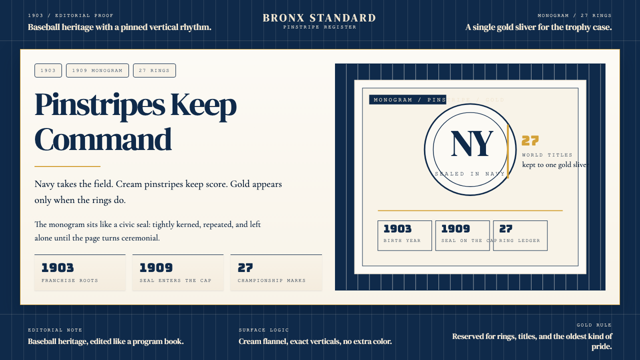 New York Yankees (Navy-Pinstripe)Navy restraint, not noise. Cream pinstripes and a gold monogram seal do the w…海军蓝克制到底。奶油细条纹与金色徽章撑起整页。