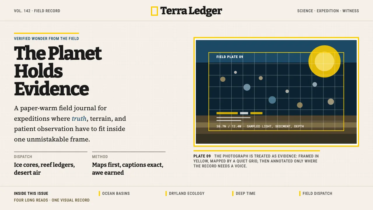
About National Geographic
National Geographic is the yellow border — the most recognized frame in publishing history. Since 1888 that `#FFCE00` rectangle has signaled exploration, science, and the beauty of the planet, wrapping photography so strong it needs no filter.
The visual language pairs a confident slab-serif voice with dense, readable editorial body text, full-bleed imagery, and generous paper-warm grounds. Chrome is minimal; the photograph is always the hero, and the yellow is always structural — a frame, an accent, a mark of authority, never a fill.
- Origin
- Washington, D.C., USA
- Era
- 1888 founded; yellow border introduced 1910; current visual refined 2000s
- Key figures
- Gilbert Hovey Grosvenor · Steve McCurry · David Guttenfelder
- Movements
- Documentary photography · Long-form scientific journalism · Exploration media
National Geographic design spec
Colors
Typography
The other 11 sections — buttons, cards, spacing, motion, techniques and more — open once you unlock. Download the DESIGN.md or send it to your AI in one click. Unlock once, yours forever.
Sign up nowStyles similar to National Geographic
Also inspired by brands & products, with a close feel.
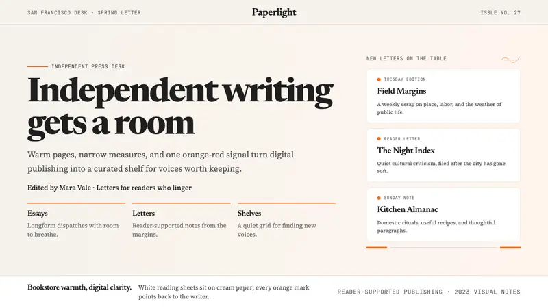 Substack 2023Writing feels shelved, not streamed. Cream paper, Newsreader serif, and one orange-red cue.
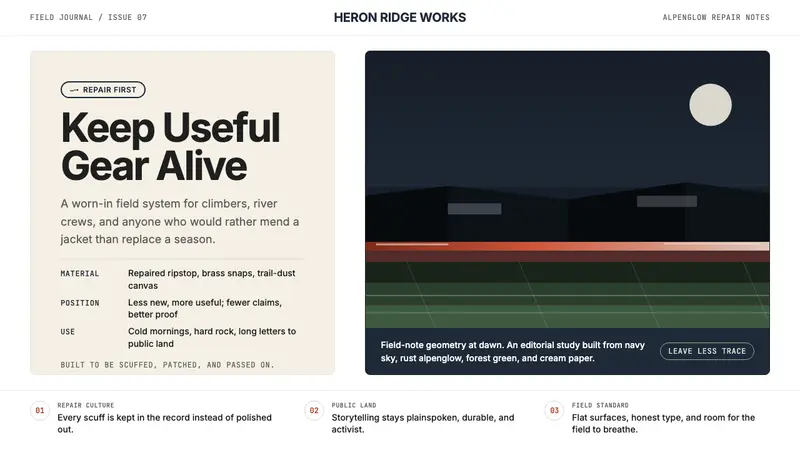 PatagoniaField-worn clarity. Deep navy, rust alpenglow, and cream editorial space carry the cause.
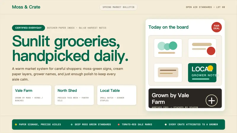 Whole Foods MarketFarmer’s-market polish. Moss green on butcher-paper cream, white cards, grower notes.
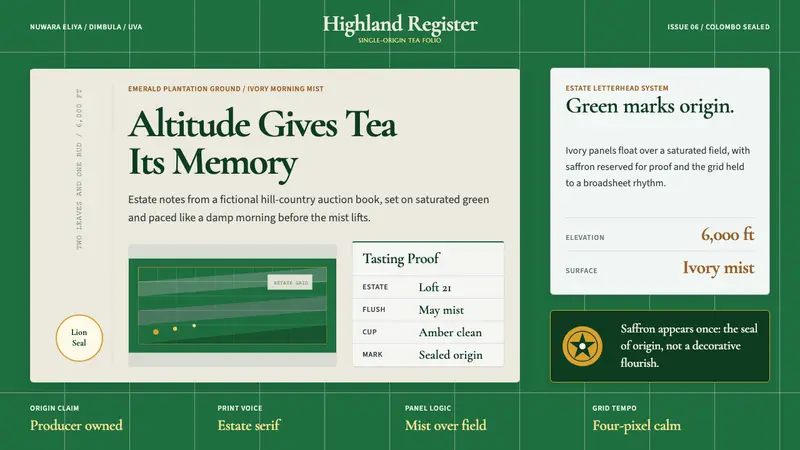 Sri Lanka Ceylon Tea ModernProvenance is emerald. Ivory mist panels and one saffron seal make origin feel official.