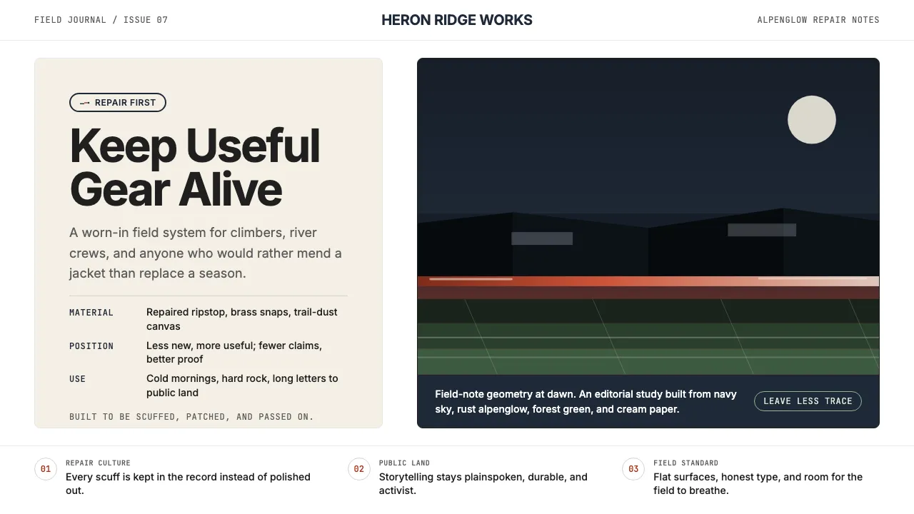
About Patagonia
Patagonia's visual language is built from the same granite and glacier light that shaped its founding story in Yosemite Valley. Deep navy skies, rust-orange alpenglow, and cream editorial paper form a palette that feels worn-in rather than designed — honest materials for an activist company that happens to sell jackets.
Every layout choice serves the same ethos: full-bleed adventure photography, generous whitespace that lets the landscape breathe, and typography set in Inter at weights that read like a field journal. The system prizes clarity and durability over trend, just like the gear.
- Origin
- Ventura, California
- Era
- 1973 founded; visual heritage consistent through 2024
- Key figures
- Yvon Chouinard · Patagonia Brand Team · Patagonia Films
- Movements
- Heritage outdoor brand · Environmental activism · B-Corp leadership
Patagonia design spec
Colors
Typography
The other 11 sections — buttons, cards, spacing, motion, techniques and more — open once you unlock. Download the DESIGN.md or send it to your AI in one click. Unlock once, yours forever.
Sign up nowStyles similar to Patagonia
Also inspired by brands & products, with a close feel.
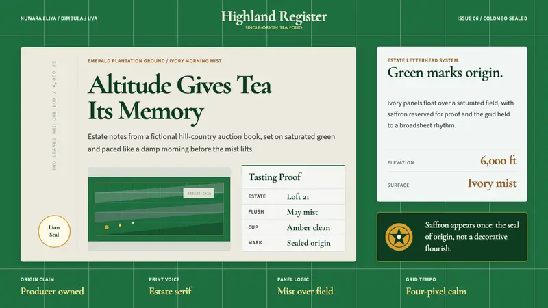 Sri Lanka Ceylon Tea ModernProvenance is emerald. Ivory mist panels and one saffron seal make origin feel official.
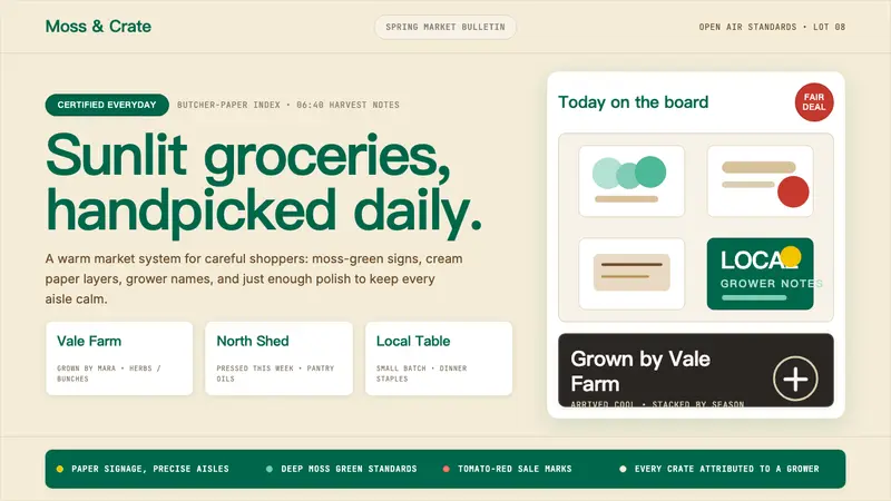 Whole Foods MarketFarmer’s-market polish. Moss green on butcher-paper cream, white cards, grower notes.
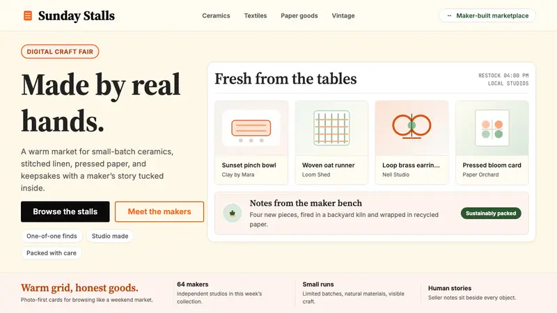 Etsy HandmadeA digital craft fair, in orange. Hand-drawn accents, cream backgrounds, deliberately imperfect.
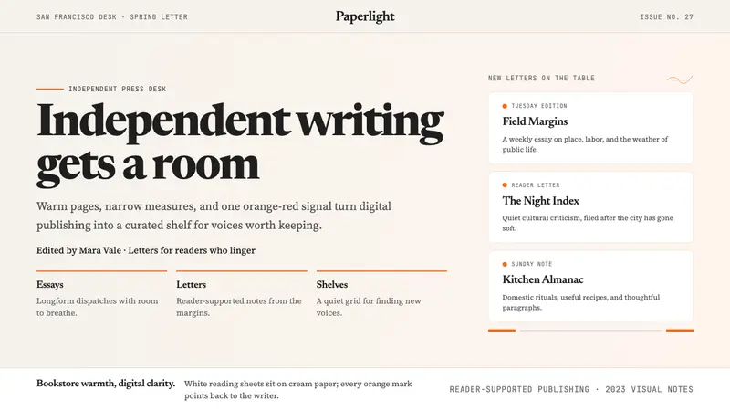 Substack 2023Writing feels shelved, not streamed. Cream paper, Newsreader serif, and one orange-red cue.