What is Patagonia?什么是 Patagonia?
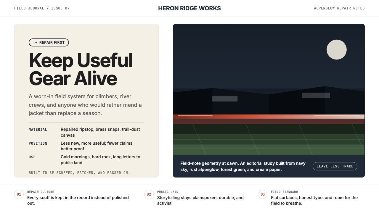
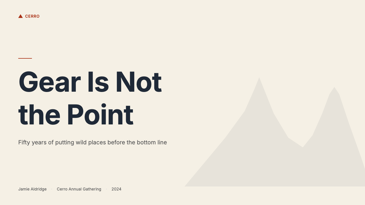
Patagonia's visual language is granite and glacier light translated into print — deep navy skies, rust alpenglow, and cream editorial paper worn honest by decades of activist purpose.巴塔哥尼亚的视觉语言是花岗岩与冰川光影的印刷转译——深邃藏青、铁锈日照与奶油刊物纸,被数十年的环保行动主义磨出真实的质感。
Patagonia in briefPatagonia 速览
Patagonia is an American outdoor clothing and gear company founded in 1973 in Ventura, California, whose visual identity became one of the most coherent and purposeful design systems in contemporary retail. Its palette — deep navy, rust-orange alpenglow, and worn cream — feels less designed than discovered: these are the colors of dusk at a granite face, of a weathered expedition journal, of the ocean at low tide. Nothing in the system reads as fashionable, because the system was never built for fashion cycles. It was built to last.巴塔哥尼亚是1973年创立于美国加利福尼亚州文图拉的户外服装与装备公司,其视觉识别系统已成为当代零售业中最连贯、最具使命感的设计体系之一。它的色彩——深邃藏青、铁锈色日照金山与用旧了的奶油——与其说是设计出来的,不如说是被发现的:这些是花岗岩山壁暮光的颜色,是一本风化探险日志的颜色,是退潮时海洋的颜色。这套体系里没有任何东西读起来像是赶时髦,因为它从来就不是为时尚周期而建立的。它的目标是经久。
The visual language operates on a principle of earned authenticity. Full-bleed adventure photography carries the primary communicative weight, placing the viewer inside landscapes of scale and consequence. Typography is set with the confidence of a field journal — clear, unhurried, readable at altitude. Generous whitespace does not signal luxury; it signals respect for the landscape being depicted. The system prizes durability and honesty over novelty, in the same way the gear it accompanies does.这套视觉语言运行在一种「用实绩换来的真实感」原则之上。全出血的户外摄影承担首要的传达重量,将观者置入具有规模感与结果感的风景之中。字体排印以野外日志的自信呈现——清晰、不急迫、在海拔高处依然可读。大面积留白传递的不是奢华,而是对所描绘风景的尊重。这套系统推崇耐久与诚实,而非新奇——与它所配合的装备如出一辙。
What makes Patagonia's aesthetic distinctive among outdoor brands is its inseparability from mission. The company has described itself as a business that happens to sell jackets, and the visual identity enforces that inversion. Editorial photography documents climbers, surfers, and activists with equal weight. Copy reads like journalism rather than advertising. The result is a design system that communicates environmental conviction as fluently as it communicates technical performance — a rare alignment of brand values and visual decisions.巴塔哥尼亚美学在户外品牌中独树一帜,在于它与使命的不可分割性。这家公司曾自我描述为「一家碰巧卖夹克的公司」,而视觉识别系统正在执行这一颠倒。编辑摄影以同等分量记录攀岩者、冲浪者与活动人士。文案读起来像新闻而非广告。结果是一套设计系统,它传递环境信念与传递技术性能同样流利——这是品牌价值观与视觉决策罕见的高度对齐。
Where does Patagonia come from?Patagonia 从何而来?
The Patagonia visual identity cannot be understood separately from the biography of its founder, Yvon Chouinard. A self-taught blacksmith and climber, Chouinard began forging reusable steel pitons in his parents' Burbank backyard in the late 1950s and selling them from the back of his car at Yosemite. By 1970 his company, Chouinard Equipment, was the largest supplier of climbing hardware in the United States. The same period saw Chouinard and fellow climber Doug Tompkins begin importing colorful rugby shirts from Scotland for use as climbing layering pieces — an experiment that would become Patagonia, incorporated as a separate clothing company in 1973 and named after the remote Argentine-Chilean wilderness that both men had crossed by van in 1968.巴塔哥尼亚的视觉识别无法与创始人伊冯·乔伊纳德的个人传记分开理解。乔伊纳德是一位自学成才的铁匠与攀岩者,20世纪50年代末开始在父母位于伯班克的后院锻造可复用的钢制岩钉,并在优胜美地的停车场后车厢里出售。到1970年,他的公司乔伊纳德器材已成为美国最大的攀岩器材供应商。同一时期,乔伊纳德与攀岩伙伴道格·汤普金斯开始从苏格兰进口彩色橄榄球衫用作攀岩保暖层——这一尝试最终演变为巴塔哥尼亚,该品牌于1973年作为独立服装公司注册成立,以两人1968年驾车穿越的阿根廷-智利偏远荒野命名。
The visual sensibility of those early years was shaped by the culture of Yosemite's Camp 4, the informal community of dirtbag climbers who were rewriting the rules of big-wall ascent through the 1960s and 1970s. Camp 4 aesthetics were anti-establishment, anti-consumerist, and rooted in the physical reality of rock and weather. Patagonia's early catalogs absorbed this ethos directly: photography by and for climbers, copy that assumed the reader already knew what a belay device was, layouts that prioritized information over seduction. The rust, navy, and cream of the emerging palette were not strategic choices — they were the colors already present in the images.早期视觉感性由优胜美地4号营地的文化塑造。那是一个「穷光蛋攀岩者」的非正式社区,在20世纪60至70年代改写了大岩壁攀登规则。4号营地的美学是反建制、反消费主义的,植根于岩石与天气的物理现实。巴塔哥尼亚早期目录直接吸收了这种精神:由攀岩者为攀岩者拍摄的照片,默认读者已知道上升器是什么的文案,将信息置于诱惑之前的版面设计。逐渐成形的铁锈色、藏青色与奶油色色板,并非战略性选择——它们是图像中本已存在的颜色。
The environmental dimension of the brand's identity crystallized in the late 1980s and early 1990s. In 1988, Patagonia opened a store in Boston and sent in a ventilation crew; workers became ill from the fumes emanating from the conventionally produced cotton products in the building. An internal audit of the company's supply chain followed, culminating in a 1994 decision to convert the entire sportswear line to organic cotton by 1996 — a move that nearly bankrupted the company and became the founding act of its environmental reputation. The visual identity shifted in parallel: the environmental campaigns, the documentary films produced under Patagonia Films, and the editorial journalism in the company's catalogs began to occupy the same visual register as the product photography, reinforcing the message that buying a jacket was an act with ecological consequences.品牌身份的环境维度在20世纪80年代末至90年代初明晰成形。1988年,巴塔哥尼亚在波士顿开店,请通风队进场检修;工人因建筑内传统棉质产品散发的气体而患病。此后公司对供应链展开内部审计,最终于1994年做出决定:到1996年将全线运动服转为有机棉——这一举措几乎使公司破产,并成为其环保声誉的奠基之举。视觉识别与此同步转变:公司旗下巴塔哥尼亚电影制作的纪录片、目录中的编辑新闻报道,开始与产品摄影占据同一视觉层级,强化了「购买一件夹克是一个具有生态后果的行为」的信息。
By the 2000s, the Patagonia visual system had stabilized into the form recognized today: full-bleed photography by climbers, surfers, and environmental photographers; Inter-weight type set with editorial confidence; a palette that reads as found rather than invented; and a consistent voice that moves between gear specification and environmental manifesto without tonal disruption. The 2022 announcement by Chouinard that he was transferring ownership of the company to a purpose trust dedicated to fighting climate change — with the statement 'Earth is now our only shareholder' — was not a departure from the brand's visual or verbal identity. It was the logical conclusion of a design system that had always treated the landscape as the client.进入2000年代,巴塔哥尼亚视觉系统稳定成为今日可辨认的形态:攀岩者、冲浪者与环境摄影师的全出血照片;以编辑自信排设的Inter字重文字;一套读起来像是被发现而非被发明的色板;以及一种在装备规格说明与环境宣言之间切换而不产生语气断裂的一致声音。2022年,乔伊纳德宣布将公司所有权转让给专注于应对气候变化的目的性信托基金——他的声明是「地球现在是我们唯一的股东」——这并非对品牌视觉或语言身份的背离。这是一套始终将风景视为客户的设计系统的逻辑终点。
What defines the Patagonia look?Patagonia 的视觉特征是什么?
Color Palette色彩体系
The palette centers on three anchor tones: a deep navy that reads as a night sky above treeline, a rust-orange that evokes alpenglow on granite at dusk, and a warm cream derived from unbleached paper and cotton. These are supplemented by earthy ochres, slate greys, and the deep teal of cold water — tones found in the environments the brand documents. The palette is never bright or synthetic; saturation is kept deliberately subdued, as if the colors have been weathered by exposure. Black and near-black appear for typographic weight. No color in the system signals luxury or fashion; every tone signals place.色板以三个锚定色调为核心:一种读起来像林线之上夜空的深藏青;一种唤起花岗岩暮光日照金山的铁锈橙;以及一种源自未漂白纸张与棉料的暖奶油色。这三种色调被泥土赭黄、板岩灰以及冷水深青蓝所补充——这些都是品牌所记录的环境中发现的色调。色板从不明亮或合成感;饱和度被刻意压低,仿佛这些颜色已被风吹日晒磨出了包浆。黑色与近黑色用于字体分量。这套体系中没有任何颜色传递奢华或时尚信号;每一种色调传递的都是地点。
Photography as Primary Language摄影作为首要语言
Adventure photography is not decorative in the Patagonia system — it is load-bearing. Images typically run full-bleed, consuming the entire available field and refusing to be contained by borders or cards. Subjects are depicted in conditions of genuine difficulty: wet rock, breaking surf, alpine weather. The photographer's perspective is participant rather than observer — the images look as though they were taken by someone who also climbed the route. Color grading leans toward the cool and honest rather than warm or cinematic. Post-processing is restrained; nothing looks retouched into fantasy.在巴塔哥尼亚体系中,户外摄影不是装饰性的——它承担结构重量。图像通常全出血铺展,占据全部可用画面,拒绝被边框或卡片容纳。主体被描绘于真实艰难的条件下:湿滑的岩石、破碎的浪涛、高山天气。摄影师的视角是参与者而非观察者——图像看起来像是由同样攀登过那条路线的人拍摄的。调色倾向冷峻与诚实,而非温暖或电影感。后期处理克制;没有任何东西看起来被修饰成了幻想。
Typography and Editorial Voice字体排印与编辑声音
Type in the Patagonia system carries the register of considered journalism rather than retail copy. Headlines are set with confident weight but without the aggressive scale contrast of advertising; they read as statements, not shouts. Body text is given genuine space — line lengths and vertical rhythm are calibrated for sustained reading, not scanning. The system does not rely on decorative dividers, pull-quote styling, or typographic flourishes to create visual interest; hierarchy comes from measured scale and weight relationships. The typographic voice is unhurried, specific, and assumes an intelligent reader.巴塔哥尼亚体系中的文字承载的是经过深思的新闻业语域,而非零售文案的腔调。标题以自信的字重排设,但没有广告的激进尺度对比;它们读起来像陈述,而非叫喊。正文被给予真实的空间——行宽与垂直节奏针对持续阅读而非快速扫描加以校准。该系统不依赖装饰性分隔线、引言样式或排印花饰来制造视觉趣味;层级来自有分寸的尺度与字重关系。排印声音不急迫、具体,并预设了一位有智识的读者。
Whitespace and Landscape Breathing Room留白与风景的呼吸空间
Generous whitespace in Patagonia layouts does not signal minimalism in the contemporary lifestyle sense — it signals editorial discipline and respect for the images. Margins are wide enough that landscape photographs are not crowded by text or interface elements. Section transitions use space rather than dividers. The system allows content to sit in silence before and after it, the same way a documentary film allows a shot to breathe before cutting. This breathing room is one of the qualities that distinguishes Patagonia's aesthetic from more commercially aggressive outdoor brands that fill every available pixel.巴塔哥尼亚版面中的大面积留白,传递的不是当代生活方式意义上的极简主义——它传递的是编辑纪律以及对图像的尊重。页边距足够宽,使风景照片不被文字或界面元素所拥挤。章节过渡使用空间而非分隔线。这套系统允许内容在其前后静默地落座,如同纪录片在剪切前让一个镜头充分呼吸。这种呼吸空间是将巴塔哥尼亚美学与那些填满每一个像素的更具商业攻击性的户外品牌区分开来的品质之一。
Material Honesty and Anti-Artifice材料诚实与拒绝造作
The Patagonia visual system resists the artificial on principle. There are no product shots taken in studios with seamless white backgrounds and cinematic lighting setups designed to make a jacket look like a luxury object. Products appear in use, in weather, on real bodies doing real activities. The same anti-artifice principle governs color: no neon accents, no gradient washes, no color-grading tricks designed to make images look more spectacular than the actual landscapes. The system trusts the raw material — both the gear and the environments it was made for — and declines to oversell either.巴塔哥尼亚视觉体系在原则上抵制一切人工造作。没有在配备无缝白色背景与电影打光装置的摄影棚里拍摄的产品图,没有将夹克渲染成奢侈品的视觉手段。产品在使用中出现,在天气中出现,在真实身体进行真实活动时出现。同样的拒绝造作原则支配色彩:没有霓虹强调色,没有渐变色洗,没有旨在让图像看起来比实际风景更壮观的调色技巧。这套系统信任原材料——无论是装备本身还是它所为之制造的环境——并拒绝对任何一方过度美化。
Mission-Integrated Layout使命融入式版面
Perhaps the most distinctive structural feature of the Patagonia system is the integration of environmental content into commercial space without visual hierarchy separating them. A catalog page might show a jacket spec sheet followed immediately by a page-width essay on the ecology of a threatened river system, set in the same type at the same scale, with equivalent photographic treatment. This layout decision communicates that the company regards its environmental advocacy as equivalent in importance to its product offering — not a footnote, not a brand values sidebar, but content with identical standing. The design enforces the mission.也许巴塔哥尼亚体系最具辨识度的结构特征,是将环境内容融入商业空间而不以视觉层级将它们分离。一本目录的某页可能展示夹克规格表,紧接着是一篇关于受威胁河流系统生态的整版文章,以相同字体、相同大小排设,配以同等摄影处理。这一版面决策传递了这家公司将其环保倡导视为与产品供应同等重要——不是注脚,不是品牌价值观边栏,而是具有相同地位的内容。设计在执行使命。
Restrained Graphic Devices克制的图形元素
The Patagonia system uses graphic devices sparingly and functionally: the mountain-silhouette wordmark, which appears without modification across all contexts; simple line-weight rules as occasional structure; maps and topographic details used journalistically rather than decoratively. There are no mascots, no custom illustration styles that compete with the photography, no iconographic systems that require a style guide to decode. The restraint is not the restraint of minimalism — it is the restraint of a design system that trusts its primary content, the images and the words, to carry the entire communicative load.巴塔哥尼亚体系惜用图形元素,且每次使用都出于功能目的:山形轮廓字标在所有语境中不加修改地出现;细线规则作为偶发性结构元素;地图与等高线细节以新闻纪实方式而非装饰方式使用。没有吉祥物,没有与摄影竞争的自定义插图风格,没有需要风格指南才能解读的图标系统。这种克制不是极简主义的克制——它是一套信任其首要内容(图像与文字)承担全部传达重量的设计系统的克制。
Who shaped Patagonia?谁塑造了 Patagonia?
Chouinard founded Patagonia in 1973 after more than a decade of climbing in Yosemite, where he developed a philosophy of low-impact ascent that translated directly into product and brand values. His background as a craftsman — forging his own gear rather than accepting what the market offered — shaped Patagonia's design ethos of making things that last rather than things that sell. His 2022 decision to transfer ownership of the company to a climate-focused purpose trust, foregoing billions in personal wealth, remains the most dramatic act of brand value alignment in corporate history, and it was legible as a logical extension of the visual and verbal identity he had built over fifty years.乔伊纳德于1973年创立巴塔哥尼亚,此前他在优胜美地攀岩逾十年,在那里发展出了一套低影响攀登哲学,并直接转化为产品与品牌价值观。作为工匠的背景——亲手锻造器材而非接受市场现成品——塑造了巴塔哥尼亚「制造经久之物而非畅销之物」的设计精神。他2022年将公司所有权转让给专注气候议题的目的性信托基金的决定,放弃了数十亿美元的个人财富,至今仍是企业史上最具戏剧性的品牌价值观践行行为,且可被解读为他五十年间所构建的视觉与语言身份的逻辑延伸。
The Patagonia brand team has operated for decades on a principle unusual in corporate design: that the people who design the catalogs, campaigns, and editorial features should be, or work closely with, the athletes and activists who appear in them. This proximity between maker and subject is visible in the work. Catalog photography and editorial layouts read as if produced by a community that actually uses the gear in the conditions depicted, because they largely are. The brand team's long-tenured contributors have produced a body of work with unusual visual consistency across fifty years — not the consistency of a rigid style guide, but the consistency of a shared set of values applied to changing circumstances.巴塔哥尼亚品牌团队数十年来遵循一条在企业设计中不同寻常的原则:设计目录、活动与编辑专题的人,应当是出现在其中的运动员与活动人士本身,或与他们密切合作。这种制作者与主体之间的亲近感在作品中清晰可见。目录摄影与编辑版面读起来像是真正在所描绘条件下使用装备的社群所制作的——在很大程度上,确实如此。品牌团队的长期贡献者在五十年间创作了一批具有不同寻常视觉一致性的作品——不是僵化风格指南的一致性,而是一套共享价值观应用于不断变化的环境所呈现的一致性。
Established as an internal production unit, Patagonia Films has produced documentary content — including works such as 'DamNation,' examining dam removal in the American West, and 'Artifishal,' on wild salmon and fish hatcheries — that extends the brand's visual language into long-form narrative film. These films are made to the same production and color standards as the brand's print and digital editorial work, with the same restraint in post-processing and the same preference for found light over constructed lighting setups. The films demonstrate that the Patagonia visual system is scalable across media without losing its defining qualities, and they have won awards in environmental documentary contexts entirely outside the brand's commercial sphere.作为内部制作单位创立,巴塔哥尼亚电影制作了多部纪录片内容——包括审视美国西部大坝拆除的《炸坝》,以及关于野生鲑鱼与鱼类孵化场的《人工鱼》——将品牌视觉语言延伸至长片叙事电影。这些影片以与品牌印刷及数字编辑内容相同的制作与色彩标准制作,在后期处理上保持同等克制,同样偏好自然采光而非搭建灯光。这些电影证明巴塔哥尼亚视觉体系在跨媒介扩展时不会失去其定义性品质,且在完全超出品牌商业范畴的环境纪录片领域获得了奖项认可。
Tompkins co-founded The North Face before partnering with Chouinard in the early adventures that seeded Patagonia's origin story. His later work as a conservation philanthropist — purchasing and protecting millions of acres of Chilean and Argentine wilderness, ultimately contributing to the creation of several national parks — embodied the values the Patagonia brand would spend decades articulating. Tompkins and Chouinard shared a formative visual sensibility rooted in the actual landscapes of Patagonia, and the brand's consistent treatment of those landscapes as subjects deserving documentary respect rather than scenic backdrop reflects that shared foundation.汤普金斯在与乔伊纳德共同参与播下巴塔哥尼亚起源故事的早期探险之前,曾共同创立了The North Face。他后来作为保护主义慈善家的工作——购置并保护数百万英亩的智利与阿根廷荒野,最终促成了数个国家公园的建立——体现了巴塔哥尼亚品牌花费数十年时间所表达的价值观。汤普金斯与乔伊纳德共享一种植根于巴塔哥尼亚实际风景的先天视觉感性,品牌始终将那些风景作为值得纪录片式尊重的主体而非风景背景来处理,正是这一共同基础的映射。
Malinda Chouinard co-founded Patagonia alongside Yvon and shaped the company's early editorial and catalog voice as much as its visual identity. Her influence is present in the brand's treatment of community — the catalogs' insistence on depicting real athletes, real working environments, and real social contexts rather than idealized lifestyle imagery. She also championed the company's early work on environmental and social responsibility in supply chains, which became the subject matter that gave the editorial content its moral weight. The editorial seriousness of the Patagonia catalog — its willingness to run long essays and investigative journalism alongside product pages — reflects her formative contribution to the brand's character.马琳达·乔伊纳德与伊冯共同创立了巴塔哥尼亚,并在视觉识别之外同样塑造了公司早期的编辑与目录声音。她的影响体现在品牌对社群的处理方式上——目录坚持描绘真实的运动员、真实的工作环境与真实的社会背景,而非理想化的生活方式图像。她还推动了公司在供应链环境与社会责任方面的早期工作,这些工作后来成为赋予编辑内容道德分量的主题。巴塔哥尼亚目录的编辑严肃性——它愿意在产品页面旁边刊登长篇文章与调查新闻——正是她对品牌性格奠基性贡献的映射。
How do you use Patagonia today?今天怎么用 Patagonia?
Patagonia's visual system is among the most purposeful in contemporary design, and applying it to new contexts requires understanding why each element exists before attempting to replicate its appearance. The palette was not chosen for trend; it was derived from the environments the brand documents. The photography conventions were not developed for aesthetic reasons alone; they reflect a commitment to depicting subjects honestly. Before adapting the style, the designer should ask whether the content being presented shares the same commitment to authenticity that the original system was built to communicate.巴塔哥尼亚视觉体系是当代设计中最具使命感的体系之一,将其应用于新语境,需要在尝试复制其外观之前先理解每个元素存在的原因。色板不是为趋势而选择的;它源自品牌所记录的环境。摄影规范不仅仅出于美学原因而发展;它们反映了一种诚实描绘主体的承诺。在改编这种风格之前,设计师应当自问:所呈现的内容是否与这套原始体系所要传达的真实性承诺相符。
For presentation slides, the Patagonia approach works exceptionally well on cover pages where full-bleed landscape photography can occupy the entire slide. Choose images with strong environmental character — the kind that feel documentary rather than stock. The title should sit in clear, weight-confident type against a portion of the image where the background tones are dark enough to ensure legibility, or against a cream or near-white field positioned at the edge or base of the slide. Content slides should use a generous single-column or two-column layout with wide margins, treating each slide as an editorial page rather than a bullet-point container. Data slides translate naturally into the system when charts are built with the palette's earth tones — rust for primary data series, navy for secondary, cream or light grey for backgrounds — and when axis labels and annotations are set with the same typographic restraint as body text.在演示文稿中,巴塔哥尼亚的方法在全出血风景摄影可以占据整张幻灯片的封面页上表现出色。选择具有强烈环境特征的图像——那种让人感觉是纪录片而非素材库的图像。标题应以清晰、字重自信的字体,置于图像中背景色调足够深以确保易读性的区域,或置于幻灯片边缘或底部的奶油色或近白色区域上。内容页应使用大间距的单列或双列版面,留有宽阔页边距,将每张幻灯片作为编辑页面而非要点容器来处理。当图表以色板的大地色调构建时——铁锈色用于主数据系列,藏青用于次级,奶油或浅灰用于背景——且坐标轴标签与注释以与正文相同的排印克制处理时,数据页自然融入这套体系。
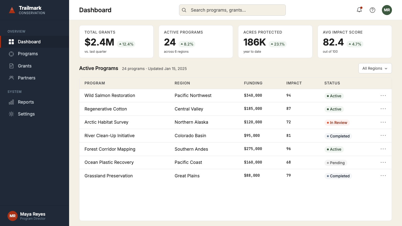
For web interfaces, the Patagonia visual language is well-suited to dashboards and editorial platforms where the primary content is photographic or data-rich. The approach: use deep navy or near-black for primary UI surfaces where the interface frames the content; bring in the cream and rust tones for informational elements, active states, and calls to action; keep backgrounds light and uncluttered for content-heavy reading views. Navigation should be typographic and restrained — clear labels at moderate scale with no icon decoration that competes with the primary imagery. For marketing or landing pages, full-width image blocks alternating with cream-background text sections create the same editorial rhythm found in Patagonia's own digital properties. Pricing or feature comparison pages benefit from the palette's inherent sense of authority: navy headers, cream table backgrounds, and rust used for the recommended tier only.对于网页界面,巴塔哥尼亚视觉语言非常适合以摄影或数据为核心内容的仪表板与编辑平台。方法如下:使用深藏青或近黑色作为主要界面底面,让界面框住内容;将奶油色与铁锈色调引入信息性元素、活跃状态与行动召唤;为内容密集的阅读视图保持浅色、不杂乱的背景。导航应当是字体性的、克制的——以适中尺度的清晰标签呈现,不使用与主要图像竞争的图标装饰。对于营销或落地页,全宽图像区块与奶油色背景文字区块交替,形成与巴塔哥尼亚自身数字媒体相同的编辑节奏。定价或功能比较页受益于色板内在的权威感:藏青色标题,奶油色表格背景,铁锈色仅用于推荐套餐。
For editorial and marketing work, the system rewards the same discipline that governs its source material. Set body text at a comfortable measure — not too wide — with vertical spacing that encourages reading rather than scanning. Use the photography to carry the primary communicative weight; text should contextualize and deepen what the image establishes, not compete with it. Section breaks should be handled with space and a simple rule rather than decorative elements. When the content is environmental, activist, or mission-oriented, the system's visual conventions are its most natural application: the combination of documentary photography, journalistic type, and honest color creates a register of conviction that few other visual systems can match. Marketing materials that adopt this approach communicate credibility rather than aspiration.对于编辑与营销内容,这套体系以与其源材料相同的纪律给予回报。将正文排设于舒适的行宽——不要过宽——以鼓励阅读而非扫描的垂直间距处理。使用摄影承担首要传达重量;文字应当语境化并深化图像所建立的内容,而非与之竞争。章节分隔应以空间与一条简单横线处理,而非装饰元素。当内容具有环境主义、行动主义或使命导向性质时,这套体系的视觉规范是最自然的应用场景:纪录片摄影、新闻体排印与诚实色彩的组合,创造出一种信念语域,是很少有其他视觉体系能够匹敌的。采用这种方式的营销材料传递的是可信度,而非渴望感。
The most common mistake when applying Patagonia's visual language is treating its palette as warm and accessible and then deploying it with the production values of lifestyle marketing — soft shadows, warm studio lighting, models posed in attractive outdoor settings rather than athletes in actual conditions. This produces a visual language that looks superficially similar but reads as inauthentic, because the original system's authority comes not from the colors themselves but from the relationship between those colors and genuinely documented reality. A second common mistake is over-saturating the rust-orange accent — in the original system, it appears at natural, weathered intensities that feel found rather than chosen. Used at high saturation or applied to interface elements across the board, it loses its documentary character and becomes merely decorative. The palette should always look as though it was discovered in the landscape, not selected from a swatch.应用巴塔哥尼亚视觉语言时最常见的错误,是将其色板视为温暖易亲近的,然后以生活方式营销的制作价值观加以部署——柔和阴影、暖调摄影棚打光、在有吸引力的户外环境中摆拍的模特,而非处于真实条件下的运动员。这产生了一种表面看起来相似但读起来不真实的视觉语言,因为原始体系的权威不来自颜色本身,而来自这些颜色与真实记录的现实之间的关系。第二个常见错误是过度饱和铁锈橙强调色——在原始体系中,它以自然的、风化后的强度出现,感觉像是被发现的而非被选择的。以高饱和度使用,或被广泛应用于界面元素,它便失去了纪录片特质,沦为纯粹的装饰。色板应当始终看起来像是在风景中被发现的,而非从色卡中挑选出来的。
Patagonia — FAQPatagonia · 常见问题
Can Patagonia's visual system work for brands that are not outdoor or environmental companies?巴塔哥尼亚的视觉体系能用于非户外或非环保公司的品牌吗?
Yes, but with important caveats. The visual system's qualities — documentary photography, generous whitespace, honest color, editorial typography — translate to any context where credibility, transparency, and long-term thinking are desired values. It works well for B-Corp companies, mission-driven nonprofits, food and agriculture brands committed to provenance transparency, and publications covering environment, science, or social issues. It does not work well for companies whose values are in tension with the system's underlying commitments — a fast-fashion brand or a fossil fuel company adopting this visual language would produce something that reads as greenwashing precisely because the aesthetic carries specific moral weight. The style is inseparable from its source values in a way that purely aesthetic systems are not.可以,但有重要前提。这套视觉体系的特质——纪录片摄影、充裕留白、诚实色彩、编辑性排印——可以迁移到任何以可信度、透明度与长远思维为期望价值的语境。它适用于B型企业、使命驱动型非营利组织、致力于来源透明度的食品与农业品牌,以及报道环境、科学或社会议题的出版物。它不适用于价值观与这套体系的底层承诺相悖的公司——快时尚品牌或化石燃料公司采用这套视觉语言,产生的效果恰恰读起来像是漂绿,正因为这套美学承载着特定的道德重量。这种风格与其源头价值观之间的不可分割性,是纯粹美学体系所不具备的。
How does the Patagonia style handle dark-mode or dark-background layouts?巴塔哥尼亚风格如何处理深色模式或深色背景版面?
The Patagonia system is fundamentally a light-ground system — cream and near-white backgrounds dominate in editorial and catalog contexts. However, a dark variant exists naturally in its own vocabulary: the deep navy serves as a strong dark ground for layouts where a night-sky or underwater quality is appropriate. On a navy ground, cream type and rust accents maintain the palette's integrity. What does not work is using a generic dark grey or black background with the palette's accent colors — this loses the environmental specificity that gives the palette its character. The dark variant works when it reads as a specific place — a night sky, a deep ocean — not as a generic dark interface.巴塔哥尼亚体系根本上是一个浅色底面体系——奶油色与近白色背景在编辑与目录语境中占主导。然而,深色变体自然存在于其自身词汇中:深藏青可作为强劲的深色底面,适用于夜空或水下品质恰当的版面。在藏青底面上,奶油色文字与铁锈色强调色保持了色板的完整性。不起作用的是使用通用的深灰色或黑色背景配以色板的强调色——这会失去赋予色板特征的环境特殊性。深色变体在读起来像一个特定地点时才有效——夜空、深海——而不是作为通用的深色界面。
What distinguishes authentic Patagonia-style design from imitation outdoor aesthetics?真正的巴塔哥尼亚风格设计与模仿性户外美学有何区别?
The primary distinguishing factor is the quality and intention of the photography. Authentic Patagonia-style work uses images where the environment is the subject, not the backdrop — images in which weather, scale, and physical difficulty are present and legible. Imitation outdoor aesthetics typically use lifestyle photography where an attractive person is posed in front of a beautiful landscape; the landscape is decorative, not documentary. A second distinguishing factor is restraint in graphic design: the original system trusts the images and typography to carry all the communicative weight and does not add graphic devices, overlays, or stylized treatments to supplement them. Imitations frequently add badge graphics, vintage texture overlays, or custom illustration that signal 'outdoor brand' rather than emerging from actual outdoor experience.首要区别因素是摄影的品质与意图。真正的巴塔哥尼亚风格作品使用环境是主体而非背景的图像——图像中天气、规模与身体上的艰难是存在的、可读的。模仿性户外美学通常使用生活方式摄影,一个有吸引力的人被摆拍在美丽风景前;风景是装饰性的,不是纪录片式的。第二个区别因素是平面设计中的克制:原始体系信任图像与字体承担全部传达重量,不添加图形元素、叠加层或程式化处理来加以补充。模仿品频繁添加徽章图形、复古质感叠加或自定义插图,这些元素在发出「户外品牌」信号,而非从真实的户外经验中涌现。
How should data visualization be handled in the Patagonia visual system?在巴塔哥尼亚视觉体系中,数据可视化应如何处理?
Data visualization in this system should follow the same editorial discipline as the typography and photography: every element earns its presence by serving the data, not by decorating the chart. Use the palette's anchor tones for primary data series — rust-orange for the most important series, navy for secondary, with earth-tone greys for tertiary or background data. Chart backgrounds should be cream or near-white, not grey. Gridlines should be extremely light — present enough to anchor the eye, absent enough not to compete with the data. Avoid three-dimensional chart treatments, gradient fills, and shadow effects entirely. The goal is a chart that reads with the same documentary honesty as the photography: this is what the data says, without visual argument or ornament.这套体系中的数据可视化应当遵循与排印和摄影相同的编辑纪律:每个元素因服务于数据而存在,而不是为了装饰图表。使用色板的锚定色调来表示主要数据系列——铁锈橙用于最重要的系列,藏青用于次级,大地色调灰色用于第三级或背景数据。图表背景应为奶油色或近白色,不用灰色。网格线应极度轻淡——足以锚定视线,又不至于与数据竞争。完全避免三维图表处理、渐变填充与阴影效果。目标是制作一张与摄影同样具有纪录片式诚实的图表:这是数据所说的,不加视觉论证或装饰。
Does the Patagonia visual system suit product-focused commercial contexts, or only mission-driven content?巴塔哥尼亚视觉体系适合以产品为中心的商业语境,还是仅适合使命驱动的内容?
The original system integrates both without visual distinction — product specification sits alongside environmental essay at the same typographic weight, and this integration is the system's defining contribution. Applied to purely commercial contexts, the system works well for products and services where quality, durability, and material honesty are genuine selling propositions. It performs less well as a wrapper for products or services whose actual qualities contradict its visual vocabulary — the aesthetic carries an implicit promise of honesty, and contexts that cannot make good on that promise will produce cognitive dissonance in audiences familiar with the original. The system asks more of its adopters than most visual styles: it requires that the content it contains actually merit the level of conviction it communicates.原始体系将两者整合而不加视觉区分——产品规格与环境文章以相同的排印分量并置,这一整合正是该体系的定义性贡献。应用于纯粹商业语境,该体系对于品质、耐久性与材料诚实是真实卖点的产品与服务效果良好。它作为实际品质与其视觉词汇相矛盾的产品或服务的包装则效果欠佳——这套美学承载着一种隐含的诚实承诺,无法兑现该承诺的语境在熟悉原始风格的受众中将产生认知失调。这套体系对采用者的要求比大多数视觉风格更高:它要求其所容纳的内容真正配得上它所传递的信念程度。
Related design styles相关设计风格
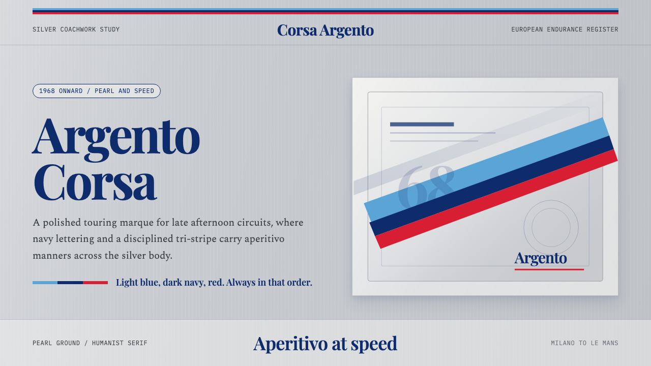 Martini Racing StripesAperitivo elegance at speed. Silver ground, Playfair serif, and a blue-navy-r…速度中的餐前酒优雅:银灰底、Playfair衬线与蓝深蓝红三色带。
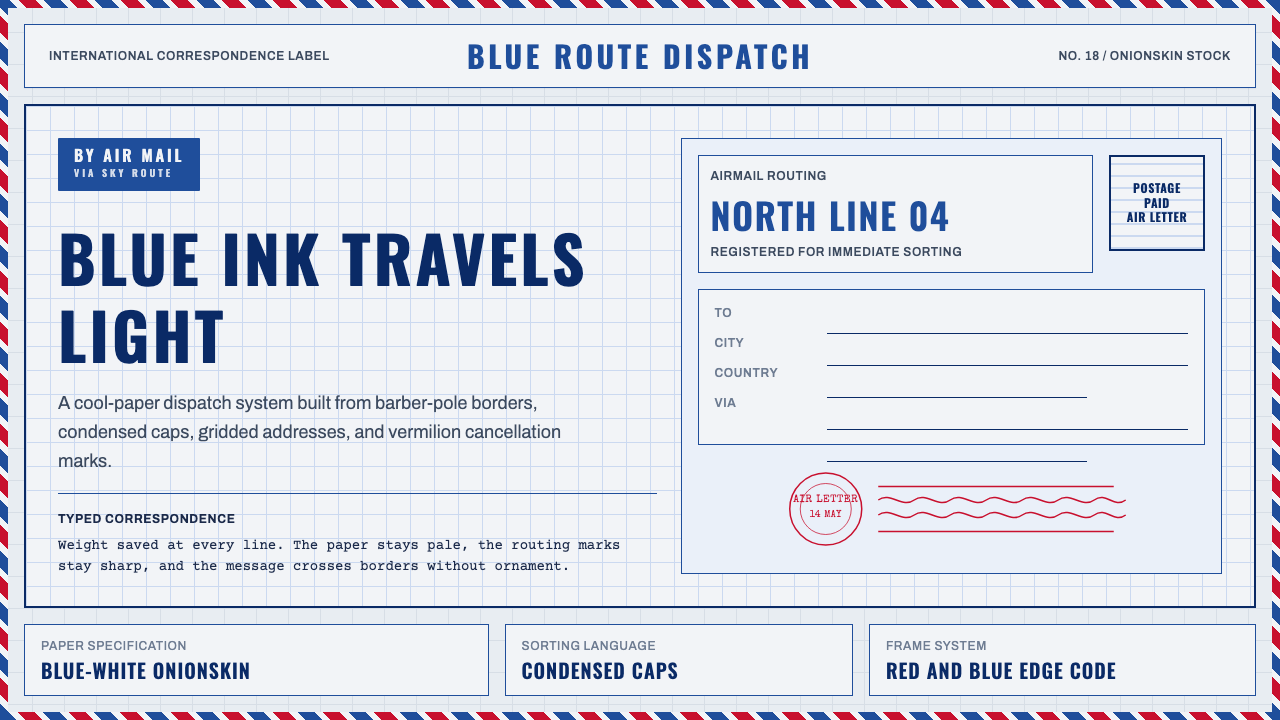 Par Avion Air MailPostal lightness made strict. Onionskin blue, Oswald caps, and red-blue edge…轻薄而严谨:葱皮蓝底、Oswald 大写字与红蓝边框。
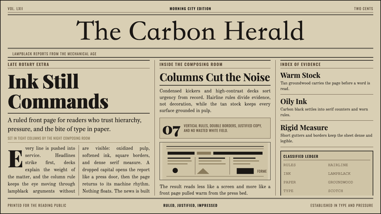 Broadsheet LetterpressAuthority in ink. Lampblack serif decks lock into tan paper with strict ruled…油墨里的权威:灯黑衬线与褐黄纸面,被严密栏线锁住。
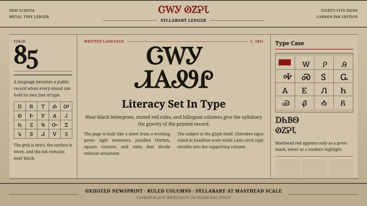 Cherokee SyllabaryLiteracy as inked record. Carbon type, muted red rules, and syllabary on tan…识字化为铅印记录:碳黑字、暗红栏线与泛黄报纸托起音节文字。
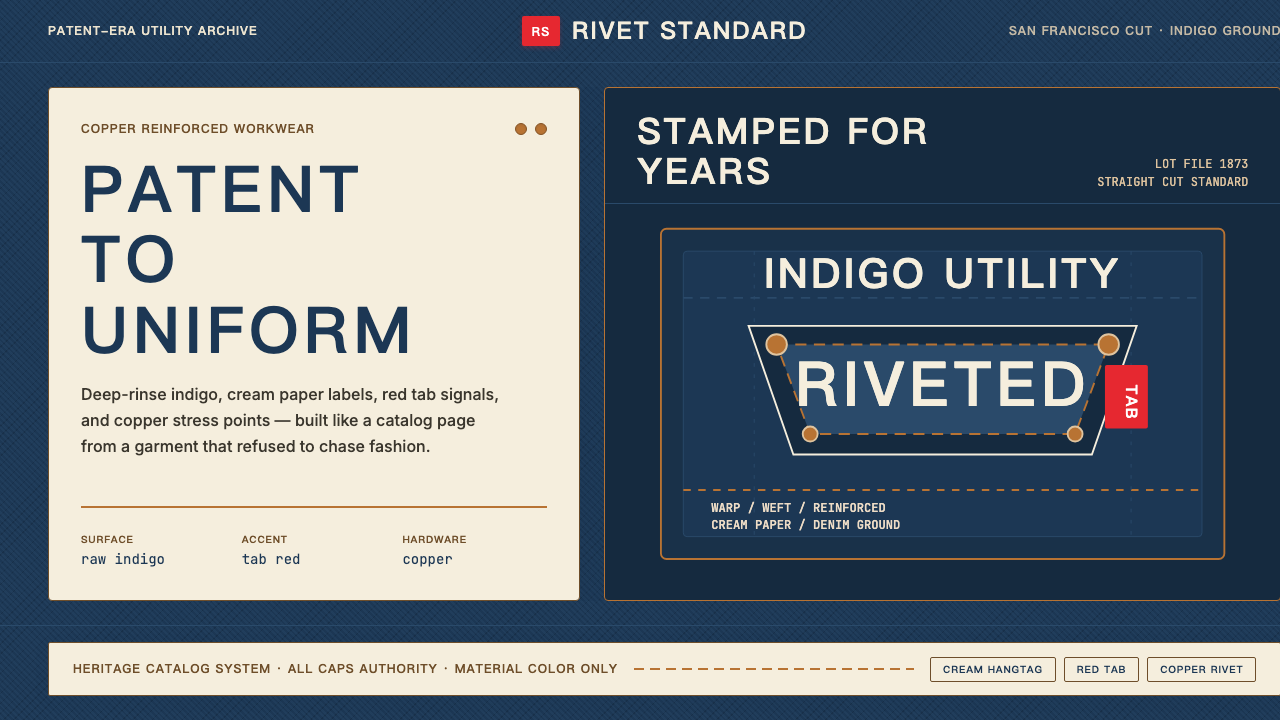 Levi's 501Utility becomes permanent. Indigo ground, cream hangtag panels, red tab and c…实用成为恒久。靛蓝底、奶油吊牌、红标与铜铆钉。
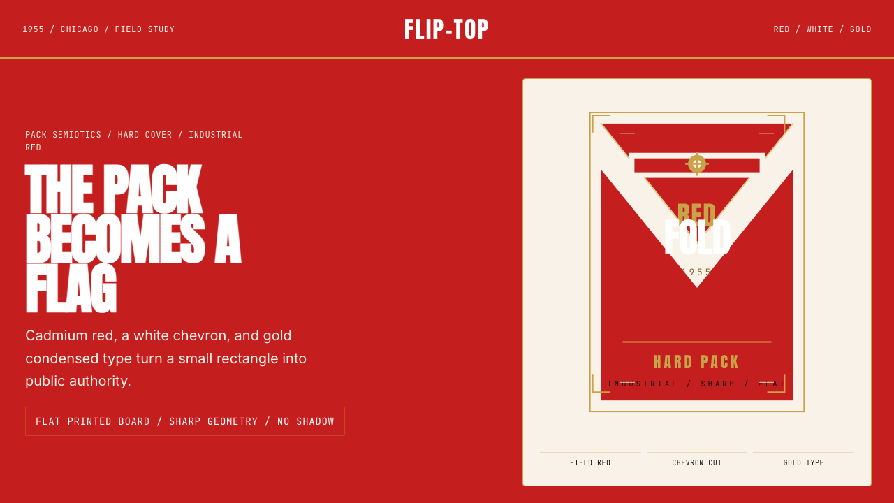 Marlboro Red Flip-Top (1955)Authority in one fold. Cadmium red, white chevron, and gold type read like a…一折成旗。镉红、白人字与金字排出强硬权威。