What is Martini Racing Stripes?
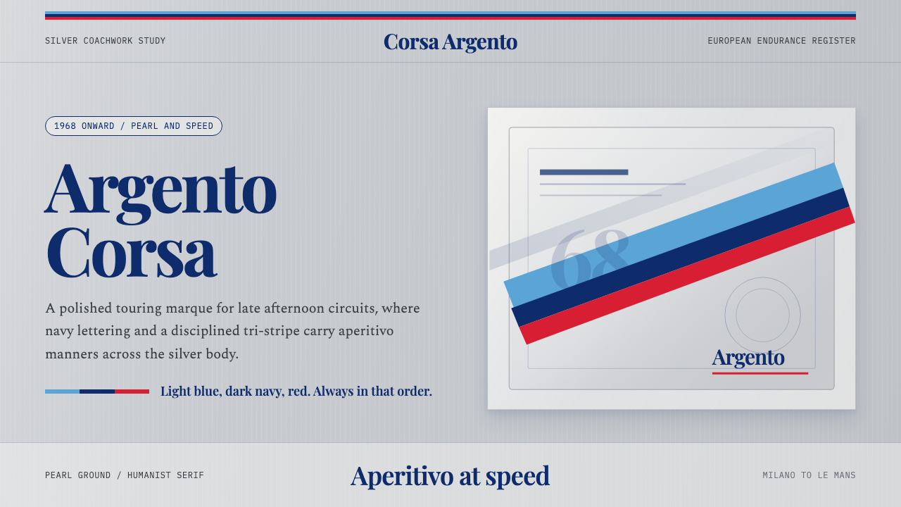
Martini Racing takes the aperitivo elegance of an Italian drinks brand and paints it down the flank of a race car — light blue, dark navy, and red, in that order, on polished silver.
Martini Racing Stripes in brief
Martini Racing Stripes is the visual identity built around the sponsorship livery that Martini & Rossi began applying to European motorsport in 1968: a narrow band of light blue, dark navy, and red running horizontally across a silver or pearl-white body. Unlike most racing liveries, which lean into aggression — jagged shapes, hot reds, black-on-yellow warning contrast — the Martini system reads as composed, expensive, and faintly aristocratic. It is speed dressed for an evening at the Villa d'Este, not speed dressed for a fistfight.
The system's core move is restraint applied to a genre that usually rewards excess. Motorsport sponsorship liveries exist to be legible at 300 kilometers per hour and from the cheap seats, so most of them shout. Martini's stripes shout too, but only three times, always in the same sequence, and always against a ground that is silver rather than a saturated hero color. The silver does the heavy lifting: it is metallic, cool, and neutral enough that the three-color band reads as jewelry laid on a case rather than paint fighting for attention.
The typography and layout choices reinforce that same restraint. Where a typical racing graphic uses squared-off, technical numerals — the kind stamped on a fuel gauge — this system pairs the stripe with a refined humanist serif, the sort of lettering you would expect on a wine label or a hotel marquee. The effect is a livery that could just as easily sit on a bottle as on a chassis, because in a real sense it always did both at once.
Where does Martini Racing Stripes come from?
Martini & Rossi's involvement in motorsport predates the famous stripes: the company had sponsored racing since the 1920s, but the specific light-blue/navy/red band that the world now recognizes did not appear until 1968. That year the vermouth maker moved its sponsorship program toward European endurance and touring-car racing, and the three-stripe motif — distinct from any earlier sponsor decal treatment — was applied for the first time to cars competing in continental events. The choice of a tri-color band, rather than a logo-heavy decal, was itself a departure from typical 1960s sponsorship graphics, which tended to plaster a brand's full wordmark and product bottle across body panels.
The identity reached its most celebrated form once it moved onto factory works cars rather than privateer entries. From 1971, Porsche's works motorsport department began fielding cars in Martini livery for the World Sportscar Championship and Le Mans, and the pairing of German engineering precision with an Italian drinks brand's aesthetic produced some of the most photographed race cars of the decade — silver-bodied prototypes with the stripe running the full length of the flank, nose to tail, uninterrupted by other sponsor clutter. The 1970 and 1971 Porsche 917s campaigned in Martini colors became so iconic that the livery is now sometimes referred to simply as 'Gulf's quieter cousin,' a comparison to the other legendary period livery, Gulf Oil's powder-blue-and-orange scheme, which pursued the opposite strategy of high contrast rather than restraint.
The identity's second major chapter came a decade later with Lancia. From 1982 through 1992, Lancia Corse ran Martini livery across its Group B and Group A rally cars — the 037, the Delta S4, and later the Delta HF Integrale — during the World Rally Championship's most spectacular and dangerous era. Rally cars are shot in mud, gravel, snow, and forest, environments where a livery has to survive being filthy and still read clearly in photographs; the Martini stripe, being a simple geometric band rather than a delicate logo, held up to that abuse in a way more ornate liveries did not. This is part of why the identity is so strongly associated with two very different disciplines — closed-course endurance racing and open-road rallying — despite sharing almost nothing mechanically.
What ties the whole four-decade span together is discipline of application. Whether on a Porsche prototype, a Lancia rally car, or later revival liveries applied to modern racing programs as a nostalgia play, the rule has stayed constant: light blue, then dark navy, then red, in that order, on a light metallic ground, never inverted, never recolored, never crowded with additional sponsor logos competing for the same visual register. That discipline — a brand refusing to let its own graphic identity be diluted across forty years of different cars, teams, and eras — is unusual in motorsport sponsorship, where liveries are typically redesigned every season.
What defines the Martini Racing Stripes look?
Color
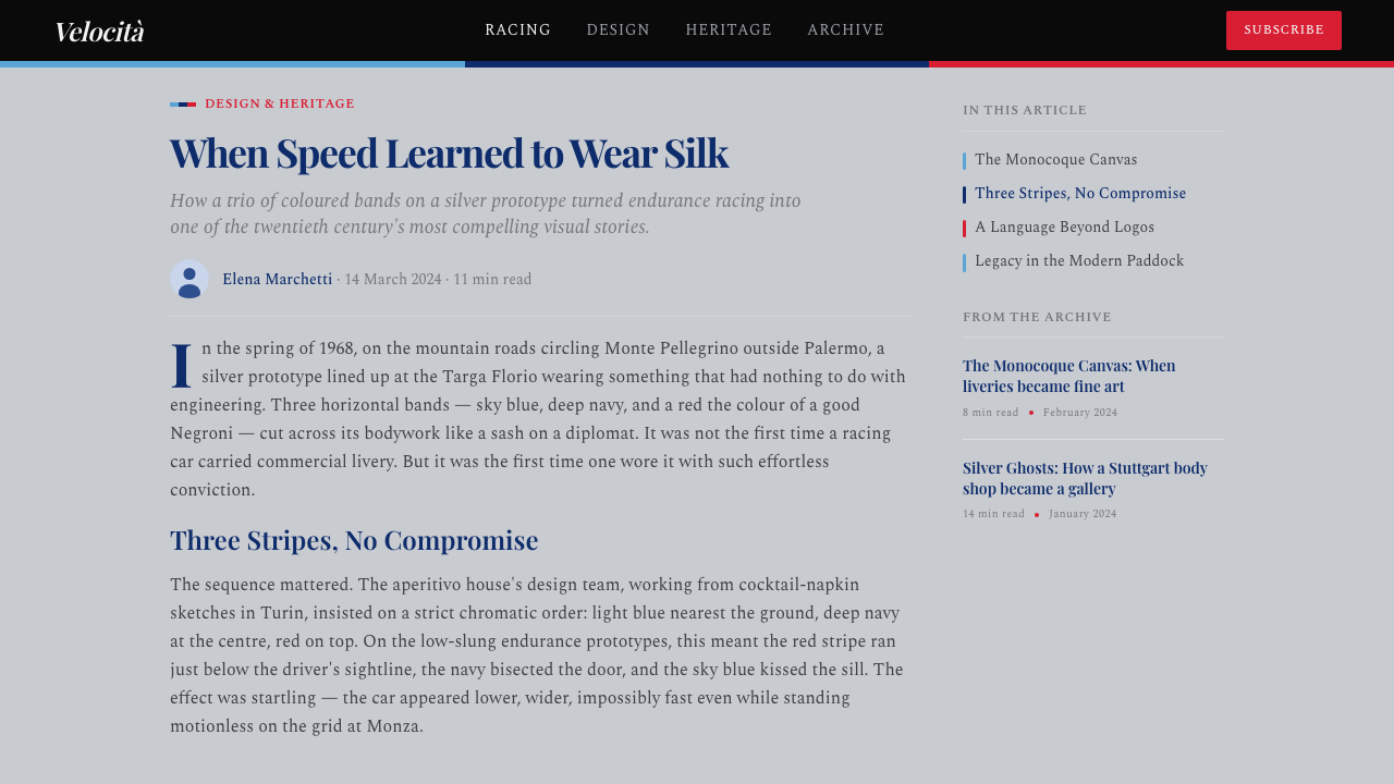
The palette is exactly three accent colors — light blue, dark navy, and red — always laid down in that sequence, always as narrow bands rather than large fields. The ground beneath them is a polished metallic silver-grey, never a saturated hue, which is what keeps the whole system reading as jewelry rather than warning paint. There is no secondary accent color; the discipline comes precisely from refusing to add a fourth.
Typography
Lettering favors a refined humanist serif rather than the squared, technical numerals typical of motorsport graphics. The serif recalls the elegant script of the Martini wordmark itself — lettering suited to a wine label or hotel marquee — and this choice is what separates the system from generic racing-sponsor decals. Numerals, where they appear, stay understated rather than blocky or industrial.
Banding and Sequence
The three-stripe band is treated as a single, indivisible unit: light blue, navy, red, always in that fixed order, running as a continuous horizontal line uninterrupted by other graphics. The sequence itself is part of the brand's identity — reversing or reordering the stripes would break recognition as surely as changing a logo's colors would. This fixed sequence is what allows the motif to travel across completely different vehicle types (endurance prototypes, rally hatchbacks) and still be read instantly as the same identity.
Ground and Metal Finish
The signature ground is a polished silver-grey with a metallic sheen — treated as neutral rather than as a hero color. Pearl-white appears as a secondary ground option in some applications, but silver is the canonical choice, chosen because it lets the stripe read as an inlay rather than as paint competing for attention. The metallic finish itself communicates precision engineering before a single stripe is added.
Restraint over Aggression
Where competing motorsport liveries of the same era pursued high contrast and visual aggression — black-and-yellow hazard palettes, hot single-hue schemes — this system's guiding principle is composure. Negative space is generous; the stripe occupies a narrow horizontal band rather than sprawling across the full body. The overall impression is closer to a tailored garment than a warning sign, and that composure is the entire point of the identity.
Cross-Discipline Consistency
The system was applied with near-identical discipline on smooth-bodied endurance prototypes and on rally cars built to survive gravel and mud — two vehicle categories with almost nothing else in common. The stripe's simple geometric construction, rather than a delicate emblem, is what allowed it to remain legible whether photographed gleaming on a starting grid or caked in dust mid-stage.
Sponsor Restraint
Unlike typical period liveries that plastered a car with the sponsor's full wordmark, product imagery, and secondary partner logos, the Martini identity keeps the stripe as the dominant graphic element and treats logotype placement as secondary and minimal. This hierarchy — motif first, brandmark second — is unusual for sponsorship-driven motorsport graphics and is a large part of why the stripe alone, without any accompanying text, remains instantly recognizable today.
Who shaped Martini Racing Stripes?
The Italian vermouth and aperitivo maker originated the sponsorship program and the specific tri-color band in 1968, choosing restraint over the logo-heavy decals typical of the era's motorsport sponsorships. The brand's insistence on a fixed stripe sequence across four decades of different teams and vehicle types is what preserved the identity's coherence.
Porsche's factory works team adopted Martini livery from 1971 onward, applying it to endurance prototypes competing at Le Mans and in the World Sportscar Championship. The pairing of German engineering precision with the Italian brand's restrained aesthetic produced some of the most photographed race cars of the 1970s, including the Martini-liveried Porsche 917.
Lancia's competition department ran the Martini identity across its Group B and Group A World Rally Championship cars from 1982 to 1992, including the 037, the Delta S4, and the Delta HF Integrale. The rally application proved the livery's durability under conditions — mud, gravel, snow — far removed from the polished endurance-racing paddock.
How do you use Martini Racing Stripes today?
Martini Racing works best in contexts that want to borrow motorsport's energy without its aggression — a rare combination that most racing-inspired design misses by defaulting to hazard stripes and industrial numerals. The system translates well because its core discipline (three fixed accent colors, restrained typography, generous negative space) is structural rather than decorative, so it survives being applied to flat digital surfaces instead of curved metal body panels.
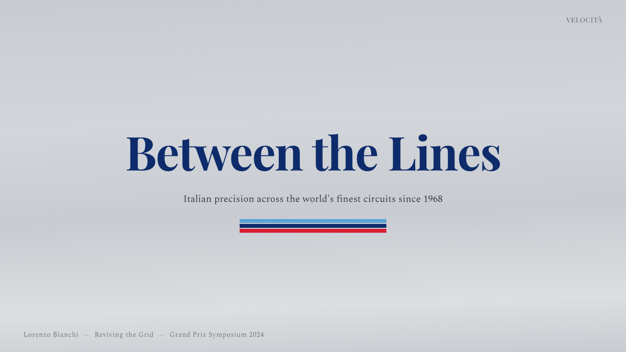
For presentation slides, the system suits a cover page built around a metallic silver-grey field with the three-color band run as a single horizontal accent near the top or bottom edge — never centered, never doubled. Title type should sit in the refined serif rather than a technical sans, reinforcing the 'aperitivo' register over the 'race telemetry' register. Content slides should keep the stripe as a header accent only, appearing once per slide at most; repeating it as a background pattern or using it to underline every bullet point breaks the sense of restraint the whole identity depends on.
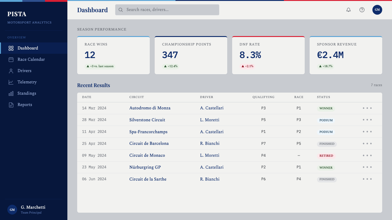
For web interfaces, the palette suits pricing pages and premium product dashboards where a brand wants to signal precision and heritage rather than urgency. The silver-grey ground works well as a card background, with the tri-color band reserved for a single accent moment — a divider above a call-to-action, a border on a featured pricing tier — rather than for navigation or body text, which should stay in neutral ink tones so the stripe keeps its status as a rare, deliberate flourish.
For editorial and marketing work, the system supports a masthead or hero treatment where the stripe runs beneath a headline set in the humanist serif, evoking a vintage motorsport program cover rather than a modern racing broadcast graphic. It suits automotive, travel, and lifestyle brands aiming for 'old European luxury' rather than 'extreme sport,' and pairs naturally with editorial photography of chrome, leather, and polished surfaces.
A common mistake is treating the three-color band as a generic 'racing stripes' motif and applying it in the wrong sequence, at the wrong scale, or duplicated across a layout as a repeating pattern. The identity's entire meaning depends on the stripe appearing once, in the correct fixed order, against a silver or pearl ground — turning it into a busy diagonal pattern splashed across a background collapses it into a generic sports-graphic cliché and loses the composed, aperitivo-hour restraint that makes the original distinctive.
Martini Racing Stripes — FAQ
Is Martini Racing the same as generic 'racing stripe' graphics?
No. Generic racing stripes are usually two parallel lines in a single hue running the length of a car's hood, borrowed loosely from American muscle-car culture. Martini's identity is a specific three-color band — light blue, navy, red, always in that order — developed for European sponsorship livery starting in 1968, paired with a refined serif and a metallic silver ground rather than a bold single hue. The number of stripes, their fixed sequence, and the aperitivo-brand restraint behind the choice are what distinguish it from a generic motorsport motif.
Why does the system use silver instead of a bolder background color?
Silver-grey acts as a neutral stage rather than a competing color. If the ground were itself saturated — bright red or deep blue, for instance — it would compete with the three-color band for attention and the composition would lose its hierarchy. Silver also carries its own meaning: a polished metallic finish reads as precision engineering before any graphic is applied, which reinforces the identity's 'expensive and composed' register rather than a 'loud and sporty' one.
Does the stripe order ever change between applications?
Historically, no — light blue, dark navy, and red always appear in that fixed sequence, whether on a Porsche endurance prototype or a Lancia rally car. This consistency is part of what makes the identity recognizable across radically different vehicle types and decades. When applying the system to new work, preserving that exact order matters more than preserving the exact colors' saturation, because the sequence itself functions as the signature.
What kind of typography pairs correctly with this system?
A refined humanist serif — the kind associated with wine labels, hotel marquees, and upscale print — is the correct pairing, echoing the elegant script of the Martini wordmark itself. Squared technical numerals or condensed industrial sans-serifs, though common in motorsport graphics generally, work against the identity's aperitivo-elegance register and should be avoided except perhaps for small functional labels like timing data.
Can this style work for a brand that has nothing to do with cars or racing?
Yes — the underlying transferable idea is not 'racing' but 'restrained luxury signaled through a fixed, minimal color sequence.' Any brand wanting to communicate heritage, precision, and understated confidence — travel, hospitality, premium spirits, even financial services — can borrow the structure: a neutral metallic or pale ground, a narrow fixed-sequence accent band used sparingly, and refined serif type. What should not transfer is the motorsport iconography itself — checkered patterns, speed lines, chassis numerals — since those pull the identity back toward generic racing graphics rather than the composed original.
Related design styles
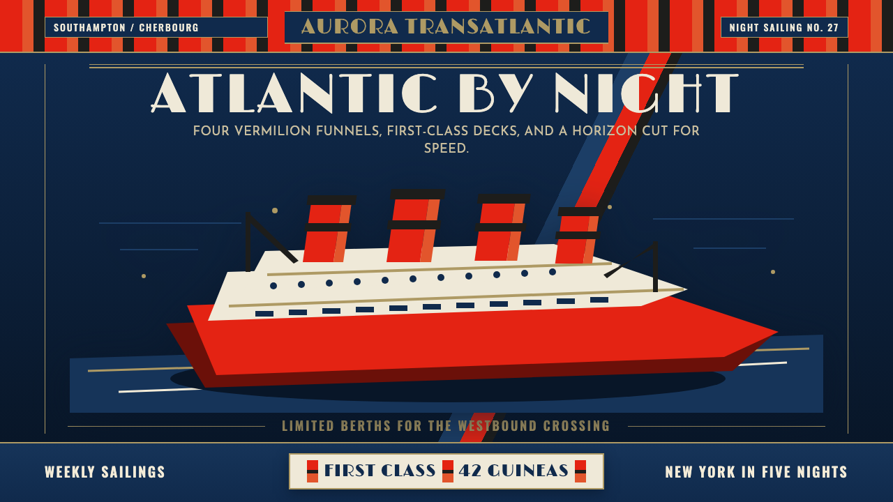 Cunard Liner PosterOceanic grandeur. Vermilion funnels, teak-gold caps, and a marine-blue poster…
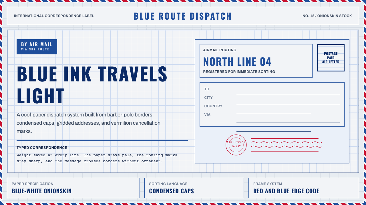 Par Avion Air MailPostal lightness made strict. Onionskin blue, Oswald caps, and red-blue edge…
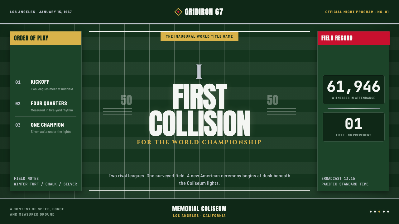 Super Bowl (1967)Athletic spectacle becomes ceremony. Chalk grids, silver rules and Roman type…
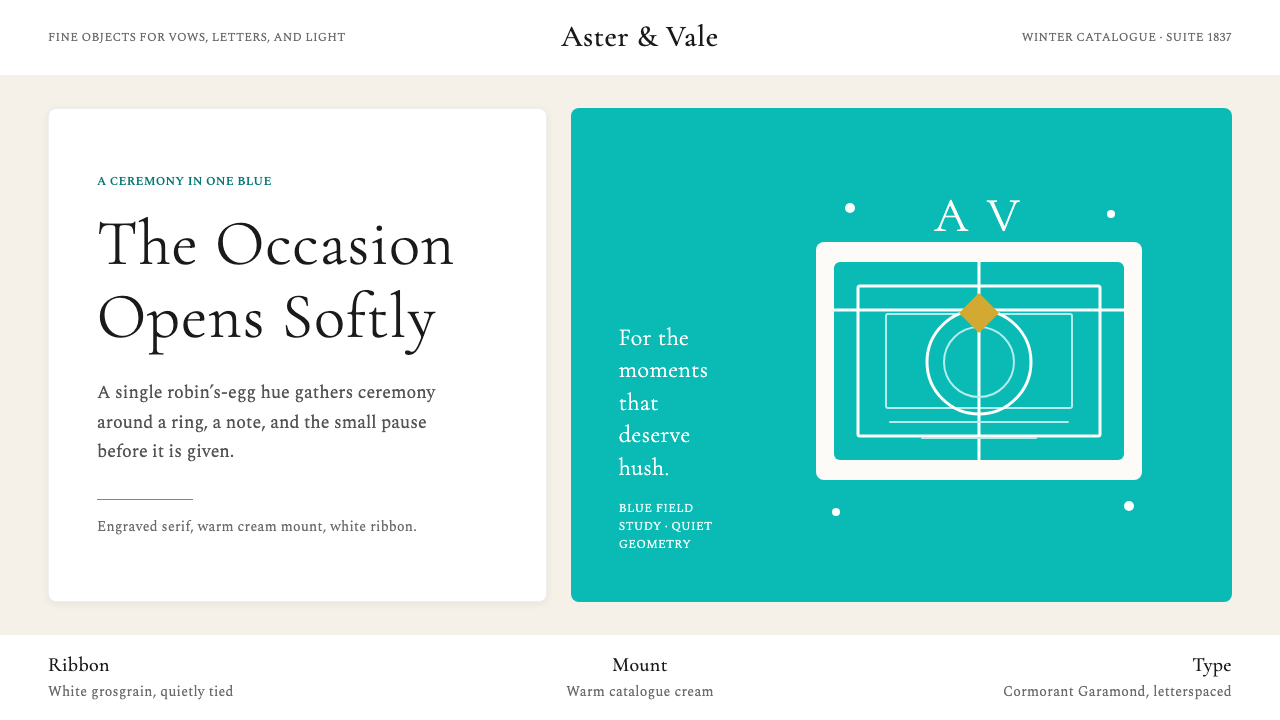 Tiffany & CoRomance in one blue. Robin's-egg panel, cream mount, airy serif restraint.
 Valentino Rouge Couture (1959)Matte couture red holds the page. Cream paper and hairline gold keep it cerem…
 Naval Dress UniformAuthority in midnight wool. Cinzel capitals, gold lace and button symmetry ho…