What is Ocean Liner Seafoam?
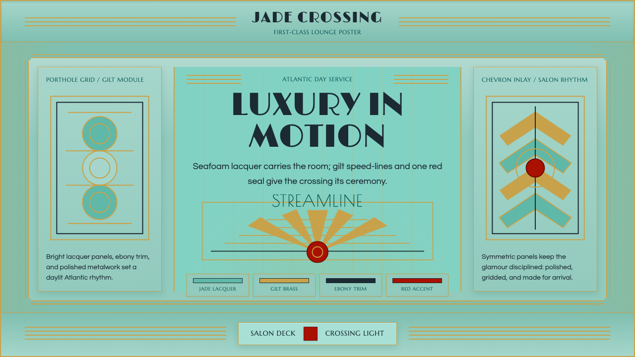
Ocean Liner Seafoam is luxury built for motion — pale jade lacquer, gilt speed-lines, and Deco symmetry, staged for the grand first-class lounges that once crossed the Atlantic.
Ocean Liner Seafoam in brief
Ocean Liner Seafoam revives the moderne glamour of the great transatlantic liners of the 1920s and 1930s — above all the SS Normandie and the RMS Queen Mary — whose first-class public rooms paired pale jade-green lacquered wall panels with chrome fittings, gilt metalwork, and lacquer red accents. It is Art Deco filtered specifically through nautical engineering: streamline speed-lines borrowed from a ship's hull, stepped ziggurat framing borrowed from skyscraper massing, and polished surfaces designed to catch the shifting daylight of an ocean crossing.
The defining quality of the style is confidence rendered through symmetry. Where later mid-century design would loosen into asymmetric balance, this system stays resolutely centered: a porthole grid repeats at regular intervals, a sunburst inlay radiates from a single fixed point, chevron patterns march in even, mirrored rhythm. This is the visual language of an era that believed in the ocean liner as the pinnacle of engineered luxury — a floating hotel that had to look unshakeable even while crossing open water.
The palette stays bright and daylit rather than moody. Seafoam green carries the bulk of every interior surface; gold metalwork — railings, light fixtures, inlay lines — draws the eye along fixed paths; ebony trim provides the darkest note in the system; and a single Normandie lacquer-red is spent sparingly, reserved for the rare accent that needs to announce itself against the pale green field. Nothing in the palette is muddy or desaturated — it is a system built for rooms lit by both electric fixtures and the open sea.
Where does Ocean Liner Seafoam come from?
The style is anchored to a specific, brief golden age: the fifteen years or so between the end of the 1920s and the outbreak of the Second World War, when transatlantic passenger lines competed openly for prestige, speed, and design spectacle. The flagship of this competition was the SS Normandie, launched by the French Line (Compagnie Générale Transatlantique) in 1932 and entering service in 1935. Normandie was conceived as a floating advertisement for French taste and industrial capability, and her interiors — designed by leading French decorators of the day — turned the entire ship into an exhibition of Art Deco craftsmanship, from Lalique glass fixtures to lacquered wall panels finished in the pale jade tone that gives this system its name.
The furniture designer Jacques-Émile Ruhlmann, already established as one of the era's most sought-after cabinetmakers and interior decorators, contributed to the elevated, luxury-goods sensibility that shaped Normandie's public rooms even where his direct hand was not present — his exotic-wood, ivory-inlaid furniture defined the taste that French Line commissioners were reaching for throughout the ship. The vessel's advertising made the connection between speed and glamour explicit: the celebrated poster designer A. M. Cassandre produced a now-iconic image of Normandie's bow rendered as a monumental, almost architectural wedge cutting through the water, an image that fused the ship's streamline engineering with pure graphic geometry and helped cement the visual identity of the entire genre.
Britain answered with the Cunard Line's RMS Queen Mary, launched in 1934 and entering service in 1936. Where Normandie leaned toward avant-garde French decoration, Queen Mary's interiors were more restrained and Anglicized — still unmistakably Deco in their geometric marquetry, chrome fittings, and symmetric public rooms, but tempered by British taste for understatement. The rivalry between the two ships, and between the French and British lines more broadly, pushed both toward ever more spectacular first-class interiors, since each new liner was implicitly a national statement as much as a commercial vessel.
This entire aesthetic era ended abruptly. Normandie was requisitioned by the United States during the Second World War, caught fire during conversion at a New York pier in 1942, and capsized — a loss that effectively closed the book on this specific strain of maritime Deco. Postwar shipping, facing new economics and the rise of transatlantic air travel, never fully revived the extravagant, decoration-forward interiors of the 1930s. What survives today is largely photographic and archival: ship models, surviving fittings in museum collections, and the enduring visual memory of a decade when an ocean crossing was designed to feel like the height of modern luxury.
What defines the Ocean Liner Seafoam look?
Color
Seafoam green carries the majority of every surface — walls, panels, upholstery grounds — and stays pale and light-catching rather than deep or saturated. Gold metalwork provides the system's line-work and accenting, ebony trim supplies its darkest register, and a single lacquer red is reserved exclusively for the rare focal accent, never spread across large areas.
Symmetry and Composition
Layouts stay resolutely centered and mirrored rather than dynamically balanced — a central axis organizes each composition, with elements repeating in even pairs on either side. This confident symmetry is the opposite of the asymmetric tension found in more radical modernist styles; it projects the stability and grandeur appropriate to a floating luxury hotel.
Geometric Motifs
The system relies on a specific vocabulary of repeating geometric patterns: porthole-derived circular grids, sunburst inlays radiating from a fixed center, and chevron or zigzag rhythms marching in even repetition. These motifs are drawn directly from ship architecture — a porthole, a ship's wake, a radiating compass — translated into decorative surface pattern.
Stepped Framing
Borders and frames use a stepped, ziggurat-like profile borrowed from skyscraper massing of the same era — a rectangular form receding in successive tiers rather than a single flat edge. This gives even simple containers, cards, or panels a sense of architectural weight and vertical ambition.
Metalwork and Line
Gilt metal lines — thin, precise, and gleaming — do the work that a hairline rule or border would do in a plainer system, but with the added implication of polished brass or chrome fittings. Lines are always crisp and unbroken, never sketchy or hand-drawn, evoking the machined precision of shipboard hardware.
Surface Finish
Every surface is treated as lacquered and polished rather than matte or textured — the aesthetic wants to catch and reflect light the way a varnished panel or a chromed rail would aboard an actual liner. This gives even flat digital surfaces a sense of luster and high finish appropriate to the luxury register.
Light and Reflection
The system is imagined as daylit rather than dim — public rooms aboard these liners were designed to be flooded with natural sea light through large windows, and the pale seafoam ground amplifies rather than absorbs it. This keeps the overall mood bright, optimistic, and celebratory rather than moody or intimate.
Who shaped Ocean Liner Seafoam?
The French Line commissioned Normandie as a national showcase of design and engineering, launching her in 1932 and putting her into service in 1935. Her interiors, finished throughout in pale jade lacquer, gilt metalwork, and Lalique glass, remain the definitive expression of this entire aesthetic.
Cunard's Queen Mary, launched in 1934 and in service from 1936, answered Normandie with a more restrained, Anglicized take on the same Deco vocabulary — geometric marquetry and chrome fittings tempered by British understatement, and a direct rival in the transatlantic prestige race.
One of the era's most celebrated cabinetmakers and interior decorators, Ruhlmann's exotic-wood, ivory-inlaid furniture defined the elevated luxury-goods taste that French Line commissioners sought throughout Normandie's public rooms, even beyond his own direct commissions.
The poster artist whose famous image of Normandie's bow, rendered as a monumental architectural wedge, fused the ship's streamline engineering with pure graphic geometry, becoming one of the most reproduced and recognizable images of the entire ocean-liner era.
How do you use Ocean Liner Seafoam today?
This style is built to signal effortless, engineered luxury, and it works best when treated as an occasion rather than a default — a register for the moments where a product wants to feel like a first-class experience rather than an everyday tool.
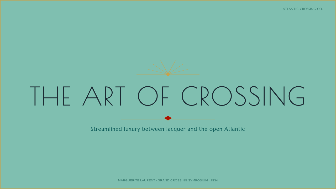
For presentation slides, the style gives cover pages real drama: a seafoam ground with a stepped, gilt-lined border framing the title, and a sunburst or porthole motif anchored in a corner or centered behind the type. Content slides should keep the symmetry intact — mirrored two-column layouts, a centered chevron rule dividing sections — while reserving the lacquer-red accent for a single call-out per slide, such as a headline statistic. Data visualizations can take on the porthole-grid logic directly, framing individual charts as circular or stepped-frame panels rather than plain rectangles.
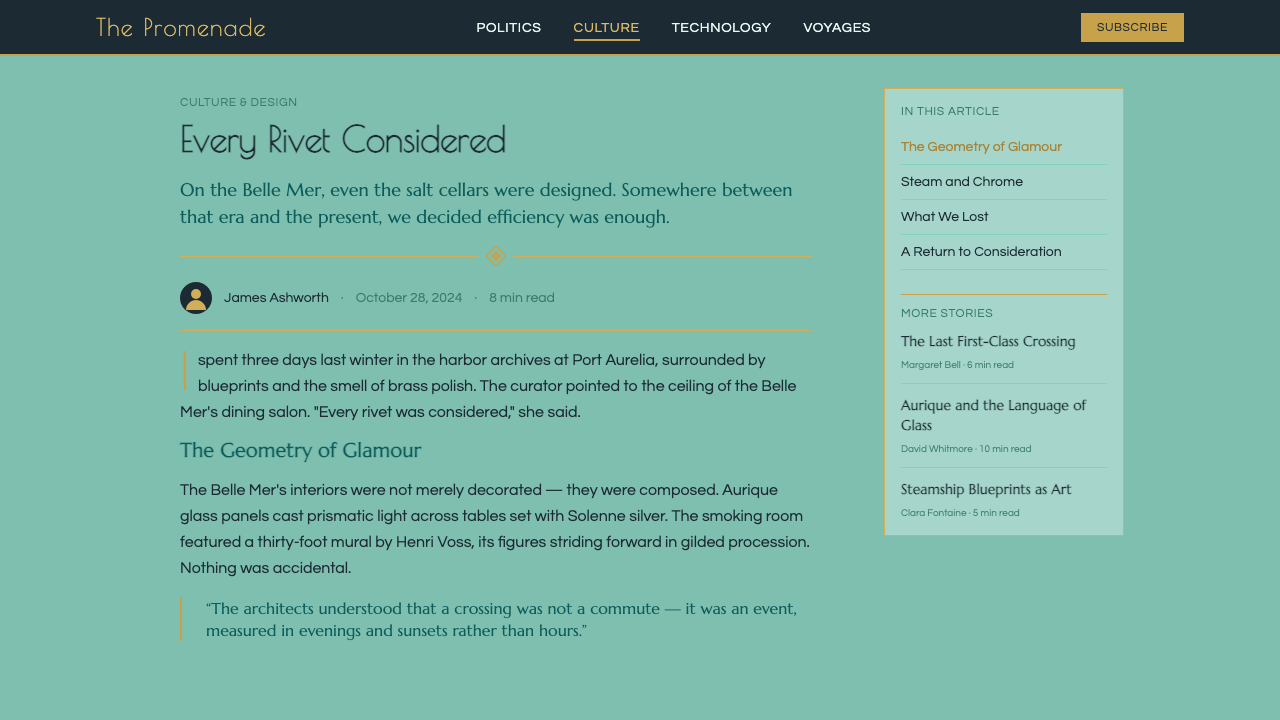
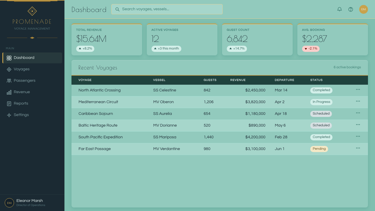
For web interfaces, the palette suits premium or hospitality-adjacent products — travel booking, luxury goods, high-end subscription tiers — where dashboards and pricing pages benefit from feeling like an invitation rather than a utility. A pale seafoam background, gilt-line dividers between sections, and ebony text create a sense of considered luxury; the reserved red accent should mark only the single most important action, such as the top-tier plan or the primary call to action, never routine interface elements.
For editorial and marketing content, the style suits travel writing, heritage brand storytelling, and any narrative invoking a golden age of design. Layouts can use the stepped ziggurat frame around feature images or pull quotes, and full-bleed sunburst or chevron patterns work well as section dividers between long-form passages, giving the reading experience the rhythm of moving through a ship's public rooms.
The most common mistake is over-saturating the palette — pushing the green toward a deep emerald or the gold toward brash yellow, which collapses the pale, daylit quality that gives the style its lightness. A second common error is abandoning symmetry for a casual, off-center layout; without the centered, mirrored composition, the aesthetic loses the confident grandeur that is its entire point.
Ocean Liner Seafoam — FAQ
Is this the same as general Art Deco, or something narrower?
It is a specific nautical strain of Art Deco, sometimes called Paquebot or Streamline Moderne when applied to ships. General Art Deco spans architecture, jewelry, and graphic design across many contexts; this system narrows to the particular palette and motifs — seafoam green, gilt metalwork, porthole grids, stepped ziggurat framing — associated specifically with 1930s transatlantic liner interiors.
Why does the palette stay so light instead of using deep, moody tones?
The source interiors were designed to be flooded with natural sea light through large windows during daytime crossings, so the pale seafoam ground and gilt metalwork were chosen specifically to amplify brightness rather than create shadow and mood. Pushing the palette darker breaks that historical logic and produces something closer to generic luxury branding than this specific style.
Can the lacquer-red accent be used more broadly across a design?
It should not be. The entire discipline of the palette depends on treating red as a rare, deliberate accent — one call to action, one focal badge, one highlighted data point — rather than a supporting color. Spreading it across multiple elements collapses the hierarchy and makes the whole composition feel busy rather than considered.
How strictly does the symmetry rule need to be followed?
Fairly strictly. Symmetry is not a stylistic preference here but the structural source of the style's confident, grand feeling. A layout that breaks symmetry for the sake of contemporary asymmetric trends will read as a different, more casual style entirely, even if the color palette and motifs remain accurate.
What kinds of products or brands does this aesthetic suit best?
It works best for travel, hospitality, luxury goods, heritage brands, and any premium subscription product that wants a moment of occasion — a booking confirmation, a top-tier plan page, a celebratory milestone. It suits products less well when everyday utility, speed, or informality is the priority, since the aesthetic's grandeur can feel excessive for routine tasks.
Related design styles
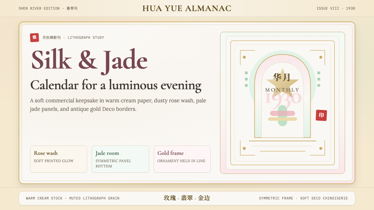 Shanghai Calendar 1930Old Shanghai glows softly. Cream paper, dusty rose, jade panels, and gold Dec…
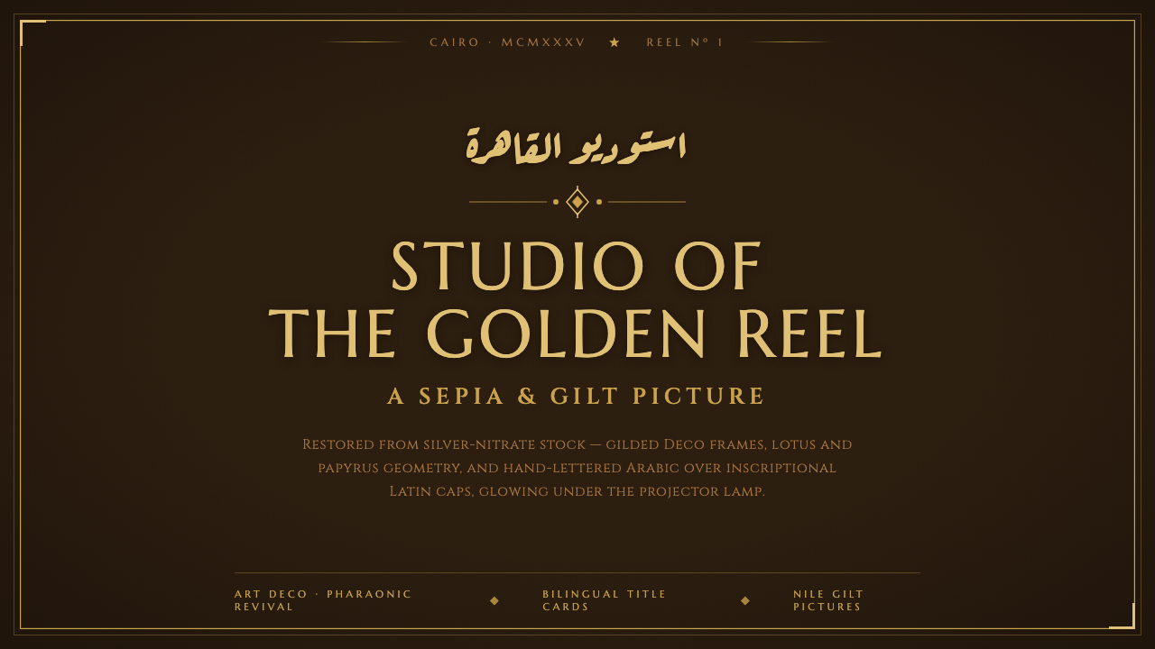 Studio Misr CairoEgyptian cinema's golden age, gilded. Silver-nitrate brown, Deco gold frames,…
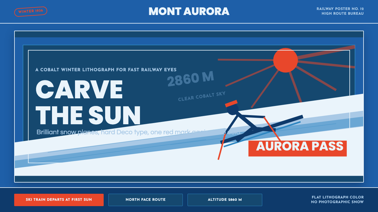 Alpine Ski PosterCold speed sells winter. Cobalt sky, snow planes, sun rays, and one resort-re…
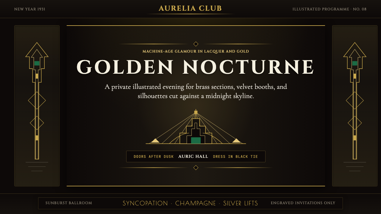 Art Deco Jazz AgeJazz Age glamour. Sunburst rays, stepped ziggurats, gold on black — Chrysler…
 Art Deco Teal BathroomColour was the modern bath. Water-duck teal glaze, snazzy black trim, Limelig…
 Cunard Liner PosterOceanic grandeur. Vermilion funnels, teak-gold caps, and a marine-blue poster…