What is Shanghai Calendar 1930?什么是 Shanghai Calendar 1930?
Shanghai calendar posters fused Chinese figure painting with Art Deco geometry into the most glamorous advertising aesthetic the East ever produced.月份牌将中国仕女画的柔美意境与装饰艺术的几何秩序熔为一炉,铸就了二十世纪东方最迷人的商业美学。
Shanghai Calendar 1930 in briefShanghai Calendar 1930 速览
Shanghai calendar posters — yuèfènpái (月份牌) — were the defining commercial art form of Republican-era China. Produced in the city's International Settlement from roughly the mid-1910s through the late 1930s, they appeared as free giveaways from cigarette companies, pharmaceutical houses, and department stores, and ended up covering the walls of homes and shops from Shanghai to Singapore. The images depicted fashionable women — qípáo-clad, bobbed-haired, relaxed in modern interiors — surrounded by intricate ornamental frames borrowed from both Chinese decorative tradition and Western Art Deco.月份牌是民国时代中国最具代表性的商业艺术形式。这些画作在上海公共租界大量生产,约从1910年代中期延续至1930年代末,由香烟公司、药房与百货商店作为赠品免费派发,张贴于从上海到新加坡的无数家庭与店铺墙壁。画面描绘时髦女性——身着旗袍、烫着波浪发、悠闲地置身摩登室内——四周环绕着融汇了中国装饰传统与西方装饰艺术的繁复边框。
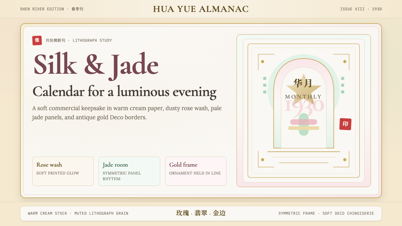
The visual language is immediately distinctive: warm cream or ivory grounds that evoke aged lithograph paper, figure compositions rendered with a soft-focus, almost luminous quality derived from the gōngbǐ fine-line painting tradition, and borders constructed from jade-toned panels, gilded geometric friezes, and chinoiserie motifs — lotus scrolls, cloud collars, bamboo lattice — interwoven with the clean symmetrical framing of Deco architecture. Color palettes favor dusty rose, powder blue, sage green, warm gold, and ivory, kept deliberately muted and powder-washed rather than saturated.这套视觉语言具有极强的辨识度:令人联想到老石版纸的温润奶油色或象牙白底面,以工笔画细线传统为根基、带有柔焦光晕质感的人物描绘,以及由翡翠色面板、镀金几何楣饰与中国纹样——莲花卷草、云肩纹、竹格窗棂——交织装饰艺术建筑的对称框架所构成的边界系统。色调倾向于带粉的玫瑰色、粉末蓝、鼠尾草绿、暖金色与象牙白,刻意保持蒙尘、粉雾感而非饱和鲜艳。
The aesthetic carries a quality that has no single Western equivalent: it is simultaneously commercial and refined, modern and nostalgic, cosmopolitan and Chinese. This hybrid character was not accidental — it was the deliberate product of artists who understood both the Western chromolithographic posters arriving from Europe and the classical Chinese painting vocabulary they had studied for years. The result is a design language of unusual richness, warmth, and cultural specificity.这种美学携带着一种无法在西方找到完全对应物的气质:它同时是商业的与精致的、摩登的与怀旧的、国际主义的与中国的。这种混血特质并非偶然,而是艺术家有意为之的成果——他们既深谙从欧洲传入的西方石版印刷海报,又浸淫于中国古典绘画传统多年。由此形成的设计语言具有罕见的丰润感、温度感与文化特殊性。
See the Shanghai Calendar 1930 design system查看 Shanghai Calendar 1930 完整设计系统
Where does Shanghai Calendar 1930 come from?Shanghai Calendar 1930 从何而来?
The calendar poster's origins lie in the intersection of two commercial forces: foreign tobacco companies seeking to penetrate the Chinese market in the early twentieth century, and a generation of Shanghai artists trained in both the gōngbǐ painting tradition and the new imported medium of chromolithography. The British-American Tobacco Company is widely credited with commissioning some of the earliest examples, distributing them alongside cigarette packages as collectible almanac sheets that combined a painted image with calendar grids. By the 1910s, the format had been adopted by Chinese-owned businesses and had evolved into a standalone art form.月份牌的起源交汇于两股商业力量:二十世纪初试图打入中国市场的外国烟草公司,以及同时受过工笔画传统与新兴彩色石版印刷技术训练的一代上海画师。英美烟草公司通常被认为委托制作了最早的一批月份牌,将其与香烟包装一同派发,作为附有绘画与月历格的可收藏年历页。到1910年代,这一形式已被中国本土商家广泛采用,并演变为一种独立的艺术形态。
The golden age — roughly 1925 to 1937 — coincided with the height of Republican Shanghai's cosmopolitan ambition. The city of this era was simultaneously a treaty port under partial foreign administration, a center of Chinese nationalist politics, a hub of Japanese commercial influence, and the publishing capital of the Chinese-speaking world. Its residents consumed Japanese magazines, Hollywood films, and Parisian fashion alongside Chinese opera, classical poetry, and traditional festivals. The calendar poster absorbed this plurality: Western Art Deco geometry and symmetry, the chromolithographic color palette of European commercial printing, and the soft figuration and ornamental vocabulary of Song and Ming dynasty Chinese painting.黄金年代——大约1925年至1937年——与民国上海国际主义抱负的顶峰相互叠合。这一时期的上海,既是部分处于外国管辖下的条约口岸,也是中国民族主义政治的中心,日本商业影响力的枢纽,以及中文出版世界的首都。居民们同时消费日本杂志、好莱坞电影、巴黎时装与中国戏曲、古典诗词、传统节庆。月份牌吸收了这种多元性:西方装饰艺术的几何结构与对称秩序、欧洲商业印刷的彩色石版色调,以及宋明两代中国画的柔和造型与装饰语汇。
The artists who defined the style worked largely in specialized commercial studios. Zheng Mantuo (鄭曼陀, 1888–1961) is credited as the first major innovator, developing a blended technique that combined watercolor wash with gōngbǐ line work to produce the soft-focus, porcelain-skinned female figures that became the genre's signature. Hang Zhiying (杭穉英, 1900–1947) ran the most commercially influential studio of the era — Zhiying Studio — training a generation of artists and producing work that set the standard for figural elegance, ornamental frame design, and the integration of Western Deco motifs with Chinese decorative traditions. His compositions display a particular mastery of the dense, jewel-like border systems that frame the central figure.塑造这一风格的艺术家大多就职于专门的商业画室。郑曼陀(1888—1961年)被公认为首要革新者,他发展出一种将水彩晕染与工笔勾线融合的技法,创造出柔焦、瓷肌质感的女性形象,成为整个画科的标志性符号。杭穉英(1900—1947年)主持了时代最具商业影响力的画室——穉英画室——培养了整整一代画师,其作品在人物典雅、边框纹样设计以及将西方装饰艺术母题与中国装饰传统整合方面树立了行业标准。他的构图对环绕中心人物的密集、宝石般华美的边框系统展现出特别的掌控力。
The abrupt end of the golden age came with Japan's full-scale invasion of China in July 1937 and the fall of Shanghai in November of that year. The conditions that had sustained the form — commercial prosperity, cosmopolitan openness, the patronage of foreign and Chinese businesses alike — dissolved under wartime occupation. After 1949, the People's Republic redirected commercial printing toward socialist realist imagery, and the yuèfènpái aesthetic was effectively suppressed for decades. It was only from the 1980s and 1990s onward that scholars, collectors, and designers began to recover and revalue the form, and the style entered global visual culture as a marker of a specific, irretrievably lost world.黄金年代的骤然终结,源于1937年7月日本对中国的全面侵略与同年11月上海的沦陷。维系这一艺术形式繁荣的条件——商业繁荣、国际主义开放氛围、外国与中国商业机构的共同赞助——在战时占领中土崩瓦解。1949年后,中华人民共和国将商业印刷导向社会主义现实主义图像,月份牌美学事实上被压制数十年。直到1980至90年代,学者、收藏家与设计师才开始重新发现并重估这一形式,这种风格进入全球视觉文化,成为一个特定的、已然永久消逝的世界的标记。
What defines the Shanghai Calendar 1930 look?Shanghai Calendar 1930 的视觉特征是什么?
Color Palette色彩系统
The palette is soft and powder-washed rather than saturated. Ivory and warm cream serve as the dominant ground, evoking the aged quality of lithograph paper. Accent colors — dusty rose, powder blue, sage green, warm gold, and muted coral — are kept at low intensity, creating a sense of delicacy and refinement rather than commercial loudness. Darker values appear sparingly in border elements and shadows, never overwhelming the overall luminosity. The effect is of light filtered through translucent silk: everything glows softly from within.整体色调粉雾而非饱和,象牙白与暖奶油色构成主导底面,唤起石版印刷老纸的岁月质感。强调色——蒙尘玫瑰粉、粉末蓝、鼠尾草绿、暖金色与低调珊瑚色——均保持低纯度,营造出精致柔雅而非商业张扬的气质。较深的色值仅在边框元素与投影中节制出现,从不压倒整体的光润感。整体效果如同透过半透明蚕丝过滤的光线:一切都从内部柔和地发光。
Figural Softness柔焦人物
The central figures — almost always fashionable women of the Republican era — are rendered with a characteristic soft-focus luminosity. This technique, pioneered by Zheng Mantuo, blended the wet-into-wet wash of watercolor with the precision line work of classical gōngbǐ painting to produce skin tones of an almost porcelain translucency. Edges are never hard; contours dissolve slightly into the ground. The figures occupy a middle space between illustration and portraiture, idealized but never abstract.中心人物——几乎清一色是民国时代的时髦女性——以标志性的柔焦光润质感呈现。这一技法由郑曼陀首创,将水彩的湿碰湿晕染与古典工笔画的精准勾线融合,产生出近乎瓷器透光感的肤色。轮廓线从不锋锐;边缘向底色中轻微消融。人物居于插图与肖像之间的中间地带,理想化但从不抽象。
Ornamental Borders装饰边框
The border systems are among the most structurally complex elements of the aesthetic. They typically consist of two or three nested frames, each carrying different decorative vocabulary: an outermost band of geometric Deco fretwork in gold or jade tones; a middle register of chinoiserie motifs — lotus blossoms, cloud collar patterns, bat-and-coin symbols of prosperity, bamboo lattice; and an innermost frame that creates a clean pictorial ground for the figure. The layering is dense but never chaotic, ordered by the same symmetrical logic that governs classical Chinese architectural ornamentation.边框系统是这套美学中结构最为复杂的元素之一。通常由两到三层嵌套框架构成,每层承载不同的装饰语汇:最外层是金色或翠绿色调的几何装饰艺术回纹;中间层是中国风母题——莲花、云肩纹、蝠钱吉祥纹、竹格窗棂;最内层则为人物创造洁净的图像底面。层叠繁复却毫不混乱,以与中国古典建筑装饰相同的对称逻辑加以统御。
Art Deco Integration装饰艺术融合
Western Art Deco forms are present throughout but always subordinated to the overall Chinese sensibility. Geometric friezes with the stepped profiles and fan-shaped radiants characteristic of Deco architecture appear in header and footer bands. Stylized floral motifs take on the flat, symmetrical quality of Deco ornament. The overall compositional logic — a strong central axis, mirrored flanking elements, hierarchical zoning from top to bottom — is Deco in its structural approach while Chinese in its surface vocabulary. Neither tradition dominates; the two are genuinely synthesized.西方装饰艺术形式遍布其中,但始终从属于整体中国气质。具有装饰艺术建筑特征的阶梯轮廓与扇形放射纹出现在页眉与页脚装饰带中。风格化花卉母题呈现出装饰艺术纹样的平面化对称特质。整体构图逻辑——强中轴、镜像侧翼元素、从上到下的层级分区——在结构方式上属于装饰艺术,在表面语汇上属于中国传统。两种传统互不主导,真正完成了融合。
Typography and Text文字与字体
Text elements are treated with elegant restraint. Brand names and product titles typically appear in refined serif letterforms — either European-style display serifs or classically proportioned Chinese brush characters — placed within dedicated cartouches or banner panels rather than floating freely over the image. Chinese characters, when used as decorative elements, are rendered in the regular script (kǎishū) or seal script (zhuànshū) tradition, contributing to the sense of historical depth and cultural rootedness. Never condensed, never bold-slab, always measured and composed.文字元素以优雅的克制处理。品牌名称与产品标题通常以精致的衬线字形呈现——欧式装饰性衬线体或比例古典的中文毛笔字——置于专门的牌匾或横幅面板内,而非自由漂浮于图像之上。汉字作为装饰元素使用时,以楷书或篆书传统书写,强化历史纵深感与文化根植感。从不压缩,从不粗壮,始终从容而有章法。
Compositional Symmetry构图对称
Unlike Bauhaus or Swiss-style asymmetric grid compositions, the calendar poster tradition is fundamentally symmetric. The central figure occupies a vertical axis, flanked by matching decorative panels. The upper and lower portions of the composition mirror each other in density and ornamental weight. This symmetry carries cultural meaning — in Chinese aesthetic tradition, balanced composition (均衡, jūnhéng) connotes stability, harmony, and auspiciousness. The symmetry is not rigid but slightly relaxed, breathing rather than mechanical, suited to printed paper rather than stone.与包豪斯或瑞士风格的非对称网格构图不同,月份牌传统在根本上是对称的。中心人物占据垂直轴线,两侧配以对称装饰面板。构图的上下部分在密度与装饰分量上相互呼应。这种对称携带文化意涵——在中国美学传统中,均衡的构图意味着稳定、和谐与吉祥。这种对称并非僵硬,而是略带松弛感,如呼吸般自然,适合印刷纸张而非石刻。
Luxury Surface Quality奢润质感
Every element of the calendar poster aesthetic connotes quality and luxury without ostentation. Gold accents are used sparingly but consistently, giving borders and text elements a warm metallic highlight. Surface textures — where they appear — suggest woven silk, carved lacquer, or hand-laid paper rather than digital cleanliness. The overall impression is of something made with patience and skill, closer to a collectible print than a mass advertisement, even though the medium was inherently commercial and widely distributed.月份牌美学的每个元素都传递品质与奢润感,却不流于炫耀。金色点缀使用克制但一致,为边框与文字元素赋予温暖的金属光泽。表面质感——在出现时——令人联想到织锦丝绸、雕漆或手工铺纸,而非数字化的洁净感。整体印象是某种以耐心与技艺制作之物,更接近珍藏版版画而非大批量广告,尽管这一媒介本质上是商业性的、被广泛传播的。
See the Shanghai Calendar 1930 design system查看 Shanghai Calendar 1930 完整设计系统
Who shaped Shanghai Calendar 1930?谁塑造了 Shanghai Calendar 1930?
Zheng Mantuo is credited as the founding innovator of the modern yuèfènpái style. Working in the 1910s and 1920s, he developed the technique that became the form's signature: building up the central figure using the wet-wash layering of Western watercolor while maintaining the fine-line precision of Chinese gōngbǐ painting for contours and detail. This blended method produced the soft, luminous skin tones and dissolving edges that distinguished Shanghai calendar art from both straight Western commercial illustration and traditional Chinese figure painting. His compositions introduced the framing conventions — the cartouche for text, the ornamental border separating image from calendar grid — that subsequent artists would elaborate and refine.郑曼陀被认为是现代月份牌风格的奠基性革新者。在1910至1920年代,他发展出使这一形式具有标志性意义的技法:以西式水彩的湿润分层构建中心人物,同时保持中国工笔画的细线精准性来处理轮廓与细节。这种融合技法产生出柔润、光亮的肤色与消融感的边缘,使上海月份牌与纯粹的西方商业插图和传统中国人物画都判然有别。他的构图引入了后续画家将不断丰富与精进的框架惯例——容纳文字的牌匾、将图像与月历格分隔的装饰边框。
Hang Zhiying's Zhiying Studio was the most commercially successful and artistically influential calendar poster enterprise of the golden age. Hang trained under earlier masters and then established his own studio in Shanghai around 1921, eventually employing dozens of artists at its peak. His contribution was not only in his own figure painting — which combined elegance of posture and costume with acute sensitivity to Western fashion illustration — but in systematizing the production of the border and ornamental elements that gave the format its characteristic richness. He developed standardized border templates drawing on both Art Deco geometry and Chinese decorative motifs, which could be combined and reconfigured for different clients. His early death in 1947 at the age of forty-seven cut short a career that had defined the aesthetic standard for an entire generation.杭穉英的穉英画室是黄金年代商业成就最高、艺术影响力最强的月份牌机构。杭穉英师从前辈画师,约于1921年在上海创立自己的画室,巅峰时期雇用了数十名画师。他的贡献不仅在于他本人的人物画——将姿态与服饰的典雅与对西方时装插图的敏锐洞察相结合——更在于他将边框与装饰元素的生产系统化,这些元素赋予这一形式其标志性的丰润感。他从装饰艺术几何形与中国装饰母题双重来源出发,研发了标准化边框模板,可根据不同客户的需求组合与重新配置。他于1947年以四十七岁之龄早逝,结束了一段为整整一代人确立美学标准的职业生涯。
Jin Meisheng was among the most prolific calendar poster artists of the Republican era and one of the few significant practitioners to survive the political changes of 1949 and continue working into the People's Republic period. His work is noted for a particular brightness and warmth of palette and for figure compositions that project a sense of idealized domestic happiness — women in gardens, with children, arranged in serene and prosperous settings. He demonstrated how the calendar poster aesthetic could adapt across different ideological contexts, and his later work in the socialist period, though serving different propaganda purposes, retained formal qualities traceable to the yuèfènpái tradition he had helped define.金梅生是民国时代最多产的月份牌画家之一,也是少数在1949年政治巨变后存续并在中华人民共和国时期延续创作的重要从业者之一。他的作品以色调的明亮温暖与传递理想化家庭幸福感的人物构图著称——女性置身花园、与儿童相伴、安处于宁静富足的场景之中。他展示了月份牌美学如何跨越不同意识形态语境进行调适;他后期在社会主义时期的作品,尽管服务于不同的宣传目的,仍保留了可追溯至他参与塑造的月份牌传统的形式特质。
Xie Zhiguang brought a particular fluency with Western-style figure drawing into the calendar poster tradition, his figures displaying an understanding of volumetric modeling and Western academic proportion alongside the expected Chinese softness of technique. He was among the artists most attuned to the cosmopolitan fashions of the International Settlement era, and his compositions frequently feature women in Western dress as naturally as in traditional qípáo, reflecting the genuinely bicultural world his audience inhabited. His work represents the calendar poster at its most internationally literate — visually accessible to both Chinese and foreign viewers while remaining distinctly rooted in its Shanghai context.谢之光将对西式人物素描的特别流畅性引入月份牌传统,其人物形象在预期中的中国柔润技法之外,展现出对体积塑造与西方学院派比例的理解。他是最能感应公共租界时代国际主义时尚气息的画家之一,构图中的女性着西式服装与穿传统旗袍同样自然,折射出其受众所真实居住的双文化世界。他的作品代表月份牌在国际视野上最为通达的形态——对中西方观者均保持视觉可及性,同时仍坚实扎根于其上海语境之中。
How do you use Shanghai Calendar 1930 today?今天怎么用 Shanghai Calendar 1930?
The Shanghai calendar poster aesthetic transfers most naturally to contexts that benefit from warmth, cultural richness, and a sense of refined historical depth. Unlike purely geometric or typographic styles, it requires a light touch: the goal is to evoke the luminosity and ornamental elegance of the original form, not to reproduce it literally. The key design decisions are palette and border treatment — get those right, and the rest of the system follows.上海月份牌美学最自然地适用于受益于温度感、文化丰富性与精致历史纵深感的场景。与纯几何或纯字体风格不同,它需要轻盈的触感:目标是唤起原始形式的光润感与装饰性典雅,而非字面复制。关键设计决策在于色调与边框处理——这两点处理得当,系统的其余部分自然随之而来。
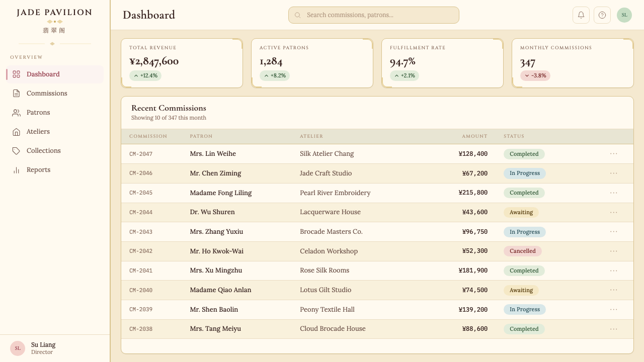
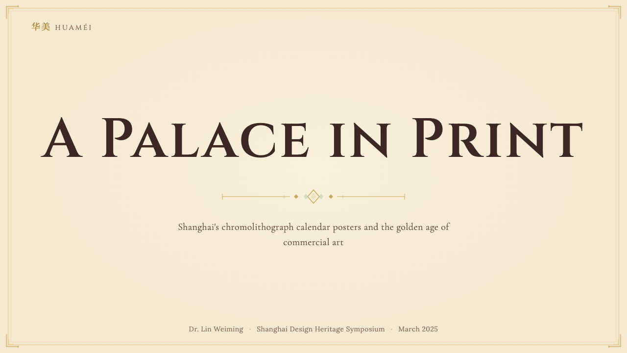
For presentation slides, this aesthetic works beautifully on cover pages and section dividers. A cover benefits from a centered, symmetrical composition: a large central image panel — illustrated, photographic, or simply a bold typographic arrangement — surrounded by a layered ornamental border in ivory, dusty rose, and gold tones. Body content slides should be treated more sparingly: a warm cream ground, refined serif headings, generous margins, and decorative elements limited to corner accents or a thin gold rule. Data slides can take inspiration from the framing conventions — present charts and tables within light bordered panels that recall the cartouche tradition, giving each data element its own contained, dignified space.在演示文稿中,这套美学在封面页与章节分隔页上效果最佳。封面适合居中对称构图:一个大型中心图像面板——插图式、摄影式或仅是大胆的字体排列——被象牙色、蒙尘玫瑰粉与金色调的多层装饰边框环绕。正文内容页应处理得更为节制:温润的奶油色底面、精致的衬线标题、充裕的边距,装饰元素仅限于角落点缀或一条细金线。数据页可从框架惯例中汲取灵感——在轻盈带框面板内呈现图表与表格,令人联想起牌匾传统,给每个数据元素以独立、有尊严的容纳空间。
For web interfaces, the style is well-suited to landing pages, product pages, and editorial layouts where warmth and a sense of craft matter more than stark functionality. A pricing or feature comparison page rendered in this aesthetic uses a cream background, bordered card components that recall the poster's nested frame structure, refined serif or calligraphic heading treatments, and accent colors in dusty rose or jade green for interactive states and callouts. Navigation should be measured and typographic rather than icon-dense; hover states should feel like a gentle illumination rather than an abrupt color switch. Dashboard applications can incorporate the style through warm-toned card borders, gold-accented data labels, and background textures that suggest aged paper without becoming distracting.在网页界面中,这种风格适合温度感与工艺感比纯粹功能性更为重要的落地页、产品页与编辑版面。以这套美学呈现定价或功能对比页时,使用奶油色背景、令人联想到月份牌嵌套框架结构的带框卡片组件、精致的衬线或书法感标题处理,并以蒙尘玫瑰粉或翡翠绿作为交互状态与重点提示的强调色。导航应从容而以字体为主导,而非图标密集;悬停状态应感觉如柔和的点亮,而非突兀的色彩切换。仪表板类应用可通过暖色调卡片边框、金色点缀的数据标签与暗示老纸质感而不至喧宾夺主的背景纹理融入这一风格。
For editorial and marketing content, the aesthetic supports immersive storytelling layouts. Magazine-style article pages benefit from a wide ornamental drop cap to open sections, generous white space that functions like the quiet air around a central figure, and pull quotes framed in a light bordered panel. Marketing campaign pages can use the full visual vocabulary: a full-width hero section with a centered figure composition, layered border elements framing key messages, and a warm, muted palette that creates a sense of considered luxury. Brand identity work for fashion, beauty, food, or hospitality products that want to signal heritage, cultural depth, or artisanal craft will find this style more resonant than cleaner contemporary alternatives.对于编辑与营销内容,这套美学支持沉浸式叙事版面。杂志风格的文章页面受益于开启段落的宽大装饰首字母、如环绕中心人物的静谧空气般起作用的充裕留白,以及以轻盈带框面板围合的引用语。营销活动页面可使用完整的视觉词汇:以居中人物构图呈现的全宽主视觉区块、框定关键信息的多层边框元素,以及营造考究奢润感的暖色调低饱和色板。希望传递传承感、文化纵深或手工艺精神的时尚、美妆、食品或酒店品牌视觉识别,将发现这一风格比更清洁的当代替代方案更具共鸣。
A common mistake when applying this aesthetic is conflating it with general chinoiserie kitsch — adding generic dragon or cherry blossom motifs and calling the result Shanghai-inspired. Authentic application requires attention to the specific ornamental vocabulary of the Republican period: the stepped Art Deco fretwork, the cloud collar and lotus scroll patterns, the particular proportion and softness of the figure rendering. A second common error is over-saturating the palette. The calendar poster palette is always dusty and powder-washed; the moment you push colors to full saturation, the delicate, aged quality that defines the style evaporates. When in doubt, desaturate further and warm the overall tone with ivory or cream.应用这套美学时最常见的错误,是将其与泛化的中国风俗艳混为一谈——添加通用的龙纹或樱花图案,并将结果称为上海风格。真实的应用要求关注民国时期特定的装饰语汇:阶梯式装饰艺术回纹、云肩与莲花卷草纹样、人物描绘特定的比例感与柔润感。第二个常见错误是将色板过度饱和。月份牌色板永远是蒙尘而粉雾的;一旦将色彩推向完全饱和,定义这一风格的那种精致老旧质感便会即刻消散。如有疑问,进一步降低饱和度,并以象牙色或奶油色暖化整体色调。
See the Shanghai Calendar 1930 design system查看 Shanghai Calendar 1930 完整设计系统
Shanghai Calendar 1930 — FAQShanghai Calendar 1930 · 常见问题
How is this style different from general vintage Chinese poster art?这种风格与一般中国复古海报艺术有何不同?
The Shanghai calendar poster (yuèfènpái) is a specific historical form from a specific era and city, with a precise visual vocabulary. It is distinct from, for example, the bold flat-color propaganda posters of the People's Republic, the woodblock print tradition of folk art, or the ink-wash landscape tradition of literati painting. The defining characteristics are the soft-focus figural rendering technique, the nested ornamental border system combining Art Deco geometry with Chinese decorative motifs, and the muted powder-washed palette on cream grounds. General vintage Chinese aesthetic references may share individual elements, but the combination and the specific softness of the figural tradition are what define the yuèfènpái style.上海月份牌是特定年代、特定城市的一种特定历史形式,具有精确的视觉语汇。它有别于中华人民共和国的大胆平面色块宣传画、民间艺术的木刻版画传统,或文人画的水墨山水传统。定义性特征是:柔焦人物描绘技法、融合装饰艺术几何形与中国装饰母题的嵌套装饰边框系统,以及奶油底面上蒙尘粉雾的色调。泛化的中国复古美学参照可能共享个别元素,但这些元素的组合方式以及人物画传统特有的柔润感,才是月份牌风格的定义所在。
Can this aesthetic work for dark or night-mode interfaces?这套美学能用于深色或夜间模式界面吗?
It can, but requires careful adaptation. The historical palette is fundamentally light-ground — cream and ivory are canonical. A dark inversion should not simply flip cream to black; rather, it should seek deep, warm-toned dark grounds: deep indigo, very dark olive, or near-black brown that retains warmth. Gold and dusty rose accents translate well to dark grounds, as they retain their luminous quality against depth. Dusty blue and sage green may need to be lightened slightly to maintain visibility. The ornamental border elements benefit from being rendered in a warm metallic or softly glowing tone rather than stark white lines, which would break the period sensibility entirely.可以,但需要谨慎适配。历史色板从根本上以浅色底面为基准——奶油色与象牙色是经典形态。深色反转不应简单地将奶油换成黑色,而应寻求深沉、带暖意的深色底面:深靛蓝、极深的橄榄色,或保留温度感的近黑棕色。金色与蒙尘玫瑰粉强调色能很好地移植到深色底面上,在深度背景中保持其光润质感。蒙尘蓝与鼠尾草绿可能需要略微提亮以维持可见度。装饰边框元素适合以温暖的金属色或柔和发光的色调呈现,而非刺眼的白色线条——后者会将历史气质彻底打破。
Is this style appropriate for technology products?这种风格适合科技产品吗?
It depends entirely on what the technology product wants to communicate. If the product is positioned around heritage, craft, cultural identity, or a deliberate departure from the cold rationalism of typical tech aesthetic, then the Shanghai calendar style can be highly effective — think platforms serving the luxury market, cultural institutions, editorial products, or consumer apps that want to differentiate through warmth and historical depth. If the product's core proposition is speed, precision, or analytical rigor, the style's softness and ornamental richness may send conflicting signals. Technology products that apply this style most successfully tend to be those where the human-facing layer — the identity, marketing, editorial — can use the full aesthetic, while underlying functional interfaces take only the palette and typographic conventions.完全取决于科技产品希望传递什么。如果产品围绕传承感、工艺感、文化认同或对典型科技美学冷理性主义的刻意背离来定位,那么上海月份牌风格可以高度有效——想想服务于奢侈品市场的平台、文化机构、编辑类产品,或希望通过温度感与历史纵深来差异化的消费者应用。如果产品的核心主张是速度、精准或分析严谨性,这种风格的柔润感与装饰丰富性则可能传递出相互矛盾的信号。最成功地应用这一风格的科技产品,往往是那些面向人的外层——识别、营销、编辑内容——可以使用完整美学,而底层功能性界面仅借鉴色调与字体排印惯例的产品。
How should photography be used within this aesthetic?摄影图像在这套美学中应如何使用?
Photography works best when it is treated to share the style's softness and warmth rather than presented in sharp, high-contrast modern form. Images should be processed with warm toning, slight desaturation, and soft highlight treatment that echoes the powder-washed quality of the palette. Cropping and framing are important: photographs placed within ornamental bordered panels — particularly those that echo the nested frame structure of the original posters — integrate naturally. Full-bleed sharp photography tends to clash with the aesthetic unless it has been carefully matched in tone and subject matter. Portraits work especially well when lit softly from the front, avoiding the dramatic side-lighting of more contemporary editorial styles.摄影图像在经过处理以分享这种风格的柔润感与温度感时效果最佳,而非以锋锐、高对比度的当代形式呈现。图像应进行暖色调调整、轻微降饱和处理与柔和高光处理,与色板的粉雾质感相呼应。裁切与框架至关重要:置于装饰带框面板内的照片——尤其是那些呼应原版月份牌嵌套框架结构的——能自然融入。全出血锋锐摄影往往与美学产生冲突,除非在色调与题材上经过精心匹配。人像在柔和正面打光下效果尤佳,应避免当代编辑风格更常用的戏剧性侧逆光。
What distinguishes authentic use of this style from superficial chinoiserie?真实运用这种风格与流于表面的中国风俗艳,区别在哪里?
The distinction lies in specificity, restraint, and understanding of source material. Superficial chinoiserie reaches for generic Chinese markers — dragons, pagodas, cherry blossoms, red and gold combinations — without understanding the actual visual logic of the source tradition. Authentic application of the Shanghai calendar aesthetic requires attention to the specific ornamental vocabulary of the Republican era (Art Deco geometry combined with cloud collar, lotus, and bat-coin motifs), the particular soft-focus figural quality, the powder-washed rather than saturated palette, and the symmetrical compositional logic. It also requires restraint: the originals achieve their effect through the accumulation of refined details at a measured pace, not through visual loudness. If the result feels overwhelming, it has drifted toward kitsch; if it feels quiet and luminous, it is closer to the source.区别在于特殊性、克制感与对源材料的理解深度。流于表面的中国风俗艳无须理解源传统的实际视觉逻辑,便伸手取用泛化的中国标记——龙纹、宝塔、樱花、红金配色组合。真实应用上海月份牌美学要求关注民国时期特定的装饰语汇(装饰艺术几何形与云肩、莲花、蝠钱纹样的结合)、特定的柔焦人物画质感、粉雾而非饱和的色板,以及对称的构图逻辑。它也要求克制:原作通过以有节制的节奏积累精致细节来实现效果,而非诉诸视觉喧闹。如果结果让人感到压倒,它已滑向俗艳;如果感觉宁静而光润,它便更接近源头。
Related design styles相关设计风格
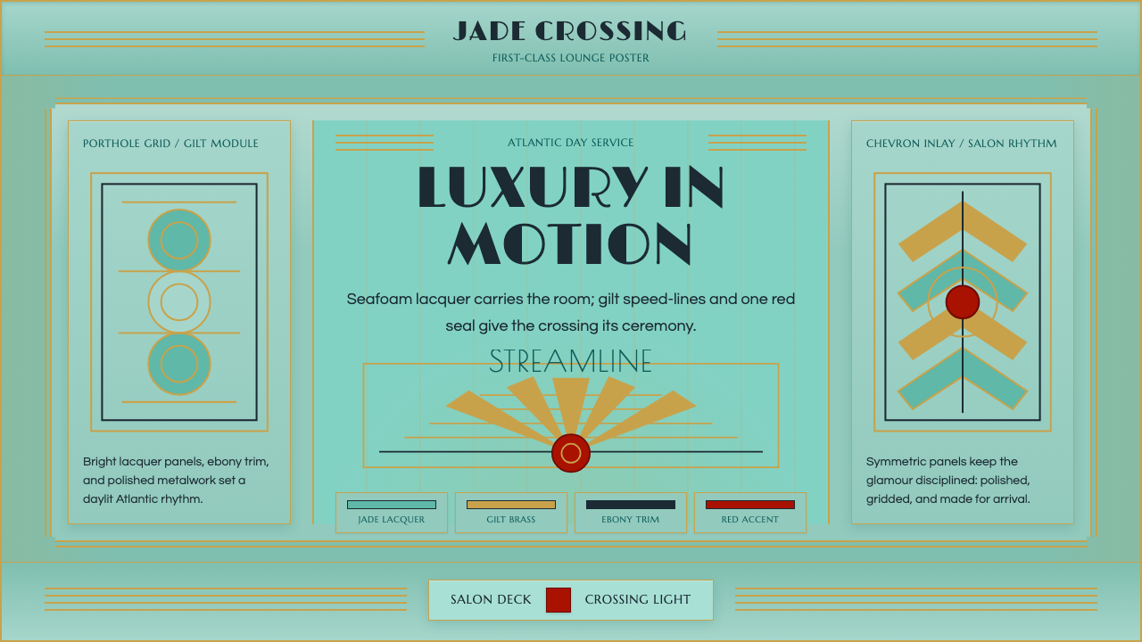 Ocean Liner SeafoamLuxury in motion. Seafoam lacquer, gilt speed-lines, and Deco symmetry frame…流动中的奢华:海沫漆面、鎏金速度线与装饰艺术对称框景。
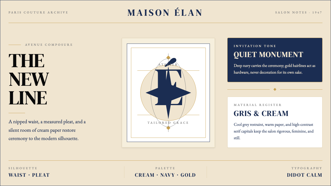 Dior New Look (1947)Couture speaks softly. Cream ground, navy Didot capitals, and gold hairlines…高级订制低声发言:米白底、海军蓝Didot大写与金色发丝线稳住全场。
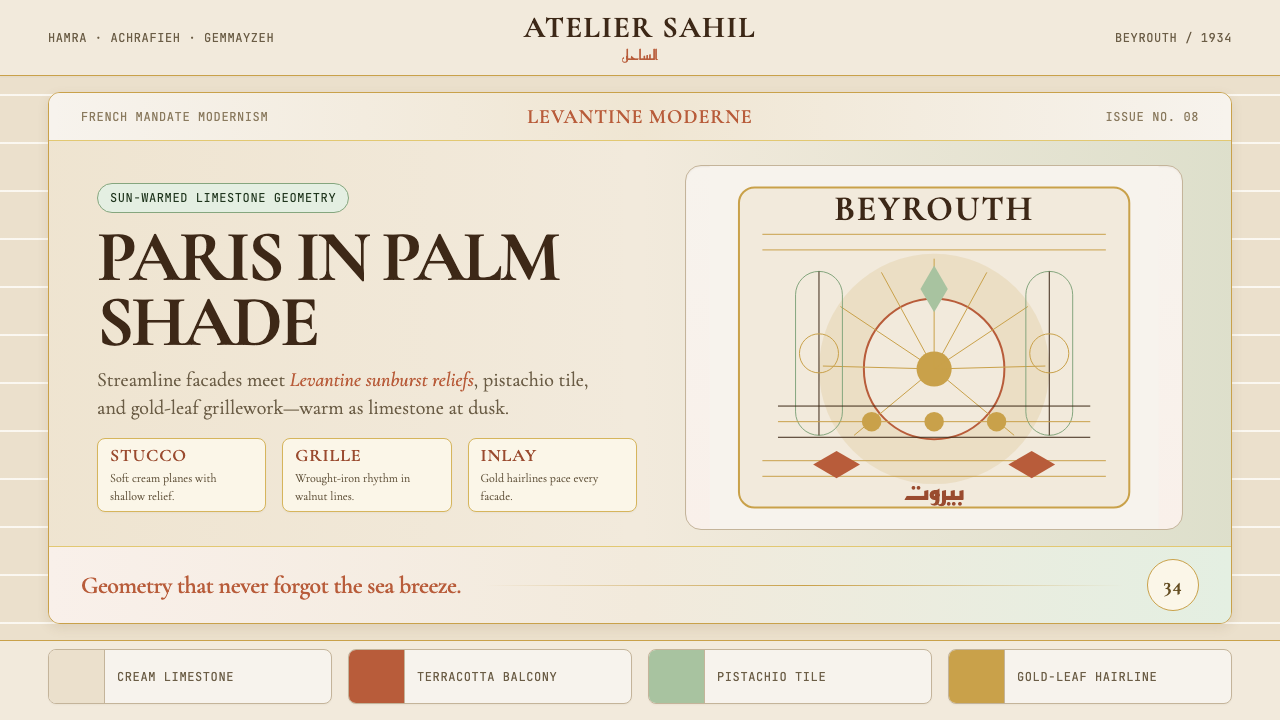 Lebanese Art Deco (Beirut)Cosmopolitan warmth. Cormorant friezes, gold hairlines, terracotta-pistachio…都市暖意。Cormorant 楣饰、金线与赤陶开心果灰泥。
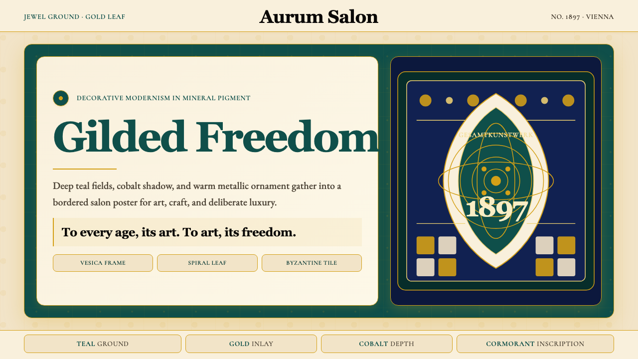 Wiener Secession (Klimt)Opulence made modern. Teal grounds, gold inlay, vesica frames and Cormorant d…奢华被现代化:深翠绿底、金箔嵌线、杏仁框与Cormorant标题。
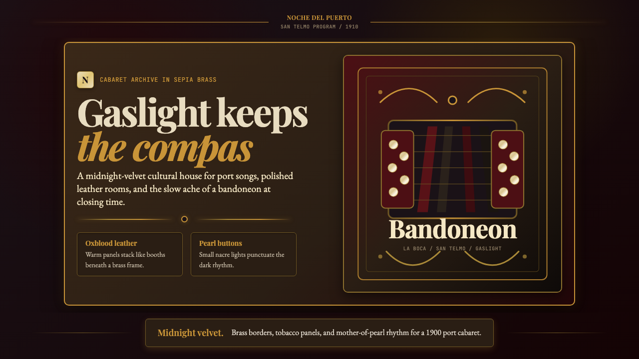 Argentine Bandoneón 1900 (Tango)Gaslit tango luxury. Midnight velvet, brass fileteado, and pearl-button geome…煤气灯下的探戈奢华:午夜绒底、黄铜卷草与珍珠琴键。
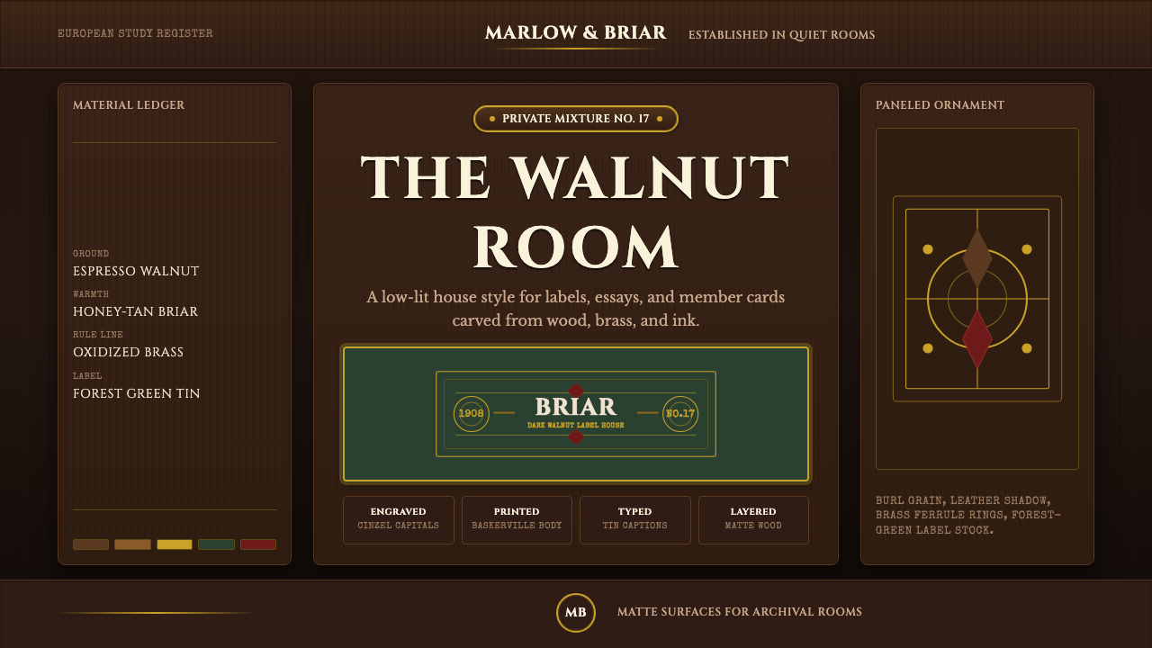 Briar Pipe & TobaccoWarm gloom, precisely aged. Brass rules and Cinzel capitals sit on espresso w…温暖幽暗而考究:黄铜细线与Cinzel大写落在浓咖胡桃木上。