What is Argentine Bandoneón 1900 (Tango)?
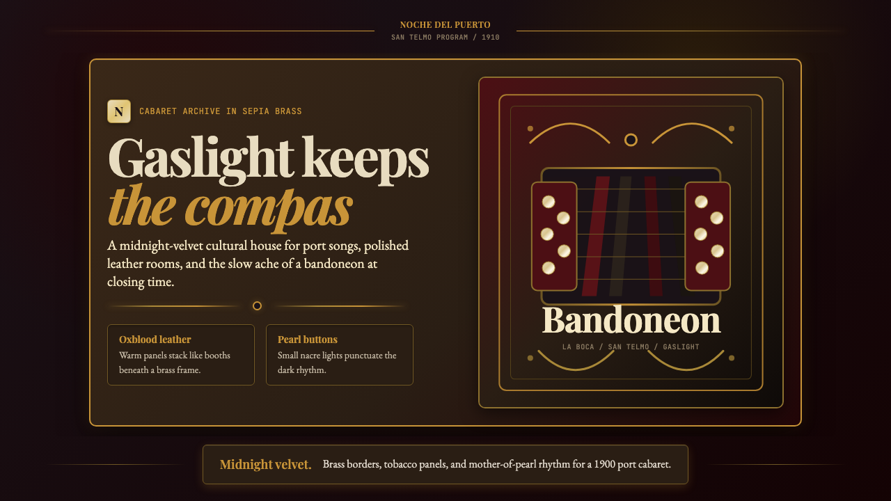
Buenos Aires tango is a design language born in gaslit back alleys — midnight velvet darkness, the warm amber of a kerosene lamp, and brass ornament scrolling through every edge.
Argentine Bandoneón 1900 (Tango) in brief
Argentine Bandoneón 1900 (Tango) is a visual design system rooted in the golden-age cabaret culture of Buenos Aires circa 1910. Its palette is drawn directly from the physical world of the San Telmo and La Boca dance halls: deep midnight blacks and oxblood reds serve as grounds, while sepia yellows and tarnished golds evoke the gaslight glow that lit those rooms. Mother-of-pearl highlights — lifted from the bandoneón concertina's buttons — bring a soft, iridescent luminosity to an otherwise shadowed palette.
The aesthetic is simultaneously opulent and melancholic. Tango never strived for the cheerful brightness of popular entertainment; it carried the emotional weight of immigrant longing, improvised belonging, and physical intimacy between strangers. This emotional register translates directly into a design language that favors deep, saturated darks over light grounds, ornamental density over minimalist restraint, and the warmth of aged materials — leather, brass, velvet — over clinical cleanliness.
What distinguishes this system from other dark or luxurious aesthetics is the presence of fileteado porteño: the Buenos Aires tradition of ornamental scrollwork derived from Baroque cartouche and craft-guild signboard painting. Fileteado borders, with their interlocking spirals, flame-like ribbon ends, and dense symmetrical arrangements, act as the system's primary decorative layer. Combined with the bandoneón's button-geometry motif and the deep, sensuous color palette, the result is a visual world that is unmistakably Argentine and unmistakably of its historical moment.
Where does Argentine Bandoneón 1900 (Tango) come from?
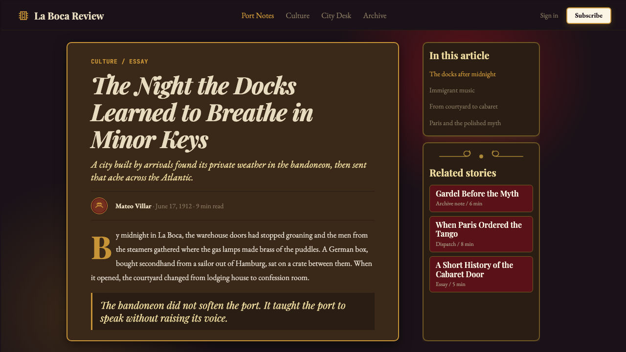
The bandoneón concertina was invented in Germany around 1840 by Heinrich Band, who intended it as a portable instrument for church music in communities that could not afford organs. It arrived in Argentina in the 1880s and 1890s via Hamburg trading ships, carried into the port of Buenos Aires and into the hands of the mixed immigrant communities of La Boca — Italian, Spanish, Polish, Jewish, and Afro-Argentine workers crowded into the tenement courtyards known as conventillos. These workers fused the instrument's mournful, bellows-driven sound with the Afro-Cuban habanera, the Andalusian milonga, and the Creole payada folk tradition, producing the earliest form of tango around 1880.
The tango spread from the conventillo courtyards into the dance academies (academias), then into the cabarets and brothels of the port districts, and by the 1910s into the more respectable entertainment venues of central Buenos Aires. Its visual culture developed in parallel: the lithographed sheet-music covers, the painted banners of the peñas and milonga clubs, the hand-lettered signboards of the cabarets — all drew on the fileteado porteño tradition that had grown up among the city's decorative painters, who were largely Italian immigrant craftsmen applying Baroque and Art Nouveau scrollwork to horse-drawn carts, storefronts, and carnival floats.
The tango's international moment came when it arrived in Paris around 1911 and became a continental sensation. French and European adoption gave the form cultural legitimacy that reverberated back to Buenos Aires, where the ruling elite had initially regarded tango as a vulgar lower-class practice. By the time of Carlos Gardel's first recordings in 1917 and his subsequent radio fame, tango had been transformed into a national emblem. The Golden Age that followed — roughly 1917 through 1955 — produced the great orchestras of Juan D'Arienzo, Carlos Di Sarli, Aníbal Troilo, and Osvaldo Pugliese, and solidified the visual aesthetic of the genre: theatrical posters, cabaret programs, and album covers designed with the velvet-and-brass richness that this design system distills.
The bandoneón's own visual form contributed directly to the aesthetic vocabulary. Its rows of mother-of-pearl buttons, the pleated bellows of dark fabric, the polished hardwood of its case — these material qualities became symbolic. When Astor Piazzolla began his nuevo tango revolution in the 1950s and 1960s, breaking the dance-hall constraints and pushing tango toward a concert-music tradition, the visual culture followed: posters for Piazzolla's concerts employed the same dark grounds and ornamental scrollwork, now rendered with a more modernist precision. UNESCO recognized tango as an Intangible Cultural Heritage of Humanity in 2009, by which point its visual language had achieved global legibility.
What defines the Argentine Bandoneón 1900 (Tango) look?
Palette
The color world is deep and warm. Midnight blacks and near-blacks anchor every composition; against these grounds, oxblood and burgundy reds appear as structural accents rather than dominant hues. Sepia yellows and tarnished amber golds carry the warmth of gaslight — they are never bright or saturated but always aged, as though touched by smoke and time. Mother-of-pearl iridescence provides the system's only true luminosity: a cool, shifting shimmer that reads as highlight against the darker tones. The overall impression is of a room lit by indirect flame rather than daylight.
Ornament and Fileteado
Decoration is not incidental but structural in this system. The fileteado porteño tradition supplies interlocking spiral scrollwork, flame-tipped ribbon borders, leafy acanthus derivatives, and stylized floral clusters — all rendered in the palette's brass and gold tones against dark grounds. These ornamental elements define borders, frame focal points, and create the system's characteristic sense of contained richness. Unlike Baroque ornament at its most excessive, fileteado is disciplined by the signboard-painting tradition from which it came: readable at a distance, symmetrically organized, and never so dense that it overwhelms the content it frames.
Texture and Material Weight
This is an unmistakably textural aesthetic. Velvet, worn leather, polished brass, aged wood — each of these material references is encoded in how surfaces are treated. Dark areas carry a soft depth suggesting fabric or hide rather than flat paint. Metallic accents read as having weight and warmth, not the cool sheen of chrome or digital highlights. Even in flat digital reproduction, the system implies materiality: you sense the grain of the leather, the nap of the velvet, the resistance of bellows-fabric under a musician's hands.
Geometry and Button Motif
The bandoneón's playing surface — a field of small, circular mother-of-pearl buttons arranged in irregular but systematic rows — provides the system's key geometric motif. Circular forms recur as both decorative elements and structural anchors: as button clusters in textural backgrounds, as framing devices for focal imagery, and as rhythmic dot patterns that create visual pulse without the rigidity of a conventional grid. The circles are never mathematically perfect — they carry the slight irregularity of hand-crafted instrument parts, which gives the system warmth.
Contrast and Dramatic Lighting
Tonal contrast is extreme and deliberate. The system does not seek balanced, photographic distribution of light — it seeks the drama of a performer caught in a single spotlight, everything peripheral absorbed into deep shadow. Transitions between light and dark are abrupt rather than gradual, and the lightest values are reserved for the most important compositional points: a face, a title, a mother-of-pearl highlight on the bandoneón's edge. This chiaroscuro logic is the system's primary compositional principle, organizing hierarchy without the need for heavy typographic variation.
Typography and Lettering Tradition
The lettering tradition associated with tango is rooted in the hand-painted signboard and cabaret poster aesthetic of early twentieth-century Buenos Aires. Display type tends toward expressive, slightly condensed letterforms with pronounced stroke contrast — the kind of letter that can hold its own against ornamental framing. Headlines carry weight and theatrical presence, implying the warmth of a painted surface rather than mechanical precision. Body text, where present, is typically restrained and close-set, serving as a foil to the richness of the display elements surrounding it.
Symmetry and Containment
Where Bauhaus favors dynamic asymmetry, this system tends toward bilateral symmetry and formal containment — a compositional instinct inherited from the poster tradition, the theater program, and the album cover. Central axis organization, mirrored ornamental borders, and oval or rectangular framing devices give the system a ceremonial quality. Content feels presented rather than placed — as though each element occupies a stage position rather than a grid cell. This is a system that announces things; it is not a system for quiet information delivery.
Who shaped Argentine Bandoneón 1900 (Tango)?
Gardel (1890–1935) is the defining figure of tango canción — the song form that carried tango from dance hall to radio and cinema. His recordings from 1917 onward established the emotional register and the sonic identity of golden-age tango. The visual culture surrounding Gardel — his promotional photographs, film posters, and album covers — established the iconic imagery of the impeccably dressed, pomaded leading man in a dark suit against a warm amber background, a visual template that persists in tango marketing to this day. He died in a plane crash in Medellín in 1935 at the height of his fame, and the mythology surrounding his death amplified his cultural significance immeasurably.
Troilo (1914–1975), known as Pichuco, was the bandoneonist and orchestra leader who most completely embodied the golden-age tango sensibility both musically and visually. His performances at the famous Tibidabo cabaret in Buenos Aires in the 1940s defined the milonga experience for a generation. Photographs and illustrated portraits of Troilo — invariably showing him hunched over the bandoneón in deep concentration, often in dramatic chiaroscuro lighting — are among the most reproduced images in tango visual culture and directly inform this system's approach to portraiture and dramatic shadow.
Piazzolla (1921–1992) transformed tango from a dance-hall tradition into a concert-music form with international standing. His nuevo tango, developed from the 1950s onward, introduced jazz harmonics, counterpoint, and extended compositional forms into the genre while retaining the bandoneón as its emotional center. The concert posters and album covers associated with Piazzolla's recordings — particularly those from his European collaborations — show the tango visual vocabulary being reprocessed through a mid-century modernist lens: the dark grounds and ornamental references remain, but with a graphic precision and compositional restraint that speaks to his ambitions beyond the dance hall.
Firpo (1884–1969) was a pioneering orchestra leader and pianist who helped codify the standard tango orchestra format during the music's earliest commercial period, and whose sheet-music covers and promotional materials from the 1910s and 1920s represent some of the earliest surviving examples of the tango visual aesthetic. The lithographed covers of his recordings — dense with Art Nouveau ornament translated into a Buenos Aires idiom, featuring the deep colors and scrollwork borders that define this system — demonstrate that the visual language of tango developed in close parallel with its musical consolidation.
Fileteado porteño developed as a craft tradition through generations of anonymous and semi-anonymous painters, but the tradition has been kept alive and formalized by practitioners who received UNESCO recognition alongside tango itself. Cecilia Rivero is among the contemporary masters who have documented and taught the craft vocabulary — the specific forms of the scrolls, the flame-tip finishing, the symmetrical arrangement protocols — that this design system draws on. The craft's 2015 UNESCO inscription as Intangible Cultural Heritage enshrined it as a living tradition rather than a historical curiosity, giving the visual system an authentic cultural anchor.
How do you use Argentine Bandoneón 1900 (Tango) today?
Argentine Bandoneón 1900 (Tango) is a system built for contexts where theatrical presence, emotional depth, and cultural richness are the primary values. It performs best when the product itself has a premium or emotionally resonant positioning — luxury events, high-end hospitality, cultural institutions, performance venues, editorial brands with a strong curatorial voice, and any product where the design needs to communicate that something consequential is happening.
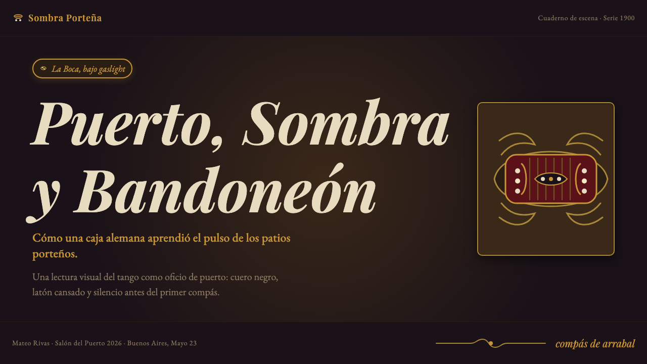
For presentation slides, this system works best on dark-ground layouts where the full palette depth can be expressed. A cover built in this aesthetic should commit to deep blacks as the primary ground, with ornamental framing elements creating a stage-like border and the title set in warm gold or amber tones. Content slides benefit from treating each page as a contained composition: a central axis with mirrored decorative elements, body text in restrained near-white, and data highlighted in oxblood or pearl tones. The system is not suited to information-dense slide decks where clarity and rapid scanning are paramount — it is a system for declaration, not for spreadsheet presentation.
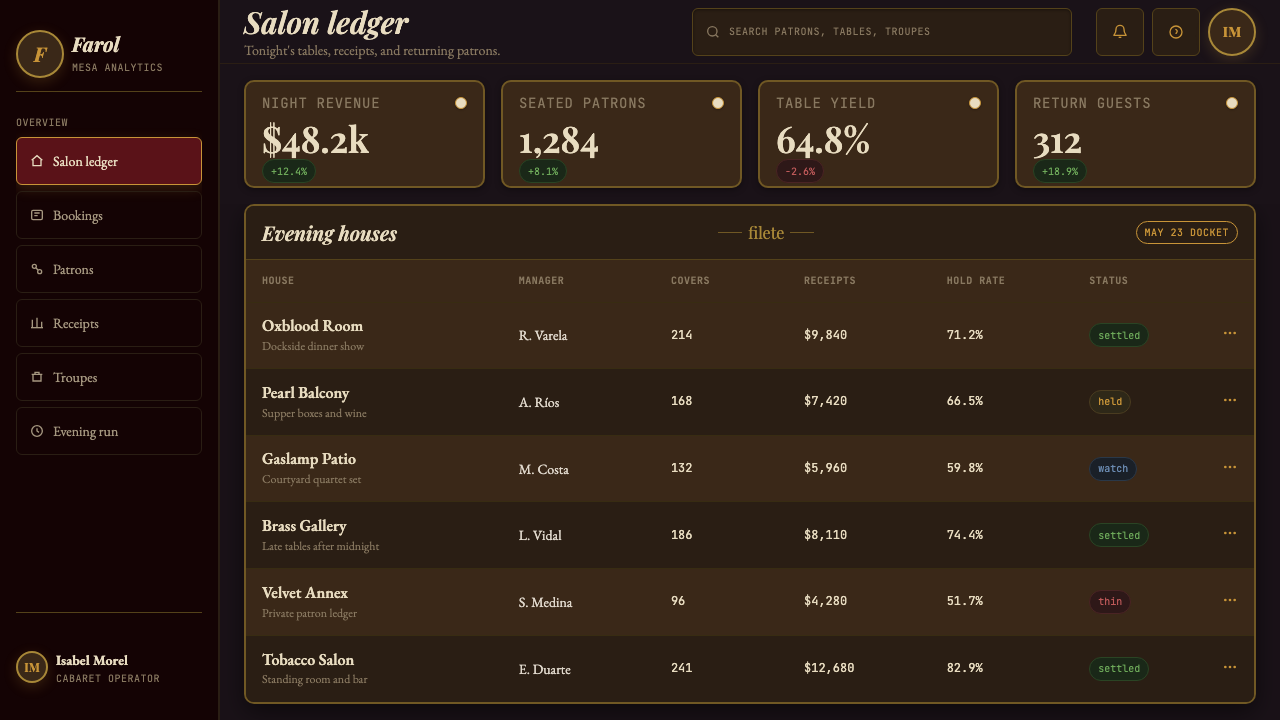
For web interfaces and dashboards, this system is most appropriate for landing pages, event pages, and brand identity contexts rather than functional product interfaces. A pricing page in this aesthetic should be organized around a central axis, with tier differentiations marked by the warmth of the palette rather than by conventional badge colors. Navigation should be minimal and typographic, letting the ornamental frame elements carry the visual weight. The system struggles on dashboard interfaces that require rapid data parsing and high-density information display — the chiaroscuro contrast logic works against scanability at the information density those contexts require.
For editorial and marketing work, this system is exceptionally well-suited to event posters, cultural institution branding, album covers, theatrical programs, and any visual material that needs to evoke a specific historical and emotional register. Magazine features on Argentine culture, Latin American music, or cultural heritage preservation are natural homes. Marketing campaigns for premium food, spirits, or hospitality brands that want to reference the sensory richness of the Río de la Plata tradition — without pastiche — can use this system as a starting point, provided they commit to the palette depth rather than lightening it for accessibility.
The most common mistake when applying this system is treating it as a generic dark-luxury aesthetic — deep background, gold highlights, ornamental border — and losing the specific cultural references that give it authenticity. A tango-derived design is not interchangeable with Art Deco, with Victorian maximalism, or with contemporary dark-mode design. The fileteado scrollwork, the pearl-button geometry, and the sepia-gaslight warmth of the highlights are what distinguish it from those related aesthetics. A second common error is lightening the palette to improve perceived accessibility, which breaks the system's defining tonal drama. This is a style that must commit to its darkness to function.
Argentine Bandoneón 1900 (Tango) — FAQ
Is this system only appropriate for explicitly Argentine or Latin American content?
Not necessarily, though cultural authenticity matters. The system carries strong associations with Buenos Aires and the tango tradition, and using it in ways that actively misrepresent its origins — or strip the cultural references for a generic dark-luxury look — would be both aesthetically and ethically questionable. But the tango aesthetic has traveled internationally since the 1910s Paris craze, and there is a long precedent for its visual language appearing in European, Japanese, and North American contexts where it signals a specific emotional register — theatrical, sensuous, elegantly melancholic — rather than a literal geographic claim. The key is to use the specific elements of the system (the fileteado ornament, the pearl-button geometry, the chiaroscuro contrast) rather than just the palette, which ensures the cultural reference remains legible.
How does this system differ from Art Deco, which also uses dark grounds and gold accents?
Art Deco is geometric and streamlined, pursuing a machine-age elegance with strong vertical emphasis, angular forms, and symmetrical compositions that feel architectural. Argentine Bandoneón 1900 (Tango) is organic and handcraft-derived, with scrollwork that curves and interlocks rather than stepping and zigzagging. The warmth of the palette is different too: Art Deco gold tends toward the bright and polished, while tango gold is amber-tinted and aged. Art Deco avoids the emotional directness of tango visual culture — it is cool where tango is warm, precise where tango is sensuous. Mixing the two breaks both systems.
Can this system work in a light-ground version?
A light inversion is technically possible but risks losing the system's defining emotional logic. The tango aesthetic depends on deep contrast between dark ground and luminous accent — the way candlelight or gaslight picks out a face, a button, an edge against darkness. On a light ground, the ornamental elements remain but the drama drains away; you are left with decorative scrollwork on cream, which reads as generic vintage rather than specifically tango. If a light-ground adaptation is genuinely required, the most successful approach is to treat the ornamental borders as the only dark elements, using a rich deep tone for the frame and allowing the central content area to remain light, recreating the sense of a framed stage.
How should data visualizations be handled within this system?
Data visualization is one of the system's more challenging applications. The palette's warmth and the ornamental density that define the aesthetic can work against the clarity that data display requires. The most effective approach is to treat the ornamental frame as a stage and the data as performers on that stage: rich decorative borders around a contained visualization area, with the charts and graphs themselves rendered in the palette's lighter tones — amber, pearl, muted oxblood — against a deep ground. The visualization should be geometrically simple (bar charts, line charts, clean tables) to provide relief from the ornamental complexity of the surrounding frame. Avoid placing decorative elements within the data area itself.
Is the tango visual aesthetic fixed in the 1900–1955 period, or did it evolve?
The core visual vocabulary was established during the golden age and has remained remarkably stable, but it has been reprocessed through different design sensibilities in each subsequent era. Piazzolla's concert period brought a mid-century modernist inflection. The global tango revival of the 1980s and 1990s produced graphic design that filtered the aesthetic through a postmodern lens — more self-conscious quotation, more visible irony. Contemporary tango design often reprocesses the elements digitally, using the palette and ornamental references but building them with vector precision rather than the slight irregularity of hand-craft. This design system is anchored in the formative 1900–1920 period as its primary reference but acknowledges that the tradition it draws from is living and evolving.
Related design styles
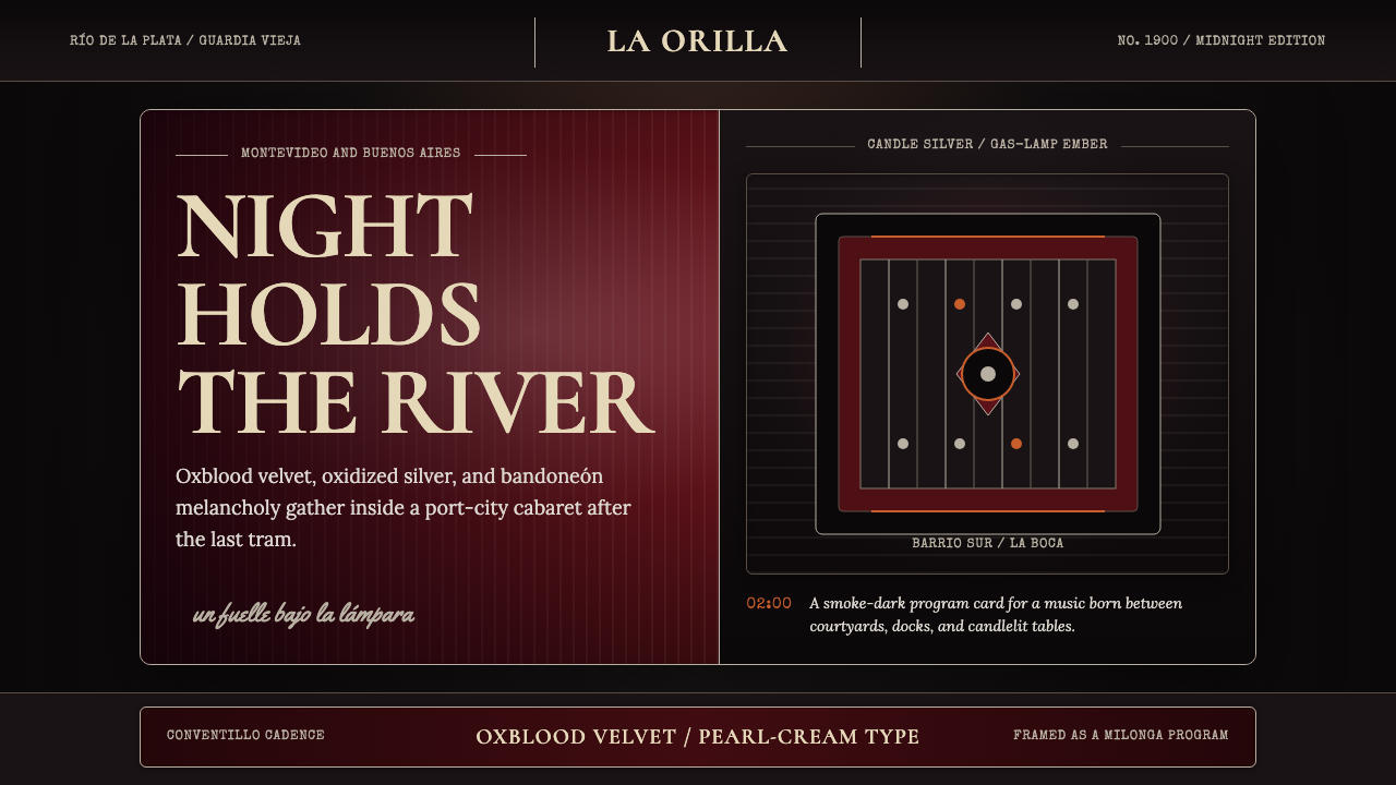 Uruguayan Tango Rioplatense 1900Cabaret melancholy. Oxblood velvet, candle silver, and framed type hold the d…
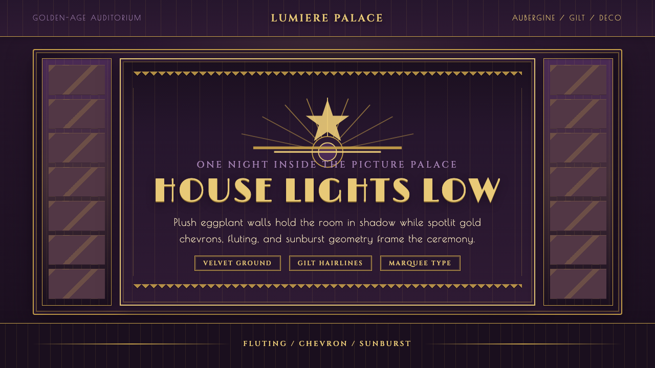 Velvet Cinema DecoDark theater opulence. Aubergine velvet and gilt Deco geometry stage every su…
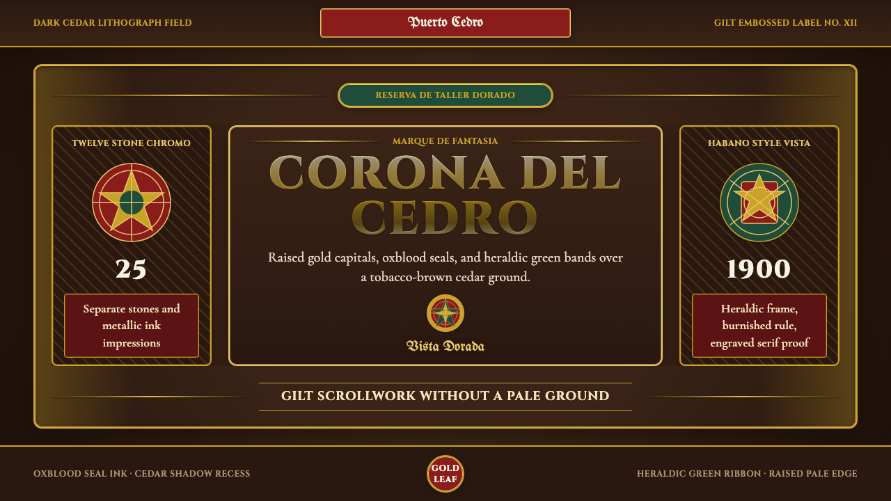 Cigar Box LabelGilt maximalism glows. Gold Cinzel capitals lock into a tobacco-brown framed…
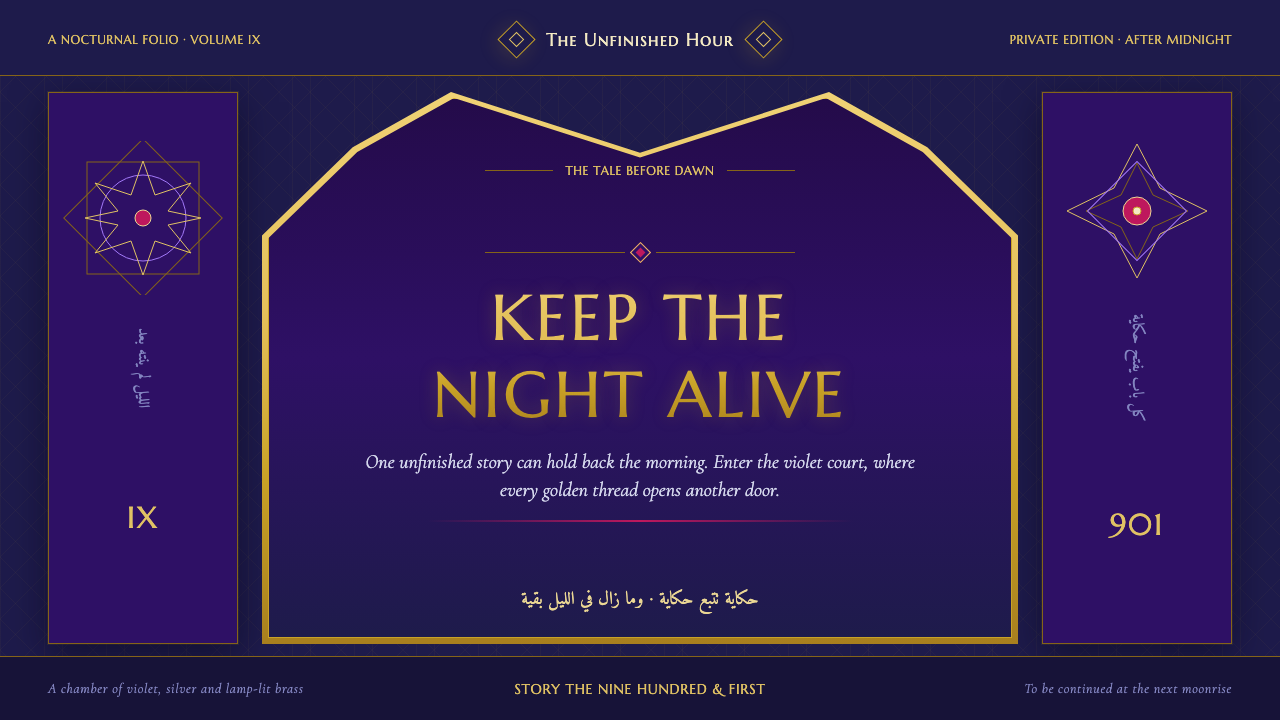 One Thousand and One NightsNight refuses to end. Midnight indigo, lamp-lit gold and star lattice frame e…
 Russian Palekh Lacquer MiniatureBlack lacquer turns mythic. Gold ovals hold crimson, lapis, and emerald tempe…
 Taishō RomanLonging framed in bronze. Maroon ground, Mincho type, and sepia ornament hush…