What is Michelin Guide Red-Stars?什么是 Michelin Guide Red-Stars?
Red is earned, not spread — the Michelin Guide's century-old visual language treats restraint as the highest form of authority.红色只留给勋章——米其林指南历经百年的视觉语言,将克制奉为权威的最高形式。
Michelin Guide Red-Stars in briefMichelin Guide Red-Stars 速览
The Michelin Guide Red-Stars aesthetic is one of the most quietly powerful visual identities in the world. It draws its authority not from abundance but from deliberate scarcity: a saturated red used only where it has been truly earned, cream-white grounds that carry classical typography with patient generosity, and the sparse star symbol placed beside a listing the way a medal is pinned to a uniform — one, two, or three, never decorative, always consequential.米其林指南红星美学是世界上最静默而有力的视觉识别系统之一。它的权威来自克制而非丰盛:饱和的红色只出现在真正应得之处,奶白色的底面以从容的节奏承托古典衬线字体,稀疏的星标立于餐厅名称旁,如同勋章别在制服上——一星、两星或三星,从不用作装饰,每一枚都举足轻重。
This is a style built on the logic of ceremony. Every element earns its place through restraint. Negative space is not emptiness but expectation. The serif letterforms, set with wide tracking and unhurried line spacing, communicate that the institution behind them has been making judgments for more than a hundred years and sees no reason to rush. Red appears as punctuation — a banner, a star, a cover — never as wallpaper.这是一套建立在仪式逻辑上的视觉语言。每一个元素都通过克制赢得自己的位置。留白不是空洞,而是期待。衬线字体以宽字距、从容的行距排列,传递出背后这家机构已经做出判断逾百年、并不急于表达的信号。红色以标点的身份出现——一道横幅、一枚星标、一张封面——绝不用来铺陈背景。
Unlike movements that achieved their aesthetic through manifestos and theoretical argument, the Michelin visual language arrived through institutional longevity. It was not designed in a single session but accumulated through decades of consistent editorial practice, becoming inseparable from the authority of the star ratings themselves. Applying it today means understanding that its power comes from what it withholds as much as from what it shows.与许多通过宣言和理论论争确立美学的流派不同,米其林的视觉语言是通过机构的长寿积累而来的。它不是在某一次会议中设计出来的,而是经由数十年一贯的编辑实践逐渐沉淀,与星级评定的权威本身融为一体。今天应用这套语言,意味着理解它的力量与它所展示的同样来自它所保留的。
See the Michelin Guide Red-Stars design system查看 Michelin Guide Red-Stars 完整设计系统
Where does Michelin Guide Red-Stars come from?Michelin Guide Red-Stars 从何而来?
The Michelin Guide was born in 1900 in Clermont-Ferrand, France, as a promotional booklet distributed free of charge by tire manufacturers André and Édouard Michelin. The original intention was entirely commercial: encourage motorists to drive more, wear out their tires faster, and buy replacements. The small red guide contained practical information — maps, petrol stations, repair shops, and hotels — alongside the implicit message that the automobile was a vehicle for sophisticated adventure. The cover's red was a practical choice for visibility and brand recognition at a time when competing publications were typically beige or grey.米其林指南于1900年诞生于法国克莱蒙费朗,最初是由轮胎制造商安德烈与爱德华·米其林兄弟免费发放的宣传小册子。最初的意图完全出于商业目的:鼓励驾车者多跑公里、更快磨损轮胎、购买替换轮胎。这本小红书收录了实用信息——地图、加油站、修车铺、旅馆——以及一个隐含的信息:汽车是通往精致冒险的载体。封面的红色在当时是出于醒目与品牌辨识的实用选择,而竞争出版物通常是米色或灰色的。
The star rating system emerged gradually. Restaurant recommendations first appeared in the guide in the early twentieth century. The iconic one-, two-, and three-star rating scale was formalized in 1926, with three stars first awarded in 1933. The symbolic weight of the stars transformed the guide from a motorist's utility into a cultural institution. By the mid-twentieth century, a Michelin star had become the highest credential in professional cooking — capable of making or, in rare cases of loss, profoundly affecting a chef's career and livelihood.星级评定体系是逐渐形成的。餐厅推荐在二十世纪初首次出现在指南中。标志性的一星、二星、三星评级制度于1926年正式确立,三星评定于1933年首次颁出。星标的象征重量将这本指南从驾驶实用手册转变为一家文化机构。到二十世纪中叶,米其林星已成为专业烹饪领域的最高资质——足以成就,在极少数失去星级的情况下也深刻影响一位厨师的职业生涯与生计。
The Bibendum mascot — the rotund figure made of stacked tire rings — was not created in-house but commissioned in 1898 from the illustrator Marius Rossillon, who worked under the pen name O'Galop. The original image showed Bibendum raising a glass of road debris, with the caption 'Nunc est bibendum' (Now is the time to drink) — a toast to the tire's ability to absorb the hazards of the road. The mascot's roundness, warmth, and slightly absurdist character provided a human counterpoint to the guide's growing seriousness, and Bibendum has remained on every edition since.米其林轮胎人比必登——由叠摞的轮胎圈构成的圆润人形——并非内部创作,而是1898年委托插画师Marius Rossillon(笔名O'Galop)绘制而成。最初的图像中,比必登高举一杯盛满路面碎屑的杯子,配以拉丁文标题「Nunc est bibendum」(现在是畅饮之时)——向轮胎吸收路面危险的能力致敬。这个吉祥物的圆润感、亲切感与略带荒诞的气质,为日益严肃的指南提供了一个人性化的对位,比必登此后出现在每一版指南之中,延续至今。
The visual identity evolved alongside the institution's authority. As the guide shed its promotional origins and became an independent editorial product — inspectors began working anonymously in the 1930s; the free distribution model was retired in 1920 — the design consolidated around classical restraint. The cream-paper interior, the generous white margins, the serif type at unhurried scale: these were not the result of any single redesign but the accumulated effect of treating each editorial decision as a small act of institutional character. By the late twentieth century, the Michelin visual system was recognizable worldwide not because it advertised itself aggressively but because it had been consistent for so long that it became synonymous with the judgment it described.视觉识别随机构权威的提升而演进。随着指南逐渐脱离促销起源,成为独立的编辑产品——检查员从1930年代起开始匿名工作;免费发行模式于1920年终止——设计围绕古典克制逐渐固化。奶油纸内页、宽裕的白色页边、以从容尺度排列的衬线字体:这些并非某次单一重新设计的结果,而是将每一个编辑决策视为机构性格小小表达的长期积累效应。到二十世纪末,米其林视觉系统已在全球范围内广为人知,并非因为它积极地宣传自身,而是因为它保持一贯的时间足够长,以至于成为它所描述的判断力本身的同义词。
What defines the Michelin Guide Red-Stars look?Michelin Guide Red-Stars 的视觉特征是什么?
Signature Red标志性红色
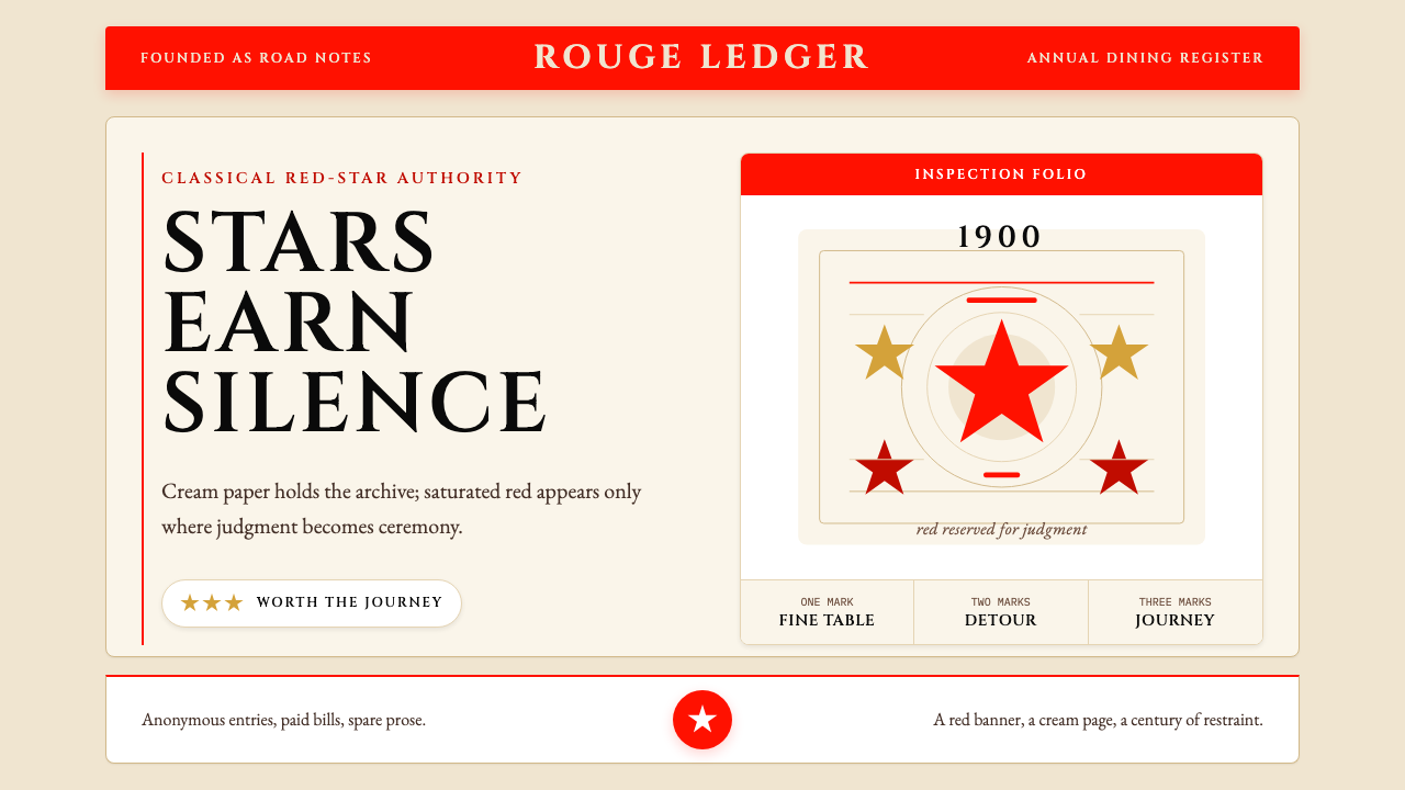
The defining color of the system is a deep, fully saturated red — not a warm tomato nor a cool crimson, but a red that reads as both urgent and authoritative. It appears in highly controlled contexts: the cover ground, the star symbol, horizontal accent rules, and navigational headers. It is never used as a fill for large content areas, never applied to body text, and never diluted into tints. This discipline is what makes each appearance of red feel like a declaration rather than a decoration.这套系统的定义色是一种深沉、充分饱和的红——既非暖调的番茄红,也非冷调的深红,而是一种兼具紧迫感与权威感的红。它出现在高度受控的场景中:封面底色、星标符号、水平装饰线与导航标题。它从不用于填充大面积内容区域,从不应用于正文,从不稀释为浅色调。正是这种自律,使每一次红色的出现都像是一次宣告,而非一次装饰。
Cream and White Grounds奶油色与白色底面
Interior pages carry a ground closer to warm cream than to clinical white — a tone that recalls quality paper stock and the physical weight of a well-produced annual. This warmth is not accidental: it softens the contrast between text and background to a level appropriate for extended reading, and it places the guide in a lineage of serious European reference publications. Against this ground, black type and red accents achieve their effect without aggression. The cream ground is as much a part of the aesthetic identity as the red cover.内页底面接近温暖的奶油色,而非冷白色——这种色调让人联想到优质纸张和一本制作精良的年刊所具有的物理分量。这种温度并非偶然:它将文字与背景之间的对比度软化至适合长时间阅读的水平,并将指南置于欧洲严肃参考出版物的传承脉络之中。在这种底面衬托下,黑色文字与红色装饰无需强势即可达到效果。奶油底面与红色封面同等程度地构成这套美学识别的一部分。
Classical Serif Typography古典衬线字体排印
The typographic register is firmly classical — letterforms with well-defined serifs, descended from the traditions of French fine printing. Text is set with generous letter-spacing and line-height, creating the impression that each listing has been given room to be considered rather than compressed to fit a quota. The type feels institutional without being cold, formal without being rigid. Hierarchy is established through size and weight contrast rather than through color or decorative rules. The overall effect is that of a publication confident enough in its own authority not to shout.字体排印的风格坚定地属于古典范畴——具有清晰衬线的字形,承袭自法国精品印刷的传统。文字以宽裕的字距和行高排列,营造出每条餐厅信息都被给予了充分考量空间而非被压缩以适应配额的印象。字体呈现出机构性而不冷漠、正式而不僵硬的气质。层级通过字号与字重的对比来建立,而非依赖色彩或装饰线条。整体效果是一本对自身权威足够自信、无需大声宣告的出版物。
The Star as Emblem星标作为徽记
The Michelin star is not a generic five-pointed star but a specific stylized form — rounder, more compact, closer to a heraldic charge than to an informal rating symbol. Its visual weight is calibrated so that one, two, or three stars beside a restaurant name read as cumulative gravity, not as a simple score. The stars never appear in decorative patterns or as background texture; their meaning depends entirely on scarcity. Overuse would drain them of significance, so the design system treats placement as a form of editorial judgment in itself.米其林星标并非通用的五角星,而是一种特定的风格化形态——更圆润、更紧凑,更接近纹章符号而非随意的评分标志。其视觉分量经过校准,使得餐厅名称旁的一、二或三颗星呈现为累积的庄重,而非简单的分数。星标从不以装饰图案或背景纹理的形式出现;其意义完全依赖于稀缺性。滥用将使其失去意义,因此这套设计系统本身就将星标的放置视为一种编辑判断。
Bibendum and Institutional Warmth比必登与机构温度
The Bibendum mascot — a figure composed of stacked pale rings, round-faced and unhurried — performs a specific function within the visual system: it humanizes an institution that would otherwise read as entirely austere. His presence on the cover and at chapter breaks signals that the guide's authority is not meant to intimidate but to guide. The mascot's rounded, almost cartoonish forms contrast deliberately with the severity of the typographic system, creating a register of approachable expertise rather than remote judgment.比必登吉祥物——由叠摞的浅色圆环构成、圆脸而从容的人形——在视觉系统中承担着特定功能:为一家否则将显得完全严峻的机构注入人情温度。它在封面与章节开篇的出现,传达出这本指南的权威并非为了令人生畏,而是为了引导读者。吉祥物圆润的、几近卡通化的形态与排印系统的严肃感形成刻意对比,营造出可亲近的专业权威,而非疏远的裁决者。
Controlled White Space克制的留白
Margins are wide by the standards of most reference publications, and section introductions breathe rather than rush. This is not inefficiency but editorial philosophy: a guide whose judgments carry the weight they do cannot afford to appear hurried. The white space communicates confidence — the institution is not afraid of silence. This spatial generosity is one of the most important and most difficult qualities to replicate, because it requires resisting the temptation to fill every available area with content.以大多数参考出版物的标准衡量,这套系统的页边距宽阔,章节导言从容而非急促。这不是低效,而是编辑哲学:一本评判具有如此分量的指南,不能显得仓促。留白传递的是自信——这家机构不惧怕沉默。这种空间慷慨是最重要也是最难复制的品质之一,因为它需要抵制将每一块可用区域都填满内容的诱惑。
Restraint Over Expression克制优于表达
The Michelin aesthetic is fundamentally allergic to visual noise. There are no gradient backgrounds, no decorative borders beyond structural rules, no illustrative flourishes in the margins, no color photography used gratuitously. Even the cover — bright red, the boldest element in the system — achieves its impact through simplicity: the logo, the title, the year, and Bibendum. The discipline is self-reinforcing: every element that is omitted makes the elements that remain more powerful. This is restraint understood not as limitation but as amplification.米其林美学从根本上对视觉噪音过敏。没有渐变背景,没有超出结构线条范围的装饰性边框,没有页边的插画花饰,没有随意使用的彩色摄影。即便是封面——鲜艳的红色,系统中最大胆的元素——也通过简洁实现其冲击力:标志、书名、年份、比必登。这种自律是自我强化的:每一个被省略的元素,都使留下来的元素更加有力。这是将克制理解为放大而非限制的结果。
See the Michelin Guide Red-Stars design system查看 Michelin Guide Red-Stars 完整设计系统
Who shaped Michelin Guide Red-Stars?谁塑造了 Michelin Guide Red-Stars?
André Michelin, along with his brother Édouard, co-founded the Michelin tire company in Clermont-Ferrand and conceived the guide as a promotional vehicle to encourage automobile travel. It was André who recognized that the guide's value lay in practical, reliable information — pushing for the inclusion of hotel and restaurant listings as the automobile industry matured. His instinct that authority required consistency and candor, not advertisement, laid the philosophical groundwork for the guide's eventual independence from its promotional origins.安德烈·米其林与兄弟爱德华共同在克莱蒙费朗创立了米其林轮胎公司,并将指南构想为鼓励汽车旅行的宣传载体。正是安德烈认识到,指南的价值在于实用、可靠的信息——随着汽车工业的成熟,他推动将酒店与餐厅信息纳入其中。他对权威需要一贯性与坦诚而非广告的直觉,为指南最终摆脱宣传起源、走向独立奠定了哲学基础。
Édouard Michelin managed the operational and industrial side of the Michelin company through its most formative decades. His commitment to product quality and brand precision translated directly into the guide's early visual character: the red cover was chosen under his watch to create an immediately distinctive identity on newsstands and in gloveboxes. Édouard's view that the Michelin name should stand for something reliable and authoritative — not merely something popular — shaped the guide's refusal to dilute its star ratings or expand them to satisfy demand.爱德华·米其林在米其林公司最关键的数十年里主管运营与工业事务。他对产品质量与品牌精准度的坚守,直接影响了指南早期的视觉气质:红色封面正是在他的主导下确立的,目的是在报亭与手套箱里创造一个立即可辨认的识别。爱德华认为米其林之名应该代表可靠与权威,而不仅仅是流行——这种观念塑造了指南拒绝稀释星级评定或为满足需求而扩大授星数量的立场。
Marius Rossillon, working under the pen name O'Galop, created the Bibendum character in 1898 based on a sketch André Michelin had noticed at an exhibition — a figure made of tire rings waiting for its proper context. Rossillon's genius was to give the industrial material a personality: round, cheerful, slightly pompous, and entirely comfortable with itself. The Bibendum image has been revised many times over 125 years but has never been fundamentally reconceived, a testament to the original character's durability and the Michelin institution's understanding that consistency in mascot identity reinforces the broader visual system.Marius Rossillon(笔名O'Galop)于1898年以安德烈·米其林在一次展览上注意到的一幅草图为基础,创造了比必登形象——一个由轮胎圆环构成、等待合适语境的人形。Rossillon的才华在于赋予工业材料一种人格:圆润、开朗、略带自负,却完全自在。比必登的形象在125年间经历了多次修改,但从未被从根本上重新构想,这证明了原始形象的持久生命力,以及米其林机构对吉祥物形象一贯性能强化整体视觉系统的深刻理解。
The Michelin inspectors — full-time employees who dine anonymously and report according to rigorous internal criteria — are not named figures but are as central to the visual system as any named designer. Their anonymity is itself a designed condition: it removes the personality of the evaluator from the equation, reinforcing the authority of the institution over any individual. The visual system's restraint and formality mirror this institutional commitment to impersonality. When the guide's design strips away all self-promotion and ornament, it is making the same argument the inspector embodies: the judgment is what matters, not the judge.米其林检查员——以匿名方式用餐、依据严格内部标准提交报告的全职雇员——虽非具名人物,却与任何具名设计师同等程度地处于这套视觉系统的核心。他们的匿名本身就是一种被设计的条件:它将评判者的个人性格从等式中移除,强化了机构权威而非个人权威。视觉系统的克制与正式,映照出这种机构对非个人化的承诺。当指南的设计剥去所有自我宣传与装饰,它所表达的论点与检查员所体现的一致:重要的是判断,而非做出判断的人。
How do you use Michelin Guide Red-Stars today?今天怎么用 Michelin Guide Red-Stars?
The Michelin Guide visual language is among the most transferable fine-dining and authority aesthetics in contemporary design, provided the core logic is understood: red earns its place, never claims it. Before applying any element of this system, establish the hierarchy of ceremony — what in your design has actually been earned and therefore deserves the red accent, and what is simply content that should recede into cream and black. Getting this hierarchy wrong produces the most common failure mode: red everywhere, meaning nowhere.米其林指南的视觉语言是当代设计中可移植性最强的高级餐饮与权威美学之一——前提是理解其核心逻辑:红色是赢得的,而非占据的。在应用这套系统的任何元素之前,先建立仪式层级——你的设计中哪些内容是真正被赢得的、因此值得红色强调,哪些只是应当退入奶油底与黑色中的普通内容。错误地处理这一层级,会产生最常见的失败模式:到处是红色,无处有意义。
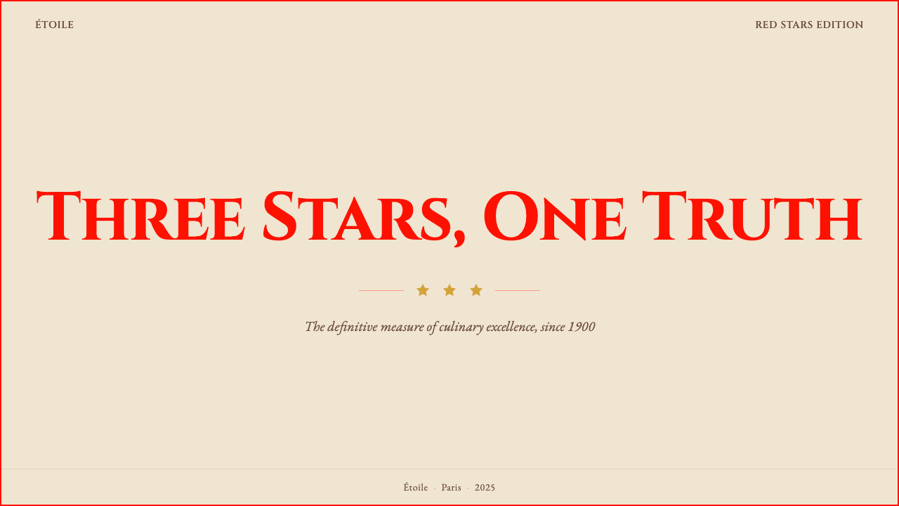
For presentation slides — both cover and content — the Michelin approach rewards deliberate composition. A cover slide benefits from simplicity bordering on austerity: the title set in a well-spaced classical serif against a cream ground, with a single red horizontal rule or star-like accent as the only color element. Content slides should treat white space as structural — wide margins, generous leading, text hierarchies established by size contrast rather than color variety. Data slides become more powerful when charts are treated as graphic objects: clean axes, minimal gridlines, and the red accent reserved for the single most important data point or trend line rather than applied to every series.对于演示文稿——无论封面还是内容页——米其林的方法以刻意的构图取胜。封面幻灯片受益于近乎严肃的简洁:标题以间距宽裕的古典衬线字体置于奶油色底面,唯一的色彩元素是一条水平红线或星形装饰。内容页应将留白视为结构性元素——宽阔的页边距、宽裕的行高、以字号对比而非色彩多样性来建立文字层级。数据页在将图表视为图形对象时会更有力量:干净的坐标轴、最少的网格线,红色强调只保留给最重要的单个数据点或趋势线,而非应用于每一个数据系列。
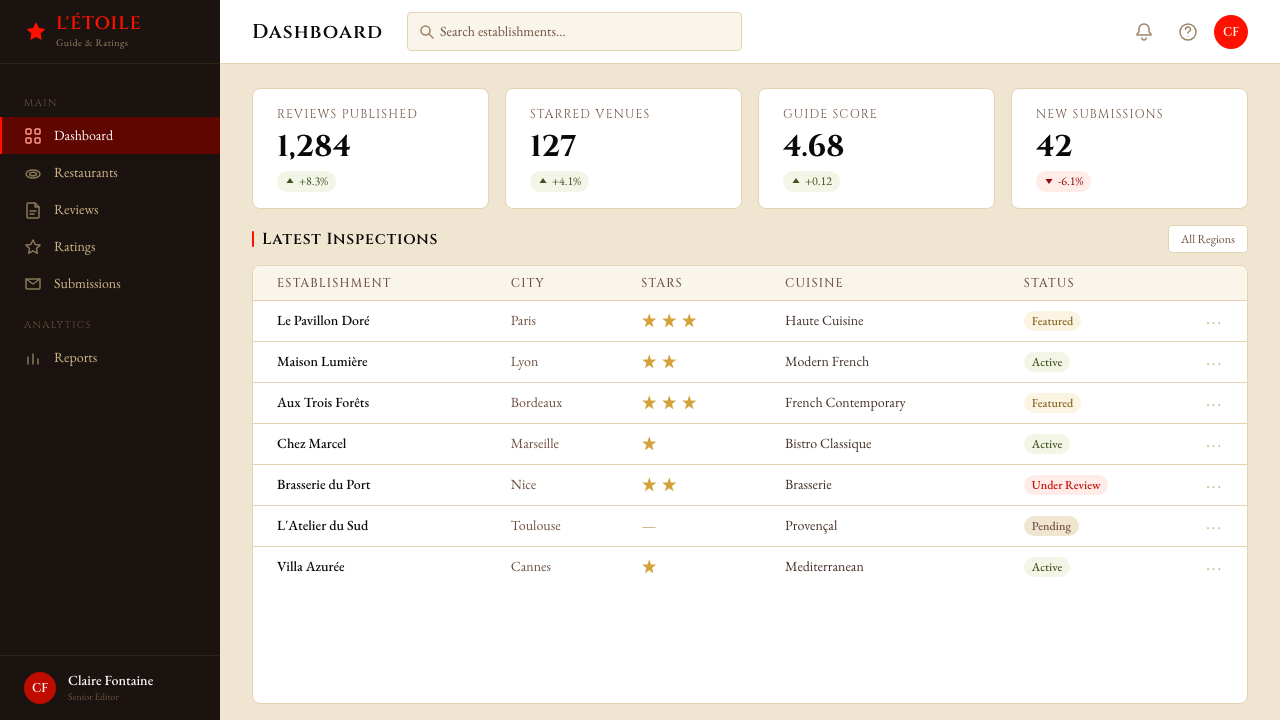
For web UI — dashboards, pricing pages, editorial headers — the system works best when the background stays warm and light, typography anchors the hierarchy, and red is used with extreme economy: one active state, one highlighted tier, one critical alert. Navigation should be typographic and spaced rather than icon-heavy. Card components benefit from a thin border rather than a shadow, and table rows from subtle alternating grounds rather than strong color fills. The overall effect should feel like a reference document rather than a marketing interface — authoritative, legible, and confident enough not to explain itself.对于网页界面——仪表板、定价页面、编辑标题——当背景保持温暖而明亮、字体锚定层级、红色以极度节制的方式使用时,这套系统效果最佳:一个激活状态、一个高亮层级、一个关键警示。导航应以文字排印为主、间距宽裕,而非图标密集。卡片组件受益于细边框而非投影,表格行受益于微妙的交替底色而非强烈的色彩填充。整体效果应让人感觉是参考文献而非营销界面——权威、易读,且自信到无需自我解释。
For editorial and marketing applications — printed materials, social assets, email headers, marketing pages — the Michelin aesthetic supports strong information hierarchy when applied with discipline. An editorial layout uses a narrow body column with a wide outer margin for annotations or pull quotes, section breaks marked by a red rule rather than ornamental dividers, and headlines in classical serif at a scale that commands attention without aggression. Marketing pages work well with the asymmetry of alternating blocks: cream ground with dark text followed by a red ground with white type for a single feature statement, never extending the red ground beyond one panel per screen.对于编辑与营销应用——印刷材料、社交媒体素材、邮件标题、营销页面——米其林美学在以纪律应用时能支撑强劲的信息层级。编辑版面使用窄正文栏与宽外边距用于注释或引用语,段落分隔以红色线条而非装饰性分割标记,标题以古典衬线字体在可引人注目却不咄咄逼人的尺度下排列。营销页面适合以区块交替的方式呈现不对称感:奶油底深色字的区块之后,是红底白色字用于单一核心主张的区块——红色底面每屏绝不超过一个面板。
The most common mistake when applying this aesthetic is treating it as a general luxury style and importing elements from adjacent high-end registers — gold accents, thin decorative borders, script typefaces, photographic texture. The Michelin system is not luxury-general; it is specifically the authority of careful judgment, which is a different thing. Gold and script signal wealth; red and cream and classical serif signal considered expertise. Mixing the two produces something that looks expensive but reads as unearned. A second common error is setting type too tightly — the system's power comes partly from the unhurried scale of its spacing, and compressing it to fit more content destroys the effect that makes each remaining element feel significant.应用这套美学时最常见的错误,是将其视为通用的奢华风格,从相邻的高端设计语汇中引入元素——金色装饰、细装饰边框、花体字体、摄影质感。米其林系统并非通用奢华;它具体指向审慎判断的权威,这是完全不同的事物。金色与花体字传递的是财富;红色、奶油色与古典衬线字体传递的是经过深思熟虑的专业积累。将两者混合,会产生看起来昂贵却显得不实至名归的结果。第二个常见错误是将文字排得过于紧密——这套系统的力量部分来自其间距的从容尺度,压缩间距以填入更多内容,会摧毁使每个留存元素都显得举足轻重的效果。
See the Michelin Guide Red-Stars design system查看 Michelin Guide Red-Stars 完整设计系统
Michelin Guide Red-Stars — FAQMichelin Guide Red-Stars · 常见问题
Is the Michelin aesthetic the same as general French luxury design?米其林美学与通用的法式奢华设计是同一回事吗?
They share a classical French serif sensibility and a preference for restraint over excess, but they differ fundamentally in their relationship to color and ornament. General French luxury design — think perfume houses, couture, fine leather goods — permits gold, delicate illustration, and tonal color palettes that suggest richness through layering. The Michelin system rejects all of this in favor of functional sobriety: the red is a badge, not a jewel; the cream is paper, not satin. Michelin communicates authority through institutional consistency rather than through the signifiers of material luxury.两者共享古典法式衬线字的感性以及对克制胜于过度的偏好,但在对色彩与装饰的关系上存在根本性差异。通用的法式奢华设计——想想香水品牌、高定时装、精品皮具——允许使用金色、精致的插画,以及通过叠加暗示富贵感的同色调色板。米其林系统则拒绝这一切,转而选择功能性的简朴:红色是徽章,不是珠宝;奶油色是纸张,不是缎面。米其林通过机构一贯性而非物质奢华的符号来传递权威。
How many times can red appear on a single page before it loses meaning?一页之中红色出现几次,才会开始失去意义?
The authentic system uses red no more than two or three times per spread, and usually far less. A page that contains a red star beside a restaurant name, a red running header, and a red rule at the section break is already at the high end of appropriate density. Every additional red element reduces the informational weight of every other one. A useful test: if removing a red element would make the page feel emptier rather than cleaner, the element was likely serving decoration rather than emphasis. When in doubt, treat red as you would an exclamation mark — used once per page at most, and only when the content genuinely merits it.真实的系统每个对页使用红色不超过两到三次,通常远少于此。一页中包含餐厅名旁的红星、红色页眉,以及段落分隔处的红线,已经处于适当密度的高限。每增加一个红色元素,都会降低其余每个元素的信息分量。一个有用的测试:如果去掉一个红色元素会让页面感觉更空洞而非更干净,那么这个元素很可能在服务装饰而非强调。当不确定时,将红色视为感叹号——每页最多使用一次,且只在内容真正值得时使用。
Can this style work for a digital product that needs to feel modern and interactive?这种风格能用在需要呈现现代感与交互性的数字产品上吗?
Yes, but the adaptation requires discipline. The Michelin system was designed for print, and digital application introduces conventions — hover states, animations, responsive reflow — that have no direct print equivalent. The key is to maintain the system's core logic while translating its effects: red still appears only for the highest-priority interactive states; spacing remains generous even on smaller viewports; type hierarchy relies on size and weight rather than color variation. Micro-animations should be minimal and purposeful — a brief transition, not an entertainment. The goal is a digital product that feels like a well-produced reference document rather than a web application, which means resisting the temptation to signal interactivity through visual complexity.可以,但改编需要纪律。米其林系统为印刷设计,数字应用引入了印刷中没有直接对应物的惯例——悬停状态、动画、响应式重排。关键在于维持系统的核心逻辑,同时转化其效果:红色仍只出现在最高优先级的交互状态;即使在较小的视口中,间距也保持宽裕;字体层级依赖字号与字重而非色彩变化。微动画应当最少且有目的——一个简短的过渡,而非一种娱乐。目标是让数字产品感觉像一份制作精良的参考文献,而非一个网络应用——这意味着抵制通过视觉复杂度来传递交互性的诱惑。
Does the style suit content categories outside of fine dining and food?这种风格适合高级餐饮与美食以外的内容类别吗?
The Michelin visual system is not bound to food content — its underlying logic of earned authority, classical typography, and ceremonial restraint applies wherever a brand genuinely needs to communicate considered judgment and institutional weight. It works well for annual reports, research publications, professional awards programs, premium legal or financial services, and editorial platforms positioning themselves as authoritative reference sources. It works poorly for contexts that require warmth, playfulness, cultural specificity, or sensory immediacy — consumer wellness, children's education, entertainment, and lifestyle brands rooted in community or personal expression. The question to ask is not 'do we serve food?' but 'does our value proposition rest on the authority of careful, earned judgment?'米其林视觉系统并不绑定于美食内容——其底层逻辑,即赢得的权威、古典字体与仪式性克制,适用于任何真正需要传达审慎判断与机构分量的品牌场景。它适合年报、研究出版物、专业奖项项目、高端法律或金融服务,以及将自身定位为权威参考来源的编辑平台。它不适合需要温暖感、趣味性、文化特殊性或感官直接性的场景——消费者健康、儿童教育、娱乐,以及植根于社群或个人表达的生活方式品牌。该问的不是「我们是否服务于食品?」而是「我们的价值主张是否建立在审慎、赢得的判断权威之上?」
How do you avoid making the style feel dated or pastiche-like?如何避免让这种风格显得过时或像是拙劣模仿?
The danger of pastiche arises when the visual elements are copied without understanding the underlying logic they serve. A designer who adds classical serifs and red accents without understanding the system's discipline around spacing, restraint, and color economy will produce something that looks like a costume rather than a character. The safest approach is to apply the system's principles rather than its surface features: ask whether the layout genuinely earns its red elements, whether the spacing is truly generous rather than merely adequate, whether each typographic decision serves hierarchy rather than variety. When these questions are answered rigorously, the result has the quality of authoritative restraint regardless of whether it quotes the Michelin visual canon directly.拙劣模仿的风险,来自于在不理解视觉元素所服务的底层逻辑的情况下直接复制它们。一个添加了古典衬线字与红色装饰却不理解系统在间距、克制与色彩节约方面纪律的设计师,会产出看起来像服装而非角色的东西。最稳妥的方法是应用这套系统的原则而非其表面特征:追问版面是否真正赢得了它的红色元素,间距是否真正宽裕而非仅仅适当,每一个字体决策是否服务于层级而非多样性。当这些问题被严格回答,结果就具有权威性克制的品质,无论它是否直接引用了米其林的视觉经典。
Related design styles相关设计风格
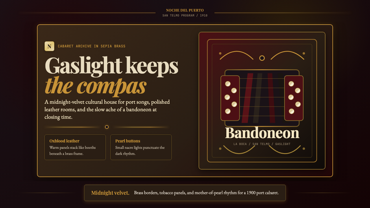 Argentine Bandoneón 1900 (Tango)Gaslit tango luxury. Midnight velvet, brass fileteado, and pearl-button geome…煤气灯下的探戈奢华:午夜绒底、黄铜卷草与珍珠琴键。
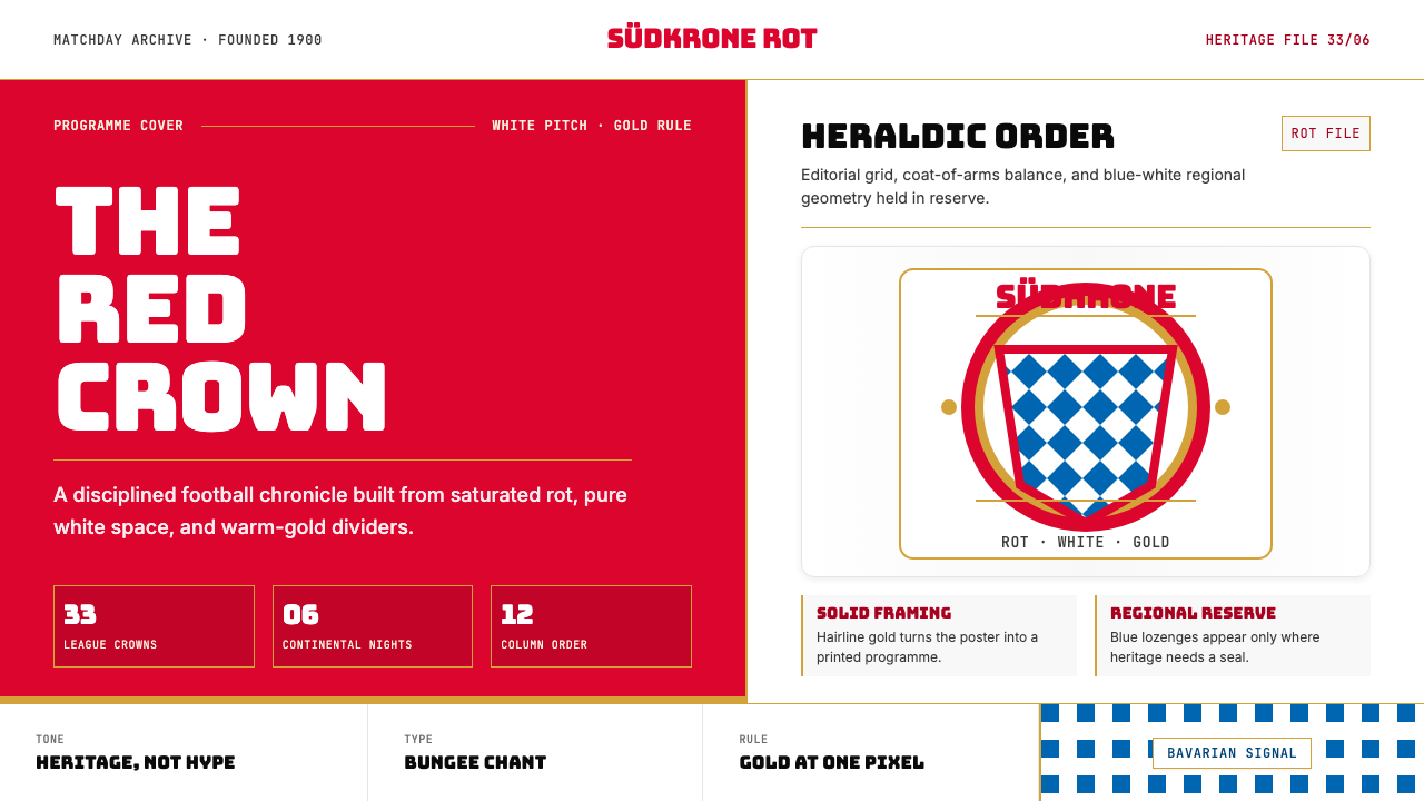 Bayern Munich (Rot)Heritage, not hype. Saturated rot fields, gold rules, and blue lozenges enfor…传统胜过喧哗:饱和红、金细线与蓝白菱格建立秩序。
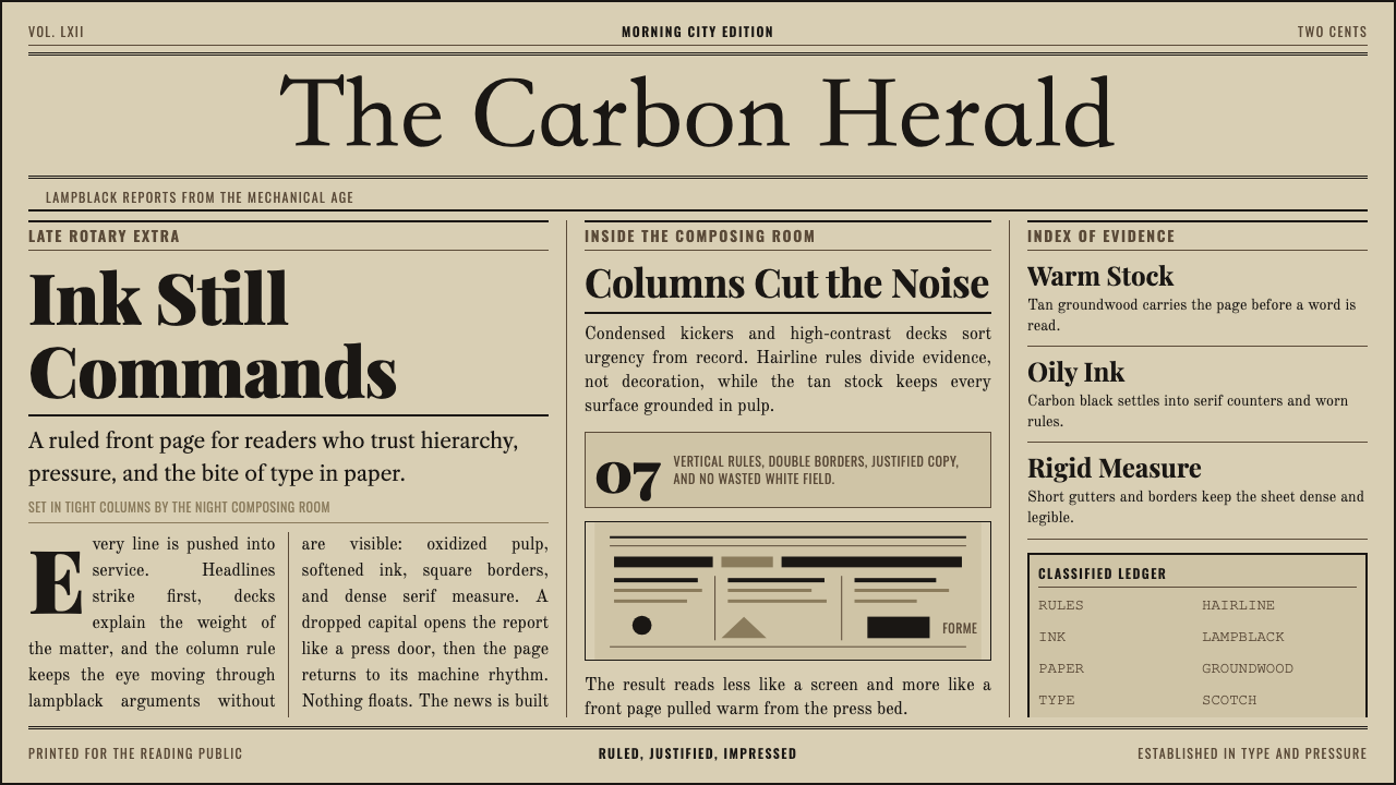 Broadsheet LetterpressAuthority in ink. Lampblack serif decks lock into tan paper with strict ruled…油墨里的权威:灯黑衬线与褐黄纸面,被严密栏线锁住。
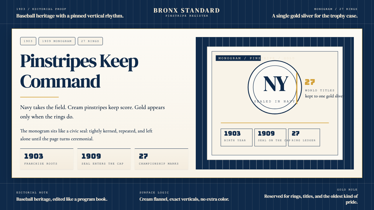 New York Yankees (Navy-Pinstripe)Navy restraint, not noise. Cream pinstripes and a gold monogram seal do the w…海军蓝克制到底。奶油细条纹与金色徽章撑起整页。
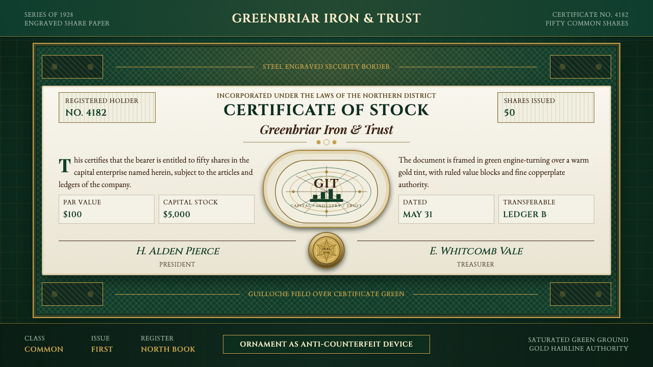 Stock CertificateCapital made ceremonial. Certificate green, gold hairlines, and guilloche bor…资本被仪式化。证书绿、金色细线与扭索边框撑起权威感。
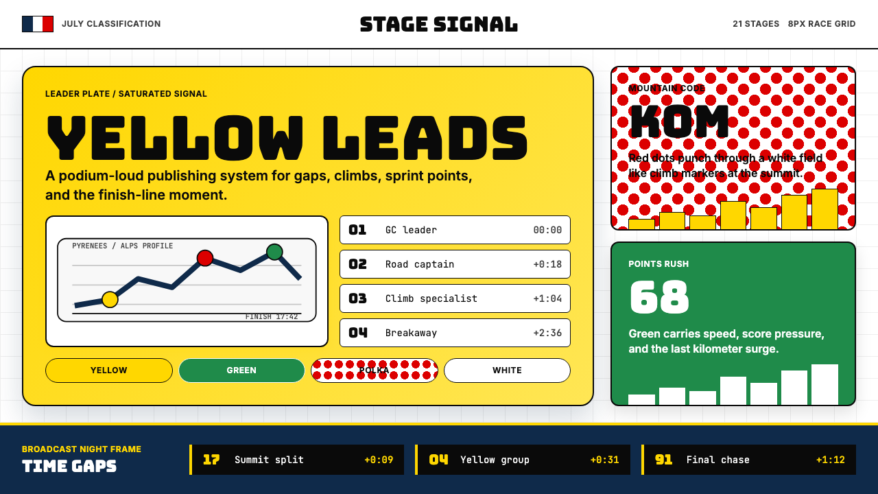 Tour de France (Yellow Jersey)Yellow owns the finish. Bungee type, polka dots, and navy tickers snap to an…黄衫统治终点:Bungee 字体、圆点红与海军蓝计时条咬合 8px 网格。