What is Bayern Munich (Rot)?什么是 Bayern Munich (Rot)?
Bayern Munich's visual language distills a century of football dominance into saturated rot red, warm Bavarian gold, and the quiet authority of a coat of arms.拜仁慕尼黑的视觉语言,将百年足球霸业提炼成饱和的拜仁红、暖金与纹章般静默的权威。
Bayern Munich (Rot) in briefBayern Munich (Rot) 速览
Bayern Munich (Rot) is the visual identity system of FC Bayern Munich, Germany's most-decorated football club. Built on a palette of saturated rot red, pure white, and warm Bavarian gold — with deep Bavarian blue held in reserve for moments of regional emphasis — the system projects heritage, discipline, and continental authority. It is not a sports brand built for hype; it is a club crest translated into design grammar.拜仁慕尼黑(Rot)是德国最荣耀足球俱乐部拜仁慕尼黑的视觉识别体系。整套系统以饱和的拜仁红、纯白、暖金为骨,以深巴伐利亚蓝作为强调地域归属时的保留色,传递出一种传统、纪律与欧陆权威并存的气质。这不是一个为喧嚣而生的运动品牌,而是一枚被翻译成设计语言的俱乐部纹章。
The rot red that anchors the system is not the aggressive neon of an energy drink or the bright scarlet of a fashion brand. It is a fully saturated, stable crimson — the kind of red that reads as institutional rather than promotional, earned rather than chosen. Against pure white grounds and precise gold rules, it carries the weight of 33 Bundesliga titles and 6 UEFA Champions League crowns without needing to announce them.锚定整套体系的拜仁红,并非能量饮料的侵略性荧光,也非时尚品牌的鲜亮朱砂。它是一种饱和、稳定的深红——那种被解读为机构感而非促销感、被赢得而非被挑选的红色。在纯白底面与精准金线的映衬下,它承载着33次德甲冠军与6次欧冠奖杯的分量,无需声张。
What distinguishes Bayern Munich (Rot) from other sports-derived aesthetics is its restraint. The Bavarian blue-and-white diamond lozenge pattern — a heraldic motif drawn directly from the state flag of Bavaria — grounds the identity in regional culture and history. Nothing in the system is decorative for decoration's sake; each element maps to something real. The result is a design language that communicates belonging, continuity, and the particular gravity of an institution that has won more than it has lost for over a century.拜仁慕尼黑(Rot)区别于其他运动美学的关键在于克制。巴伐利亚蓝白菱格纹——直接取自巴伐利亚州旗的纹章母题——将整套识别锚定在地域文化与历史之中。体系中的每一个元素都对应着某种真实的存在,没有纯粹为装饰而存在的装饰。最终呈现出的设计语言,传达的是归属感、延续性,以及一个百年来胜多负少的机构所特有的沉稳重量。
See the Bayern Munich (Rot) design system查看 Bayern Munich (Rot) 完整设计系统
Where does Bayern Munich (Rot) come from?Bayern Munich (Rot) 从何而来?
FC Bayern Munich was founded on February 27, 1900, in the Bavarian capital, by eleven footballers who broke away from Munich gymnastic club MTV 1879 to form an independent football association. The founding moment was modest, but the cultural soil was rich: Bavaria had its own distinct identity within the newly unified Germany, its own royal house (the Wittelsbachs), and a visual heraldic tradition — the blue-and-white diamond lozenge — that had defined the region's flag and coat of arms for centuries. From the earliest years, the club's colors were red and white, reflecting both the city of Munich's traditional palette and the straightforward directness that Bavarian identity prized.拜仁慕尼黑足球俱乐部于1900年2月27日在巴伐利亚首府慕尼黑成立,由十一名脱离慕尼黑体操俱乐部MTV 1879的球员组建而成。创立时刻颇为低调,但文化土壤十分丰厚:巴伐利亚在新统一的德意志帝国中拥有独特的地域身份,有自己的王室(维特尔斯巴赫家族),以及一套数百年来定义本州旗帜与纹章的蓝白菱格视觉纹章传统。建队最初数年,俱乐部便采用红白配色,既呼应慕尼黑城市的传统色调,也契合巴伐利亚人所珍视的直率个性。
The visual language evolved gradually through the twentieth century alongside the club's fortunes. The crest — a circle divided into a red ring, the club's initials in gold on red, and the Bavarian lozenge pattern in blue and white — was formalized across decades of iteration. The rot red deepened and stabilized as a specific institutional hue; the gold rules and lettering gained precision. By the time the club entered its golden European era under Franz Beckenbauer in the 1970s — winning the UEFA European Cup three consecutive times from 1974 to 1976 — the visual identity had coalesced into something that felt historic even as it was being made.整套视觉语言随俱乐部命运的起伏,在二十世纪间缓慢演进。队徽——一个圆形,分为红色外环、金字红底的俱乐部缩写,以及蓝白菱格纹内芯——经历数十年迭代而逐渐定型。拜仁红作为一种特定的机构色调愈发深沉稳固,金色细线与字体的精确度也随之提升。当俱乐部在弗朗茨·贝肯鲍尔率领下进入1970年代的欧洲黄金年代——1974至1976年连续三次夺得欧洲冠军杯——视觉识别已凝聚成一种在创造之时便令人感到厚重的东西。
The current global visual expression of Bayern Munich, refined across the 2010s and consolidated through the 2022–2024 period, reflects the club's standing as one of the world's most commercially successful and internationally recognized football institutions. The rot red jersey on white shorts, the white-and-gold crest centered like a coat of arms, the Allianz Arena glowing red against the Munich skyline — these images have been broadcast to audiences across every continent. The visual system had to scale from a match-day scarf to a global marketing campaign without losing the heraldic weight that defines it.拜仁慕尼黑当前的全球视觉表达,经由2010年代的持续打磨,在2022至2024年间进一步整合确立,折射出俱乐部作为世界上最具商业价值、国际知名度最高的足球机构之一的地位。拜仁红球衣配白色球裤、白金队徽居中如纹章,安联球场在慕尼黑夜空中泛出红光——这些画面已被广播至每一个大陆的观众面前。视觉体系必须从比赛日围巾无缝延伸至全球营销战役,且不能失去定义它的纹章重量。
The Bavarian cultural context is not incidental to understanding this aesthetic. Bavaria is Germany's largest state by area, a region with a distinctive folk tradition, a strong sense of local identity that coexists with German national pride, and an economic and institutional confidence that extends well beyond football. The blue-and-white lozenge in Bayern's crest is not a design choice — it is a citation, a deliberate anchoring of the club within a regional identity that predates the German nation itself. When Bayern Munich's visual language is applied to presentations, editorial work, or digital products, it carries this layered historical resonance whether or not the audience is consciously aware of its source.理解这套美学,巴伐利亚的文化语境不可或缺。巴伐利亚是德国面积最大的联邦州,拥有独特的民俗传统,以及一种与德意志民族自豪感并行共存的强烈地域认同,其经济与制度自信远超足球领域。拜仁队徽中的蓝白菱格纹并非一种设计选择,而是一种引证——有意识地将俱乐部锚定在一个早于德意志民族国家本身的地域身份之中。当拜仁慕尼黑的视觉语言被应用于演示文稿、编辑作品或数字产品时,无论受众是否有意识地察觉到其来源,这种多层次的历史共鸣都会随之传递。
What defines the Bayern Munich (Rot) look?Bayern Munich (Rot) 的视觉特征是什么?
Color色彩
The palette is built on three anchors: a fully saturated rot red that reads as institutional and earned rather than promotional; pure white that provides clean negative space and amplifies the red's authority; and warm Bavarian gold used for rules, lettering, and heraldic detail. Deep Bavarian blue appears as a fourth element, always in partnership with white in the lozenge pattern, and reserved for accent rather than mass. The hierarchy is deliberate — rot red dominates, gold articulates structure, blue signals regional heritage.色板建立在三个锚点之上:饱和的拜仁红,传递机构感与历史积累而非促销气息;纯白作为干净的负空间,放大红色的权威感;暖金用于细线、字体与纹章细节。深巴伐利亚蓝作为第四元素出现,始终以蓝白菱格纹的形式与白色搭配,保留作强调而非大面积铺陈。层级分明——拜仁红主导,金色勾勒结构,蓝色标示地域归属。
Heraldic Structure纹章结构
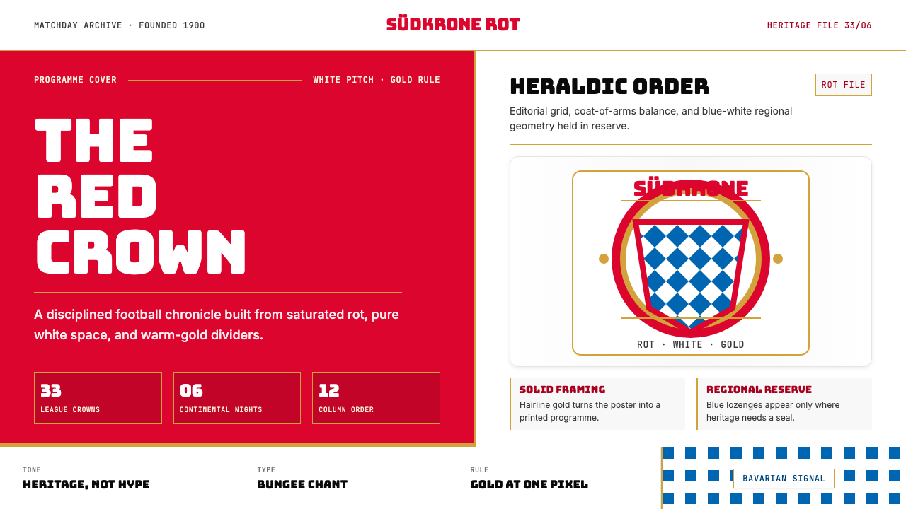
The crest logic — a circular device divided into a bold outer ring, an inner field carrying the club initials, and a central lozenge panel — governs how the identity is composed across applications. The circular crest is treated as a centered anchor, like a coat of arms or a royal seal, rather than as a logo to be floated freely. This heraldic instinct informs the broader design system: symmetry and central alignment are permitted here in ways they are not in more modernist sports brands, because the reference is medieval civic identity rather than contemporary branding.队徽的逻辑——一个圆形装置,分为粗重外环、承载俱乐部缩写的内域,以及中央菱格面板——支配着视觉识别在各类应用中的构图方式。圆形队徽被视为居中的锚点,如纹章或王室印章,而非可随意漂浮的标志。这种纹章本能渗透到更广泛的设计体系:对称与居中对齐在此是被允许的,而在更多现代主义运动品牌中则不然——因为参照的是中世纪市民身份,而非当代品牌学。
Lozenge Pattern菱格纹
The blue-and-white diamond lozenge — drawn directly from the Bavarian state flag — is the system's most distinctive textural element. Used as a repeating pattern, a border treatment, or a contained panel within the crest, it introduces visual rhythm without resorting to abstract decoration. It carries specific geographic and historical meaning: it is a citation of Bavaria, not an ornament. Applied subtly as a background texture or a contained accent, it grounds any layout in the club's regional identity without overwhelming the primary rot-and-white palette.蓝白菱格纹——直接源自巴伐利亚州旗——是整套体系最具辨识度的肌理元素。作为重复纹样、边框处理或队徽内嵌面板,它引入视觉韵律而无须借助抽象装饰。它承载着特定的地理与历史意义:是对巴伐利亚的引证,而非单纯的装饰。作为背景纹理或局部强调元素低调运用时,它能在不压倒主导的红白色调的情况下,将版面锚定于俱乐部的地域身份之中。
Typography字体排印
The typographic register is bold, upright, and institutional. Headlines carry significant weight, set in capitals or mixed-case with strong inter-letter spacing that gives each word a monumental quality. Body text is set cleanly in a neutral sans-serif that recedes behind the structural color work rather than competing with it. Gold is used for titles and emphasized labels; white type on red grounds creates the high-contrast combinations most associated with the club's matchday communications. The overall effect is authoritative and legible at scale — designed to work on stadium signage as readily as on a printed program.字体格调粗重、挺拔、具机构感。标题字重显著,以全大写或混合大小写设置,宽字间距赋予每个词以纪念碑般的品质。正文以中性无衬线字体清晰排印,在结构性色彩工作之后退居幕后而非与之竞争。金色用于标题与强调标签;红色底面上的白色文字创造出与俱乐部赛事传播最关联的高对比度组合。整体效果权威而在大尺寸下清晰易读——适合在球场标识和印刷节目册上同样出色地呈现。
Spatial Gravity空间重力
Bayern Munich's visual system favors centered, anchored compositions over dynamic asymmetry. Where modernist sports brands chase kinetic energy through diagonal cuts and explosive typography, the Bayern system holds weight at the center and lets the color do the work of commanding attention. Generous margins give the crest and type room to breathe. The result is a composure that reads as earned confidence — not excitement, but authority.拜仁慕尼黑的视觉体系偏向居中、锚定的构图,而非动态的非对称。当现代主义运动品牌通过斜切与爆炸性字体追求动能感时,拜仁体系将重量保持在中央,让色彩来完成吸引注意力的工作。宽裕的边距给予队徽与字体充足的呼吸空间。最终呈现出的沉稳,被读作一种经由积累而来的自信——不是兴奋,而是权威。
Gold as Structure金色作为结构
Warm gold in this system does not function as luxury signaling — it functions as a structural element. Fine gold rules divide sections, gold letterforms in the crest carry the club identity, and gold borders frame panels of red or white. The warmth of the gold prevents the red-and-white combination from reading as clinical or cold; it introduces a sense of permanence and material richness without departing from the heraldic vocabulary. Used sparingly and precisely, gold is the element that elevates the palette from a football color scheme to something that reads as genuinely institutional.暖金在这套体系中的功能不是传递奢华信号,而是充当结构性元素。细金线划分章节,队徽中的金色字形承载俱乐部身份,金色边框框定红色或白色的面板区域。金色的温度防止红白组合被解读为临床感或冷漠感,引入一种永久性与物质丰富感,且不脱离纹章词汇的语境。克制而精准地运用时,金色是将整套色板从一种足球配色提升为真正具有机构感的读物的关键元素。
Red as Field, Not Accent红色作为底场而非强调
In most design systems, red functions as an accent — a warning color, a call to action, a signal of urgency. In Bayern Munich (Rot), red is the field: the ground against which everything else is read. This inversion is the system's most distinctive quality. Red is background, not foreground. It is the environment the viewer enters, not the element that competes for attention within a white or neutral space. Understanding this distinction is essential to applying the system correctly — when red is treated as accent rather than field, the entire visual weight of the identity collapses.在大多数设计体系中,红色充当强调色——警示色、行动号召、紧迫信号。在拜仁慕尼黑(Rot)中,红色是底场:是其他一切元素被阅读时的背景。这种反转是整套体系最鲜明的特质。红色是背景,而非前景。它是观者进入的环境,而非在白色或中性空间中争夺注意力的元素。理解这一区别,是正确应用这套体系的关键——当红色被当作强调色而非底场处理时,整套识别的视觉重量便会崩塌。
See the Bayern Munich (Rot) design system查看 Bayern Munich (Rot) 完整设计系统
Who shaped Bayern Munich (Rot)?谁塑造了 Bayern Munich (Rot)?
Beckenbauer — 'Der Kaiser' — is the single figure most associated with Bayern Munich's ascent to continental dominance. As a libero, he reinvented the defensive position by reading the game as an architect rather than a stopper, bringing the ball forward and directing attacks from the back. He captained Bayern to three consecutive European Cup titles from 1974 to 1976 and later managed the club, winning the Bundesliga in 1994. His disciplined, imperious style of play became the human expression of the club's visual identity: controlled, authoritative, and never showy.贝肯鲍尔——「皇帝」——是与拜仁慕尼黑跻身欧陆霸主联系最紧密的单一人物。作为自由人,他以建筑师而非阻截者的方式解读比赛,向前带球、从后场指挥进攻,重新定义了防守位置。他率队在1974至1976年间连续三次夺得欧洲冠军杯,后来又执教俱乐部并于1994年赢得德甲冠军。他那种克制、威严而从不浮夸的踢球风格,成为俱乐部视觉识别在人格层面的表达。
Hoeneß transformed Bayern Munich from a successful football club into a German institution. As a forward he was part of the 1970s championship squads; as manager and later president, he built the administrative and financial structure that made Bayern's consistent dominance possible. His insistence on financial prudence — Bayern has been debt-free for decades — and his fierce protection of the club's identity shaped an organizational culture that the visual system reflects: no shortcuts, no compromise on the fundamentals, heritage as competitive advantage.赫内斯将拜仁慕尼黑从一家成功的足球俱乐部转型为德国的一项机构。作为前锋,他是1970年代冠军阵容的一员;作为经理,后来又作为主席,他构建了使拜仁持续称霸成为可能的行政与财务结构。他对财务审慎的坚持——拜仁数十年来无负债——以及对俱乐部身份的强力守护,塑造了一种视觉体系所映射的组织文化:不走捷径,不在根本上妥协,将传统作为竞争优势。
Rummenigge served as CEO of Bayern Munich for decades, overseeing the club's commercial expansion and its establishment as one of the most globally recognized sports brands. Under his leadership, Bayern's visual identity was systematized and internationalized — the rot red, the crest, the Allianz Arena becoming consistent global symbols rather than regional ones. His role bridges the sporting heritage that gives the identity its authority and the commercial infrastructure that gives it its reach.鲁梅尼格担任拜仁慕尼黑首席执行官数十年,主导了俱乐部的商业扩张,以及其成为全球最具知名度运动品牌之一的历程。在他的领导下,拜仁的视觉识别被系统化与国际化——拜仁红、队徽、安联球场成为一致的全球符号而非地域符号。他的角色连接着赋予这套识别权威感的运动传统,与赋予它传播广度的商业基础设施。
Neuer redefined the goalkeeper position for the modern era, becoming synonymous with the concept of the sweeper-keeper — a player who commands territory beyond the penalty area with the same confidence that Bayern's visual identity commands the page. His tenure as club and national captain placed him at the center of Bayern's contemporary identity during its most globally visible era, including the treble-winning 2012–2013 season and multiple subsequent Bundesliga and European campaigns.诺伊尔为现代足球重新定义了门将位置,成为横扫型门将概念的代名词——一个以拜仁视觉识别统驭版面同样的自信,掌控禁区之外领地的球员。他担任俱乐部与国家队队长的任期,将他置于拜仁当代身份全球曝光度最高时期的中心,包括2012至2013赛季三冠王以及此后多次德甲与欧冠征程。
Müller represents Bayern Munich's continuity in its purest form — a player who has spent his entire senior career at the club and become inseparable from its identity. His longevity, combined with a playing style that prioritizes collective function over individual spectacle, mirrors the design system's own values: no flash, no ornament, just relentless effectiveness in service of a larger structure. Müller is the human argument for why Bayern's aesthetic reads as heritage rather than marketing.穆勒以最纯粹的形式代表着拜仁慕尼黑的延续性——一位将整个职业生涯献给俱乐部、与其身份密不可分的球员。他的长期性,加上一种将集体功能置于个人表演之上的踢球风格,映照出这套设计体系自身的价值观:没有闪耀,没有装饰,只有服务于更大结构的不懈有效性。穆勒是拜仁美学被读作传统而非营销的人格化论据。
How do you use Bayern Munich (Rot) today?今天怎么用 Bayern Munich (Rot)?
Bayern Munich (Rot) is a high-authority style that works best when the content itself has institutional weight — football, sports journalism, Bavarian cultural programming, anniversary or commemorative materials, and any brand positioning that needs to communicate earned confidence rather than aspirational energy. The system's power comes from restraint: the rot red must be allowed to function as a field rather than as an accent, and the gold must be used sparingly to articulate structure rather than to signal luxury.拜仁慕尼黑(Rot)是一种高权威感风格,在内容本身具有机构重量时效果最佳——足球、体育新闻、巴伐利亚文化项目、周年纪念与纪念材料,以及任何需要传递积累自信而非憧憬能量的品牌定位。这套体系的力量来自克制:拜仁红必须被允许作为底场而非强调色发挥功能,金色必须被节制地用于勾勒结构,而非传递奢华信号。
For presentation slides, the system works most powerfully on cover and chapter-break pages, where the full rot-red field can be deployed without visual competition. A cover built on a saturated rot ground, white title set in heavy upright type, and a gold rule or the club's lozenge motif as a structural accent will communicate authority from the first slide. Content pages should shift to white or near-white grounds, with rot red reserved for key callouts, data highlights, or section labels rather than backgrounds. Data visualization — bar charts, timelines, scorecards — should follow the color hierarchy: red for the primary series, white or light neutral for secondary, gold for annotation or emphasis. Avoid decorative frames and gratuitous background elements; let the type and data carry the page.在演示文稿中,这套体系在封面与章节分隔页上最具力量,在那里可以部署完整的拜仁红底场而不受视觉竞争干扰。以饱和红色为底面、白色标题以粗重挺拔字体排印、金色细线或俱乐部菱格母题作结构强调的封面,将从第一张幻灯片起便传递权威感。内容页应转向白色或近白底面,将拜仁红保留用于关键引语、数据高亮或章节标签,而非作背景。数据可视化——柱状图、时间线、计分卡——应遵循色彩层级:红色用于主要数据系列,白色或浅中性色用于次要系列,金色用于注释或强调。避免装饰性边框与多余的背景元素;让字体和数据承载页面。
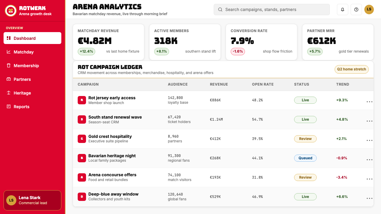
For web interfaces and dashboards, Bayern Munich (Rot) suits contexts where clarity and authority are the primary UX values — analytics platforms, sports statistics tools, Bundesliga or UEFA content hubs, and institutional sites. The approach: establish a strong typographic hierarchy with heavy headlines and clean body text, use the rot red sparingly for primary interactive states and tier labels, and keep the background white or off-white with gold rules as structural dividers. Pricing pages benefit from the style's heraldic instinct — tier cards centered like crests, gold for premium tier labels, rot red for calls to action. Navigation should be text-forward, with the crest or lozenge motif as a contained brand element rather than a floating decoration.对于网页界面与仪表板,拜仁慕尼黑(Rot)适合清晰性与权威感是首要用户体验价值的场景——分析平台、体育统计工具、德甲或欧冠内容枢纽,以及机构性网站。方法如下:以粗重标题与干净正文建立强劲的字体层级;将拜仁红节制地用于主要交互状态与等级标签;保持背景白色或近白,以金色线条作结构分隔。定价页面受益于这套体系的纹章本能——等级卡居中如徽章,金色用于高级等级标签,拜仁红用于行动号召。导航应以文字为主,队徽或菱格母题作为包含性品牌元素,而非漂浮的装饰。
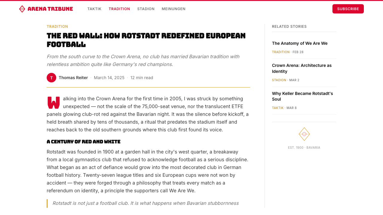
For editorial and marketing work, the system's poster-like boldness makes it exceptionally well-suited to full-page spreads, feature openers, and campaign headers. A spread that commits fully to the rot-red field — white headline in heavy type, gold rule marking a structural divide, lozenge border as a contained texture at the edge — carries the kind of visual authority that few purely modernist systems can achieve. Marketing emails and social cards work well with a tight red-white-gold palette: one dominant color per module, clean hierarchy, no gradient fills or soft shadows. The goal is always to make the layout feel like it was stamped rather than assembled.对于编辑与营销内容,这套体系的海报式大胆感使其尤其适合整版展开页、专题开篇与活动头版。完全投入拜仁红底场的展开页——粗重字体的白色标题、金色细线标记结构分割、菱格边框作边缘肌理——传递出纯粹现代主义体系难以企及的视觉权威感。营销邮件与社交卡片适合紧凑的红白金色板:每个模块以一种主色为主,清晰层级,无渐变填充或柔和阴影。目标始终是让版面看起来像被盖了印章,而非被拼装出来。
A common mistake when applying Bayern Munich (Rot) is treating the red as one color among equals — using it alongside the gold and blue simultaneously at high saturation to achieve a 'full Bayern' effect. In practice, this produces visual noise rather than authority. The authentic system leads with rot red as the ground, brings in white as the primary contrast, introduces gold as a structural accent, and allows the Bavarian blue only within the lozenge pattern or as a very contained regional marker. Using all four colors at once at full saturation collapses the hierarchy that gives the system its power. Similarly, substituting bright or warm-toned photography for the system's flat-color palette undermines the heraldic seriousness of the identity — photographic images should be treated as contained elements within the structured color field, not allowed to bleed freely across the composition.应用拜仁慕尼黑(Rot)时最常见的错误,是将红色当作与金色、蓝色平等的颜色——同时在高饱和度下使用三种颜色以求达到「完整拜仁」效果。实践中,这会产生视觉噪音而非权威感。真实的体系以拜仁红为底场打头,以白色为主要对比,将金色引入作结构强调,仅在菱格纹样内或作为极其局限的地域标记时允许巴伐利亚蓝出现。同时以完整饱和度使用四种颜色会崩解赋予这套体系力量的层级结构。同样,以明亮或暖调摄影替代体系的平色色板,会破坏识别的纹章严肃感——摄影图像应当作结构化色彩场域内的包含性元素处理,而非允许其自由渗透整个构图。
See the Bayern Munich (Rot) design system查看 Bayern Munich (Rot) 完整设计系统
Bayern Munich (Rot) — FAQBayern Munich (Rot) · 常见问题
Is Bayern Munich (Rot) appropriate for non-football contexts?拜仁慕尼黑(Rot)适合用于非足球场景吗?
Yes, with the right content. The system's authority derives from heraldic structure and color restraint, not from football imagery itself. It transfers well to any context that values institutional confidence: financial reporting, sports analytics platforms, regional tourism presenting Bavarian cultural heritage, anniversary publications, and premium editorial work. What it does not transfer well to is contexts requiring warmth, approachability, or sensory softness — the saturated red and rigid gold structure will read as cold or imposing in wellness, food, or family-oriented contexts. The question is whether the content earns the weight of the palette.可以,但需要合适的内容。这套体系的权威感来自纹章结构与色彩克制,而非足球图像本身。它能良好迁移至任何重视机构自信的场景:财务报告、体育分析平台、呈现巴伐利亚文化遗产的地域旅游、周年出版物,以及高端编辑作品。它迁移效果欠佳的,是需要温暖感、亲切感或感官柔软度的场景——饱和红与严格金色结构在健康、食品或家庭导向场景中会被解读为冷漠甚至压迫感。关键问题是:内容是否承担得起这套色板的重量。
How does this system differ from other European football club identities?这套体系与其他欧洲足球俱乐部的视觉识别有何不同?
Most European football clubs use their primary colors as accent elements within a broader design language that prioritizes dynamism, diagonal energy, and kinetic typography. Bayern Munich (Rot) inverts this: the red is the field, not the accent, and the composition favors centered heraldic gravity over diagonal movement. This makes it closer in spirit to an institutional identity — a bank, a university, a government body — than to a contemporary sports brand. The Bavarian lozenge pattern also gives it a geographic specificity that purely color-based football identities lack; it is Bavaria made visible, not just a red club.大多数欧洲足球俱乐部将主色作为强调元素,嵌入一套优先考虑动感、斜切能量与动态字体的更广泛设计语言之中。拜仁慕尼黑(Rot)反其道而行:红色是底场而非强调,构图偏向居中的纹章重力而非斜切运动。这使其在精神气质上更接近机构识别——银行、大学、政府机构——而非当代运动品牌。巴伐利亚菱格纹也赋予它纯色彩型足球识别所缺乏的地理特殊性:它让巴伐利亚变得可见,而不仅仅是一支红色俱乐部。
Can the lozenge pattern be used as a full background texture?菱格纹可以作为整版背景纹理使用吗?
It can, but it requires careful calibration. The lozenge pattern at full density and high contrast will compete with body text and other structural elements, reducing legibility and collapsing the hierarchy the system depends on. The more effective approach is to use the pattern at reduced contrast — blue on near-blue, or white on near-white — as a contained border treatment, a background texture in a header band, or a corner detail. Think of it as architectural surface texture rather than wallpaper: it should enrich the spatial quality of the layout without asserting itself over the primary content.可以,但需要仔细校准。菱格纹在完整密度与高对比度下会与正文及其他结构性元素竞争,降低可读性并崩解整套体系赖以运转的层级。更有效的做法是以降低对比度的方式使用——蓝色叠近蓝、白色叠近白——作为局限性边框处理、标题条中的背景纹理或角部细节。将其视为建筑表面肌理而非壁纸:它应当丰富版面的空间质感,而不凌驾于主要内容之上。
How should photography be integrated into this design system?摄影图像应当如何融入这套设计体系?
Photography should be treated as a contained element within the structured color field, not as a bleeding, ambient background. The most compatible approach is to frame photographic images within hard geometric borders — a rectangle flush with a grid column, a circle echoing the circular crest — rather than allowing them to extend edge-to-edge. High-contrast black-and-white treatment makes photographs more compatible with the flat-color palette; desaturated or duotone images treated in rot-red and white are particularly effective. Action photography that emphasizes the kit color — the red jersey against a white or green ground — integrates naturally. Lifestyle photography with warm ambient lighting and soft backgrounds fights the system's heraldic seriousness and should generally be avoided.摄影图像应当被视为结构化色彩场域内的包含性元素,而非自由渗透的环境背景。最兼容的做法是将摄影图像框定在硬边几何边界内——与网格列对齐的矩形、呼应圆形队徽的圆形——而非允许其从边到边延伸。高对比度黑白处理使照片更兼容于平色色板;以拜仁红与白色处理的去饱和或双色调图像尤为有效。强调球衣色彩的动作摄影——红色球衣映衬白色或绿色场地——自然融入。带有温暖环境光与柔和背景的生活方式摄影会与这套体系的纹章严肃感产生冲突,通常应当避免。
What is the most common misconception about this style?关于这种风格最常见的误解是什么?
The most common misconception is that Bayern Munich (Rot) is interchangeable with any red-dominant sports aesthetic — that using red heavily, white secondarily, and some gold detail is enough to invoke the system. It is not. The specific quality of the red (institutional, fully saturated, treated as field rather than accent), the heraldic composition logic (centered, symmetry-tolerant, crest-anchored), the precise restraint in gold usage, and the geographic specificity of the Bavarian lozenge all combine to produce an identity that is qualitatively different from generic red sports branding. Applying the palette without understanding the structure produces work that feels like a football kit rather than an institutional identity — which misses the entire point of what makes Bayern Munich (Rot) distinctive.最常见的误解是认为拜仁慕尼黑(Rot)可与任何以红色为主的运动美学互换——以为大量使用红色、次要使用白色、加一些金色细节就足以唤起这套体系。事实并非如此。红色的特定质感(机构感、完全饱和、作为底场而非强调色处理)、纹章构图逻辑(居中、容许对称、以纹章为锚)、金色使用的精准克制,以及巴伐利亚菱格纹的地理特殊性——这些元素共同作用,产生一种在品质上截然不同于泛化红色运动品牌的识别。在不理解结构的情况下应用色板,产出的作品感觉像是一套足球装备而非一套机构识别——而这恰恰错过了拜仁慕尼黑(Rot)之所以独特的全部意义。
Related design styles相关设计风格
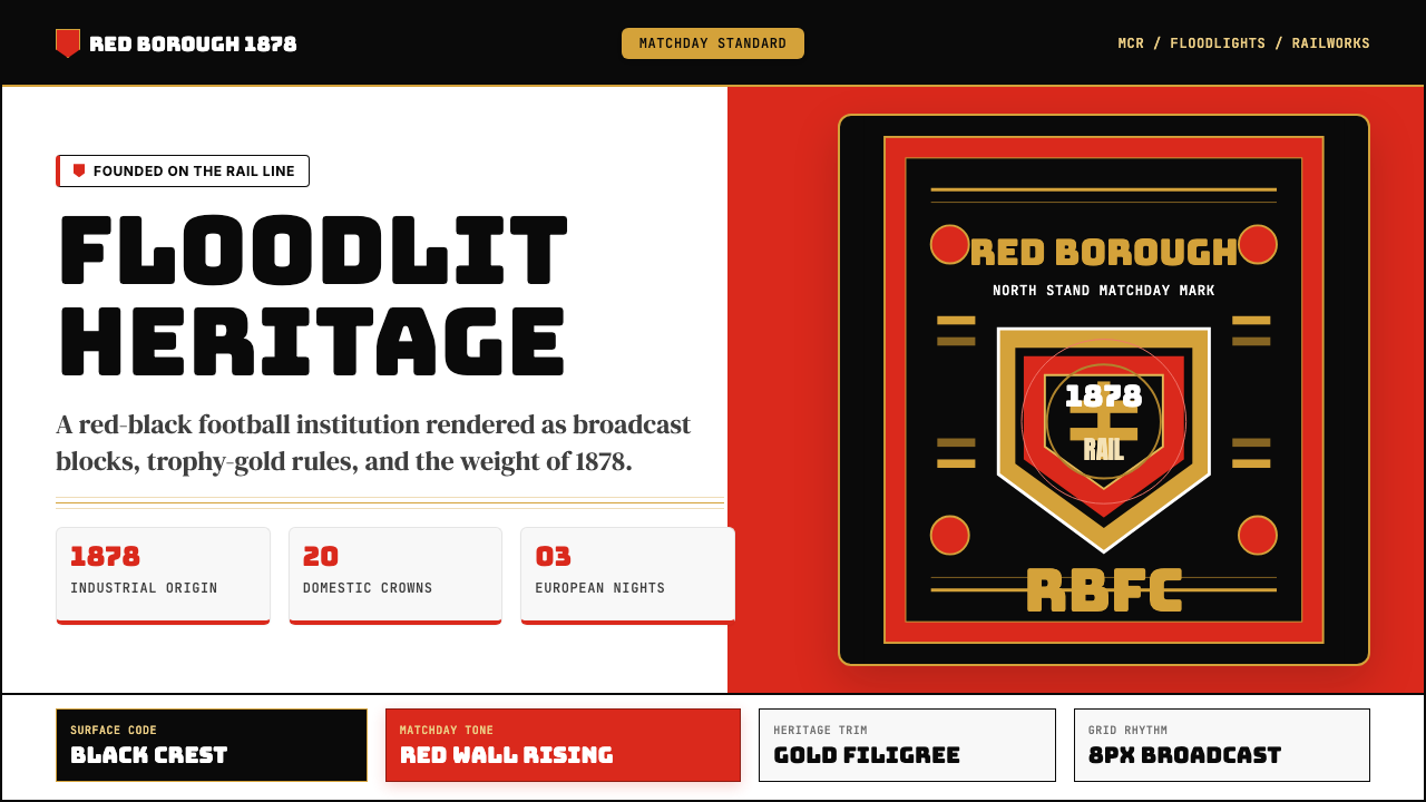 Manchester United (Red Devils)Heritage hits like a chant. Red-black blocks, Bungee type, and gold filigree…百年声浪压场:红黑块面、Bungee粗字与金色纹线撑起比赛日。
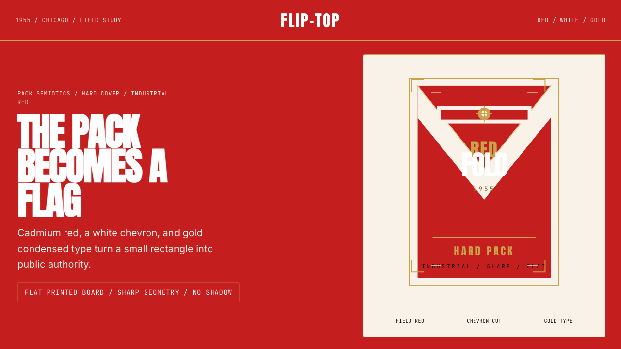 Marlboro Red Flip-Top (1955)Authority in one fold. Cadmium red, white chevron, and gold type read like a…一折成旗。镉红、白人字与金字排出强硬权威。
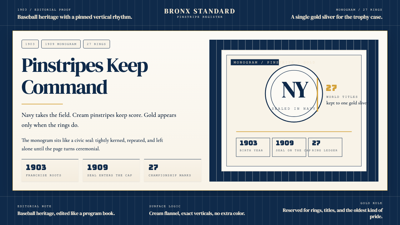 New York Yankees (Navy-Pinstripe)Navy restraint, not noise. Cream pinstripes and a gold monogram seal do the w…海军蓝克制到底。奶油细条纹与金色徽章撑起整页。
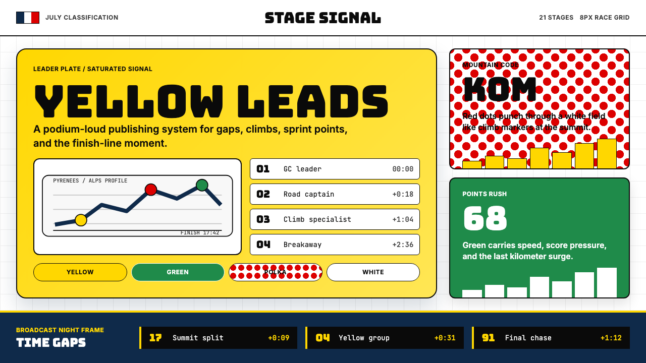 Tour de France (Yellow Jersey)Yellow owns the finish. Bungee type, polka dots, and navy tickers snap to an…黄衫统治终点:Bungee 字体、圆点红与海军蓝计时条咬合 8px 网格。
 Al Jazeera Arabic NewsAuthority, stripped bare. Gold seal, dense Arabic type, matte charcoal.权威感被提纯。金色印章、密集阿文、炭黑底面构成画面。
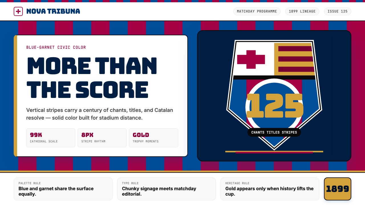 FC Barcelona (Blaugrana)Stadium heritage, not nostalgia. Blue-garnet stripes, Bungee type, gold heral…不是怀旧,是球场传承。蓝石榴红竖纹、Bungee 字体与金色纹章发声。