What is FC Barcelona (Blaugrana)?什么是 FC Barcelona (Blaugrana)?
A century of Catalan defiance compressed into blue-and-garnet stripes, gold heraldry, and type as bold as a stadium chant.一个世纪的加泰罗尼亚抵抗精神,凝缩进蓝石榴红竖纹、金色纹章与如球场呐喊般粗犷的字体之中。
FC Barcelona (Blaugrana) in briefFC Barcelona (Blaugrana) 速览
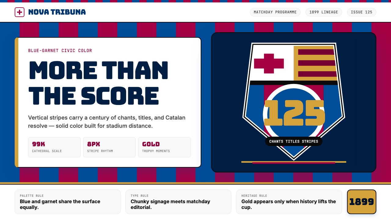
The Blaugrana design system is the visual identity of FC Barcelona, a football club founded in Barcelona in 1899 that grew into one of the most recognized institutions in global sport. Its name comes from the Catalan words for blue and garnet — the two colors of the club's vertical-striped jerseys — and the design language built around them is simultaneously a sporting livery, a cultural statement, and a carrier of political memory.蓝石榴红(Blaugrana)设计体系是巴塞罗那足球俱乐部的视觉语言。这家球俱由瑞士人汉斯·甘伯于一八九九年创立于巴塞罗那,历经百余年演变成为全球体育史上辨识度最高的机构之一。体系得名于加泰罗尼亚语中的「蓝」与「石榴红」——球衣竖纹的两种颜色——围绕这两种颜色构建的视觉语言,同时是运动制服、文化宣言与政治记忆的载体。
At its core, the system is built on deep saturated blue and a dark claret-garnet, paired with a warm gold reserved for moments of ceremony and achievement. These three hues carry historical weight: the blue and garnet were worn through decades when the club's Catalan identity was actively suppressed, making the jersey a form of resistance, and the gold marks the heraldic tradition of the club's crest. The typography that anchors the system is chunky and architectural — display letterforms that echo the weight of stadium signage, built for legibility at distance and impact at scale.体系的核心是深邃的饱和蓝与暗沉的绛红石榴色,搭配仅在仪式与荣耀时刻出现的暖金色。这三种色彩承载着历史重量:蓝色与石榴红在球俱的加泰罗尼亚认同遭受压制的数十年间始终穿在球员身上,使球衣本身成为一种抵抗形式;金色则延续了俱乐部盾徽的纹章传统。锚定整个体系的字体粗犷而建筑感十足——展示性字形呼应着球场指示牌的厚重,在远处清晰可读,在大尺度下震撼有力。
The overall character of the Blaugrana aesthetic is one of proud solidity. It does not whisper or suggest; it asserts. Vertical rhythm — the recurring stripe motif — runs through applications from jerseys to editorial spreads. Gold accents and heraldic crest elements introduce a ceremonial register that lifts the system above pure sportswear into something closer to civic heraldry. The result is a design language that works at the scale of a stadium banner and at the intimacy of a matchday program.蓝石榴红美学整体上散发出一种傲然的沉实感。它不低语、不暗示,而是断言。竖纹节奏——反复出现的条纹母题——贯穿从球衣到编辑版面的所有应用场景。金色点缀与盾徽纹章元素引入仪式性格调,将体系从纯粹的运动服饰提升到更接近市民纹章学的维度。最终呈现的是一套既能在球场横幅的巨大尺度上有效运作、又能在赛日场刊的亲密版面上精准传达的设计语言。
See the FC Barcelona (Blaugrana) design system查看 FC Barcelona (Blaugrana) 完整设计系统
Where does FC Barcelona (Blaugrana) come from?FC Barcelona (Blaugrana) 从何而来?
FC Barcelona was founded on 29 November 1899 by Hans Gamper, a Swiss merchant and footballer who had arrived in Barcelona earlier that year. Gamper placed a notice in a local sports newspaper seeking players to form a football club; eleven men responded, and the club was born. The choice of blue and garnet for the jersey is most plausibly attributed to the colors of Gamper's Swiss hometown club, FC Basel, though the exact origin remains a matter of historical debate. What is certain is that by the early twentieth century, the blue-and-garnet stripes had become inseparable from the club's identity and, increasingly, from the identity of Catalonia itself.巴塞罗那足球俱乐部由汉斯·甘伯于一八九九年十一月二十九日创立。这位瑞士商人兼球手当年抵达巴塞罗那后,在当地一份体育报上刊登招募队员的启事,十一人响应,俱乐部由此诞生。球衣选用蓝色与石榴红,最可信的说法是源自甘伯故乡球俱巴塞尔足球俱乐部的颜色,尽管确切起源至今仍有史学争议。可以确定的是,进入二十世纪初,蓝石榴红竖纹已与俱乐部身份不可分割,并日益与加泰罗尼亚认同融为一体。
The political dimension of the Blaugrana colors deepened dramatically under the dictatorship of Francisco Franco, which lasted from 1939 to 1975. Franco's regime suppressed Catalan language, culture, and political expression with particular severity; the Camp Nou stadium and the club's jerseys became one of the few public spaces where Catalan identity could be expressed without direct political risk. Attending a Barcelona match was, for many Catalans, an act of cultural preservation. The visual system absorbed this weight: the blue and garnet were not merely colors but a form of declaration, and the crest — with its Catalan flag quarters and the cross of Saint George — carried heraldic significance that went far beyond sport.蓝石榴红颜色的政治维度在弗朗西斯科·佛朗哥独裁统治期间(一九三九年至一九七五年)急剧加深。佛朗哥政权对加泰罗尼亚语言、文化与政治表达实施严酷压制;诺坎普球场与俱乐部球衣,成为少数几个能够公开表达加泰罗尼亚认同而不承担直接政治风险的空间。对许多加泰罗尼亚人而言,观看一场巴萨的比赛就是一次文化保存行为。视觉体系吸收了这份重量:蓝色与石榴红不只是颜色,而是一种宣示;盾徽上的加泰罗尼亚四条旗与圣乔治十字,承载着远超体育范畴的纹章意义。
The modern visual identity emerged through a long process of refinement in the late twentieth and early twenty-first centuries, with a significant redesign of the club crest in the 1990s and further evolution of the broader identity system through the 2010s and into the early 2020s. The introduction of bold, architecturally weighted display typography — reminiscent of stadium lettering from earlier eras — was part of this modernization. The goal was to distill the visual weight of Camp Nou: the sense that entering the stadium is entering a civic institution, not merely a sports venue.现代视觉识别系统经历了二十世纪末至二十一世纪初的漫长打磨——俱乐部盾徽在二十世纪九十年代经历了一次重要的重新设计,更宏观的识别体系则在二零一零年代持续演进,并在二零二零年代初趋于成熟。粗犷建筑感展示字体的引入——令人联想到早期球场字牌的厚重笔画——是这次现代化的组成部分。目标是提炼诺坎普的视觉重量:进入球场如同进入一座市民机构,而非仅仅是一处体育场馆。
The tiki-taka philosophy — the high-tempo, possession-based style of play associated with Johan Cruyff's tenure as manager in the late 1980s and early 1990s, and brought to its peak by Pep Guardiola's teams between 2008 and 2012 — did not directly shape the visual identity, but it reinforced a shared organizational character: precision, intelligence, and the subordination of individual spectacle to collective system. The design language shares these values. It is not maximalist or showy in a brash sense; its confidence comes from certainty of structure rather than from decoration. Every stripe, crest, and headline is where it is because it belongs there.传控战术哲学——与约翰·克鲁伊夫八十年代末至九十年代初出任主帅时形成的高强度控球风格相关,并在瓜迪奥拉率队的二零零八年至二零一二年间臻于巅峰——未必直接塑造了视觉识别,但强化了共同的组织性格:精准、智识,以及个人表演对集体系统的让位。设计语言共享这些价值。它不是炫目或浮夸的最大化主义;它的自信来自对结构的确信而非来自装饰。每一道竖纹、每一面盾徽、每一行标题,都因为属于那里而在那里。
What defines the FC Barcelona (Blaugrana) look?FC Barcelona (Blaugrana) 的视觉特征是什么?
Color色彩
The palette centers on two foundational hues — a deep, fully saturated blue and a dark garnet-claret — used in near-equal weight, neither subordinate to the other. Gold functions as a ceremony color, appearing on the crest, trophy-related applications, and moments of elevated significance; it never serves as a decorative filler. The system avoids pastels, neutrals, and gradients. Color transitions, where they occur, are structural: a stripe ends, a field begins. The saturation level is consistently high, lending the palette a quality that reads with conviction even at distance or under stadium floodlighting.色板以两种基础色为核心——深邃的全饱和蓝与暗沉的石榴绛红——二者以近乎对等的分量并置,无主次之分。金色作为仪式色登场,出现在盾徽、奖杯相关应用及重要时刻;它从不充当装饰填充。体系回避粉彩色、中性色与渐变。颜色过渡(若出现)均为结构性的:一条纹结束,一片色域开始。整体饱和度持续维持在高位,使色板在远处或球场泛光灯下依然能以坚定的力度清晰传达。
Vertical Stripe Rhythm竖纹节奏
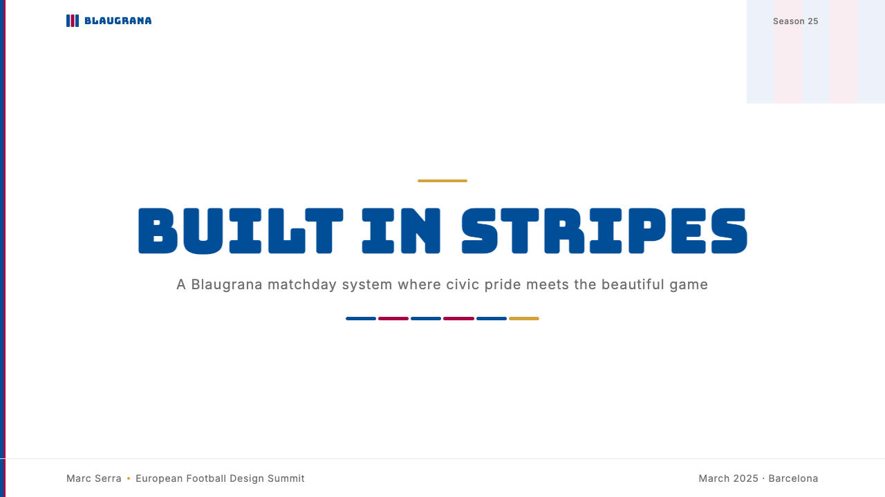
The blue-and-garnet vertical stripe is the system's most distinctive structural motif. It appears not only on jerseys but as a compositional device in editorial layouts, presentation backgrounds, and environmental graphics. When used as a background or framing element, the stripes impose a strong vertical rhythm that naturally organizes content into columns and directs the eye downward. The stripe width and spacing carry visual weight — too narrow and they become texture; at the canonical width, they read as deliberate structure.蓝石榴红竖纹是整个体系最具辨识度的结构性母题。它不仅出现在球衣上,也作为构图装置运用于编辑版面、演示背景与环境图形设计中。用作背景或框架元素时,竖纹施加强烈的纵向节奏,自然地将内容组织成列并引导视线向下流动。条纹宽度与间距承载视觉重量——过窄则沦为肌理;在标准宽度下,它们被读作刻意的结构陈述。
Typography字体排印
Display typography in the Blaugrana system is bold, wide, and architecturally scaled — letterforms that carry the same visual weight as stadium signage and feel at home printed large on banners or projected across scoreboards. The character of the type is chunky and confident, with a slab-like density that holds firm against the high-saturation color palette beneath it. Body text is kept clean and subordinate, allowing the display hierarchy to dominate. The contrast between headline scale and body scale is dramatic, creating clear reading entry points without relying on decorative dividers.蓝石榴红体系的展示字体粗犷、宽展且具有建筑尺度——字形承载着与球场指示牌相同的视觉重量,印在横幅上或投映在计分板上同样气场自如。字体的性格厚实而笃定,带有一种平板式的密度,足以在高饱和色板底面上稳稳立住。正文字体保持干净与从属,让展示层级主导一切。标题与正文之间的尺度对比戏剧性十足,无需装饰分隔线即能形成清晰的阅读切入点。
Heraldic Crest纹章盾徽
The club crest is a central and non-negotiable element of the system — it is the point at which sport, heraldry, and Catalan cultural identity converge. The crest incorporates the four red-and-gold bars of the Catalan flag, the cross of Saint George, the club's founding colors, and a football. It is used at high prominence on both formal and informal applications, scaled to anchor compositions rather than float as a small identifier. Attempts to strip or simplify the crest undermine the system's cultural legitimacy.俱乐部盾徽是体系中不可或缺的核心元素——它是体育、纹章学与加泰罗尼亚文化认同的汇聚点。盾徽融入了加泰罗尼亚旗的四道红金条纹、圣乔治十字、俱乐部创始配色与一颗足球。无论正式还是非正式场合,它都以高显眼度呈现,被放大以锚定构图而非作为小型标识符漂浮其间。任何试图简化或剥除盾徽的做法都会损害体系的文化合法性。
Gold as Ceremony金色作为仪式语言
Gold in the Blaugrana system is not a general accent or a substitute for yellow. It functions as a ceremonial register, appearing at specific moments — trophies, championship graphics, crest metalwork, anniversary editions. This restraint is what gives gold its power: when it appears, it signals that something significant has been achieved. Diluting gold to a general decorative role flattens the system's hierarchy and strips the color of its earned meaning.蓝石榴红体系中的金色并非通用点缀,也不是黄色的替代品。它承担仪式性职能,在特定时刻登场——奖杯、冠军图形、盾徽金属件、周年纪念版本。正是这种克制赋予了金色力量:当它出现时,它宣示某项重要成就已然实现。将金色降格为通用装饰角色,会拉平体系的层级并剥夺这种颜色所积累的意义。
Structural Confidence结构性自信
Every element in the Blaugrana system is placed with the assumption that it belongs there — no apologetic spacing, no soft-focus vignettes, no hedging through gradient transitions. Negative space is used generously on content-dense layouts, but the overall posture of the design is assertive rather than tentative. This structural confidence is a direct translation of the club's institutional character: 125 years of titles, anthems, and contested identity do not produce a system that whispers.蓝石榴红体系中的每一个元素都以"它属于这里"的姿态落位——没有歉意式的留白,没有柔焦晕影,没有用渐变过渡来回避决定。在内容密集的版面上,留白被慷慨运用,但设计的整体姿态是断然的而非试探性的。这种结构性自信是俱乐部机构性格的直接转译:一百二十五年的冠军、战歌与被争夺的认同,不会孕育出一套轻声细语的设计系统。
Surface and Texture表面与质感
The system is fundamentally flat in its two-dimensional applications. Color fields are solid, not graduated; edges are crisp, not feathered; shadows, when they appear, are hard-edged and used for structural separation rather than atmospheric depth. This flatness is not minimalism for its own sake — it is a practical consequence of the system's origins in fabric printing and stadium graphics, where the ability to reproduce cleanly at any scale matters more than nuance.在二维应用中,体系从根本上是平面化的。色域是实心的而非渐变的;边缘是清晰的而非羽化的;投影(若出现)是硬边的,用于结构性分隔而非营造氛围深度。这种平面性并非为极简而极简——它是体系在织物印刷与球场图形中诞生的实际结果,在那些场景中,在任意尺度下清晰复现的能力,远比细腻微妙更重要。
See the FC Barcelona (Blaugrana) design system查看 FC Barcelona (Blaugrana) 完整设计系统
Who shaped FC Barcelona (Blaugrana)?谁塑造了 FC Barcelona (Blaugrana)?
Gamper founded FC Barcelona in 1899 after placing a notice in a local sports newspaper seeking players. Swiss-born and trained as a merchant, he brought organizational discipline and a genuine passion for football to the new club. He served as president on multiple occasions and was instrumental in securing the club's early financial stability and growth. The choice of the blue-and-garnet colors — likely influenced by his hometown club FC Basel — set the visual foundation that would define the club's identity for the following 125 years.甘伯于一八九九年在当地体育报刊登招募启事后创立了巴塞罗那足球俱乐部。这位瑞士出生的商人将组织纪律与对足球的真挚热情带入了这家新生俱乐部。他多次担任俱乐部主席,对俱乐部早期财务稳定与发展居功至伟。他选择蓝石榴红配色——很可能受其故乡球俱巴塞尔足球俱乐部影响——奠定了视觉基础,并在此后一百二十五年间定义着俱乐部的身份。
Cruyff's relationship with Barcelona ran across two distinct phases. As a player in the early 1970s, he was the most visible embodiment of a particular style of intelligence-first football; his transfer to Barcelona in 1973 was a cultural event as much as a sporting one. As manager from 1988 to 1996, he built the so-called Dream Team and embedded the tiki-taka possession philosophy that would define the club's identity for the next three decades. His insistence on a coherent football philosophy — applied consistently from the youth academy to the first team — created the organizational ethos that gives the Blaugrana identity its internal logic.克鲁伊夫与巴塞罗那的关系贯穿两个截然不同的阶段。作为球员,他于二十世纪七十年代初成为以智识为先的足球风格的最鲜明体现;一九七三年转会巴萨是一场文化事件,而非仅仅是体育交易。作为主帅(一九八八年至一九九六年),他打造了所谓的「梦之队」,并植入了传控哲学——这一哲学在此后三十年间持续定义着俱乐部的身份。他对贯通式足球哲学的坚持——从青训梯队到一线队一以贯之地践行——构建了赋予蓝石榴红认同以内在逻辑的组织精神。
Guardiola played under Cruyff and returned as manager from 2008 to 2012, leading arguably the most successful period in the club's history. His teams — built around Xavi Hernández, Andrés Iniesta, and Lionel Messi — won fourteen titles in four seasons, including two UEFA Champions League trophies, and played a style of football so coherent and beautiful that it reshaped how the sport was understood globally. For the visual identity, Guardiola's era represents the peak of the institutional confidence that the Blaugrana system projects: total commitment to a system, executed with technical precision.瓜迪奥拉曾在克鲁伊夫麾下踢球,后以主帅身份于二零零八年至二零一二年执掌帅印,率队度过了俱乐部历史上公认最辉煌的时期。他麾下以哈维·埃尔南德斯、安德烈斯·伊涅斯塔与里奥内尔·梅西为核心的球队在四个赛季内夺得十四座冠军奖杯,包括两座欧洲冠军联赛奖杯,并以一种如此连贯而优美的足球改写了全球对这项运动的理解。对视觉识别而言,瓜迪奥拉时代代表着蓝石榴红体系所投射的机构自信的巅峰:对一套系统的彻底承诺,以技术上的精准加以执行。
Messi joined Barcelona's youth academy La Masia in 2000 at the age of thirteen and remained at the club until 2021 — a span of over two decades that saw him become arguably the greatest footballer in history. His association with the Blaugrana colors is so complete that the two are, for a generation of fans worldwide, inseparable. From a design perspective, Messi's career is the human proof of the system's internal logic: exceptional individual talent entirely at the service of a collective structure, producing results that look effortless precisely because the system behind them is so well designed.梅西于二零零零年十三岁时加入巴萨青训营拉玛西亚,并在俱乐部效力至二零二一年——超过二十年的时光见证了他成为史上公认最伟大足球运动员的历程。他与蓝石榴红颜色的关联已如此完整,以至于对全球一代球迷而言,两者已不可分割。从设计视角看,梅西的职业生涯是体系内在逻辑的人形证明:超凡的个人天赋完全服务于集体结构,产出的成果看似毫不费力,恰恰是因为背后的系统设计得如此精良。
Xavi spent nearly his entire playing career at Barcelona — from 1998 to 2015 — and is the technical embodiment of the tiki-taka philosophy. As a midfielder, his passing accuracy, spatial intelligence, and tempo control set the rhythm of an era. He later returned as manager in 2021, continuing the pedagogical tradition of players who understood the system deeply becoming its teachers. His significance for the design language is in what he represents: that the Blaugrana system values system over spectacle, consistency over flash.哈维在巴塞罗那度过了几乎整个职业生涯(一九九八年至二零一五年),是传控战术哲学的技术化身。作为中场,他的传球精准度、空间智识与节奏掌控定义了一个时代的韵律。他后于二零二一年以主帅身份回归,延续了深刻理解体系的球员成为其传授者的教学传统。他对设计语言的意义在于他所象征的价值:蓝石榴红体系将系统置于奇观之上,将一致性置于炫技之上。
How do you use FC Barcelona (Blaugrana) today?今天怎么用 FC Barcelona (Blaugrana)?
Blaugrana is one of the most immediately recognizable sporting identities in the world, which makes it both powerful and demanding to work with. Applying it correctly means understanding that its authority comes from structural commitment — to color, to stripe, to crest — rather than from surface decoration. Borrowing only the colors without engaging the vertical rhythm and the heraldic weight produces work that looks like merchandise, not like design rooted in a century of institutional history.蓝石榴红是全球辨识度最高的运动识别系统之一,这使其既强大又对使用者要求极高。正确应用它意味着理解其权威感来自对结构的承诺——对颜色、对竖纹、对盾徽的承诺——而非来自表面装饰。仅仅借用颜色而不调动竖纹节奏与纹章分量,产出的作品看起来像商品,而非根植于百年机构历史的设计。
For presentation slides, the system works best when it commits fully to the vertical stripe as a structural device. A cover slide benefits from a field of blue-and-garnet stripes occupying one half of the canvas, with the title in bold, wide display type on a clean white or cream ground — the contrast between the dense stripe pattern and the open typographic field creates immediate visual tension and hierarchy. Content slides should be treated as clean white fields with the Blaugrana palette reserved for key data, section markers, or emphasis states. Gold appears only for the single most important metric or call-out on any given slide; diluting it across multiple elements destroys its signaling power.在演示文稿中,体系最有效的用法是将竖纹作为结构性装置彻底落实。封面适合让蓝石榴红竖纹占据画布一半,标题以粗犷宽展的展示字体呈现于干净的白色或奶油色底面上——密集条纹与开阔字体字段之间的对比制造出即时的视觉张力与层级感。内容页应处理为简洁的白色底面,将蓝石榴红色板保留给关键数据、章节标记或强调状态。金色仅出现在任意单张幻灯片上最重要的那一个指标或引用处;将其分散于多个元素将摧毁其信号力量。
For web user interfaces and dashboards, the system translates into a structure-first approach. A header or sidebar in deep Blaugrana blue establishes the primary navigation zone; content areas remain near-white to ensure body text is comfortable at extended reading lengths. Interactive states — hover, active, selected — can draw on the garnet, reserving blue for structural framing and gold for premium or achievement-related badges. Pricing pages benefit from the system's natural tier-differentiation logic: a blue tier, a garnet tier, and a gold tier communicate hierarchy without requiring additional visual complexity.在网页界面与仪表板设计中,体系转化为结构优先的方法论。深蓝色的页头或侧边栏确立主导航区域;内容区域维持接近白色,确保正文在长时间阅读中保持舒适。交互状态——悬停、激活、选中——可调用石榴红,将蓝色保留给结构框架,将金色保留给付费功能或成就相关的徽章。定价页面可以充分利用体系天然的等级分层逻辑:蓝色套餐、石榴红套餐与金色套餐,无需额外的视觉复杂度即可清晰传达层级关系。
For editorial and marketing applications, the Blaugrana system supports a poster-like directness. A full-bleed background in Blaugrana blue with reversed-out white type and a gold crest produces a composition that reads instantly and at distance. Feature spreads can use the vertical stripe as a structural break between sections rather than as wallpaper — stripes occupying a quarter-column width act as visual rhythm markers without overwhelming the content. Campaign work benefits from the system's championship associations: gold details, crest lockups, and heavyweight display type combine to create materials that feel earned rather than designed.在编辑与营销应用中,蓝石榴红体系支持一种如海报般直接的表达方式。蓝石榴红蓝色满版背景配合反白字体与金色盾徽,产出的构图在任意距离下都能即时传达。专题版面可以将竖纹用作章节之间的结构性分隔而非壁纸——占据四分之一栏宽的条纹作为视觉节奏标记,不会淹没内容。活动营销物料可充分利用体系的冠军联想:金色细节、盾徽锁版与重磅展示字体组合,创造出一种感觉是赢来的而非设计出来的物料质感。
A common mistake when applying the Blaugrana system is treating it as a general sports palette — reaching for the blue and garnet without engaging the heraldic and ceremonial logic that gives them meaning. The crest should not be reduced to a small watermark; the stripes should not be randomized or scaled arbitrarily; the gold should not appear on body copy or secondary UI elements. The system's power lies in its discipline: each element appears at the right scale, in the right position, for the right reason. Departing from that discipline produces work that references the style superficially without inheriting its authority.应用蓝石榴红体系时最常见的错误,是将其视为一套通用运动调色板——取用蓝色与石榴红,却不调动赋予它们意义的纹章逻辑与仪式逻辑。盾徽不应被缩小为水印;条纹不应被随意缩放或打乱;金色不应出现在正文或次要界面元素上。体系的力量在于它的纪律:每个元素以正确的尺度、在正确的位置、因正确的理由出现。偏离这种纪律,产出的作品只是表面上援引了这种风格,而未能继承其权威。
See the FC Barcelona (Blaugrana) design system查看 FC Barcelona (Blaugrana) 完整设计系统
FC Barcelona (Blaugrana) — FAQFC Barcelona (Blaugrana) · 常见问题
Can the Blaugrana system be used outside football and sports contexts?蓝石榴红体系能用于足球与体育之外的场景吗?
Yes, but with awareness that the system carries strong sporting and Catalan cultural associations that will arrive with it. In contexts where those associations are welcome — a Barcelona-themed event, a Catalan cultural initiative, a sports technology product — the system carries immediate authority and recognition. In completely unrelated commercial contexts, the associations may distract or feel incongruous. The vertical stripe motif and the bold display typography are the most transferable elements; the crest is the least transferable and should only be used with explicit licensing or in clearly transformative creative work.可以,但需意识到体系携带的强烈体育联想与加泰罗尼亚文化联想将随之而来。在这些联想受欢迎的场景中——巴塞罗那主题活动、加泰罗尼亚文化项目、体育科技产品——体系能带来即时的权威感与辨识度。在完全无关的商业场景中,这些联想可能产生干扰或显得突兀。竖纹母题与粗犷展示字体是可移植性最强的元素;盾徽的可移植性最弱,仅应在获得明确授权或明显属于创意转化性使用的场合下出现。
How does Blaugrana differ from other football club visual identities?蓝石榴红与其他足球俱乐部视觉识别有何不同?
Most football club identities are primarily jersey-plus-crest systems — the visual language rarely extends beyond those two anchors into a developed typographic and compositional system. Blaugrana is unusual in that the vertical stripe translates into a compositional device, the heraldic crest carries genuine historical and political weight, and the color relationship between blue, garnet, and gold creates a three-register system with clear rules for when each appears. By comparison, many club identities use a single primary color with black or white, and deploy the crest as a logo without the surrounding heraldic logic. The result is that Blaugrana feels more like a national identity than a sports brand.大多数足球俱乐部识别系统本质上是球衣加盾徽的组合——视觉语言很少从这两个锚点延伸出一套发展完善的字体排印与构图系统。蓝石榴红的特殊之处在于:竖纹转化为构图装置,纹章盾徽承载着真实的历史与政治分量,蓝色、石榴红与金色之间的色彩关系构建了一套三层级系统,对每种颜色何时登场有清晰的规则。相比之下,许多俱乐部识别仅使用单一主色搭配黑色或白色,并将盾徽作为标识使用而不附带周围的纹章逻辑。结果是,蓝石榴红给人的感觉更接近国家认同,而非体育品牌。
Is dark mode appropriate for Blaugrana?深色模式适合蓝石榴红体系吗?
A dark ground version is possible and has precedents in the club's own night-match and third-kit applications. On a very dark navy or near-black ground, the garnet can be introduced as a mid-ground element, with white type providing the primary contrast. Gold becomes even more powerful on a dark ground — its ceremonial register intensifies. However, the full blue-and-garnet stripe on a black background can read as excessive in weight, collapsing into a single dark mass at distance. The most successful dark Blaugrana applications tend to reduce the stripe to a structural border or accent rather than a full-field background, and use the dark ground to make the gold detailing more luminous.深色底面版本是可行的,在俱乐部自身的夜场比赛与第三客场球衣应用中均有先例。在极深的深海蓝或接近黑色的底面上,石榴红可作为中间层元素引入,白色字体提供主要对比。金色在深色底面上变得更为强劲——其仪式性格调随之加深。然而,蓝石榴红竖纹在黑色背景上可能在视觉重量上显得过于沉重,在远处坍缩为一个深色整块。最成功的深色蓝石榴红应用往往将竖纹缩减为结构性边框或点缀,而非全场背景,并借助深色底面使金色细节更加发光。
How should the stripe motif be scaled?竖纹母题应如何缩放?
Scale matters enormously for the stripe. At jersey width — where each stripe is roughly the span of a palm — the pattern reads as structured, deliberate, and athletic. At very fine scales, the stripes collapse into visual noise and lose their identity. At very large scales — mural-width — they become architectural elements that structure space rather than surface pattern. In design applications, the canonical jersey proportion is a reliable starting point: each stripe occupying approximately equal width, with no stripe significantly wider or narrower than its neighbor. Departing significantly from this proportion without a clear compositional reason risks making the stripes look decorative rather than structural.尺度对竖纹至关重要。在球衣宽度——每道条纹大约相当于一掌宽——的比例下,图案读作结构性的、刻意的、运动感的。在极细的尺度下,条纹坍缩为视觉噪音并失去识别性。在极大的尺度下——壁画宽度——它们成为建筑性元素,构建空间而非表面图案。在设计应用中,标准球衣比例是可靠的出发点:每道条纹占据近乎相等的宽度,无条纹显著宽于或窄于其相邻条纹。在没有明确构图理由的情况下大幅偏离这一比例,会使条纹看起来是装饰性的而非结构性的。
What kinds of content or products are a poor fit for the Blaugrana system?哪些内容类型或产品不适合蓝石榴红体系?
The system is a poor fit for products that depend on warmth, softness, or organic approachability — children's platforms, wellness and health applications, food and hospitality brands, or any context where the user relationship is built on intimacy and care rather than authority and achievement. The Blaugrana system is assertive, saturated, and ceremonial; these qualities read as cold or imposing in contexts that call for the opposite. The system is also a poor fit for products seeking to project novelty or irreverence — its century of institutional history means it carries weight in a direction that works against lightness, humor, or disruptive positioning.体系不适合依赖温暖感、柔和感或有机亲切感的产品——儿童平台、健康与养生应用、餐饮与酒店品牌,或任何用户关系建立在亲密与关怀而非权威与成就之上的场景。蓝石榴红体系是断然的、饱和的、仪式性的;这些品质在需要相反特质的场景中会被读作冷漠或压迫。体系也不适合寻求投射新颖感或反叛气质的产品——百年机构历史意味着它携带的重量方向,有碍于轻盈感、幽默感或颠覆性定位的实现。
Related design styles相关设计风格
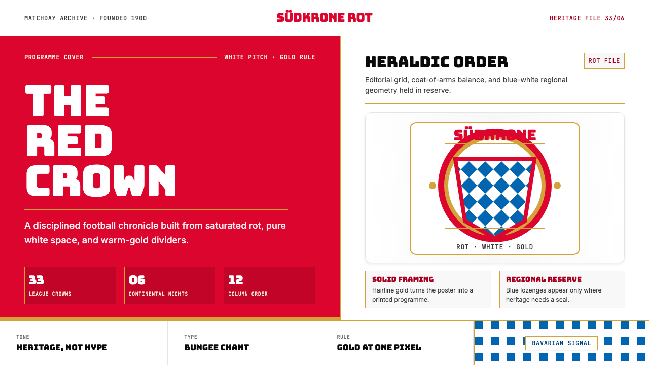 Bayern Munich (Rot)Heritage, not hype. Saturated rot fields, gold rules, and blue lozenges enfor…传统胜过喧哗:饱和红、金细线与蓝白菱格建立秩序。
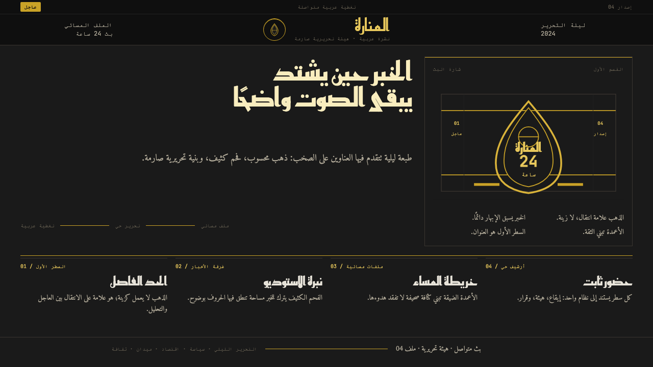 Al Jazeera Arabic NewsAuthority, stripped bare. Gold seal, dense Arabic type, matte charcoal.权威感被提纯。金色印章、密集阿文、炭黑底面构成画面。
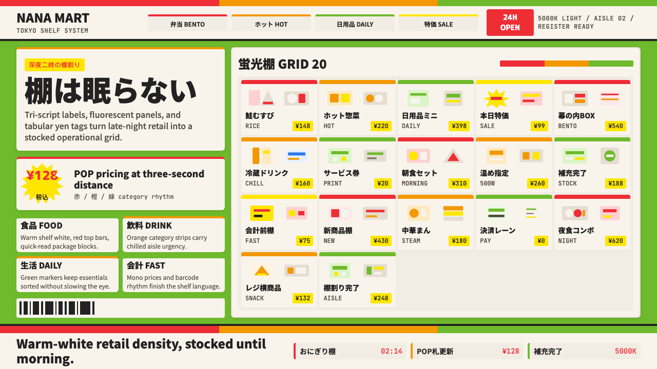 Japanese Konbini 7-ElevenAlways stocked, always bright. Green canopy, warm shelves, POP yen tags, tigh…永远明亮、永远满架。绿底暖白货架、POP日元价签与便当格。
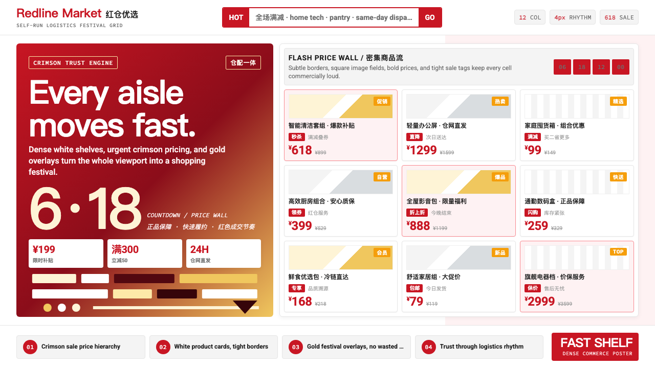 JD.com (京东)Urgency earns trust. Deep red prices pack a white 12-column grid with gold fe…急迫也可信:深红价格挤满白色12栏网格,金色大促点燃节奏。
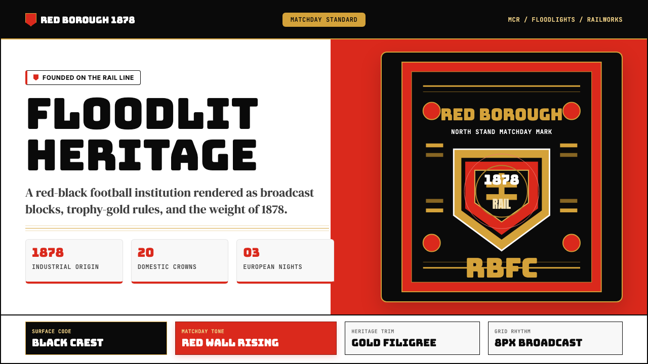 Manchester United (Red Devils)Heritage hits like a chant. Red-black blocks, Bungee type, and gold filigree…百年声浪压场:红黑块面、Bungee粗字与金色纹线撑起比赛日。
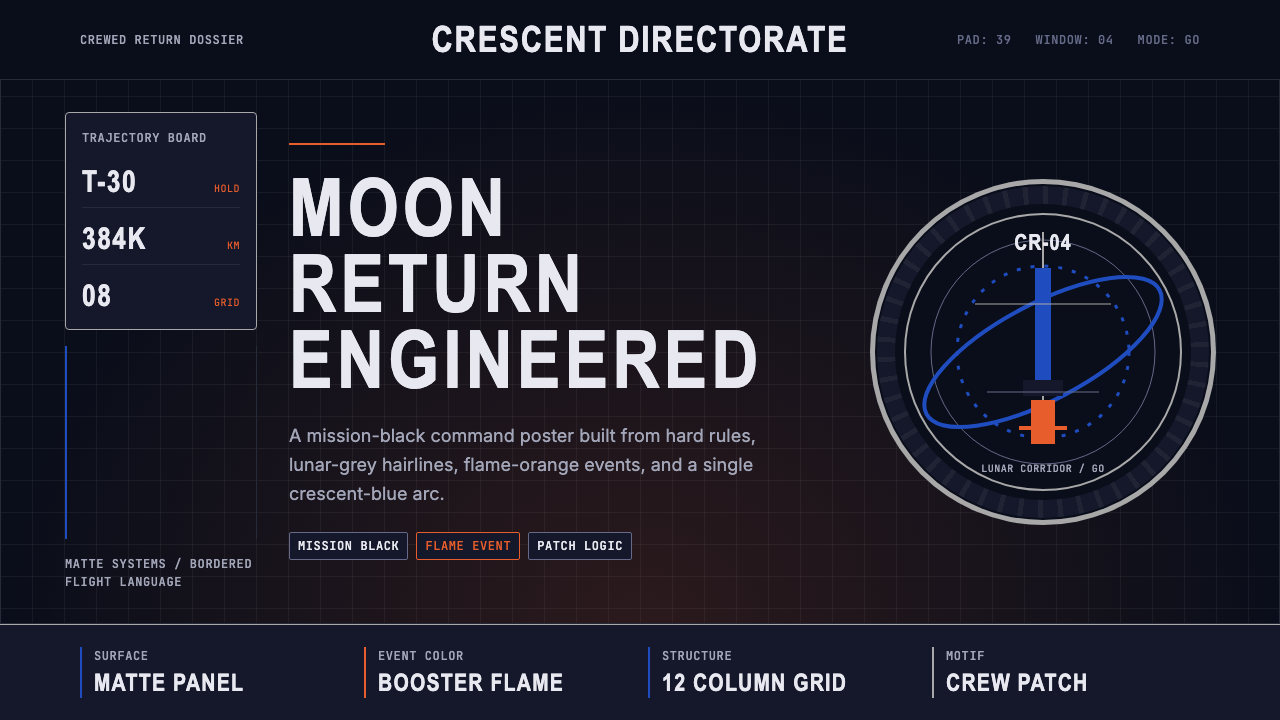 NASA Artemis ProgramCrewed return, engineered. Mission black, crescent-blue arc, flame orange, ri…载人回归的工程感:任务黑、蓝色弧线、火焰橙与刚性网格。