Design style guide设计风格指南
What is NASA Artemis Program?什么是 NASA Artemis Program?
NASA's Artemis program revives the visual confidence of the Apollo era for a new lunar generation — mission black, crescent blue, and flame orange fused with control-room precision.阿尔忒弥斯计划以新一代载人登月任务重燃阿波罗时代的视觉自信——任务黑、蓝色弧线与火焰橙,在控制室级别的精准中交汇。
NASA Artemis Program in briefNASA Artemis Program 速览
The NASA Artemis design style is the visual identity of the United States' return to crewed lunar exploration, crystallized between 2020 and 2024 alongside the Artemis I, II, and III missions. It extends NASA's institutional graphic tradition — engineered clarity, dense informational grids, and the gravity of human spaceflight — into a contemporary aesthetic that feels simultaneously retro and relentlessly forward-looking.NASA阿尔忒弥斯视觉风格,是美国重返载人登月这一历史事件的视觉载体,随着阿尔忒弥斯一号、二号、三号任务的推进,在2020至2024年间逐步成型。它承袭了NASA的机构图形传统——工程化清晰、信息密集网格、载人航天特有的庄重感——并将这一传统带入一种同时具有复古质感与前瞻气质的当代美学。
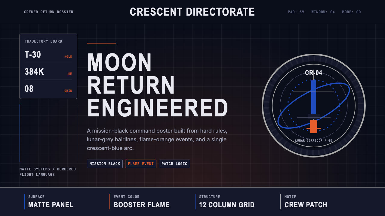
At its core, the style deploys a palette of deep mission black, a signature crescent arc in a cool space blue, and a warm, fuel-fire orange that echoes the exhaust plume of a Saturn V or the SLS main engines at ignition. These three anchors carry different emotional frequencies: black evokes the void of space and the matte surfaces of spacecraft hulls; blue suggests lunar orbit, atmospheric limb light, and the precision of trajectory data; orange signals power, heat, and the irreversible moment of launch.风格的核心,是三组色彩锚点:深邃的任务黑、以冷冽宇宙蓝呈现的标志性弧线,以及令人联想到燃料火焰的暖橙——那是土星五号或SLS主发动机点火瞬间腾起的颜色。三者承载不同的情感频率:黑色唤起太空虚空与飞船外壳哑光涂层的质感;蓝色指向月球轨道、大气边缘的散射光,以及轨道数据的精密;橙色传递动力、热量与发射那不可逆转的时刻。
The typography is condensed, all-caps, and engineered in register — it reads less like marketing and more like a systems label on a flight panel. Round, embroidered mission patches provide the style's human counterweight: they carry heraldic imagery, crew insignia, and national symbolism in a format that has been standard in crewed spaceflight since Project Mercury. Together, the geometric severity of the grid and the artisanal warmth of the patch create a tension that is central to the style's appeal.排印风格压缩、全大写、工程化——读来不像市场推广,更像飞行面板上的系统标签。圆形刺绣任务徽章是这套语言的人文对位:它们以纹章式图像、机组标识与国家象征承载着载人航天自水星计划以来延续的传统形式。网格的几何严苛与徽章的手工温度之间的张力,正是这种风格魅力的核心所在。
See the NASA Artemis Program design system →查看 NASA Artemis Program 完整设计系统 →
Where does NASA Artemis Program come from?NASA Artemis Program 从何而来?
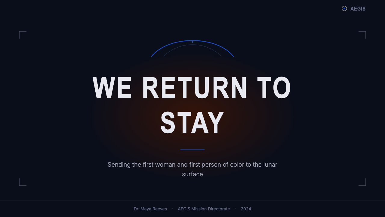
Artemis as a program was formally announced in 2017, when NASA tasked itself with returning astronauts to the Moon by the mid-2020s — this time to stay, and to establish a sustainable presence that would serve as a proving ground for eventual Mars missions. The program took its name from the Greek goddess of the Moon and twin sister of Apollo, a deliberate mythological symmetry that acknowledged the lineage while signaling something new: Artemis would carry the first woman and the first person of color to the lunar surface.阿尔忒弥斯计划于2017年正式宣布,NASA为自己设定了在2020年代中期重返月球的目标——这一次不只是到访,而是建立可持续的长期存在,作为未来火星任务的试验场。计划取名自希腊月亮女神、阿波罗之孪生姐妹阿尔忒弥斯,这一神话对称经过精心选择:它承认了血统传承,同时宣告了全新内容——阿尔忒弥斯将把首位女性和首位有色人种宇航员送上月球表面。
The visual identity crystallized most visibly between 2020 and 2024, as NASA and its contractors — including Lockheed Martin, Boeing, and SpaceX — produced mission patches, vehicle liveries, press kits, and public communications for the first uncrewed test flight (Artemis I, November 2022) and the planned crewed missions. The design drew explicitly on NASA's own archival identity: the 'worm' logotype, retired in 1992 and revived in 2020, reappeared on the Space Launch System rocket and on Orion spacecraft hardware. This revival was not nostalgia for its own sake but a deliberate assertion that institutional credibility, accumulated through decades of missions, was a design asset worth recovering.视觉识别在2020至2024年间最为清晰地成型,随着NASA及洛克希德·马丁、波音、SpaceX等承包商为首次无人测试飞行(2022年11月的阿尔忒弥斯一号)及后续载人任务制作任务徽章、飞行器涂装、新闻资料包与公众传播材料而逐步浮现。设计语言明确援引了NASA自身的历史视觉资产:1992年退役、2020年复活的「蠕虫」标志再度出现在太空发射系统火箭与猎户座飞船的硬件上。这次复活并非单纯的怀旧,而是一种刻意的宣告:通过数十年任务积累而来的机构公信力,是值得恢复的设计资产。
Key figures in the Artemis era shaped the program's public face in different ways. Administrator Bill Nelson, who took office in 2021, oversaw the communications strategy that positioned Artemis as a geopolitical as well as a scientific mission — a response to China's lunar ambitions as much as a continuation of exploration. Astronauts Reid Wiseman, Christina Koch, and Victor Glover, designated for the Artemis II crewed lunar flyby, became the human faces of the program: their mission patch, crew portraits, and public appearances all carried the visual language described here into public consciousness. Koch, set to become the first woman to travel to the Moon's vicinity, represented the program's stated commitment to expanding who spaceflight represents.阿尔忒弥斯时代的几位关键人物以不同方式塑造了计划的公众面貌。2021年就任的局长比尔·纳尔逊主导了将阿尔忒弥斯定位为地缘政治与科学双重使命的传播策略——它既是对探索事业的延续,也是对中国月球雄心的回应。被指定执行阿尔忒弥斯二号载人绕月飞行的里德·怀斯曼、克里斯蒂娜·科赫与维克多·格洛弗成为计划的人类面孔:他们的任务徽章、机组肖像与公众亮相,将这套视觉语言带入了公众意识。科赫——定于成为首位抵达月球附近的女性——代表着计划对拓展太空飞行代表性的明确承诺。
The broader movements surrounding Artemis — the commercial crew era, public-private partnerships with SpaceX and Blue Origin, the Lunar Gateway station concept, and the Artemis Accords that established norms for international space cooperation — each left traces in the visual language. Where Apollo's imagery was government-monolithic, Artemis's is ecosystem-aware: it accommodates corporate partner logos, international flags, and the visual vocabularies of collaborating space agencies from Europe, Japan, Canada, and beyond. The mission patch tradition, adapted across these partnerships, became the clearest symbol of this collaborative but iconographically American character.围绕阿尔忒弥斯的更广泛运动——商业载人时代、与SpaceX及蓝色起源的公私合作、月球门户站概念、以及建立国际空间合作规范的《阿尔忒弥斯协议》——各自在视觉语言中留下了印记。阿波罗时代的形象是政府独角兽式的,阿尔忒弥斯的形象则具有生态系统意识:它容纳了企业合作伙伴标志、国际旗帜,以及来自欧洲、日本、加拿大等合作航天机构的视觉语汇。在这些合作中不断演化的任务徽章传统,成为这种协作却又鲜明带有美国图形特征之风格的最清晰象征。
What defines the NASA Artemis Program look?NASA Artemis Program 的视觉特征是什么?
Color Palette色彩体系
The palette is built around three anchors: a near-black that carries the weight of deep space, a cool arc blue that suggests orbital trajectories and lunar distance, and a warm flame orange tied to rocket propulsion and the spectacle of launch. Black dominates as the background field — it is not decorative darkness but structural void. Blue functions as both accent and wayfinding, appearing most often as the crescent arc motif. Orange is used sparingly but decisively, landing on key calls to action, mission designators, or moments of maximum visual emphasis. Secondary neutrals — gray scales and off-whites — carry supporting text and fine-line grid elements without competing with the three primaries.色板以三个锚点构建:一种承载深空重量的近黑、一种暗示轨道轨迹与月球距离的冷蓝弧线,以及一种与火箭推力和发射奇观相联的暖橙。黑色作为背景主场主导整体——它不是装饰性的黑暗,而是结构性的虚空。蓝色同时充当强调色与导视色,最常以弦月弧线图案出现。橙色克制而果断,落在关键行动号召、任务标识符或视觉重心最强处。次要中性色——灰阶与近白——承载辅助文字与细线网格元素,不与三个主色竞争。
Typography字体排印
All-caps condensed letterforms dominate in headline and identifier roles — they read as systems nomenclature, mission designators, and control-room labels rather than as editorial text. The compression of the letterform is a functional choice: condensed type fits more information into narrow column widths and survives reproduction at small sizes on mission badges, instrument panels, and press materials. Body text, where it appears, is set in a neutral upright face that provides readability without drawing attention to itself. The deliberate contrast between the muscular all-caps headers and the quieter body copy creates a hierarchy that readers parse in stages.全大写压缩字体在标题与标识符场景中占主导——读来如系统命名、任务代号与控制室标签,而非编辑性文字。字体的压缩是功能性选择:压缩字形在窄栏宽中能容纳更多信息,并在任务徽章、仪表面板与新闻材料的小尺寸复制中保持清晰。正文(若出现)以中性直立字体排设,提供可读性而不喧宾夺主。肌肉感全大写标题与内敛正文之间的刻意对比,创造出读者分阶段解读的层级关系。
The Mission Patch Motif任务徽章图案
The circular embroidered mission patch is the most distinctive compositional element in the Artemis visual lexicon. It carries heraldic conventions — a motto, a symbolic central image, crew names arranged around the perimeter — within a format that has been standard in crewed spaceflight since Project Mercury in the early 1960s. In the Artemis system, patches appear not only as physical embroidered objects on flight suits but as graphic motifs integrated into digital compositions: they anchor layout centers, provide focal weight on dark fields, and carry the human, hand-crafted counterpoint to the machine-grid environment around them. The combination of embroidery-like texture with surrounding geometric precision is a deliberate tension in the style.圆形刺绣任务徽章是阿尔忒弥斯视觉词汇中最具辨识度的构图元素。它遵循纹章惯例——箴言、象征性中心图像、沿周边排列的机组名字——以一种自1960年代初水星计划以来就是载人航天标准的形式呈现。在阿尔忒弥斯体系中,徽章不仅作为实物刺绣出现在航天服上,也作为图形母题融入数字构图:它们锚定版面中心,在深色底面上提供视觉重心,并在机器网格环境中承载人文手工的对位音。刺绣质感与周围几何精确之间的组合,是这种风格中刻意维持的张力。
Grid and Technical Precision网格与技术精准
Layouts are organized around rigid engineering grids that recall the orthographic projections and schematic drawings of aerospace documentation. Spacing is consistent and systematic — components align to an underlying structure that is never visible but always felt. Square-cornered containers, hard ruled lines, and tight column structures communicate control-room discipline. Nothing drifts; every element is locked to its position as deliberately as a component in an assembly diagram. This rigidity is not aesthetic severity for its own sake — it references the actual production discipline of mission-critical documentation, where precision is a safety value.版面围绕严格的工程网格组织,令人联想到航空航天文件中的正投影图与原理图。间距一致而系统化——组件对齐于一个永远不可见却始终可感的底层结构。方角容器、硬边直线与紧密栏结构传递控制室纪律。没有任何元素漂移;每个元素被锁定在其位置上,其刻意程度不亚于装配图中的每一个零部件。这种刚性并非为了美学严肃而生——它援引的是任务关键文件的实际生产纪律,在那里,精确是一种安全价值。
Matte Surfaces and Hard Edges哑光表面与硬边
The Artemis visual vocabulary avoids gloss, lens flare, and soft atmospheric glow — the tropes of cinematic space spectacle. Surfaces read as matte: the black of the background has the quality of a spacecraft's thermal coating, not a polished void. Edges between elements are hard and decisive, never feathered or blended. This matte, hard-edged approach signals that the aesthetic is rooted in engineering artifacts — heat shields, instrument casings, flight-suit patches — rather than in visual effects design. The contrast with the high-gloss, CGI-saturated imagery of commercial space branding is deliberate.阿尔忒弥斯视觉词汇刻意回避光泽、镜头眩光与柔和大气光晕——那些电影式太空奇观的惯用手法。表面呈现哑光质感:背景的黑色具有航天器热防护涂层的品质,而非抛光的虚空。元素之间的边界硬朗果断,从不羽化或混融。这种哑光硬边的处理方式表明,这套美学植根于工程制品——隔热罩、仪表外壳、航天服徽章——而非视觉特效设计。与商业太空品牌高光泽、CGI饱和图像的对比,是刻意为之的。
Emblem and Heraldry Logic徽标与纹章逻辑
Beyond the circular patch, the broader Artemis visual system incorporates the logic of heraldry: each sub-program, vehicle, and mission carries a distinct mark with consistent compositional rules. The Artemis wordmark, the SLS vehicle identifier, the Orion capsule insignia, and the Gateway station emblem each function as coats of arms within a unified armorial system. Color assignments are meaningful — a departure from decorative branding in which color is applied arbitrarily to distinguish products. The result is a visual ecosystem in which individual elements are legible both in isolation and as part of a family.在圆形徽章之外,阿尔忒弥斯更广泛的视觉系统还融入了纹章学的逻辑:每个子计划、飞行器与任务都拥有遵循一致构图规则的独特标志。阿尔忒弥斯字体标志、SLS飞行器标识、猎户座舱标志与门户站徽章,各自在统一的徽章体系中发挥着纹章族徽的功能。色彩分配具有意义——这有别于装饰性品牌中色彩被随意用于区分产品的做法。其结果是一个视觉生态系统,其中每个单独元素既可独立识别,也可作为家族成员被辨认。
Dark-Field Composition深色底面构图
Unlike most design systems that use light backgrounds as the default field, Artemis deploys darkness as the primary compositional ground. Elements are placed on black not for dramatic effect alone but because the void is the literal context of the program's activity. Light elements — white type, blue arcs, orange accent marks — emerge from the dark field as stars emerge from space: with clarity, isolation, and precise positioning. This inversion of the conventional light-on-white layout is the single most powerful signal that the viewer is in an environment governed by different physical and emotional rules than everyday terrestrial design.与大多数以浅色背景为默认底面的设计系统不同,阿尔忒弥斯将黑暗部署为主要构图基底。元素被放置在黑色上,不仅仅是为了戏剧效果,更因为这虚空正是计划活动的字面语境。浅色元素——白色文字、蓝色弧线、橙色强调符——从深色底面中浮现,如同星星从太空中显现:清晰、孤立、位置精确。这种对传统浅底浅场版面的颠覆,是最有力的单一信号,告知观者:此处由不同于日常地面设计的物理与情感规则所主导。

See the NASA Artemis Program design system →查看 NASA Artemis Program 完整设计系统 →
Who shaped NASA Artemis Program?谁塑造了 NASA Artemis Program?
As NASA Administrator from 2021, Nelson shaped the public communications strategy that framed Artemis simultaneously as a scientific mission, a geopolitical statement, and a national aspiration. Under his tenure, the program's visual identity was elevated alongside its policy messaging — the worm logo revival was endorsed, mission patch reveals became media events, and the program's visual language was treated as part of its diplomatic and institutional case. Nelson's positioning of Artemis against international competition, particularly from China's lunar program, gave the style's bold authority a specific geopolitical resonance.纳尔逊自2021年起担任NASA局长,主导了将阿尔忒弥斯同时定位为科学任务、地缘政治宣言与国家抱负的公众传播策略。在他任期内,计划的视觉识别随政策信息一道被提升——「蠕虫」标志复活获得背书,任务徽章发布成为媒体事件,视觉语言被纳入计划的外交与机构论证体系。纳尔逊将阿尔忒弥斯置于国际竞争语境中的定位——尤其针对中国月球计划——赋予了这套风格大胆权威感以特定的地缘政治共鸣。
Koch, designated for the Artemis II crewed lunar flyby, became one of the most visible human embodiments of the program's identity. As the astronaut set to become the first woman to travel to the Moon's vicinity, she appeared repeatedly in mission materials, press photography, and public communications, her image consistently embedded in the Artemis visual language. Her presence represents the program's stated mission expansion — Artemis is not only a return to the Moon but a deliberate broadening of who spaceflight represents, and that narrative is inseparable from the visual identity that frames it.科赫被指定执行阿尔忒弥斯二号载人绕月飞行,成为计划身份最具可见度的人类化身之一。作为定于成为首位抵达月球附近的女性宇航员,她在任务材料、新闻摄影与公众传播中反复出现,其形象始终被嵌入阿尔忒弥斯视觉语言之中。她的存在代表着计划明确宣示的使命拓展——阿尔忒弥斯不仅是重返月球,更是对太空飞行代表性的刻意拓宽,而这一叙事与框架它的视觉识别密不可分。
Glover, designated pilot for Artemis II, brought to the program's public imagery a personal and historical dimension. As the first Black astronaut to be on long-duration station crew during the SpaceX Crew-1 mission, and a core crew member for Artemis II, his presence in mission materials reinforced the program's narrative of expansion and inclusion. Mission portraits and patch reveals featuring Glover were widely circulated and became key images in the program's public communications strategy, embedding the crew's human diversity directly into the Artemis visual record.格洛弗担任阿尔忒弥斯二号指令长,为计划的公众形象带来了个人与历史的维度。作为在SpaceX载人一号任务中长期驻守空间站的首位黑人宇航员,以及阿尔忒弥斯二号的核心机组成员,他在任务材料中的存在强化了计划关于拓展与包容的叙事。包含格洛弗的任务肖像与徽章发布图广泛传播,成为计划公众传播策略的核心图像,将机组的人文多样性直接嵌入了阿尔忒弥斯视觉档案。
As Commander of the Artemis II mission and one of its public spokespeople, Wiseman's role in crew communications shaped how the mission's human dimension was presented in the program's visual materials. A veteran of the International Space Station, his experience brought credibility to the Artemis crew portraits and mission briefings. The Artemis II crew, with Wiseman as its public anchor, received some of the most carefully composed photographic and graphic treatment of any crewed spaceflight in decades — each image deliberate in its use of the program's established visual vocabulary.怀斯曼担任阿尔忒弥斯二号任务指挥官兼公众发言人之一,其在机组传播中的角色塑造了任务人文维度在计划视觉材料中的呈现方式。作为国际空间站老兵,他的经验为阿尔忒弥斯机组肖像与任务简报赋予了可信度。以怀斯曼为公众锚点的阿尔忒弥斯二号机组,在摄影与图形处理上获得了数十年来任何载人航天任务中最为精心的待遇——每幅图像都刻意运用了计划既定的视觉词汇。
How do you use NASA Artemis Program today?今天怎么用 NASA Artemis Program?
The Artemis design language translates into contemporary design contexts that call for authority, precision, and a sense of high stakes — it works best when the product genuinely needs to evoke seriousness of purpose rather than simply borrowing visual credibility from the space program. Applied thoughtfully, the style signals rigor and ambition; applied carelessly, it reads as costume.阿尔忒弥斯设计语言适用于那些需要权威感、精准感与高风险氛围的当代设计语境——它在产品真正需要传递严肃目的时效果最佳,而非单纯借用太空计划的视觉公信力。运用得当,这种风格传递严格与抱负;运用草率,则沦为视觉服装。
For presentation slides, the style is most effective when applied consistently from cover to close. A cover slide benefits from the dark-field approach: a near-black background, a single large typographic element in all-caps condensed form, and a bold accent — either the blue arc motif or an orange highlight — placed asymmetrically for visual tension. Content slides should treat the grid as non-negotiable: every element aligns, column widths are consistent, and the only decoration is the structural grid itself. Data slides work especially well in this register — charts and diagrams rendered in the style's three-color palette acquire a mission-readout quality that makes technical data feel authoritative rather than merely illustrated.在演示文稿中,从封面到结尾保持一致是这种风格发挥最大效用的前提。封面幻灯片适合深色底面处理:近黑背景、一个以全大写压缩字体排设的大型文字元素,以及一个大胆的强调色——蓝色弧线图案或橙色高亮——以非对称方式放置制造视觉张力。内容页应将网格视为不可妥协的约束:每个元素对齐,栏宽一致,唯一的装饰是网格本身。数据页在这种语境中尤为出色——以风格三色板呈现的图表获得了一种任务读数的品质,使技术数据显得权威而非仅仅是图示。
For web interfaces, the style is best suited to dashboards, launch pages, or product sites where the user needs to feel that they are interacting with something consequential. Apply a dark background as the primary canvas, reserve the accent colors for interactive states and key calls to action, and use condensed all-caps labels for navigation and category identifiers. Component edges should be hard — avoid rounded corners where a squared edge better communicates precision. System status indicators, progress bars, and data readouts all benefit from the mission-critical vocabulary of the style.在网页界面中,这种风格最适合仪表板、发布页或用户需要感受到正在与某件具有分量之事交互的产品站点。以深色背景作为主画布,将强调色保留给交互状态与关键行动号召,使用全大写压缩标签进行导航与分类标识。组件边角应保持硬边——在方角能更好传递精准感的地方避免圆角。系统状态指示器、进度条与数据读数,都在风格的任务关键词汇中获益。
For editorial and marketing applications, the Artemis vocabulary works powerfully in headline-driven layouts where a single bold statement anchors a page. Full-width sections alternating between dark and very dark backgrounds — with the blue arc appearing as a dividing or transitional element — create rhythm without resorting to decorative ornament. Marketing materials aimed at announcing something ambitious (a product launch, a significant milestone, a bold institutional claim) benefit from the style's association with moments of high consequence. The mission patch motif, adapted as a circular badge or emblem, can anchor product or event identities within the aesthetic.在编辑与营销应用中,阿尔忒弥斯词汇在以标题驱动的版面中效果强劲,一个大胆陈述锚定整个页面。深色与极深色背景之间交替的全宽板块——以蓝色弧线作为分割或过渡元素——在不借助装饰性元素的情况下创造节奏。旨在宣告某件雄心勃勃之事(产品发布、重要里程碑、大胆机构主张)的营销材料,从风格与高后果时刻的关联中获益。任务徽章图案,以圆形徽标的形式改编,可在美学体系内锚定产品或活动识别。
A common mistake is treating the dark background as the only Artemis marker and then filling it with generic content — gradients, multiple typeface families, photographic imagery with soft lighting. The style's authority comes not from the darkness alone but from the discipline of what appears within it: condensed type, hard edges, systematic spacing, and a color palette held to three anchors. A second common error is using the orange too liberally, treating it as general fill rather than as a precise emphasis tool. In authentic Artemis-derived work, orange is rare and therefore powerful; when it appears everywhere, the hierarchy collapses and the style reads as mere mood rather than system.一个常见错误是将深色背景视为阿尔忒弥斯的唯一标志,然后在其中填充通用内容——渐变、多字体家族、柔光摄影图像。风格的权威不单来自黑暗本身,而来自出现在其中的内容的纪律:压缩字体、硬边、系统化间距,以及被约束在三个锚点的色板。第二个常见错误是过度使用橙色,将其作为普通填充而非精准强调工具。在真正源自阿尔忒弥斯的作品中,橙色是稀少的,因此是有力量的;当它无处不在时,层级崩溃,风格只读出情绪而非系统。
See the NASA Artemis Program design system →查看 NASA Artemis Program 完整设计系统 →
NASA Artemis Program — FAQNASA Artemis Program · 常见问题
How does the Artemis style differ from generic 'space' aesthetic?阿尔忒弥斯风格与通用「太空」美学有何不同?
Generic space aesthetics typically rely on photographic nebulae, lens flares, CGI planet renderings, and gradients from deep purple to electric blue — they borrow from science fiction film production design. The Artemis style draws instead from aerospace engineering documentation and the institutional tradition of NASA graphic identity. Its darkness is matte, its edges are hard, its typography is condensed and functional, and its graphic motifs — the crescent arc, the circular mission patch — are specific to the Artemis program rather than generic signifiers of 'space'. The distinction matters practically: the former evokes wonder; the latter evokes authority.通用太空美学通常依赖星云摄影、镜头眩光、CGI星球渲染,以及从深紫到电蓝的渐变——它们借鉴科幻电影的美术设计。阿尔忒弥斯风格则取径于航空航天工程文件与NASA图形识别的机构传统。它的黑暗是哑光的,边缘是硬朗的,排印是压缩而功能性的,其图形母题——弦月弧线、圆形任务徽章——是阿尔忒弥斯计划的特定产物,而非「太空」的通用符号。这一区别在实践中至关重要:前者唤起惊奇,后者唤起权威。
Is this style appropriate for consumer-facing products, or is it primarily institutional?这种风格适合面向消费者的产品,还是主要适用于机构场景?
The Artemis style is primarily an institutional and mission-communications vocabulary, and it carries that register strongly. It works well for consumer-facing products when the brand's positioning genuinely aligns with the style's values: precision, high stakes, capability, and ambition. It has been adopted or referenced in sectors like aerospace technology, fintech platforms signaling trust and gravity, productivity tools targeting professional or technical audiences, and hardware products where engineering credibility is a brand asset. It struggles in consumer contexts that require warmth, approachability, playfulness, or organic texture — the style's severity reads as cold in those environments.阿尔忒弥斯风格主要是机构与任务传播词汇,并强烈保持这一语调。当品牌定位真正与风格价值观对齐时——精准、高风险、能力与抱负——它在面向消费者的产品中同样有效。该风格已被或被参照应用于航空航天科技、传递信任感与庄重感的金融科技平台、面向专业或技术受众的生产力工具,以及工程公信力是品牌资产的硬件产品等领域。在需要温暖感、亲近感、趣味性或有机质感的消费者语境中,它则力不从心——风格的严肃性在那些环境中被读解为冷漠。
Can the style work on a light background, or is the dark field essential?这种风格能在浅色背景上运作吗,还是深色底面是其本质所在?
The dark field is deeply embedded in the Artemis visual identity — it references the literal context of space and the matte surfaces of spacecraft hardware. A light inversion is possible but requires careful recalibration. On a white or off-white ground, the blue arc retains its function but the flame orange becomes aggressive rather than punctuating; the condensed all-caps type can start to feel like branding pastiche rather than mission documentation. A light-background variant works best when the grid discipline, hard edges, and three-anchor color restriction are maintained strictly — the darkness is removable, but the engineering rigor is not.深色底面深度嵌入阿尔忒弥斯视觉识别——它援引的是太空的字面语境与航天器硬件的哑光表面。浅色反转是可能的,但需要谨慎重新校准。在白色或近白底面上,蓝色弧线保持其功能,但火焰橙变得激进而非点睛;全大写压缩字体开始感觉像品牌仿制而非任务文件。浅色背景变体在严格保持网格纪律、硬边与三锚色板限制时效果最佳——黑暗是可以移除的,但工程严格性不是。
How do the mission patches work as a design element in digital contexts?任务徽章在数字场景中作为设计元素如何运用?
The circular mission patch translates into digital contexts most naturally as a circular emblem or badge — a contained graphic unit that carries identity, mission name, and symbolic imagery within a round field. In digital applications, it functions as an anchor element: placed at the center of a hero section, used as an avatar or product mark, or deployed as a section divider on dark backgrounds. The key is maintaining the emblem's integrity — treating it as a complete, independent graphic object rather than breaking it apart for decorative elements. A common misapplication is extracting the color palette from a patch while discarding its compositional wholeness, which loses the heraldic authority that gives the motif its weight.圆形任务徽章在数字场景中最自然地转化为圆形徽标——一个在圆形区域内承载身份、任务名称与象征图像的独立图形单元。在数字应用中,它充当锚定元素:置于主视觉区域中心、用作头像或产品标志,或在深色背景上作为板块分隔符。关键是保持徽章的完整性——将其作为完整的独立图形对象处理,而非拆解为装饰性元素。一种常见的误用是从徽章中提取色板同时丢弃其构图整体性,这会失去赋予这一图案以分量的纹章权威。
What makes the Artemis style feel contemporary rather than retro, given its strong NASA heritage?尽管有强烈的NASA传承,是什么让阿尔忒弥斯风格感觉是当代的而非复古的?
The style walks a deliberate line between heritage and contemporaneity. The worm logo revival, the mission patch tradition, and the condensed all-caps typography all carry explicit historical weight — they are meant to be recognized as institutional continuity. What makes the result feel contemporary rather than merely nostalgic is the selectivity of those references: only the elements that encode authority and precision are revived; the visual habits of the 1970s that would read as dated (certain color combinations, analog gauge aesthetics, particular illustration styles) are absent. The style also accommodates contemporary interface conventions — digital readouts, scrollable layouts, responsive grid structures — without compromising its core vocabulary. Heritage provides gravity; discipline keeps it present.这种风格在传承与当代性之间走在一条刻意的线上。「蠕虫」标志的复活、任务徽章传统、全大写压缩排印,都承载着明确的历史重量——它们意在被识别为机构连续性。使结果感觉当代而非单纯怀旧的,是这些援引的选择性:只有编码了权威与精准的元素被复活;那些在今天会被读解为过时的1970年代视觉习惯——某些色彩组合、模拟仪表美学、特定插图风格——是缺席的。这种风格还容纳了当代界面惯例——数字读数、可滚动版面、响应式网格结构——而不损害其核心词汇。传承提供重量;纪律使其保持当下。
Related design styles相关设计风格
 NZ All Blacks Rugby Haka FernBlack owns the field. Pewter Oswald type, jersey-stripe grid, and fern linewo…黑色掌控全场。银灰Oswald字、球衣条纹栅格与蕨叶线条压入暗场。
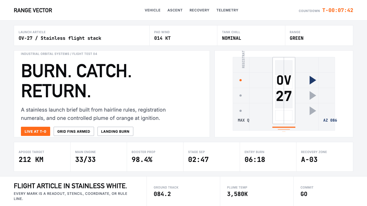 SpaceX Starship / FalconOrbital restraint. Stainless white grids, DIN-like type, and one orange burn…轨道级克制:不锈钢白网格、DIN式字体,一道橙色燃烧线。
 Al Jazeera Arabic NewsAuthority, stripped bare. Gold seal, dense Arabic type, matte charcoal.权威感被提纯。金色印章、密集阿文、炭黑底面构成画面。
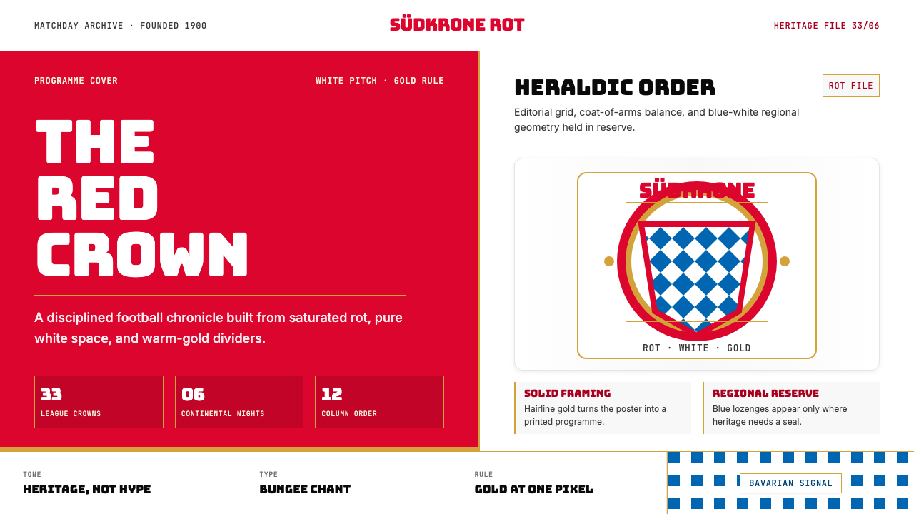 Bayern Munich (Rot)Heritage, not hype. Saturated rot fields, gold rules, and blue lozenges enfor…传统胜过喧哗:饱和红、金细线与蓝白菱格建立秩序。
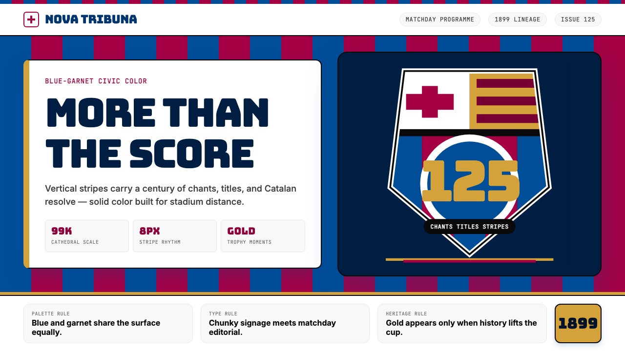 FC Barcelona (Blaugrana)Stadium heritage, not nostalgia. Blue-garnet stripes, Bungee type, gold heral…不是怀旧,是球场传承。蓝石榴红竖纹、Bungee 字体与金色纹章发声。
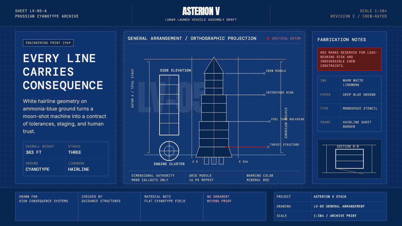 NASA Saturn V BlueprintPrecision carries risk. Prussian blue grids and white mono callouts frame a l…精密即风险。普鲁士蓝网格与白色等宽标注构成发射栈蓝图。