What is NASA Saturn V Blueprint?什么是 NASA Saturn V Blueprint?
White hairline drawings on saturated blue cyanotype paper — the visual language of the most precisely engineered machine ever launched from Earth.饱和蓝色氰版底纸上的白色细线图纸——这是人类有史以来发射过的最精密工程机器所用的视觉语言。
NASA Saturn V Blueprint in briefNASA Saturn V Blueprint 速览
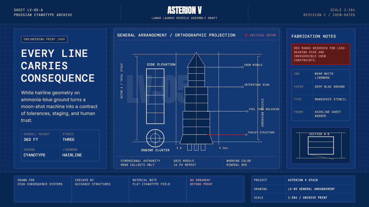
The NASA Saturn V Blueprint aesthetic draws its entire visual authority from a single, utilitarian artifact: the engineering drawing produced at Marshall Space Flight Center between 1962 and 1973 for humanity's most powerful rocket. These were not artistic documents. Every line, every dimension callout, every hatch pattern indicating a section cut, every tolerance specification printed on those ammonia-developed sheets carried the literal weight of human lives. The look that emerged from this life-or-death engineering environment — deep Prussian blue grounds, stark white hairlines, monospace type for numerical callouts, rectilinear geometry with no softening of any corner — is one of the most charged visual vocabularies in twentieth-century technological culture.NASA土星五号蓝图美学的全部视觉权威,来自一种单一的实用性文件:1962至1973年间,马歇尔太空飞行中心为人类有史以来最强大火箭制作的工程图纸。那些图纸并非艺术品。氨气显影的蓝图上,每一条线、每一个尺寸标注、每一处表示截面切割的剖面线、每一项公差规范,都承载着宇航员真实的生命重量。这种在生死边界上诞生的视觉语言——深沉的普鲁士蓝底色、冷峻的白色细线、用于数字标注的等宽字体、每个角落都不曾软化的直角矩形几何——是二十世纪技术文化中最具张力的视觉词汇之一。
As a design system, the Saturn V Blueprint aesthetic translates this austere engineering precision into digital and print contexts. The core ingredients are the inverted blueprint palette (light marks on a dark, saturated blue field), monospace or near-monospace type that reads as dimensional annotation rather than literary text, geometric forms that favor the right angle and the straight edge over any curve, and a rigorous absence of any element that could not be justified by structural or informational necessity. The result is a system that conveys authority, technical mastery, and the kind of seriousness that comes from contexts where error is not tolerable.作为设计系统,土星五号蓝图美学将这种严谨的工程制图精神转化为数字与印刷语境。其核心构成要素是:反转的蓝图配色(深而饱和的蓝色底面上的浅色标记)、读来像尺寸标注而非文学文字的等宽或近等宽字体、偏好直角与直边而非任何曲线的几何形态,以及对所有无法以结构或信息必要性为由的元素的严格排除。由此产生的系统,传递出一种权威感、技术精通感,以及那种只在错误不被容忍的语境中才会出现的严肃性。
What distinguishes the Saturn V Blueprint look from generic dark-mode design is its specific cultural and historical weight. The palette is not simply dark blue on black — it is the particular saturated Prussian blue of a cyanotype print under fluorescent drafting-room light, aged and precise. The typography is not merely geometric; it speaks the vocabulary of dimension callouts, revision clouds, and tolerance blocks. Every compositional choice references the discipline of technical drawing, where nothing is decorative and everything carries an information function.将土星五号蓝图风格与普通深色模式设计区分开来的,是它特有的文化与历史分量。这里的配色并非简单的深蓝加黑——它是荧光灯下制图室中一张氰版印刷品那种特定的饱和普鲁士蓝,历经岁月却依然精确。字体选择也不仅仅是几何感,它说的是尺寸标注、修订云线和公差说明框的语言。每一个构图决策,都指向工程制图的学科规范——那个没有任何装饰性存在、一切都承载信息功能的世界。
See the NASA Saturn V Blueprint design system查看 NASA Saturn V Blueprint 完整设计系统
Where does NASA Saturn V Blueprint come from?NASA Saturn V Blueprint 从何而来?
The Saturn V rocket program grew out of the political urgency of the Space Race. In 1961, President Kennedy committed the United States to landing a human on the Moon before the decade's end. The engineering challenge was staggering: the vehicle that would accomplish this mission needed to be taller than a thirty-story building, generate more thrust at liftoff than any machine ever built, and maintain tolerances across all its components that left no margin for fabrication error. Wernher von Braun, director of the Marshall Space Flight Center in Huntsville, Alabama, led the design effort. Arthur Rudolph, as Saturn V project manager, was responsible for the industrial coordination that turned the blueprints into manufactured hardware.土星五号火箭计划源于太空竞赛的政治紧迫性。1961年,肯尼迪总统承诺在十年内将人类送上月球。工程挑战令人叹为观止:完成这一使命的运载器必须高达三十层楼,起飞推力超过有史以来任何机器,所有零部件的公差必须为制造误差留下零容忍空间。阿拉巴马州亨茨维尔马歇尔太空飞行中心主任沃纳·冯·布劳恩主导了设计工作。土星五号项目经理阿瑟·鲁道夫负责工业协调,将蓝图转化为可制造的实体硬件。
The physical blueprints themselves — cyanotype prints produced by exposing a photosensitive coating to ultraviolet light through a translucent original — were the communication medium of the entire program. Boeing's Michoud Assembly Facility in New Orleans built the S-IC first stage; North American Aviation in Downey, California, built the S-II second stage; Douglas Aircraft in Huntington Beach built the S-IVB third stage; Rocketdyne in Canoga Park designed and manufactured the F-1 and J-2 engines. Thousands of draftsmen at these facilities produced and received cyanotype blueprints that specified every dimension of every part. The visual grammar of those sheets — white lines on blue paper, annotation in condensed block lettering, revision tracking in title blocks — became the shared technical language of the entire Apollo program.这些实物蓝图本身——通过紫外线穿透半透明原稿曝光感光涂层制成的氰版印刷品——是整个计划的通信媒介。波音公司在新奥尔良的米丘德装配设施建造了S-IC一级火箭;北美航空在加州道尼建造了S-II二级火箭;道格拉斯飞机公司在亨廷顿海滩建造了S-IVB三级火箭;洛克达因公司在卡诺加公园设计并制造了F-1与J-2发动机。这些机构的数千名制图员制作和接收氰版蓝图,规定了每个零件的每一处尺寸。那些图纸的视觉语法——蓝纸上的白色线条、以压缩块状字体书写的注释、在标题栏中追踪的修订记录——成为整个阿波罗计划共同的技术语言。
The first Saturn V launched on November 9, 1967 (Apollo 4), carrying no crew, to test the vehicle's systems in a single all-up test that flew all three stages simultaneously — an approach that went against standard incremental testing practice but was forced by the deadline Kennedy had set. The rocket performed almost perfectly. Five months later, Apollo 6 identified some engine issues that were subsequently corrected. Saturn V then carried Apollo 8 around the Moon in December 1968, Apollo 11 to the first lunar landing in July 1969, and continued through Apollo 17 in December 1972. Thirteen Saturn V rockets flew in total; none failed. The program formally concluded in 1973, and the blueprint archive was distributed across NASA facilities and storage — some sheets surviving in remarkably good condition, others deteriorating.第一枚土星五号于1967年11月9日(阿波罗4号)发射,无人乘载,以一次全面综合测试同时飞行三个阶段来检验整个系统——这一做法违背了通常的渐进式测试惯例,但被肯尼迪设定的截止期限所迫。火箭表现几乎完美。五个月后,阿波罗6号发现了一些发动机问题,随后得到纠正。此后,土星五号先后将阿波罗8号送入绕月轨道(1968年12月),将阿波罗11号送上人类首次月球着陆(1969年7月),并持续服役至1972年12月的阿波罗17号。共有十三枚土星五号发射,无一失败。项目于1973年正式结束,蓝图档案分散于各NASA设施与存储库——部分图纸保存状况出奇良好,另一些则已残损。
The aesthetic revival of the blueprint look in contemporary design began in earnest in the early 2010s, driven by a combination of nostalgia for the Apollo era, growing appreciation for mid-century American industrial aesthetics, and the technical capability of digital tools to render fine-line precision on dark grounds without the photographic limitations of the original cyanotype process. Space agencies, aerospace companies, and science communicators adopted the style to signal technical seriousness and to distinguish their communications from the glossy consumer-product aesthetic that dominated the same period. By the mid-2010s, the blueprint aesthetic had migrated from aerospace contexts into broader design practice — used for posters, data visualizations, UI themes, and presentation decks that wanted to borrow the connotations of rigorous engineering without necessarily operating in that domain.蓝图美学在当代设计中的复兴,从2010年代初期开始认真起步,动力来源于多重因素:对阿波罗时代的怀旧情绪、对二十世纪中叶美国工业美学的日益欣赏,以及数字工具在深色底面上精确渲染细线的能力——这超越了原始氰版工艺的摄影限制。航天机构、航空航天公司和科学传播者采用这种风格,以彰显技术严肃性,将自身通信与同期主导消费品市场的光鲜品牌美学区分开来。到2010年代中期,蓝图美学已从航空航天语境迁移至更广泛的设计实践——被用于海报、数据可视化、UI主题和演示文稿,借用严格工程学的内涵而无需真正置身其中。
What defines the NASA Saturn V Blueprint look?NASA Saturn V Blueprint 的视觉特征是什么?
Palette色板
The foundational color relationship is light marks on a dark, deeply saturated blue field — the direct inversion of ink on paper, referencing the specific blue of a cyanotype print rather than generic navy or midnight blue. Accent marks appear in a warm off-white or pale yellow, approximating the tone of aged blueprint paper or the amber glow of drafting-room light. A restrained use of orange or amber provides the one warm contrast note, echoing the warning markings found on actual launch vehicle drawings. The palette is not chosen for visual comfort; it is chosen for maximum legibility of fine-line technical information under specific lighting conditions, and that functional origin gives it its authority.色彩关系的基础是深而饱和的蓝色底面上的浅色标记——这是油墨在纸上的直接反转,指向氰版印刷品特有的蓝色,而非泛泛的海军蓝或午夜蓝。强调色呈暖调的近白色或浅黄色,近似老化蓝图纸的色调或制图室灯光的琥珀色泽。克制地使用橙色或琥珀色,提供唯一一个暖调对比音符,呼应实际发射载具图纸上的警告标记。这套色板不是为视觉舒适而选择的,而是为了在特定照明条件下最大化细线技术信息的可读性——这一功能性起源赋予了它的权威感。
Typography字体排印
Monospace or engineering-lettering typefaces are the core typographic choice, directly referencing the hand-lettered block annotations of technical drawings or the Leroy lettering templates that draftsmen used for consistent annotation. Each character occupies equal horizontal space, giving text a diagrammatic rather than literary quality — numbers and letters read as data, not prose. Scale contrast is used aggressively: a label or callout sits at a small, precise size that implies measured accuracy, while section titles or diagram names may appear at a dramatically larger scale to establish document hierarchy. Uppercase or small-caps settings dominate; lowercase type, where it appears, feels like a deliberate stylistic departure from the dominant register.等宽字体或工程制图字体是核心字体选择,直接指向技术图纸上手写块状注释,或制图员用于统一标注的莱罗字模。每个字符占据相同的水平空间,赋予文字示意图式而非文学式的品质——数字与字母读起来像数据而非散文。尺度对比被积极运用:标签或标注以精小准确的尺寸出现,暗示测量的精确性;而节标题或图表名称则可能以戏剧性的大尺寸呈现,建立文档层级。大写或小型大写字母占主导;小写字母一旦出现,便如同对主导风格的刻意偏离。
Line Weight and Precision线宽与精确性
The blueprint tradition employed strict hierarchies of line weight — center lines, hidden lines, section lines, border lines, and dimension lines each had a prescribed thickness corresponding to its informational role. The Saturn V Blueprint aesthetic preserves this discipline: hairlines delineate form, slightly heavier lines indicate structure, and the thickest lines mark the primary boundary of an object or region. This hierarchy functions both technically and aesthetically — it creates visual depth on a flat ground without requiring shadow or gradient. Dimension lines with arrowheads, extension lines, and leader lines are legitimate compositional elements in this style, not technical clutter.蓝图传统对线宽有严格的层级规定——中心线、虚线、剖面线、边框线和尺寸线各有与其信息功能相对应的规定粗细。土星五号蓝图美学保留了这一规范:细线勾勒形态,稍重的线条表示结构,最粗的线条标记对象或区域的主要边界。这种层级既具有技术功能,又具有美学功能——它在平面底面上创造视觉深度,无需阴影或渐变。带箭头的尺寸线、延长线和引线,在这种风格中是合法的构图元素,而非技术性杂乱。
Geometry and Form几何与形态
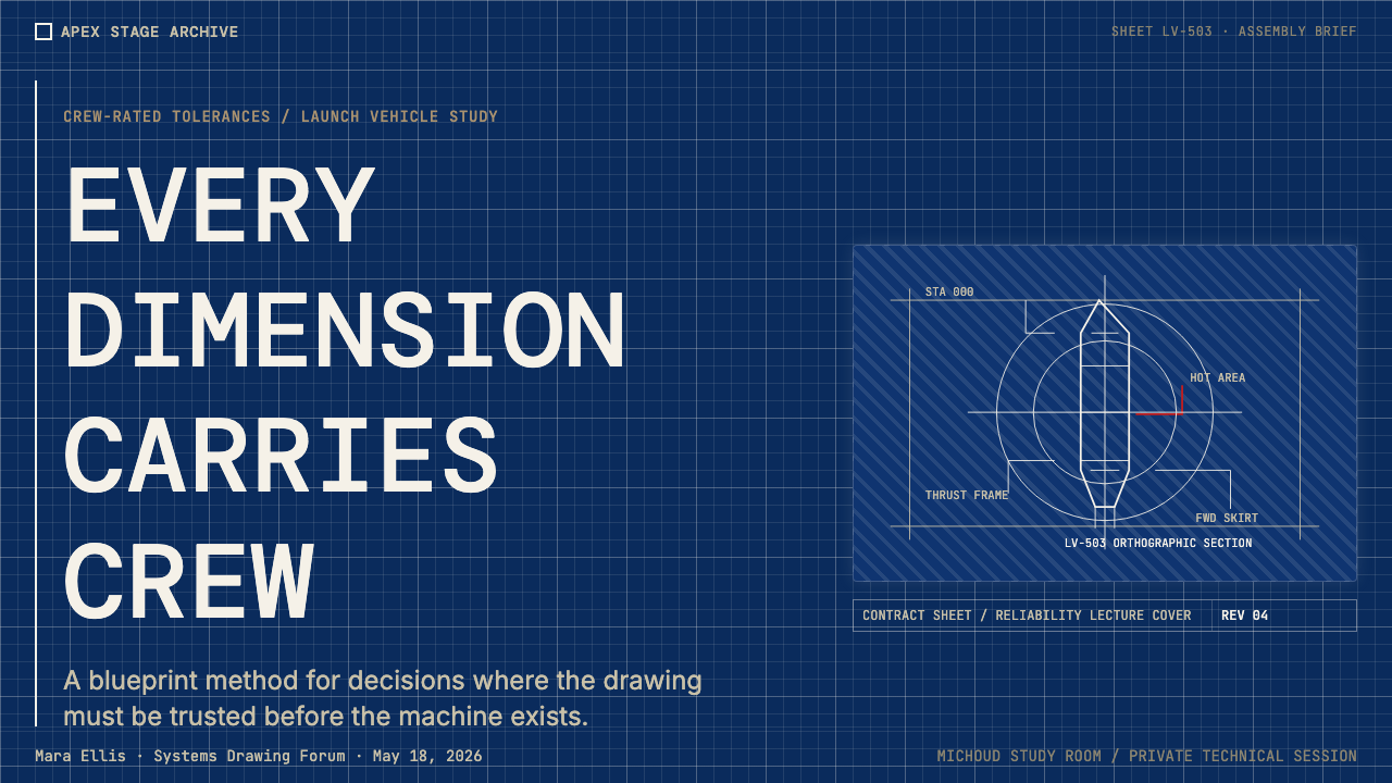
The visual grammar is overwhelmingly rectilinear. Right angles dominate; curves, where they appear, are mechanical in character — arcs of precise radius, not organic sweeps. Section cuts reveal interior geometry as flat cross-sections. Orthographic projection (top view, front view, side view laid out in standardized relationship to one another) is the underlying spatial logic. Grid lines or registration crosses appear as visual anchors. The style deliberately avoids rounded corners, organic shapes, or any form that could not be produced by a compass, straight edge, and drafting triangle. Everything looks measured because, in the source material, everything was measured.视觉语法以直角为主导。直角统治一切;弧线(若出现)具有机械特征——精确半径的圆弧,而非有机曲线。截面切割以平面横截面揭示内部几何。正射影(俯视、正视、侧视按标准关系排列)是底层空间逻辑。网格线或十字定位标作为视觉锚点出现。这种风格刻意回避圆角、有机形态,以及任何无法用圆规、直尺和制图三角板制作的形状。一切看起来都是经过测量的,因为在原始材料中,一切都确实经过了测量。
Annotation as Decoration标注即装饰
In engineering drawings, annotations serve a purely functional role: they communicate specifications that the drawing geometry alone cannot convey. In the Saturn V Blueprint aesthetic applied to design, annotations become a visual texture as much as an informational one. Dimension callouts, part numbers, revision indicators, zone coordinates along border margins, and title block structures are visual elements in their own right — they fill space with the suggestion of technical depth even when their specific content is not being read. This is one of the style's most distinctive features: it transforms the scaffolding of technical communication into surface richness, without ever introducing anything that would be foreign to an actual engineering drawing.在工程图纸中,标注承担纯粹的功能性角色:传达图纸几何本身无法独立表达的规格信息。而在应用于设计的土星五号蓝图美学中,标注既是视觉纹理,也是信息载体。尺寸标注、零件编号、修订标记、边框上的区域坐标,以及标题栏结构,都是独立的视觉元素——即便其具体内容并未被阅读,它们也以技术深度的暗示填充空间。这是这种风格最具辨识性的特征之一:它将技术传达的脚手架转化为表面的丰富性,却从不引入任何在真实工程图纸中显得格格不入的元素。
Darkness and Luminosity暗调与发光感
Unlike most dark-mode design, which uses darkness primarily for visual comfort or trendy contrast, the Saturn V Blueprint aesthetic treats the dark ground as a luminous field. Light elements appear to glow against the deep blue background, suggesting a backlit drawing table or a technical display screen rather than simply inverted color values. This creates a quality of self-illumination — the white lines seem to emit rather than reflect light, referencing both the phosphor glow of early CRT displays used in mission control and the original cyanotype's distinctive optical properties. The darkness is not atmospheric; it is a medium through which precision is revealed.与大多数主要为视觉舒适或时髦对比而使用暗色的深色模式设计不同,土星五号蓝图美学将深色底面视为一个发光场。浅色元素在深蓝背景上仿佛在发光,暗示着背光绘图桌或技术显示屏,而非单纯的颜色反转。这创造出一种自发光的品质——白色线条仿佛在发光而非反光,同时指向任务控制中心早期阴极射线管显示器的磷光光辉,以及原始氰版印刷特有的光学特性。这种暗调不是大气感的,而是一种让精确性得以显现的媒介。
Structural Severity结构的严峻感
The Saturn V Blueprint style does not attempt to be welcoming, approachable, or warm. Its aesthetic purpose is to communicate that the information it carries has been subjected to a level of rigor that ordinary consumer design does not aspire to. Decorative elements, flourishes, gradient transitions, soft shadows, rounded corners, illustrative imagery, and anything that introduces ambiguity about the designed object's edges or boundaries are all excluded. The result is a style that reads as authoritative precisely because it refuses to court the viewer's comfort — just as an actual engineering specification exists to constrain possibility, not to invite exploration.土星五号蓝图风格不试图显得亲切、平易近人或温暖。它的美学目的是传达:其所承载的信息已经过普通消费品设计所不追求的严格程度的检验。装饰性元素、花饰、渐变过渡、柔和阴影、圆角、插图性图像,以及任何会引入关于设计对象边缘或边界歧义的元素,均被排除在外。结果是一种因为拒绝迎合观者舒适感而显得权威的风格——正如真实的工程规范之所以存在,是为了约束可能性,而非邀请探索。
See the NASA Saturn V Blueprint design system查看 NASA Saturn V Blueprint 完整设计系统
Who shaped NASA Saturn V Blueprint?谁塑造了 NASA Saturn V Blueprint?
Von Braun was director of the Marshall Space Flight Center from its founding in 1960 until 1970, and the central technical and administrative figure behind the Saturn V design. His background in German wartime rocket development at Peenemünde gave him an intimate familiarity with the engineering drawing culture that the Saturn V blueprint archive reflects. Von Braun was as much a manager of visual and technical standards as he was a rocket engineer — the rigor of the Saturn V documentation system, which specified everything from engine combustion chamber tolerances to the color coding of hydraulic system lines on schematics, reflected his insistence on complete, unambiguous communication between engineering teams.冯·布劳恩自1960年马歇尔太空飞行中心成立起担任主任,直至1970年,是土星五号设计背后的核心技术与行政人物。他在德国战时佩内明德火箭开发中的背景,使他对土星五号蓝图档案所反映的工程制图文化有着深入的熟悉。冯·布劳恩既是火箭工程师,也是视觉与技术标准的管理者——土星五号文档系统的严格性(从发动机燃烧室公差到原理图上液压系统线路的颜色编码均有规定)反映了他对工程团队之间完整、无歧义沟通的坚持。
As Saturn V project manager from 1963 onward, Rudolph was responsible for coordinating the work of dozens of contractors and subcontractors across multiple states into a single coherent engineering program. The documentation systems that gave the Saturn V blueprint aesthetic its visual coherence — standardized title blocks, revision control procedures, drawing number hierarchies — were maintained under his project management authority. Rudolph's background was in production engineering rather than design, but the discipline he imposed on manufacturing documentation is directly readable in the visual consistency of surviving Saturn V drawings.作为1963年起的土星五号项目经理,鲁道夫负责将数十家承包商和分包商在多个州的工作协调成一个连贯的工程项目。赋予土星五号蓝图美学视觉统一性的文档系统——标准化标题栏、修订控制程序、图纸编号层级——均在其项目管理权威下维护。鲁道夫的背景在于生产工程而非设计,但他对制造文档施加的规范,可以直接从现存土星五号图纸的视觉一致性中读出。
The thousands of anonymous draftsmen and technical illustrators who worked at Boeing's Michoud Assembly Facility in New Orleans, as well as at North American Aviation, Douglas Aircraft, and Rocketdyne, are the actual authors of the visual aesthetic now associated with the Saturn V blueprint. Working at large-format drafting tables with Leroy lettering guides, rotring-style technical pens, and mylar or vellum drafting media, they produced the specific combination of line weight hierarchy, annotation style, and compositional discipline that defines the look. Their craft — a blend of technical precision and hand-produced visual consistency — is irreducibly embedded in the aesthetic.在波音公司新奥尔良米丘德装配设施,以及北美航空、道格拉斯飞机公司和洛克达因工作的数千名匿名制图员和技术插图师,才是现在与土星五号蓝图关联的视觉美学的真正作者。他们在大幅面制图桌上,使用莱罗字模指南、类针管笔技术钢笔,以及聚酯薄膜或硫酸纸制图介质,制作出定义这种外观的特定线宽层级、标注风格和构图规范的组合。他们的技艺——技术精确性与手工制作视觉一致性的融合——不可分割地嵌入于这一美学之中。
The F-1 engine drawings produced by Rocketdyne engineers in Canoga Park, California, represent some of the most visually complex and aesthetically compelling documents in the Saturn V archive. The F-1, which burned refined kerosene and liquid oxygen to produce more thrust than any single rocket engine before or since, required engineering drawings of exceptional detail — turbopump schematics, combustion chamber cross-sections, and propellant line routing diagrams that pushed the limits of technical illustration at the time. The visual density and informational richness of these drawings is a specific reference point for the Saturn V Blueprint aesthetic at its most technically intense.洛克达因工程师在加州卡诺加公园制作的F-1发动机图纸,是土星五号档案中视觉上最复杂、美学上最引人入胜的文件之一。F-1燃烧精炼煤油和液氧,产生的推力超过此前和此后任何单一火箭发动机,其工程图纸要求具备非凡的细节——涡轮泵原理图、燃烧室横截面,以及当时技术插图极限处的推进剂管路走向图。这些图纸的视觉密度和信息丰富性,是土星五号蓝图美学在技术强度最高处的特定参照点。
The broader NASA visual standards developed during the Apollo era — including the famous 1975 NASA Graphics Standards Manual overseen by the design firm Danne and Blackburn — created the institutional visual context within which the Saturn V blueprints existed. The Manual established typographic standards, color systems, and grid disciplines for NASA's public communications that reflected the same values of precision and technical authority visible in the engineering drawings. Though the blueprint aesthetic and the public identity standards were developed for different audiences, they shared an underlying commitment to visual clarity and technical rigor that made them culturally coherent.阿波罗时代开发的更广泛的NASA视觉标准——包括1975年由设计公司丹尼与布莱克本监制的著名《NASA视觉规范手册》——创造了土星五号蓝图所存在的机构视觉语境。该手册为NASA的公共传播建立了排印标准、色彩系统和网格规范,反映了工程图纸中可见的相同精确性与技术权威价值观。尽管蓝图美学与公共识别标准是为不同受众开发的,但它们共享一种对视觉清晰度和技术严格性的根本承诺,使两者在文化上呈现出连贯性。
How do you use NASA Saturn V Blueprint today?今天怎么用 NASA Saturn V Blueprint?
The Saturn V Blueprint aesthetic is highly directional: it works powerfully in contexts where technical authority, precision, and the suggestion of engineered complexity are desired values. It does not work in contexts that require warmth, playfulness, consumer-friendliness, or organic visual texture. Applying it requires understanding what the style is actually communicating — not just its visual surface, but the values of rigorous documentation and zero-tolerance engineering that give the visual surface its cultural weight.土星五号蓝图美学具有高度方向性:它在技术权威性、精确性以及工程复杂性暗示是期望价值的语境中极具力量。它不适用于需要温暖感、趣味性、消费者友好性或有机视觉纹理的语境。应用它需要理解这种风格实际上在传达什么——不仅仅是其视觉表面,而是赋予视觉表面文化重量的那种严格文档和零容忍工程学的价值观。
For presentation slides, the style excels on both covers and data-heavy content pages. A cover designed in this aesthetic uses the deep blue field as the primary surface, places a technical diagram or schematic element as the central compositional anchor, and sets the title in a monospace or engineering-lettered typeface at a scale that commands the space without crowding it. Subtitle or metadata information appears at a smaller, annotation-level scale, reinforcing the hierarchy between labeling and primary information. Content slides should be treated as technical drawings: organize information in gridded zones separated by hairlines, use numbered or coded callouts rather than decorative bullet points, and treat data charts as geometric objects in their own right — bar charts drawn with blueprint-precision line weights, axis labels in the annotation typeface, and color coding that references the core palette rather than arbitrary hues.对于演示文稿,这种风格在封面和数据密集的内容页上均表现出色。以这种美学设计的封面,以深蓝色底面为主要表面,以技术图表或示意图元素作为中央构图锚点,以等宽或工程制图字体将标题设置在主导空间而不显拥挤的尺寸上。副标题或元数据信息以更小的标注级别尺寸呈现,强化标注与主要信息之间的层级关系。内容页应被当作技术图纸处理:以细线分隔的网格区域组织信息,使用编号或代码标注而非装饰性项目符号,将数据图表视为独立的几何对象——以蓝图精度线宽绘制的柱状图、以标注字体书写的坐标轴标签,以及参照核心色板而非任意色调的颜色编码。
For web UI and dashboard design, the Saturn V Blueprint aesthetic is exceptionally well-suited to interfaces where the user is consuming technical data: scientific instruments, aerospace or engineering software, monitoring systems, developer tools, or financial analytics platforms. The approach: maintain the deep blue field as the background throughout, use near-white or warm off-white for all primary data and text, reserve amber or orange strictly for alert states and critical indicators, and build all card and container components with hard-edged borders rather than rounded corners or soft shadows. Navigation elements should feel like control panel interfaces — compact, precisely labeled, with no decorative icon beyond a geometric indicator. Pricing pages in this aesthetic benefit from the style's natural hierarchy: tier names set at diagram-label scale, feature lists formatted as specification tables, and call-to-action elements using the warm accent color as the sole departure from the blue-and-white ground.对于网页UI和仪表板设计,土星五号蓝图美学特别适合用户正在消费技术数据的界面:科学仪器、航空航天或工程软件、监控系统、开发者工具或金融分析平台。方法如下:在整个界面中保持深蓝色底面,对所有主要数据和文字使用近白色或暖调近白色,严格将琥珀色或橙色保留给警报状态和关键指标,以硬边边框而非圆角或软阴影构建所有卡片和容器组件。导航元素应有控制面板界面的感觉——紧凑、精确标注,除几何指示符外无装饰图标。这种美学下的定价页面得益于风格固有的层级感:以图表标签尺寸设置的等级名称、格式化为规格表的功能列表,以及以暖调强调色作为偏离蓝白底色的唯一元素的行动号召按钮。
For editorial and marketing applications, the blueprint aesthetic creates strong, distinctive visual presence in contexts that want to signal technological sophistication without appearing corporate or generic. Poster and cover designs work well with the style's inherent drama: a large technical schematic or cross-section of a complex object dominates the composition, with title information set in the annotation register. Data-visualization editorial — long-form articles or reports that make technical information legible to a broad audience — benefits from blueprint-style infographics where dimensional callouts, section cuts, and part-number labels make diagrams feel authoritative. Marketing materials for technology products, scientific instruments, or engineering platforms can use the aesthetic to position the product as a precision tool rather than a consumer convenience.对于编辑与营销应用,蓝图美学在希望传达技术精密感而不显得企业化或通用化的语境中,创造出强烈而独特的视觉存在感。海报和封面设计适合这种风格固有的戏剧性:一个大型技术示意图或复杂对象的横截面主导构图,标题信息以标注风格呈现。数据可视化编辑——将技术信息传达给广泛受众的长篇文章或报告——得益于蓝图风格的信息图形,其中尺寸标注、截面切割和零件编号标签使图表显得具有权威性。技术产品、科学仪器或工程平台的营销材料,可以使用这种美学将产品定位为精密工具而非消费便利品。
A common and damaging mistake when applying this style is treating the deep blue palette as a decorative choice rather than a functional one. Designers who borrow the color without understanding the underlying visual logic tend to reintroduce elements that are antithetical to the style — rounded corners that soften the rectilinear severity, gradient fills that undermine the flat, luminous quality of the original cyanotype, soft drop shadows that simulate a different kind of depth than the line-weight hierarchy provides, and typographic choices that mix script or humanist faces with the monospace core, fragmenting the document-register coherence. Another frequent error is over-complexity: the original blueprints were dense because they had to communicate complete engineering specifications in a single sheet. Applied design does not carry that obligation, and attempting to replicate the visual density without the informational justification produces images that feel busy rather than authoritative.应用这种风格时一个常见且有害的错误,是将深蓝色板视为装饰性选择而非功能性选择。借用颜色却不理解底层视觉逻辑的设计师,往往会重新引入与这种风格相悖的元素——软化直角严峻感的圆角、破坏原始氰版平面发光品质的渐变填充、模拟与线宽层级所提供的不同深度感的柔和投影,以及将脚本体或人文主义字体与等宽核心混用、分裂文档风格连贯性的字体选择。另一个常见错误是过度复杂:原始蓝图密集是因为它必须在单张图纸上传达完整的工程规范。应用设计不承担这一义务,试图在没有信息依据的情况下复制视觉密度,只会产生显得繁忙而非权威的图像。
See the NASA Saturn V Blueprint design system查看 NASA Saturn V Blueprint 完整设计系统
NASA Saturn V Blueprint — FAQNASA Saturn V Blueprint · 常见问题
Is this style only suitable for space or aerospace contexts?这种风格只适合航天或航空航天语境吗?
No — but the context needs to share some of the values that the style communicates. The Saturn V Blueprint aesthetic works well wherever precision, technical authority, and the suggestion of engineered complexity are appropriate signals: developer tools, scientific data platforms, financial analytics interfaces, engineering software, industrial monitoring systems, and technology brand communications that want to position a product as a precision instrument. It does not work well in consumer contexts that prioritize warmth, playfulness, or approachability. The key question is whether the audience and purpose can absorb the severity of the style's visual logic without feeling alienated by it.不——但语境需要与这种风格所传达的价值观有所共鸣。土星五号蓝图美学在精确性、技术权威性以及工程复杂性暗示是适当信号的地方表现出色:开发者工具、科学数据平台、金融分析界面、工程软件、工业监控系统,以及希望将产品定位为精密仪器的技术品牌传播。它在优先考虑温暖感、趣味性或亲和力的消费者语境中则表现欠佳。关键问题是:受众和目的是否能够吸收这种风格视觉逻辑的严峻性,而不会因此产生疏离感。
How is this different from generic dark mode or cyberpunk aesthetics?这与通用深色模式或赛博朋克美学有何不同?
The difference is specificity of reference and discipline of execution. Generic dark mode uses dark backgrounds for visual comfort or trend-following, with rounded corners, soft glows, and arbitrary accent colors. Cyberpunk aesthetics use dark grounds for atmospheric effect — neon overlays, glitch textures, diagonal cuts, and a deliberately chaotic energy. The Saturn V Blueprint style uses darkness as a functional medium through which precision is revealed, not as atmosphere or comfort. Its references are specific: cyanotype chemistry, technical drawing conventions, engineering annotation standards. Every element must be justifiable as something that would appear in an actual engineering drawing. The style is severe and disciplined, not expressive or atmospheric.区别在于参照的具体性和执行的规范性。通用深色模式为视觉舒适或跟随潮流使用深色背景,配以圆角、柔和光晕和任意强调色。赛博朋克美学使用深色底面营造氛围——霓虹叠加、故障纹理、对角切割和刻意混乱的能量感。土星五号蓝图风格将暗调作为让精确性得以显现的功能性媒介,而非氛围或舒适感。其参照是具体的:氰版化学、技术制图惯例、工程标注标准。每个元素都必须能以「这在真实工程图纸中会出现」为合理依据。这种风格是严峻而规范的,而非表现性或氛围性的。
Can the style work on light backgrounds instead of the dark blue field?这种风格能在浅色背景而非深蓝底面上使用吗?
A light-ground version is possible but changes the cultural reference significantly. The historical blueprint was specifically an inverted image — white on blue — so a light-ground version loses the direct cyanotype reference and reads more as generic technical drawing or drafting-table aesthetic. If you go light-ground, the cues that maintain the identity are the monospace annotation typeface, the strict avoidance of rounded forms, the use of dimension lines and callout structures as compositional elements, and the disciplined restraint from any decorative element. A pale warm cream or aged-paper tone as the ground, rather than pure white, preserves some of the warm-aged quality of the original cyanotype and helps the version feel intentional rather than merely desaturated.浅色底面版本是可行的,但会显著改变文化指向。历史上的蓝图本质上是一种反转图像——蓝底白线——因此浅色底面版本失去了对氰版印刷的直接指向,读起来更像是通用技术图纸或制图桌美学。若使用浅色底面,维持风格特征的线索是:等宽标注字体、对圆润形态的严格回避、以尺寸线和标注结构作为构图元素,以及对任何装饰性元素的规范克制。以浅暖奶油色或老化纸张色调(而非纯白色)作为底色,可以保留原始氰版印刷的暖调陈旧质感,使这个版本看起来是有意为之,而非仅仅是去饱和处理。
How should photography or imagery be handled within this style?在这种风格中应如何处理摄影或图像?
Photography is problematic in the Saturn V Blueprint style because naturalistic images of the physical world conflict with the flat, annotated quality of engineering drawing. Where imagery is necessary, the appropriate approach is to treat photographs as technical documents: high-contrast duotone treatment in the core palette (reducing the image to blue and off-white tones), aggressive cropping to isolate the subject as an object of study rather than a scene, or conversion to technical illustration through a high-contrast threshold effect. Actual technical photographs — close-up detail shots of mechanical components, cutaway views of engine assemblies — are more at home in this style than any lifestyle or ambient photography. When in doubt, replace photography with a diagram or schematic entirely.摄影在土星五号蓝图风格中存在问题,因为物理世界的自然主义图像与工程图纸的平面标注品质相冲突。若图像确有必要,合适的处理方式是将照片作为技术文件处理:以核心色板进行高对比度双色调处理(将图像简化为蓝色与近白色调),激进裁切以将主体隔离为研究对象而非场景,或通过高对比度阈值效果转化为技术插图。真实的技术照片——机械部件的近距离细节照、发动机组件的剖面图——比任何生活方式或环境摄影更适合这种风格。如有疑问,直接以图表或示意图取代摄影。
What makes a Saturn V Blueprint design feel authentic versus merely thematic?什么使土星五号蓝图设计看起来真实而非仅仅是主题性的?
Authenticity in this style comes from understanding that every visual decision in the original blueprints was made under constraint — not aesthetic constraint, but engineering necessity. Authentic work asks, for each element: could this element appear in an actual technical drawing, and does it serve an informational purpose analogous to what it would serve there? Annotation-style type is authentic because annotation is a core engineering drawing element. A rounded button is not authentic because no engineering drawing contains rounded UI elements. A hard-edged grid line is authentic; a decorative border with corner flourishes is not. The discipline is not about surface-level imitation of the visual style — it is about internalizing the underlying logic of technical communication and allowing that logic to govern every compositional decision.这种风格的真实性来自于理解:原始蓝图中的每一个视觉决策都是在约束下做出的——不是美学约束,而是工程必要性。真实的作品对每个元素都会追问:这个元素能出现在真实的技术图纸中吗?它是否服务于与在那里类似的信息目的?标注风格的文字是真实的,因为标注是工程图纸的核心元素。圆角按钮不是真实的,因为没有工程图纸包含圆角UI元素。硬边网格线是真实的;带角部花饰的装饰边框不是。这种规范不是关于对视觉风格进行表面层面的模仿——而是关于内化技术传达的底层逻辑,并让这种逻辑支配每一个构图决策。
Related design styles相关设计风格
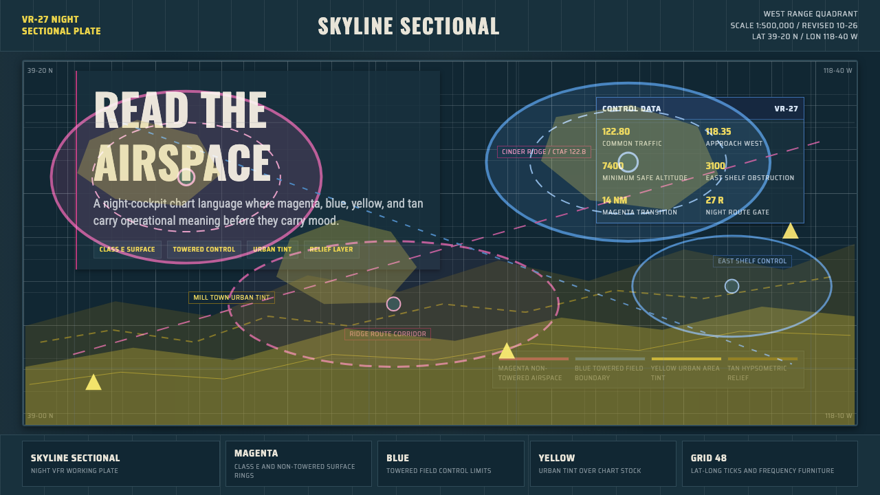 Aeronautical ChartReads like cockpit data. Magenta-blue airspace rings cut through dense dark-c…像座舱数据般可读:品红与蓝色空域环切入深色密集网格。
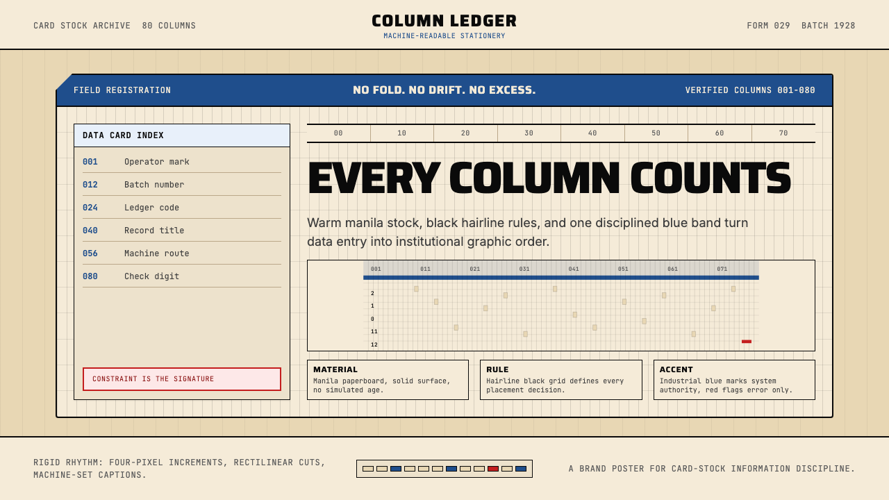 IBM Punchcard 029 (1928)Constraint becomes authority. Manila stock, hairline grid, industrial blue.约束即权威。米黄色卡纸、发丝网格与工业蓝。
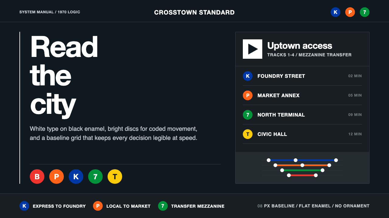 NYC Transit HelveticaOrder made visible. White type, black enamel, route discs, and a grid that ne…秩序一眼可见:黑底白字、线路圆盘与永不弯折的网格。
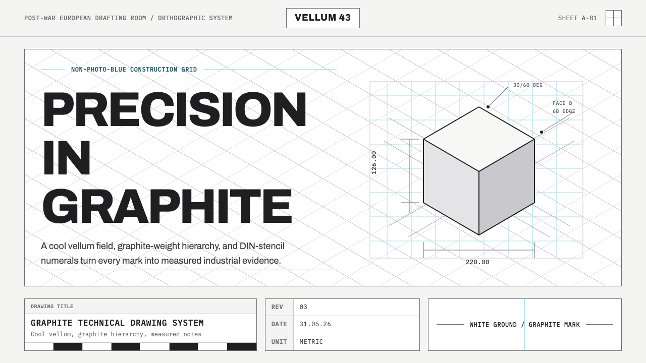 Graphite Technical DrawingDrafting-room precision. Non-photo-blue grid and graphite DIN lettering do th…制图室般精确:淡蓝网格与石墨DIN字母构成秩序。
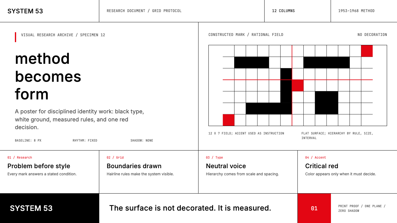 Ulm School (HfG Ulm)Clarity becomes discipline. Black-white grid, Inter grotesk, and one surgical…清晰即纪律:黑白网格、Inter 无衬线与一处手术般红标。
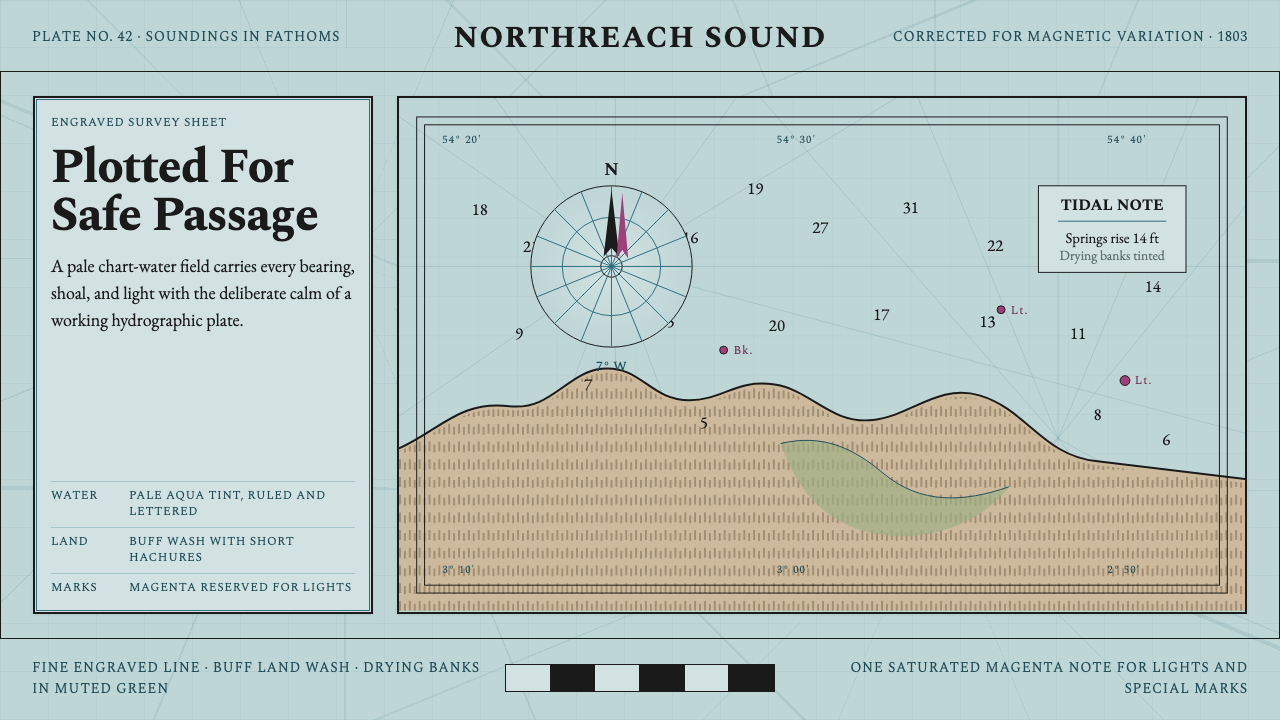 Admiralty Sea ChartSurvey authority, engraved. Aqua chart water, black soundings, buff land, one…测量权威感。淡水绿图水、黑色水深、浅赭陆地与一抹品红。