What is Aeronautical Chart?
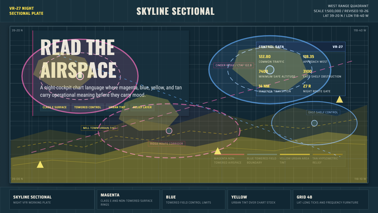
The Aeronautical Sectional Chart style borrows its entire visual logic from the FAA's VFR sectional — a densely coded paper map built for split-second cockpit decisions, where every hue is a federal standard and every symbol earns its ink by saving lives.
Aeronautical Chart in brief
The Aeronautical Sectional Chart is a design system derived directly from the FAA VFR (Visual Flight Rules) sectional chart — the folded paper map that private pilots carry in the cockpit for visual navigation. Its visual identity is built from a dark, aged-paper ground overlaid with magenta airspace rings, blue towered-airport symbols, yellow urban-area tints, and tan hypsometric terrain banding, all labeled in condensed grotesque type. Nothing in the system is decorative; every color code and symbol has a regulatory definition.
What makes this aesthetic distinctive is the complete subordination of visual beauty to informational precision. The palette exists not for mood or brand recognition but because federal aviation regulations assign each hue to a specific class of airspace or terrain feature. The density of information — frequency boxes, lat/long tick marks, restricted-area crosshatching, altitude figures — is a direct map of real-world navigational complexity. Reading this style correctly means reading it as a system of codes, not as graphic design.
As a design language transplanted into product work, the Aeronautical Chart system carries unmistakable authority and technical seriousness. Its dark ground and high-contrast coded overlays read as professional instrumentation, evoking cockpit displays and mission-critical data environments. The style suits any context where the user is expected to make fast, consequential decisions from dense information — and where trust in the system is itself part of the product proposition.
Where does Aeronautical Chart come from?
The FAA VFR sectional chart — the direct parent of this design system — traces its lineage to early twentieth-century aeronautical cartography. As civil aviation expanded rapidly after the First World War, nations needed standardized maps that could be read by pilots under stress, in poor visibility, with no time to interpret ambiguous symbols. The United States Sectional Aeronautical Chart series was developed by the Coast and Geodetic Survey and later administered by the National Aeronautical Charting Office (NACO) under the FAA. By the mid-twentieth century, the color conventions, symbol vocabularies, and information layering that characterize modern sectionals were largely codified and have remained stable — with incremental updates — through to the present.
The defining visual characteristic — the use of magenta for non-towered airports and Class E surface airspace, and blue for towered fields — emerged from the practical need to distinguish, at a glance and under cockpit lighting, between fields with and without air traffic control towers. Magenta was chosen partly because it remained readable under the red cockpit lighting used to preserve night vision. The hypsometric tint bands (tan deepening to olive as terrain rises) follow a tradition of continental European cartographic relief shading adapted for aviation: pilots flying in mountainous terrain need to see at a glance which ground lies above their cruising altitude.
The typeface conventions of the sectional — condensed grotesque letterforms packed into tight label clusters — reflect the constraint of fitting enormous information density onto a folded sheet readable at arm's length. Each label must compete with its neighbors without any typographic hierarchy other than size and weight. The overall visual grammar is closer to engineering drawing than to graphic design: the purpose is unambiguous communication of safety-critical data, not aesthetic pleasure.
The Aeronautical Chart style as a design aesthetic gained broader cultural traction in the late twentieth and early twenty-first centuries as aviation enthusiasm, military-surplus culture, and the visual language of mission-critical software converged. Dashboard designers, data visualization practitioners, and game UI designers began borrowing the palette and symbol vocabulary explicitly — recognizing that the sectional chart's visual density and authoritative coding system mapped naturally onto data-rich product interfaces.
What defines the Aeronautical Chart look?
Color as Federal Code
Every hue in the Aeronautical Chart palette carries a specific regulatory meaning. Magenta denotes non-towered airports and Class E surface-area airspace. Blue marks controlled fields with operating control towers. Yellow indicates urban population centers. Tan and olive describe terrain elevation through hypsometric banding. This is not palette selection in the conventional design sense — it is color assignment by law. Applying the palette decoratively, without respecting the underlying code structure, produces visual noise rather than authority.
Dark Ground and High-Contrast Overlay
The base of the sectional is a dark, aged-paper tone — not pure black but a deep charcoal or darkened parchment — which simultaneously suggests age, seriousness, and legibility under cockpit lighting. All informational overlays are rendered in high contrast against this ground: the magenta and blue airspace symbols punch out clearly, while the hypsometric terrain bands transition from the dark background toward progressively lighter warm tones at high elevation. The overall effect reads as depth and layering rather than flatness.
Information Density as Aesthetic
The sectional chart is among the densest information surfaces produced by twentieth-century graphic practice. Frequency boxes, airport identifiers, obstacle heights, airspace altitude limits, lat/long tick marks, and terrain labels compete for space without any of the breathing room that conventional graphic design considers essential. In the Aeronautical Chart style, this density is not a problem to be solved — it is the defining characteristic. Applied to product design, it communicates that the system contains serious depth and rewards attentive reading.
Condensed Grotesque Typography
All labeling on the sectional is set in condensed grotesque letterforms — narrow, upright, legible at small sizes, and capable of fitting long text strings into tight spaces between symbols. There is no expressive variation in weight or style; type is a functional tool for attaching meaning to symbols. In design applications of this style, condensed sans-serif type carries the informational density of the map while keeping the visual hierarchy subordinate to the color-coded symbol system.
Grid of Latitude and Longitude
The underlying structure of the sectional is a geographic coordinate grid — rigid, regular, and indifferent to compositional preferences. Section lines, township markers, and lat/long tick marks create a consistent linear armature across the entire sheet. In design applications, this grid logic translates to strict alignment systems: elements lock to invisible structural lines rather than being placed intuitively. The resulting layouts have a measured, almost mechanical regularity that reads as precision rather than rigidity.
Functional Symbol Vocabulary
The sectional's symbol set is extensive and standardized: different airport types have distinct icons (the towered airport's ringed circle versus the non-towered field's open circle), obstruction lights have specific markers, restricted and prohibited areas are marked with crosshatching and distinctive borders. Each symbol is designed for instant recognition at a small size. In design systems borrowing this aesthetic, icons and indicators should follow the same logic: distinct, consistent, and readable without accompanying text, with meaning conveyed by both shape and color.
Age and Materiality
The sectional chart is a physical artifact — printed on paper that develops a characteristic creased, slightly yellowed quality with use. The aesthetic deliberately acknowledges this materiality: the dark base tone reads as aged paper, and the color overlays suggest the multiple-pass offset printing that produced the charts for decades. This sense of materiality and age gives the design language gravitas. Unlike purely digital aesthetics, the Aeronautical Chart style carries the weight of a physical object that has been handled, folded, and trusted.
Who shaped Aeronautical Chart?
The FAA's Aeronautical Information Services division is the institutional author of the VFR sectional chart series — the regulatory body that has defined and maintained the color standards, symbol conventions, and information layering rules that form the visual backbone of this design system. Unlike most design movements, which originate with individual practitioners, the Aeronautical Chart aesthetic is the product of a bureaucratic process oriented entirely toward safety standardization. Its visual authority derives directly from that institutional origin.
NACO, operating under the FAA, oversaw the production and incremental refinement of the sectional chart series through most of the late twentieth century. The consistency of the chart's visual language across decades — the same magenta for Class E airspace in 1965 and in 2005 — is attributable to NACO's maintenance of strict charting standards. This institutional consistency is itself a design achievement: a visual system that remained stable enough to be learned once and trusted for a career.
The visual conventions of the modern VFR sectional crystallized through the work of mid-twentieth-century technical cartographers working at the intersection of geodetic survey, aviation safety, and printing technology. These practitioners — working largely anonymously within government agencies — developed the hypsometric tinting system, the airspace ring conventions, and the condensed-type labeling practices that give the chart its distinctive appearance. Their decisions were driven by legibility research and pilot feedback rather than design theory.
Jeppesen was a pioneer of aviation charting who, in the 1930s, began creating his own standardized approach and terminal charts for pilots navigating instrument approaches — work that eventually became the Jeppesen chart series, a private-sector complement to the government sectional. His systematic approach to encoding navigational information into a readable, standardized visual format established principles that influenced both official charting and the broader culture of data visualization for high-stakes environments. The Jeppesen style is related to but distinct from the FAA sectional.
From the 1990s onward, a generation of UI designers working on radar systems, air traffic control software, military situational awareness displays, and later flight-simulation games deliberately borrowed the sectional's visual vocabulary — the dark grounds, coded color overlays, and dense symbol systems — for digital interfaces. This transfer from paper chart to screen interface established the Aeronautical Chart aesthetic as a living design language for data-dense, high-stakes digital environments, extending its influence far beyond aviation.
How do you use Aeronautical Chart today?
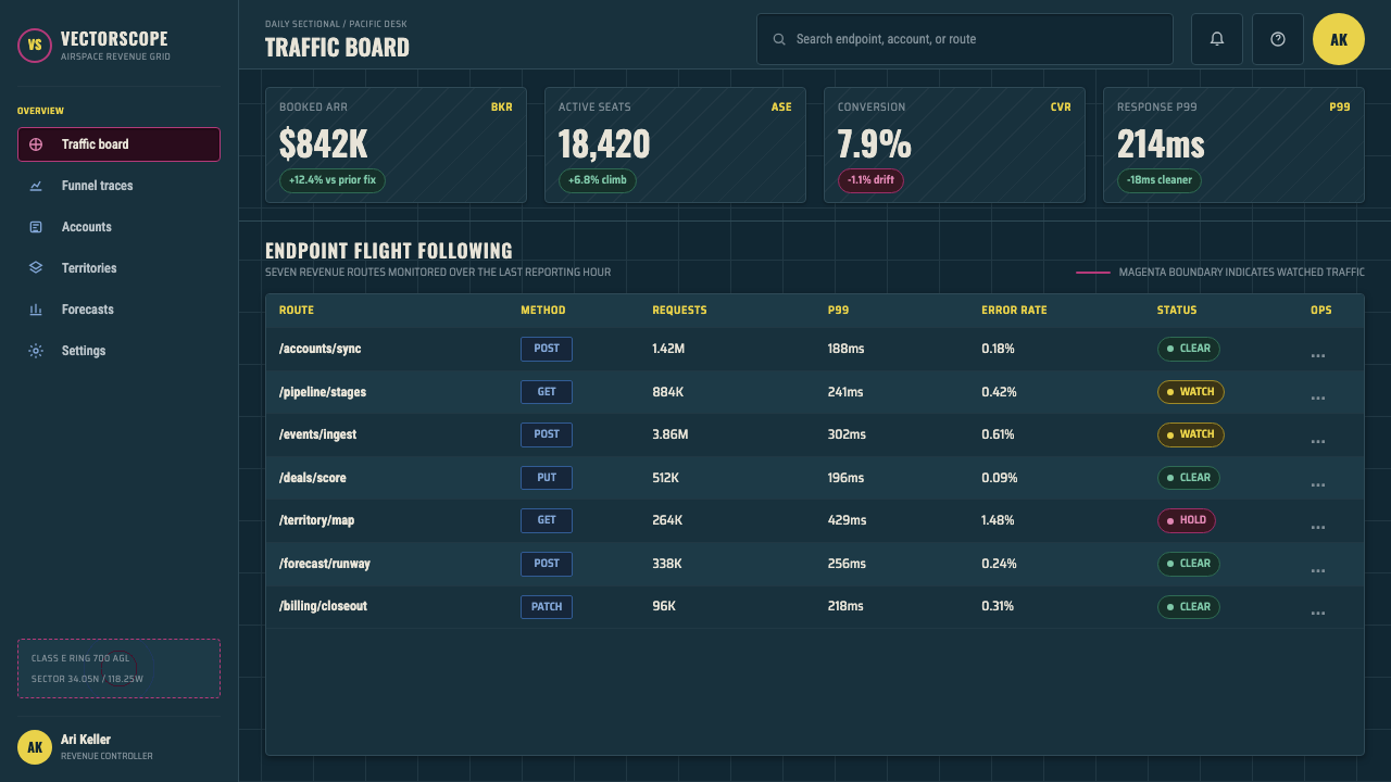
The Aeronautical Sectional Chart style is most effective in contexts that call for authoritative information density — dashboard products, analytics platforms, command-and-control interfaces, and any situation where the user is expected to extract actionable meaning from complex layered data quickly. The style sets an implicit contract with the user: this system is serious, the data is real, and reading it carefully will be rewarded. That contract makes it poorly suited to casual consumer contexts but exceptionally well-suited to professional tools.
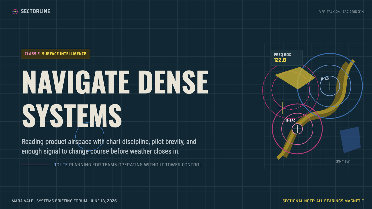
For presentation slides, the style works best when used selectively — a cover or section-break slide can deploy the full dark-ground, high-contrast aesthetic dramatically, while content slides should pull back to a lighter interpretation: dark type on cream ground, with the coded color accents (magenta, blue, yellow) used sparingly for data categories or callout elements. Data slides translate naturally into the sectional's diagrammatic logic: charts become annotated overlays, with data series color-coded according to the chart's palette rather than conventional business-presentation color schemes. The condensed grotesque typeface carries the informational tone without requiring the full visual complexity of the source chart.
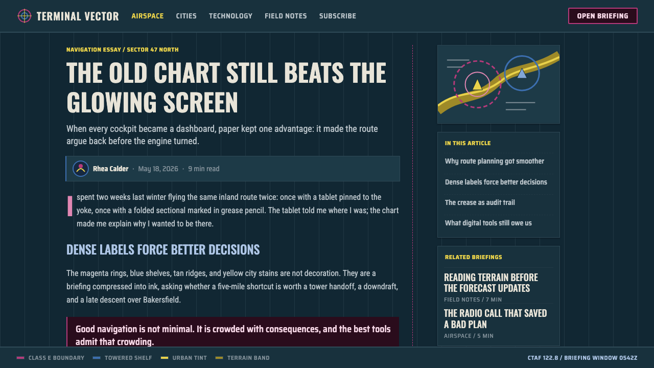
For web and dashboard interfaces, the style suits night-mode and dark-theme applications particularly well. A sidebar or navigation panel rendered in the deep charcoal ground with magenta active-state indicators and blue secondary elements will immediately read as instrumentation. Filter controls and status badges translate naturally from the chart's legend conventions. Avoid applying the full information density of the source chart to interface components — the sectional works as an aesthetic inspiration, not as a literal interface pattern. Interactive elements need appropriate spacing and affordance that the paper chart, designed for reading rather than interaction, does not model.
For editorial and marketing work, the Aeronautical Chart style works best as an art direction device applied to specific sections or hero treatments rather than as a full-document system. A feature story about aviation, logistics, or data-heavy topics can use the sectional aesthetic for opening spreads and pull quotes while reverting to cleaner type treatment for long-form body text. Marketing pages can use the dark-ground, coded-color system to evoke precision and authority in the hero section, then transition to lighter, more accessible layouts as the page develops. The style's specificity is both its strength and its limitation: it reads immediately as technical and serious, which is exactly right for some audiences and entirely wrong for others.
The most common mistake when applying this style is treating the color palette as decorative rather than semantic. In the source chart, magenta means a specific thing; blue means a different specific thing. If you use these colors arbitrarily — magenta for decorative rings, blue for whatever looks good next to it — you borrow the visual surface of the system without its authority. The authority comes from the codes being consistent and meaningful. Applied to a dashboard, this means assigning magenta consistently to one data type and blue to another, and maintaining that assignment rigorously across every view. Breaking the code — even once — undermines the entire system.
Aeronautical Chart — FAQ
Is this style only appropriate for aviation-related products?
Not at all. The Aeronautical Chart style is a design language built on information density, coded color, and authoritative dark-ground presentation — principles that transfer to any context requiring complex data communication. Logistics dashboards, financial analytics platforms, scientific visualization tools, military-adjacent applications, and even high-end gaming interfaces have successfully adopted the aesthetic. The key is that the product's values — seriousness, precision, depth — should align with what the style communicates. Using it for a food delivery app or a children's education product would create a jarring mismatch between style and purpose.
How does this style differ from other dark-mode or 'hacker aesthetic' design systems?
The difference is the source of the visual logic. Generic dark-mode aesthetics typically use dark backgrounds as a contrast choice or an energy-saving rationale, with neon accent colors chosen for visual impact rather than meaning. The Aeronautical Chart style's dark ground is not a contrast choice — it reflects a paper stock designed for cockpit readability under night lighting. The color palette is not chosen for impact — it is a regulatory code. This distinction matters in application: a well-executed Aeronautical Chart-derived interface feels like instrumentation because every color choice has a reason, whereas a generic dark-mode interface with neon accents is often just dark with decoration.
Can the Aeronautical Chart style work in a light or white-background layout?
Yes, with significant adjustment. The source chart is a dark-ground artifact, and much of its visual power comes from the way the coded color palette pops against that ground. On a white or light background, the magenta and blue accents behave differently — they read as brand colors or data indicators rather than as navigation codes. A light-background interpretation of the style retains the condensed grotesque typography, the dense information layout, and the semantic color assignments, but loses the sense of depth and gravitas that the dark ground provides. It reads more as 'technical' than 'authoritative.' Whether that tradeoff works depends entirely on the product context.
What is the biggest visual difference between this style and traditional data visualization?
Traditional data visualization typically isolates individual charts or graphs in generous white space, following Tufte-influenced principles of chart junk elimination and data-ink ratio optimization. The Aeronautical Chart style does the opposite: it maximizes information density and treats the entire surface as a continuous information field, with individual data elements embedded in a coded context that supplies additional meaning through proximity and color. The chart is designed to be read holistically as well as locally — a pilot reads the sectional as a whole (What is the big picture of my route?) and locally (What is this specific airport's frequency?). That simultaneous macro and micro reading mode is what the style, at its best, produces in product interfaces.
Does the aged-paper texture need to be literal to apply this style effectively?
No — the aged-paper quality of the source chart is a material artifact of its production process, not a design requirement. What the style requires is the dark base tone and the sense of depth created by layering coded information over it. A clean digital dark ground achieves the same structural effect without any literal texture. Applied texture — scan lines, paper grain, aging filters — can reinforce the aesthetic in contexts where nostalgia or materiality is appropriate (a flight simulation UI, a military history project) but it risks reading as costume rather than character in purely professional product contexts. The color coding and information density carry the essential identity of the style; the texture is optional.
Related design styles
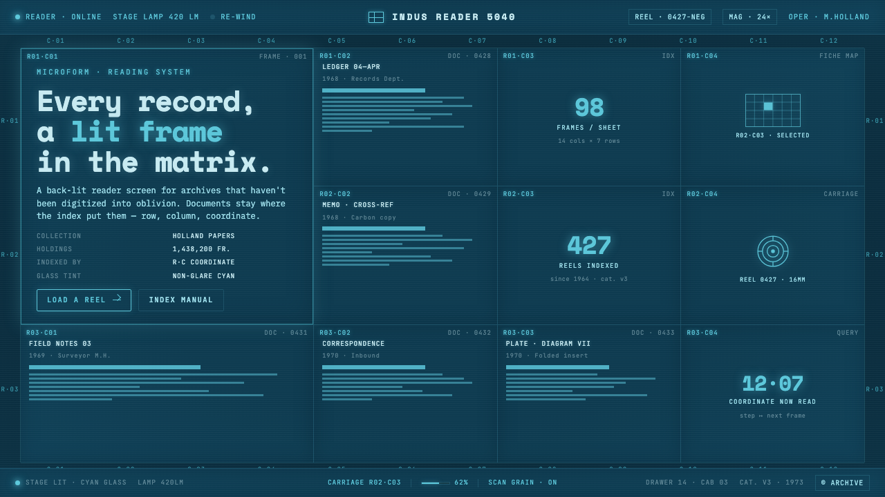 Microfiche ArchiveRecords as lit frames in a matrix. Cyan-blue back-lit panel, glowing mono typ…
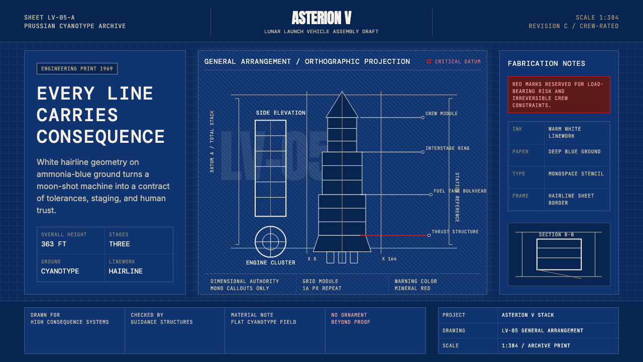 NASA Saturn V BlueprintPrecision carries risk. Prussian blue grids and white mono callouts frame a l…
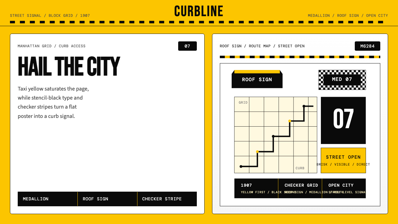 New York Yellow Cab (1907)Visibility is the brand. Taxi yellow, stencil type, checker stripes.
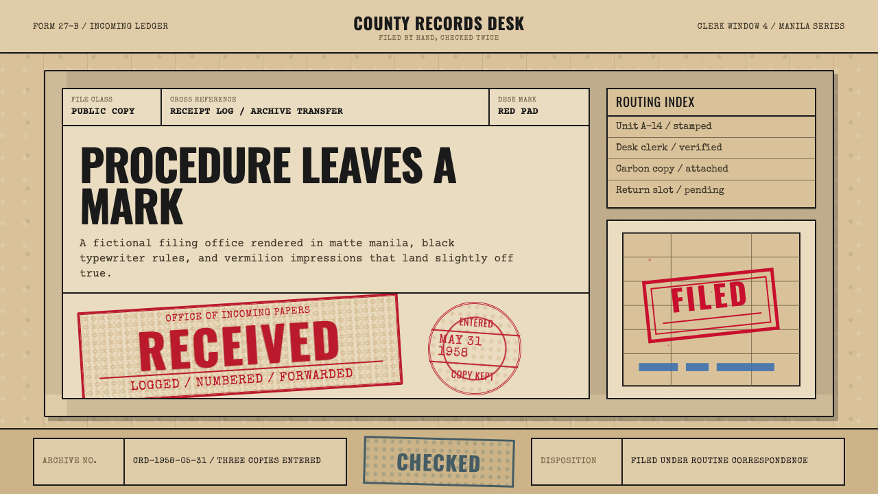 Office Rubber StampsProcedure made visible. Vermilion Oswald stamps strike a manila logbook grid.
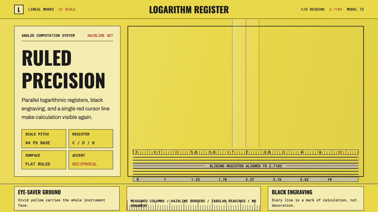 Slide RulePrecision made visible. Eye-saver yellow, black ticks, and one red hairline d…
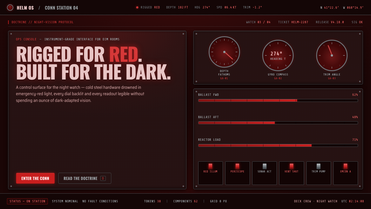 Submarine Control RoomRigged for red. Steel hardware drowned in emergency lamplight, every dial bac…