Design style guide设计风格指南
What is Australian Flying Doctor Radio?什么是 Australian Flying Doctor Radio?
From a corrugated-iron shed in the Queensland outback, one pedal-powered wireless set and a fleet of biplanes forged a visual language as functional and uncompromising as the landscape it served.从昆士兰内陆的一座铁皮棚屋里,一台脚踏无线电和一批双翼机共同锻造出一套视觉语言——与它所服务的那片土地同样实用、同样不妥协。
Australian Flying Doctor Radio in briefAustralian Flying Doctor Radio 速览
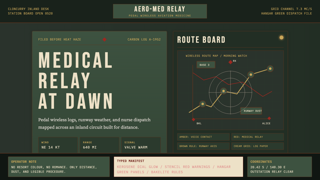
Australian Flying Doctor Radio is a design aesthetic rooted in the visual culture of the Royal Flying Doctor Service (RFDS) and the wider network of outback infrastructure that surrounded it from the late 1920s through the 1950s. It draws on the look of RAAF hangar buildings, pedal-powered Traeger wireless sets, typewritten dispatch logs, hand-stencilled signage, and the schematic diagrams pinned to plywood walls of remote station communication rooms.澳大利亚飞行医生无线电是一种设计美学,根植于皇家飞行医生服务(RFDS)以及1920年代末至1950年代围绕其生长的内陆基础设施的视觉文化。它汲取了皇家空军机库建筑、脚踏特雷格无线电台、打字机调度日志、手工模板印刷标识,以及钉在偏远牧站通讯室胶合板墙上的线路示意图的外观与气质。
The palette anchors itself in deep institutional greens — the painted steel of hangar walls and government-issue equipment cabinets — set against signal reds borrowed from stencilled warnings and emergency markings, with warm amber tones evoking the glow of bakelite instrument panels and kerosene lanterns. Background surfaces suggest the textured skin of aged corrugated iron, worn plywood, or yellowed paper. Everything reads as functional, slightly worn, and built for survival rather than display.色板以深沉的机构绿为核心——机库钢板墙壁与政府配发设备机柜的绿色——与从模板警示标识和紧急标记借来的信号红相互对抗,琥珀暖调则唤起胶木仪表盘与煤油灯的光泽。背景表面暗示着老化波纹铁皮、磨损胶合板或泛黄纸张的肌理。一切都读起来像是实用的、略带磨痕的、为存活而非展示而建造的。
As a design system, it is deliberately dark and warm in character: high contrast for legibility across difficult reading conditions, typewriter-style letterforms for authenticity, and a compositional logic borrowed from technical schematics and operational manuals rather than from commercial print culture. It is one of the few historical aesthetics that manages to feel both institutional and deeply human.作为一套设计体系,它的性格刻意是深沉而温暖的:为应对恶劣阅读条件的高对比度、为真实感而选用的打字机式字母形态,以及从技术示意图和操作手册而非商业印刷文化借来的构图逻辑。它是为数不多的能同时散发出机构感与深沉人文气息的历史美学之一。
See the Australian Flying Doctor Radio design system →查看 Australian Flying Doctor Radio 完整设计系统 →
Where does Australian Flying Doctor Radio come from?Australian Flying Doctor Radio 从何而来?
The story begins with Reverend John Flynn, a Presbyterian minister who in 1912 began documenting the medical isolation of Australians living hundreds of kilometres from the nearest doctor. Flynn's reports to the Australian Inland Mission were stark: minor injuries became fatal infections; women gave birth without any medical support; accidents left men dying over days rather than hours simply for want of transport. His answer was the concept of a 'mantle of safety' — a network of aerial medical services that would collapse the tyranny of distance.故事始于约翰·弗林牧师——一位长老会传教士,他从1912年开始记录那些生活在距最近医生数百公里之外的澳大利亚人所面临的医疗隔绝困境。弗林向澳大利亚内地传教会提交的报告触目惊心:小伤化为致命感染;女性在毫无医疗支持的情况下分娩;事故伤者因缺乏转运手段而在数日而非数小时内死去。他的回答是“安全斗篷”的构想——一个能消除距离暴政的航空医疗服务网络。
Flynn founded the Aerial Medical Service in 1928 at Cloncurry in western Queensland, operating a de Havilland DH.50 biplane. The service was revolutionary in concept but initially hobbled by one critical problem: there was no way for remote stations to communicate with the base. Correspondence by mail took weeks. The breakthrough came from Alfred 'Alf' Traeger, a radio engineer in Adelaide who in 1929 developed a pedal-powered wireless transceiver that could be operated without a generator or mains electricity. A person sitting at the device could pedal to generate enough current to transmit and receive morse code — and later voice — across several hundred kilometres of open country. By the mid-1930s, Traeger sets had been distributed to stations across the outback, transforming the service from a reactive ambulance into a genuine communications network. The Aerial Medical Service was renamed the Royal Flying Doctor Service in 1942.弗林于1928年在昆士兰州西部的克朗克里创立了空中医疗服务,以一架德哈维兰DH.50双翼机起家。这项服务在理念上是革命性的,但最初被一个关键问题所困:偏远牧站与基地之间没有通讯手段,邮件往返需要数周。突破来自阿德莱德的无线电工程师阿尔弗雷德·特雷格,他于1929年研制出一种脚踏式无线电收发器,无需发电机或市电即可运行。操作者只需踩踏产生足够电流,便可在数百公里的旷野上发送和接收摩尔斯电码——后来又实现了语音通讯。到1930年代中期,特雷格电台已分发至内陆各地牧站,将这项服务从被动出诊的救护车变成了真正的通讯网络。空中医疗服务于1942年更名为皇家飞行医生服务。
The visual culture of the RFDS and its outback setting developed organically from the materials at hand. Station buildings were corrugated iron on timber frames — cheap, portable, and brutally effective against heat. Equipment arrived in government-green painted metal cases, stencilled with part numbers and warning codes in bright red. Morse code transcripts and flight logs were typed on portable machines, the faint impressions of keys still visible on yellowed carbon copies. Maps and circuit diagrams were hand-drawn in ink or pencil and pinned directly to walls. The Traeger set itself — with its bakelite casing, amber indicator lights, and hand-stamped metal identification plates — became a totemic object, the physical embodiment of connection in an isolating landscape.飞行医生服务及其内陆场景的视觉文化,从就地取材中有机生长。牧站建筑是木骨架上的波纹铁皮——廉价、可拆卸、对抗酷热效果残酷地有效。设备装在政府绿色涂装的金属箱中运抵,箱体用鲜红色模板印刷着零件编号与警告代码。摩尔斯电码转录稿和飞行日志在便携式打字机上敲出,泛黄复写纸上仍可见按键留下的隐约印痕。地图与电路图用墨水或铅笔手绘,直接钉在墙上。特雷格电台本身——其胶木外壳、琥珀色指示灯、手工冲压的金属铭牌——成为一件图腾式的物件,是孤立旷野中“连接”这一概念的实体化身。
By the 1950s, the RFDS had expanded to cover nearly the entire Australian outback, with bases in every state and territory. The visual infrastructure of the service — its signage, logbooks, equipment, and architecture — had coalesced into a coherent aesthetic that was entirely unintentional: it looked the way it did because those materials, under those conditions, served those purposes. Hudson Fysh, co-founder of Qantas and a close associate of Flynn, helped establish the aviation and radio culture of the interior; Fred McKay, Flynn's successor as head of the Australian Inland Mission, sustained the pastoral and spiritual dimension of the network through decades of expansion. The aesthetic they left behind is a record of practical problem-solving in one of the world's most demanding environments.到1950年代,飞行医生服务已扩展至覆盖澳大利亚内陆的绝大部分地区,每个州和领地都设有基地。这项服务的视觉基础设施——标识、日志、设备与建筑——已凝聚成一种完全无意为之的连贯美学:它之所以呈现那种面貌,是因为那些材料在那些条件下服务于那些目的。澳洲航空公司联合创始人、弗林的密切合作者赫德森·费希,帮助确立了内陆的航空与无线电文化;弗林的继任者、内地传教会领袖弗雷德·麦凯,在数十年的扩张中维系了这一网络的牧区与精神维度。他们留下的美学,是在世界上最严苛环境之一中实用解题的历史记录。
What defines the Australian Flying Doctor Radio look?Australian Flying Doctor Radio 的视觉特征是什么?
Color Palette色板
The palette centers on a deep institutional green — the colour of painted hangar walls, government-issue metal cabinets, and RAAF field equipment — used as the dominant background tone. Against this ground, signal red appears with clarity and urgency, drawn from hand-stencilled warning markings and emergency indicators. Warm amber provides the third anchor, evoking bakelite instrument panels, indicator bulbs, and kerosene lanterns. Off-whites and aged cream tones reference typewritten paper and worn canvas. The overall effect is dark, warm, and purposeful — the palette of a place where light is rationed and every mark must count.色板以深沉的机构绿为核心——机库钢板墙壁、政府配发金属箱柜与皇家空军野战装备的颜色——作为主导背景色调。在这一底色上,信号红以清晰而紧迫的姿态呈现,取自手工模板印刷的警告标记与紧急指示。温暖的琥珀色提供第三个锚点,唤起胶木仪表盘、指示灯泡与煤油灯笼的光泽。灰白与陈旧奶油色调参照打字机用纸与磨损帆布。整体效果深沉、温暖而目的明确——这是一个光线珍贵、每一道印记都必须有所为的地方的色板。
Typography字体排印
Letterforms echo the typewriter — monospaced, slightly uneven, with the characteristic ink pressure variations of mechanical key strikes. Stencil-cut letters appear for headings and signage: thick strokes, rounded terminals, and the deliberate bridges that prevent the stencil template from falling apart. All-capitals settings reinforce the operational and military register. There is no decorative lettering and no serif refinement; legibility at a glance, even in poor light or under operational stress, governs every typographic decision.字母形态呼应打字机——等宽、略带不均匀感,带有机械按键敲击时特有的墨迹压力变化。模板切割的字母用于标题与标识:粗壮笔画、圆润收尾,以及防止模板崩散的刻意连桥。全大写设置强化了操作性与军事性的语调。没有装饰性字体,没有衬线的精致修饰;一眼可辨的易读性——即使在昏暗光线下或操作压力之下——统驭着每一个排印决定。
Surface and Texture表面与质感
Surfaces carry the memory of material. Backgrounds suggest the corrugated profile of galvanised iron, the grain of rough-sawn plywood, or the fibrous weave of aged paper — rendered as subtle tonal variation rather than photographic replication. Equipment faces show the micro-scratches of field use. This textural layer distinguishes the aesthetic from purely diagrammatic approaches: it places every element inside a physical environment with a past, giving the whole system the feeling of something used and trusted rather than merely designed.表面承载着材料的记忆。背景暗示镀锌铁皮的波纹轮廓、粗锯胶合板的木纹,或老化纸张的纤维织感——以微妙的色调变化而非摄影式复现来呈现。设备面板显示着野外使用留下的微小划痕。这种肌理层将美学与纯粹的示意图式处理区别开来:它将每个元素置于一个有历史的物理环境之中,赋予整套体系一种被使用过、被信任过而非仅仅被设计过的感觉。
Schematic Logic示意图逻辑
Information is organized along the visual grammar of technical schematics and operational charts: horizontal rule dividers, grid-aligned blocks, labelled signal lines, and annotated data fields. Charts and data presentations borrow the aesthetic of hand-drawn circuit diagrams — clean lines with deliberate angles, nodes marked with small circles or crosses, routing paths that avoid decoration and emphasize flow. This schematic logic gives the system an internal coherence that feels earned rather than imposed.信息按照技术示意图与操作图表的视觉语法组织:水平线分隔符、网格对齐的信息块、带标签的信号线,以及注解式数据字段。图表与数据呈现借鉴手绘电路图的美学——洁净线条、刻意角度、以小圆圈或十字标记的节点,以及回避装饰、强调流向的路径。这种示意图逻辑赋予体系一种由内而外的连贯性,感觉像是挣来的而非强加的。
Operational Restraint操作性克制
Nothing is ornamental. Every visual element — a border, a dividing line, a background tone — exists because it performs a function: separating information zones, directing the eye, signalling urgency, or establishing hierarchy. The aesthetic borrows this discipline directly from the operational environments it depicts: in a remote radio room with limited supplies and no graphic design tradition, every mark had to earn its place. Applied to contemporary design, this translates to a high signal-to-noise ratio and a strong resistance to decorative inflation.没有任何元素是装饰性的。每个视觉元素——边框、分隔线、背景色调——的存在都因为它在执行一项功能:分隔信息区域、引导视线、传递紧迫感,或建立层级。这种美学将纪律直接从它所描绘的操作环境中借来:在一间供应有限、毫无平面设计传统的偏远无线电室里,每一道印记都必须自证其位。应用于当代设计,这转化为高信噪比和对装饰性膨胀的强烈抵抗。
Dark Ground Logic深色底面逻辑
The system is built for dark grounds, which is unusual among historical aesthetics. The dominant green and the warm dark background tones mean that light elements — amber glows, white type, red signals — sit as figures against a deep field. This inversion of typical print conventions suits the nighttime and low-light conditions of outback operation, and in contemporary applications it produces interfaces that feel immersive, focused, and authoritative rather than clinical or cold.这套体系以深色底面为基础建立,这在历史美学中颇为罕见。主导的绿色调与温暖的深色背景意味着浅色元素——琥珀色光晕、白色字体、红色信号——作为图形浮现于深色底场之上。这种对典型印刷惯例的反转,契合内陆操作的夜间与低光照条件;在当代应用中,它产生的界面感觉沉浸、专注、权威,而非冷冽或冰冷。
Amber Warmth琥珀暖意
Amber is the emotional counterweight to the system's institutional severity. Where green and red carry authority and urgency, amber introduces human warmth: the lit dial of a receiver in an otherwise dark room, the glow of a lamp on a typewritten page, the readiness signal on a transmitter. In use, amber functions as a highlight colour for interactive states, focus indicators, or moments where the system needs to communicate readiness or attention without alarm. Its warmth prevents the overall palette from reading as purely cold or governmental.琥珀色是对这套体系机构性严肃感的情感平衡。绿色与红色承载权威与紧迫,琥珀色则引入人文温度:在一间黑暗房间里接收机的发光刻度盘,灯光照亮打字机稿页的光晕,发射机上的就绪信号。在使用中,琥珀色作为交互状态、焦点指示器或系统需要传达就绪或注意——而非警报——时刻的高亮色。它的温度防止整体色板被解读为纯粹冷漠或纯粹政府风格。
See the Australian Flying Doctor Radio design system →查看 Australian Flying Doctor Radio 完整设计系统 →
Who shaped Australian Flying Doctor Radio?谁塑造了 Australian Flying Doctor Radio?
Flynn founded the Aerial Medical Service in 1928 after more than a decade of documenting the medical isolation of outback Australia through his work with the Australian Inland Mission. His vision of a 'mantle of safety' — an integrated network of aerial medicine, radio communication, and pastoral care — was as much a design brief as a humanitarian mission. The systems and visual conventions of the RFDS flow directly from his insistence that the service be genuinely usable by the people it served, which meant prioritising clarity, reliability, and physical robustness over any aesthetic consideration.弗林在通过澳大利亚内地传教会记录内陆澳大利亚医疗隔绝问题长达十余年后,于1928年创立了空中医疗服务。他对“安全斗篷”的构想——一个整合了航空医疗、无线电通讯与牧区关怀的网络——既是人道主义使命,也是一份设计任务书。飞行医生服务的体系与视觉惯例,直接源于他对这项服务必须真正可被服务对象使用的坚持——这意味着将清晰、可靠与物理坚固置于任何美学考量之上。
Traeger was the engineer who made the RFDS communications network possible. His 1929 pedal-powered wireless transceiver — developed in close collaboration with Flynn — resolved the fundamental problem of generating electricity in locations without power infrastructure. The Traeger set's design, with its bakelite casing, hand-stamped metal plates, amber indicator lights, and robust mechanical construction, became the visual anchor of the entire aesthetic. Traeger continued refining his transceivers for decades, eventually introducing voice transmission to replace Morse code and developing simplified keyboard systems that allowed non-specialists to operate the equipment.特雷格是使飞行医生通讯网络成为可能的工程师。他于1929年研制的脚踏无线电收发器——与弗林密切合作开发——解决了在没有电力基础设施的地点发电的根本问题。特雷格电台的设计,以其胶木外壳、手工冲压金属铭牌、琥珀色指示灯和坚固的机械结构,成为整套美学的视觉锚点。特雷格此后数十年持续改进他的收发器,最终以语音传输取代摩尔斯电码,并开发了简化键盘系统,使非专业人员也能操作设备。
Fysh was the co-founder of Qantas and a key figure in establishing the aviation and radio culture of inland Australia. His work in the early days of Australian aviation — operating across the same vast distances and under the same harsh conditions as the RFDS — contributed to the shared visual and operational vocabulary of outback aviation infrastructure. The functional severity of early Qantas operations, its logbooks, hangar signage, and ground equipment, overlaps substantially with the RFDS aesthetic and reflects the broader culture of pragmatic, resource-constrained aviation that defined the Australian interior in the interwar period.费希是澳洲航空公司(Qantas)联合创始人,也是确立澳大利亚内陆航空与无线电文化的关键人物。他在早期澳大利亚航空事业中的工作——横跨同样广阔的距离、在同样严苛的条件下运营——为内陆航空基础设施共同的视觉与操作词汇做出了贡献。早期澳洲航空运营的功能性严肃——其日志、机库标识与地面设备——与飞行医生服务美学有大量重叠,反映了在两次大战之间的时期定义澳大利亚内陆的更广泛的务实、资源约束型航空文化。
McKay succeeded John Flynn as superintendent of the Australian Inland Mission in 1951 and led the organisation through a period of significant expansion in both the radio network and the medical service. Under McKay, the School of the Air — which used RFDS radio infrastructure to deliver education to remote children — was formalised and extended, deepening the integration of radio communication into outback life. His stewardship of the network through the 1950s and 1960s consolidated the visual and operational culture of the RFDS into the form that is now recognised as characteristic.麦凯于1951年接替约翰·弗林担任澳大利亚内地传教会总监,带领该机构度过了无线电网络与医疗服务大幅扩张的时期。在麦凯领导下,利用飞行医生无线电基础设施向偏远地区儿童提供教育的“空中学校”得以正式化并扩展,使无线电通讯更深地融入内陆生活。他在1950至60年代对网络的管理,将飞行医生服务的视觉与操作文化巩固成现在所公认的特征形态。
How do you use Australian Flying Doctor Radio today?今天怎么用 Australian Flying Doctor Radio?
Australian Flying Doctor Radio translates into contemporary design most naturally through dark-ground interfaces and presentation contexts where authority, clarity, and a sense of purposeful history are valued. The aesthetic carries inherent trust signals — it looks like something that has been tested against real conditions — which makes it well-suited to contexts where credibility and reliability are the primary messages.澳大利亚飞行医生无线电最自然地转化为当代设计,适用于深色底面界面与演示场景——在那些场景中,权威感、清晰度和一种有目的感的历史纵深是被珍视的品质。这种美学携带着内在的信任信号——它看起来像是经过真实条件检验的东西——使它非常适合于可信度与可靠性是主要信息的场合。
For presentation slides, the style suits cover pages with a boldly anchored composition: a large schematic-style element in amber or red positioned against the deep green or near-black background, with stencil-weight headline type in cream or white. Content slides should follow the operational logic of the dispatch log: clear horizontal zone divisions, typewriter-register body text, and data presented in simple ruled tables rather than decorative chart containers. Data visualisations work as schematic diagrams — signal lines, annotated nodes, and sparse grid overlays — rather than as softly rendered infographics.对于演示文稿,这种风格适合以大胆锚点构图的封面页:在深绿或近黑背景上,一个大型示意图式元素以琥珀色或红色定位,标题字体以奶油色或白色的模板字重呈现。内容页应遵循调度日志的操作逻辑:清晰的水平区域划分、打字机风格的正文字体,以及以简洁线性表格而非装饰性图表容器呈现的数据。数据可视化以示意图方式呈现——信号线、注解节点与稀疏的网格叠加——而非柔和渲染的信息图形。
For web interfaces and dashboards, the aesthetic is most powerful when the dark ground is used consistently and the amber highlight is reserved for active states, focus rings, and primary calls to action. A navigation structure borrowed from a radio dial or frequency selector — indexed, sequential, and labelled with operational precision — creates a coherent metaphor. Sidebar panels can carry the corrugated texture as a background pattern. Tables and data grids benefit from the schematic grid logic: narrow rule lines, monospaced figures, and a clear hierarchy between header rows and data rows established purely through weight and colour rather than through decorative treatment.对于网页界面和仪表板,这种美学在深色底面被一贯使用、琥珀色高亮被保留给活动状态、焦点环与主要行动呼叫时最具力量。借鉴无线电刻度盘或频率选择器的导航结构——有索引、有序列、以操作精度标注——创造了一个连贯的隐喻。侧边栏面板可以将波纹铁皮纹理作为背景图案。表格与数据网格受益于示意图网格逻辑:细线边框、等宽数字,以及纯粹通过字重与颜色而非装饰处理建立的标题行与数据行之间清晰的层级。
For editorial and marketing work, the style's poster-like contrast — deep green fields broken by red and amber signals — translates well to full-width feature sections and documentary-tone photography treatments. Long-form text benefits from a generous measure with typewriter-style line spacing and section breaks marked by a single horizontal rule in the signal red, rather than by any decorative element. Marketing pages can use the amber glow motif — a warm circle of light against the dark ground — as a focal point for hero sections, creating a campfire-like warmth that makes the severity of the overall palette emotionally accessible.对于编辑与营销工作,这种风格的海报式对比——深绿底色被红色与琥珀色信号所打破——很好地转化为全宽特性版块与纪录片风格的摄影处理。长文字受益于慷慨的行宽、打字机式的行距,以及以单条信号红水平线而非任何装饰元素标记的段落分隔。营销页面可以将琥珀光晕母题——深色底面上的温暖光圈——作为首屏版块的视觉焦点,创造出篝火般的温暖,使整体色板的严肃性在情感上变得可亲。
A common mistake when applying this aesthetic is treating the textural elements as decoration rather than as structural character. Layering corrugated iron textures on top of a design that has not committed to the palette and compositional logic produces pastiche rather than coherence. The system works when the deep green, signal red, and amber are adopted as a genuine hierarchy — background, accent, and warmth — and when every element, including texture, exists because it contributes to readability or emotional register. Equally, over-saturating the signal red or amber turns urgency into noise; the power of each colour depends on its restraint elsewhere in the composition.应用这种美学时最常见的错误,是将质感元素视为装饰而非结构性角色。在一个未真正承诺色板与构图逻辑的设计上叠加波纹铁皮纹理,产生的是仿制品而非连贯性。当深绿、信号红与琥珀被作为真正的层级采用——背景、强调与温度——并且每个元素包括质感都因为它对可读性或情感基调有所贡献而存在时,这套体系才能运作。同样,过度饱和信号红或琥珀色会将紧迫感变成噪音;每种颜色的力量依赖于它在构图其他部分的克制。
See the Australian Flying Doctor Radio design system →查看 Australian Flying Doctor Radio 完整设计系统 →
Australian Flying Doctor Radio — FAQAustralian Flying Doctor Radio · 常见问题
Is this aesthetic only appropriate for dark-mode interfaces?这种美学只适合深色模式界面吗?
The style was born from a dark-ground environment — hangar interiors, instrument panels lit from behind, kerosene-lit station rooms — so it reads most naturally and most authentically in dark-ground applications. A light-ground adaptation is possible: the deep greens become muted sage or khaki, the signal red holds its role, and amber warms a cream or off-white background. This works better for print and long-form editorial contexts than for screen interfaces. The critical constraint is maintaining the high contrast between background and figure elements; reducing the contrast in the name of lightness loses the aesthetic's essential character.这种风格诞生于深色底面的环境——机库内部、从背面点亮的仪表盘、煤油灯照亮的牧站房间——因此在深色底面应用中读来最自然、最真实。浅色底面的改编是可能的:深绿变成柔和的鼠尾草绿或卡其色,信号红保持其作用,琥珀色温暖奶油或灰白底面。这对印刷与长文编辑场景比对屏幕界面更有效。关键限制是维持背景与图形元素之间的高对比度;以明亮为名降低对比度,会失去美学的本质性格。
How does this style differ from general military or industrial aesthetics?这种风格与一般军事或工业美学有何不同?
The RFDS aesthetic shares DNA with military and industrial visual cultures — the institutional green, the stencil type, the schematic logic — but its emotional register is distinctly different. Military aesthetics emphasise power and threat suppression; industrial aesthetics emphasise scale and efficiency. The Flying Doctor aesthetic carries a humanitarian urgency: it is built around the idea of reaching people in crisis across impossible distances. The amber warmth and the human scale of the Traeger set — something operable by a farmer or a nurse with no technical training — give the system a warmth and approachability that purely military or industrial aesthetics lack. It is rigorous but never cold.飞行医生美学与军事和工业视觉文化有共同的基因——机构绿、模板字体、示意图逻辑——但其情感基调截然不同。军事美学强调权力与威慑;工业美学强调规模与效率。飞行医生美学携带着人道主义的紧迫感:它围绕着跨越不可能的距离抵达危机中的人这一理念而建立。琥珀色的温度,以及特雷格电台的人性化尺度——一个农民或没有技术训练的护士都可以操作的东西——赋予了这套体系一种纯粹军事或工业美学所缺乏的温暖与亲近感。它严谨,但从不冰冷。
Can the typewriter letterform register work in digital interfaces without looking retro?打字机字母风格能在数字界面中发挥作用而不显得复古做作吗?
It can, but it requires careful scoping. Typewriter-register letterforms — monospaced, slightly imperfect in weight distribution — work well for data fields, log-style readouts, timestamps, and any content that is operational or informational in character. They struggle in body copy at reading length, where the monospaced rhythm creates fatigue over extended text. The practical approach is to use a typewriter-register typeface for display and data elements, and a clean sans-serif in the same weight range for body text. This preserves the aesthetic character without imposing the reading cost across the full interface.可以,但需要谨慎界定适用范围。打字机风格字母——等宽、字重分布略带不均匀——在数据字段、日志式读出、时间戳以及任何操作性或信息性内容上表现良好。它们在阅读长度的正文中力不从心——等宽韵律在延伸阅读中造成疲劳。实际方法是将打字机风格字体用于展示与数据元素,将同等字重范围内的简洁无衬线字体用于正文。这在不对整个界面施加阅读成本的前提下保留了美学性格。
What kinds of products or brands would this style suit most naturally?这种风格最自然地适合哪类产品或品牌?
The style suits products and organisations where reliability, reach, and a sense of earned authority are core values: emergency communications tools, remote operations platforms, logistics and field-work software, documentary and investigative journalism brands, hardware products designed for outdoor or demanding environments, and organisations with a genuine history of operating in difficult conditions. It is less suited to consumer lifestyle brands, social platforms, or any context where playfulness and approachability are primary values. The style's strength is its specificity: it says something definite about what an organisation values and how it operates, which is only an asset when those implied values align with the product's actual positioning.这种风格适合那些将可靠性、覆盖范围与一种积累得来的权威感作为核心价值的产品与机构:紧急通讯工具、远程操作平台、物流与野外作业软件、纪录片与调查性新闻品牌、为户外或苛刻环境设计的硬件产品,以及真正有在艰难条件下运营历史的机构。它不太适合消费类生活方式品牌、社交平台,或任何以趣味性和亲和力为主要价值的场合。这种风格的力量在于其特殊性:它清楚地说明了一个机构重视什么、如何运营——这只有在所隐含的价值观与产品实际定位一致时,才构成资产。
How should the corrugated iron texture be used without becoming decorative noise?如何使用波纹铁皮纹理,而不使其沦为装饰性噪音?
The texture should function as a material signal, not a pattern. It belongs on surfaces that are structurally equivalent to walls or enclosures in the original environment: background panels, sidebar containers, modal backdrops, and card surfaces where the content sits 'inside' a space. It should not appear on interactive elements, type, or any surface where it would compete with content for visual attention. The tonal contrast between the texture and the content layer must remain clearly legible — if the texture can be mistaken for content or creates visual vibration behind text, it has overstepped its structural role and become decoration.纹理应作为材料信号发挥作用,而非作为图案。它属于与原始环境中的墙壁或围合物在结构上等价的表面:背景面板、侧边栏容器、模态背板,以及内容“坐落于”某个空间内部的卡片表面。它不应出现在交互元素、字体,或任何会与内容争夺视觉注意力的表面上。纹理与内容层之间的色调对比必须保持清晰可读——如果纹理可能被误认为内容,或在文字后面产生视觉振动,它就已经越出了其结构性角色,成为了装饰。
Related design styles相关设计风格
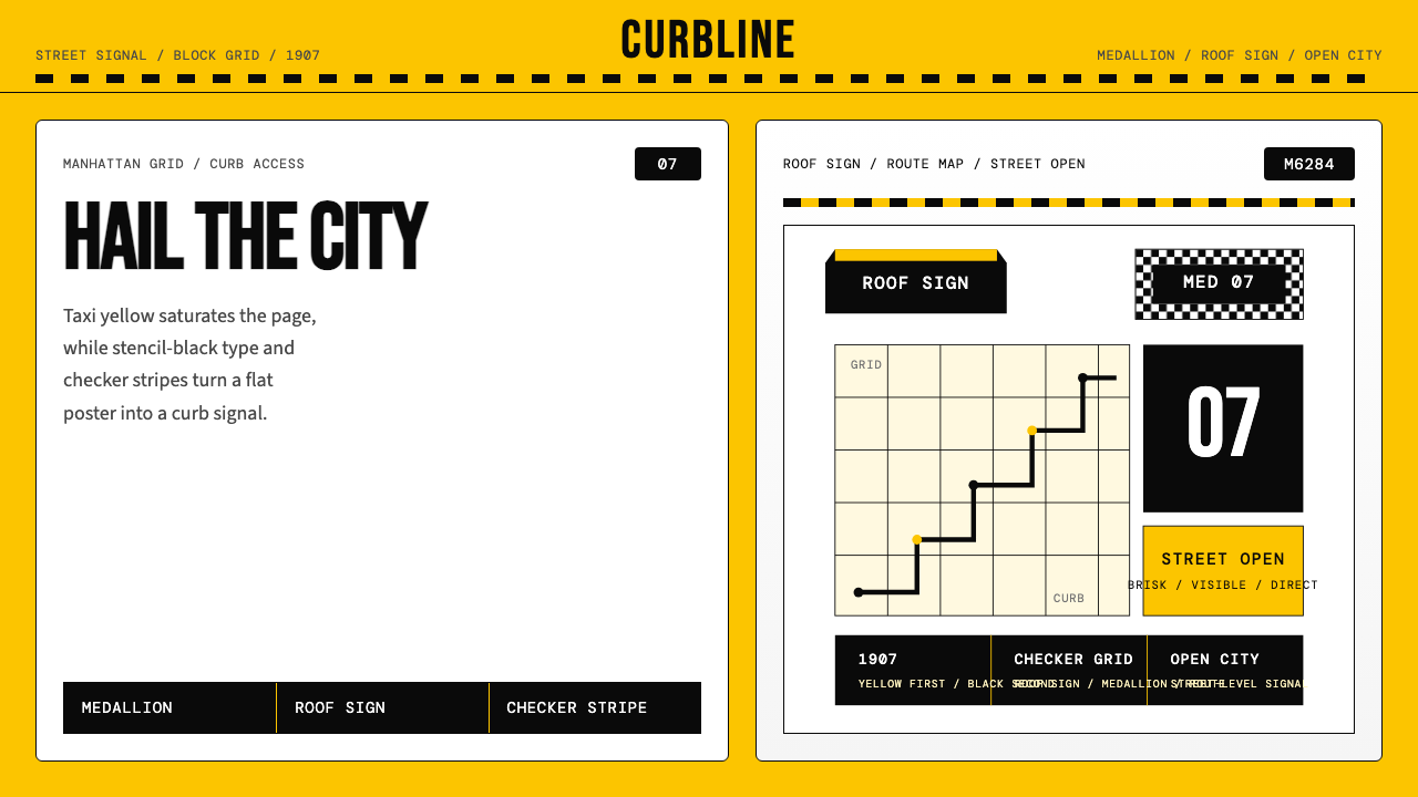 New York Yellow Cab (1907)Visibility is the brand. Taxi yellow, stencil type, checker stripes.可见性就是品牌。出租车黄、模板字与棋盘格定调。
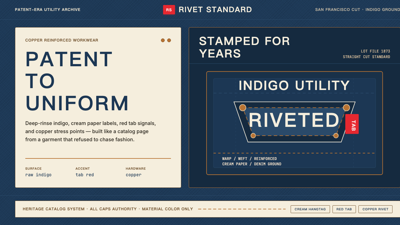 Levi's 501Utility becomes permanent. Indigo ground, cream hangtag panels, red tab and c…实用成为恒久。靛蓝底、奶油吊牌、红标与铜铆钉。
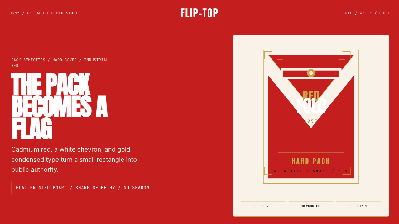 Marlboro Red Flip-Top (1955)Authority in one fold. Cadmium red, white chevron, and gold type read like a…一折成旗。镉红、白人字与金字排出强硬权威。
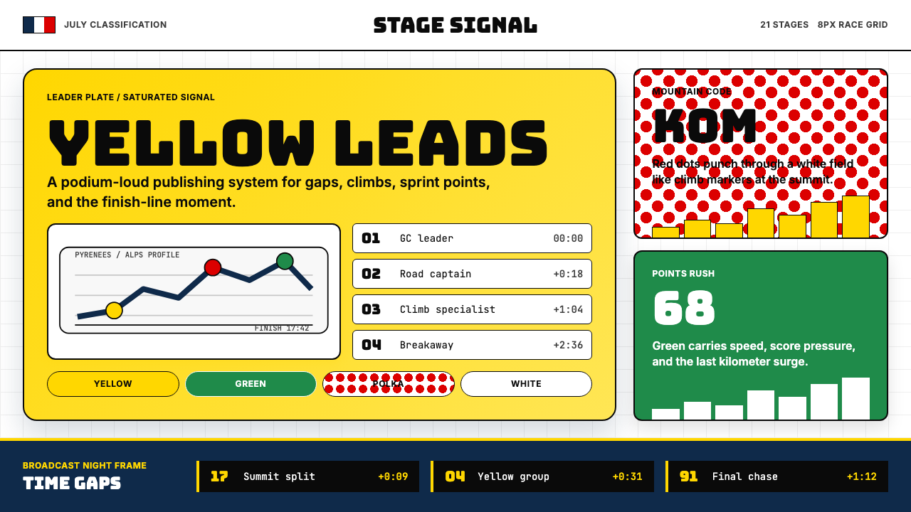 Tour de France (Yellow Jersey)Yellow owns the finish. Bungee type, polka dots, and navy tickers snap to an…黄衫统治终点:Bungee 字体、圆点红与海军蓝计时条咬合 8px 网格。
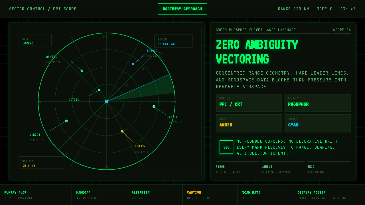 Air Traffic Control RadarOperational gravity. Phosphor green rings, sweep wedges, and monospace blips…军工级冷静:磷光绿同心环、扫描扇面与等宽光点建立零歧义。
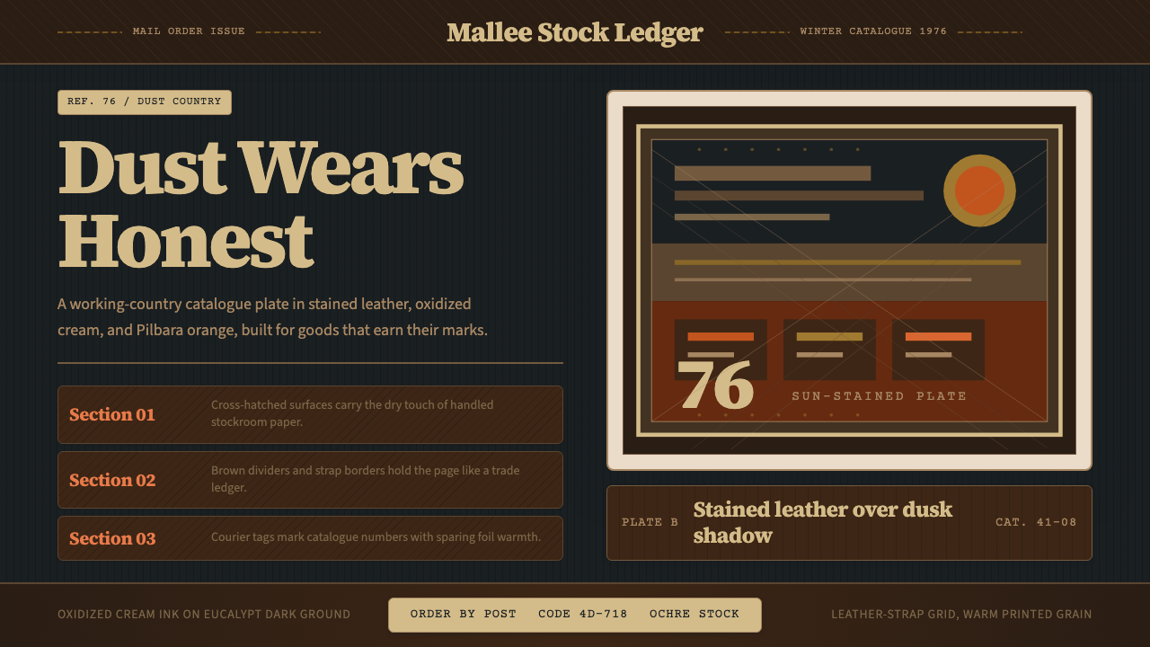 Akubra Outback (1970s Stockman)Worn honesty. Leather brown, Pilbara orange, and cream catalogue frames carry…诚实耐磨:皮革棕、赭橙与奶油目录框,承载粗粝质感。