What is Levi's 501?什么是 Levi's 501?
Since 1873, one pair of copper-riveted work pants has remained unchanged in cut while clothing gold miners, rebels, and rock stars alike — the 501 is not fashion, it is infrastructure.自1873年起,一条铜铆钉工装裤从未改变其基本剪裁,却先后穿在淘金客、叛逆者与摇滚巨星身上——501不是时尚,它是基础设施。
Levi's 501 in briefLevi's 501 速览
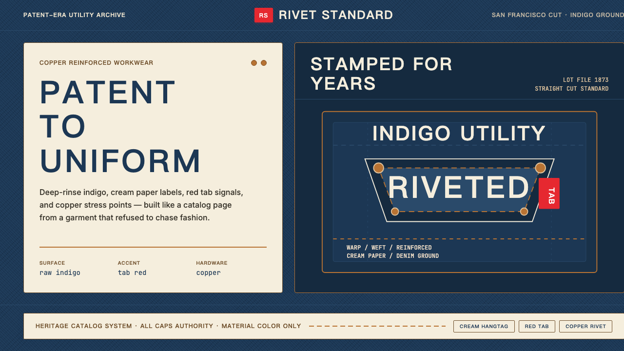
The Levi's 501 design system is built on a small number of irreducible visual decisions that have not fundamentally changed in over a century: a deep, saturated indigo ground that reads as both workwear and authority; a cream or off-white panel used wherever information must be legible against that dark field; a precisely sized red accent — the iconic pocket tab — that functions purely as a signature and navigation mark; and copper hardware whose warm, oxidized tone prevents the composition from reading as cold or industrial.Levi's 501设计系统建立在少数几个不可再简化的视觉决策之上,超过一个世纪以来从未根本改变:深邃而饱和的靛蓝底面,同时传递工装感与权威感;奶油色或米白色色块,专门用于深色底面上需要清晰传达信息的区域;精确比例的红色标签——那枚标志性的口袋标签——纯粹作为品牌签名与视觉定位点而存在;以及铜质五金件,其温暖的氧化色调使整体构图不致显得冰冷或工业化。
These four elements — indigo, cream, red tab, copper — operate as a system rather than a palette. Each carries a specific role. The indigo is the ground and mood: permanence, labour, authenticity. The cream panel is the content surface: receipts, hangtags, care labels, warranty cards — everything that must communicate clearly is printed on this field. The red tab is the action marker: it identifies ownership and brand at the smallest legible scale. The copper is the structural accent: rivets, buttons, and clasps that hold the object together and signal quality through material weight.这四个元素——靛蓝、奶油、红标、铜件——作为一个系统而非一组色板运转。每一个都承担明确角色。靛蓝是基底与情绪:恒久、劳动、真实。奶油色区域是内容承载面:收据、吊牌、洗涤标签、保修卡——所有必须清晰传达的信息都印在这一底面上。红标是识别标记:在最小可辨认的尺度下确立所有权与品牌身份。铜件是结构性强调:铆钉、纽扣与扣件将物件固定在一起,并通过材料质感传达品质信号。
Typography in the 501 system is condensed, all-capitals, and blunt. It descends from the commercial lettering traditions of late-nineteenth-century American trade printing — bold compressed letterforms that ensure legibility under dust, distance, and poor light. The sensibility is label, not logotype: authoritative, neutral, and almost bureaucratic. Nothing about the type style invites reading so much as it insists on being read.501系统的字体排印是窄体、全大写且直接的。它源自十九世纪末美国商业印刷的字牌传统——粗重的压缩字形,在灰尘、距离与昏暗光线下仍保持清晰度。其气质是标牌,而非商标:权威、中性,近乎官僚体制的存在感。字体风格中没有任何东西是邀请阅读的——它只是坚持要被看到。
Where does Levi's 501 come from?Levi's 501 从何而来?
The 501's origin is a practical document: United States Patent No. 139,121, granted on May 20, 1873, to Levi Strauss and Jacob Davis for the Improvement in Fastening Pocket-Openings. Davis, a Latvian immigrant tailor working in Reno, Nevada, had discovered that copper rivets placed at pocket corners and the base of the button fly could prevent the tearing that hard physical labour caused in ordinary cotton trousers. He wrote to Strauss — his fabric supplier in San Francisco — proposing to patent the idea jointly, since he could not afford the fourteen-dollar filing fee alone. Strauss agreed. The patent transformed workwear from a disposable consumable into a durable engineered object.501的起源是一份实用文件:1873年5月20日,美国专利局向李维·施特劳斯(Levi Strauss)与雅各布·戴维斯(Jacob Davis)授予第139,121号专利,专利名称为《口袋开口加固改进》。戴维斯是一位在内华达州里诺工作的拉脱维亚裔移民裁缝,他发现将铜铆钉钉在口袋角落与门襟底部,可以防止繁重体力劳动将普通棉布裤子撕裂。他写信给在旧金山的布料供应商施特劳斯,提议共同申请专利——因为他独自负担不起十四美元的申请费。施特劳斯同意了。这项专利将工装裤从一次性消耗品转变为耐久的工程化产品。
The model number 501 came later, assigned in 1890 as Levi Strauss & Co. began organizing its product line with lot numbers. The precise reason 501 was assigned to this particular cut is not documented, but the number became inseparable from the garment's identity as the company's core straight-leg, button-fly jean. For the first several decades, the 501 was sold almost exclusively to working men in the American West — miners, ranchers, and railroad workers who needed trousers that would survive the work rather than the wearer. The design changed only in response to material constraints: copper rivets were removed from the back pockets during World War II to preserve metal for the war effort, an absence that was made permanent after the war when it was discovered that the rivets scratched saddles and school furniture.501这个型号数字出现得更晚,于1890年在李维斯公司开始以批次编号整理产品线时被分配给这款裤型。为何恰好将501分配给这一款直筒剪裁、扣式门襟的牛仔裤,并无明确记录,但这个数字从此与产品身份密不可分,成为公司核心款式的代名词。最初数十年间,501几乎只卖给美国西部的劳动阶层男性——矿工、牧场主、铁路工人,他们需要的是比人更能承受劳损的裤子。设计的改变只来自物料限制:二战期间铜铆钉从后袋上移除,以节省战备金属;战后经发现铆钉会刮伤马鞍和学校课桌,这一缺席便被永久保留下来。
The garment's cultural meaning shifted decisively after World War II, when returning veterans and their teenage children adopted denim as a rejection of formal postwar conformity. Marlon Brando wore 501s in The Wild One (1953); James Dean wore them in Rebel Without a Cause (1955). These appearances transformed the 501 from workwear to iconography. The jeans were subsequently banned from many American schools and public buildings as a symbol of juvenile delinquency — which only accelerated their adoption. By the 1960s they had been absorbed into the aesthetics of folk music, student movements, and counterculture, and by the 1970s they were a genuine global phenomenon, commanding premium prices in European markets where denim was scarce.二战结束后,这件服装的文化意义发生了决定性转变。归国老兵及其青少年子女将牛仔布视为对战后正式循规主义的拒绝。马龙·白兰度(Marlon Brando)在《飞车党》(1953年)中身穿501;詹姆斯·迪恩(James Dean)在《无因的反叛》(1955年)中同样如此。这些银幕形象将501从工装转变为视觉图腾。随后,牛仔裤作为青少年不良行为的象征在许多美国学校和公共场所遭到禁止——这反而加速了它的传播。到1960年代,它已融入民谣音乐、学生运动与反文化的美学;到1970年代,它成为真正的全球现象,在牛仔布稀缺的欧洲市场售出高溢价。
The visual identity of the 501 system as it is recognized today was shaped primarily in the mid-twentieth century and refined in a major brand refresh around 2014. The red tab — introduced in 1936 to distinguish authentic Levi's product from imitations on retail shelves — became one of the most recognizable small brand marks in commercial history, recognizable at the scale of a thumbnail. The two-horse logo, depicting two horses pulling in opposite directions on a pair of jeans and failing to tear them, was first registered in 1886 and has appeared continuously on the leather patch at the back waistband ever since. Walter Landor, the San Francisco brand strategist whose firm worked with Levi's from the 1960s onward, helped systematize the brand's visual language for an era of global retail, establishing the proportional relationships and print standards that govern how the identity reproduces across packaging, retail environments, and advertising at scale. Chip Bergh, CEO from 2011, oversaw the contemporary repositioning that reaffirmed heritage authenticity as the brand's primary value in a competitive fast-fashion environment.501系统如今所呈现的视觉识别体系,主要在二十世纪中期成形,并在2014年前后的一次重大品牌更新中得到精炼。红色口袋标签——1936年引入,用于在零售货架上将正版李维斯与仿品区分开来——成为商业史上辨识度最高的微型品牌标记之一,即便缩至指甲大小仍可辨认。双马标志描绘两匹马向相反方向拉扯一条牛仔裤却无法将其扯断,首次注册于1886年,此后持续出现在后腰皮质标牌上,从未中断。旧金山品牌战略家沃尔特·朗多尔(Walter Landor)的公司从1960年代起与李维斯合作,帮助将品牌视觉语言系统化,以适应全球零售时代,建立起支配包装、零售空间与大规模广告中识别体系复制的比例关系与印刷标准。2011年起担任首席执行官的奇普·博格(Chip Bergh)主导了当代品牌重新定位,在竞争激烈的快时尚环境中重新确立传承真实性作为品牌核心价值。
What defines the Levi's 501 look?Levi's 501 的视觉特征是什么?
Indigo Ground靛蓝底面
The dominant surface is a deep, rinse-faded indigo — not navy, not black, not a decorative blue, but the specific blue of selvedge denim that has been dyed in natural indigo and worn in. This tone carries associations of labour and age that a clean, flat blue does not. In the design system it functions as both background and mood-setter: it makes everything placed on or against it — cream, red, copper — appear earned rather than applied.主导底面是一种深邃的水洗靛蓝——不是藏青,不是黑,不是装饰性的蓝,而是经天然靛蓝染色、历经穿用后那种特定的布边牛仔蓝。这一色调携带着劳动与岁月的联想,是平整纯净的蓝色所不具备的。在设计系统中,它同时充当背景与情绪设定者:置于其上或对其的一切——奶油、红、铜——看起来都是经历过的,而非附加上去的。
Cream Content Panel奶油信息区域
Wherever legible information must appear — hangtag, care label, waistband patch, receipt — the 501 system shifts to a cream or warm off-white ground. This is not a neutral white; it carries the warmth of unbleached cotton and aged paper, reinforcing the heritage character. The contrast between the deep indigo field and the cream panel is high enough for clear reading while remaining within the system's warm, earthy temperature. This panel is the document surface of the design language.凡是需要清晰传达信息之处——吊牌、洗涤标签、腰带皮牌、收据——501系统都切换至奶油色或暖米白色底面。这不是中性的白色;它携带着未漂白棉布与旧纸的温度,强化了传承感。深靛蓝底面与奶油色区域之间的对比度足以保证清晰阅读,同时保持在系统整体的暖调、大地温度之内。这一区域是设计语言的文件承载面。
Red Tab Accent红标强调
The red tab — a small folded cloth label sewn into the right rear pocket seam since 1936 — is the most concentrated point of brand identity in the system. It introduces the only vivid warm accent into an otherwise subdued palette, and it does so at the smallest scale: a mark no larger than a fingernail that nonetheless reads unmistakably at a distance. In the broader design system, red is used with the same discipline: reserved for a single identifiable action, call-to-action, or brand mark per composition, never as a general accent throughout.红色标签——自1936年起缝入右后袋接缝处的一小块折叠布标——是整个系统中品牌识别最集中的节点。它将整套原本低调的色板中唯一鲜明的暖色强调引入最小尺度:一个不超过指甲大小的标记,却在距离之外同样清晰可辨。在更广泛的设计系统中,红色以同等纪律使用:每一个构图中只保留给单一可识别的行动标记、行动号召或品牌标志,绝不泛用为通用强调色。
Copper Hardware Warmth铜件暖调
The copper rivets and buttons are structural elements — they hold the garment together — but they also serve an important tonal function in the visual system. Their warm, slightly oxidized metallic quality prevents the deep indigo from reading as cold or severe, and they bridge the palette between the blue-black ground and the warm cream panels. In digital and print applications of the system, copper-toned metallic accents or warm amber tones perform the same thermal balancing function.铜铆钉与铜纽扣是结构性元件——它们将衣物固定在一起——但在视觉系统中同样承担着重要的色调功能。其温暖、略带氧化的金属质感防止深靛蓝显得冷峻或严酷,并在蓝黑底面与暖奶油色区域之间架起色调桥梁。在系统的数字与印刷应用中,铜调金属感强调或暖琥珀色调执行同样的热度平衡功能。
Condensed All-Capitals Typography窄体全大写排印
Text in the 501 system is set tight, narrow, and entirely in capitals. This follows the visual logic of late-nineteenth-century American label printing, where information needed to be dense and legible on small surfaces under poor conditions. The all-caps format removes hierarchy within words and creates a uniform texture — every line reads as a declaration rather than a sentence. Line spacing is tight; letter spacing is optically adjusted but never airy. The overall effect is of text as stamp rather than text as prose.501系统中的文字排印紧凑、窄体、全部大写。这遵循十九世纪末美国标签印刷的视觉逻辑——信息需要在恶劣条件下的小尺寸表面上做到密集且清晰。全大写格式消除了单词内的层级关系,形成均匀的文字肌理——每一行都像宣言而非句子。行距紧凑;字距经过视觉调整,但绝不宽松。整体效果是文字作为印鉴,而非文字作为散文。
Heritage Label Composition传承标牌构图
Layouts in the 501 system are organized around the logic of the physical label: a bordered rectangle containing stacked lines of condensed type, possibly a logo or mark at top, and the essential information below in descending size. This is not grid-based composition in the contemporary sense — it is closer to the certificate or the typographic broadside. Borders are functional, not decorative; they define the edge of the content field. The composition is symmetrical within its rectangle but the rectangle itself may be asymmetrically placed against the ground.501系统中的版面构图围绕实物标牌的逻辑组织:一个带边框的矩形,内含叠排的窄体文字行,顶部可能是商标或标志,其下是按降序尺寸排列的核心信息。这不是当代意义上的网格化构图——它更接近证书或排版宽幅印刷品。边框是功能性的,而非装饰性的;它们界定内容区域的边界。构图在矩形内部是对称的,但矩形本身可能不对称地置于底面之上。
Material Authenticity材料真实性
The 501 system resists simulation. Textures referenced are real textures — denim weave, unbleached paper, oxidized metal — rather than digitally generated surfaces approximating these materials. In application, this means avoiding surface treatments that mimic materials without the material logic: a photographic denim texture used as a decorative pattern is a pastiche; a solid indigo field that refers to denim in tone and weight is authentic. The system's authority comes from restraint and directness, not from decorative reference.501系统抵制模拟。所引用的质感是真实质感——牛仔布纹、未漂白纸张、氧化金属——而非数字生成的近似表面。在应用中,这意味着避免使用模仿材料外观却缺乏材料逻辑的表面处理:将牛仔布照片纹理用作装饰图案是拼贴仿制;而一块在色调与视觉分量上指向牛仔布的纯靛蓝色块则是真实的。系统的权威来自克制与直接,而非装饰性引用。
Who shaped Levi's 501?谁塑造了 Levi's 501?
Levi Strauss emigrated from Bavaria to New York in 1847 and arrived in San Francisco in 1853, where he established a dry-goods wholesale business supplying merchants throughout the American West. When Jacob Davis proposed the copper-rivet patent in 1872, Strauss provided both the financial backing and the manufacturing infrastructure. His company's San Francisco base — far from the Eastern textile establishment — meant that the product's identity was rooted in frontier utility from the start. Strauss never married; his company passed to his nephews, who maintained the family control that kept the Levi Strauss & Co. identity stable and commercially consistent through periods of fashion pressure that destroyed comparable brands.李维·施特劳斯1847年从巴伐利亚移民至纽约,1853年抵达旧金山,在那里建立了一家向美国西部各地商人供货的干货批发生意。1872年雅各布·戴维斯提出铜铆钉专利合作时,施特劳斯提供了资金支持与制造基础设施。公司在旧金山的根基——远离东部纺织业中心——使产品的身份从一开始就植根于边疆实用主义。施特劳斯终身未婚;公司传给其外甥,他们维持的家族控制使李维斯公司的品牌识别在时尚压力足以摧毁同类品牌的时期保持了稳定而一致的传承。
Jacob Davis was the actual inventor of the copper-rivet reinforcement. A tailor by trade, he had been buying denim cloth from Levi Strauss's wholesale business and sewing work garments for labourers in Reno. After a customer — reportedly the wife of a woodcutter — repeatedly returned with torn trousers, Davis experimented with placing copper rivets at stress points. He produced his first riveted trousers in 1870 or 1871 and had sold around two hundred pairs before contacting Strauss. After the patent was granted, Davis moved to San Francisco to oversee production as Strauss's factory superintendent, a role he held until his death in 1908. His contribution was practical engineering applied to a garment problem; the design insight was entirely functional.雅各布·戴维斯是铜铆钉加固技术的真正发明者。作为一名职业裁缝,他一直向李维斯批发业务购买牛仔布,并为里诺的劳工缝制工装。在一位顾客——据说是一名伐木工的妻子——反复拿着撕裂的裤子回来修补之后,戴维斯开始尝试在受力点钉上铜铆钉。他在1870或1871年制作了第一条铆钉裤,并在联系施特劳斯之前已售出约两百条。专利获批后,戴维斯迁往旧金山担任施特劳斯工厂的生产总监,直至1908年去世。他的贡献是将实用工程学应用于一个服装问题;设计洞见完全是功能性的。
Walter Landor founded his brand design firm in San Francisco in 1941, making it a near neighbour — both geographically and culturally — to Levi Strauss & Co. Landor's work with Levi's, spanning decades from the 1960s onward, focused on translating the brand's heritage visual language into systems that could operate consistently across mass retail, international markets, and advertising at scale. His contribution was not to invent the 501's iconography — the rivets, the red tab, the two-horse patch were all pre-existing — but to codify the proportional relationships, the typographic standards, and the color hierarchies that make the system reproducible and defensible. Landor's broader influence on American corporate identity design also shaped how heritage brands across industries learned to systematize authenticity.沃尔特·朗多尔于1941年在旧金山创立其品牌设计公司,在地理与文化上都与李维斯公司相近。朗多尔与李维斯从1960年代起长达数十年的合作,聚焦于将品牌的传承视觉语言转化为能在大众零售、国际市场与大规模广告中保持一致运作的系统。他的贡献不是发明501的图腾符号——铆钉、红标、双马标牌都已先行存在——而是将支配系统可复制性与可防御性的比例关系、排印标准与色彩层级加以编码。朗多尔对美国企业识别设计的更广泛影响,也塑造了各行业传承品牌学习系统化真实性的方式。
Chip Bergh became CEO of Levi Strauss & Co. in 2011, inheriting a brand whose heritage was widely recognized but whose commercial position had eroded in the face of fast fashion and premium denim competitors. His tenure prioritized returning to the 501's core identity: authentic, durable, and direct. The brand refresh overseen during his leadership — including tightened visual standards, a renewed emphasis on the made-in-USA heritage narrative, and the relaunch of the 501 as a cultural rather than purely commercial object — helped position the company for its 2019 IPO. Bergh's strategic contribution was demonstrating that a heritage brand's visual restraint and historical consistency were competitive assets rather than liabilities in an era of brand proliferation.奇普·博格于2011年出任李维斯公司首席执行官,接手的品牌传承广为认知,但在快时尚与高端牛仔裤竞争者的夹击下,商业地位已有所侵蚀。他的任期将重心放在回归501核心身份上:真实、耐久、直接。他主导的品牌更新——包括收紧视觉标准、重新强调美国制造的传承叙事,以及将501重新定位为文化对象而非纯粹商业产品——帮助公司为2019年的IPO做好准备。博格的战略贡献在于证明:在品牌泛滥的时代,传承品牌的视觉克制与历史一致性是竞争资产,而非负担。
How do you use Levi's 501 today?今天怎么用 Levi's 501?
The 501 design system is highly transferable to contemporary design work precisely because its logic is material rather than fashionable. Applying it correctly requires understanding the roles of each element — indigo as ground and mood, cream as content field, red as singular accent, copper as thermal counterweight — and maintaining those role boundaries rigorously rather than using the palette as a general color scheme. The most common failure mode is treating the four elements as interchangeable decorative options rather than a system with internal grammar.501设计系统之所以高度可移植于当代设计实践,恰恰因为其逻辑是材料性的,而非时尚性的。正确应用它,需要理解每个元素的角色——靛蓝作为基底与情绪,奶油色作为内容承载面,红色作为单一强调,铜色作为热度对衡——并严格维护这些角色边界,而不是将色板作为通用配色方案使用。最常见的失败模式,是将四个元素视为可互换的装饰选项,而非一套具有内在语法的系统。
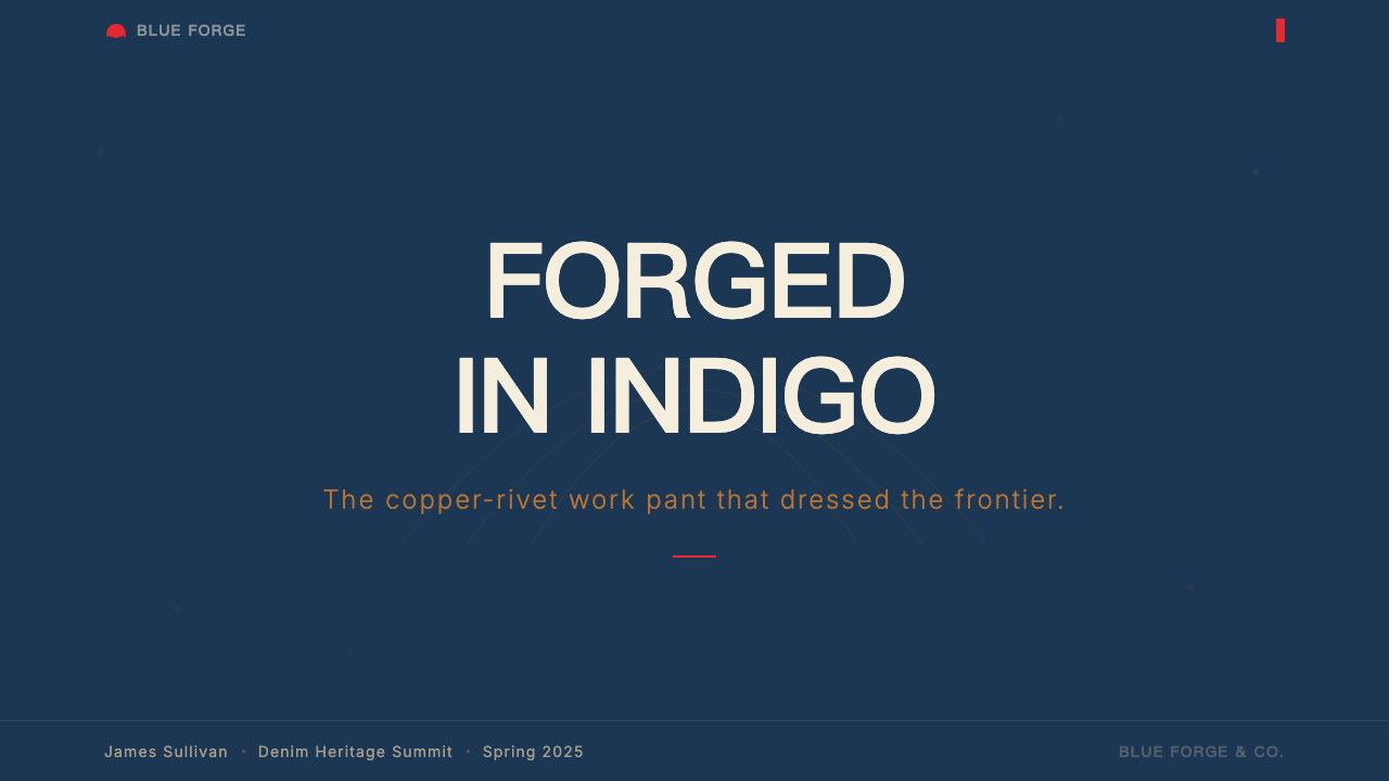
For presentation slides, the 501 system works exceptionally well on cover pages and section dividers where a strong visual statement is needed. A cover might be built around a near-full-bleed indigo field with the title set in condensed all-caps cream type, a single red accent mark positioned as a tab or badge at one edge, and copper-toned metallic treatment on a logo or numbering element. Content slides are best treated differently: move to a cream or near-white ground for the body, use the indigo as a heavy header band or a strong left-margin accent bar, and reserve red for a single call-out or live data figure per slide. Data visualizations — bar charts, progress indicators, comparison tables — should use indigo as the primary fill, cream as the background field, and red only for the single most critical value or threshold line.在演示文稿中,501系统在需要强烈视觉陈述的封面页与章节分隔页上表现出色。封面可以建立在近满版靛蓝底面上,标题以奶油色窄体全大写字体排印,单一红色标记如标签或徽章状定位在一侧边缘,商标或编号元素施以铜调金属处理。内容页则最好换一种方式:将底面切换为奶油色或近白色,用靛蓝作为厚重的页眉色带或有力的左边距强调条,每张幻灯片只为单一引用标注或关键数据数字保留红色。数据可视化——柱状图、进度指示器、对比表格——应以靛蓝为主要填色,奶油色为背景底面,红色仅用于单一最关键的数值或阈值线。
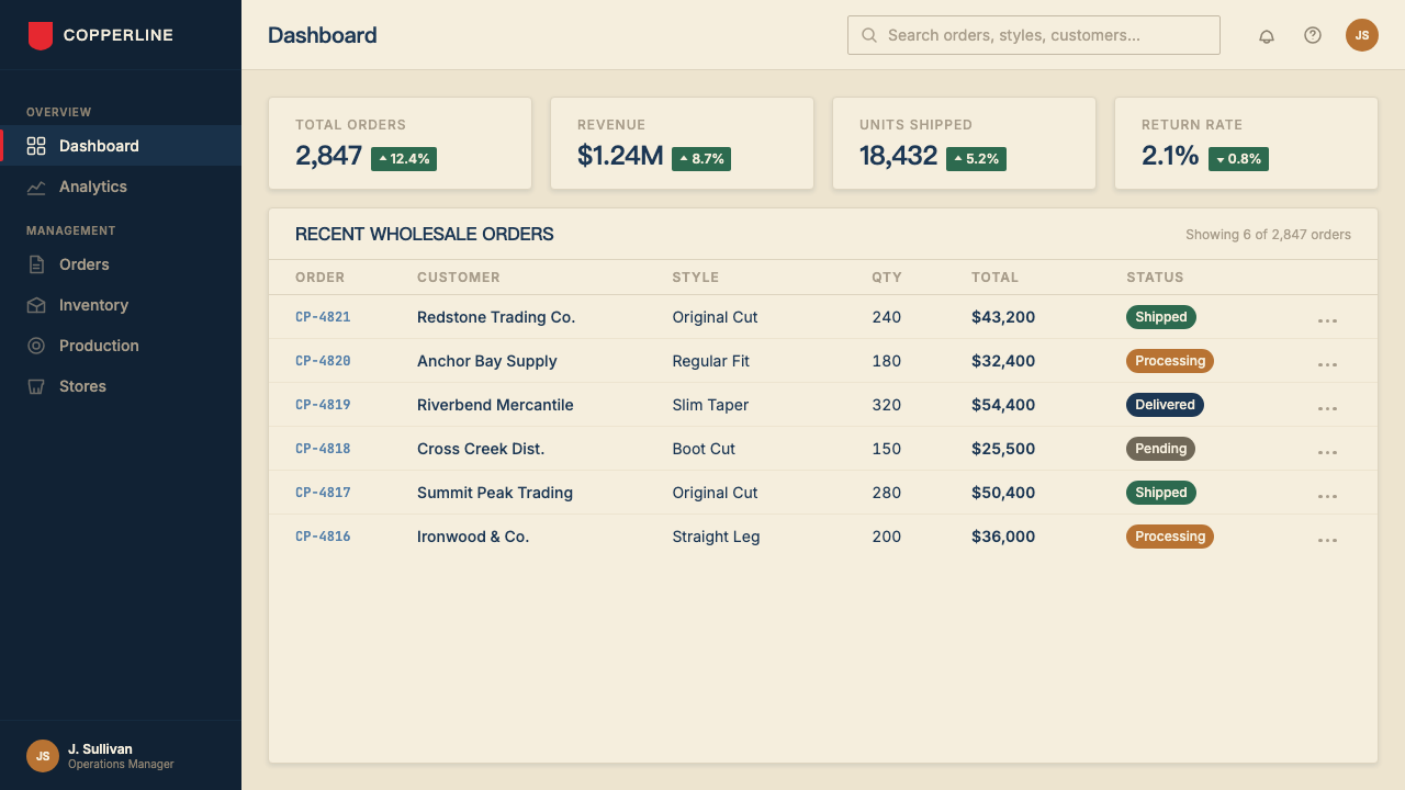
For web interfaces and dashboards, the system translates well to utility-forward products: analytics tools, inventory management, logistics platforms, and financial applications where the user needs to extract information quickly under pressure. The approach is to build the primary navigation and header in deep indigo, use cream or near-white for the main content area, and apply the red accent to a single interactive state — primary action button, active tab indicator, critical alert — per screen. Typography should be condensed and authoritative throughout the UI, with hierarchy established through weight and capitalization rather than multiple typeface families. Hard-edged card separators and bordered table cells read more authentically in this system than soft shadows and rounded corners.对于网页界面与仪表板,该系统很好地适配功能优先的产品:分析工具、库存管理、物流平台,以及用户需要在压力下快速提取信息的金融应用。做法是以深靛蓝构建主导航与页眉,用奶油色或近白色覆盖主要内容区域,每个屏幕只将红色强调应用于单一交互状态——主行动按钮、激活标签指示器、关键警报。整个界面的排印应保持窄体与权威感,通过字重与大写来建立层级,而非使用多个字体家族。在这个系统中,硬边卡片分隔线与带边框的表格单元格,比柔和阴影与圆角更具真实感。
For editorial and marketing work, the 501 system supports a strong heritage-brand narrative. Feature pages can alternate between indigo-ground sections with cream type and cream-ground sections with indigo type, using the inversion to create visual rhythm without introducing new colors. Pull quotes and callout statistics benefit from the red-tab treatment: a small red rectangle beside or beneath a large-scale figure functions exactly as the pocket tab does on the garment — a small, confident mark that identifies the most important element on the page. Marketing pages directed at establishing authenticity and durability as brand values are well served by this system; pages that need to communicate warmth, softness, or playfulness are not.对于编辑与营销内容,501系统有力支撑传承品牌叙事。特性页面可以在靛蓝底奶油字的区块与奶油底靛蓝字的区块之间交替,利用反转制造视觉节奏,而无需引入新色彩。引言语与标注统计数字适合红标处理:大尺寸数字旁边或下方放置的一个小红色矩形,其功能与服装上的口袋标签完全一致——一个小而自信的标记,识别出页面上最重要的元素。旨在建立真实性与耐久性为品牌价值的营销页面适合这套系统;需要传达温暖、柔软或趣味感的页面则不适合。
A common mistake when applying the 501 system is introducing visual noise in the name of richness: additional accent colors pulled from the indigo-denim color family, distressed or worn texture overlays applied decoratively, or multiple weight variants of condensed type competing on a single surface. The system's authority comes from restraint. Each element appears because it has a specific job; when an element has no job, it should not appear. Similarly, using a washed or desaturated indigo in place of the deep, saturated ground compromises the system's gravity — the indigo must read as material and permanent, not faded or provisional.应用501系统时常见的错误,是以丰富感为名引入视觉噪音:从靛蓝牛仔色系中拉出额外的强调色,装饰性地叠加做旧或磨损的肌理效果,或在单一表面上让多个字重的窄体字互相竞争。系统的权威来自克制。每个元素出现,是因为它有具体的工作;当一个元素没有工作时,它就不应出现。同样,用水洗或去饱和的靛蓝替代深邃、饱和的底面,会损害系统的分量——靛蓝必须读作材料性的、永久的,而非褪色的或暂时的。
Levi's 501 — FAQLevi's 501 · 常见问题
Is the 501 system the same as a general denim or Americana aesthetic?501系统与泛泛的牛仔或美国风格审美是同一回事吗?
No. The 501 system is more specific and more restrained than a general denim or Americana aesthetic. Denim as a decorative theme often incorporates distressed textures, patchwork motifs, vintage photography, and a wide warm-brown earth palette that references the American West broadly. The 501 system uses none of these: it is an indigo field, a cream panel, a red tab, and condensed capitals. Its references are industrial and documentary rather than folkloric. A page designed in a general denim aesthetic might feel rustic and warm; a page designed in the 501 system should feel authoritative and permanent, closer in spirit to a utility patent or a government stamp than to a vintage poster.不是。501系统比泛泛的牛仔或美国风格审美更为具体、更为克制。作为装饰主题的牛仔布通常包含做旧肌理、拼接图案、复古摄影,以及广泛引用美国西部意象的大范围暖棕大地色板。501系统不使用其中任何一样:它是靛蓝底面、奶油色区域、红标与窄体全大写。它的引用是工业性的与文献性的,而非民俗性的。以泛泛牛仔美学设计的页面可能感觉粗朴而温暖;以501系统设计的页面应当感觉权威而永久,在精神上更接近实用专利或政府印鉴,而非复古海报。
Can the 501 system work on a light background, or does it require the dark indigo ground?501系统能在浅色背景上使用吗,还是必须要有深色靛蓝底面?
The system works on a cream or warm off-white ground — this is, in fact, the authentic surface for much of the 501's physical communication: hangtags, care labels, and the two-horse patch are all cream or paper-toned. On a light ground, indigo becomes the heavy structural accent rather than the field: wide header bands, thick ruled lines, heavy typographic elements. The red tab accent remains a single small mark. The copper warmth may need to be replaced with a warm dark brown or amber if full metallic treatment is not appropriate. What the system cannot accommodate gracefully is a cool, clinical white ground — that temperature belongs to a different design sensibility entirely.系统在奶油色或暖米白色底面上同样有效——事实上,这正是501大量实物传达材料的真实表面:吊牌、洗涤标签与双马标牌都是奶油色或纸张色调的。在浅色底面上,靛蓝变为厚重的结构性强调,而非整体底面:宽幅页眉色带、粗直线、重字体元素。红标依然是单一的小标记。如果全金属处理不合适,铜色温度可能需要用暖深棕或琥珀色替代。系统无法优雅容纳的,是冷调、临床感的纯白底面——那种温度属于完全不同的设计感性。
How should the 501 system handle imagery and photography?501系统应该如何处理图像与摄影?
Photography in the 501 system should be treated the way garment photography has historically been treated by the brand: direct, unapologetic, documentary in character rather than styled or conceptual. Images are best reproduced with high contrast against the indigo or cream ground — silhouetted, edge-cropped, or treated with a duotone approach that limits the image palette to the system's warm tones. Lifestyle imagery with soft natural light, warm glows, and ambient atmosphere works against the system's directness. The preferred photographic register is closer to a product specification sheet or an archival trade photograph than to an editorial fashion story. When in doubt, removing the image and using type alone will produce a more authentic result.501系统中的摄影应以品牌历史上处理服装摄影的方式加以对待:直接、毫不歉疚、记录性的,而非造型化或概念化的。图像最好以高对比度在靛蓝或奶油底面上呈现——轮廓剪影、边缘裁切,或以将图像色板限定在系统暖调之内的双色调方式处理。带有柔和自然光、温暖光晕与环境氛围的生活方式图像,与系统的直接性相悖。首选的摄影调性更接近产品规格表或档案贸易照片,而非时尚编辑故事。如有疑虑,移除图像、单独使用文字,往往会产生更真实的结果。
Does the 501 system suit consumer-facing products, or is it primarily a B2B or utilitarian register?501系统适合面向消费者的产品吗,还是主要适用于B2B或功能性场景?
The 501 system is unusual in that it operates successfully in both registers — but for a specific reason: the Levi's brand itself has historically occupied both the utilitarian and the aspirational simultaneously. The system works for consumer-facing products when the product wants to communicate permanence, authenticity, and anti-trend positioning. It works well for heritage goods, quality-over-quantity retail, professional tools, and any product whose value proposition is durability rather than novelty. It struggles in categories that depend on novelty, luxury warmth, or sensory softness: high-end beauty, artisan food, wellness, and children's products are typically mismatched. The question to ask is whether the product values the 501's specific associations — labour, permanence, no-nonsense utility — or whether it needs a different emotional register entirely.501系统不同寻常之处在于它在两种场景中都能成功运作——但有其特定原因:李维斯品牌本身历史上同时占据了功能性与渴望性两个维度。当产品希望传达永久性、真实性与反潮流定位时,该系统适用于面向消费者的产品。它在传承商品、质量优先于数量的零售、专业工具,以及任何价值主张是耐久而非新颖的产品上表现良好。它在依赖新奇感、奢华温度或感官柔软度的品类中表现欠佳:高端美妆、手工食品、健康产品与儿童产品通常与之不匹配。需要问的问题是:产品是否认同501的特定联想——劳动、永久、务实功能——还是它需要的是一套完全不同的情感语言。
What is the most important single principle to preserve when adapting the 501 system to a new medium?将501系统移植到新媒介时,最重要的单一原则是什么?
Role clarity. Each of the four primary elements — indigo ground, cream panel, red tab, copper accent — has a specific job, and that job should not be transferred to a different element or performed by two elements simultaneously. If the indigo is the ground, it should not also be used as a typographic accent on a cream page; if the red is the singular identifier, it should appear once per composition, not as a general highlight color. The system's strength comes from the fact that each element is unrepeatable in its role: you always know what you are looking at and why it is there. Breaking role clarity — even in service of variety or visual interest — collapses the system into a palette, and a palette without grammar is just decoration.角色清晰度。四个主要元素中的每一个——靛蓝底面、奶油色区域、红标、铜色强调——都有其特定工作,这一工作不应转移给其他元素,也不应由两个元素同时执行。如果靛蓝是底面,它就不应同时在奶油色页面上被用作字体强调;如果红色是单一识别标记,它就应在每个构图中只出现一次,而非作为通用高亮色。系统的力量来自每个元素在其角色中的不可替代性:你始终知道你在看什么,以及它为何在那里。打破角色清晰度——即便是以多样性或视觉趣味为由——会将系统坍塌为一组色板,而没有语法的色板只是装饰。
Related design styles相关设计风格
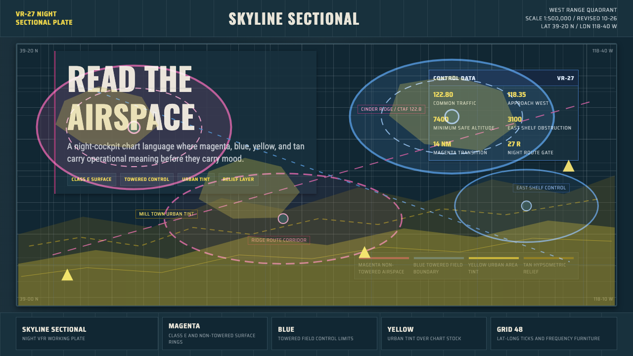 Aeronautical ChartReads like cockpit data. Magenta-blue airspace rings cut through dense dark-c…像座舱数据般可读:品红与蓝色空域环切入深色密集网格。
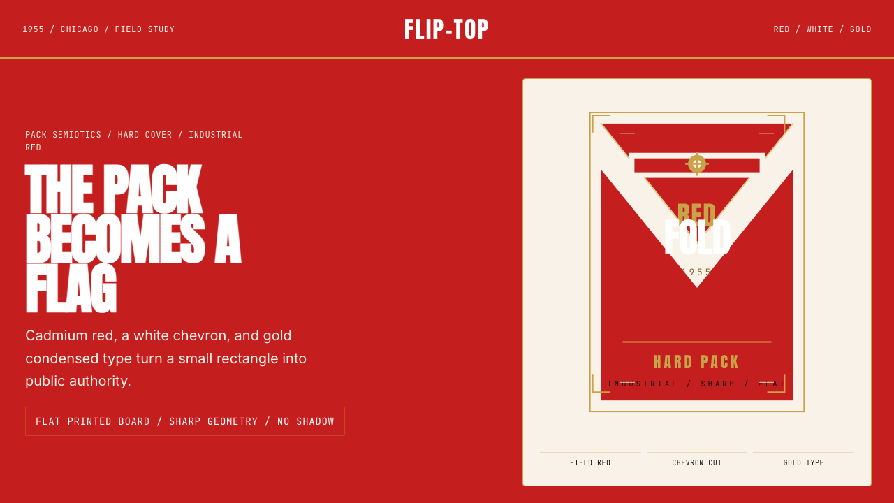 Marlboro Red Flip-Top (1955)Authority in one fold. Cadmium red, white chevron, and gold type read like a…一折成旗。镉红、白人字与金字排出强硬权威。
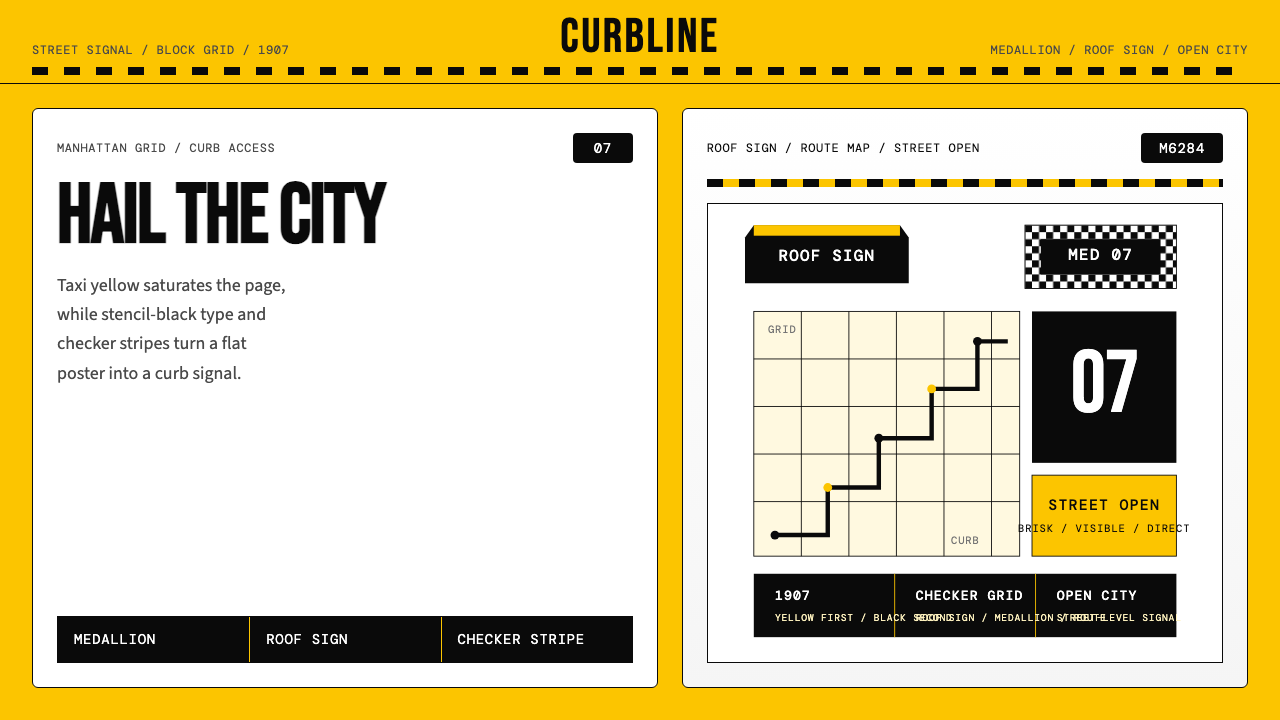 New York Yellow Cab (1907)Visibility is the brand. Taxi yellow, stencil type, checker stripes.可见性就是品牌。出租车黄、模板字与棋盘格定调。
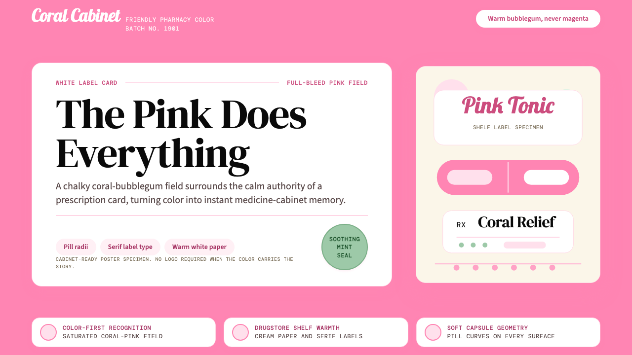 Pepto-Bismol Pink (1901)Color is the cure. Bubblegum pink floods the field; white label cards and pil…颜色就是招牌:泡泡糖粉铺满画面,白色标签卡和药丸弧度稳住信任。
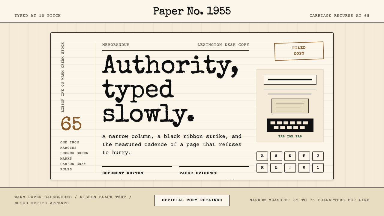 Typewriter Courier (1955)Unhurried authority. Cream paper, ribbon-black monospace, and bordered 65-cha…从容权威。奶油纸、色带黑等宽字与65字符边框节奏。
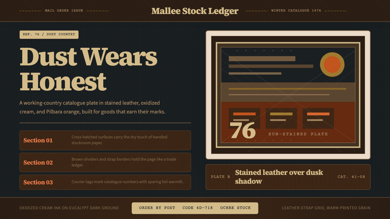 Akubra Outback (1970s Stockman)Worn honesty. Leather brown, Pilbara orange, and cream catalogue frames carry…诚实耐磨:皮革棕、赭橙与奶油目录框,承载粗粝质感。