What is Pepto-Bismol Pink (1901)?什么是 Pepto-Bismol Pink (1901)?
Since 1901, one saturated pink has done the work of an entire brand — proof that when a product's color is inseparable from the product itself, no logo is needed.自1901年起,一抹饱和的粉红完成了整个品牌的使命——当产品的颜色与产品本身融为一体,商标便成了多余。
Pepto-Bismol Pink (1901) in briefPepto-Bismol Pink (1901) 速览
Pepto-Bismol Pink is an American commercial color system rooted in the visual identity of the stomach-remedy brand launched in 1901. The defining hue is a warm, coral-tinged bubblegum pink — deeply saturated, never sugary-pale, never drifting toward magenta or lavender — that functions simultaneously as product color, packaging color, and brand identifier. It is one of the rare cases in design history where the color of a substance is the brand.碧托邦粉(Pepto-Bismol Pink)是一套根植于1901年胃药品牌视觉识别的美国商业色彩体系。其核心色调是一种温暖的、带有珊瑚调的泡泡糖粉——高度饱和,既非糖果般的浅淡,也不偏向洋红或薰衣草——同时承担着产品颜色、包装颜色与品牌标识三重身份。这是设计史上极少数「产品本身的颜色即品牌」的案例之一。
The system pairs that full-bleed pink field with white prescription-card surfaces, serif label typography borrowed from early twentieth-century American pharmacy conventions, and pill-shaped corner radii that echo the rounded forms of tablets and capsules. The result is a visual language that reads as simultaneously clinical and comforting — the warmth of the pink is domesticated by the orderliness of the white label and the quiet authority of serif letterforms.这套体系将那片满版粉红的底色与白色处方卡片式的表面、借鉴自二十世纪初美国药房惯例的衬线标签字体,以及呼应药片和胶囊圆润形态的药丸状圆角相结合。由此形成的视觉语言兼具临床感与安慰感——粉红的温暖被白色标签的井然秩序与衬线字体的内敛权威所驯化。
What distinguishes this aesthetic from broader candy-pink or millennial-pink trends is its specificity and its institutional weight. The pink is not decorative; it is diagnostic. It carries over a century of association with relief, trust, and the reassuring familiarity of the American medicine cabinet. Designers who borrow from it are borrowing not just a color but a feeling: the quiet confidence of something that has been on the shelf since your grandparents were children.使这套美学有别于更宽泛的糖果粉或千禧粉潮流的,是它的特殊性与制度性分量。这里的粉红不是装饰性的,而是诊断性的:它承载着一个多世纪与缓解、信任、以及美国家庭药箱亲切熟悉感的关联。借用它的设计师不只是在借用一种颜色,而是借用一种感受——一种从你祖父母还是孩子的时候就摆在货架上的东西所特有的安静自信。
See the Pepto-Bismol Pink (1901) design system查看 Pepto-Bismol Pink (1901) 完整设计系统
Where does Pepto-Bismol Pink (1901) come from?Pepto-Bismol Pink (1901) 从何而来?
The story begins in 1901 in Norwich, New York, where Dr. Wendell Lawrence compounded a pink oral suspension intended to treat infant cholera. The pink color was not a branding decision — it was a consequence of the formula's bismuth subsalicylate base reacting with trace minerals in the mixture. The product was initially sold as 'Bismosal: Mixture Cholera Infantum' by the Norwich Pharmacal Company, and for its first two decades it circulated primarily among physicians and pharmacists rather than general consumers.故事始于1901年的纽约州诺里奇。温德尔·劳伦斯医生在那里配制了一种用于治疗婴儿霍乱的粉色口服悬浮液。这种粉色并非品牌决策的产物——它是配方中次水杨酸铋基底与混合物中微量矿物质发生反应的结果。这款产品最初由诺里奇药业公司以「碧索多:婴儿霍乱混合剂」之名销售,在最初的二十年里主要在医生和药剂师之间流通,而非面向普通消费者。
Commercial mass marketing of the product began in earnest around 1919, and with it came the deliberate elevation of the pink into an identity asset. By the mid-twentieth century, Pepto-Bismol had become a fixture of American drugstore shelves, and its pink — warm, unmistakable, distinct from any competitor — had achieved the status of a trade color. The brand was acquired by Procter and Gamble in 1982, and P&G's brand-consistency discipline further standardized the shade across every touchpoint: bottle, label, television advertising, and eventually digital media.大约从1919年起,该产品开始进行大规模的商业推广,粉红色也随之被有意识地提升为品牌资产。到二十世纪中叶,碧托邦已成为美国药店货架上的固定陈列,其粉色——温暖、辨识度极高、与任何竞争对手截然不同——获得了商业色彩的地位。1982年,该品牌被宝洁公司收购;宝洁对品牌一致性的严格要求进一步将这种色调标准化,覆盖了从瓶身、标签到电视广告乃至数字媒体的每一个触点。
The visual system that evolved around the color drew heavily from early twentieth-century American pharmacy aesthetics: the serif typefaces of prescription labels, the white enamel surfaces of drugstore fixtures, the rounded edges of pill bottles and medicine cabinets. Walt Cunningham, credited as a key figure in formalizing the brand's visual language in the mid-twentieth century, helped translate these vernacular pharmacy references into a coherent commercial identity. The system was never avant-garde; its power came from familiarity and continuity.围绕这种颜色演化出的视觉体系大量借鉴了二十世纪初美国药房的美学:处方标签上的衬线字体,药店装置的白色搪瓷表面,药瓶与药箱的圆润边角。沃尔特·坎宁安被认为是二十世纪中叶将品牌视觉语言系统化的关键人物,他将这些来自药房的通俗视觉参照转化为连贯的商业身份。这套体系从未追求先锋——它的力量来自熟悉感与延续性。
By the time P&G assumed ownership, the pink had transcended mere product identification. It had entered American cultural memory as a shorthand for digestive comfort — appearing in film and television as a visual joke, a cultural reference, and a symbol of domestic medicine. This cultural saturation is itself a design phenomenon: a color so consistently deployed, over so long a period, that it achieves the rare status of a proprietary hue recognized without context. The design lesson is not about the pink itself but about the discipline of using one color, consistently, for a century.到宝洁接手时,这种粉色已超越了单纯的产品识别,进入了美国的文化记忆,成为消化道舒适感的视觉简语,在电影和电视中作为视觉梗、文化引用和家庭医药的符号反复出现。这种文化饱和度本身就是一种设计现象:一种颜色被如此一贯地、如此长期地使用,以至于达到了无需上下文即可被辨认的专属色调的罕见地位。其设计课题不在于粉色本身,而在于坚持用一种颜色、持续百年的那种纪律。
What defines the Pepto-Bismol Pink (1901) look?Pepto-Bismol Pink (1901) 的视觉特征是什么?
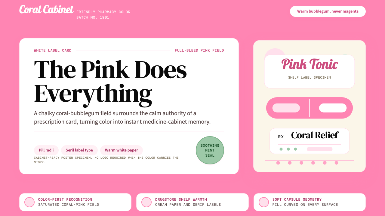
Color Field色彩底色
The system leads with a full-bleed pink ground — warm, coral-inflected bubblegum, saturated enough to read as bold in a crowded retail environment but soft enough to avoid aggression. The pink is never used as an accent; it is always the environment. White appears as the surface of label cards and information panels, creating sharp figure-ground contrast. No tertiary palette, no gradient transitions — the shift from pink to white is clean and immediate.这套体系以满版铺色的粉红底色为主导——温暖的、带珊瑚调的泡泡糖粉,饱和度足以在拥挤的零售环境中显眼,却又柔和到不具攻击性。粉红色从不作为点缀使用,它始终是背景环境。白色作为标签卡片和信息面板的表面出现,形成鲜明的图底对比。没有次要色板,没有渐变过渡——从粉红到白色的转换干净而直接。
Corner Radius圆角弧度
Rounded corners are not a decoration but a structural reference: every container, card, and panel echoes the pill capsule and the medicine bottle. The radius is generous — approaching a stadium or lozenge shape at smaller scales — so that even rectangular elements read as soft and pharmaceutical rather than sharp and bureaucratic. This rounding is consistent across all scales, from small data badges to large hero containers.圆角不是装饰,而是一种结构性引用:每一个容器、卡片和面板都呼应药丸胶囊和药瓶的形态。圆角弧度十分慷慨——在较小尺寸时接近椭圆形或菱形糖果的轮廓——使得即便是矩形元素也透出柔和的药品感,而非尖锐的官僚气息。这种圆角处理在从小型数据标签到大型主视觉容器的所有尺寸中保持一致。
Typography字体排印
Serif letterforms carry the weight of institutional trust. The typeface conventions derive from early American prescription label design: upright, legible, slightly condensed serifs that read as authoritative without being rigid. Labels are centered on white card surfaces, echoing the format of a pharmaceutical package insert or a vintage apothecary jar label. Display text is used sparingly; when it appears, its scale is large enough to anchor the composition without competing with the pink field.衬线字体承载着制度性信任的分量。字体惯例源自早期美国处方标签设计:直立、易读、略带紧缩感的衬线字体,既有权威感又不失亲和力。标签居中置于白色卡片表面,呼应药品说明书或复古药剂罐标签的版式。展示性文字使用节制;当其出现时,尺寸足够大以锚定构图,而不与粉红底色争抢视觉主导权。
Surface Vocabulary表面语汇
The white prescription card is the system's primary information container — a rectangular panel with rounded corners that floats on the pink field, suggesting a physical label affixed to a bottle. Multiple cards may stack or overlap slightly, creating the sense of layered pharmaceutical documentation. The surfaces are flat and matte in feeling; no glass effects, no gradients, no dimensional sheen. The card has a clinical cleanliness associated with medical environments.白色处方卡片是整套体系的核心信息容器——一块带圆角的矩形面板浮于粉红底色之上,仿佛一张贴在瓶身上的实体标签。多张卡片可以堆叠或略有重叠,营造出分层药品文件的感觉。表面在感受上是平整、哑光的——没有玻璃质感,没有渐变,没有立体光泽。卡片带有与医疗环境相关联的临床整洁感。
Iconography and Form图形与形态
Illustrative elements, when present, draw from the iconographic vocabulary of mid-century American pharmacy: pill shapes, capsule outlines, bottle silhouettes, and medicine spoon forms. These appear as flat, simplified line forms rather than detailed illustrations. The style is diagrammatic — enough detail to identify the object, no detail beyond that. Decorative illustration in the contemporary sense is absent; all graphic elements serve as functional signifiers.当出现插图元素时,其图形语汇来自二十世纪中叶美国药房的视觉传统:药丸形状、胶囊轮廓、瓶身剪影和药匙造型。这些以平面化、简洁的线形而非细致插画的方式呈现。风格具有示意图性质——足以辨认对象的细节,多余的细节一概省略。当代意义上的装饰性插图完全缺席;所有图形元素都承担功能性符号的角色。
Tone and Trust语调与信任
The overall affect is warm authority — the visual equivalent of a pharmacist who is both kind and competent. The pink signals approachability and domesticity; the serif type and clinical white surfaces signal knowledge and reliability. Neither register dominates: the system holds both in balance, which is precisely what makes it suitable for a health remedy consumed in moments of discomfort. The aesthetic never condescends to cheerfulness nor intimidates with austerity.整体气质是温暖的权威感——相当于一位既亲切又专业的药剂师在视觉上的呈现。粉红传递亲近感与居家感;衬线字体与临床白色表面传递知识与可靠性。两种感受都不占主导:这套体系将两者保持在平衡状态,这恰恰是它适合在不适时刻被使用的健康药物的原因所在。这套美学既不俯身迁就于欢快,也不以严肃冷漠令人望而生畏。
Temporal Depth时间厚度
The aesthetic carries visible age — not as decay but as continuity. Slight vintage warmth in the pink, reference to early twentieth-century type conventions, the pharmacy shelf as an organizing metaphor: together these create the impression of something that has been proven, not invented. This temporal quality is a design asset; it communicates that the system has survived long enough to be trusted, which is a rare thing to achieve through purely visual means.这套美学携带着可见的年岁——不是衰败,而是延续。粉红中轻微的复古暖调,对二十世纪初字体惯例的引用,以药店货架作为组织隐喻:这些元素共同创造出某种经过验证而非凭空发明之物的印象。这种时间性品质是一种设计资产;它传递出这套体系经历了足够长的时间而值得信任——这是极少数能通过纯粹视觉手段实现的表达。
See the Pepto-Bismol Pink (1901) design system查看 Pepto-Bismol Pink (1901) 完整设计系统
Who shaped Pepto-Bismol Pink (1901)?谁塑造了 Pepto-Bismol Pink (1901)?
Lawrence compounded the original pink bismuth mixture in Norwich, New York in 1901, initially as a treatment for infant cholera. His formula's accidental color — produced by the interaction of the active ingredient with trace minerals — became the visual foundation of a brand that would outlast every deliberate branding decision made in its wake. Lawrence represents the class of origin figures whose most consequential contribution was unintentional: he did not design a color; he made a medicine that happened to be pink.劳伦斯医生于1901年在纽约州诺里奇配制了最初的粉色铋剂混合液,最初用于治疗婴儿霍乱。配方的偶然颜色——由活性成分与微量矿物质相互作用产生——成为一个品牌视觉基础,并超越了此后所有刻意的品牌决策。劳伦斯代表了一类起源人物,其最具深远影响的贡献是无意为之:他没有设计一种颜色,他只是制造了一款碰巧是粉色的药物。
The pharmaceutical firm that first commercialized Lawrence's formula and began the deliberate process of building a consumer identity around the product's distinctive color. Norwich Pharmacal's early marketing efforts — transitioning the product from a physician-prescribed remedy to an over-the-counter consumer brand — established the conventions of white label on pink ground, serif pharmaceutical typography, and the reassuring visual grammar of the home medicine cabinet that the brand would carry for over a century.最早将劳伦斯配方商业化的制药公司,开始了围绕产品独特颜色建立消费者身份的刻意进程。诺里奇药业的早期营销努力——将产品从医生处方药转变为非处方消费品牌——确立了粉红底色上白色标签、衬线药品字体,以及家庭药箱令人安心的视觉语法,这些惯例品牌此后沿用逾百年。
P&G's 1982 acquisition of the brand brought the resources and brand-management discipline of one of the world's largest consumer goods companies to a color that had already been accumulating cultural weight for eight decades. P&G's contribution was standardization: the systematic locking of the pink across every medium, market, and production technology. In an era before comprehensive digital color management, maintaining consistent color across television, print, and physical packaging at global scale was a significant brand engineering achievement.宝洁公司1982年对该品牌的收购,将世界上最大的消费品公司之一的资源与品牌管理纪律,带给了一种已积累了八十年文化分量的颜色。宝洁的贡献在于标准化:在每一种媒介、市场和生产技术中系统性地锁定这种粉色。在全面数字色彩管理出现之前的时代,在全球范围内跨越电视、印刷和实体包装保持一致的颜色,是一项重要的品牌工程成就。
Credited with formalizing key elements of the brand's visual language in the mid-twentieth century, Cunningham worked to translate the vernacular conventions of American pharmacy aesthetics — the prescription label, the apothecary jar, the drugstore shelf — into a coherent branded system. His work represents the moment when the brand's color shifted from being an inherited accident to being a consciously managed asset, a transition that most long-lived brand colors must eventually make.沃尔特·坎宁安被认为在二十世纪中叶系统化了品牌视觉语言的关键要素,他将美国药房美学的通俗惯例——处方标签、药剂罐、药店货架——转化为一套连贯的品牌体系。他的工作代表了品牌颜色从偶然继承转变为被有意识管理的资产这一时刻,这是大多数长寿品牌色彩最终必须经历的转变。
How do you use Pepto-Bismol Pink (1901) today?今天怎么用 Pepto-Bismol Pink (1901)?
Pepto-Bismol Pink is a system built on a paradox: it uses a color strongly associated with playfulness and sweetness to communicate medical seriousness and institutional trust. Applying it well means holding both registers simultaneously. The pink should never feel clinical by itself — it is the white label surface, the serif type, and the pill-radius rounding that introduce the pharmaceutical authority. Strip any one of these elements and the system collapses toward either generic candy-pink or generic medical white.碧托邦粉是一套建立在悖论之上的体系:它使用一种与玩趣感和甜蜜感强烈关联的颜色,来传递医疗严肃性与制度信任感。正确应用它,意味着同时维持两种感受。粉红色本身不应给人以临床感——引入药品权威的,是白色标签表面、衬线字体和药丸弧度的圆角。抽去其中任何一个元素,这套体系便会倒向纯粹的糖果粉或普通的医疗白。
For presentation slides, the system is most effective as a cover and section-divider treatment. A full-bleed pink cover with a centered white card panel containing the title — set in a legible serif at generous scale — immediately signals warmth, confidence, and distinctiveness in a landscape dominated by neutral or dark presentation templates. Content slides should shift to a white or near-white ground with the pink appearing only as an accent — pill-shaped badges for labels, rounded containers for callout text, a pink rule as a section marker. Data slides work well with pink as the primary data color against white grounds, particularly for bar charts and donut diagrams where the rounded forms complement the system's aesthetic logic.在演示文稿中,这套体系作为封面和章节分隔页的处理方式最为有效。一张满版粉红的封面,居中放置一块包含标题的白色卡片面板——标题以清晰的衬线字体、充裕的字号排印——在一片中性色调或深色演示模板主导的环境中,立刻传递出温暖、自信与与众不同的气质。内容页应转换为白色或近白色底色,粉红仅作为点缀出现——用于标签的药丸形状标记、引用文字的圆角容器,或以粉红色线条作为章节分隔符。数据页面以粉红作为白底上的主要数据颜色效果良好,尤其适用于柱状图和环形图,其圆润造型与这套体系的形态逻辑相互呼应。
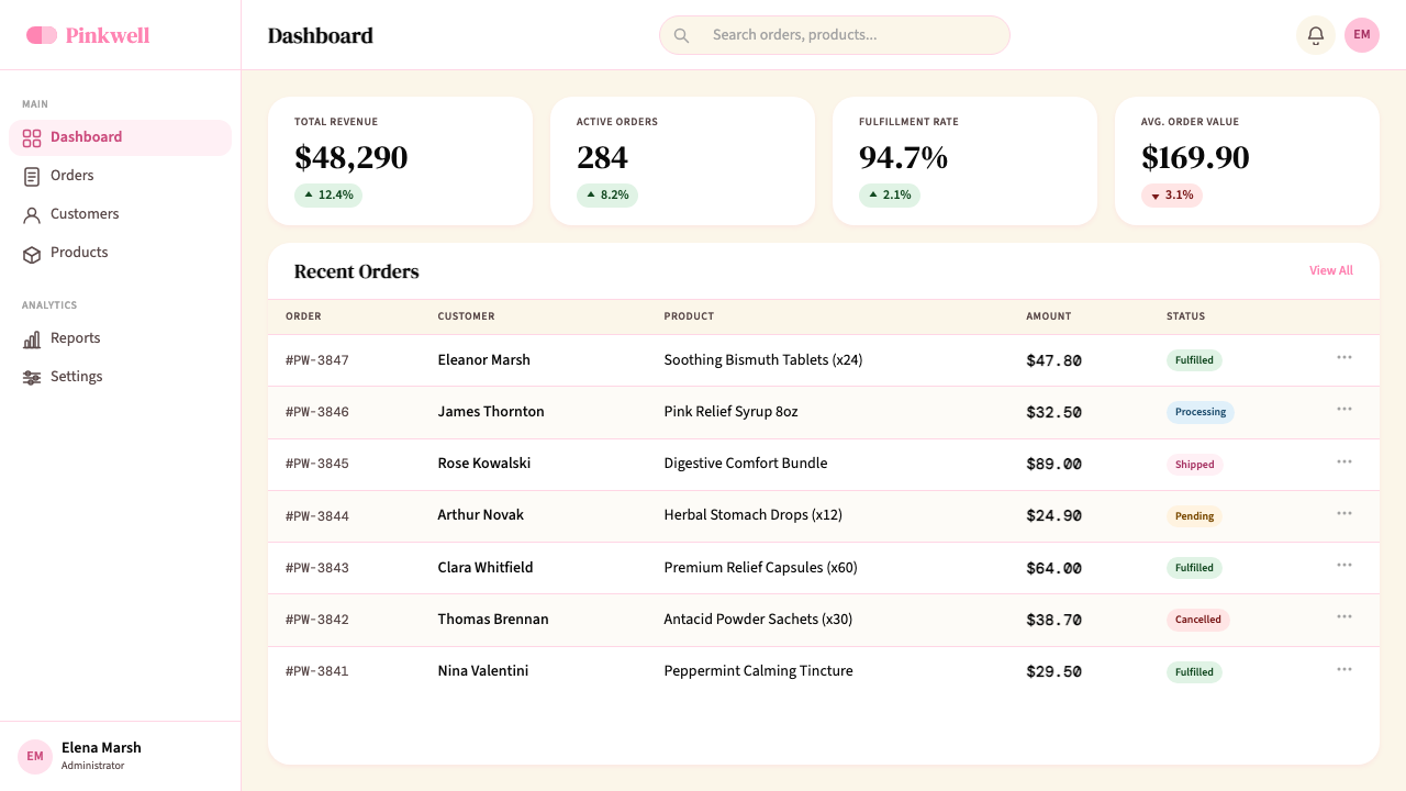
For web interfaces and dashboards, the system suits contexts where the user needs to feel both informed and reassured — health tracking applications, pharmacy e-commerce, wellness dashboards, and benefit or insurance pricing pages. The approach: use white as the primary background for data-dense content areas, deploy the pink as a header environment or hero background with white card containers floating within it, and use rounded corner radii throughout to maintain formal consistency. Navigation and interactive elements in this system should lean on the white-card vocabulary rather than introducing flat pink buttons, which can read as overly casual. Reserve pink button treatments for primary calls to action only.在网页界面和仪表板中,这套体系适合用户需要同时感到知情且被安抚的场景——健康追踪应用、药房电商、健康管理仪表板,以及保险定价页面。具体方法:以白色作为数据密集内容区域的主背景,将粉红用作页眉环境或主视觉背景,其中浮置白色卡片容器;全程保持圆角半径以维持形态一致性。这套体系中的导航和交互元素应倚重白色卡片语汇,而非引入纯色粉红按钮,后者容易显得过于随意。仅将粉红按钮处理方式保留给主要行动号召使用。
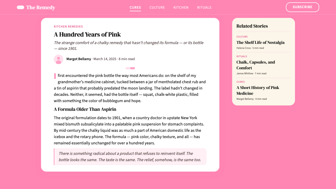
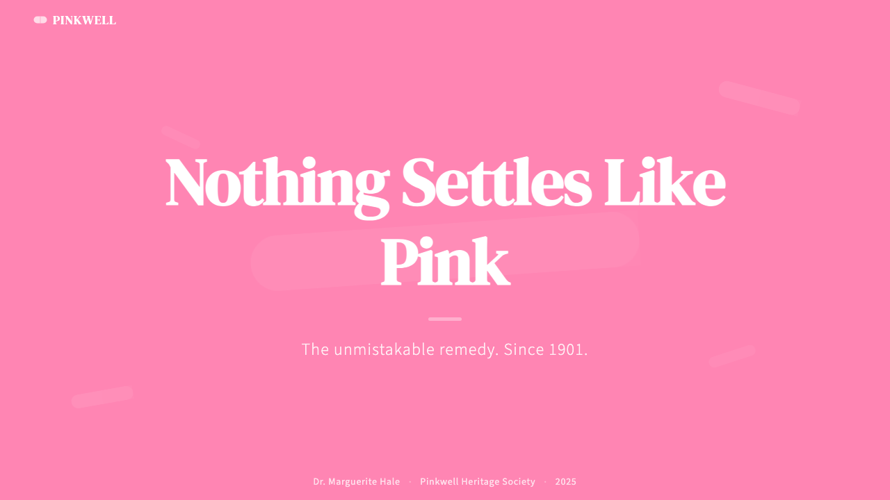
For editorial and marketing applications, the system's strongest register is the bold, full-bleed poster mode: pink saturating the entire background, a white label card centered or offset-centered in the composition, large serif type inside the card, and minimal supporting elements. This configuration works well for product launch announcements, healthcare campaign headers, and any editorial context where the design needs to arrest attention immediately. Marketing email headers in this mode perform well because the pink is distinctive enough to be recognizable in preview panes even at thumbnail scale. Pairing the system with clean, open white body-text areas in long-form content prevents the pink from fatiguing the reader.在编辑和营销应用中,这套体系最强势的表达方式是大胆的满版海报模式:粉红饱和整个背景,一块白色标签卡片居中或偏心置于构图之中,卡片内部是大号衬线字体,辅助元素极少。这种配置非常适合产品发布公告、医疗健康活动页头,以及任何需要立即抓住注意力的编辑场景。这一模式下的营销邮件页头表现良好,因为粉红足够醒目,即便在缩略图尺寸的预览框中也能被识别。在长篇内容中搭配干净开阔的白色正文区域,可以防止粉红令读者产生视觉疲劳。
A common mistake is pushing the pink too far toward either extreme: making it so pale that it loses its pharmaceutical specificity and becomes generic millennial pink, or so saturated and cool that it drifts toward magenta and loses the warmth that makes it trustworthy. A second frequent error is abandoning the serif typography and white card vocabulary in favor of sans-serif type directly on the pink ground — this produces something that feels more like a cosmetics brand or candy packaging than a health system. The pill-radius detail is also often underused; designers who apply round corners timidly produce something that reads as merely trendy rather than as a considered reference to the pharmaceutical form language that gives the system its meaning.一个常见错误是将粉红推向任意一个极端:使其过于浅淡,失去药品的特殊性,沦为普通千禧粉;或使其过于饱和且偏冷,偏向洋红,失去使其令人信任的暖调。第二个常见错误是抛弃衬线字体与白色卡片语汇,转而将无衬线字体直接置于粉红底色之上——这会产生更接近美妆品牌或糖果包装的观感,而非健康体系。药丸弧度这一细节也常常被低估使用;圆角处理过于保守的设计师,做出来的作品会显得只是追随了一种时髦,而非有意识地引用了赋予这套体系意义的药品形态语言。
See the Pepto-Bismol Pink (1901) design system查看 Pepto-Bismol Pink (1901) 完整设计系统
Pepto-Bismol Pink (1901) — FAQPepto-Bismol Pink (1901) · 常见问题
Is Pepto-Bismol Pink just millennial pink by another name?碧托邦粉只是千禧粉的另一个叫法吗?
No — and the distinction matters for application. Millennial pink (the soft, desaturated blush that dominated design from roughly 2016 to 2019) is a cool, low-energy hue that communicates softness and accessibility. Pepto-Bismol Pink is warmer, deeper, and more saturated — a coral-inflected bubblegum that carries institutional weight rather than lifestyle aspiration. Millennial pink says 'approachable luxury'; Pepto-Bismol Pink says 'trusted remedy'. Using one in a context that calls for the other produces a category mismatch that careful observers will sense even if they cannot name it.不是——这一区别对实际应用至关重要。千禧粉(大约在2016至2019年间主导设计的柔和、低饱和腮红色)是一种偏冷、低能量的色调,传递柔软感与亲近感。碧托邦粉则更温暖、更深沉、饱和度更高——一种带珊瑚调的泡泡糖粉,承载的是制度性分量而非生活方式的向往。千禧粉说的是「触手可及的轻奢」;碧托邦粉说的是「值得信赖的良药」。将其中一种用于呼唤另一种的场合,会产生品类错位,即便观者无法说出原因,也会有所感知。
Can this system work for brands outside healthcare and pharmacy?这套体系能否适用于医疗和药房以外的品牌?
Yes, but with awareness of what the color carries. The system's associations — comfort in discomfort, domestic familiarity, institutional trust — transfer well to food and beverage, insurance and financial products, hospitality, and any brand that wants to position itself as reliable and warmly authoritative rather than cool and aspirational. The risk lies in brands that operate in categories where the pharmaceutical association creates unintended connotations — for example, a premium fashion or spirits brand would likely find the medicine-cabinet reference undermining. The question to ask is: does your brand want to feel like something people reach for when they need help?可以,但需要对这种颜色所承载的联想保持清醒。这套体系的关联——不适时的慰藉、居家的亲切感、制度性的信任——能很好地迁移到食品饮料、保险与金融产品、酒店服务,以及任何想要将自己定位为可靠且温暖权威(而非冷酷向往)的品牌。风险在于那些在特定品类中运营的品牌——药房联想会带来意想不到的负面含义——例如,高端时尚或烈酒品牌很可能会发现这种家庭药箱的指涉在侵蚀品牌形象。需要问的问题是:你的品牌是否希望给人一种「人们在需要帮助时会伸手去拿」的感觉?
How do you keep the pink from feeling childish or kitsch?如何避免这种粉红显得幼稚或俗气?
The pink is held in check by three things: the serif typeface, the white clinical surface, and the restraint of the overall system. Remove any of these and the pink's playful associations take over. Practically: always pair the pink with at least one typographic element set in a legible upright serif rather than a rounded or script face; always provide white label surfaces as information containers rather than placing text directly on the pink ground; and resist the temptation to add secondary colors, gradients, or illustrative decoration that would push the system toward candy or cosmetics territory. The discipline of the white card is what keeps the whole composition medicinal rather than whimsical.三样东西制约着粉红的玩趣联想:衬线字体、白色临床表面,以及整套体系的克制。去掉任何一样,粉红的玩趣联想便会占据主导。具体做法:始终将粉红与至少一个使用直立衬线字体(而非圆体或手写体)的排版元素搭配;始终提供白色标签表面作为信息容器,而非将文字直接置于粉红底色之上;抵制添加辅助颜色、渐变或插图装饰的诱惑——这些会将体系推向糖果或美妆的领域。白色卡片的规律,正是使整个构图保持药品感而非奇思妙想感的关键所在。
Does the system work in dark mode or inverted layouts?这套体系能否用于深色模式或反转版面?
The canonical form is pink ground with white surfaces — a light-dominant system. Dark inversions are possible but require significant rebalancing. On a dark or near-black ground, the pink behaves differently: it loses the field-saturation that gives it authority and reads instead as a bright accent. A workable dark variant treats the dark background as the pharmaceutical container (evoking a dark glass medicine bottle rather than the white enamel shelf), uses the pink sparingly as a highlight and typographic accent, and maintains the serif type and rounded corners as the primary system identifiers. This is a different composition, not simply an inversion of the original.这套体系的经典形态是粉红底色配白色表面——一个以浅色为主导的体系。深色反转版本是可行的,但需要大幅重新平衡。在深色或近黑底色上,粉红的表现截然不同:它失去了赋予其权威感的底色饱和度,转而以明亮点缀的方式出现。一种可行的深色变体,将深色背景视为药品容器(唤起深色玻璃药瓶而非白色搪瓷货架的意象),节制地将粉红用作高亮和排版点缀,并以衬线字体和圆角保持系统的主要识别标志。这是一套不同的构图,而非简单的原版反转。
What makes this color system different from other pink brand systems?这套色彩体系与其他粉色品牌体系有何不同?
Most pink brand systems use pink as a personality signal — a marker of femininity, playfulness, luxury, or modernity. Pepto-Bismol Pink uses pink as a performance guarantee: the color promises the same thing the medicine promises. This is the distinction between a color that has been chosen for its associations and a color that has earned its associations through over a century of consistent deployment. The practical implication for designers is that this system carries pre-existing cultural credit: audiences over a certain age bring their own trust to it before any design element is processed. This is both its greatest strength (trust is hard to design from scratch) and its greatest constraint (the system cannot drift too far from its referents without cashing out the credit).大多数粉色品牌体系将粉色作为个性信号——女性气质、玩趣感、奢华感或现代感的标志。碧托邦粉则将粉色作为性能保证:这种颜色承诺与药物本身同样的东西。这是一种因联想而被选择的颜色,与一种通过超过一个世纪的持续使用而赢得其联想的颜色之间的区别。对设计师的实际意义在于:这套体系携带着预先存在的文化信用——特定年龄以上的受众在处理任何设计元素之前,就已经带来了自己的信任。这既是其最大的优势(信任极难从零设计),也是其最大的约束(这套体系无法偏离其参照物太远,否则便会透支信用)。
Related design styles相关设计风格
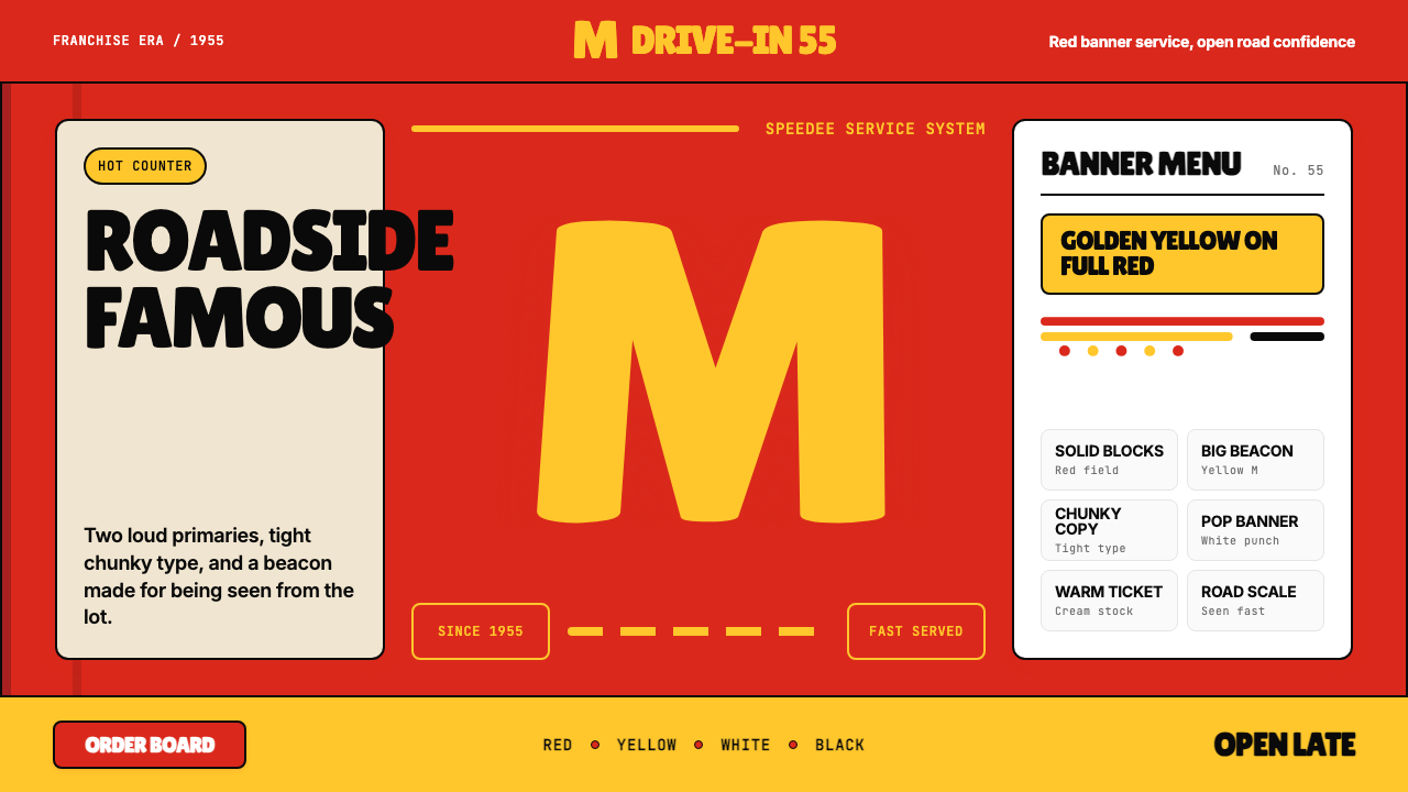 McDonald's Golden ArchesRoadside famous. Saturated red, hot yellow, and chunky type shout from 1955.路边即识别:饱和红、热黄与厚重字体喊出1955。
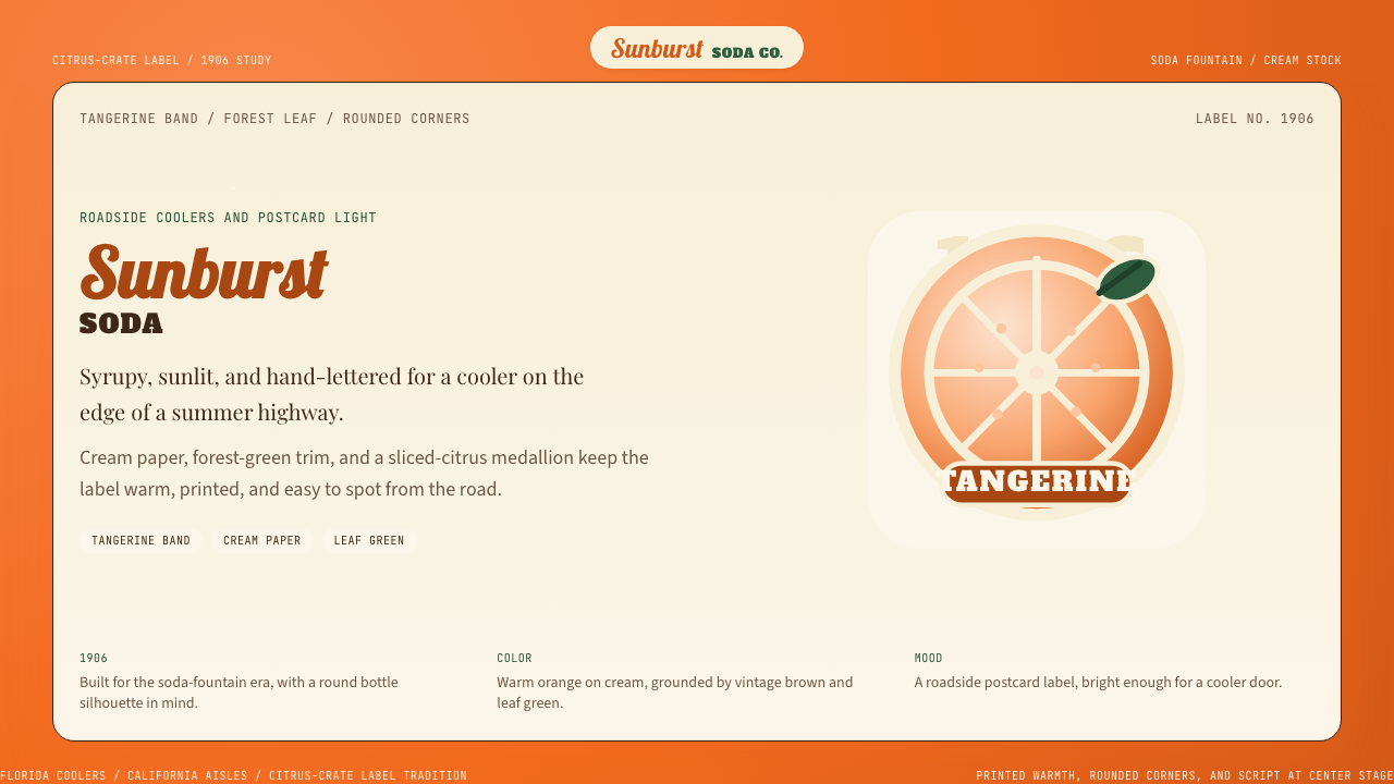 Orange Crush Soda (1906)Syrupy nostalgia. Tangerine, cream, and script make it a postcard label.糖浆般怀旧。橘红、奶油纸与手写体把标签变成明信片。
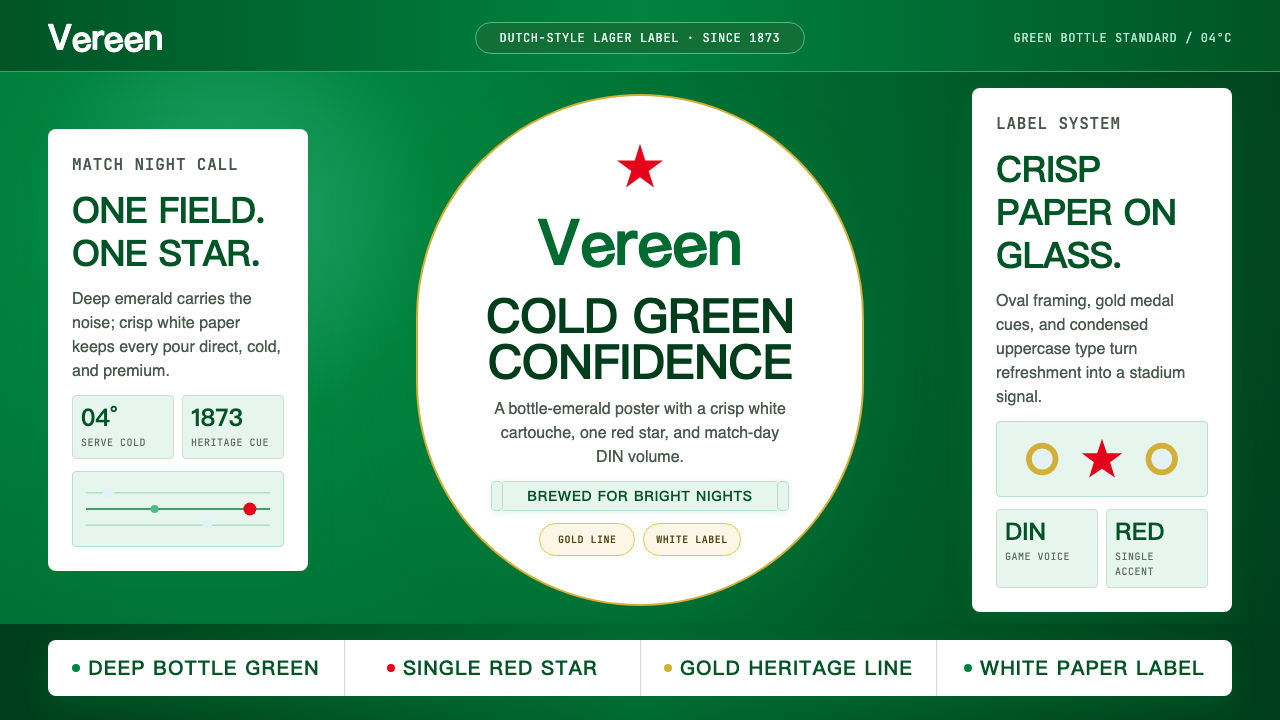 HeinekenEmerald owns the field. White label, red star, gold line, and condensed type…翠绿占满赛场。白标、红星、金线与窄体字让画面冰爽。
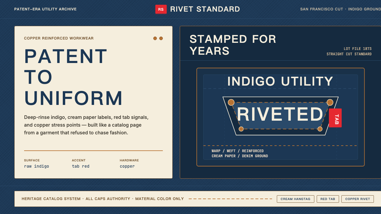 Levi's 501Utility becomes permanent. Indigo ground, cream hangtag panels, red tab and c…实用成为恒久。靛蓝底、奶油吊牌、红标与铜铆钉。
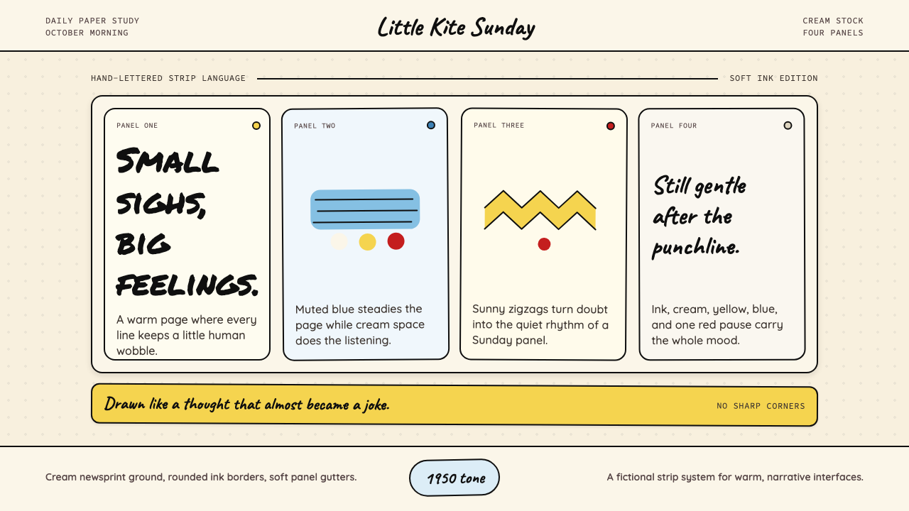 Peanuts Comic Schulz (1950)Gentle melancholy on newsprint. Caveat lettering, cream panels, yellow and bl…温柔忧郁的新闻纸感:Caveat 手写字、奶油格框、黄蓝点色。
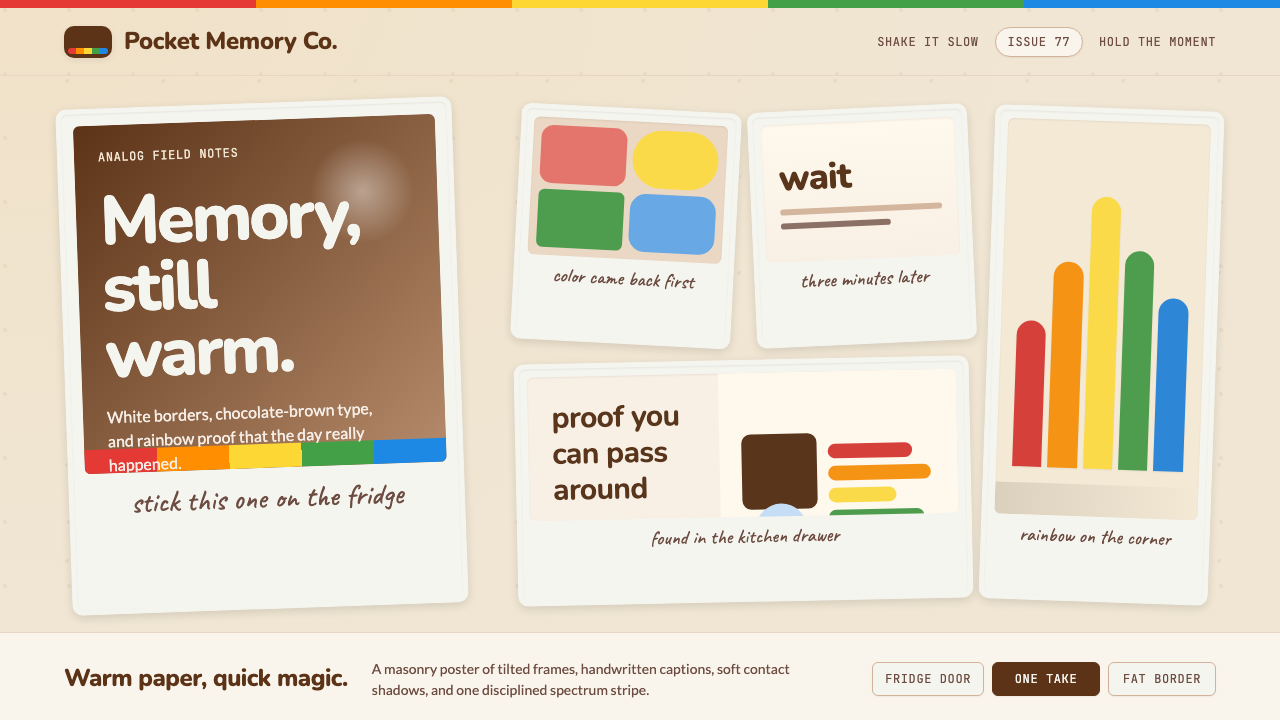 Polaroid InstantMemory made tangible. Photo-white frames tilt on aged paper with a warm rainb…记忆变得可触:相纸白边倾斜在旧纸底上,彩虹条点亮温度。