What is Heineken?什么是 Heineken?
One bottle, one shade of green, and a tilted wordmark turned a Dutch lager into the world's most recognizable beer brand.一只瓶子、一抹绿色、一个倾斜字标,将一款荷兰拉格啤酒变成了全球辨识度最高的啤酒品牌。
Heineken in briefHeineken 速览
Heineken's visual identity is one of the most disciplined color-brand systems ever built for a consumer product. Its palette is ruthlessly simple: a deep, saturated bottle green anchors everything, supported by crisp white and a single red accent. Gold appears as a heritage flourish — recalling competition medals — but never overwhelms the trio. The result is a brand that reads clearly at the speed of a refrigerated shelf scan, a sports-stadium hoarding, or a six-second television cut.喜力的视觉识别是消费品领域有史以来最严谨的色彩品牌体系之一。色板简洁到近乎苛刻:一抹深邃饱和的瓶绿色统领全局,以纯净白色和唯一的红色点缀支撑。金色作为传承性装饰偶尔出现——呼应历年大赛奖章——却从不喧宾夺主。最终呈现出的品牌,无论在冰柜货架扫视、体育场广告牌,还是六秒电视贴片中,都能被一眼识别。
The system's emotional register sits at the intersection of sport-sponsorship confidence and Dutch directness. It does not whisper premiumness through restraint the way a luxury fashion house might; instead it announces itself — cool, slightly cocky, and certain of its own quality. The oval label, the crown cap, the condensation-beaded bottle shot: every touchpoint reinforces the same sensation of cold, refreshing certainty.这套体系的情感基调,处于体育赞助商的自信与荷兰式直率的交汇点。它不像奢侈时装屋那样以内敛低语高端;而是大声宣告自身——清凉、略带不羁、对自身品质胸有成竹。椭圆标签、皇冠瓶盖、挂着凝结水珠的瓶身特写:每个触点都在强化同一种感受——冰爽、可靠、毋庸置疑。
Two distinct typographic voices coexist within the identity. A bold condensed sans-serif — associated with match-day headlines and promotional callouts — shouts energy and urgency. The script wordmark, with its characteristic tilted letterforms, counters that directness with warmth and approachability. The tension between these two voices — one mechanical, one human — is what keeps the brand from reading as either purely corporate or purely casual.品牌识别体系中并存两种截然不同的字体声音。粗重的窄体无衬线字体与赛日大标题、促销标语相关联,传递能量与紧迫感。手写字标以其独特的倾斜字母形态,以温暖与亲和力平衡了那份直接。这两种声音之间的张力——一个机械,一个人性——正是品牌既不显得纯然冷硬,也不显得过于随意的原因。
Where does Heineken come from?Heineken 从何而来?
The Heineken story begins in 1873, when twenty-two-year-old Gerard Adriaan Heineken purchased the De Hooiberg brewery in Amsterdam and began systematically transforming it into a modern industrial enterprise. From the outset, Gerard was interested in scientific brewing — he hired the chemist Hartog Elion, a student of Louis Pasteur, to develop a proprietary yeast strain that would ensure consistency across batches. That yeast, known internally as Heineken A-yeast, is still used today and represents one of the most durable pieces of intellectual property in the beverage industry.喜力的故事始于1873年。年仅二十二岁的赫拉尔德·阿德里安·喜力收购了阿姆斯特丹的De Hooiberg啤酒厂,开始系统性地将其改造为一家现代工业企业。从一开始,赫拉尔德就对科学酿造抱有浓厚兴趣——他聘请了路易·巴斯德的学生、化学家哈托格·伊利翁,开发出一株专有酵母菌株,以确保每批次产品的一致性。这株被内部称为「喜力A酵母」的菌株沿用至今,是饮料行业最持久的知识产权之一。
The brand's visual identity, however, remained relatively modest through the early decades. Labels changed incrementally, and the green bottle — which became so central to the brand's identity — was adopted partly for practical reasons: amber glass was in short supply after the Second World War, and green glass became a workable substitute that Heineken eventually made iconic. By the postwar period, the brand had established strong distribution across Europe and was beginning its expansion into the American market, where imported lagers commanded a premium over domestic brands.然而,品牌的视觉识别在早期数十年间依然相对低调。标签在逐步演变,而那只后来成为品牌核心符号的绿色瓶子,最初被采用也有实际原因:第二次世界大战后琥珀色玻璃供应短缺,绿色玻璃成为一种可行的替代品,喜力最终将其打造成了标志性元素。到战后时期,品牌已在欧洲建立了强大的分销网络,并开始向美国市场扩张——在那里,进口拉格啤酒比本土品牌享有更高的溢价。
The pivotal moment in the brand's visual history came in 1964, when Alfred Henry Heineken — known universally as Freddy — took a direct personal interest in redesigning the wordmark. Freddy Heineken was an instinctive marketer who understood that the brand's label was its most powerful communication tool. His most celebrated contribution was the so-called 'smiling e': the observation that tilting the three e's in the Heineken wordmark slightly backward gave them a jaunty, human quality — as if the letters themselves were grinning. This seemingly small adjustment transformed a functional logotype into a personality.品牌视觉史上的关键转折发生在1964年,阿尔弗雷德·亨利·喜力——人称弗雷迪——亲自介入字标的重新设计。弗雷迪·喜力是一位凭本能行事的营销者,深知品牌标签是最强大的传播工具。他最广为人知的贡献,是那个所谓的「微笑e」:他观察到,将喜力字标中的三个e字母略微向后倾斜,会赋予它们一种俏皮的人性气质——仿佛字母本身在微笑。这个看似微小的调整,将一个功能性字标变成了一种个性。
The red star that crowns the oval label predates Freddy's tenure and carries contested origin stories — some accounts link it to European brewing guild traditions, others to the postwar period when Heineken sought to signal solidarity with Eastern European markets. Whatever its origin, the star became an indispensable element of the lock-up, providing a vertical anchor to the horizontal sweep of the wordmark. The Amsterdam-based agency VBAT has been a long-standing steward of the identity in its modern iterations, maintaining visual coherence across an increasingly complex sponsorship and licensing portfolio.椭圆标签顶部的红星早于弗雷迪的任期而存在,其起源众说纷纭——有说法将其与欧洲酿酒行会传统相联系,也有说法认为它源于战后喜力向东欧市场表达亲近之意的时期。无论起源如何,这枚红星已成为标志性锁定图案中不可或缺的元素,为字标水平展开的弧度提供了一个垂直锚点。阿姆斯特丹设计机构VBAT长期担任该品牌现代迭代的视觉守护者,在日益复杂的赞助与授权版图中维护着视觉一致性。
What defines the Heineken look?Heineken 的视觉特征是什么?
Signature Green标志绿
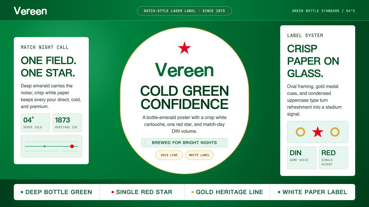
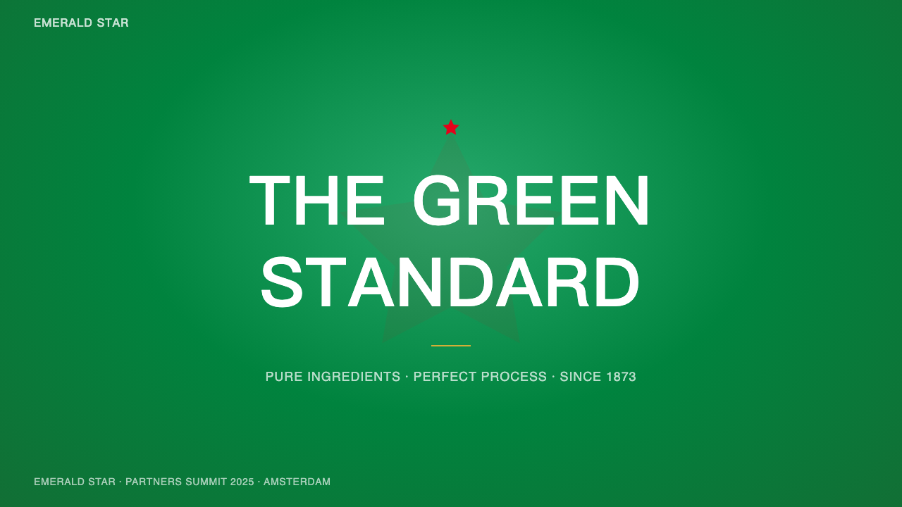
The deep, saturated bottle green that defines the brand is neither forest green nor lime green — it occupies a specific middle territory that reads as simultaneously cool, natural, and premium. It is dark enough to convey substance and heritage, saturated enough to command attention across large-format outdoor media. The green is the brand's single most powerful asset: instantly recognizable across markets, cultures, and contexts without any supporting text.定义品牌的深邃、饱和瓶绿色,既非森林绿也非柠绿——它占据着一个特定的中间地带,同时传递出清凉、自然与高端的感受。其深度足以传达厚重感与传承感,饱和度足以在大型户外媒体中夺人眼球。这抹绿色是品牌最强大的单一资产:无需任何辅助文字,便可跨越市场、文化与语境被即刻识别。
The Smiling Wordmark微笑字标
The defining characteristic of the Heineken logotype is the backward tilt of the three lowercase e's — a deliberate design decision made in 1964 that gives the letters a jaunty, almost animated quality. The effect is subtle enough to feel organic rather than contrived, yet it is the single element that most distinguishes the wordmark from generic script lettering. The tilt creates an impression of forward movement and good humor, directly encoding the brand's personality at the letterform level.喜力字标最鲜明的特征是三个小写e字母向后倾斜——这是1964年做出的刻意设计决定,赋予字母一种俏皮的、几乎是动感的气质。这种效果微妙到让人感觉是自然生长而非刻意为之,却又是使这个字标区别于普通手写体的核心元素。倾斜制造出一种向前运动与愉悦心情的印象,直接在字母形态层面编码了品牌个性。
Oval Label Architecture椭圆标签结构
The oval label is a container that organizes a remarkably complex set of elements — red star, script wordmark, white scroll banner, heritage text, decorative gold rule — into a coherent, legible unit. The oval itself implies completeness and quality: it is a format associated with heritage European product labels across wine, spirits, and condiments. Within the brand system, the oval functions as a seal of authenticity, and its proportions have been carefully maintained through decades of iteration.椭圆标签是一个将一组极为复杂的元素——红星、手写字标、白色卷轴横幅、传承文字、装饰金线——组织为连贯可读单元的容器。椭圆本身暗示了完整性与品质:这是一种与欧洲传统产品标签相关联的形式,遍布葡萄酒、烈酒与调味品领域。在品牌体系中,椭圆充当真实性的印章,其比例在数十年的迭代中被小心维护。
Red Star Accent红星点缀
The five-pointed red star positioned at the top of the oval label serves multiple compositional functions: it punctuates the vertical axis of the label, it provides the only warm-toned element in an otherwise cool palette, and it creates a visual focal point before the eye drops to the wordmark. The star reads simultaneously as a symbol of quality (the European quality-star convention), as a geometric form, and as a brand mark. Its scale relative to the wordmark is precisely calibrated — large enough to lead the eye but small enough not to compete with the name.位于椭圆标签顶部的五角红星承担多重构图功能:它点缀了标签的垂直轴线,提供了整体冷色调色板中唯一的暖色元素,并在视线落向字标之前制造了一个视觉焦点。红星同时作为品质符号(欧洲品质星级惯例)、几何形态和品牌标志被解读。它相对于字标的大小精准校准——足够大以引导视线,却又不至于与品牌名称形成竞争。
Gold Heritage Detailing金色传承细节
Gold appears in the Heineken system as a tertiary accent — present but subordinate. Gold rules separate sections of the label; gold border lines frame the oval; gold referencing the brand's medal-winning history at world expositions nods to long-established quality. Unlike the assertive green or the punctuating red, gold's role is atmospheric: it ages the brand, lending it a sense of history and earned authority without triggering the codes of ultra-luxury that would contradict the product's accessible positioning.金色在喜力体系中作为第三级点缀色出现——存在但从属。金色线条分隔标签各区块;金色边框勒住椭圆轮廓;金色暗示品牌在世界博览会上屡获大奖的历史,致敬长久积累的品质声望。与强势的绿色或点睛的红色不同,金色的角色是氛围性的:它为品牌赋予历史感和当之无愧的权威感,却不触发超奢侈品的符码——那会与产品亲民的定位相矛盾。
Condensed Type for Activation窄体字用于推广活动
Beyond the wordmark, the brand deploys bold condensed sans-serif type for promotional and sponsorship contexts — campaign headlines, stadium graphics, event branding, and digital advertisements. Condensed type shares the brand's directness: it takes up less horizontal space while projecting more visual weight, making it ideal for match-day environments where legibility at distance matters. The contrast between the human warmth of the script wordmark and the mechanical authority of condensed sans-serif gives the brand two distinct communicative registers for different contexts.在字标之外,品牌在推广与赞助场景中大量使用粗重窄体无衬线字体——活动标题、体育场图形、赛事品牌、数字广告。窄体字与品牌的直率气质相通:它占用更少的水平空间,同时投射出更强的视觉重量,非常适合远距离可读性至关重要的赛日环境。手写字标的人文温度与窄体无衬线字体的机械权威之间的对比,赋予了品牌在不同语境下两种截然不同的传播腔调。
Condensation Photography凝结水珠摄影
A persistent visual language within Heineken's advertising is the close-up of a cold, condensation-beaded bottle or glass — drops of water on cold green glass being one of the most effective sensory-transfer devices in beverage marketing. The photography style tends toward high contrast, clean studio backdrops, and precise lighting that emphasizes the cold, glassy surface of the product. This photographic vocabulary reinforces the core brand promise at a visceral, pre-verbal level: refreshment, coldness, and quality.喜力广告中持续出现的视觉语言之一,是冰冷、挂满凝结水珠的瓶或杯特写——冷绿玻璃上的水滴是饮料营销中最有效的感官转移装置之一。摄影风格倾向高对比度、干净的棚拍背景和精准光线,着重呈现产品冰冷、透亮的玻璃表面。这套摄影词汇在内脏层面、语言前的层面强化了品牌核心承诺:清爽、冰凉与品质。
Who shaped Heineken?谁塑造了 Heineken?
The founder purchased the De Hooiberg brewery in Amsterdam in 1873 at age twenty-two and began the systematic industrialization of the brewing process that would turn a local Amsterdam operation into a national and eventually international brand. Gerard's most consequential early decision was scientific: hiring a Pasteur-trained chemist to develop the proprietary yeast strain that ensures consistency across every bottle of Heineken produced anywhere in the world. This foundational commitment to process quality established the brand's authority before its visual identity had been formalized.这位创始人于1873年年仅二十二岁时收购了阿姆斯特丹的De Hooiberg啤酒厂,开始系统性地推进酿造工业化进程,最终将一家阿姆斯特丹本地作坊发展为全国乃至全球品牌。赫拉尔德最具决定性的早期决策是科学性的:聘请一位受过巴斯德训练的化学家开发专有酵母菌株,确保全球各地生产的每一瓶喜力品质一致。这种对工艺品质的根本性承诺,在品牌视觉识别尚未成型之前,便已奠定了其权威。
The third-generation family steward and the single individual most responsible for shaping the brand's modern visual identity. Freddy Heineken joined the company in 1942 as a young man and, after returning from studying in the United States, brought American marketing sensibility to a European brewing tradition. His 1964 observation about tilting the e's in the wordmark — creating what became known as the 'smiling e' — stands as one of the most celebrated moments of intuitive brand thinking in consumer goods history. Freddy also drove Heineken's aggressive international expansion and its transformation into a premium global lager rather than merely a Dutch export.第三代家族掌门人,对品牌现代视觉识别的塑造贡献最大的个人。弗雷迪·喜力于1942年以青年身份加入公司,从美国求学归来后,将美式营销思维带入欧洲酿酒传统。他于1964年发现字标中的e字母倾斜之后呈现出的效果——即后来人称「微笑e」——已成为消费品史上最广为称道的品牌直觉时刻之一。弗雷迪还推动了喜力的积极国际扩张,使其从单纯的荷兰出口产品转型为全球高端拉格品牌。
The Amsterdam-based branding and design agency that has served as the long-term custodian of the Heineken visual identity through its contemporary iterations. VBAT's role has been primarily one of stewardship rather than reinvention: maintaining the coherence of the oval label system, the smiling wordmark, and the brand's color hierarchy across an enormous range of applications — from stadium hoardings for UEFA Champions League sponsorship to limited-edition bottle collaborations. In an era of brand restlessness and frequent identity redesigns, Heineken's commitment to evolutionary refinement rather than periodic reinvention is itself a strategic statement.这家阿姆斯特丹品牌与设计机构是喜力视觉识别在当代迭代中的长期守护者。VBAT的角色主要是守护而非重塑:在欧冠赛事赞助体育场广告牌到限量版瓶身合作等庞大应用范围中,维护椭圆标签体系、微笑字标和品牌色彩层级的一致性。在品牌频繁焦虑、动辄大改设计的时代,喜力坚持演进式打磨而非周期性重塑,本身就是一种战略表态。
The chemist whose scientific contributions underpinned the brand's claim to consistent quality. A student of Louis Pasteur, Elion was hired by Gerard Heineken specifically to bring a scientific approach to the brewery's yeast management and fermentation process. The proprietary yeast strain he developed gave Heineken a technical edge that translated, over time, into a marketing edge: the ability to claim genuine batch-to-batch consistency across a global production network. The invisible science behind the bottle is as much a part of the brand's identity as the green glass and the smiling wordmark.这位化学家的科学贡献支撑了品牌对一致品质的主张。作为路易·巴斯德的学生,伊利翁被赫拉尔德·喜力专程聘请,以将科学方法引入酒厂的酵母管理与发酵工艺。他开发的专有酵母菌株赋予喜力技术优势,这一优势随时间转化为营销优势:能够在全球生产网络中真正实现批次间的一致性。瓶子背后看不见的科学,与绿色玻璃和微笑字标同等重要地构成了品牌身份的一部分。
How do you use Heineken today?今天怎么用 Heineken?
Applying the Heineken visual language to presentation work requires understanding its fundamental logic: the system derives its power from color contrast and typographic confidence, not from decorative complexity. A cover slide should deploy the deep bottle green at full bleed, with the title rendered in bold condensed type in white — the same dynamic used in Heineken's own large-format advertising. The single red accent, used sparingly, provides the only punctuation. Avoid the instinct to soften or dilute the palette; the strength of this aesthetic comes from its directness.将喜力视觉语言应用于演示文稿,需要理解其基本逻辑:这套体系的力量来源于色彩对比与排印自信,而非装饰复杂度。封面幻灯片应以深邃瓶绿色满版铺底,标题以粗重窄体字白色呈现——与喜力自身大幅广告所用的动态如出一辙。唯一的红色点缀克制使用,仅作节奏停顿。抵制弱化或稀释色板的冲动;这种美学的力量正来自其直接。
Content slides within a Heineken-inflected deck should be treated as clean information fields: white or very light ground, green used only for section headers or key callout text, body copy in neutral dark. The structural discipline here mirrors the brand's product label — every element present for a reason, nothing decorative. Data visualizations benefit from the palette's limited range: use green for primary data series, red for alerts or contrasting metrics, and white-on-green for summary call-outs. The result feels authoritative and sport-adjacent — well-suited to sales decks, sponsorship proposals, and brand partnership presentations.喜力风格演示文稿的内容页应作为干净的信息场处理:白色或极浅底色,绿色仅用于节标题或关键引文,正文用中性深色。此处的结构纪律反映了品牌产品标签的逻辑——每个元素各有其存在理由,没有纯装饰性元素。数据可视化受益于色板的有限范围:绿色用于主要数据系列,红色用于警示或对比指标,绿底白字用于总结性标注。结果呈现出权威感和运动气质——非常适合销售提案、赞助提案和品牌合作演示。
For web interfaces and digital products, the Heineken aesthetic translates most naturally into bold, high-contrast layouts — landing pages for events, promotional campaign microsites, or sports-themed applications. The approach: green backgrounds for hero sections, white for content areas, condensed sans-serif for navigation and CTAs, and the script-style treatment reserved for brand moments or identity-heavy components. Pricing pages benefit from the palette's inherent legibility: green tiers carry authority, white tiers read as open and accessible, and the red accent marks featured or recommended plans. Dashboard applications can use green as a status-positive indicator, with the red reserved for alerts or negative states.对于网页界面与数字产品,喜力美学最自然地转化为大胆高对比布局——活动落地页、推广活动微型网站或运动主题应用。做法是:英雄区块用绿色背景,内容区域用白色,导航与行动号召用窄体无衬线字体,手写风格处理保留给品牌时刻或重度品牌识别组件。定价页面受益于色板天然的可读性:绿色等级传递权威,白色等级显得开放易达,红色点缀标记特色或推荐套餐。仪表板应用可用绿色作为正向状态指示,红色保留给警报或负面状态。
In editorial and marketing contexts, the style works particularly well for sports coverage, beverage-related content, event promotion, and lifestyle editorial with a young-adult energy. An editorial spread using this language would feature photography with the high-contrast, cool-toned quality of condensation photography; typographic hierarchy in condensed sans-serif for headlines and a legible text typeface for body; and color used in blocks rather than gradients. Marketing materials — out-of-home advertising, social cards, email campaigns — benefit from committing to the full-bleed green field: the color itself is the communication, and any content placed on it arrives pre-credentialed by the brand's global recognition.在编辑与营销语境中,这种风格尤其适合体育报道、饮料相关内容、活动推广与充满年轻活力的生活方式编辑。使用这套视觉语言的编辑版面,会以高对比度、冷色调——凝结水珠摄影气质——的图片为主;以窄体无衬线字体作标题层级、以可读正文字体处理正文;色彩以色块而非渐变方式使用。营销物料——户外广告、社交卡片、邮件活动——会因坚持满版绿色底场而获益:这抹颜色本身就是传播,置于其上的任何内容都借助品牌的全球认知度预先获得了背书。
A common mistake when working in this aesthetic is over-indexing on green at the expense of white space. The Heineken system is disciplined about giving the green color room to breathe — it works on white, framed, on product labels, not necessarily as an all-over environment. Flooding every surface with bottle green produces a claustrophobic, heavy result. Equally, introducing additional colors beyond the three-color system — purples, oranges, teals — immediately dilutes the brand's characteristic authority. The system's power comes from restriction; every addition is a subtraction from the palette's coherence.使用这种美学时最常见的错误,是过度索取绿色而牺牲留白。喜力体系非常注重为绿色留出呼吸空间——它在白底上工作、有框架地工作、在产品标签上工作,而不必然适合作为全覆盖的环境色。将每一个表面都铺满瓶绿色,会产生令人窒息的沉重效果。同样,在三色体系之外引入额外颜色——紫色、橙色、蓝绿色——会立即稀释品牌特有的权威感。这套体系的力量来自限制;每一次增加,都是对色板凝聚力的一次削减。
Heineken — FAQHeineken · 常见问题
What makes the Heineken green different from generic green in branding?喜力绿与品牌设计中普通的绿色有何不同?
The specificity of the green is inseparable from its association with the glass bottle — the color was originally a material property of the container, and decades of brand association have made that particular deep, cool-toned saturation inseparable from the Heineken name. Generic green in branding tends toward the associations of nature, sustainability, or health. Heineken green carries different codes: coldness, refreshment, European brewing heritage, and sport-sponsorship authority. The difference is not in a measurable color value but in what that color has come to mean through decades of consistent use across a single highly visible product.这抹绿色的独特性与玻璃瓶的物质属性密不可分——这种颜色最初是容器的材料特性,数十年的品牌联想使那种特定的深邃、冷调饱和色与喜力品牌名称变得难以分割。品牌设计中普通的绿色往往倾向于传递自然、可持续或健康的联想。喜力绿携带着截然不同的符码:冰凉、清爽、欧洲酿酒传承与体育赞助权威。差异不在于某个可测量的色彩数值,而在于这种颜色通过数十年在单一高曝光产品上的一致使用所积累的意义。
Can the Heineken visual style work for non-beverage or non-sports brands?喜力视觉风格能用于非饮料或非体育品牌吗?
The style is transferable but context-dependent. Its core visual vocabulary — high-contrast color pairing, condensed bold type, confident use of a dominant signature color, oval or badge framing — is not inherently beverage-specific. It works well for any brand that wants to project authority, energy, and international confidence: professional services firms, sports leagues, event brands, or consumer technology products with a premium-but-approachable positioning. It struggles in contexts requiring softness, intimacy, or cultural specificity — luxury personal care, children's education, or community-centered brands would find the palette's assertiveness tonally misaligned.这种风格可以移植,但高度依赖语境。其核心视觉词汇——高对比度色彩搭配、粗重窄体字、对主导标志色的自信运用、椭圆或徽章式框架——并非天然属于饮料行业。它适用于任何希望传递权威、能量与国际自信的品牌:专业服务公司、体育联赛、活动品牌,或定位于高端而不失亲和力的消费科技产品。在需要柔和感、亲密感或文化特异性的语境中,它就会力不从心——奢侈个护、儿童教育或社区导向的品牌,都会发现这套色板的强势与其基调格格不入。
Why does Heineken's identity remain so stable compared to other global brands that rebrand frequently?与其他频繁改版的全球品牌相比,为什么喜力的品牌识别保持如此稳定?
The stability is strategic rather than conservative. Heineken's brand equity is inseparably tied to the green bottle and its associated visual system — the smiling wordmark, the oval label, the red star. Any substantial departure from those elements risks destroying accumulated brand recognition that took over a century to build. The brand has also demonstrated that significant emotional impact can be achieved through communication and activation (advertising, sponsorship, experiential) rather than identity change. Major competitors in the global beer category — Budweiser, Corona, Stella Artois — have followed similar patterns of evolutionary refinement, suggesting that for brands anchored in physical packaging, visual stability is itself a competitive advantage.这种稳定是战略性的,而非保守性的。喜力的品牌资产与绿色瓶子及其关联的视觉体系——微笑字标、椭圆标签、红星——密不可分。对这些元素的任何实质性偏离,都有可能摧毁历经一个多世纪才积累起来的品牌认知。品牌也已证明,重大的情感影响可以通过传播与激活(广告、赞助、体验)而非品牌识别变更来实现。全球啤酒品类的主要竞争对手——百威、科罗娜、时代啤酒——均遵循类似的演进式打磨模式,这表明对于以实体包装为锚点的品牌而言,视觉稳定性本身就是一种竞争优势。
How does the Heineken system handle dark and light mode in digital contexts?喜力体系如何在数字语境中处理深色与浅色模式?
The Heineken palette is inherently a light-context system — the canonical presentation is the green bottle against a white or light background, and the oval label itself is a light-on-dark composition (white scroll on green ground) nested inside a larger light field. For digital dark-mode contexts, the brand's deep bottle green functions well as a background, with white and gold providing foreground contrast. The red accent remains effective on dark grounds as a call-to-action or status marker. What does not translate cleanly to dark mode is the label's white scroll element, which risks visual busyness when inverted — digital adaptations typically simplify the badge to its essential elements: wordmark, star, and color.喜力色板本质上是一套适合浅色语境的体系——标准呈现是白色或浅色背景上的绿色瓶子,而椭圆标签本身是一种深底浅色构图(绿底白色卷轴),嵌套在更大的浅色场域中。在数字深色模式语境中,品牌深邃的瓶绿色作为背景效果良好,白色与金色提供前景对比。红色点缀在深色底上作为行动号召或状态标识依然有效。无法清晰移植到深色模式的,是标签的白色卷轴元素——反色后容易产生视觉拥挤感。数字适配通常将徽章简化为其核心要素:字标、红星与色彩。
Is the Heineken visual style appropriate for sustainability or environmental messaging?喜力视觉风格适合用于可持续发展或环保主题的传播吗?
This is a nuanced question. Green carries environmental associations in contemporary visual culture, and Heineken has actively used its signature color in sustainability campaigns — leaning into the coincidence of brand color and ecological coding. However, the Heineken green reads primarily as cold and premium rather than organic and natural — its saturation and depth are more associated with glass and metal than with foliage and earth. Environmental messaging that relies on the natural-warmth register of sustainability communication may find the Heineken palette tonally incongruent. The brand works best in sustainability contexts when the messaging is confident and assertive rather than gentle and community-oriented — reporting carbon commitments and operational targets rather than evoking pastoral natural imagery.这是一个需要细致辨析的问题。在当代视觉文化中,绿色携带着环保联想,喜力也确实在可持续发展活动中主动运用了自己的标志色——顺势利用了品牌色与生态符码的巧合。然而,喜力绿首先被解读为冰凉与高端,而非有机与自然——其饱和度和深度更多让人联想到玻璃与金属,而非植被与大地。依赖自然温暖质感的可持续传播,可能会发现喜力色板在基调上格格不入。品牌在可持续发展语境中最有效的做法,是当传播信息呈现为自信、强势而非温柔、社区导向的时候——报告碳承诺与运营指标,而非唤起田园自然意象。
Related design styles相关设计风格
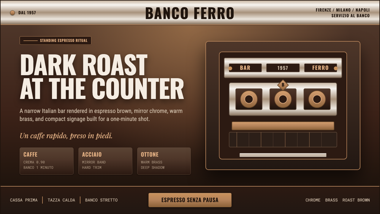 Italian Espresso BarDark roast, hard metal. Brass lines and Oswald signage slice a deep espresso…深烘硬朗。黄铜线与Oswald招牌字切开浓缩棕底。
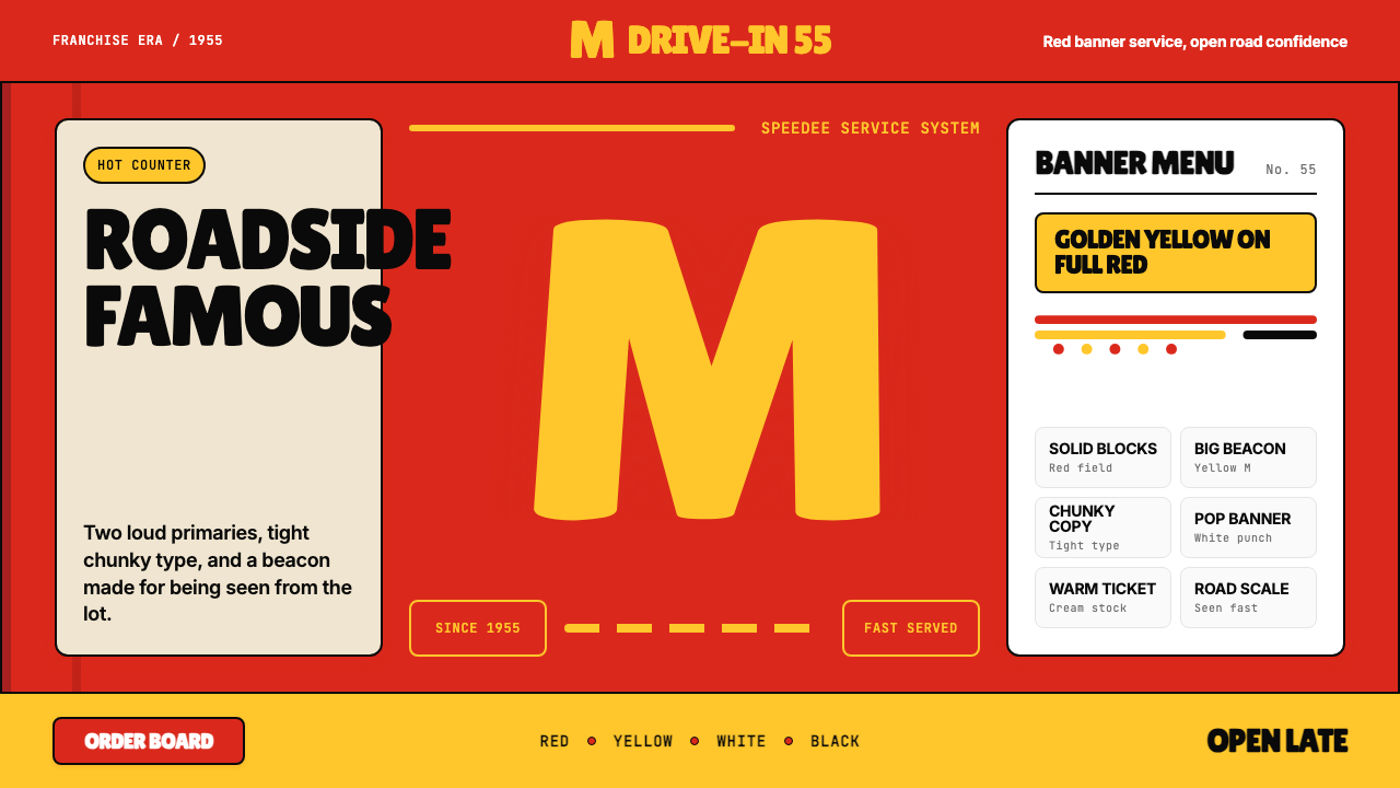 McDonald's Golden ArchesRoadside famous. Saturated red, hot yellow, and chunky type shout from 1955.路边即识别:饱和红、热黄与厚重字体喊出1955。
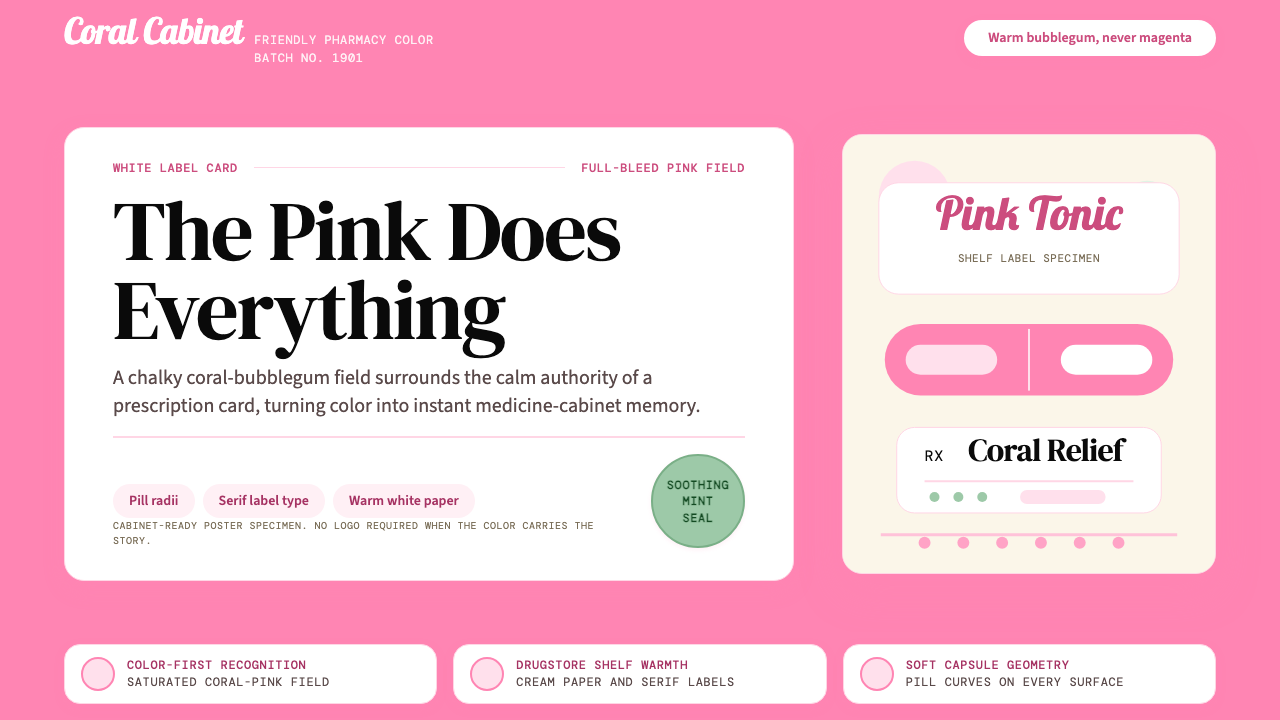 Pepto-Bismol Pink (1901)Color is the cure. Bubblegum pink floods the field; white label cards and pil…颜色就是招牌:泡泡糖粉铺满画面,白色标签卡和药丸弧度稳住信任。
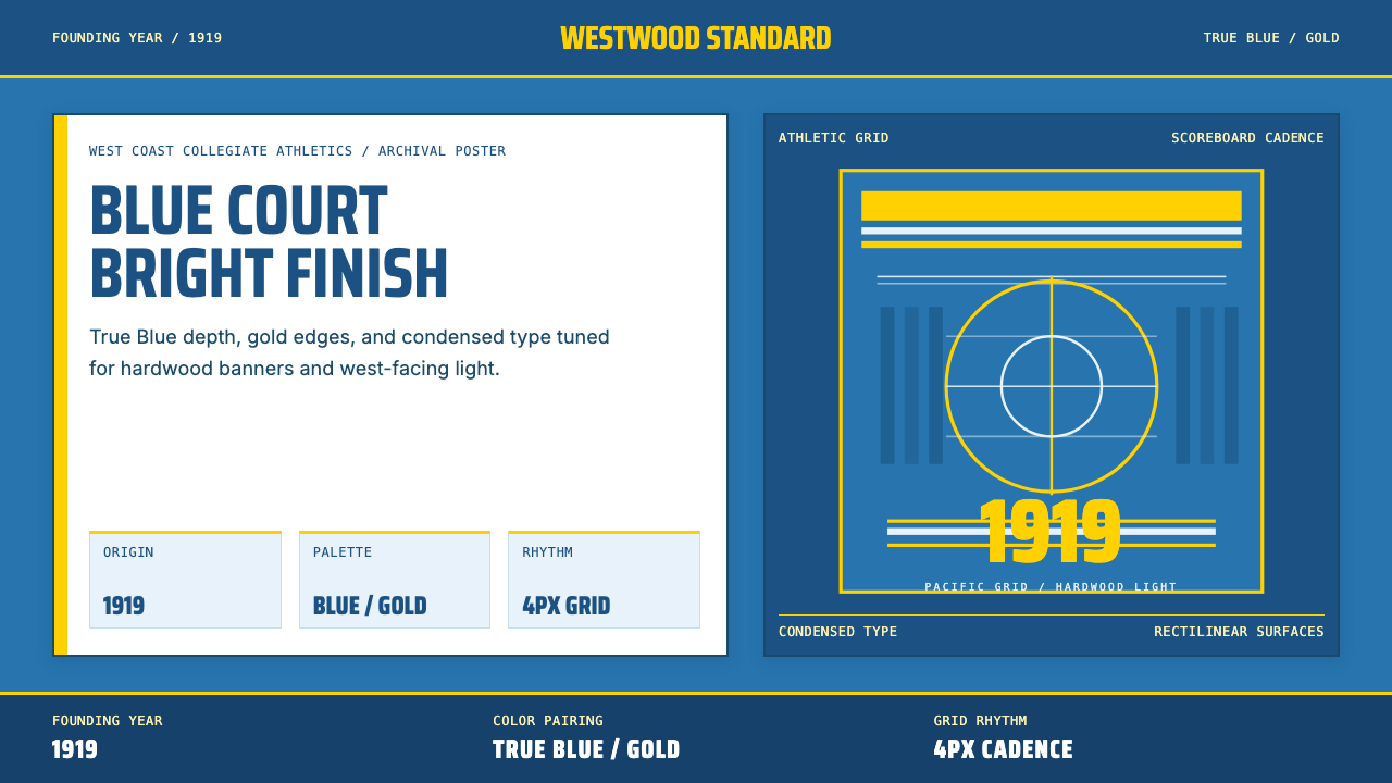 UCLA Bruin Purple & Gold (1919)Pacific authority in motion. True Blue panels, gold stripes, condensed athlet…太平洋式权威感。真蓝面、金条纹、压缩体育字。
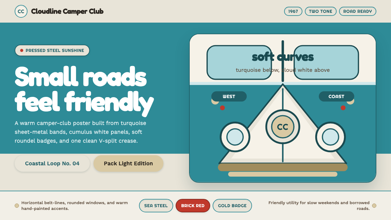 VW Kombi BusSunny steel optimism. Turquoise-and-white belt lines, Fredoka curves, warm go…晴朗钢板乐观主义。青绿白双色腰线、Fredoka圆角与金色徽章。
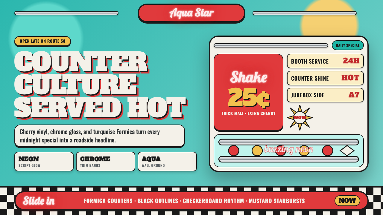 1950s Diner AquaRoadside optimism shouts. Aqua walls, cherry vinyl, chrome bands, and neon sc…公路乐观主义在叫卖:湖水蓝墙、樱桃红皮革、镀铬条与霓虹手写体发光。