About Heineken
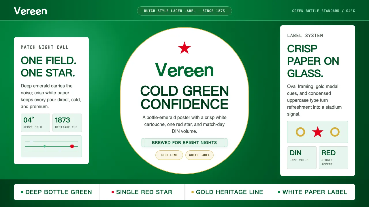
Heineken's visual identity is the emerald-green bottle that became a global icon. The 1964 redesign by Freddy Heineken introduced the "smiling e" — three tilted letters that give the wordmark its jaunty optimism — crowned by a red star and framed in a white scroll banner. It is premium-mass-market beer distilled into color: deep bottle green, crisp white, and a single red accent.
The system channels sport-sponsorship confidence and Dutch directness. DIN Condensed shouts match-day callouts while the script wordmark stays warm and approachable. Gold foil nods to heritage medals; condensation photography keeps everything cold and refreshing.
- Origin
- Amsterdam, Netherlands
- Era
- 1873 founded; current visual identity since 1964 (smiling-e wordmark)
- Key figures
- Gerard Adriaan Heineken · Alfred Henry "Freddy" Heineken · VBAT Amsterdam
- Movements
- European brewery branding · Sport-sponsorship beer culture · Dutch graphic design
Heineken design spec
Colors
Typography
The other 11 sections — buttons, cards, spacing, motion, techniques and more — open once you unlock. Download the DESIGN.md or send it to your AI in one click. Unlock once, yours forever.
Sign up nowStyles similar to Heineken
Also inspired by brands & products, with a close feel.
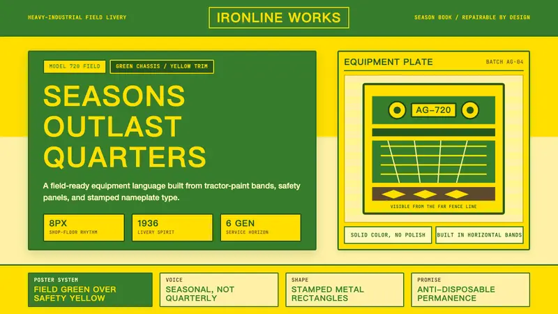 John DeereBuilt to outlast seasons. Forest green bands over safety yellow, stamped in uppercase grids.
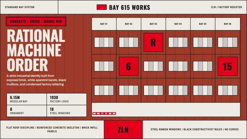 Baťa Zlín Functionalist BrandMachine-age precision. Brick red, concrete bands, and Oswald type lock into a 6.15m grid.
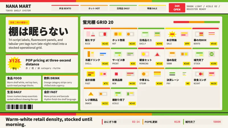 Japanese Konbini 7-ElevenAlways stocked, always bright. Green canopy, warm shelves, POP yen tags, tight bento grid.
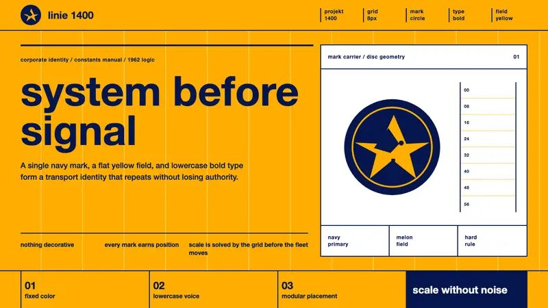 Lufthansa (Aicher)Systems speak first. Melon yellow, navy disc mark, lowercase Helvetica on a hard grid.