What is UCLA Bruin Purple & Gold (1919)?什么是 UCLA Bruin Purple & Gold (1919)?
UCLA's True Blue and Gold — colors adopted by a fledgling Southern California teachers college in 1919 — became synonymous with competitive excellence and Pacific coastal authority through a century of collegiate athletics.1919年,一所南加州师范学院确立的真蓝与金色,历经一个世纪的大学体育竞技,演化为竞技卓越与太平洋海岸权威感的同义词。
UCLA Bruin Purple & Gold (1919) in briefUCLA Bruin Purple & Gold (1919) 速览
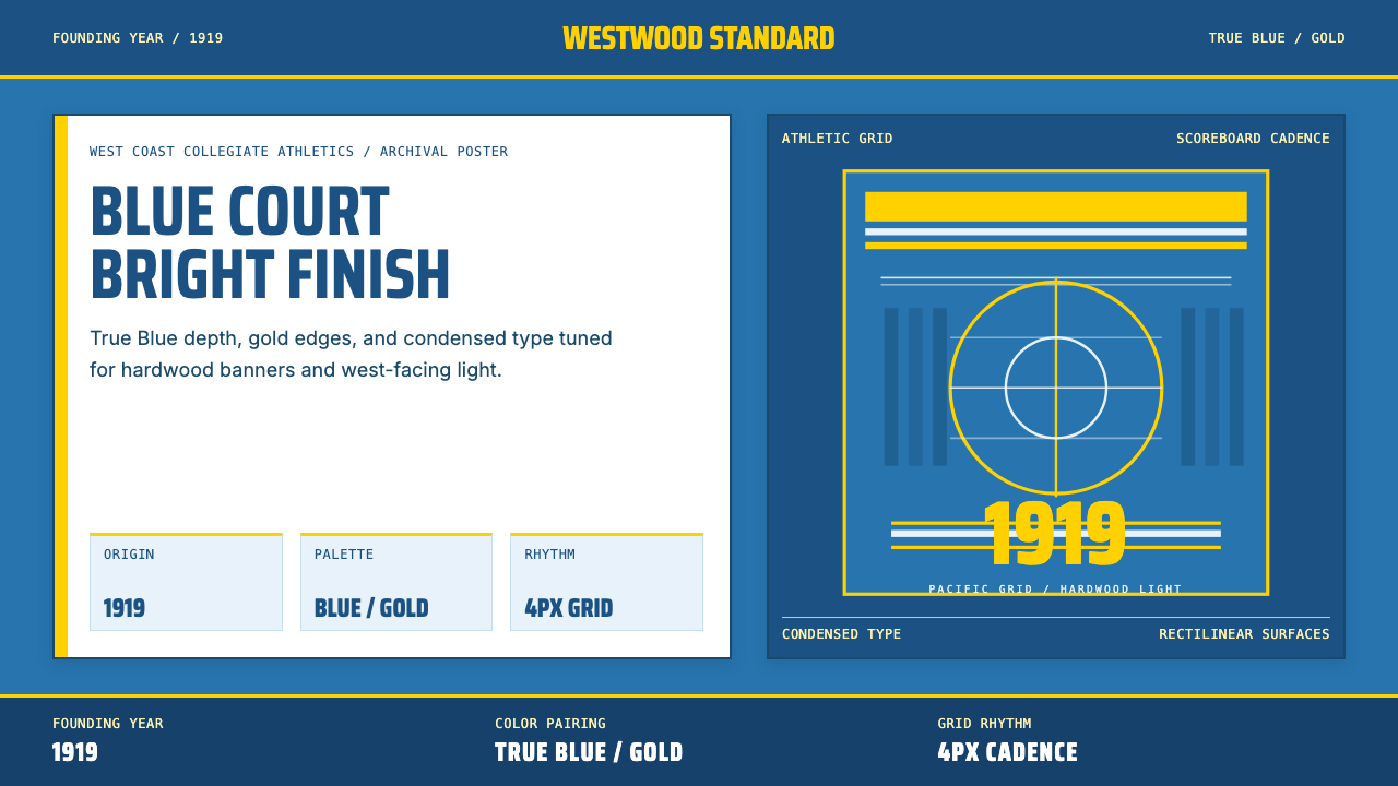
The UCLA Bruin color system is one of American collegiate athletics' most recognizable pairings: a deep Pacific Blue carried at high saturation alongside a bright, warm athletic gold. Both colors operate at peak intensity — neither is muted or tinted toward neutrality — which produces an identity that reads as confident and unapologetic at any scale, from a stadium banner to a jersey number.UCLA棕熊色彩体系是美国大学体育界最具辨识度的配色之一:高饱和度的深邃太平洋蓝,与明亮、暖调的运动金并置。两种颜色均以峰值强度呈现——既不沉寂,也不向中性偏移——在任何尺度下,从体育场横幅到球衣号码,都传递出自信而不妥协的气质。
Visually, the system depends on high chromatic contrast and bold rectilinear structure. Condensed athletic typefaces — letterforms that compress horizontal width to emphasize vertical thrust — anchor the typographic identity, while broad flat panels of color replace any need for gradation or shadow. The geometry is deliberate and frontal: there is no ambiguity about where the eye should go.从视觉上看,这套体系依赖高色度对比与硬朗矩形结构。压缩体育字体——水平宽度收窄、强调垂直冲力的字形——锚定了字体识别,而宽阔的纯色平面块取代了渐变或阴影的需求。几何感是刻意而直接的:视线的落点毫无歧义。
What makes this system more than a sports palette is its historical weight. Every deployment of True Blue and Gold carries the residue of decades of West Coast athletic dominance — from the hardwood of Pauley Pavilion to the track at Drake Stadium — giving even a simple composition a sense of inherited authority that purely contemporary palettes cannot manufacture.使这套系统超越单纯运动色板的,是它承载的历史重量。每一次真蓝与金色的运用,都叠加着数十年西海岸体育霸主的印记——从保利馆的硬木地板到德雷克田径场的跑道——赋予哪怕最简单的构图一种纯粹当代配色无法制造的传承权威感。
See the UCLA Bruin Purple & Gold (1919) design system查看 UCLA Bruin Purple & Gold (1919) 完整设计系统
Where does UCLA Bruin Purple & Gold (1919) come from?UCLA Bruin Purple & Gold (1919) 从何而来?
UCLA was founded in 1919 as the Southern Branch of the University of California — a modest extension campus in Los Angeles at a time when the state's flagship institution in Berkeley still dominated all prestige and resources. The school's colors were adopted in that founding year, borrowing the broader University of California's commitment to blue and gold while distinguishing itself through a particular shade of blue that gestured toward the Pacific Ocean rather than the Bay. That early act of color selection was also an act of geographic and institutional self-definition.UCLA创建于1919年,是加利福尼亚大学的南部分校——当时不过是洛杉矶一处规模有限的延伸校区,而伯克利的旗舰校区仍垄断着所有声望与资源。学校颜色在创立当年即已确立,沿用了加利福尼亚大学系统对蓝色与金色的承诺,同时以一种特定的蓝色色调加以区别——这种蓝色指向太平洋而非海湾。那次早期的色彩选择,同时也是一次地理与机构自我定义的行为。
Edward Augustus Dickson, a regent of the University of California and one of the principal advocates for the Los Angeles campus, played a key role in establishing UCLA's identity as something distinct from its northern counterpart. The drive to build a credible, independent institution in Southern California shaped the visual culture of the young university — including the insistence on colors that would stand confidently on their own. The gold, deeply saturated and warm rather than yellow, specifically evoked California sunshine and the West Coast's different relationship to landscape and light compared with the older Eastern or Midwestern university traditions.爱德华·奥古斯塔斯·迪克森——加利福尼亚大学董事会成员、洛杉矶校区最重要的倡导者之一——在建立UCLA独立于北方同胞的独特身份方面扮演了关键角色。在南加州建立一所可信赖、独立的院校的驱动力,塑造了这所年轻大学的视觉文化,包括对能独立站立的颜色的坚持。深度饱和、偏暖而非偏黄的金色,特别唤起了加州阳光,以及西海岸与东部或中西部更古老的大学传统截然不同的风景与光线关系。
The athletic program that would make these colors famous on a national stage took shape gradually through the 1920s and 1930s as UCLA joined the Pacific Coast Conference and began competing at the highest levels of collegiate athletics. The university moved to its permanent Westwood campus in 1929, and the new facilities — including eventually Pauley Pavilion, opened in 1965 — gave the color system a physical home whose architecture reinforced its boldness. Blue and gold on hardwood, under arena lights, at championship stakes: the palette was forged in high-contrast conditions.使这些颜色在全国舞台上声名大噪的体育项目,在1920至1930年代随UCLA加入太平洋海岸联盟、开始在最高级别大学体育中竞技而逐渐成形。大学于1929年迁至位于韦斯特伍德的永久校区,新设施——包括最终于1965年启用的保利馆——给色彩体系提供了一个以建筑强化其大胆感的物理家园。硬木地板上的蓝与金,在体育馆灯光下,置于冠军赌注之中:这套色板在高对比度的条件下被淬炼定型。
The John Wooden era (1948–1975) transformed UCLA's colors from a recognizable regional mark into a globally understood symbol of athletic excellence. Ten national basketball championships in twelve years — including seven consecutive titles from 1967 to 1973 — gave the True Blue and Gold an unmatched winning context. Players like Kareem Abdul-Jabbar, who arrived as Lew Alcindor in 1965, and Bill Walton carried those colors into professional careers that amplified the palette's visibility worldwide. The identity was no longer merely Californian; it had become a standard against which athletic aspiration measured itself. Jackie Robinson, who attended UCLA from 1939 to 1941 before his major league career, had earlier demonstrated that the university's colors could signify excellence across multiple disciplines simultaneously — athletics, character, and historical consequence.约翰·伍登时代(1948—1975年)将UCLA的色彩从一个可辨认的地区性标志,转化为全球公认的体育卓越象征。十二年内十次全国篮球冠军——包括1967至1973年连续七冠——赋予了真蓝与金色无与伦比的胜利语境。卡里姆·阿卜杜勒-贾巴尔(1965年以卢·阿辛多身份入学)、比尔·沃尔顿等球员带着这些颜色进入职业生涯,将这套色板的能见度放大至全球。这套视觉识别不再仅仅属于加州;它已成为运动抱负衡量自身的标准。杰基·罗宾逊在1939至1941年就读UCLA,后来开启了大联盟生涯,更早地证明了这所大学的颜色能够同时代表多个维度的卓越——体育、品格与历史意义。
What defines the UCLA Bruin Purple & Gold (1919) look?UCLA Bruin Purple & Gold (1919) 的视觉特征是什么?
Color Authority色彩权威
The palette operates on two colors at maximum saturation: a deep, cool blue with the weight of deep Pacific water and a warm, brilliant gold that reads as direct California sunlight rather than pale yellow. Neither color hedges toward neutrality. Deployed together, they create an optical tension that reads as competitive confidence — two strong forces in deliberate balance rather than harmonious blend. White is used structurally to separate and clarify rather than to soften.色板以两种颜色在最高饱和度下运作:一种深邃、冷调的蓝,承载着太平洋深水的重量;一种温暖、明亮的金,读起来像直射的加州阳光而非淡黄。两种颜色都不向中性妥协。并置时,它们制造出一种读作竞技自信的视觉张力——两股强大力量的刻意均衡,而非和谐调和。白色被用作结构性工具,用于分隔与澄清,而非柔化。
Condensed Athletic Typography压缩体育字体
The typeface tradition of this system favors letterforms with compressed horizontal width and tall, assertive vertical strokes — the visual language of scoreboards, jersey numbers, and stadium signage designed to be read instantly at distance. This condensed proportion communicates urgency and forward motion. Headlines set in this manner carry physical energy; they lean into the message rather than presenting it at a neutral stance.这套系统的字体传统偏爱水平宽度收窄、垂直笔画高挑而有力的字形——计分牌、球衣号码和体育场标识的视觉语言,专为在远距离被瞬间识读而设计。这种压缩比例传递紧迫感与向前运动的冲力。以此方式排版的标题携带肢体能量;它们向信息前倾,而非以中立姿态呈现。
Rectilinear Surface Architecture矩形界面结构
Compositions in this system are built from bold rectangular blocks of color rather than organic shapes, gradients, or textural fills. Panels divide the picture plane into zones of blue, gold, and white with hard, confident edges. This rectilinear approach gives every composition a structural certainty — a sense that each element occupies exactly the space it was given and that no space is uncertain or transitional. The geometry is frontal and declarative.这套系统的构图由大胆的矩形色块构建,而非有机形态、渐变或纹理填充。色板将画面平面划分为蓝、金、白区域,边缘硬朗而自信。这种矩形处理方式赋予每个构图结构性确定感——每个元素都恰好占据被赋予的空间,没有任何空间是不确定或过渡性的。几何感是正面的、宣示性的。
High-Contrast Hierarchy高对比度层级
Information hierarchy is established through maximum contrast rather than subtle gradation. A number or headline in gold against deep blue, or deep blue against white, announces itself without ambiguity. Supporting text in a neutral weight steps clearly back. There are no intermediate tones muddying the relationship between foreground and background. This binary logic — foreground at full strength, background at full strength in opposition — produces layouts that communicate instantly across distance and media.信息层级通过最大对比度而非细微渐变来建立。深蓝底上的金色数字或标题,或白底上的深蓝,自我宣示,毫无歧义。中性字重的辅助文字清晰地退居其后。前景与背景之间没有中间调混淆关系。这种二元逻辑——前景以全力展现,背景以全力对抗——产生能在任何距离和媒介上即时传达的版面。
Earned Historical Resonance历经积淀的历史共鸣
Unlike style systems assembled purely from formal principles, the UCLA palette carries specific historical memory. Each application of this color combination activates associations with championship seasons, individual athletic greatness, and a university tradition extending back more than a century. This resonance is available to designers who understand its source but cannot be manufactured without it. The palette works hardest when its context is consistent with those associations — achievement, precision, West Coast confidence.与纯粹由形式原则构建的风格体系不同,UCLA色板携带着具体的历史记忆。每一次运用这种色彩组合,都激活着与冠军赛季、个人体育伟大和一所延续逾百年大学传统的关联。这种共鸣对理解其来源的设计师开放,却无法在没有这种理解的情况下被制造。当应用语境与这些关联保持一致时,色板的力量最为充分——成就、精准、西海岸自信。
Flat Finish, No Ornamentation平涂表面,零装饰
Surface treatments in authentic applications of this system are uniformly flat. Colors are applied as solid fills with no gradient transitions, no beveled edges suggesting three-dimensional depth, no drop shadows softening the boundary between elements. When a gold stripe crosses a blue field, the edge is absolute. This flatness is consistent with the athletic context from which the system derives — jerseys, flags, painted surfaces — where printing conditions demand clarity over subtlety.这套系统真实应用中的表面处理是统一平涂的。颜色以实色填充呈现,无渐变过渡,无暗示三维深度的斜角边缘,无柔化元素边界的投影。当金色条纹穿越蓝色底面时,边缘是绝对的。这种平面性与系统所源自的运动语境相符——球衣、旗帜、涂料表面——这些印刷条件要求清晰高于精妙。
Directional and Kinetic Composition方向性与动势构图
Compositions in this system favor diagonal stripes, angled type baselines, and geometric divisions that imply movement and momentum. Where the Bauhaus uses geometry to impose rational order, the UCLA athletic tradition uses it to suggest speed and forward energy. A panel may be divided by a bold diagonal that echoes the motion of a running figure or the trajectory of a thrown ball. The composition does not rest; it moves.这套系统的构图偏爱斜向条纹、倾斜字体基线,以及暗示运动与动势的几何分割。包豪斯用几何施加理性秩序,UCLA运动传统则用几何暗示速度与向前能量。一个面板可能被一条大胆对角线分割,呼应奔跑身形或投掷轨迹的动态。构图不静止;它在运动。
See the UCLA Bruin Purple & Gold (1919) design system查看 UCLA Bruin Purple & Gold (1919) 完整设计系统
Who shaped UCLA Bruin Purple & Gold (1919)?谁塑造了 UCLA Bruin Purple & Gold (1919)?
Dickson served as a regent of the University of California and was the most persistent advocate for establishing a southern branch of the university in Los Angeles. His lobbying of the state legislature was instrumental in creating what would become UCLA in 1919. As a founding figure, Dickson helped set the tone for an institution that would see itself as equal to, rather than subordinate to, the Berkeley flagship — an attitude of confident independence that the blue and gold palette has long embodied.迪克森曾任加利福尼亚大学董事,是在洛杉矶设立大学南部分校最坚持不懈的倡导者。他对州立法机构的游说对1919年UCLA的建立起到了决定性作用。作为创校人物,迪克森帮助确立了一所将自身视为与伯克利旗舰校平起平坐、而非从属其下的院校的基调——这种自信独立的姿态,正是蓝金色板长期承载的气质。
Wooden coached UCLA's men's basketball team from 1948 to 1975, accumulating ten national championships, including seven consecutive titles. His tenure transformed UCLA from a regional program into the most decorated collegiate basketball program in American history. The sustained excellence of the Wooden years gave the True Blue and Gold their primary cultural meaning: these are the colors of a dynasty, not merely a team. His methodical, principled approach to coaching also aligned the color system with values of preparation, precision, and character rather than just athletic spectacle.伍登自1948至1975年执教UCLA男子篮球队,共获十次全国冠军,包括连续七冠。他的任期将UCLA从一个地区性项目转变为美国历史上成就最卓著的大学篮球项目。伍登时代持续的卓越,赋予了真蓝与金色其主要文化含义:这是王朝的颜色,而非仅仅是一支球队的颜色。他有条不紊、以原则为本的执教方式,也使这套色彩体系与准备、精准和品格的价值相连,而不仅仅是体育奇观。
Kareem Abdul-Jabbar — who played at UCLA from 1965 to 1969 under the name Lew Alcindor — won three consecutive national championships and was named the Most Outstanding Player in each of those tournaments. His physical and intellectual presence as a UCLA Bruin is inseparable from the peak of the color system's cultural authority. His subsequent professional career, which spanned two decades and six NBA championships, ensured that the association between the palette and sustained excellence would extend far beyond the campus.卡里姆·阿卜杜勒-贾巴尔——1965至1969年以卢·阿辛多之名就读UCLA——连续三次赢得全国冠军,并在每届锦标赛中荣获最杰出球员称号。他作为UCLA棕熊的身体与智识存在,与这套色彩体系文化权威的巅峰密不可分。其后跨越二十年、六次NBA冠军的职业生涯,确保了这套色板与持续卓越之间的关联远远延伸至校园之外。
Robinson attended UCLA from 1939 to 1941, where he became the first athlete in the university's history to letter in four sports in a single year: baseball, basketball, football, and track. Long before breaking Major League Baseball's color barrier in 1947, Robinson demonstrated at UCLA that a single individual — wearing Bruin blue and gold — could achieve excellence across fundamentally different disciplines simultaneously. His UCLA years established the color system's early association with barrier-breaking achievement rather than narrow athletic specialization.罗宾逊1939至1941年就读UCLA,成为该校历史上首位在同一学年在四个运动项目中获得字母奖的运动员:棒球、篮球、橄榄球和田径。早在1947年打破大联盟棒球种族壁垒之前,罗宾逊便在UCLA证明了一个个体——身穿棕熊蓝金——能够同时在根本不同的领域取得卓越。他的UCLA岁月确立了这套色彩体系早期与突破壁垒的成就相连的关联,而非狭义的运动专业化。
Walton played at UCLA from 1971 to 1974, winning two national championships and anchoring two of the most dominant seasons in collegiate basketball history. In the 1973 championship game, he scored forty-four points on twenty-one of twenty-two field goal attempts — a performance that became one of the most cited examples of athletic perfection in American sports history. His UCLA career is inseparable from the apex of the Wooden dynasty and represents the color system at its moment of greatest competitive intensity.沃尔顿1971至1974年就读UCLA,赢得两次全国冠军,支撑了大学篮球史上最具统治力的两个赛季之一。在1973年的冠军决赛中,他以22次投篮命中21次,得到44分——这一表现成为美国体育史上被引用最多的运动完美主义例证之一。他的UCLA生涯与伍登王朝的顶点密不可分,代表着这套色彩体系在竞技强度最高时刻的呈现。
How do you use UCLA Bruin Purple & Gold (1919) today?今天怎么用 UCLA Bruin Purple & Gold (1919)?
The UCLA Bruin color system transfers effectively to contemporary design contexts because it is built on a principle rather than an era: maximum-saturation contrast in the service of clear hierarchy and immediate legibility. Applying it well requires understanding that the palette does not whisper — it declares. Every design decision should be made with that declarative quality in mind. When the palette hedges, it fails; when it commits fully, it commands.UCLA棕熊色彩体系能有效迁移至当代设计语境,因为它建立在原则而非时代之上:最高饱和度对比,服务于清晰层级与即时可读性。正确应用它,需要理解这套色板不低语——它宣示。每一个设计决定都应带着这种宣示性品质作出。当色板犹豫时,它失败;当它完全投入时,它统驭。
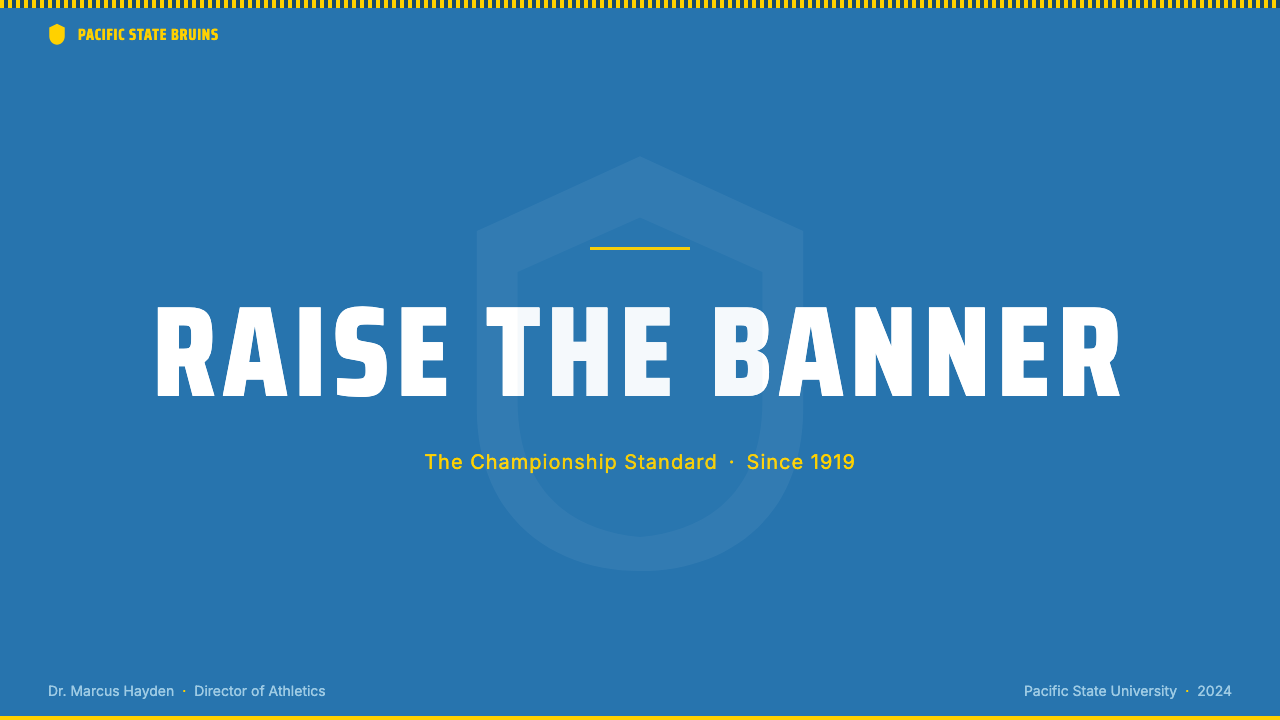
For presentation slides, the system works with particular force on cover pages that need to assert authority from the first frame. A cover built in this palette places a bold typographic title in condensed letterforms against a field of deep blue, with the gold used as a single horizontal accent stripe or to highlight one critical word. Content slides should maintain the structural commitment: one primary color per slide as the dominant field, white for body text, and gold reserved strictly for the single most important data point or call-out. Data visualizations take on athletic clarity — bar charts in full-saturation blue and gold, with no intermediate tones diluting the contrast between compared categories.对于演示文稿,这套系统在需要从第一帧就宣示权威的封面页上表现出特别强劲的力量。以这套色板制作的封面,将以压缩字形排版的粗体标题置于深蓝底面,金色作为单一水平强调条纹或用于突出一个关键词。内容页应维持结构性承诺:每张幻灯片以一种主色作为主导底面,白色用于正文,金色严格保留给单一最重要的数据点或引用。数据可视化具有运动般的清晰度——柱状图以全饱和度蓝与金呈现,无中间调稀释对比类别间的反差。
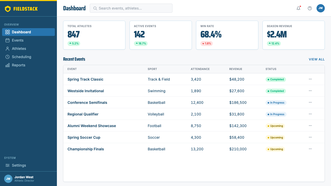
For web interfaces, the system suits dashboards, analytics platforms, and pricing pages where users need to process information quickly under competitive pressure. The approach is disciplined: a near-white or light neutral background, deep blue used for primary navigation and structural elements, gold deployed exclusively for active states, primary calls to action, and the one tier or metric that must stand apart. Interactive components use hard edges and flat fills — no soft shadows, no blurred backgrounds, no frosted glass effects. The system reads as professional competence rather than friendly approachability, which suits B2B and performance-oriented consumer contexts.对于网页界面,这套系统适合用户需要在竞争压力下快速处理信息的仪表板、分析平台和定价页面。方法是有纪律的:接近白色或浅中性的背景,深蓝用于主导导航和结构元素,金色专门用于激活状态、主要行动号召,以及唯一需要突出的层级或指标。交互组件使用硬边和平涂——无柔和阴影,无模糊背景,无磨砂玻璃效果。这套系统读起来像专业能力而非友好亲切,适合B2B和以表现为导向的消费者语境。
For editorial and marketing work, the palette supports bold information hierarchy in the tradition of mid-century American sports publishing. A feature layout uses full-bleed blue or gold panels for section openers, with white body text set at a generous size in a condensed weight to maintain the athletic register. Marketing pages work with alternating full-width blocks — deep blue with gold typography, then white with blue typography — creating rhythm through chromatic alternation rather than decorative ornament. Campaign materials benefit from diagonal compositional energy: angled color panels that imply momentum, with condensed type sized to the edge of legibility for maximum impact.对于编辑与营销内容,这套色板沿袭二十世纪中叶美国体育出版传统,支持大胆的信息层级。一个专题版面为章节开头使用满版蓝或金色面板,白色正文以宽松的字号、压缩字重排版,维持运动语域。营销页面通过交替全宽色块产生效果——深蓝配金色字体,接着白色配蓝色字体——通过色彩交替而非装饰性元素创造节奏。活动物料受益于对角线构图能量:暗示动势的倾斜色板,压缩字体放大至可读性边缘以追求最大冲击力。
A common mistake when working with this palette is treating the blue and gold as interchangeable dominants and alternating them at equal weight across a composition. In practice, the system requires a clear hierarchy of application: blue is the structural ground — the field, the frame, the primary surface — and gold is the accent that defines the single most important element at any moment. When gold dominates at the same weight as blue, the composition loses its directional energy and reads as decorative contrast rather than purposeful hierarchy. Similarly, introducing warm neutrals or muted tones as a mediating third element undermines the palette's core logic, which depends on the confrontational intensity of two fully saturated colors working in opposition.使用这套色板时最常见的错误,是将蓝色与金色视为可互换的主导色,以等重方式交替出现在构图中。实践中,这套系统需要明确的应用层级:蓝色是结构性的地基——底面、框架、主要表面——金色是在任何时刻定义单一最重要元素的强调色。当金色以与蓝色相当的重量主导时,构图失去其方向性能量,读起来像装饰性对比而非有目的的层级。同样,引入暖性中性或消光调作为调和第三元素,会破坏色板的核心逻辑——这套逻辑依赖两种完全饱和色彩在对立中产生的对抗强度。
See the UCLA Bruin Purple & Gold (1919) design system查看 UCLA Bruin Purple & Gold (1919) 完整设计系统
UCLA Bruin Purple & Gold (1919) — FAQUCLA Bruin Purple & Gold (1919) · 常见问题
Can this palette work for non-athletic or non-sports-adjacent brands?这套色板适用于非体育或非体育相关品牌吗?
Yes, but with intentionality. The UCLA palette's core properties — high saturation, maximum contrast, condensed bold type — are not inherently athletic; they are inherently authoritative and high-energy. Financial platforms, competitive B2B software, legal or professional services seeking to project confidence, and educational technology brands can all employ this palette effectively. The important condition is that the brand's positioning aligns with authority, performance, and clarity rather than warmth, playfulness, or sensory richness. The palette actively works against contexts that require approachability or softness.可以,但需要有意识地使用。UCLA色板的核心特性——高饱和度、最大对比度、压缩粗体字——本质上不是体育性的;它们本质上是权威性和高能量的。金融平台、竞争性B2B软件、寻求传递自信的法律或专业服务,以及教育科技品牌,都能有效运用这套色板。重要条件是:品牌定位与权威、表现和清晰对齐,而非温暖、趣味或感官丰富。这套色板会主动对抗那些需要亲切感或柔软感的语境。
How does this system handle dark-mode or dark-background layouts?这套系统如何处理暗模式或深色背景版面?
The system inverts with reasonable success when using deep blue as the primary background surface. In a dark variant, gold becomes the primary typographic and accent color against the blue ground, with white reserved for body text and secondary information. The critical risk in dark mode is overusing gold — because it reads as a light source against the dark field, it must be applied even more selectively than in the standard light variant, or it will overwhelm the hierarchy. Introducing a true black background rather than the deep blue is possible but loses the color temperature contrast between the two primaries, flattening the compositional energy.当以深蓝作为主要背景表面时,这套系统能以较好的效果进行反转。在暗色变体中,金色成为蓝色底面上主要的字体与强调色,白色保留给正文和次级信息。暗模式中的关键风险是过度使用金色——因为它在深色底面上读起来像光源,必须比标准浅色变体中更有选择性地应用,否则会压倒层级结构。引入纯黑背景而非深蓝是可行的,但会失去两种主色之间的色温对比,使构图能量趋于平淡。
What distinguishes authentic application of this palette from a generic blue-and-yellow scheme?这套色板的真实应用与通用蓝黄配色方案有何区别?
Three elements: the specific character of the blue, the typographic register, and the compositional commitment. The blue in this system is deep and cool — Pacific in character, carrying oceanic weight rather than corporate lightness. Generic blue-yellow combinations often use a mid-tone blue that reads as friendly or trustworthy rather than authoritative. The typographic register matters equally: condensed, bold, athletic letterforms are as central to the identity as the colors themselves. And the compositional commitment — bold rectilinear panels, hard edges, maximum contrast, no hedging — separates genuine application from a surface-level color substitution on an otherwise unrelated design.三个要素:蓝色的具体特质、字体语域,以及构图的承诺。这套系统中的蓝色是深邃而冷调的——太平洋性格,承载海洋重量而非企业轻盈。通用蓝黄组合通常使用中调蓝,读起来友好或可信而非权威。字体语域同等重要:压缩、粗体、运动性字形与颜色本身一样是身份识别的核心。而构图承诺——大胆矩形面板、硬朗边缘、最大对比度、不犹豫——将真实应用与对其他无关设计的表层色彩替换区分开来。
Is it appropriate to add a third color to extend the palette?是否适合添加第三种颜色来扩展色板?
The system works precisely because it refuses a third chromatic presence. Adding a third color dissolves the binary tension that gives the palette its declarative force. In practice, the system already contains a functional third element — white — which handles separation, body text, and negative space. If additional differentiation is genuinely needed (for instance, to distinguish five service tiers in a pricing table), the preferred approach is to use tonal variations of the existing blue — a lighter, more airy shade for lower tiers — rather than introducing a new hue. Metallics or neutrals as accent metals are the only addition that does not disrupt the core logic, because they read as surface quality rather than chromatic competition.这套系统的效力正是因为拒绝第三种色彩存在。添加第三种颜色会溶解赋予色板宣示力量的二元张力。实践中,这套系统已经包含一个功能性第三元素——白色——处理分隔、正文和负空间。如果真正需要额外的区分(例如在定价表中区分五个服务层级),首选方法是使用现有蓝色的色调变体——较低层级使用更轻盈、更通透的色调——而非引入新色相。金属色或中性色作为强调性金属饰面是唯一不破坏核心逻辑的补充,因为它们读作表面质感而非色彩竞争。
How should imagery and photography be handled within this system?在这套系统中应如何处理图像与摄影?
Photography in this system should be treated as a structural element rather than an atmospheric one. The preferred approach is high-contrast treatment: images cropped aggressively to isolate a single figure or gesture, reproduced with enhanced tonal contrast so that the image reads as graphic rather than naturalistic, and either placed within a hard-edged rectangular field or silhouetted against the flat color backgrounds. Duotone treatments using the palette's blue and gold are particularly effective, converting photographic naturalism into a graphic object consistent with the flat, high-contrast surfaces of the broader system. Soft, atmospheric photography — wide landscape shots, environmental mood imagery — conflicts with the system's declarative character and should be avoided.这套系统中的摄影应被当作结构性元素而非氛围性元素处理。首选方法是高对比度处理:图像被激进裁切以隔离单一人物或姿态,以增强的明暗对比度复制使图像读作图形而非自然主义,并置于硬边矩形底面内或在平涂色彩背景上做轮廓剪影处理。使用色板蓝与金的双色调处理尤为有效,将摄影的自然主义转化为与整体系统平涂、高对比度表面相符的图形对象。柔和的、氛围性的摄影——广角风景照、环境情绪图像——与这套系统的宣示性格相冲突,应予以避免。
Related design styles相关设计风格
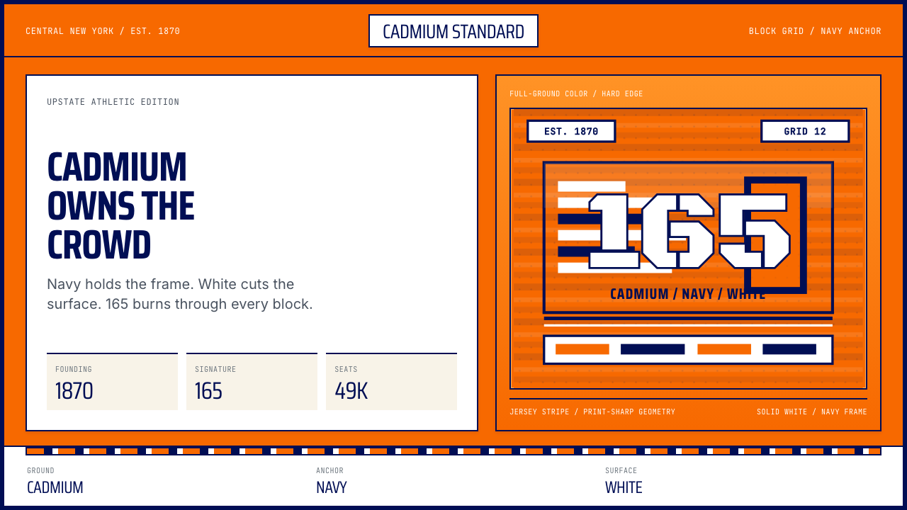 Syracuse Orange (College Athletics, 1870)One hue owns the crowd. Cadmium orange, navy frames, jersey-stripe geometry.一色统领全场。镉橙打底,海军蓝框线与球衣条纹。
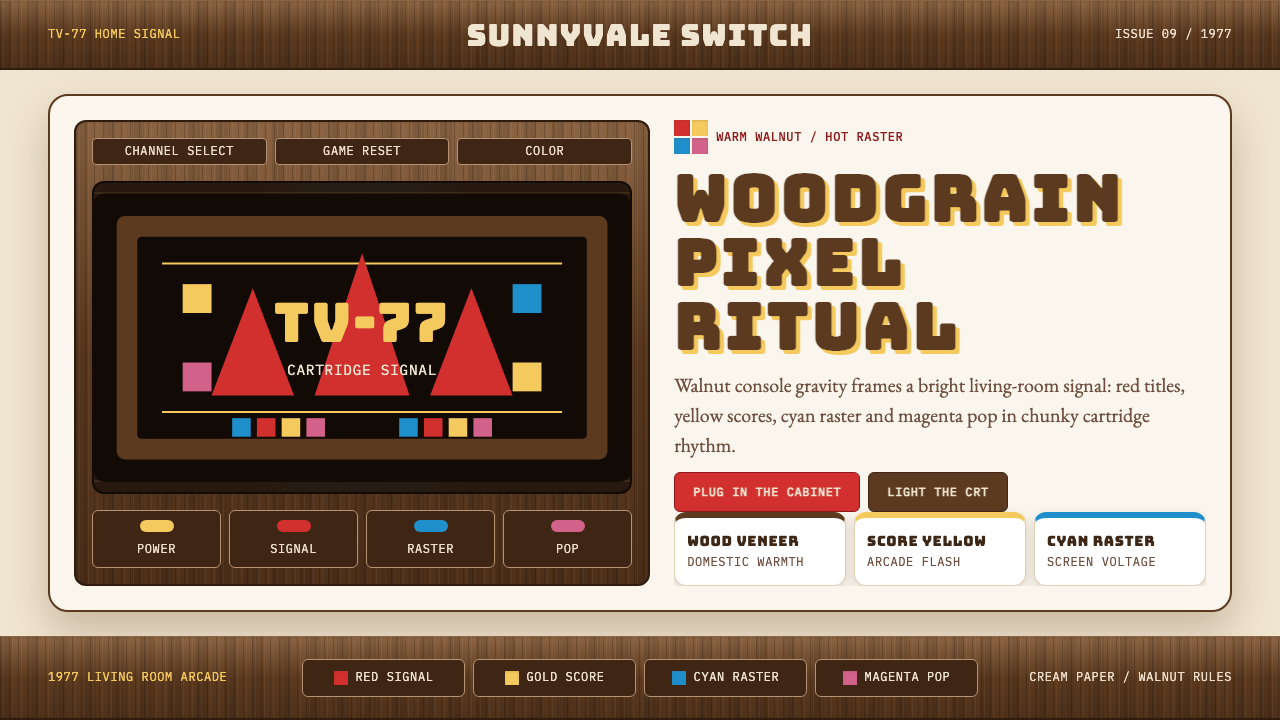 Atari 2600 (Woodgrain)Woodgrain meets raw pixels. Walnut panels frame Bungee type and CMYK raster b…木纹遇上生猛像素:胡桃木面板包裹Bungee字与CMYK色块。
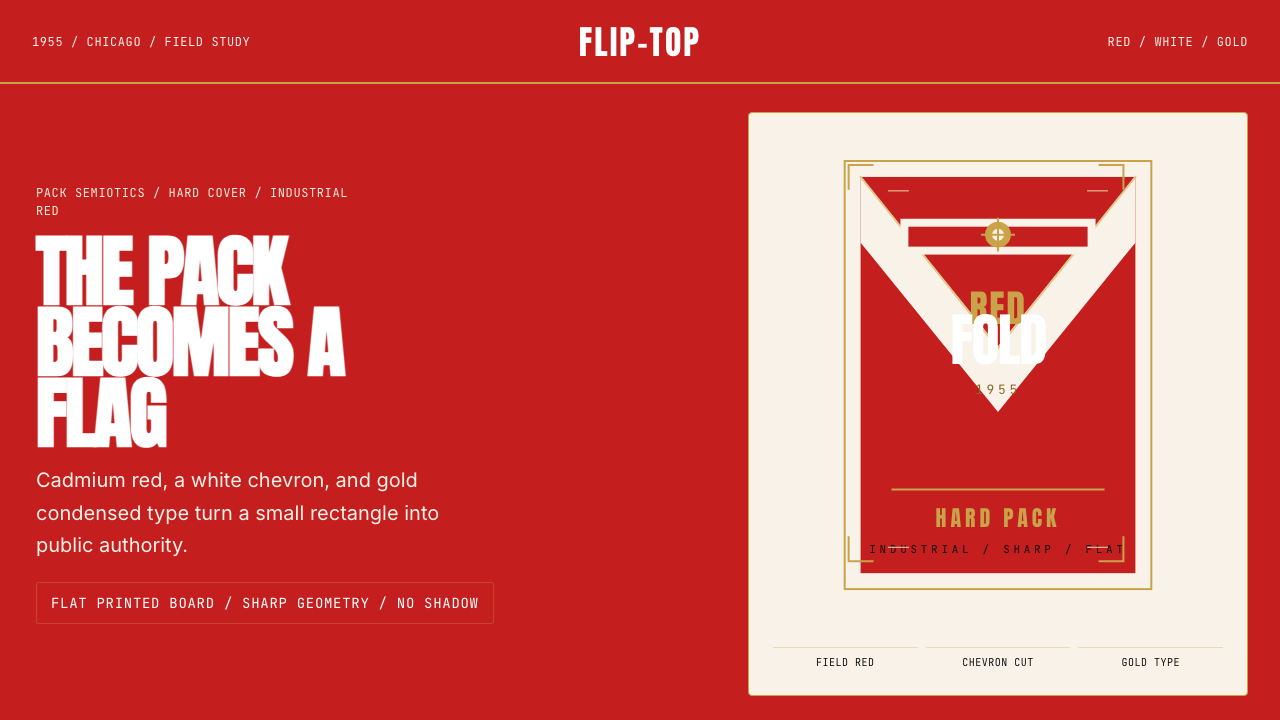 Marlboro Red Flip-Top (1955)Authority in one fold. Cadmium red, white chevron, and gold type read like a…一折成旗。镉红、白人字与金字排出强硬权威。
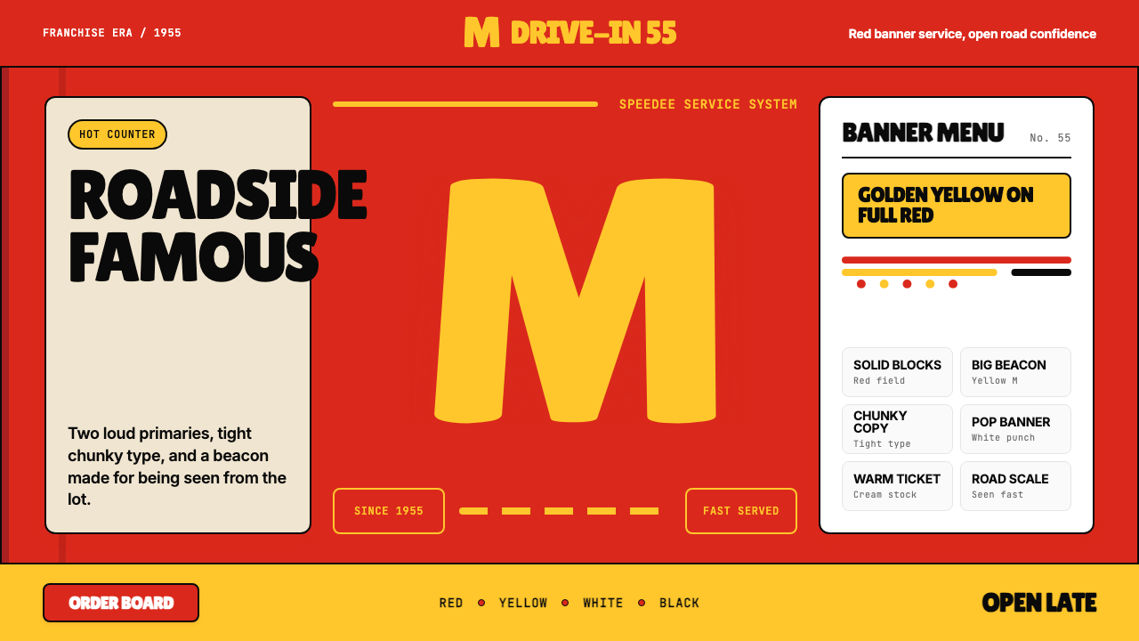 McDonald's Golden ArchesRoadside famous. Saturated red, hot yellow, and chunky type shout from 1955.路边即识别:饱和红、热黄与厚重字体喊出1955。
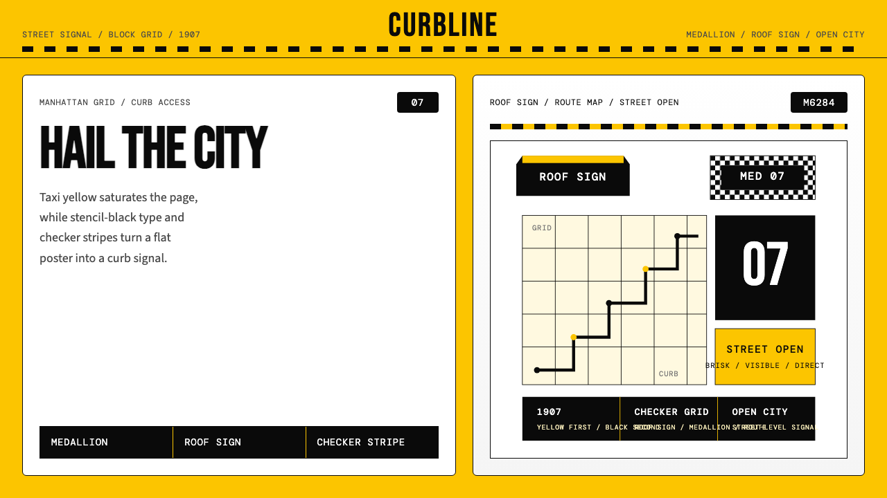 New York Yellow Cab (1907)Visibility is the brand. Taxi yellow, stencil type, checker stripes.可见性就是品牌。出租车黄、模板字与棋盘格定调。