What is Amtrak Arrow (1971)?
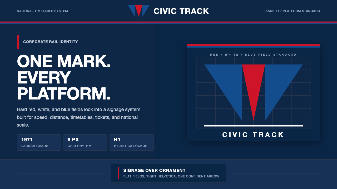
The Amtrak Arrow is 1970s American civic modernism at its most confident — a system built from flat patriotic fields, customized Helvetica, and one decisive arrowhead that earned its place not through ornament but through absolute legibility at speed.
Amtrak Arrow (1971) in brief
The Amtrak Arrow identity, created by Lippincott & Margulies and launched in 1971 alongside the founding of the National Railroad Passenger Corporation, is the defining example of American governmental corporate modernism. Built from a deep corporate navy, flat red and white fields, and a single 'pointless arrow' — a geometric arrowhead whose tip is squared rather than sharp — the system communicates authority, momentum, and national purpose without a single decorative stroke.
The identity's genius lies in systematic restraint. Rather than celebrating the romance of railroads through figurative illustration or historical reference, the Arrow lockup treats the national passenger train as a public utility: efficient, uniform, reproducible. The inverted arrow reads as direction and speed; the customized Helvetica letterforms read as institutional confidence. Together they form a mark that can be silk-screened onto a locomotive nose, embossed on a timetable, or painted on a platform sign with identical authority.
This is a dark-ground identity — the deep navy creates the field against which red and white perform. Unlike light-ground modernist systems that rely on white space as the organizing element, the Amtrak palette makes the background itself active. The navy reads as weight and permanence; the red punctuates with patriotic energy; the white defines the letterforms and the arrow's negative space. The result is a system that feels simultaneously governmental and forward-moving, civic and kinetic.
Where does Amtrak Arrow (1971) come from?
The Amtrak story begins with crisis. By the late 1960s, American passenger rail had been losing money for decades. Private railroads, burdened by the costs of maintaining both freight and passenger infrastructure, were abandoning intercity passenger service at an accelerating rate. The Penn Central Transportation Company — formed from the merger of the Pennsylvania Railroad and the New York Central — filed for bankruptcy in June 1970, the largest corporate failure in American history to that point. Congress responded by passing the Rail Passenger Service Act of 1970, which created Amtrak as a quasi-public corporation to absorb the ailing intercity passenger routes and attempt to make them viable.
Lippincott & Margulies, one of the premier American corporate identity consultancies of the era — they had worked on Shell, Chrysler, and numerous other major brands — was retained to create a visual identity for the new entity. The brief was to create something that conveyed speed, modernity, and national purpose while working across an enormous range of applications: locomotive livery, uniforms, ticketing, signage, printed materials, and passenger car interiors. The solution was the 'pointless arrow,' a geometric mark in red and blue whose squared tip and chevron form evoked forward motion without the aggression of a true arrowhead.
The choice of deep navy as the primary ground color was deliberate. In American civic and governmental visual culture, navy carries associations with reliability, authority, and institutional permanence. It was also a practical choice: navy reads cleanly across a wide range of surface conditions, from a station platform sign viewed in strong sunlight to a dining car menu printed on cream stock. The customized Helvetica letterforms — tighter and more condensed than the standard cuts of the typeface available at the time — were designed to lock tightly with the arrow mark, creating a unified wordmark rather than a loose pairing.
The identity launched with the first Amtrak trains on May 1, 1971, and remained in its original form until around 1999–2000, when Amtrak introduced a revised identity. During those nearly three decades, the Arrow system proved remarkably durable. It survived multiple management changes, government funding battles, and the gradual modernization of the fleet. In the 1980s and 1990s, as corporate identity design moved toward multi-color complexity and photographic treatment, the Arrow's flat, two-color boldness looked increasingly austere — but also increasingly authoritative, like a piece of infrastructure that predated trends.
What defines the Amtrak Arrow (1971) look?
Color Field
The palette is built on three flat, saturated fields: deep corporate navy as the primary ground, flag red as the punctuating accent, and white for letterforms and negative space. The colors are applied in solid, unmodulated planes — no gradients, no tints, no transparent overlays. Their relationship is specifically American in cultural coding: the red-white-blue triad carries patriotic weight without requiring explicit flag imagery, making the brand feel governmental without being propagandistic.
The Pointless Arrow
The central mark is a composite arrowhead formed by two offset chevron bands — one red, one blue — whose tips are squared flat rather than tapered. The 'pointless' quality is not a weakness but the mark's essential character: it conveys direction and velocity without aggression, suggesting institutional momentum rather than competitive speed. The inverted chevron form also reads as a tunnel or corridor — a particularly apt shape for a transportation system designed to move people through space.
Typography
The identity uses a customized, condensed variant of Helvetica whose letterforms are tighter and more compact than the standard typeface. This compression was deliberate: it allows the wordmark to lock tightly against the arrow mark and to fit within the narrow vertical bands of locomotive livery and signage. The type is always set in capitals and at a consistent weight, with no typographic variation for hierarchy — any differentiation of information is handled through layout position and color field, not typographic styling.
Horizontal Alignment
Every element in the system aligns to a strict horizontal baseline. The arrow mark and the wordmark sit on the same optical baseline, with margins that are generous and consistent across applications. This horizontal discipline reflects the practical reality of the system's primary surface — the long, horizontal flank of a passenger locomotive — but also reinforces the sense of controlled forward motion. Nothing rises, tilts, or breaks the horizontal plane; everything points resolutely ahead.
Flat Reproduction Logic
The entire system was designed to reproduce cleanly in any medium with any number of colors — from full-color paint on a locomotive to single-color ink on a timetable. This reproducibility is not a constraint the designers worked around but the fundamental design principle: an identity that cannot be reduced to a two-color stamp is not a system but a style. Every element — the arrow, the type, the color fields — resolves to clean flat shapes at any scale.
Signage-First Legibility
The mark was built to be read from a moving platform, by a passenger who might have only a few seconds to identify the approaching train. This demand for extreme legibility at speed shapes every decision: the high-contrast navy-to-white relationship, the thick strokes of the customized letterforms, the bold geometry of the arrow mark itself. Contemporary digital applications inherit these legibility qualities — the system reads well at small sizes on screens for the same reasons it reads well from fifty feet on a platform.
Institutional Reserve
Unlike commercial airline or automotive branding of the same period, which often pursued dynamism through diagonal composition, swooping letterforms, or illustrative speed lines, the Amtrak system maintains a composed, almost deliberate stillness. The mark does not try to look fast; it tries to look reliable. This reserve distinguishes public-service identity from commercial branding: the civic register requires permanence and trustworthiness over excitement.
Who shaped Amtrak Arrow (1971)?
The New York-based corporate identity consultancy founded by J. Gordon Lippincott and Walter P. Margulies was one of the defining firms of mid-century American brand design. Their portfolio included Shell's pecten logo update, Chrysler's corporate redesign, and numerous other major American and multinational identity systems. For Amtrak, they applied the same systematic approach they had developed across commercial clients: a mark that could be owned completely by the client, reproduced consistently across any surface, and recognized instantly. The Amtrak Arrow stands as one of their most enduring commissions, remaining in use for nearly three decades.
Roger Lewis, a former aerospace executive who served as Amtrak's first president from 1971 to 1975, oversaw the launch of the identity alongside the launch of service itself. His background in large-scale operational systems — he had run General Dynamics — shaped the approach to Amtrak's identity: it had to work as infrastructure, not as advertising. Lewis's insistence on a unified, system-wide identity applied to every touchpoint, from menus to maintenance vehicles, established the discipline that made the Arrow so consistent over its long life.
The rolling stock that carried the Arrow identity was itself a study in forced coherence. Amtrak inherited equipment from more than a dozen different railroads, each with its own livery, maintenance standards, and age profile. Applying the Arrow system to this heterogeneous fleet — painting inherited Pullman cars, Budd-built coaches, and eventually new Superliner double-deckers in the same navy-and-red scheme — demonstrated the identity's defining virtue: a system strong enough to create visual unity from physical diversity. The fleet became the identity's most powerful display medium.
While not the original identity designer, Vignelli — who had created the celebrated New York City subway signage system — was retained by Amtrak in the mid-1970s to study and document the typographic standards of the system. His involvement reflects the period's broader commitment to typographic rigor in American public transportation identity. Vignelli's system-thinking approach, which held that a unified typeface was the primary instrument of institutional coherence, aligned closely with the Arrow identity's own convictions. The two bodies of work — Amtrak and the NYC Subway — represent the twin poles of American governmental information design in the 1970s.
The arrow mark occupies an unusual position in American design history: it is instantly recognizable, widely remembered, yet technically 'pointless' — its designers gave it a squared tip rather than a sharp one to avoid the aggression of a true arrowhead. This formal decision encoded a public-service value into a shape. Transportation systems that carry the general public cannot afford to feel threatening; the blunt tip transforms what would be a weapon's symbol into an instrument of movement. It is one of the subtler pieces of visual rhetoric in mid-century American design.
How do you use Amtrak Arrow (1971) today?
Applying the Amtrak Arrow aesthetic in contemporary work requires understanding its core principle: authority derived from systematic consistency rather than visual complexity. The style works for any project where the client or product is meant to feel like infrastructure — reliable, public-facing, built to last. Government services, civic platforms, public transit applications, and institutional communications are natural fits. Commercial applications work when the goal is trust and legibility over excitement.
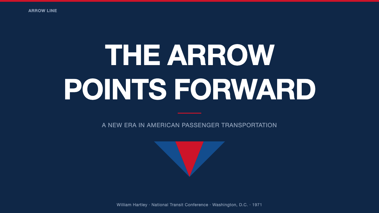
For presentation slides, the Arrow approach calls for a dark navy ground as the primary field, with content elements organized in strict horizontal registers. Cover slides should feature the mark or wordmark at generous scale against the navy, with a single red accent element — a bar, a rule, a band — to activate the composition. Content slides treat the navy as a premium surface: white type at two or three scales creates hierarchy, and a red highlight used sparingly (one element per slide maximum) directs attention. Data slides work in this system when charts and graphs are reduced to flat geometric shapes, colored in the red-white-navy palette, with no gradient fills or drop shadows.
For web interfaces, the style is most at home in contexts that need to communicate institutional weight: government portals, transit apps, civic service dashboards, or any product positioning itself as the serious alternative to a flashier competitor. The approach: navy or near-black as the primary surface color, white for all primary text and interactive labels, red reserved for primary calls to action and status alerts only. Navigation should be typographic and horizontal, with generous spacing and no icon clutter. Card components should use solid borders rather than shadows; tables should use ruled lines rather than alternating row fills.
For editorial and marketing, the style supports bold, high-impact layouts with a public-service register. Full-width navy headers alternating with white content zones create the rhythm of a well-organized timetable. Pull quotes and section labels work in red on white or white on navy. Marketing copy should be direct and declarative — the style does not support hedging or whimsy. The wordmark or logotype should be set tight and at relatively large scale; the system's authority comes from confident sizing, not elaborate decoration.
A common mistake when working with this aesthetic is softening the palette or adding warm undertones to make it 'more approachable.' The Amtrak identity's navy is cool and slightly greenish, its red is pure and flat — adding warmth or depth to either destroys the civic directness that is the system's defining quality. Similarly, replacing the flat color fields with gradients or photographic backgrounds undermines the system's legibility at scale. The discipline is the design: if the palette feels stark, that is the point.
Amtrak Arrow (1971) — FAQ
Why is the arrow called 'pointless'?
The name refers to the shape of the tip: the arrowhead is squared flat at the leading edge rather than tapered to a point. This was a deliberate formal decision by Lippincott & Margulies. A true arrowhead implies aggression and weaponry; the blunt-tipped version implies direction and momentum without threat. For a public transportation system serving the general population, this distinction mattered. The 'pointless' quality also makes the mark more abstract — it reads as a symbol of movement rather than as a literal arrow, which gives it greater flexibility and longevity as an identity mark.
How does the Amtrak Arrow differ from European rail identities of the same period?
European national rail identities of the 1970s — Deutsche Bahn, British Rail, SNCF, and others — were shaped by longer institutional histories and a more confident public-sector design culture. British Rail's double-arrow mark (designed by Gerald Barneyof Design Research Unit in 1964) and Deutsche Bahn's corporate identity are similarly systematic and mark-led, but they emerged from established national institutions rather than crisis-born new entities. The Amtrak Arrow carries a specifically American quality: it needed to claim institutional authority it had not yet earned, to look permanent before it had proven permanence. European marks could afford more restraint; the American system needed to shout its legitimacy.
Does the system work outside of dark navy backgrounds?
The Arrow mark was also used on white and light grounds, particularly in printed materials such as timetables, tickets, and signage inserts. On light grounds, the red element of the mark carries the primary visual weight, with the blue element providing supporting structure. The wordmark remains in the same customized Helvetica at the same weight. The system works on light grounds, but loses some of its characteristic authority — the deep navy is where the mark finds its fullest expression, because the dark field gives the white type and red accent their maximum contrast and weight.
Is this style appropriate for commercial products, or only public-sector use?
The civic register of the Amtrak Arrow is a feature, not a limitation — and it can be strategically deployed in commercial contexts where trust and reliability are competitive differentiators. Financial technology products, insurance platforms, healthcare services, infrastructure software, and any commercial product that competes on stability rather than novelty can benefit from this style's institutional authority. The key is that the civic-register quality must match the product's actual promise. Applying the style to a speculative or entertainment-forward product will read as incongruent — the visual system claims permanence the product cannot deliver.
How should the red accent be used without overwhelming the composition?
In the original Amtrak identity, the red occupies a precisely calibrated proportion of the total mark — it is present, emphatic, but never dominant. The navy field always provides the primary visual mass, with white giving legibility and red providing directional energy. Contemporary applications should observe this hierarchy strictly: red should appear in no more than one or two elements per composition, and those elements should be the points of maximum informational importance. The moment red begins to spread across a composition — multiple buttons, multiple highlights, multiple sections — the civic authority collapses into commercial loudness. One red is a statement; three reds are noise.
Related design styles
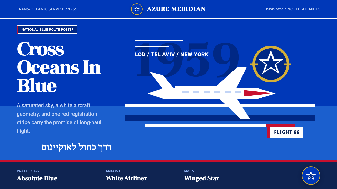 El Al Israel AirlinesNational blue takes command. White aircraft geometry cuts a flat jet-age post…
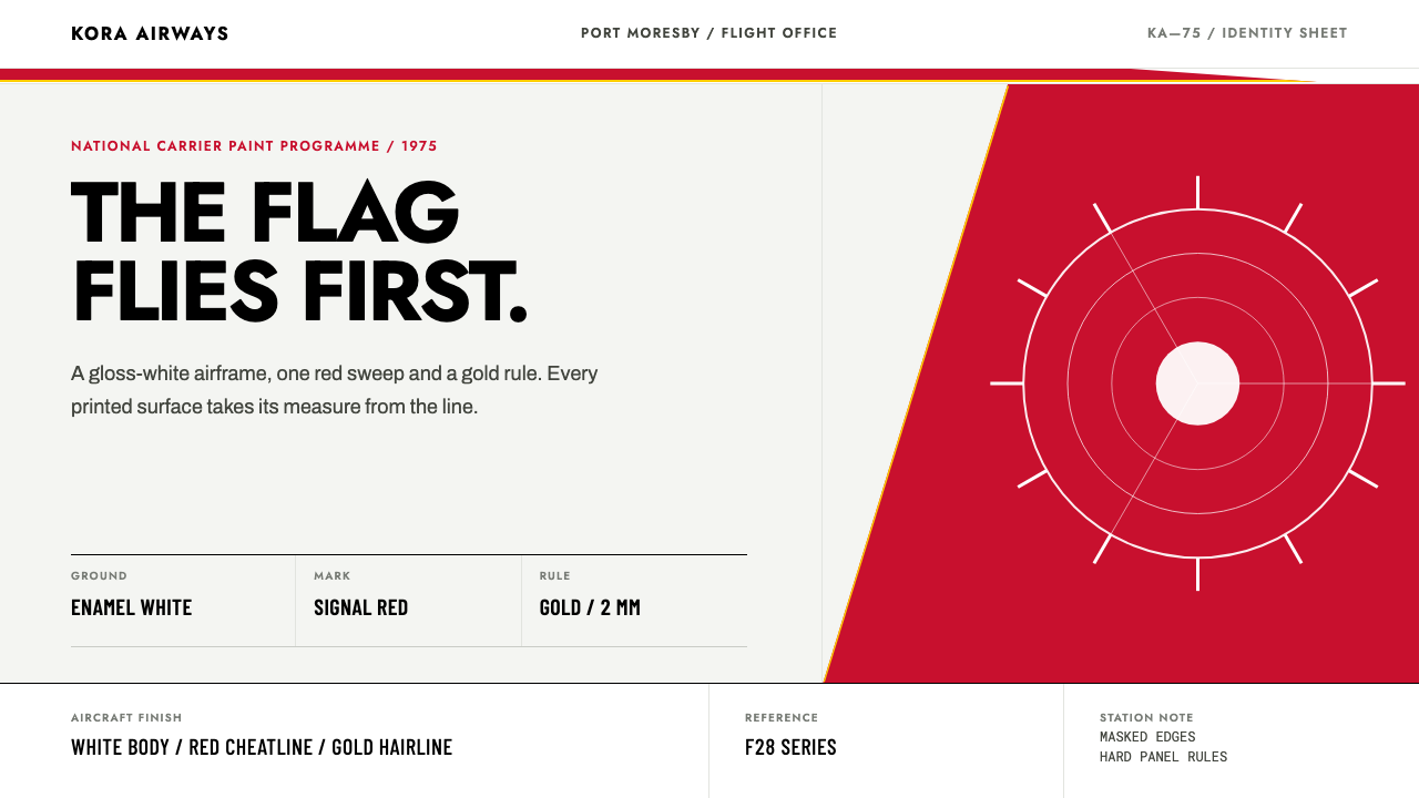 Air Niugini Livery 1975A flag engineered for flight. Signal red sweeps across enamel white, underlin…
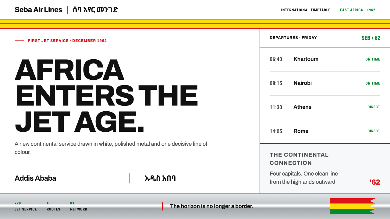 Ethiopian Airlines 1960sJet-age confidence, drawn flat. Yellow bands and red hairlines cut across whi…
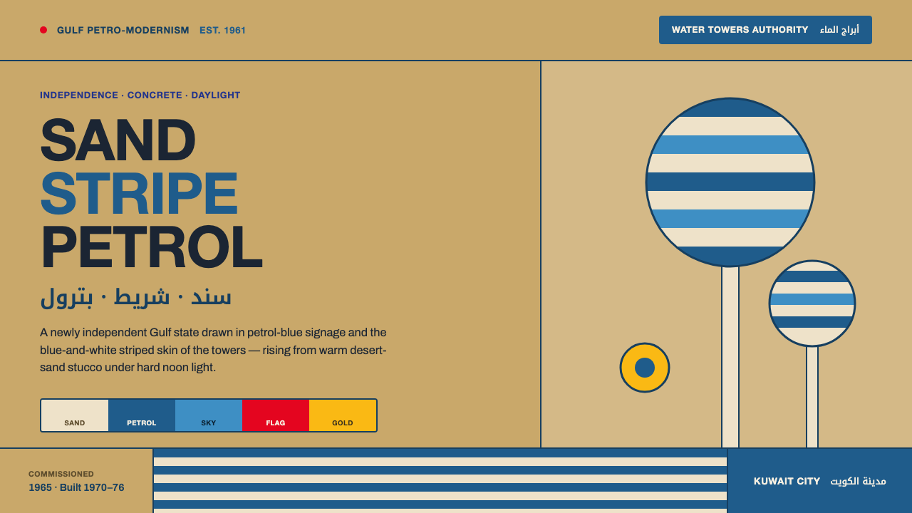 Kuwait Oil-Era ModernismOil-boom optimism in concrete. Petrol-and-sky tower stripes band warm desert-…
 Aeroflot Soviet AirlineEngineered restraint rules. Silver ground, royal-blue cheatlines, and flat gr…
 Gill Sans British RailPublic authority, enamel-flat. Rail Blue bands, white humanist type, one red…