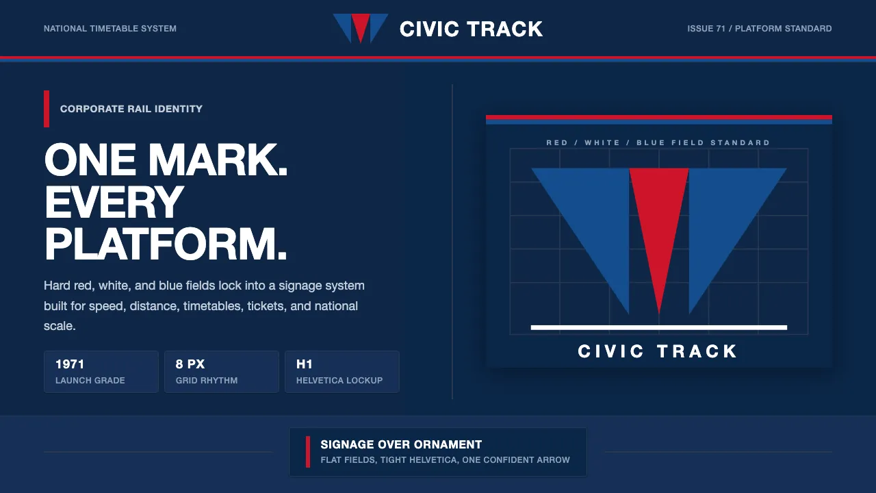
About Amtrak Arrow (1971)
When America nationalized its failing passenger railroads in 1971, the new Amtrak needed a face — and got the textbook of 1970s corporate modernism: an inverted "pointless arrow" of red and blue, locked tight in customized Helvetica on a field of deep corporate navy. It is patriotic without flag-waving, disciplined without coldness. The system trades ornament for system. Flat solid red/white/blue fields, strict horizontal alignment, generous spacing, and a single confident arrowhead carry the whole identity. It reads as signage — built to be legible from a moving platform and reproduced on a thousand surfaces.
- Origin
- United States passenger rail
- Era
- 1950–1990; 1971 Amtrak launch, pointless-arrow mark used to ~1999/2000
- Key figures
- Lippincott & Margulies
- Movements
- 1970s corporate modernism · Helvetica-driven systematic identity · nationalized-rail branding
Amtrak Arrow (1971) design spec
Colors
Typography
The other 11 sections — buttons, cards, spacing, motion, techniques and more — open once you unlock. Download the DESIGN.md or send it to your AI in one click. Unlock once, yours forever.
Sign up nowStyles similar to Amtrak Arrow (1971)
Also inspired by brands & products, with a close feel.
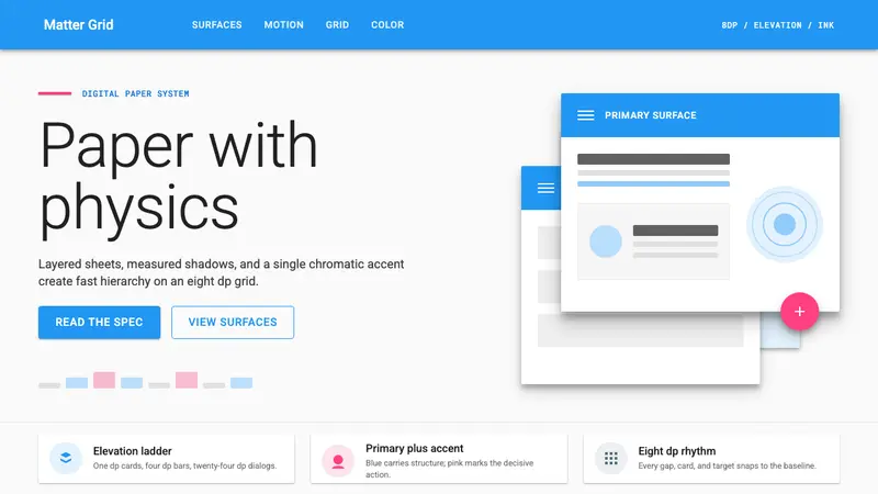 Material Design 1.0Depth made flat usable. Blue app bars, pink FABs, 8dp grids, and crisp paper shadows.
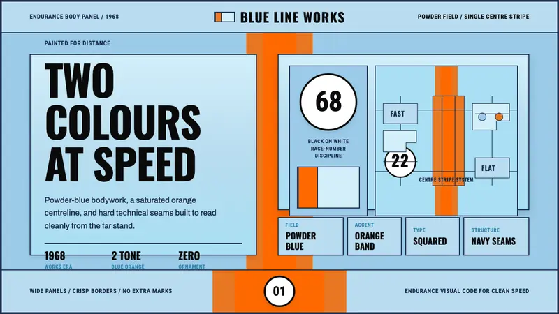 Gulf Racing LiverySpeed made disciplined. Powder blue, orange stripe, black roundel, strict grid.
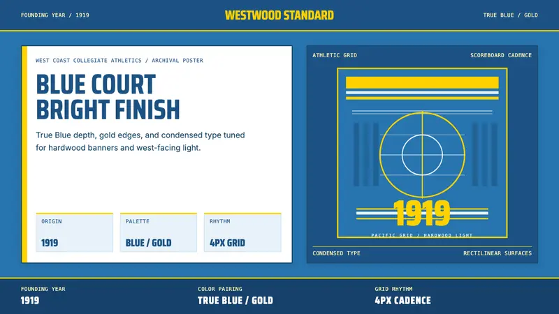 UCLA Bruin Purple & Gold (1919)Pacific authority in motion. True Blue panels, gold stripes, condensed athletic type.
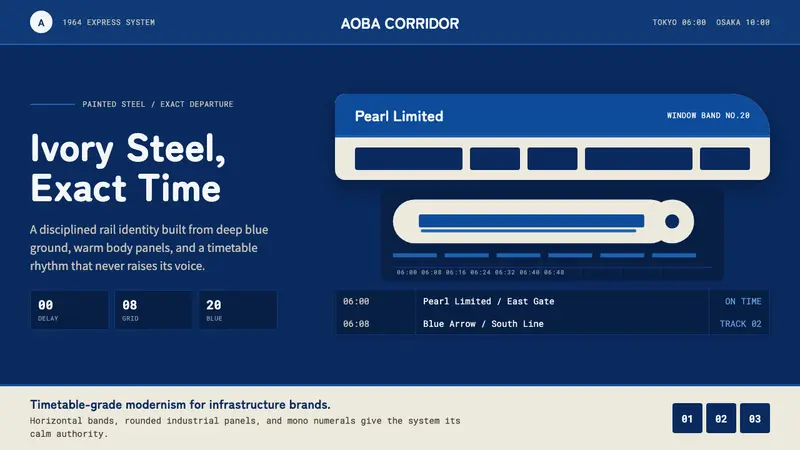 Shinkansen BulletTimetable authority. Ivory steel bands and Bullet Blue grids move with exact restraint.