What is Office Rubber Stamps?
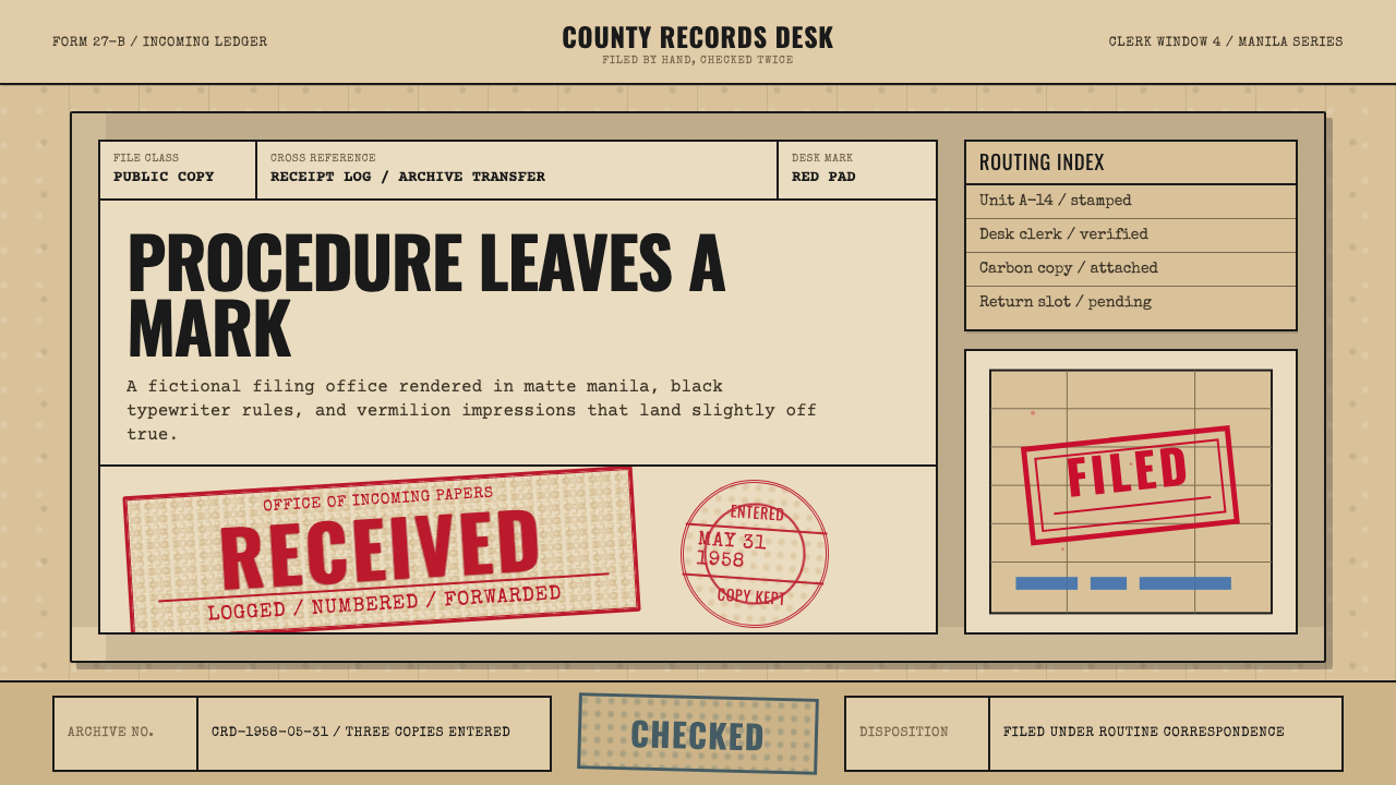
Office Rubber Stamps makes bureaucratic procedure visible — a vermilion date stamp thudded slightly off-axis onto a manila folder, over the black type of a mid-century filing desk.
Office Rubber Stamps in brief
Office Rubber Stamps is the visual language of the postwar filing desk — the world of the clerk who received, dated, cross-referenced, and refiled paper by hand, decades before any of that process moved onto a screen. Its central image is a RECEIVED or APPROVED stamp struck onto a manila folder: vermilion ink pressed unevenly, skewed a few degrees off true, over-inked at the edges where the stamp first bit the paper and starved toward the center where the pad ran dry mid-stroke.
Around that stamp sits the rest of the ledger: black typewriter body text, ruled tables for tracking file numbers and dates, and an occasional second color — often a paler blue — reserved for a second pad used to distinguish one kind of approval from another. Nothing here is printed with mechanical precision; everything carries the visible evidence of a human hand pressing, aligning by eye, and sometimes missing the mark slightly.
The overall material feel is matte throughout — rubber, ink, and aged tan card stock, never gloss or shine. The system reads as official, handled, and quietly imperfect: not a design that was drawn to look worn, but one that documents the actual residue of a daily clerical routine, repeated so many times across so many folders that the imperfections became part of the visual identity of the process itself.
Where does Office Rubber Stamps come from?
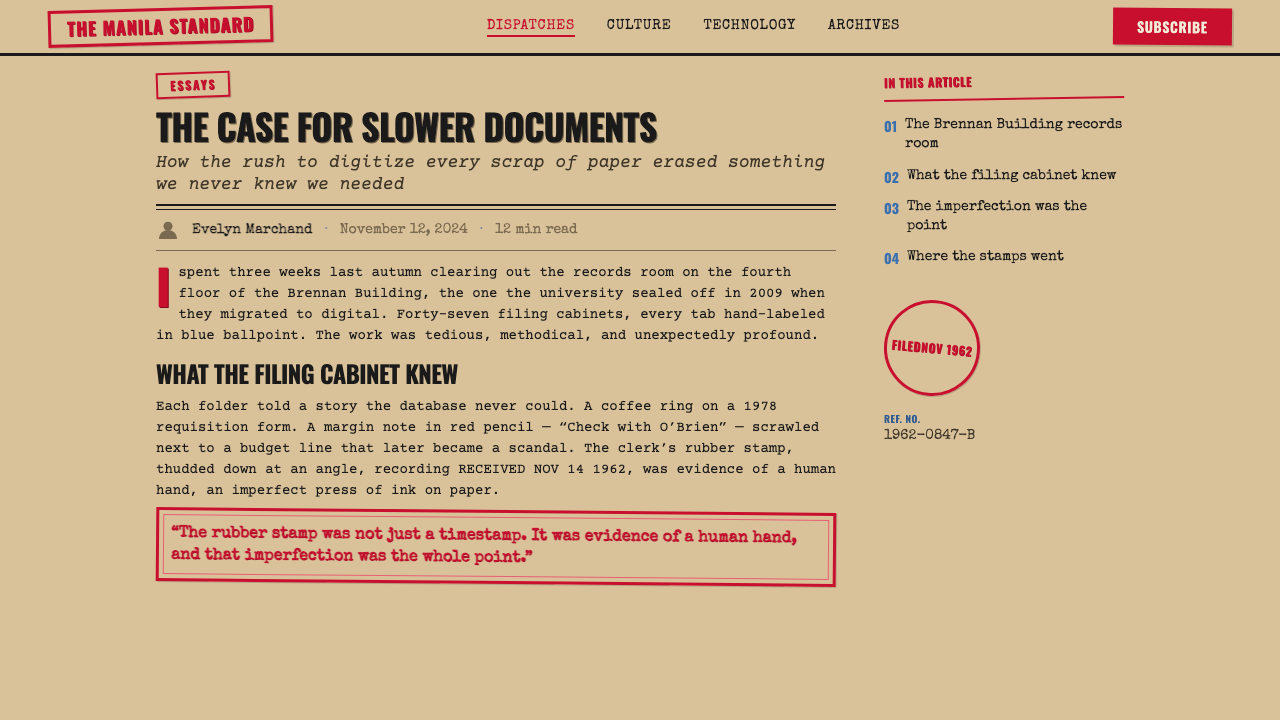
The rubber stamp itself is a nineteenth-century invention, made practical once vulcanized rubber — patented by Charles Goodyear in 1839 and refined through the following decades — could be molded into durable, reusable printing surfaces cheaper and faster to produce than engraved metal type. By the early twentieth century, self-inking stamp mechanisms, which re-coated the rubber die automatically between strikes, had made repeated, high-volume stamping practical for any office that processed paperwork at scale — banks, government agencies, insurance companies, shipping firms, and the filing rooms of any sizable postwar corporation.
The aesthetic this system draws from belongs specifically to the mid-twentieth-century North American office, roughly the 1950s through the 1980s, when paper-based bureaucracy reached its peak scale just before computerization began to displace it. This was an era whose administrative culture was defined by the typewriter, the filing cabinet, the carbon-copy form, and the date stamp — a system built for legibility and audit trail, where every document had to show, in ink, exactly when it had been received and by whom it had been actioned.
Companies such as Trodat, founded in Austria in 1912 and a pioneer of the modern self-inking stamp mechanism, and long-established American stamp makers such as Simon's Stamps, supplied the physical tools of this world — durable rubber dies mounted in wood or plastic handles, designed to survive thousands of repeated impressions. The vermilion ink favored for many official stamps was chosen partly for visibility against black type and partly by long bureaucratic convention, carrying forward a much older tradition, in many cultures, of reserving red ink or a red seal for marks of authority and official action.
Behind the stamp itself sat an entire clerical culture: rooms of typists working from carbon-paper forms, filing clerks who cross-referenced folder numbers by hand against master ledgers, and a paper trail whose whole purpose was accountability — a document's journey through an organization had to be traceable, date by date, stamp by stamp. The visual roughness this style now recalls — the skewed angle, the uneven ink, the slight fade — was never a stylistic choice at the time. It was simply what happened when a human being, working quickly and by hand, stamped the same folder for the ten-thousandth time that year.
What defines the Office Rubber Stamps look?
Stamp Ink and Color
Vermilion red is the dominant stamp color, chosen historically for maximum visibility against black type and long bureaucratic convention around red as the color of official authority. A secondary, paler blue occasionally appears from a second ink pad, used to distinguish a different category of approval or action from the primary vermilion mark.
Uneven Impression
No stamped mark is ever perfectly even. Ink pools heavily where the stamp first struck the paper and thins toward the center or far edge, where pressure and ink supply were weaker. This unevenness is the visual signature of a hand-pressed object rather than a mechanically printed one, and it should read as an artifact of repeated real-world use rather than a decorative texture applied after the fact.
Off-Axis Alignment
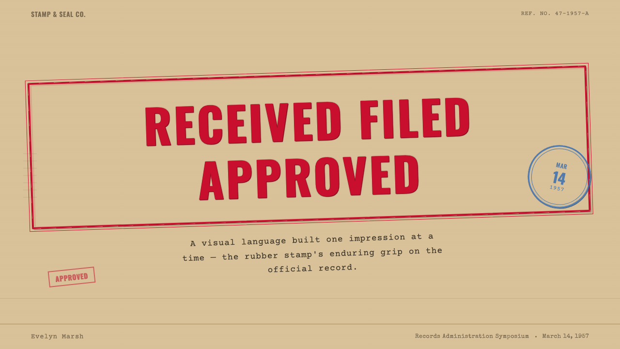
Stamps are struck a few degrees off true rather than perfectly square to the page, since a clerk aligning a stamp by eye at speed rarely achieved perfect rotation. This slight skew, consistently applied at a small angle rather than a dramatic one, is what separates the style from a generic 'grunge' texture — the imperfection is procedural, not decorative.
Typewriter Text
Body text is set in the register of a mechanical typewriter — monospaced, evenly weighted characters struck onto paper by a physical key rather than composed by a compositor. This gives every document the flat, businesslike voice of an office form rather than the more expressive variety of printed typography.
Manila and Tan Card
The ground material throughout is aged tan and manila card stock — the folder, the form, the ledger sheet — with a matte, slightly fibrous surface that has yellowed and softened with handling over time. This warm neutral base is what every ink color and stamp mark sits against.
Ruled Ledger Grid
Tables and forms are built from thin, hand-ruled or lightly printed lines organizing file numbers, dates, and cross-references into rows and columns. The grid is functional rather than decorative — its job is to keep a clerk's handwritten or typed entries aligned and auditable, not to add visual structure for its own sake.
Matte Material Feel
Every surface in this system is matte — rubber, ink, and card — with no gloss, shine, or reflective element anywhere. This flat, light-absorbing quality is central to the style's honesty: nothing here is meant to catch the eye with sheen, only with the visible fact of procedure having been performed.
Who shaped Office Rubber Stamps?
Founded in Austria in 1912, Trodat became a leading manufacturer of self-inking stamp mechanisms — devices that automatically re-coated the rubber die with ink between strikes, making rapid, repeated stamping practical for high-volume offices. Its designs standardized much of the physical stamping hardware this style depicts.
A long-established American maker of rubber stamps, Simon's Stamps supplied the durable dies and handles used across countless mid-century North American offices, from small businesses to government filing departments, embedding the rubber stamp as a standard fixture of clerical work.
Though not a named individual, the anonymous clerical worker of the 1950s–1980s office — typing forms, stamping dates, cross-referencing file numbers by hand — is the true author of this aesthetic. Every imperfection the style now celebrates originated as an ordinary, unremarked byproduct of that daily routine repeated at scale.
How do you use Office Rubber Stamps today?
Office Rubber Stamps is a style for products that want to feel procedural, official, and lightly bureaucratic in a warm rather than cold way — approval workflows, compliance and audit tools, document management systems, or any brand that wants a sense of institutional history and paper-trail rigor rather than sleek software polish.
For presentation slides, a cover works well built around a single large stamp mark — 'APPROVED,' 'RECEIVED,' a status word — set slightly off-axis on a manila-toned ground, with a typewriter-style title beneath it. Content slides should use the ruled ledger grid as an actual layout device: rows and columns of information bordered by thin hand-drawn-feeling lines. Data slides benefit from treating each data point as a stamped entry in a ledger — a number followed by a small stamped icon or checkmark rather than a polished modern chart style.
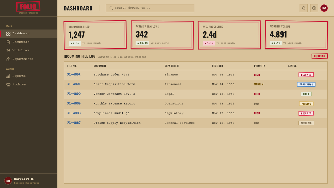
For web interfaces, the style suits dashboards for compliance, logistics, or document-tracking products where status changes should feel officially recorded rather than instantly toggled. A status badge rendered as a small stamp graphic — vermilion 'Approved,' pale blue 'Pending' — communicates state changes with more institutional weight than a flat colored pill. Buttons and form fields can borrow the manila card texture as a background, with typewriter-style type for labels.
For editorial and marketing work, the style supports storytelling around process, history, or institutional trust — annual reports, compliance-focused marketing, or brands built on a long operating history. A stamped date or status mark makes an effective visual anchor for a timeline or case study, giving each entry the feeling of having been officially logged rather than merely listed.
A common mistake is to make every stamp mark identically uneven, using the same texture or rotation repeatedly across a layout — real stamped impressions vary from strike to strike, and a design that copies the same 'distressed' texture everywhere reads as an applied filter rather than an authentic procedural residue. Equally, overusing the vermilion red across large areas of a layout undoes the effect: the color's power comes from appearing only where an actual stamp would have struck, against a much larger field of quiet manila and black type.
Office Rubber Stamps — FAQ
Is this the same as a generic 'grunge' or 'distressed' texture style?
It looks adjacent but works on a more specific logic. Generic grunge texture applies random wear and tear for atmosphere without any underlying process it represents. Office Rubber Stamps ties every imperfection to a specific real-world cause — uneven ink from a drying pad, off-axis alignment from a hand pressing a stamp at speed, yellowing card from years of handling. The imperfections should look procedural and explainable, not randomly distressed.
Can this style work in a dark or high-contrast layout?
Not naturally. The style depends on a warm, light, matte manila ground as the base every ink color sits against — vermilion and blue stamps only read as procedural marks when contrasted with pale tan card and black typewriter text. A dark or high-contrast inversion would lose the essential quality of a paper document being handled in office light, which is central to the style's meaning.
Why vermilion red specifically, rather than any other stamp color?
Vermilion was favored historically for practical and symbolic reasons together: it offers strong visual contrast against black typewriter ink and pale card stock, making a stamped mark easy to spot at a glance during a file review, and it carries forward a much older bureaucratic and cultural convention of reserving red for marks of authority and official sanction. A secondary blue occasionally appears specifically to distinguish a different category of action from the primary red mark, not as a stylistic alternative to it.
Does this style suit modern SaaS products, or only retro-themed ones?
It can suit modern products directly, not only retro pastiche, particularly compliance, audit, logistics, and document-workflow tools where the underlying function — recording that something official happened, and when — is unchanged from the paper era. Used with restraint, a stamped status badge can communicate 'this action is officially recorded' more clearly than a generic colored pill, precisely because the visual metaphor of a stamp still maps onto what the product is actually doing.
What is the most important detail to get right when applying this style?
The relationship between restraint and imperfection. The style depends on a large, quiet field of manila, tan, and typewriter black, punctuated rarely by an uneven, slightly off-axis stamp mark. If the imperfection is applied everywhere, or the stamp color is overused, the design loses the very quality that makes it convincing — the sense that a real hand, working through a real stack of paper, pressed down once and moved on.
Related design styles
 Slide RulePrecision made visible. Eye-saver yellow, black ticks, and one red hairline d…
 Aeronautical ChartReads like cockpit data. Magenta-blue airspace rings cut through dense dark-c…
 Air Traffic Control RadarOperational gravity. Phosphor green rings, sweep wedges, and monospace blips…
 Amtrak Arrow (1971)Civic authority at speed. Deep navy, Helvetica lockups, and red-blue arrows.
 Interstate Highway ShieldEngineered for 70 mph. Guide-sign green, Pantone shield blue and red, Highway…
 Lunar RoverBuilt for the vacuum. Kapton-gold foil and stencil part-numbers against void-…