What is Nixie Tube Display?
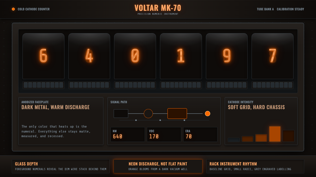
Nixie tube display design is the visual language of instrumentation — warm reddish-orange numerals glowing from within glass vacuum envelopes, suspended in depth over near-black metal chassis, precision and heat made visible.
Nixie Tube Display in brief
Nixie tube display aesthetics emerge directly from the physics of cold-cathode gas discharge. Each glass vacuum tube contains a stack of shaped metal numeral cathodes; when voltage is applied to a specific cathode, the neon gas surrounding it ionizes and glows with a warm reddish-orange light near 640 nanometers. The visible numeral appears to float slightly behind the glass envelope, giving the display an inherent sense of depth that no flat-panel technology can replicate.
As a design system, Nixie tube aesthetics are defined by strict constraints: luminous warm orange numerals on absolute black or near-black grounds, never on cream or white. The surrounding chassis is machined metal — anodized aluminum or brushed steel — with visible structure: ventilation slots, screw heads, grid overlays, bezel edges. Every surface detail communicates that a real physical instrument exists behind the display.
The style reached its peak commercial presence in the late 1960s and early 1970s in Hewlett-Packard bench instruments, Burroughs electronic calculators, and precision frequency counters built for laboratories and broadcast facilities. When LED and liquid-crystal displays arrived in the mid-1970s, Nixie tubes were rapidly displaced — but the aesthetic they defined has enjoyed a sustained revival in hobbyist clock construction, retro industrial interior design, and digital interfaces that want to signal precision, authority, and analog warmth simultaneously.
Where does Nixie Tube Display come from?
The Nixie tube takes its name from a Burroughs Corporation type designation: 'Nixie' was a registered trademark derived from 'NIX I' — Numeric Indicator eXperimental No. 1. The underlying technology was developed by the Haydu Brothers Laboratories, a California electronics company that Burroughs acquired in the early 1950s. The device itself drew on the physics of cold-cathode gas discharge tubes, a technology that had been used in voltage regulator tubes and thyratrons since the 1920s. What was novel about the Nixie tube was its use of shaped metal cathodes stacked inside a single glass envelope, allowing a single tube to display any digit from zero to nine.
Through the late 1950s and into the 1960s, Nixie tubes became the preferred numeric display for high-end electronic test equipment, especially instruments demanding both legibility at a distance and stability over time. Hewlett-Packard adopted them widely for frequency counters, digital voltmeters, and oscilloscope readouts. The National Bureau of Standards and NASA both used Nixie-equipped instruments in precision measurement applications. This association with scientific and engineering accuracy became inseparable from the aesthetic — Nixie tubes did not merely display numbers; they asserted the rigor of measurement.
The design grammar of the instruments that housed Nixie tubes was itself a product of mid-century American industrial design: Burroughs and HP developed a visual language of grey or black anodized metal enclosures, orange or yellow labeling on brushed aluminum panels, and a restrained palette that communicated technical seriousness. Ventilation grilles, recessed controls, and visible fasteners were not incidental details but deliberate expressions of a product category that valued repairability and transparency of construction over decorative concealment.
By the mid-1970s, inexpensive LED displays and seven-segment liquid crystal panels had made Nixie tubes economically obsolete. Remaining NOS (new-old-stock) tubes became collector items, and a hobbyist tradition of building Nixie tube clocks emerged in the 1990s and flourished through the 2000s. This revival fixed the aesthetic firmly in the public imagination as a marker of analog warmth, craft, and the particular beauty of technologies that glow from within rather than projecting light forward.
What defines the Nixie Tube Display look?
Ground Color
The definitive constraint of Nixie tube aesthetics is the requirement for an absolute dark ground. Nixie digits are not printed or painted — they emit light, and light-emitting displays require dark surroundings to be legible. Authentic Nixie tube interfaces use black or near-black as their only background, reserving the warm orange glow exclusively for active numeric elements. Cream, white, or grey grounds are categorically incompatible with this system; they undermine the sense of emission that defines the entire aesthetic.
Glow and Depth
A Nixie tube digit is not flat. The shaped metal cathodes are stacked at slightly different depths inside the glass envelope, and the ionized gas glow surrounds each cathode fully in three dimensions. The result is a numeral that appears to exist behind a glass surface, with soft ambient luminosity that bleeds gently into the surrounding darkness. Digitally rendered Nixie aesthetics must capture this depth: a hard-edged glowing digit is wrong; the light should bloom outward from the character with gradual falloff, implying the physics of gas ionization.
Warm Orange Chromaticity
The orange-red hue of neon gas discharge at Nixie tube operating voltages is specific and not freely substitutable. It sits firmly in the warm orange-red range — more amber than fire-engine red, more saturated than a candle flame, but never crossing into yellow or pure red. This chromaticity is the single most recognizable feature of the style. Blue, green, or white glows belong to different gas discharge families (argon, mercury vapor, cold white fluorescent) and produce entirely different aesthetic territories. A Nixie aesthetic that uses any glow color other than warm orange is misidentifying the source material.
Metal and Structure
Nixie tube instruments are encased in machined metal, and this material language is inseparable from the aesthetic. Anodized aluminum chassis show fine surface texture and light reflection; ventilation slots cast hard parallel shadows; recessed panel labels print in high-contrast stencil type. The surrounding structure communicates weight, precision, and industrial provenance. When rendering this aesthetic digitally, textured metal surfaces, visible grid overlays, bezel shadows, and implied mechanical structure are not optional decorative additions — they are part of the semantic content of the style.
Digit Legibility as Hierarchy
Nixie tube instruments exist to communicate numeric readings, and every visual decision in the original designs subordinates itself to that goal. The digits are large relative to the enclosure, their glow provides intrinsic contrast against the dark ground, and all supporting labels and controls are sized to never compete with the primary display. Applied digitally, this principle translates to a strict hierarchy: the glowing numeric or data element anchors the composition, and all surrounding text, labels, and UI controls remain secondary in both luminosity and visual weight.
Typography: Stencil and Monospace
The text labels and supporting typography on mid-century instruments follow a specific logic: stencil-cut lettering on metal panels, monospace type on printout paper, and digit displays that treat every character as occupying the same horizontal space. Authentically rendered Nixie-adjacent digital work uses monospace or fixed-width typefaces for any numeric display, and favors stencil-like capitals or tightly tracked uppercase sans-serif for labels. Proportional serif or variable-weight display fonts are foreign to this environment and erode the system's internal coherence.
Glass Reflection and Specular Detail
The glass envelope of a Nixie tube is visible and reflective. In photographic references and well-rendered digital interpretations, the glass surface catches ambient light and produces a small specular highlight — a thin bright arc near the top of the tube — while the lower body of the glass shows a subtle internal glow from the discharge. This glass-over-glow layering is one of the most distinctive qualities of the aesthetic. Digitally, it can be rendered as a subtle light reflection overlaying the digit glow, reinforcing the sense that the numerals exist behind a physical surface rather than on top of one.
Who shaped Nixie Tube Display?
Burroughs Corporation was the primary commercial force behind Nixie tube technology. After acquiring the Haydu Brothers' patent and production capability, Burroughs manufactured Nixie tubes under that brand name and supplied them to instrument makers across the electronics industry through the late 1950s and 1960s. The company's investment in the technology gave Nixie tubes their commercial foothold, and the aesthetic that Burroughs-equipped instruments established — precise, authoritative, quietly glowing — defined the look of the precision measurement market for two decades.
The Haydu Brothers, working in California in the early 1950s, developed the cold-cathode numeric display tube that would become the Nixie. Their technical innovation — stacking multiple formed metal numeral cathodes inside a single glass vacuum envelope with a common anode — solved the problem of compact numeric display in a way that predated and outperformed all contemporary alternatives. Without their foundational work, the particular depth, glow quality, and digit-in-glass appearance that defines Nixie tube aesthetics would not exist.
Hewlett-Packard's bench instrument designs of the 1960s and early 1970s represent the aesthetic high point of Nixie tube application. HP frequency counters, digital voltmeters, and signal generators featured clean anodized aluminum front panels, Nixie tube arrays in black bezels, and a restrained visual language that balanced functional information density with visual calm. These instruments set the standard for what precision electronics should look like, and their design grammar — dark panels, orange numerals, labeled controls in high-contrast type — is the canonical reference for the Nixie tube aesthetic as applied in contemporary digital interfaces.
The National Bureau of Standards in the United States was among the most demanding institutional users of Nixie-equipped instruments, deploying precision frequency counters and time-standard equipment where legibility, stability, and absolute reliability under laboratory conditions were mandatory. The bureau's adoption of Nixie tube technology helped cement the association between the display format and scientific authority. Photographs of NBS laboratory settings from the 1960s and 1970s are among the richest primary references for understanding how Nixie instruments were actually used in professional practice.
When NOS (new-old-stock) Nixie tubes became widely available through surplus electronics markets and later through online trading in the 1990s, a global community of hobbyist clock builders emerged. These builders — engineers, electronics enthusiasts, and industrial design admirers — produced thousands of Nixie tube clock designs ranging from faithful period reproductions to contemporary artistic interpretations. Their work, documented extensively in online forums and later on platforms like Etsy and Tindie, is largely responsible for the renewed cultural visibility of the Nixie tube aesthetic in the 21st century, and it produced a refined visual vocabulary — walnut wood bases, machined brass bezels, high-clarity glass — that extends the original mid-century instrument language into contemporary artisan contexts.
How do you use Nixie Tube Display today?
The Nixie tube aesthetic is a precise, high-context style: it works best when the product genuinely involves numeric data, measurement, time display, or technical instrumentation — and when the emotional register the product wants to project is precision, reliability, and a kind of nostalgic authority. The style is not a general-purpose dark theme; it is a specific statement about what kind of instrument this is and what tradition it comes from.
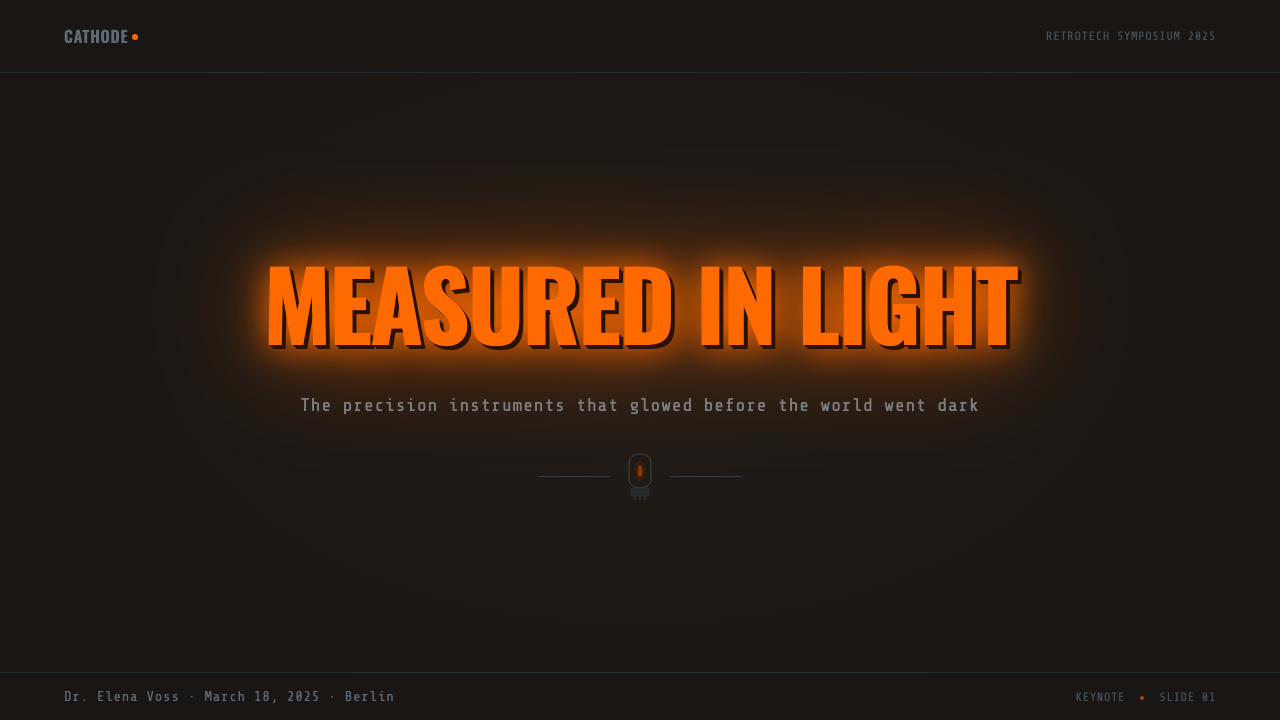
For presentation slides, Nixie tube aesthetics produce strong cover treatments. A full-black slide with a large rendered Nixie-style numeral — a date, a key metric, a countdown — in warm orange bloom against absolute black, surrounded by a subtle metal frame or grid overlay, makes an immediate and memorable impression. Content slides should remain restrained: the glow motif should be reserved for the most important numeric callout on each slide, not applied to all data. Body text should stay in a neutral, slightly warm near-white, set in monospace or fixed-width type for any displayed numbers. Data visualizations benefit from Nixie-style rendering: bar charts with glowing orange bars on black grounds, where the glow intensity itself implies value magnitude, outperform conventional charting conventions in emotional impact.
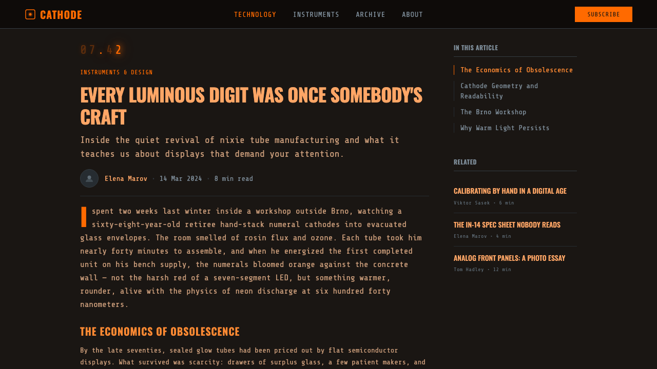
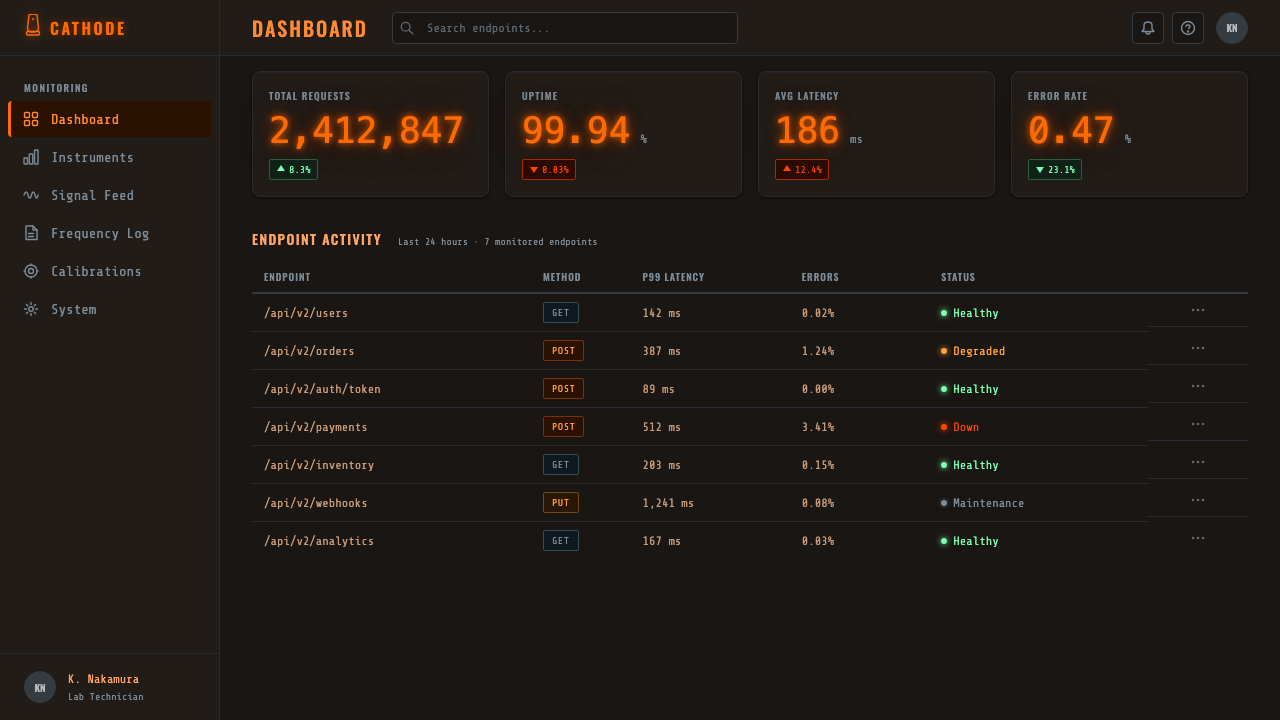
For web and dashboard interfaces, the style is most naturally at home in monitoring and telemetry contexts — server dashboards, analytics platforms, financial data terminals, real-time metrics displays. The key implementation principle: treat the page ground as an instrument chassis. Dark backgrounds should suggest anodized metal, not generic dark mode. Key metrics should glow; supporting labels should be set in monospace type at reduced luminosity. Grid lines and structural overlays suggest instrument panel layout. The style should feel like a precision instrument that happens to run in a browser, not like a dark-themed app with orange accents.
For editorial and marketing contexts, Nixie tube aesthetics work best as a contained system applied to a specific section or hero — a full-bleed dark panel with glowing numerals displaying a key statistic, for example — rather than as a theme applied throughout a long-form piece. The style's emotional associations (precision, authority, nostalgia, craft) are powerful but narrow; sustained over many screens they can feel heavy or tonally monotonous. Use it to make a specific moment land, then transition to a lighter base system for the reading experience.
The most common mistake when applying this aesthetic is treating it as a generic orange-on-black color scheme. The critical failure modes: using warm orange on any background other than near-black (which eliminates the glow illusion entirely); applying hard, flat edges to the orange numerals rather than a bloom or diffusion (which denies the gas-discharge physics the style depends on); using proportional or serif typefaces for supporting text (which breaks the instrument-panel register); and adding graphic decoration or illustrative imagery that competes with the numerals for attention. Nixie tube design exists to make numbers visible in demanding conditions — everything else is in service of that single goal.
Nixie Tube Display — FAQ
Can Nixie tube aesthetics work with colors other than warm orange?
Technically, other gas discharge tubes glow in other colors — argon produces a blue-violet discharge, mercury vapor a blue-white, and krypton a green. These are real and well-documented technologies, but they are not Nixie tubes and they produce different aesthetic associations. The warm orange-red of neon discharge is the specific, historically grounded color of Nixie tube technology. Using other colors can produce valid retro-electronics aesthetics, but they reference different instruments and different traditions. If the goal is specifically Nixie tube authenticity, warm orange-red is not a variable.
How does Nixie tube style relate to the broader steampunk or retro-futurist aesthetic?
Nixie tube aesthetics and steampunk overlap in their shared interest in visible mechanism, warm-toned light sources, and the romance of pre-digital technology — but they are distinct. Steampunk typically draws on Victorian-era imagery: brass, copper, gears, rivets, steam, gaslight. Nixie tube aesthetics are mid-century and electronic: anodized aluminum, precision machining, post-war industrial design, solid-state physics. The emotional register is different too — steampunk is ornate and fantastical, while Nixie tube design is austere and scientific. The two can coexist in a single composition, but conflating them produces visual confusion rather than depth.
Is this style appropriate for consumer-facing products, or is it too technical?
Nixie tube aesthetics carry strong associations with precision instruments, laboratories, and technical expertise. In consumer contexts, this can work powerfully as a marker of seriousness and craft — think high-end audio equipment, precision watches, technical apparel brands, or financial products that want to convey expertise and reliability. It works less well for products where approachability, warmth, or playfulness are primary values. The key test: does this product benefit from being associated with a precision instrument? If yes, the style earns its use. If the product needs to feel friendly or gentle, the aesthetic's technical severity will undermine the experience.
How should motion and animation be handled in Nixie tube interfaces?
Real Nixie tubes do not transition smoothly between digits — when a new cathode ignites, the old one extinguishes rapidly, sometimes with a brief flash or flicker as the gas discharge stabilizes. This physical characteristic offers a motion vocabulary: digit changes should be abrupt or accompanied by a brief flicker rather than smooth animated transitions. A subtle random flicker at very low amplitude can be applied to the glow intensity to simulate the slight instability of gas discharge. Fade-ins on page load can use a slow warm-up simulation — the tube reaching operating temperature. Smooth morphing, easing functions that feel 'digital', or animation that implies continuous fluid change are all wrong for this aesthetic: they belong to a different technological era.
Does the style work for text-heavy layouts, or is it limited to numeric display?
The Nixie tube aesthetic is fundamentally oriented toward numeric display — that is its historical reason for existing. Extended body text in glowing orange on black is physiologically difficult to read and aesthetically inconsistent with the source material. The style handles numeric and short-label content authentically; for supporting prose, the correct treatment is neutral near-white or dim warm-grey monospace type at comfortable reading weight, allowing the body text to recede while the numerals command attention. Attempting to apply the glow treatment to paragraphs of body text stretches the aesthetic beyond what it was built to do and typically results in an interface that is tiring to use.
Related design styles
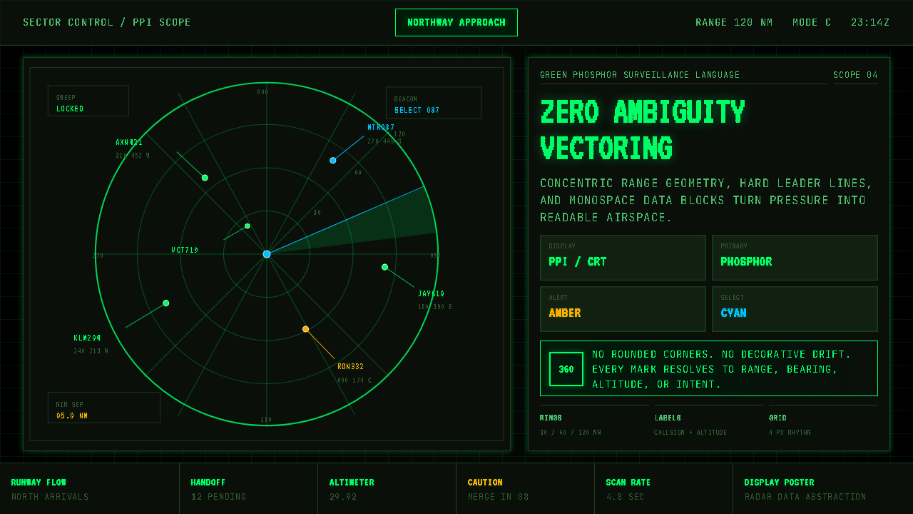 Air Traffic Control RadarOperational gravity. Phosphor green rings, sweep wedges, and monospace blips…
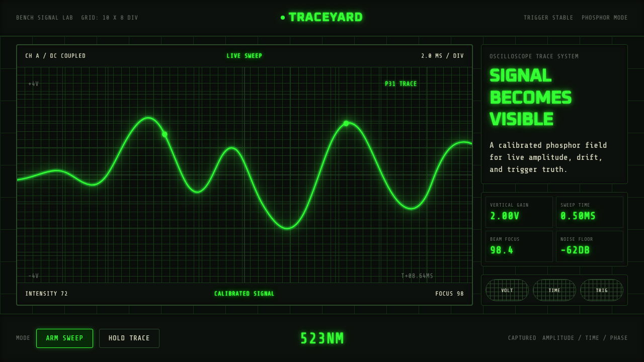 Oscilloscope TraceMeasurement glows. P31 green waveforms burn through a black graticule.
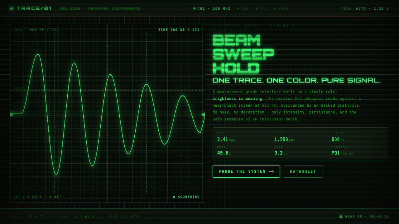 Oscilloscope WaveformBrightness is meaning. One P31 phosphor trace glowing across an etched gratic…
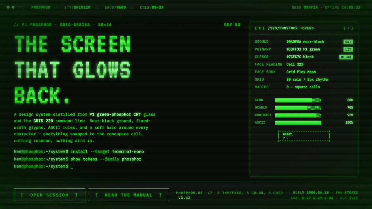 Unix Terminal MonoNear-black CRT glass that glows back. P1 phosphor green, VT323 mono, ASCII ru…
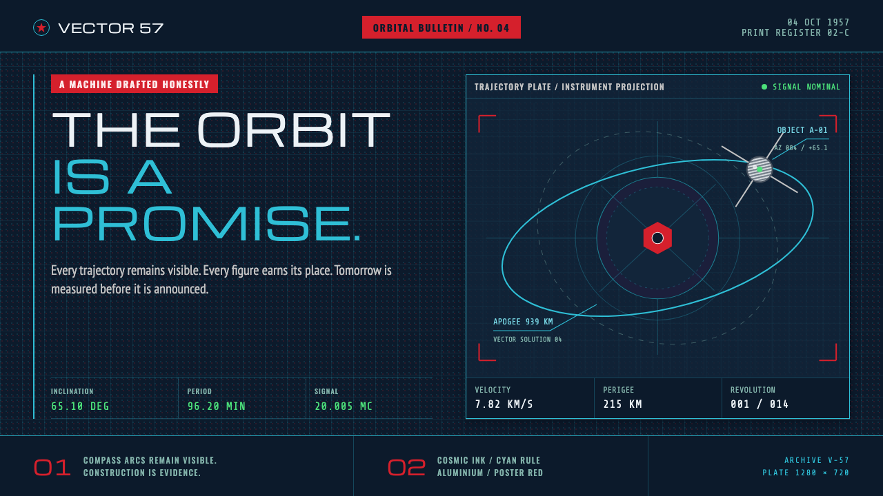 Atompunk Sputnik EraTomorrow, drafted precisely. Cyan orbits cross cosmic ink with red poster blo…
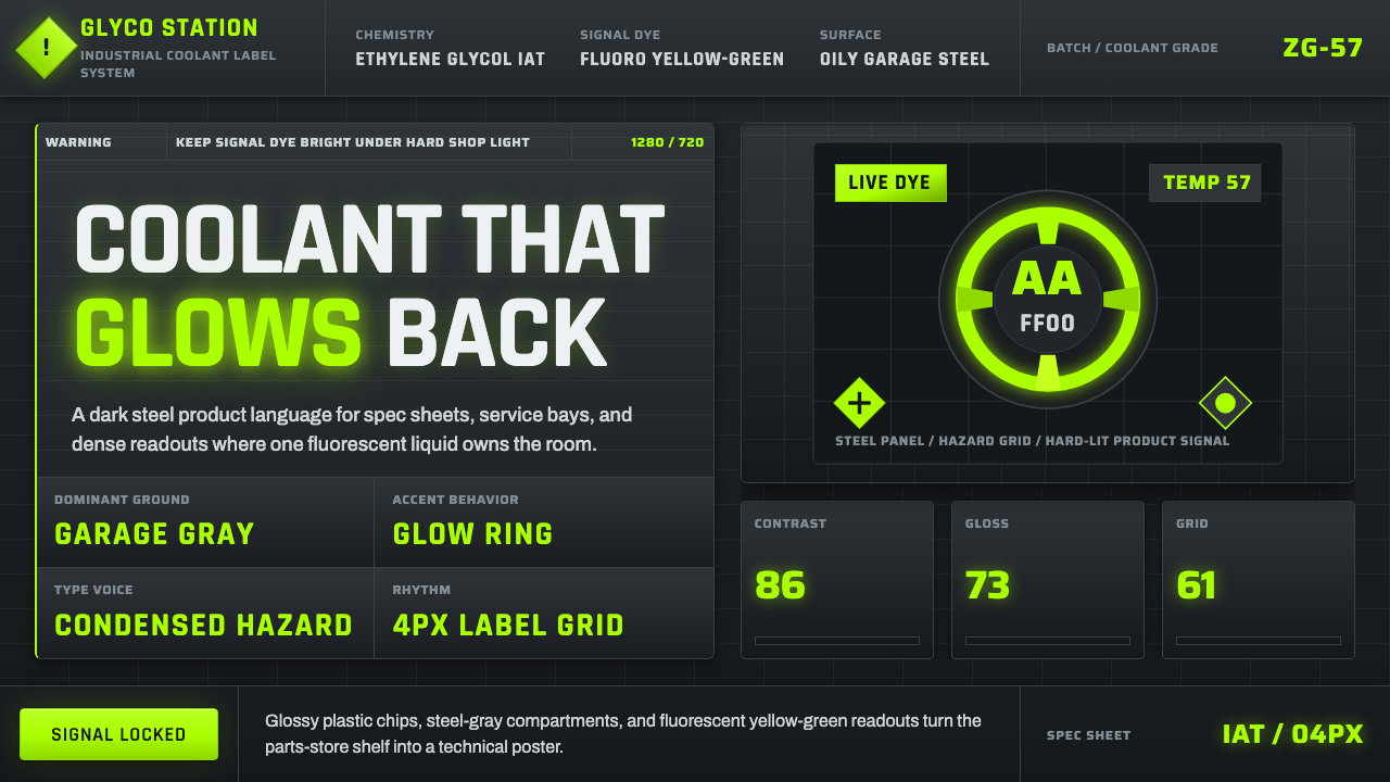 Fluorescent Antifreeze GreenCoolant becomes hazard signal. Fluoro green burns through steel-gray label gr…