What is Bloomberg Terminal (Amber CRT)?什么是 Bloomberg Terminal (Amber CRT)?
The Bloomberg Terminal's amber-on-black grid is the visual language of financial authority — a deliberately hostile interface that has run unchanged on hundreds of thousands of trading-floor screens since 1982.彭博终端的琥珀黑底网格是金融权威的视觉语言——一套自1982年起在全球数十万交易大厅屏幕上几乎原封不动运行的、刻意强硬的界面。
Bloomberg Terminal (Amber CRT) in briefBloomberg Terminal (Amber CRT) 速览
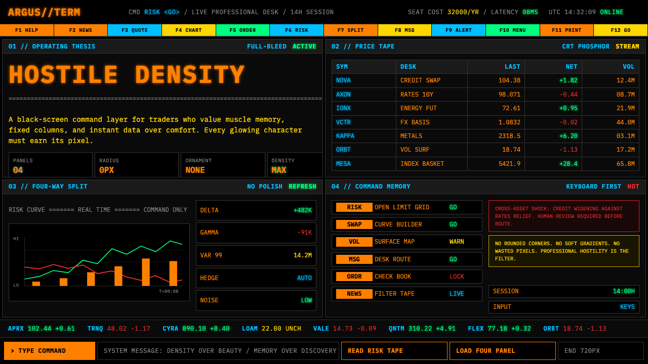
Bloomberg Terminal (Amber CRT) is the design language of the world's most dominant financial data platform, characterized by warm amber or orange-tinted monospaced type set against a deep black ground, rigid four-panel grid layouts, and a total rejection of aesthetic softening. It belongs to the lineage of phosphor cathode-ray tube terminal displays — the same family as the DEC VT100 and IBM 3270 — and has remained the canonical reference for professional financial data visualization for over four decades.彭博终端(琥珀CRT)是世界上最具主导地位的金融数据平台的设计语言,以深黑底色上温暖的琥珀或橙调等宽字体、严格的四面板网格布局,以及对一切美学柔化的彻底拒绝为特征。它属于磷光阴极射线管终端显示器的美学谱系——与DEC VT100和IBM 3270同出一源——并在四十余年间持续作为专业金融数据可视化的标准参照。
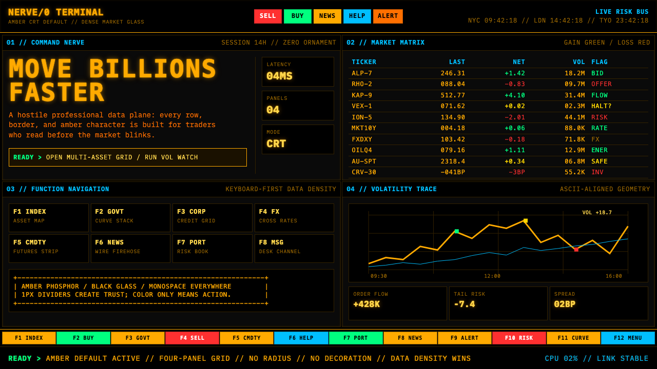
The visual system operates on principles of deliberate density and functional severity. Every pixel of screen space is treated as scarce and valuable. Typographic hierarchy is communicated through color coding — a small set of high-saturation accent tones against the dominant amber and black — rather than through variation in weight or size. Function-key labels, hard rectangular panel borders, and tightly packed data tables define the aesthetic register: this is a tool for professionals who measure their decisions in milliseconds and billions.这套视觉系统建立在刻意的信息密度与功能严肃性之上。屏幕上的每一寸空间都被视为稀缺且珍贵的资源。字体层级通过色彩编码传达——在主导性的琥珀与黑色之上叠加一组高饱和度的强调色调——而非通过字重或字号的变化来区分。功能键标签、硬边矩形面板框线、以及密集排列的数据表格共同定义了这套美学的调性:这是一个为以毫秒和数十亿美元衡量决策的专业人士打造的工具。
The amber CRT aesthetic has since crossed over from operational necessity into cultural shorthand. In contemporary design, reinterpreting this visual language signals competence, data authority, and institutional seriousness. When applied deliberately — rather than naively copied — it communicates that the product it dresses is built for people who understand what the data actually means.琥珀CRT美学此后已从操作性必要跨越为文化符码。在当代设计中,重新诠释这套视觉语言意味着对能力、数据权威和机构严肃性的主张。若是经过深思熟虑的应用——而非天真的抄袭——它传达的信息是:穿戴这套语言的产品,是为真正理解数据含义的人而建造的。
See the Bloomberg Terminal (Amber CRT) design system查看 Bloomberg Terminal (Amber CRT) 完整设计系统
Where does Bloomberg Terminal (Amber CRT) come from?Bloomberg Terminal (Amber CRT) 从何而来?
In 1981, Michael Bloomberg was dismissed from Salomon Brothers after a merger eliminated his position. With his severance, he co-founded Innovative Market Systems — later renamed Bloomberg L.P. — alongside Tom Secunda, Duncan MacMillan, and Charles Zegar. The founding insight was that Wall Street's information advantage was structural: the traders and analysts who had faster, more complete access to financial data consistently outperformed those who did not. Bloomberg set out to build a terminal that would democratize that advantage among institutional subscribers.1981年,迈克尔·彭博因一场并购被所罗门兄弟公司裁员。他用离职补偿金与汤姆·塞昆达、邓肯·麦克米兰和查尔斯·泽加尔共同创立了创新市场系统公司——后更名为彭博有限合伙公司。创业的核心洞察在于:华尔街的信息优势是结构性的——那些能更快、更完整地获取金融数据的交易员和分析师,始终胜过那些不能的人。彭博着手打造一个能在机构订阅用户之间将这种优势民主化的终端。
The first Bloomberg terminals were delivered to Merrill Lynch in 1982. The hardware constraints of that era — monochrome phosphor displays, limited processing power, keyboard-driven input — shaped the aesthetic decisions that would define the system for decades. Amber phosphor was chosen as the display tone not for its warmth or visual appeal but because it offered superior legibility under the high-ambient-light conditions of trading floors during extended sessions. Green phosphor, the other common choice of the era, produced more eye strain over fourteen-hour shifts. The color was a fatigue-engineering decision.1982年,首批彭博终端交付美林公司。那个时代的硬件约束——单色磷光显示器、有限的处理能力、键盘驱动的输入——塑造了将在数十年间定义这套系统的美学决策。琥珀磷光被选为显示色调,并非因为它的温暖感或视觉吸引力,而是因为它在交易大厅高环境光条件下的长时间使用中提供了更优越的可读性。绿色磷光是那个时代另一种常见选择,但在十四小时工作班次中会产生更多视疲劳。这个颜色是一个疲劳工程学决策。
The four-panel grid that defines the terminal's spatial logic emerged from practical workflow requirements rather than compositional theory. Traders needed to monitor price feeds, news alerts, analytics charts, and messaging simultaneously without switching between screens. Dividing a single monitor into four discrete, hard-bordered panels — each dedicated to a category of information — solved the problem within the hardware limitations of the time. The function-key navigation system, with its red, green, yellow, and orange color assignments, created a tactile and visual shorthand that experienced users could operate by muscle memory alone.定义终端空间逻辑的四面板网格,是从实际工作流程需求中涌现的,而非来自构图理论。交易员需要同时监控价格数据流、新闻警报、分析图表和消息通讯,而无需在多个屏幕之间切换。将单个显示器划分为四个独立的硬边框面板——每个专门用于一类信息——在当时的硬件限制内解决了这个问题。功能键导航系统以红、绿、黄、橙四种颜色分配,创造了一套有经验的用户仅凭肌肉记忆即可操作的触觉与视觉速记体系。
By the 1990s, Bloomberg's system had become so entrenched on trading floors globally that its visual language had acquired cultural weight independent of its technical function. The amber glow and cramped data grids were not just an interface — they were the visual signature of institutional finance itself. When Bloomberg eventually added more graphical capabilities and color options, the amber-on-black default remained the dominant mode, because traders who had built careers reading it resisted change, and because the density it enabled was genuinely superior for data-heavy professional use.到1990年代,彭博的系统已深度嵌入全球交易大厅,其视觉语言获得了独立于技术功能之外的文化分量。琥珀光晕与拥挤的数据网格不仅仅是一个界面——它们是机构金融本身的视觉签名。当彭博终端后来增加了更多图形能力和颜色选项时,琥珀黑底的默认设置依然是主导模式——因为凭借读它建立职业生涯的交易员抵制改变,也因为它所实现的信息密度对于数据密集的专业使用而言确实卓越。
What defines the Bloomberg Terminal (Amber CRT) look?Bloomberg Terminal (Amber CRT) 的视觉特征是什么?
Amber Phosphor Ground琥珀磷光底色
The defining chromatic signature is warm amber or deep orange type rendered against a near-absolute black background. The amber tone occupies a narrow band of the warm spectrum — neither the yellow of caution signals nor the orange of consumer branding, but something more constrained and purposeful: the color of a phosphor tube pushed to its operational optimum for human visual acuity under sustained use. In contemporary adaptations, this chromatic relationship — warm, saturated foreground against a black field — is the first and most essential element to preserve.这套设计语言最具定义性的色彩签名,是在接近绝对黑色的背景上呈现出来的温暖琥珀色或深橙色字体。琥珀调占据暖色谱系的一个狭窄区间——既不是警示信号的黄色,也不是消费品牌的橙色,而是更为克制和有目的的颜色:一根磷光管在人类视觉长时间持续使用中被推至最佳工作状态时的颜色。在当代改编中,这种色彩关系——黑色底面上温暖、饱和的前景色——是最首要、最根本需要保留的元素。
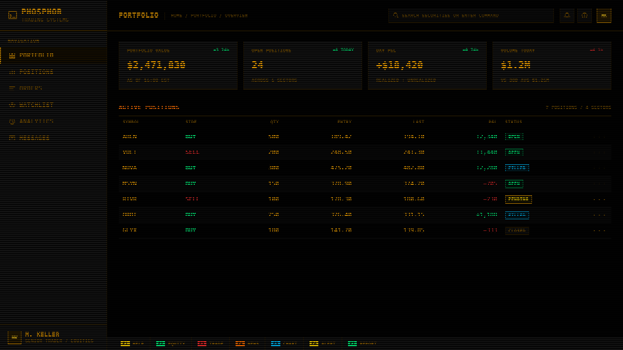
Monospaced Type Grid等宽字体网格
All text in the Bloomberg visual system is set in monospaced letterforms — each character occupies an identical horizontal unit of space. This is not an aesthetic choice but a functional one: monospaced type allows columns of numerical data to align perfectly without decimal-point juggling, ensures that formatted table structures render predictably, and enables keyboard-generated layouts to hold their shape across sessions and terminals. The visual effect is a fine, even texture across the entire screen — a tapestry of information where every character has equal standing, and hierarchy is imposed through color rather than spatial privilege.彭博视觉系统中的所有文本均使用等宽字形排版——每个字符占据相同的水平空间单位。这不是一种美学选择,而是功能性的选择:等宽字体使数字数据的列能够完美对齐,无需调整小数点位置;确保格式化的表格结构在不同会话和终端上可预测地呈现;并使键盘生成的布局能够保持其形态。视觉效果是整个屏幕上细密而均匀的质感——一幅信息挂毯,其中每个字符都享有同等地位,而层级通过色彩而非空间特权来施加。
Four-Panel Hard Grid四面板硬网格
The canonical Bloomberg layout divides the screen into four discrete rectangular panels, each bounded by hard, high-contrast borders. These borders are not decorative frame elements — they are structural divisions that communicate absolute separation between information categories. The grid is non-negotiable in its rigidity: panels do not bleed into one another, content does not float outside its assigned region, and whitespace between panel walls is minimal. This spatial discipline creates a density of information that no other layout approach can match while still maintaining legibility, because the categorical boundaries do the cognitive work of organizing what the eye needs to track.彭博的标准布局将屏幕划分为四个独立的矩形面板,每个面板由硬边、高对比度的边框界定。这些边框不是装饰性的边框元素——它们是传达信息类别之间绝对分隔的结构性分割线。网格在其刚性上是不可妥协的:面板之间不相互渗透,内容不漂浮于其指定区域之外,面板墙之间的空白极为有限。这种空间纪律创造出其他任何布局方式都无法企及的信息密度,同时仍维持可读性,因为类别边界承担了组织眼睛需要追踪之物的认知工作。
Functional Color Coding功能性色彩编码
Beyond the primary amber, the system employs a small set of high-saturation accent colors — red for losses or alerts, green for gains or active states, yellow and orange for secondary function keys and classifications. Each color carries a fixed semantic meaning that experienced users internalize as deeply as the keyboard shortcuts themselves. The color set is never used decoratively; introducing a tone that does not correspond to an established semantic category is a violation of the system's logic. In contemporary applications of this style, maintaining strict semantic discipline — green means one thing and one thing only — is what separates a credible adaptation from a pastiche.在主导性的琥珀色之外,这套系统还采用了一组小型的高饱和度强调色——红色用于损失或警报,绿色用于收益或活跃状态,黄色和橙色用于次级功能键和分类标签。每种颜色都承载着有经验的用户内化得如同键盘快捷键一般深刻的固定语义含义。这组色彩从不用于装饰目的;引入一个与既定语义类别不对应的色调,是对系统逻辑的违背。在这种风格的当代应用中,保持严格的语义纪律——绿色只意味着一件事——才是区分可信改编与表面模仿的关键。
Zero Ornament, Maximum Density零装饰,最大密度
The Bloomberg interface contains no decorative elements whatsoever — no gradients, no rounded corners, no shadow effects, no illustrative imagery, no brand motifs beyond the minimal wordmark. Every available unit of screen space that is not occupied by data or structural borders is treated as wasted capacity. This is not minimalism in the contemporary design sense, which accepts generous whitespace as part of the aesthetic; it is the opposite — a maximalism of content with an absolute economy of presentation. The discipline required to reproduce this quality in a contemporary context is significant, because modern design tools and frameworks continuously tempt designers toward softening touches.彭博界面完全不包含任何装饰性元素——无渐变,无圆角,无阴影效果,无说明性图像,除最简文字标志外无任何品牌图案。每一个不被数据或结构边框占用的屏幕空间单位都被视为浪费的容量。这不是当代设计意义上的极简主义——那种接受充裕留白作为美学组成部分的极简主义;而是其对立面——内容的最大化与呈现的绝对经济性。在当代语境中复现这种品质所需的纪律是相当高的,因为现代设计工具和框架持续诱惑设计师走向各种柔化处理。
Keyboard-First Navigation Logic键盘优先的导航逻辑
The Bloomberg Terminal was designed around a dedicated hardware keyboard, not a mouse or touch interface. Function keys, hotkeys, and sequential command codes are the primary navigation method. In the visual system, this manifests as labels and affordances sized and positioned for keyboard-confidence users: small, dense, and precise, not large and invitation-giving. UI elements do not expand invitingly on hover or pulse to attract attention — they are static, awaiting command. In contemporary adaptations, preserving this keyboard-first grammar means treating interactive affordances as discovered, not advertised, and sizing touch targets for precision rather than forgiveness.彭博终端围绕专用硬件键盘而非鼠标或触控界面设计。功能键、热键和顺序命令代码是主要的导航方式。在视觉系统中,这体现为为具备键盘信心的用户而设计的标签和操作元素——尺寸小、密度高、精确,而非大而发出邀请的姿态。UI元素不会在悬停时引诱性地展开,也不会搏动以吸引注意力——它们是静态的,等待命令。在当代改编中,保留这种键盘优先的语法,意味着将交互元素处理为被发现而非被宣传的东西,并为精确而非容错调整触控目标的大小。
Institutional Legibility Over Aesthetics机构可读性优先于美学
Every decision in the Bloomberg visual system prioritizes legibility under operational conditions over aesthetic appeal at a distance. Character spacing is calibrated for dense numerical tables rather than comfortable reading prose. Contrast ratios are set at the extreme end of the scale. Color relationships are not balanced for visual harmony but for the fastest possible discrimination between states — up versus down, live versus stale, alert versus nominal. The result is a visual system that appears hostile to the untrained eye but becomes deeply efficient when internalized. This principle — that the system should optimize for its user's performance, not for a casual observer's approval — is the deepest design value the style embeds.彭博视觉系统中的每一个决策都将操作条件下的可读性置于远距离审视时的美观之上。字符间距为密集的数字表格而校准,而非为舒适阅读散文而设计。对比度被设定在刻度的极端端。色彩关系不是为了视觉和谐而平衡,而是为了在状态之间实现最快速的区分——上涨对下跌,实时对过时,警报对正常。结果是一套对未经训练的眼睛显得强硬的视觉系统,但一旦被内化便变得极为高效。这个原则——系统应当为其用户的绩效而优化,而非为随意旁观者的认可——是这种风格所嵌入的最深层设计价值。
See the Bloomberg Terminal (Amber CRT) design system查看 Bloomberg Terminal (Amber CRT) 完整设计系统
Who shaped Bloomberg Terminal (Amber CRT)?谁塑造了 Bloomberg Terminal (Amber CRT)?
Bloomberg founded Innovative Market Systems in 1981 after being dismissed from Salomon Brothers, and his conviction that real-time financial data access was the defining competitive advantage of institutional finance shaped every product decision the company made. He personally championed the terminal's density and speed above all visual polish, establishing the principle that the Bloomberg interface existed to serve professional performance, not to impress casual observers. After stepping down from the company to serve as Mayor of New York City from 2002 to 2013, he returned to Bloomberg L.P. and has continued to oversee a product whose core visual language has remained recognizable for over forty years.彭博于1981年从所罗门兄弟被裁员后创立了创新市场系统,他对实时金融数据获取是机构金融决定性竞争优势的坚定信念,塑造了公司的每一项产品决策。他亲自将终端的信息密度和速度置于一切视觉打磨之上,确立了彭博界面存在于服务专业绩效而非给随意旁观者留下印象的原则。在辞去公司职务出任纽约市市长(2002—2013年)后,他回到彭博有限合伙公司,并继续监督一个核心视觉语言已保持辨识度逾四十年的产品。
Secunda was Bloomberg's technical co-founder and the primary architect of the terminal's underlying data and software systems. His engineering decisions in the early 1980s — particularly the commitment to a keyboard-driven, character-cell interface over graphical alternatives — locked in the visual language of the platform for decades. Secunda understood that the professional users of the terminal valued speed and data density above all other considerations, and the interface architecture he established reflected that priority absolutely. His technical choices are as responsible for the amber CRT aesthetic as any visual design decision.塞昆达是彭博的技术联合创始人,也是终端底层数据和软件系统的主要架构师。他在1980年代初期的工程决策——尤其是对键盘驱动的字符单元界面而非图形界面的承诺——将平台的视觉语言锁定了数十年。塞昆达理解终端的专业用户将速度和数据密度置于一切其他考量之上,他所建立的界面架构绝对地反映了这一优先级。他的技术选择与任何视觉设计决策一样,对琥珀CRT美学负有同等的责任。
MacMillan was a co-founder and early product architect who helped define the informational structure of the Bloomberg Terminal — what data would live in which panel, how news and analytics would relate to price feeds, and how the function-key navigation would be organized. The four-panel grid architecture that became the Bloomberg layout standard bears his influence. MacMillan's contributions are rarely discussed in design contexts, but the spatial logic that makes the Bloomberg Terminal legible under pressure is as much a product design achievement as a software or financial data achievement.麦克米兰是联合创始人和早期产品架构师,帮助定义了彭博终端的信息结构——哪些数据存在于哪个面板、新闻和分析如何与价格数据流关联、以及功能键导航如何组织。成为彭博布局标准的四面板网格架构带有他的影响。麦克米兰的贡献在设计语境中鲜有讨论,但使彭博终端在压力下仍保持可读性的空间逻辑,与其说是软件或金融数据成就,不如说同样是产品设计成就。
Zegar was the fourth co-founder and contributed significantly to the analytical and computational underpinnings of the platform. His work on the data processing systems that made real-time analytics possible at the scale Bloomberg operated determined the interface requirements the visual system had to accommodate. Because the data volumes were dense and the update frequencies high, the visual language had to be engineered for rapid scanning rather than comfortable reading — a constraint that directly generated the amber CRT aesthetic's characteristic hostility to whitespace and visual softening.泽加尔是第四位联合创始人,对平台的分析和计算基础有重要贡献。他在实时分析数据处理系统方面的工作——使彭博规模的实时分析成为可能——决定了视觉系统必须适应的界面要求。由于数据量密集、更新频率高,视觉语言必须为快速扫描而非舒适阅读而工程化——这一约束直接产生了琥珀CRT美学对留白和视觉柔化特有的强硬态度。
Unlike most canonical design systems, the Bloomberg Terminal's visual language has no single credited designer. Its aesthetic emerged from the collective decisions of engineers solving operational problems under hardware constraints. The amber phosphor choice, the character-cell grid, the function-key color coding — none of these were the product of a design process in the contemporary sense. This anonymous, need-driven origin is itself significant: the Bloomberg aesthetic is what design looks like when it is generated entirely by performance requirements, with no space given to the question of how it looks to an outside observer.与大多数标准设计系统不同,彭博终端的视觉语言没有任何单一署名设计师。其美学从工程师在硬件约束下解决操作问题的集体决策中涌现。琥珀磷光的选择、字符单元网格、功能键色彩编码——这些都不是当代意义上的设计流程的产物。这种匿名的、需求驱动的起源本身就意义重大:彭博美学展示了当设计完全由性能需求生成、完全没有空间留给它在外部观察者眼中看起来如何这一问题时,设计是什么样子的。
How do you use Bloomberg Terminal (Amber CRT) today?今天怎么用 Bloomberg Terminal (Amber CRT)?
The Bloomberg Terminal aesthetic is among the most powerful and specific visual registers available to contemporary designers — but also among the most easily misapplied. Its authority derives from the fact that it is not a designed style in the conventional sense: it was generated by operational requirements. When you apply it correctly, the design recedes and the data advances; when you apply it incorrectly, the terminal aesthetic reads as costume, and the disconnect between the theatrical severity of the interface and the lightness of the underlying content is immediately legible to anyone who has spent time on an actual trading floor.彭博终端美学是当代设计师可用的最强大、最具体的视觉语域之一——但也是最容易被误用的之一。它的权威性源于一个事实:它不是传统意义上的设计风格,而是由操作需求生成的。当你正确应用它时,设计退隐而数据凸显;当你错误应用它时,终端美学被解读为戏服,界面戏剧性严肃与底层内容轻浮之间的割裂对任何在真实交易大厅待过时间的人来说都是立刻可读的。
For presentation slides, the Bloomberg aesthetic works with exceptional force on data-heavy content. Cover slides should commit to the fundamental chromatic relationship — warm amber or near-orange type on a black ground — with no softening touches. A title rendered in large, weight-consistent monospaced type against a full black field communicates institutional authority before a single word is read. Content slides should treat the slide area as a terminal panel: dense, bordered sections for different information categories, color used strictly for semantic differentiation rather than visual interest. Data slides — charts, tables, comparisons — become the natural home of this aesthetic; bar charts with amber columns on black grounds, status indicators in functional red and green, data tables with minimal spacing and maximum row density all feel native to the visual language.在演示文稿中,彭博美学对数据密集型内容有着极强的冲击力。封面页应当承诺基本的色彩关系——黑色底面上温暖的琥珀色或接近橙色的字体——不加任何柔化处理。在纯黑底面上以大型、字重一致的等宽字体呈现标题,在读到任何一个单词之前就传达了机构权威。内容页应将幻灯片区域视为终端面板:用于不同信息类别的密集、有边框的区段,色彩严格用于语义区分而非视觉趣味。数据页——图表、表格、比较——成为这种美学的自然栖居地;黑底琥珀色柱条的柱状图、功能性红绿状态指示符、间距最小行密度最大的数据表格,都在这套视觉语言中感觉浑然天成。
For web interfaces and dashboards, the Bloomberg style is particularly well-suited to financial data platforms, analytics tools, trading interfaces, and any product where data density and rapid scanning are the primary user needs. The approach requires committing to a dark ground as the base state, using the amber primary for default data display, and reserving the small functional color set — red, green, and a secondary warm accent — strictly for semantic states. Panel borders should be visible and hard rather than subtle or gradient. Navigation elements should be text-based and compact, not large and icon-dominant. Pricing pages and comparison tables in this style carry a natural weight: the austerity of the visual language signals that the product is priced for serious consideration, not impulse subscription.对于网页界面和仪表板,彭博风格特别适合金融数据平台、分析工具、交易界面,以及任何数据密度和快速扫描是主要用户需求的产品。这种方法需要以深色背景作为基础状态,用琥珀主色进行默认数据显示,并将那组小型功能性色彩——红、绿和一个次级暖调强调色——严格保留给语义状态。面板边框应该是可见的和硬边的,而非微妙的或渐变的。导航元素应当是基于文字的且紧凑的,而非大型图标主导的。这种风格的定价页面和比较表格自带一种天然分量:视觉语言的朴素性发出信号,这个产品的定价值得认真考量,而非冲动订阅。
For editorial and marketing contexts, the Bloomberg aesthetic requires a lighter hand. A feature story with a Bloomberg-inflected layout might use the amber-on-black palette for section headers and data callouts while softening the body text environment to avoid fatiguing readers. Marketing pages can deploy the style as a hero moment — a full-width dark panel with amber headline type — before transitioning to a more accessible typographic environment for conversion-focused content. Brand campaigns for financial institutions, professional services, and enterprise software regularly borrow from this visual register to signal institutional credibility, using amber and black as accent palette against a lighter base, or reserving the full dark-terminal aesthetic for moments of data drama.对于编辑和营销语境,彭博美学需要更轻的手法。采用彭博风格布局的特写文章,可以将琥珀黑底色板用于章节标题和数据引述,同时为正文环境做柔化处理以避免让读者疲劳。营销页面可以将这种风格部署为一个主角时刻——全宽深色面板配琥珀色标题字体——然后过渡到一个更易于访问的字体环境以处理以转化为导向的内容。面向金融机构、专业服务和企业软件的品牌活动经常借用这种视觉语域来发出机构可信度的信号,以琥珀和黑色作为浅色基底上的强调色板,或将完整的深色终端美学保留给数据戏剧时刻。
A common and critical mistake is using the Bloomberg aesthetic decoratively — applying the amber color scheme and terminal-style borders to content that has none of the density or operational rigor that justifies them. A single data point in a large amber number on a black card does not reproduce the Bloomberg authority; it reproduces the shell of it. The aesthetic earns its weight from density, and low-density applications read as affectation. Similarly, introducing rounded corners, soft shadows, gentle gradients, or excess whitespace into a Bloomberg-styled layout dissolves the visual grammar that makes it legible as a distinct system. Every softening touch is an argument that the content does not deserve the interface's severity — and if the content genuinely does not, a different visual register is a more honest choice.一个常见且严重的错误是将彭博美学用于装饰性目的——将琥珀色方案和终端风格边框应用于根本没有理由使用它们的密度或操作严肃性的内容。一个在黑色卡片上以大型琥珀数字呈现的单个数据点并不能复现彭博的权威;它复现的只是它的外壳。这种美学的分量来自密度,低密度的应用被解读为矫饰。同样,在彭博风格布局中引入圆角、柔和阴影、温和渐变或多余留白,会瓦解使其作为独特系统可读的视觉语法。每一个柔化处理都是一个论点,说明内容不值得这套界面的严肃性——如果内容真的不值得,选择一个不同的视觉语域是更诚实的做法。
See the Bloomberg Terminal (Amber CRT) design system查看 Bloomberg Terminal (Amber CRT) 完整设计系统
Bloomberg Terminal (Amber CRT) — FAQBloomberg Terminal (Amber CRT) · 常见问题
Is the Bloomberg Terminal aesthetic actually usable outside of financial contexts?彭博终端美学在金融语境之外真的可用吗?
Yes, but with meaningful constraints. The style's authority comes from its association with data density, professional rigor, and institutional finance — cultural associations that transfer most naturally to products in data analytics, enterprise software, cybersecurity, scientific instrumentation, and any domain where the intended user is a specialist dealing with complex, high-stakes information. It transfers poorly to consumer contexts where warmth, approachability, or sensory pleasure are primary values. A wellness app, a food delivery service, or a children's educational product would not benefit from the Bloomberg register — the severity of the aesthetic would work against the emotional relationship the product needs to establish. The question to ask is whether the product's core value proposition — precision, authority, data mastery — is consonant with what the aesthetic communicates.可以,但有实质性的约束。这种风格的权威性来自其与数据密度、专业严谨和机构金融的关联——这些文化关联最自然地转移到数据分析、企业软件、网络安全、科学仪器,以及任何目标用户是处理复杂、高风险信息的专业人士的领域。它在温暖感、亲和力或感官愉悦是主要价值的消费者语境中转移效果很差。一个健康应用、一个食品配送服务或一个儿童教育产品不会从彭博语域中受益——美学的严肃性会妨碍产品需要建立的情感关系。需要追问的是:产品的核心价值主张——精确性、权威性、数据掌控力——是否与这套美学所传达的内容相契合。
How do you adapt the Bloomberg aesthetic for light-background layouts?如何将彭博美学改编到浅色背景的布局中?
The canonical Bloomberg system is dark-ground — amber on black — and light inversions require careful reconstruction rather than simple color reversal. Swapping the palette to dark type on a cream or light gray ground retains the monospaced type grid and high-density layout logic while sacrificing the phosphor glow that is the most distinctive signature of the dark version. In a light adaptation, the defining elements become the monospaced letterforms, the hard panel borders, and the strict semantic color coding — green for positive states, red for alerts, a warm amber or orange used as an accent for highlights and active selections. The result reads as a professional financial data environment without the theatrical darkness of the original; appropriate for contexts where dark mode is not the expected default, such as print materials, light-background web applications, or enterprise dashboards that need to coexist with brighter interface environments.彭博系统的标准形态是深色底面——琥珀色在黑底上——浅色反转版本需要仔细的重构,而非简单的色彩反转。将色板换成浅灰或奶油底面上的深色字体,保留了等宽字体网格和高密度布局逻辑,同时牺牲了深色版本中最具特色签名的磷光光晕。在浅色改编中,定义性元素变成了等宽字形、硬边面板边框,以及严格的语义色彩编码——绿色用于正面状态,红色用于警报,温暖的琥珀或橙色用作高亮和活跃选择的强调色。结果呈现为一个专业的金融数据环境,却没有原版的戏剧性暗黑感;适合深色模式不是预期默认设置的语境,例如印刷材料、浅色背景的网页应用,或需要与更明亮界面环境共存的企业仪表板。
What distinguishes an authentic Bloomberg Terminal adaptation from a superficial one?真实的彭博终端改编与表面性改编之间有什么区别?
The most reliable distinguishing factor is information density. Authentic adaptations are dense — every element present is justified by data it contains or structure it communicates. Superficial adaptations apply the amber-on-black color scheme and monospaced type to layouts that retain the generous spacing, large whitespace margins, and decorative touches of conventional consumer design. The authentic version is immediately readable to someone who has used the real terminal; it feels operational rather than theatrical. Secondary markers include: whether color is used strictly semantically or also decoratively; whether borders are hard-edged and unforgiving or subtly rounded and softened; whether interactive elements are small and precise or large and inviting; and whether the type density across the screen produces a unified texture or leaves large voids.最可靠的区分因素是信息密度。真实的改编是密集的——每一个存在的元素都因其包含的数据或传达的结构而得到正当化。表面性改编将琥珀黑底色方案和等宽字体应用于保留了传统消费品设计的宽松间距、大面积留白和装饰性处理的布局上。真实版本对于使用过真实终端的人来说是立即可读的;它感觉是操作性的而非戏剧性的。次级标志包括:色彩是否被严格语义地使用或也被装饰性地使用;边框是否是硬边且不留情面的或微妙圆润且柔和的;交互元素是否小而精确或大而邀请性的;以及整个屏幕上的字体密度是否产生统一的质感或留下大片空洞。
Why does the Bloomberg aesthetic feel authoritative rather than just old?为什么彭博美学感觉具有权威性,而不仅仅是老旧的?
Because the visual language was never driven by fashion — it was driven by function. Most retro aesthetics age in two steps: first they feel dated, then, after enough time passes, they feel nostalgic and intentionally vintage. Bloomberg Terminal aesthetics skipped the dated phase almost entirely because the original system never went away. It is still running, still used by professionals who treat it as the operational standard, and still evolving around its core visual logic. When contemporary designers reinterpret it, they are not reaching backward to a defunct aesthetic; they are referencing an active, living system. The authority the aesthetic carries is not borrowed from nostalgia but from the continued fact of the terminal's dominance in a domain where performance is measured in money and milliseconds.因为这套视觉语言从未被时尚驱动——它被功能驱动。大多数复古美学的老化分两步:首先感觉过时,然后,经过足够的时间,感觉怀旧和刻意复古。彭博终端美学几乎完全跳过了过时阶段,因为原始系统从未消失。它仍在运行,仍被将其视为操作标准的专业人士使用,仍在其核心视觉逻辑周围演化。当当代设计师重新诠释它时,他们不是在向一个已废弃的美学回望;他们是在引用一个活跃的、有生命力的系统。这套美学所承载的权威性不是从怀旧中借来的,而是来自终端在一个以金钱和毫秒衡量绩效的领域中持续主导地位这一持续的事实。
Can the Bloomberg Terminal style work for consumer-facing products, or is it strictly B2B?彭博终端风格能用于面向消费者的产品吗,还是它严格属于B2B?
The style is not categorically limited to B2B, but consumer applications require a more selective extraction. Several successful consumer products have borrowed elements of the terminal aesthetic — crypto trading apps, stock-monitoring tools, personal finance dashboards, and some gaming interfaces (particularly in the simulation and strategy genres) have used amber-on-dark palettes, monospaced data displays, and hard-bordered panel structures to signal competence and data authority to users who want to feel like professionals. The key is extracting the semantic color system, the type density, and the hard borders without importing the operational hostility that makes the full Bloomberg terminal experience intimidating to non-specialists. A consumer product can borrow the grammar while adjusting the register — slightly more whitespace, slightly softer borders, the same functional color logic — and still read as belonging to the same visual family.这种风格并非绝对限于B2B,但消费者应用需要更有选择性地提取。几个成功的消费者产品借用了终端美学的元素——加密货币交易应用、股票监控工具、个人理财仪表板,以及一些游戏界面(特别是在模拟和策略类型中)——使用琥珀暗底色板、等宽数据显示和硬边框面板结构,向想要感觉像专业人士的用户发出能力和数据权威的信号。关键在于提取语义色彩系统、字体密度和硬边框,而不引入使完整彭博终端体验对非专业人士感到威慑的操作性强硬感。一个消费者产品可以借用这套语法,同时调整语域——稍多的留白,稍软的边框,相同的功能性色彩逻辑——仍然被读作属于同一视觉家族。
Related design styles相关设计风格
 Bloomberg Terminal (CRT Green)Hostile density wins. Orange CRT mono, black grids, and four-panel data walls.敌意密度取胜:橙色CRT等宽字、黑底四分屏数据墙。
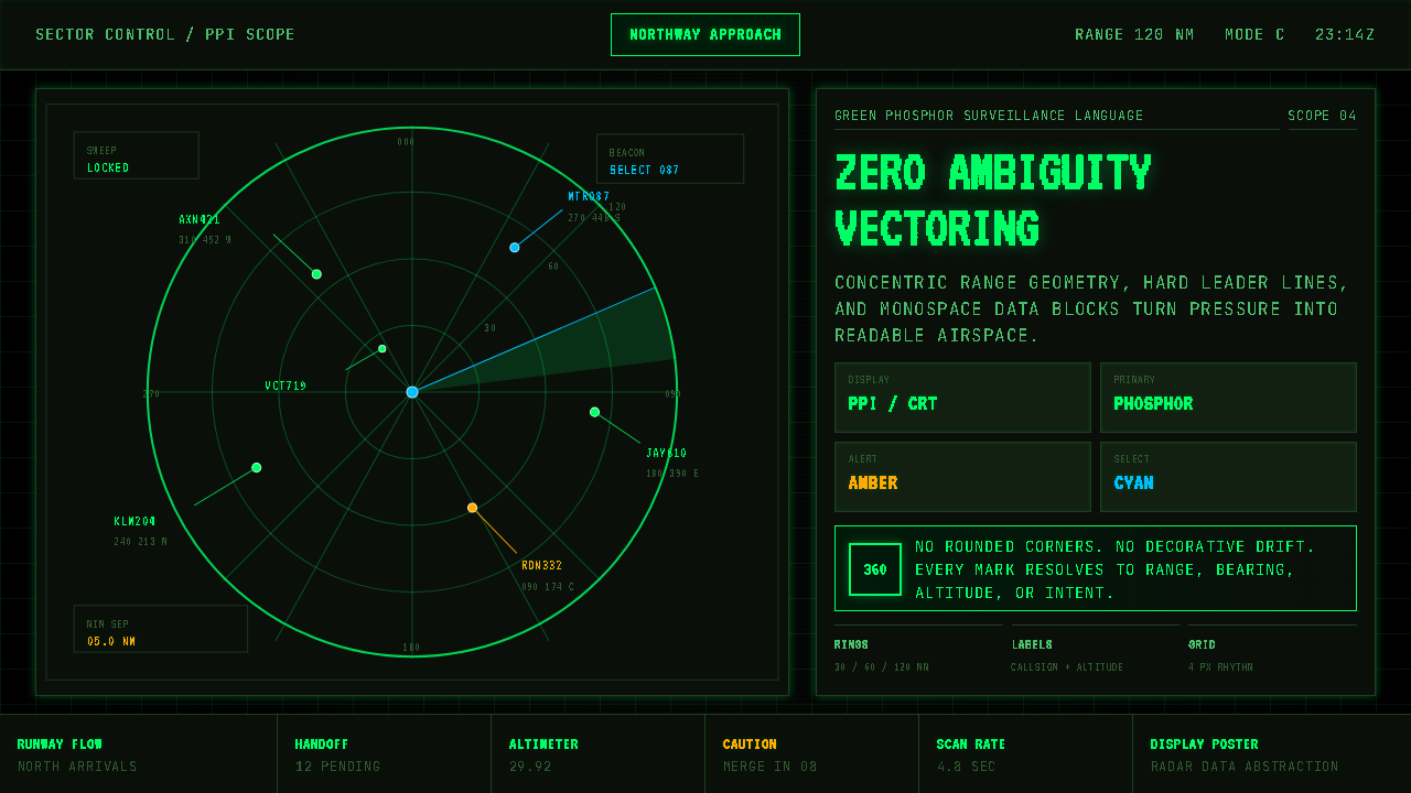 Air Traffic Control RadarOperational gravity. Phosphor green rings, sweep wedges, and monospace blips…军工级冷静:磷光绿同心环、扫描扇面与等宽光点建立零歧义。
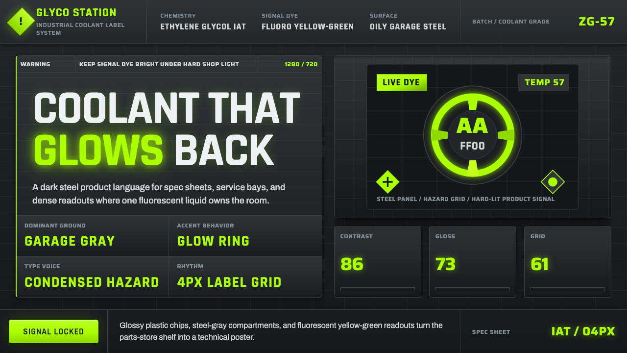 Fluorescent Antifreeze GreenCoolant becomes hazard signal. Fluoro green burns through steel-gray label gr…冷却液成为危险信号。荧光绿刺穿钢灰标签网格。
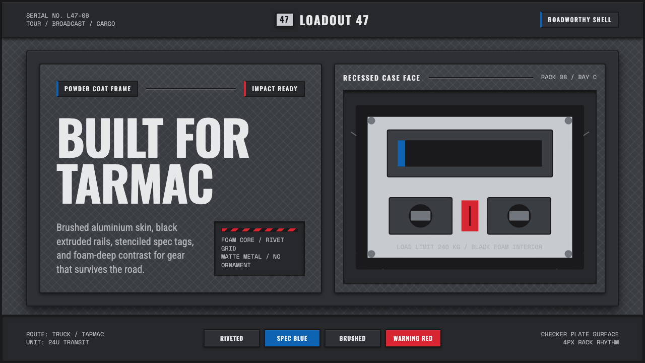 Aluminium Flight CaseRoadproof and exact. Diamond-plate gray, stencil type, black frames, blue-red…坚硬精确:菱形铝纹、模版字、黑框与蓝红规格标签。
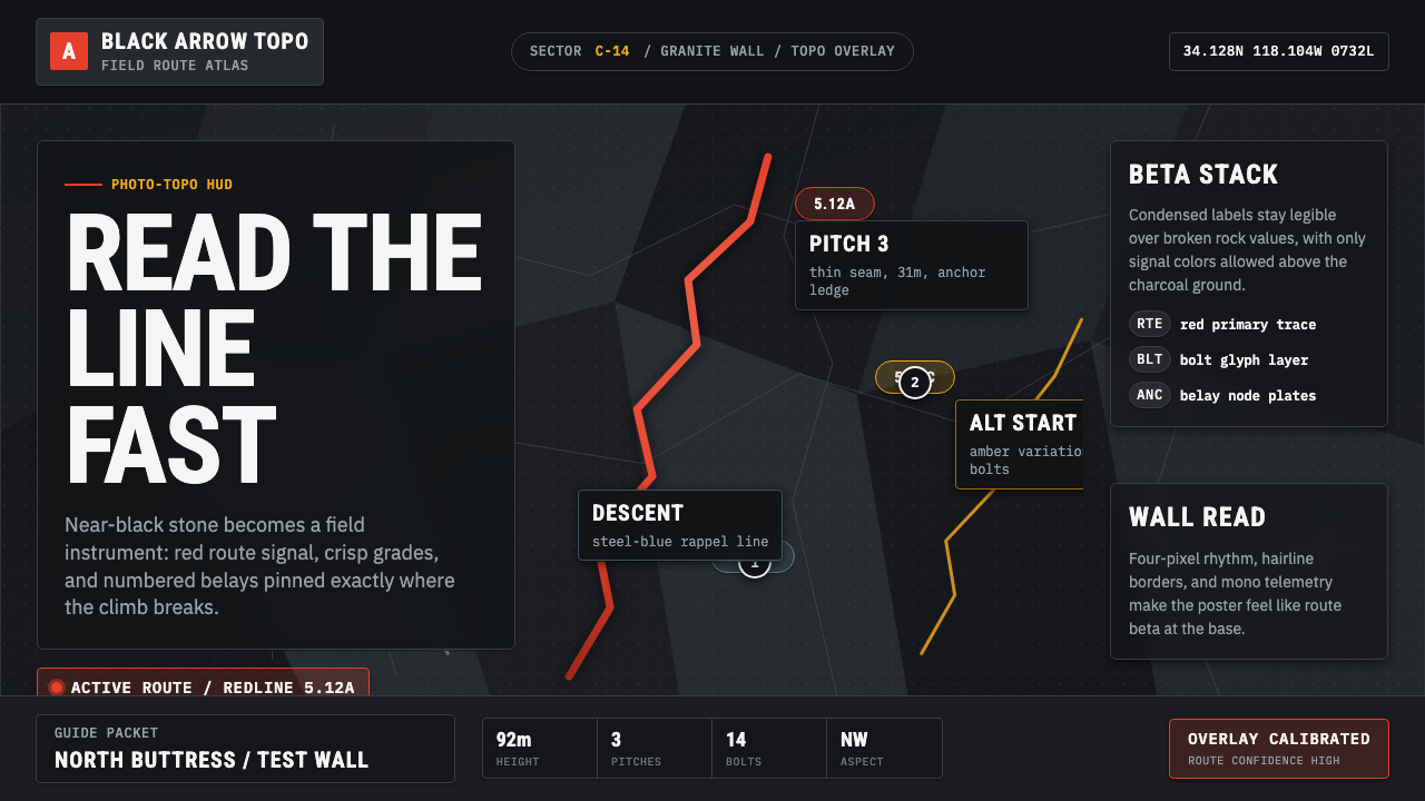 Climbing Topo GuideBeta at a glance. Red route telemetry cuts across near-black stone and conden…一眼读懂路线。红色拓扑线切过近黑岩面,紧缩标签如仪表读数。
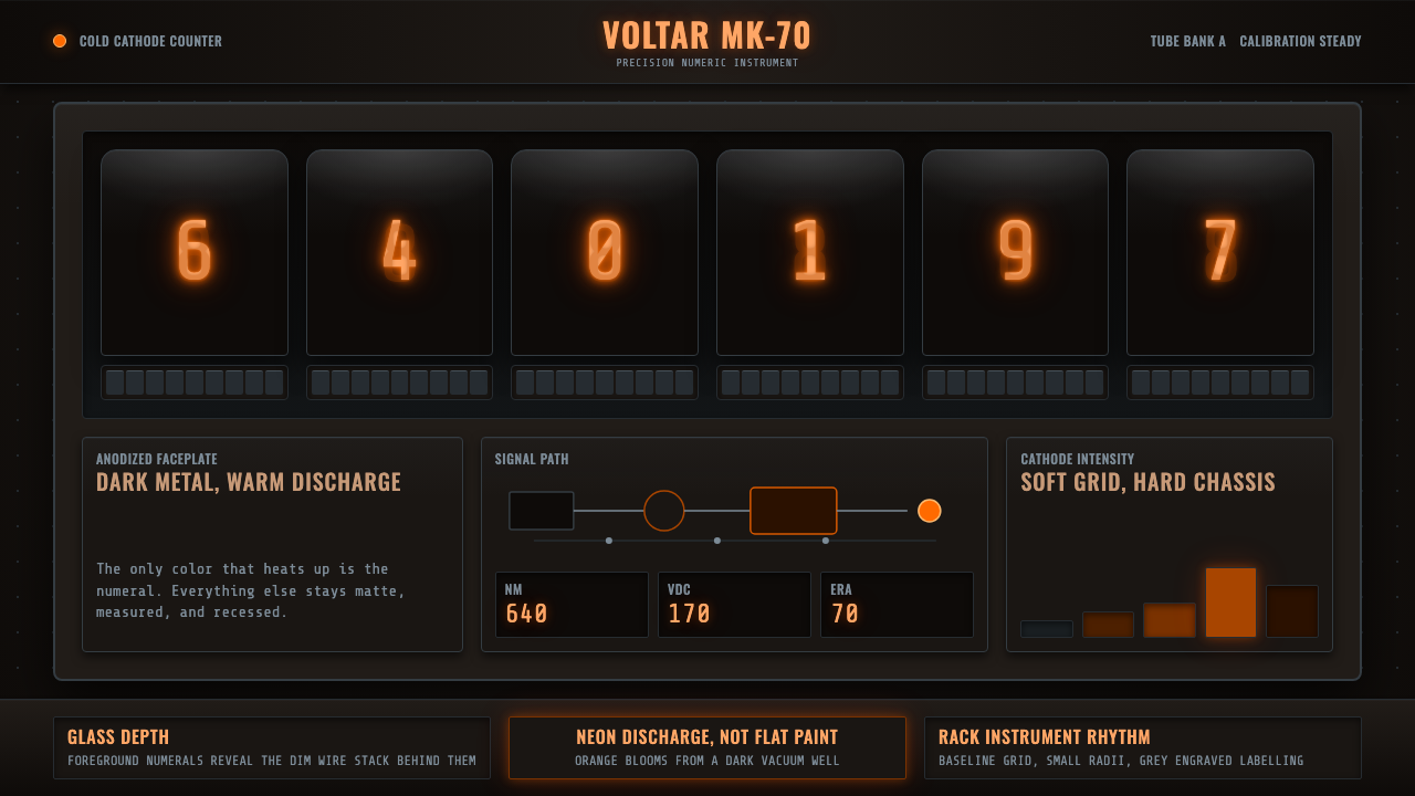 Nixie Tube DisplayHeat inside the machine. Neon-orange digits glow over black metal gridwork.机器里的热光:霓虹橙数字浮在黑色金属栅格上。